
Charlie's Alter Ego
Members
-
Joined
Everything posted by Charlie's Alter Ego
-
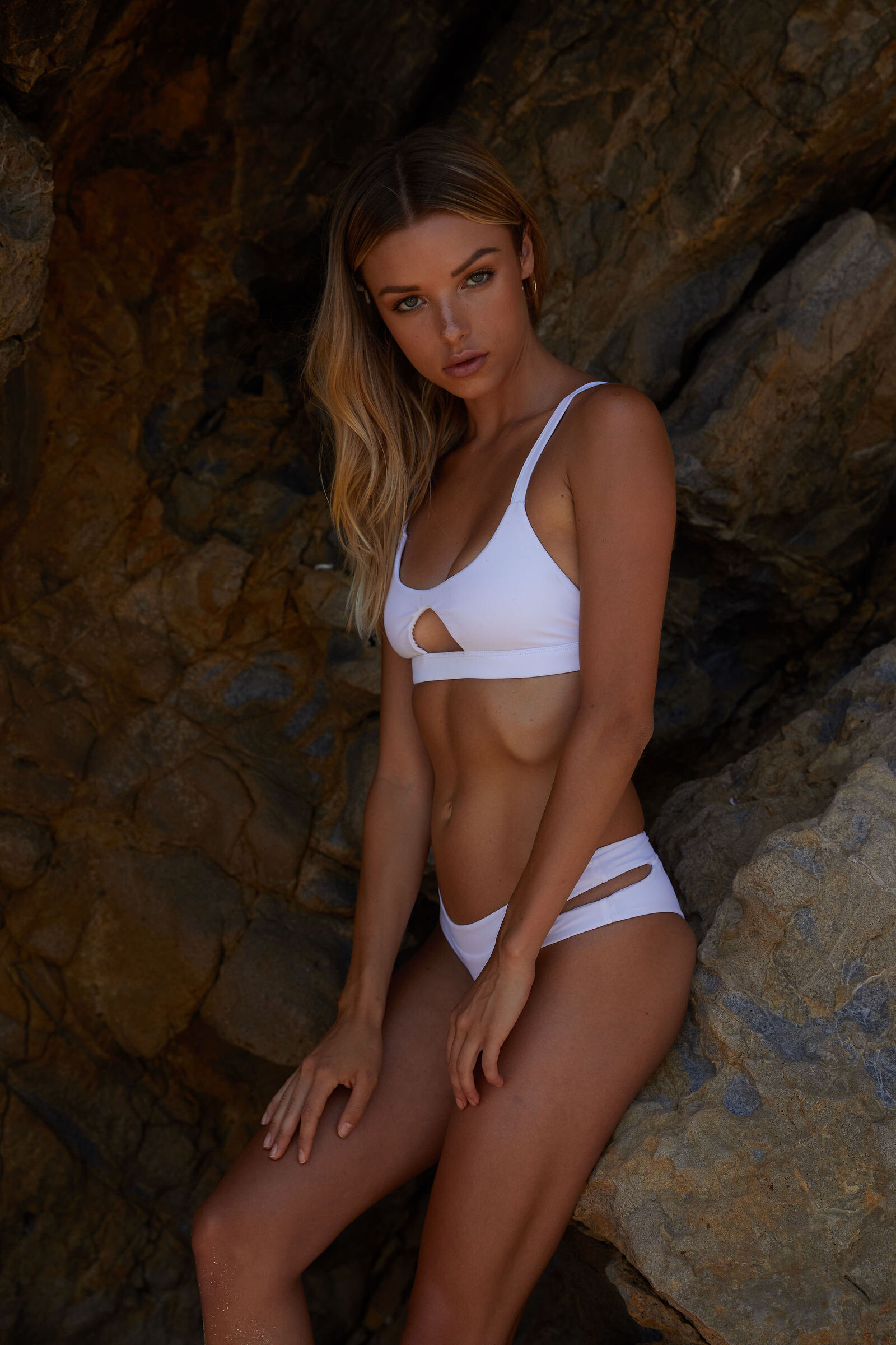
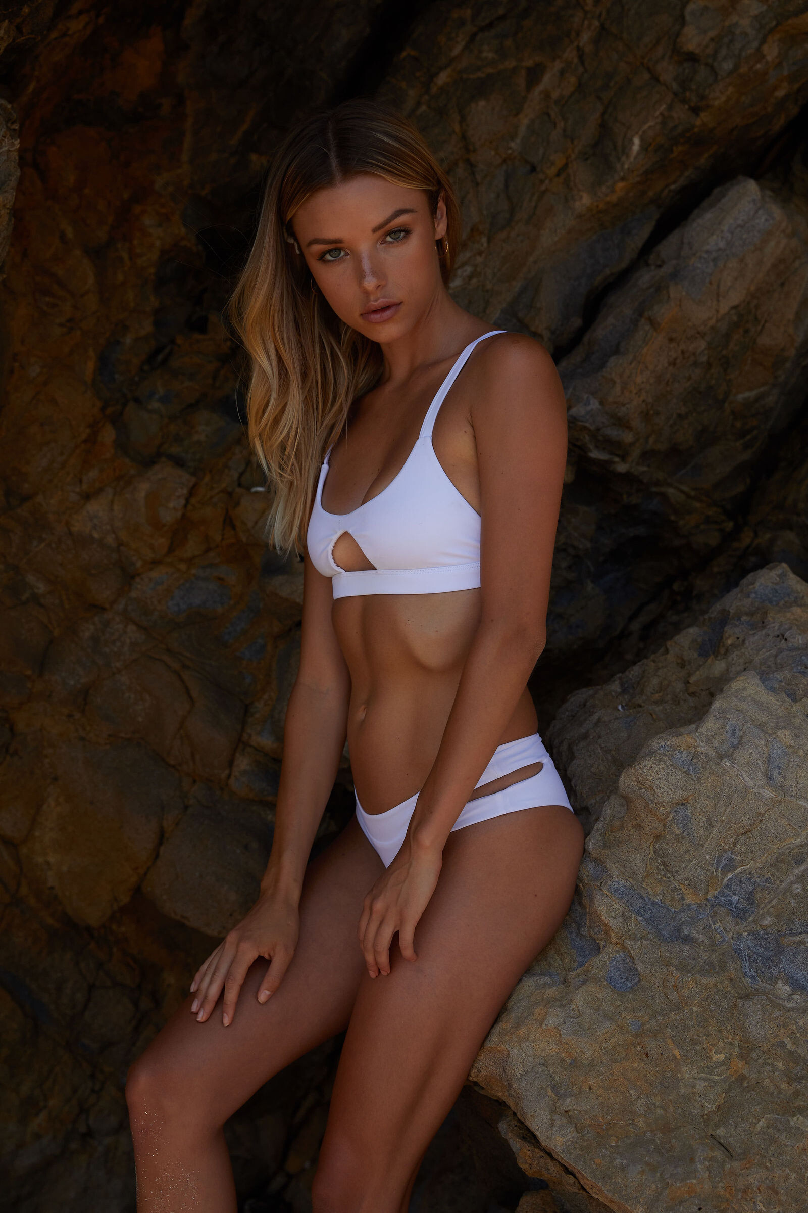
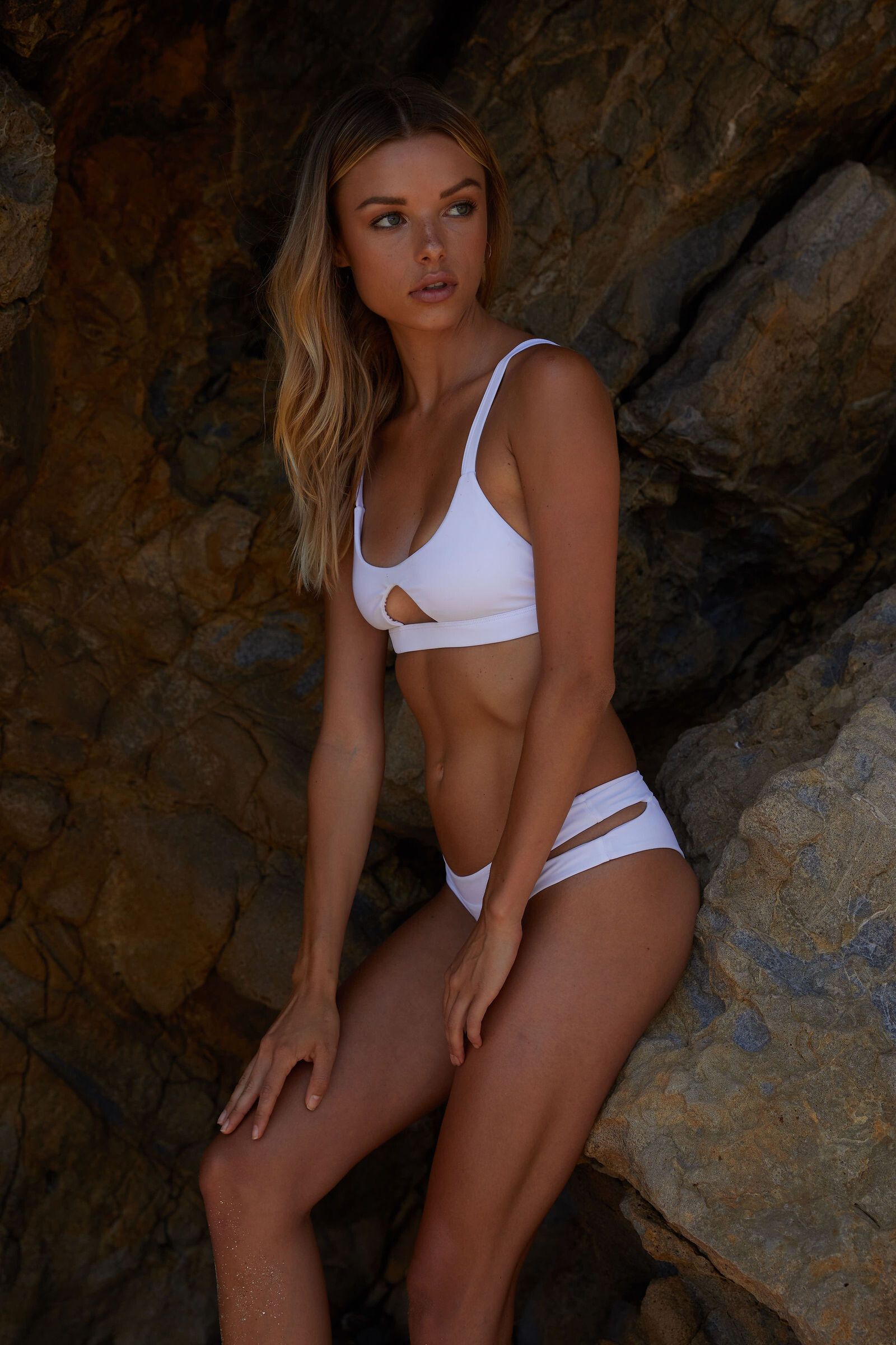
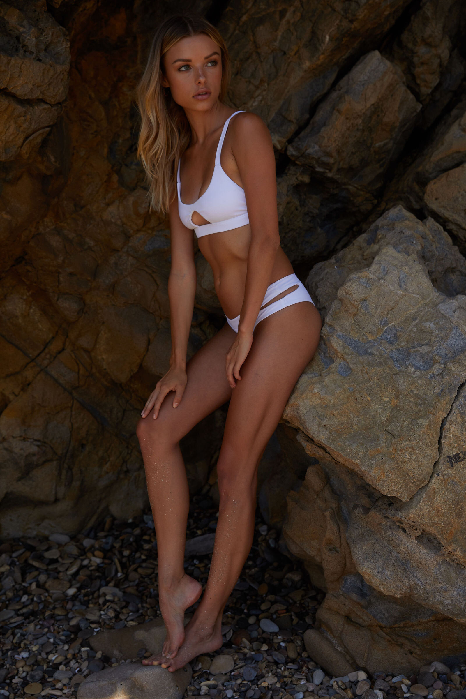
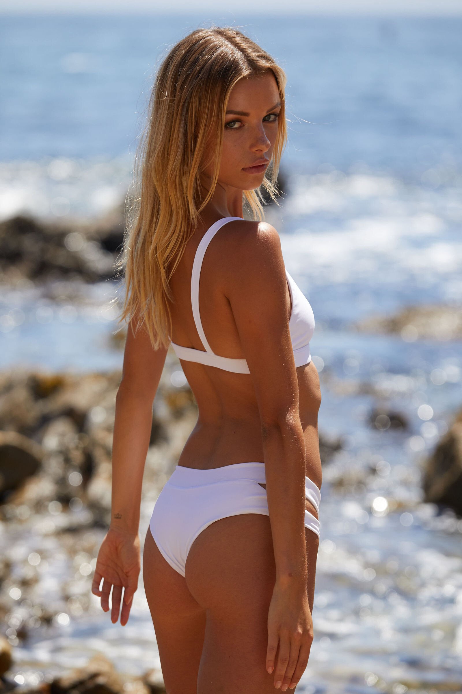
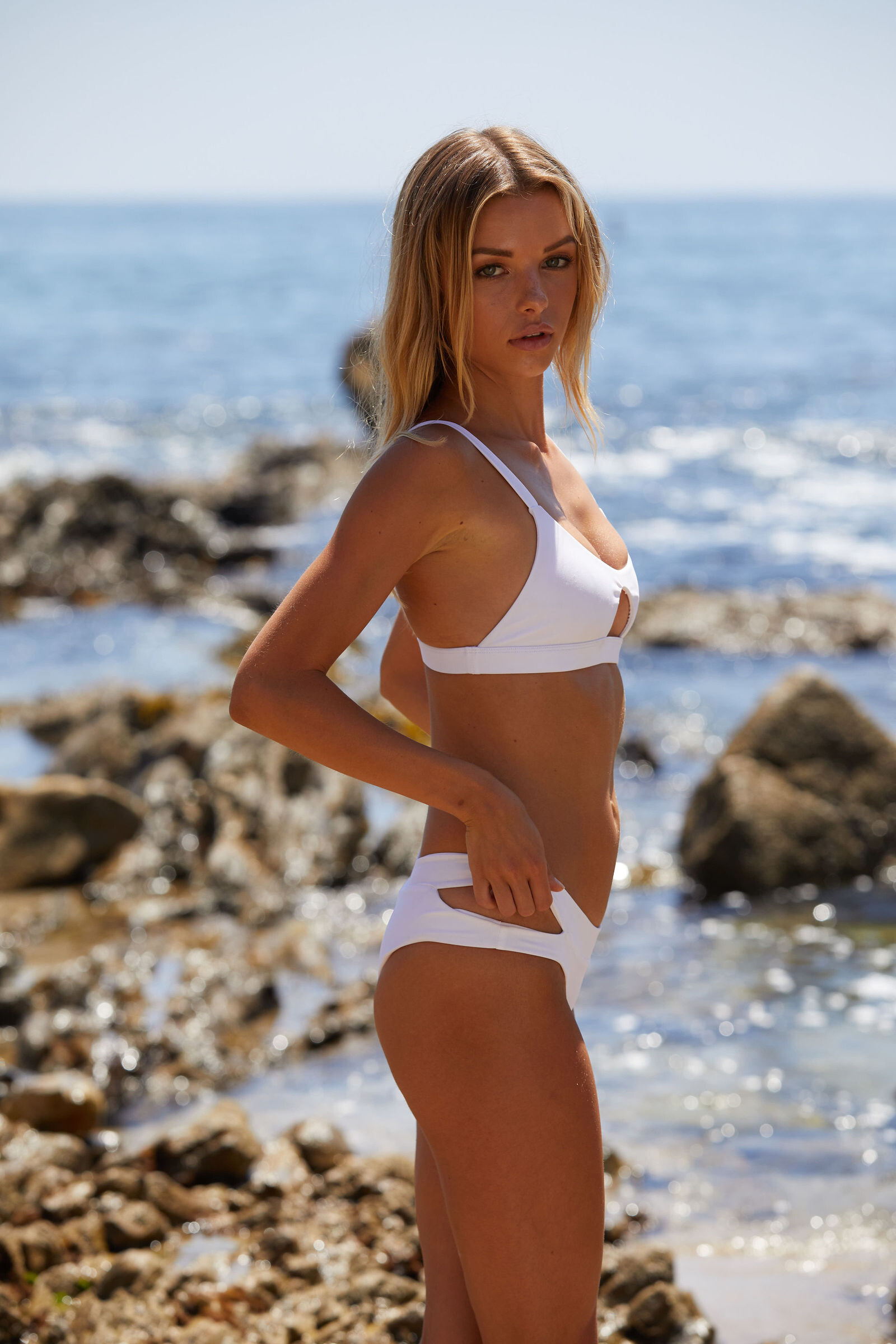
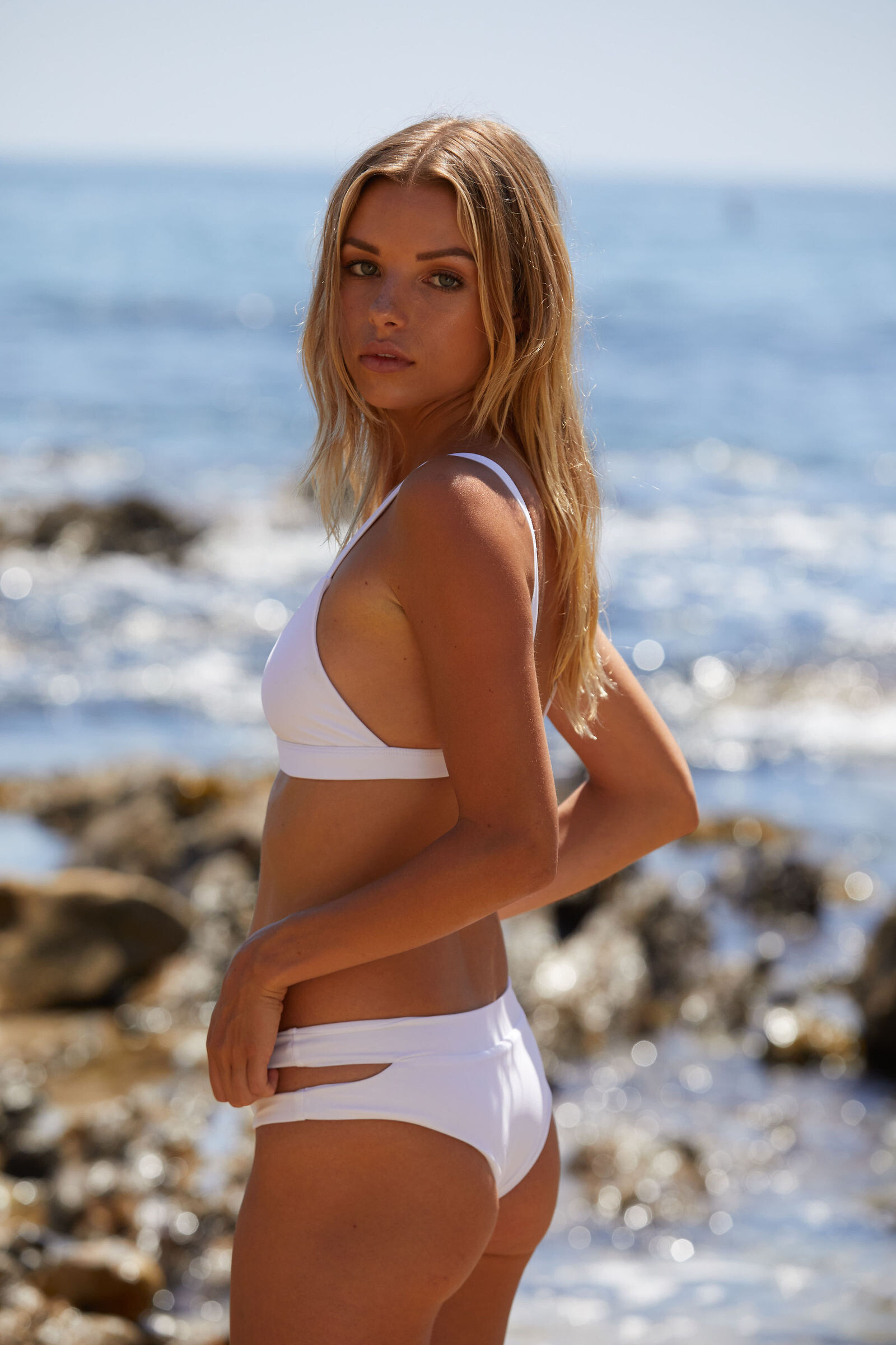
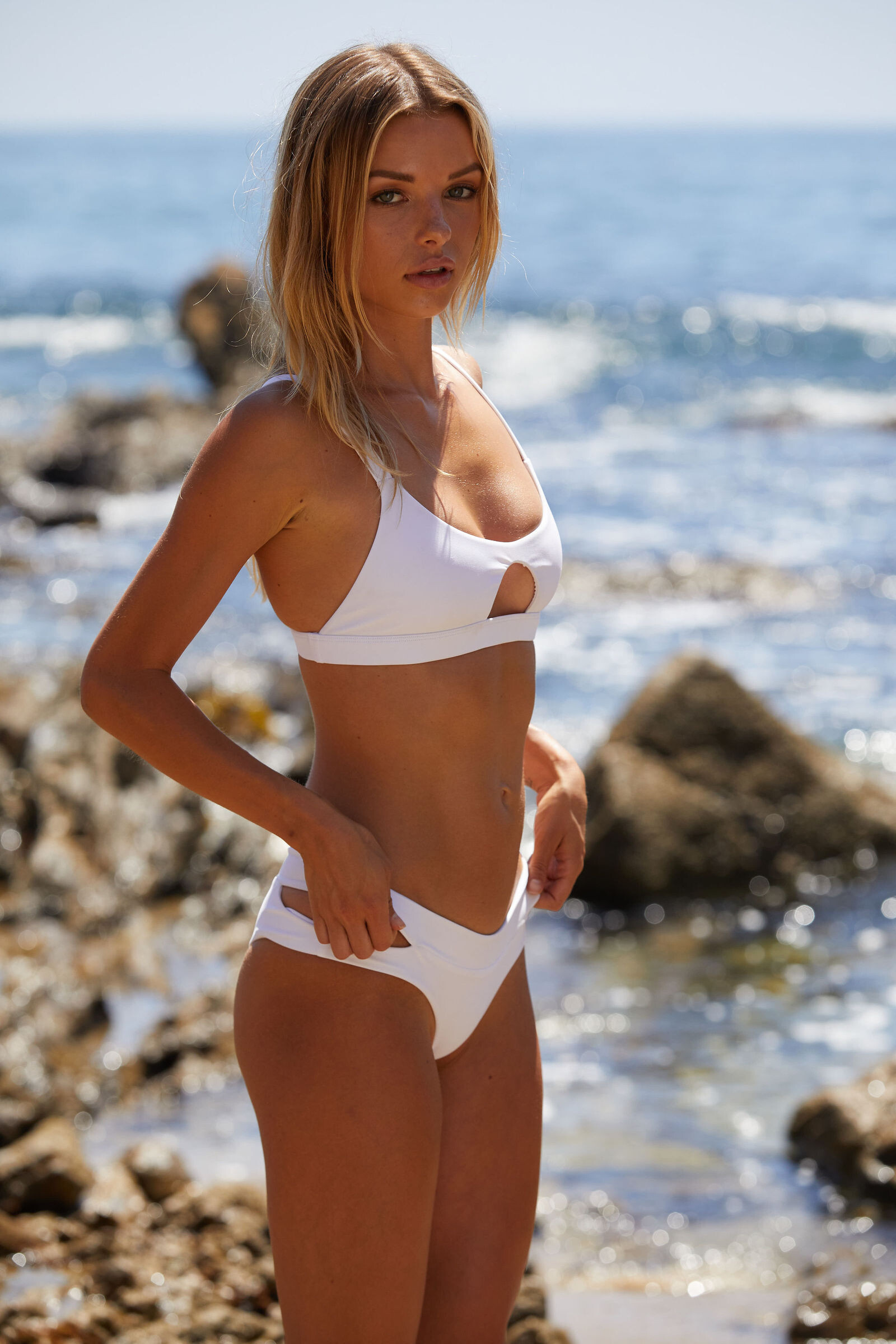
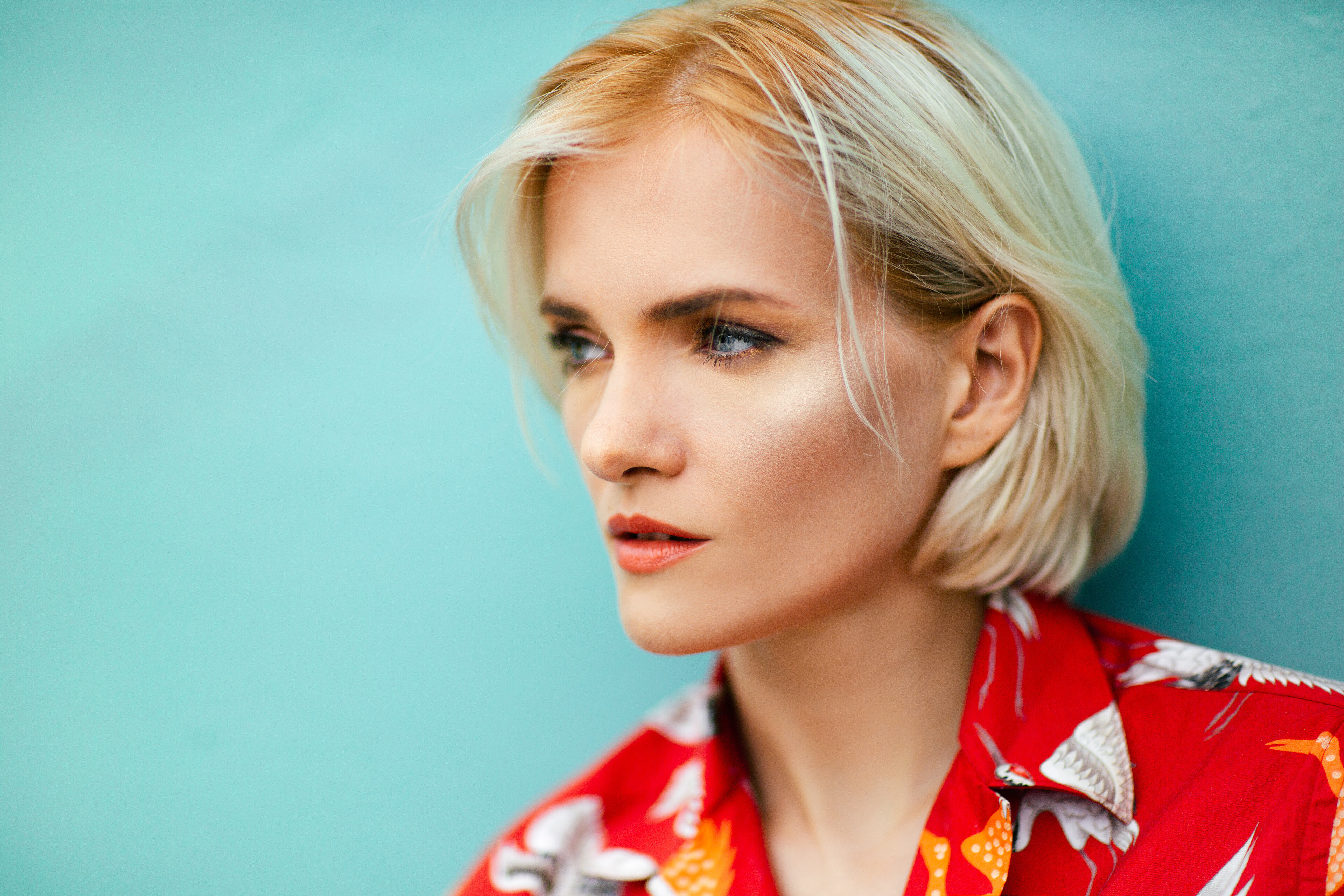
 "The Alchemist" By André Josselin HQ+ Source: Published: September 15th 2019


-
Sonias Instagram Live Stream September 12th 2019 Resolution: 504x896 Duration: 00h15m18s Size: 96.9MB itsnotsonia~1568351212~17846216797620792~1.mp4

-
Another spammer posting spam: User https://www.bellazon.com/main/profile/146770-palama-fashion/ posting spam https://www.bellazon.com/main/topic/80371-palama-fashion/
-
Did you drag 'n' drop the image? 'Cause this happens when you drag 'n' drop images into the editor. When posting the image-url, the embedding will look like this:
-
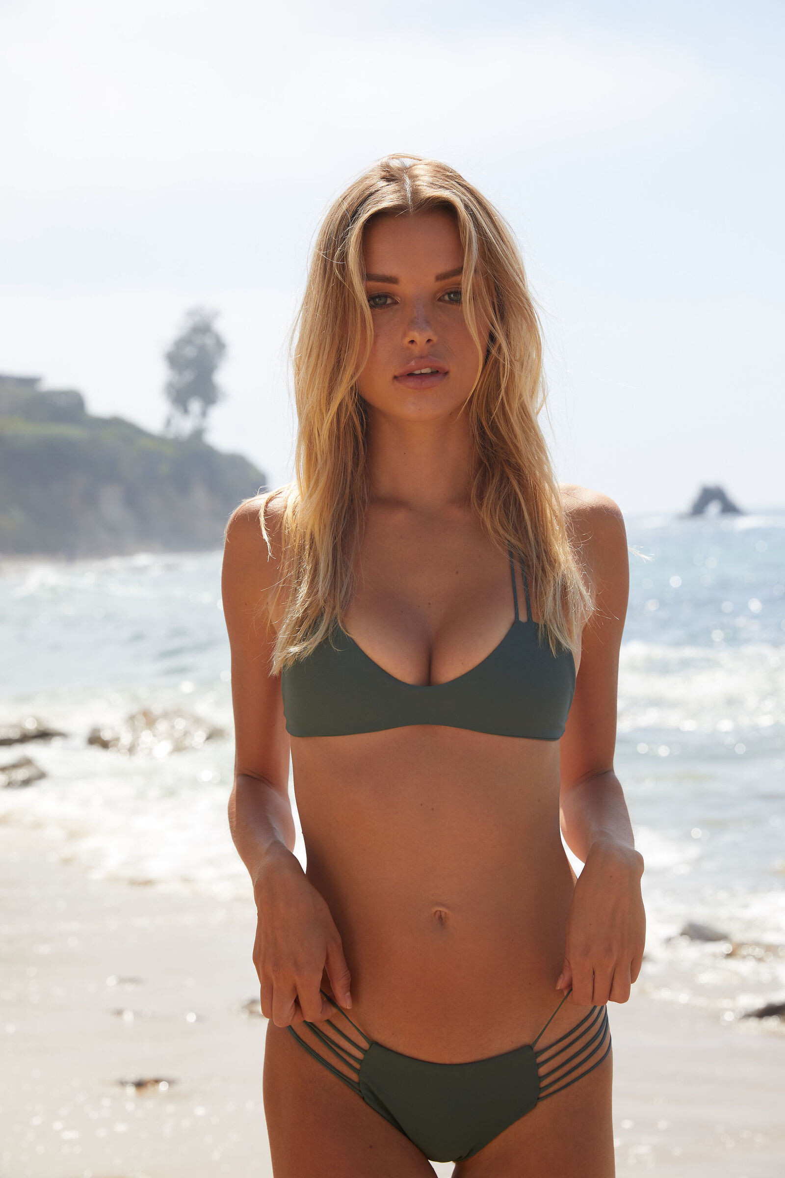
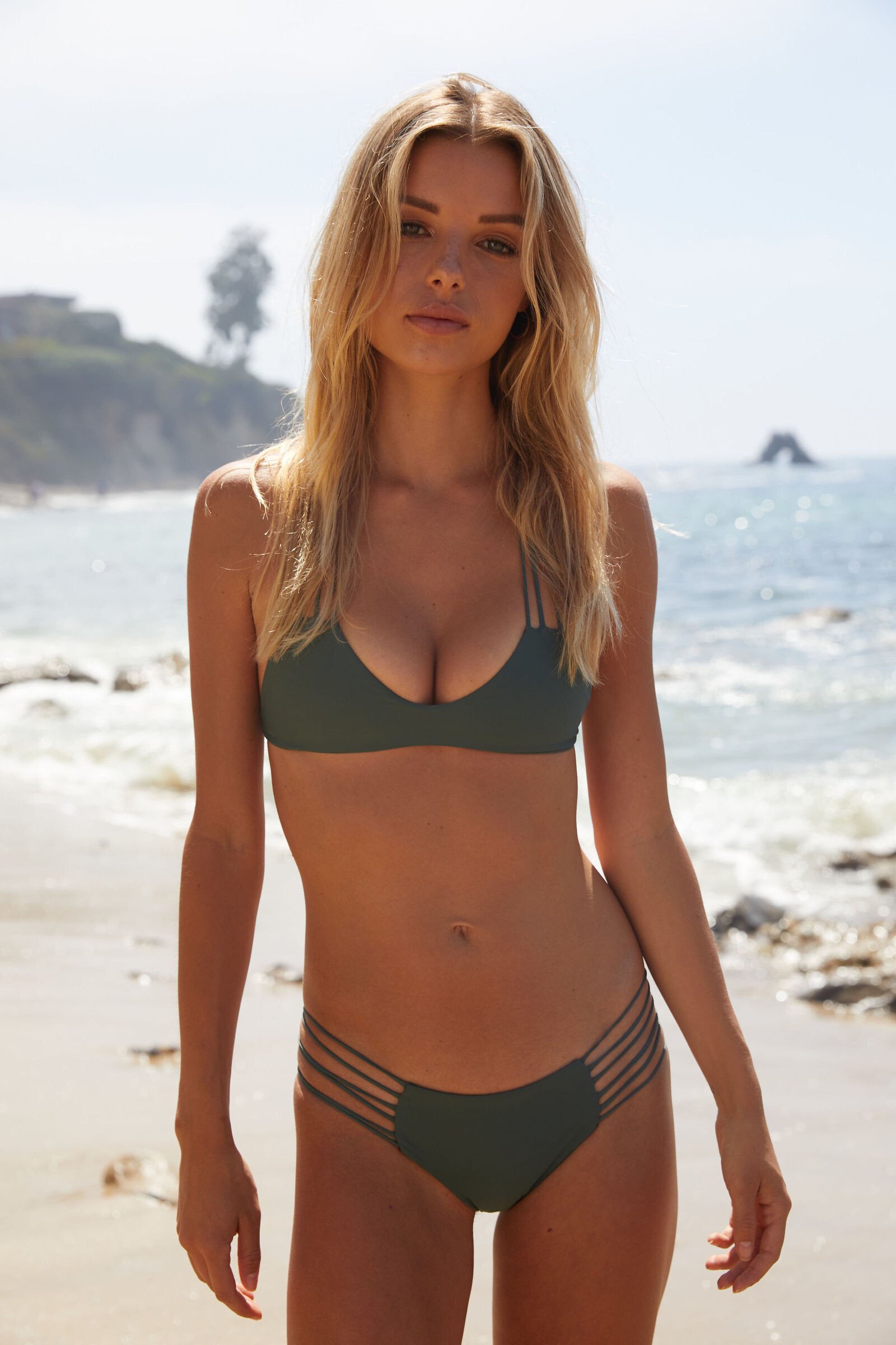
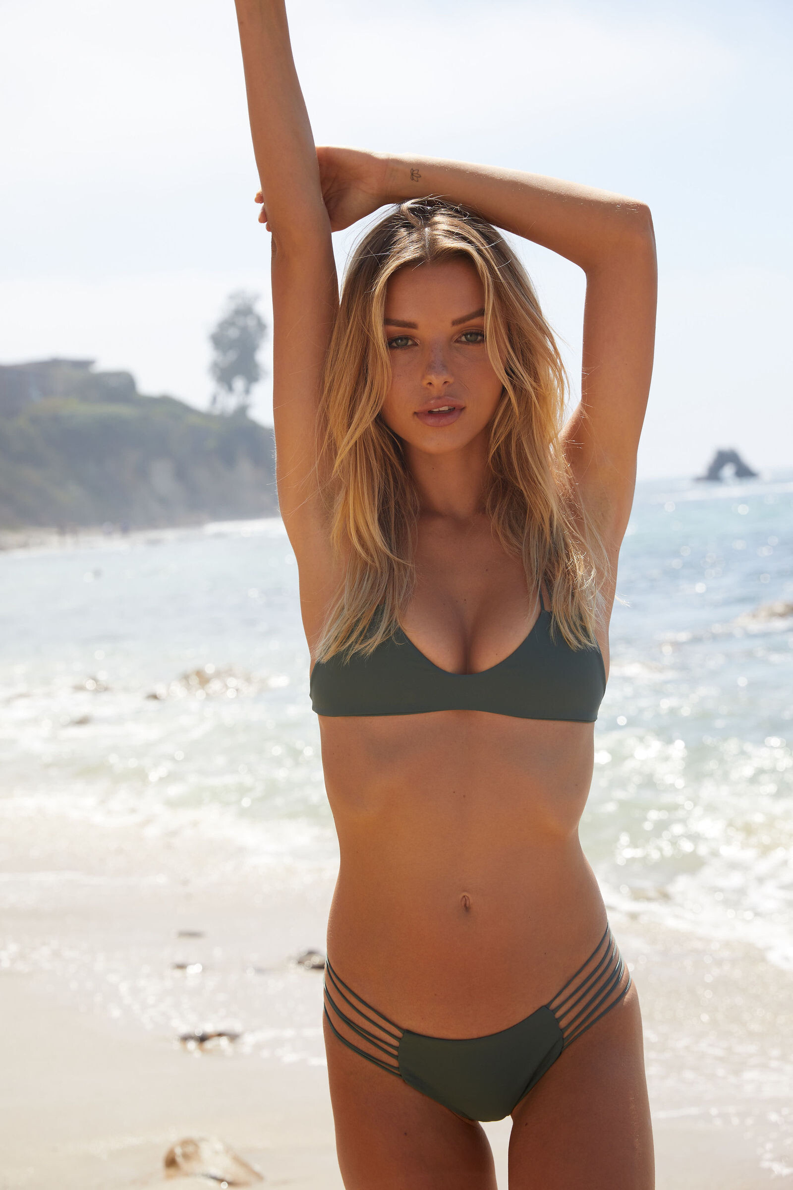
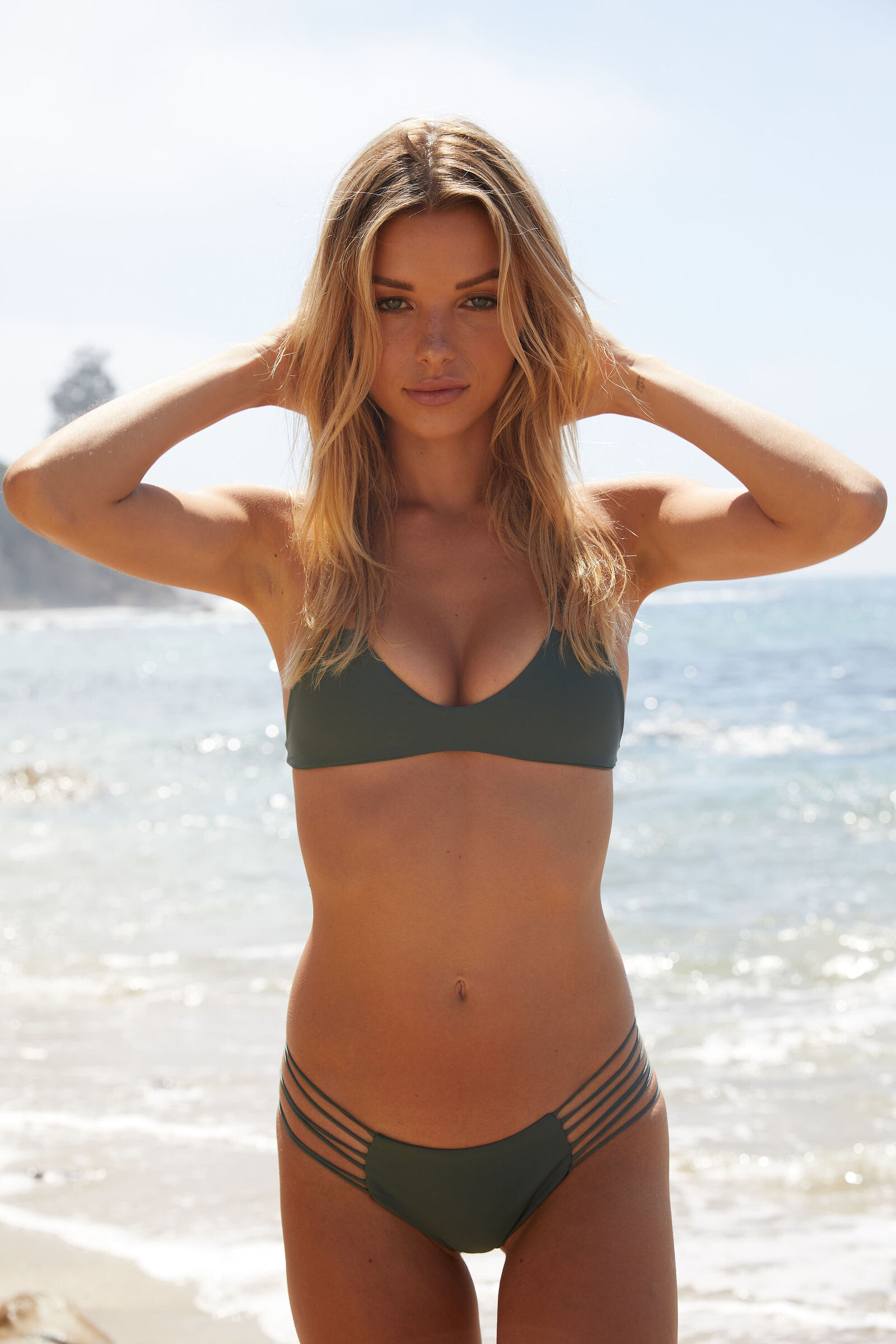
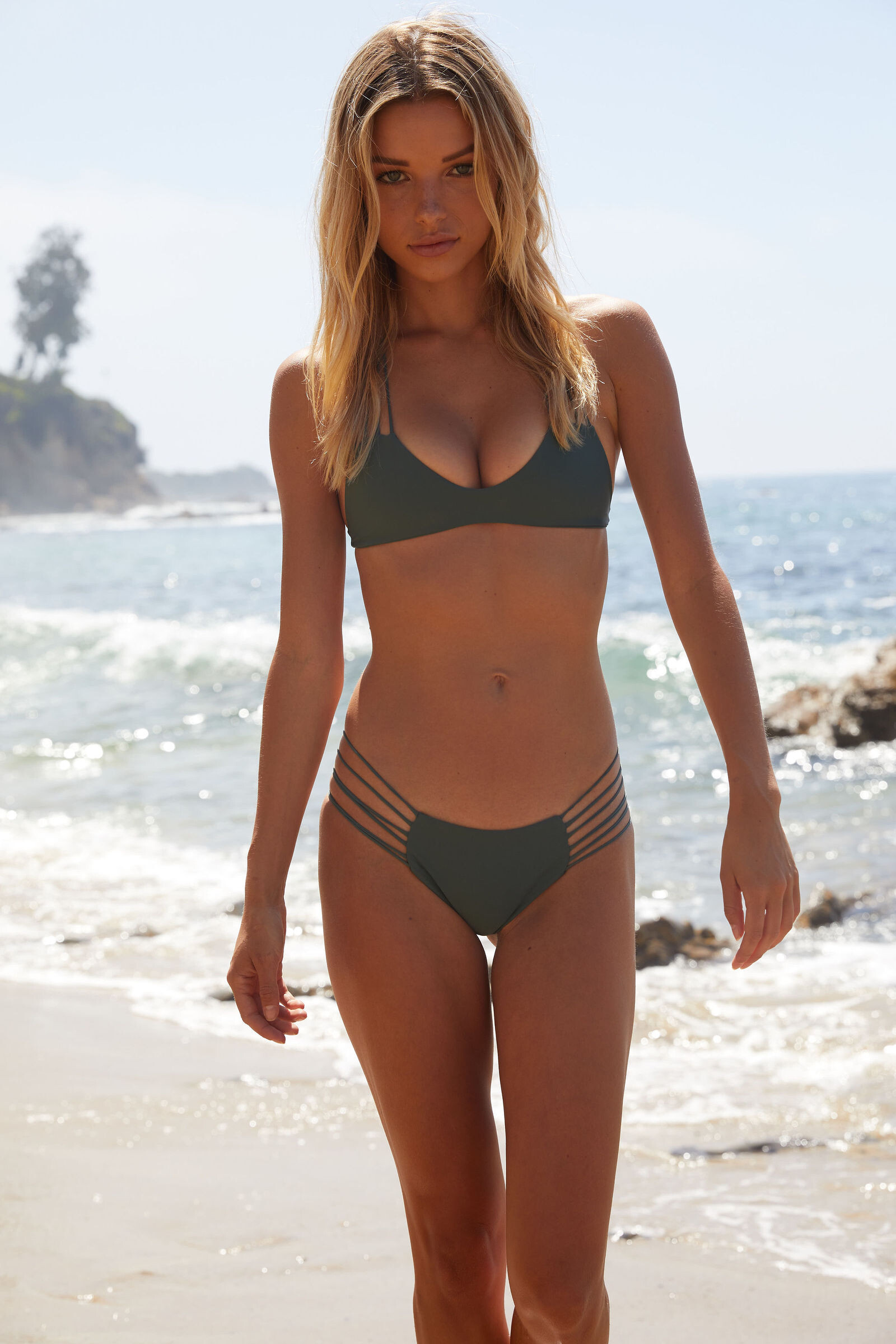
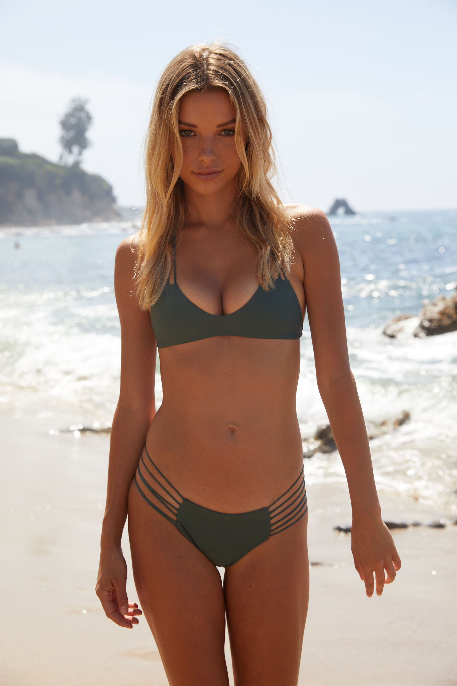
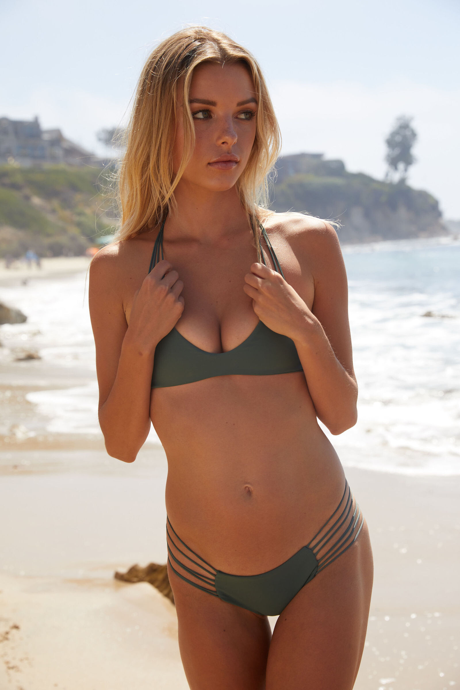
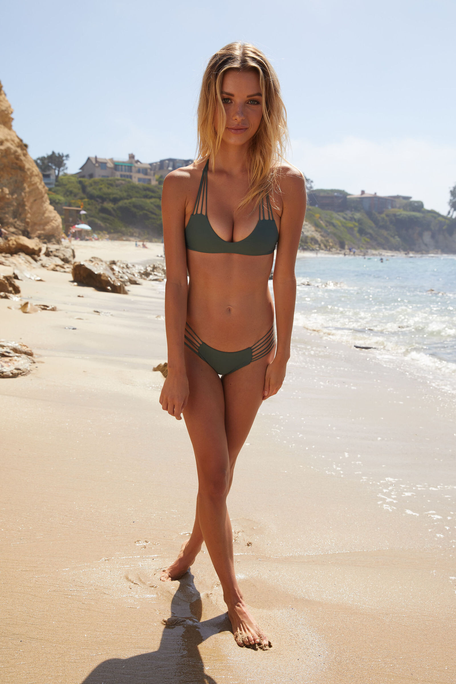
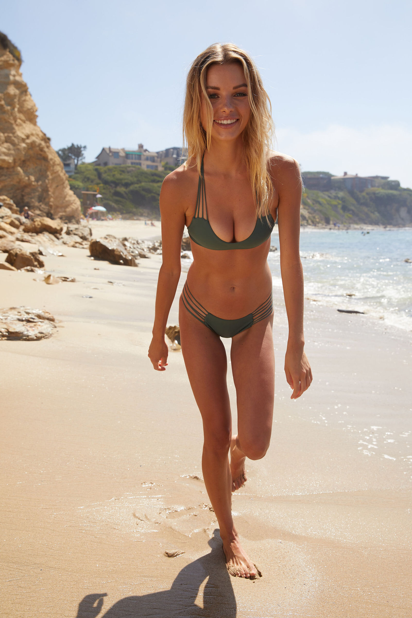
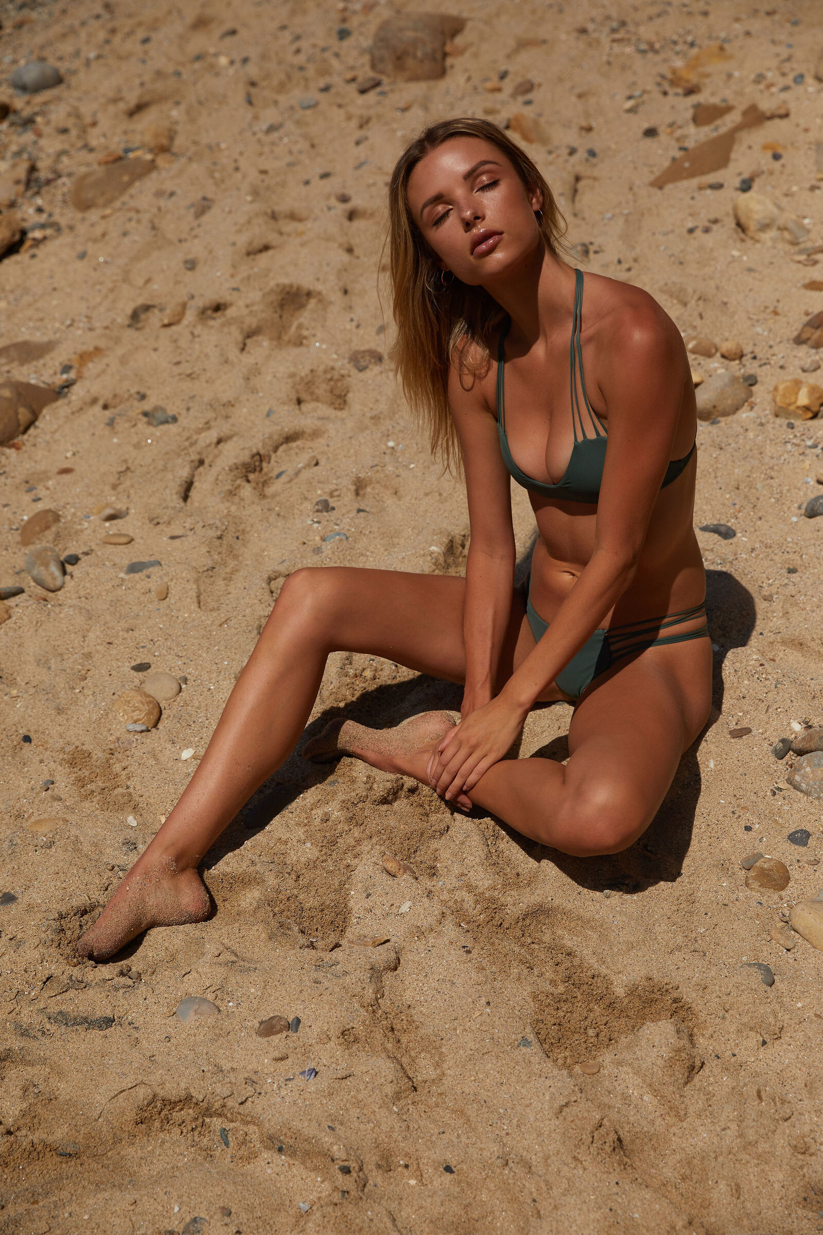
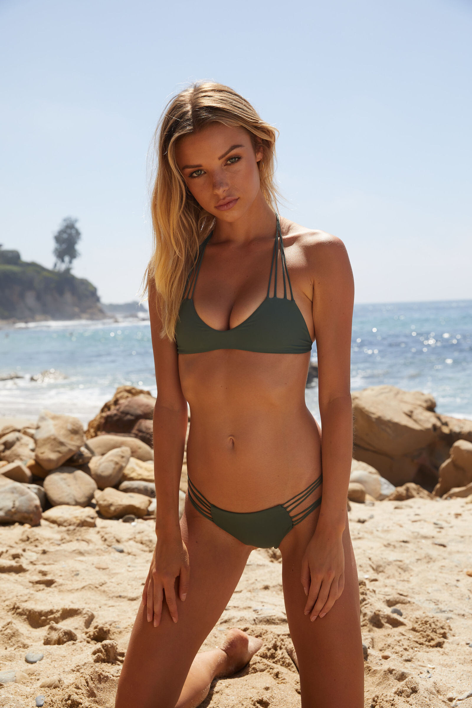
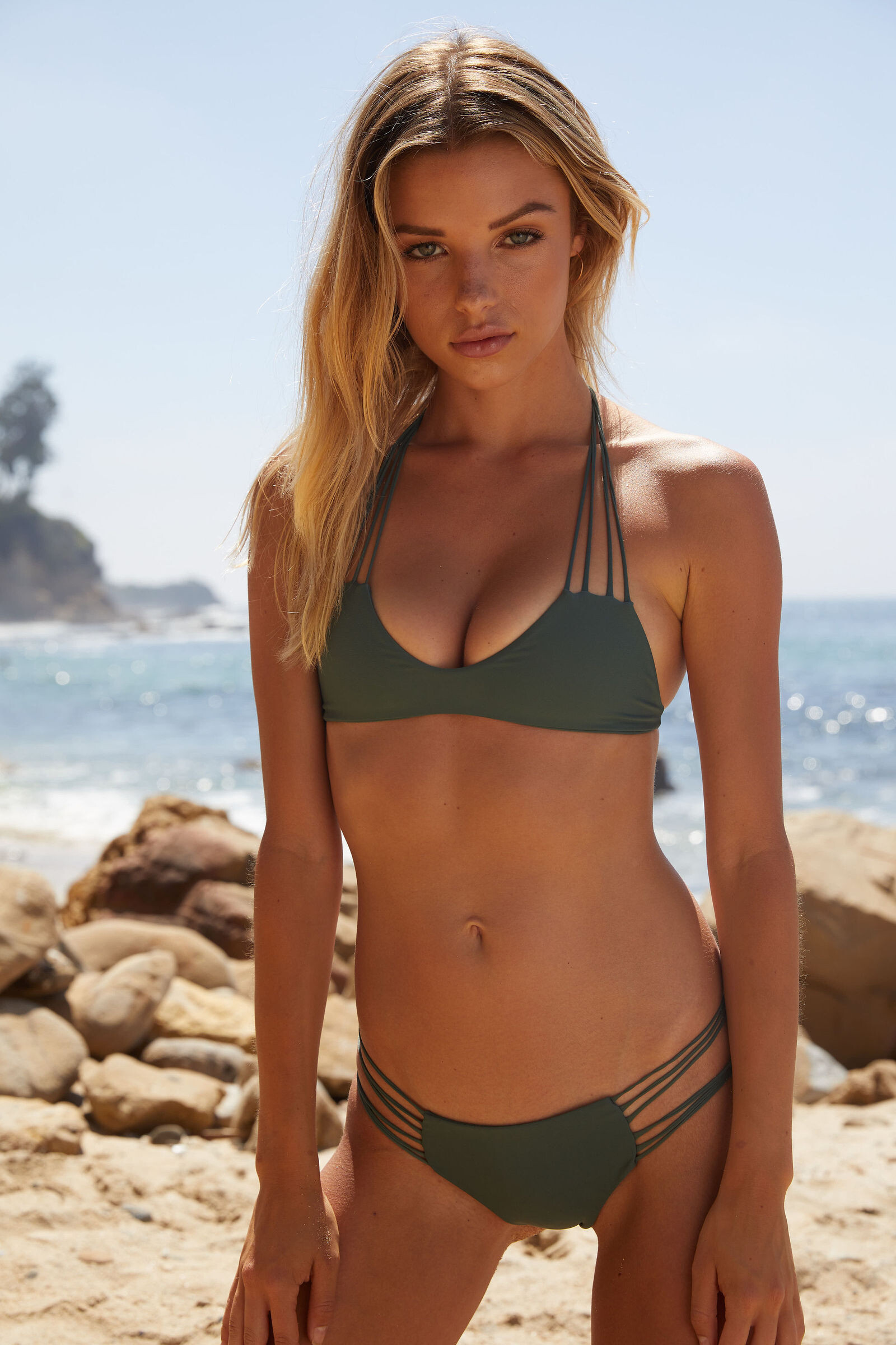
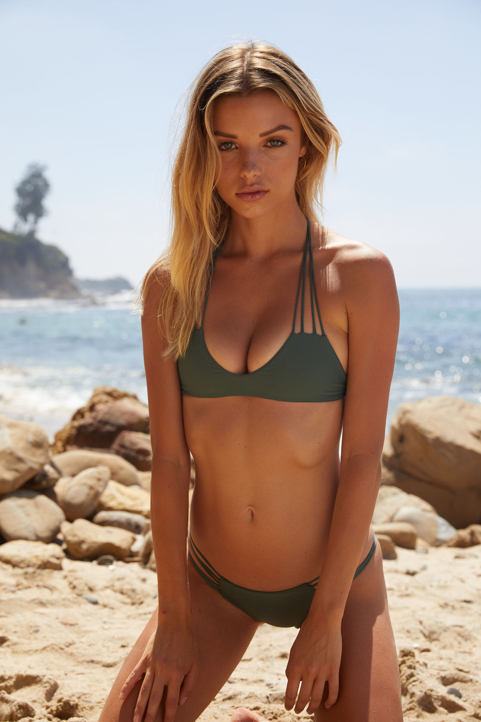
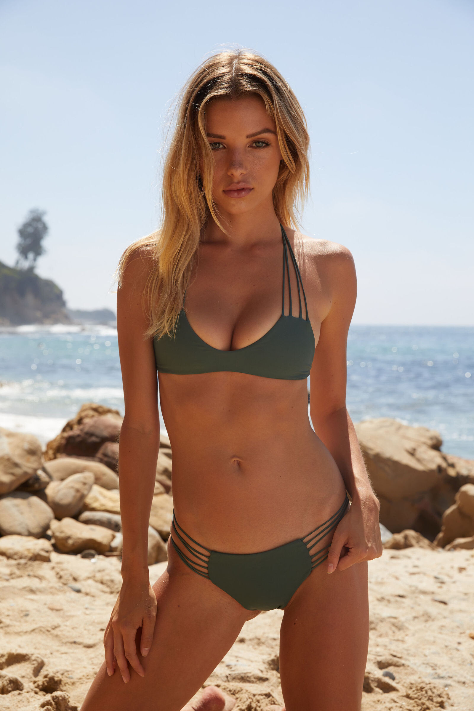
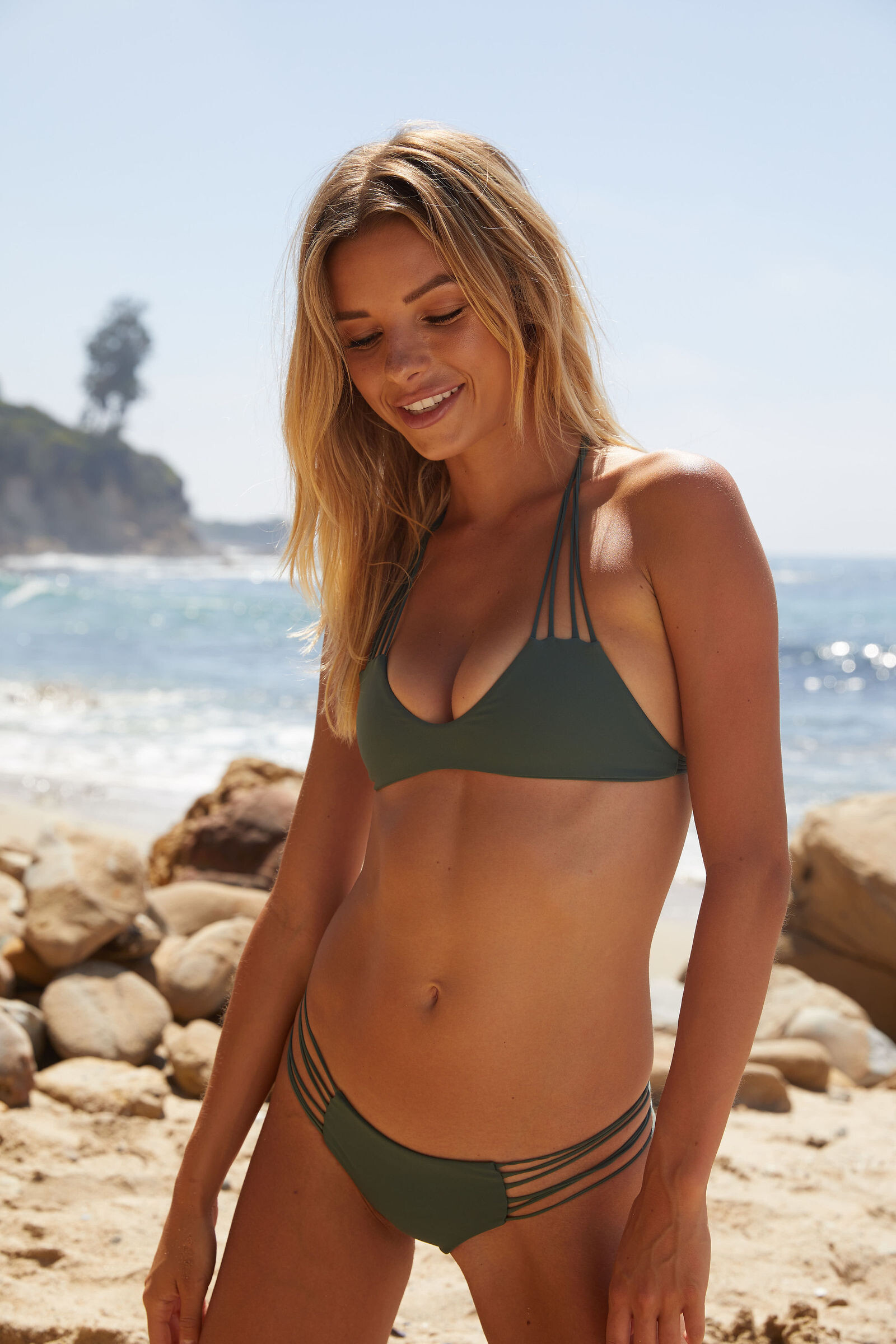
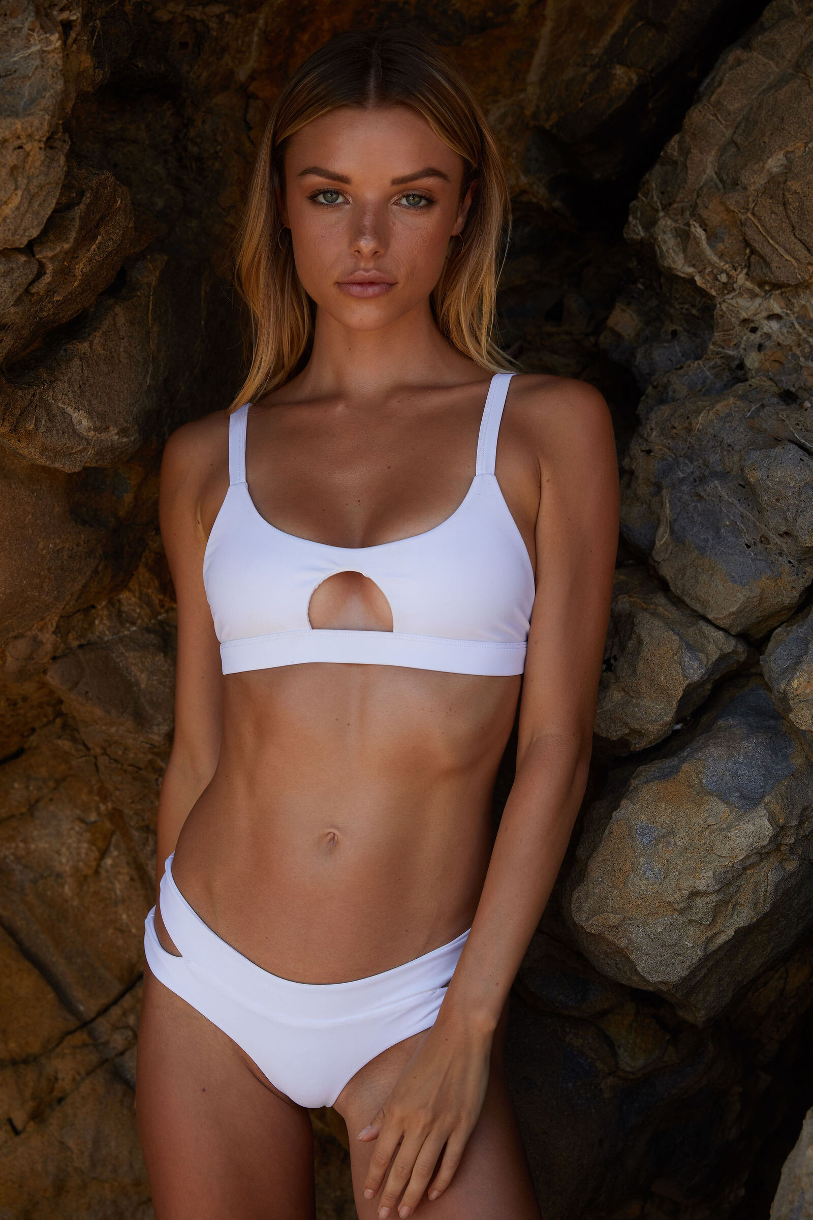
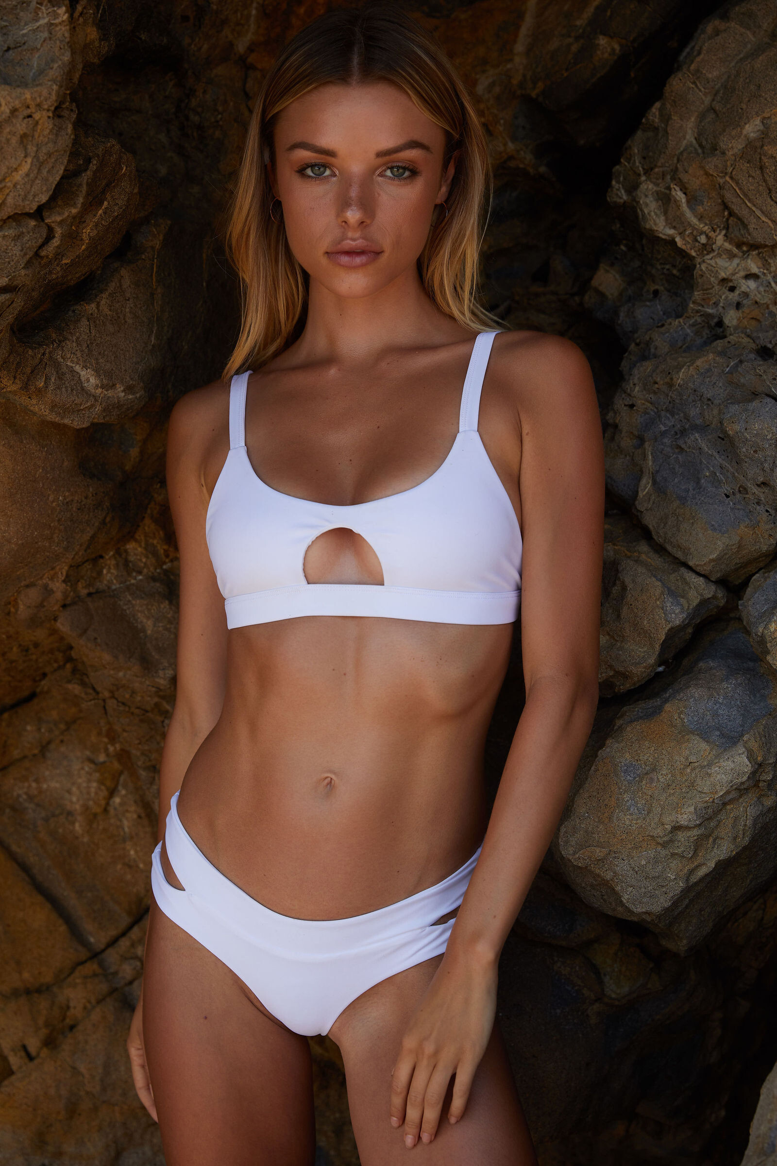
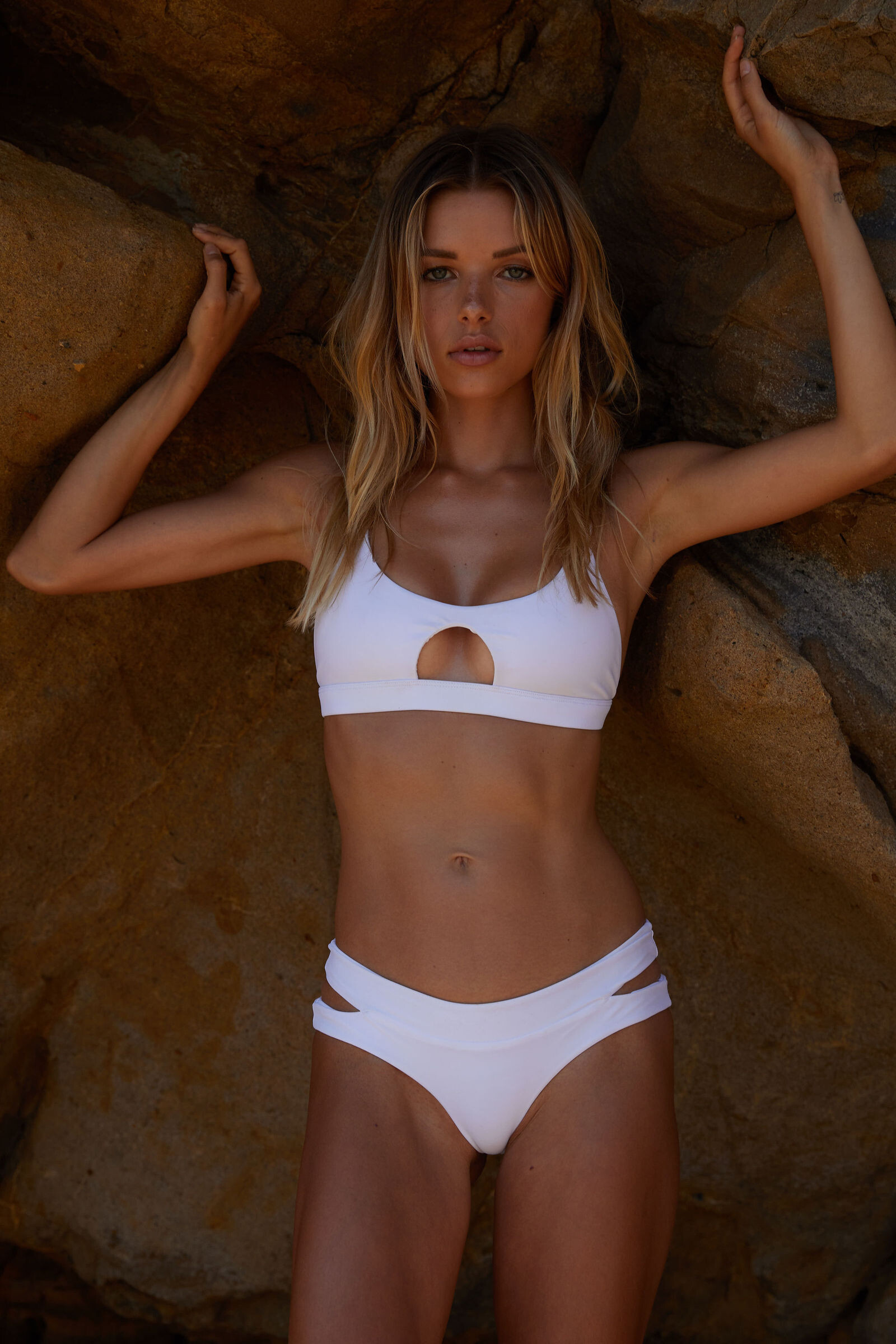
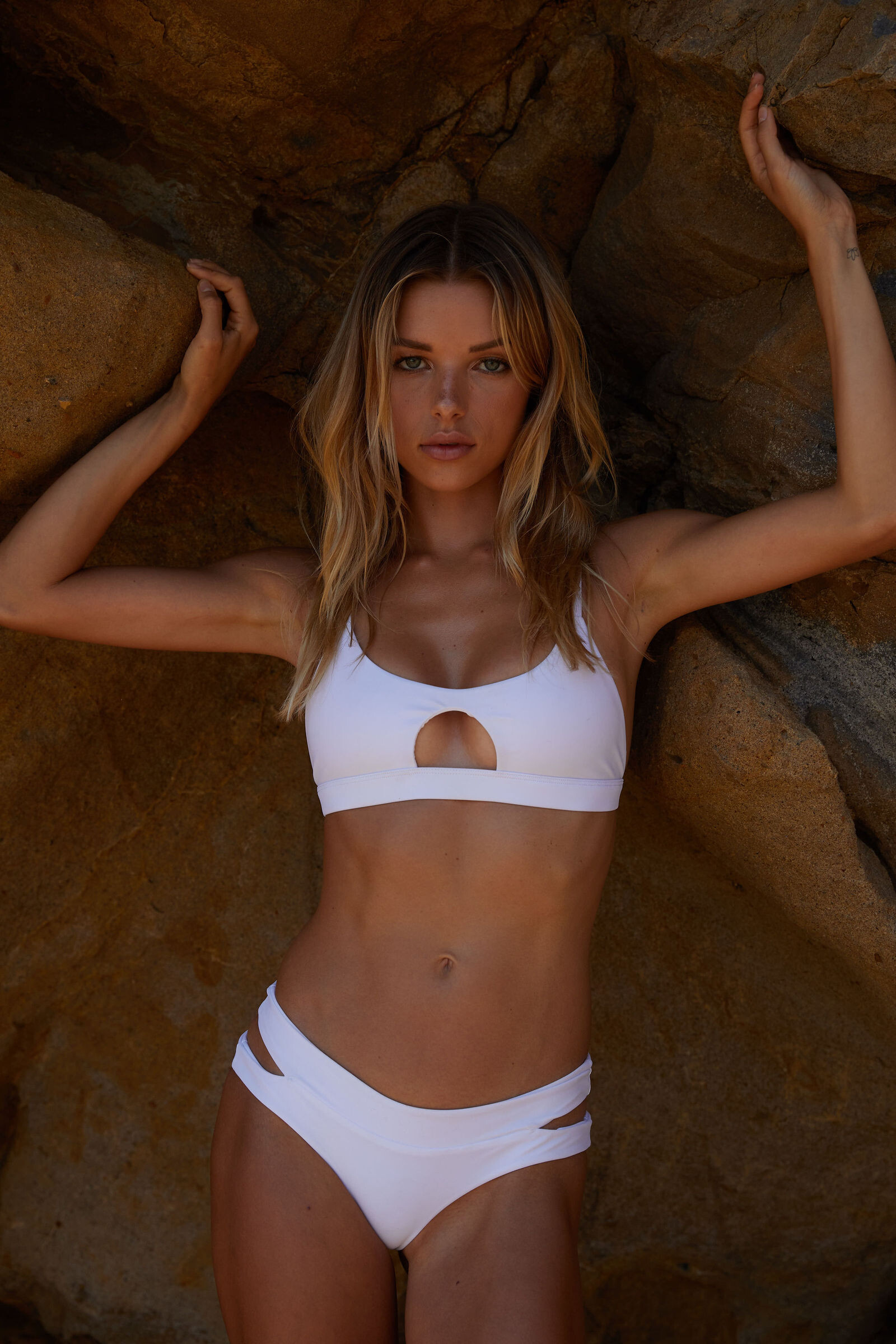
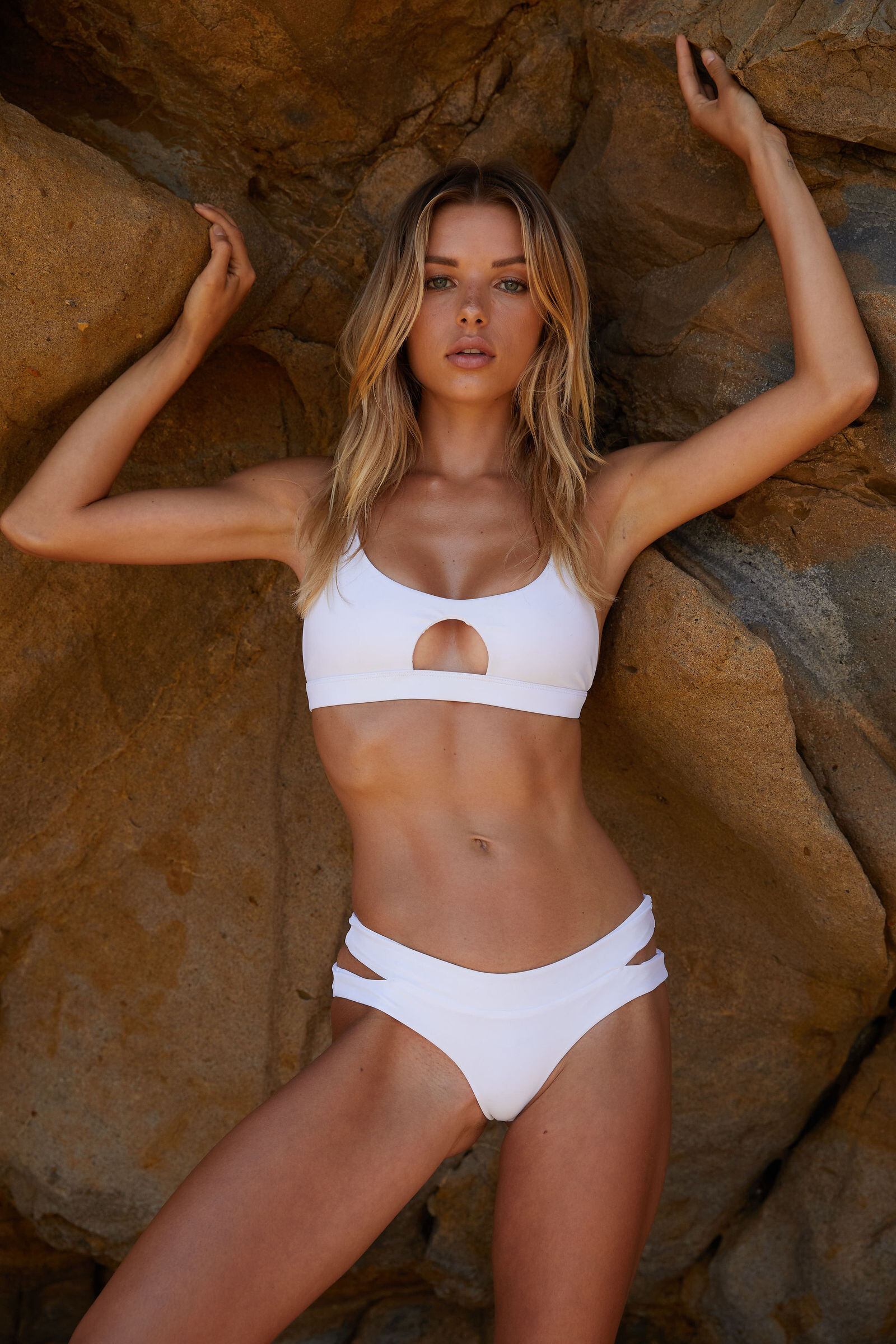
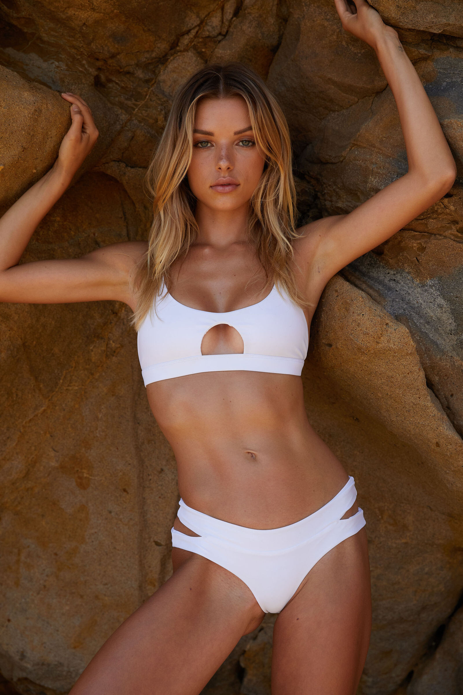
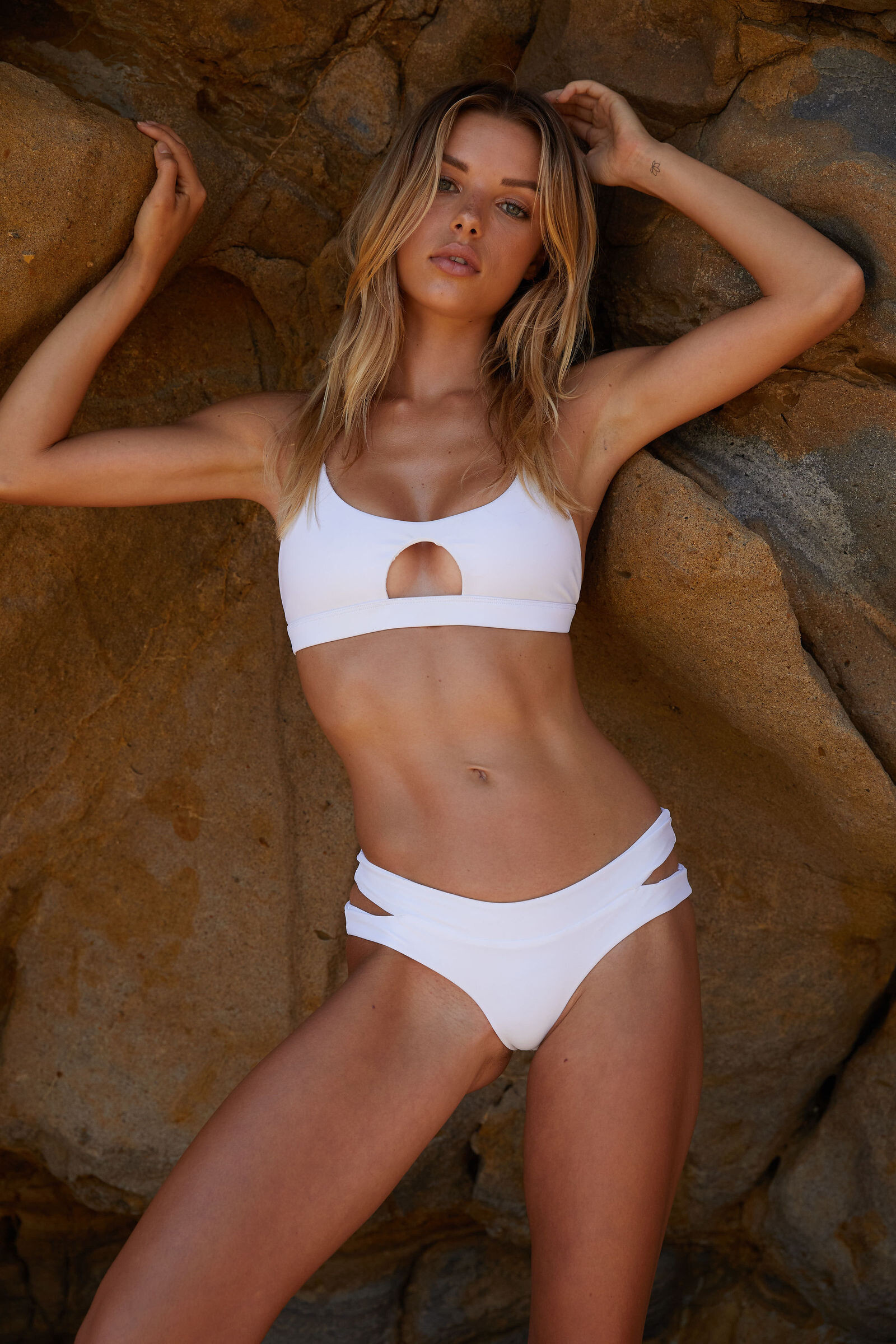
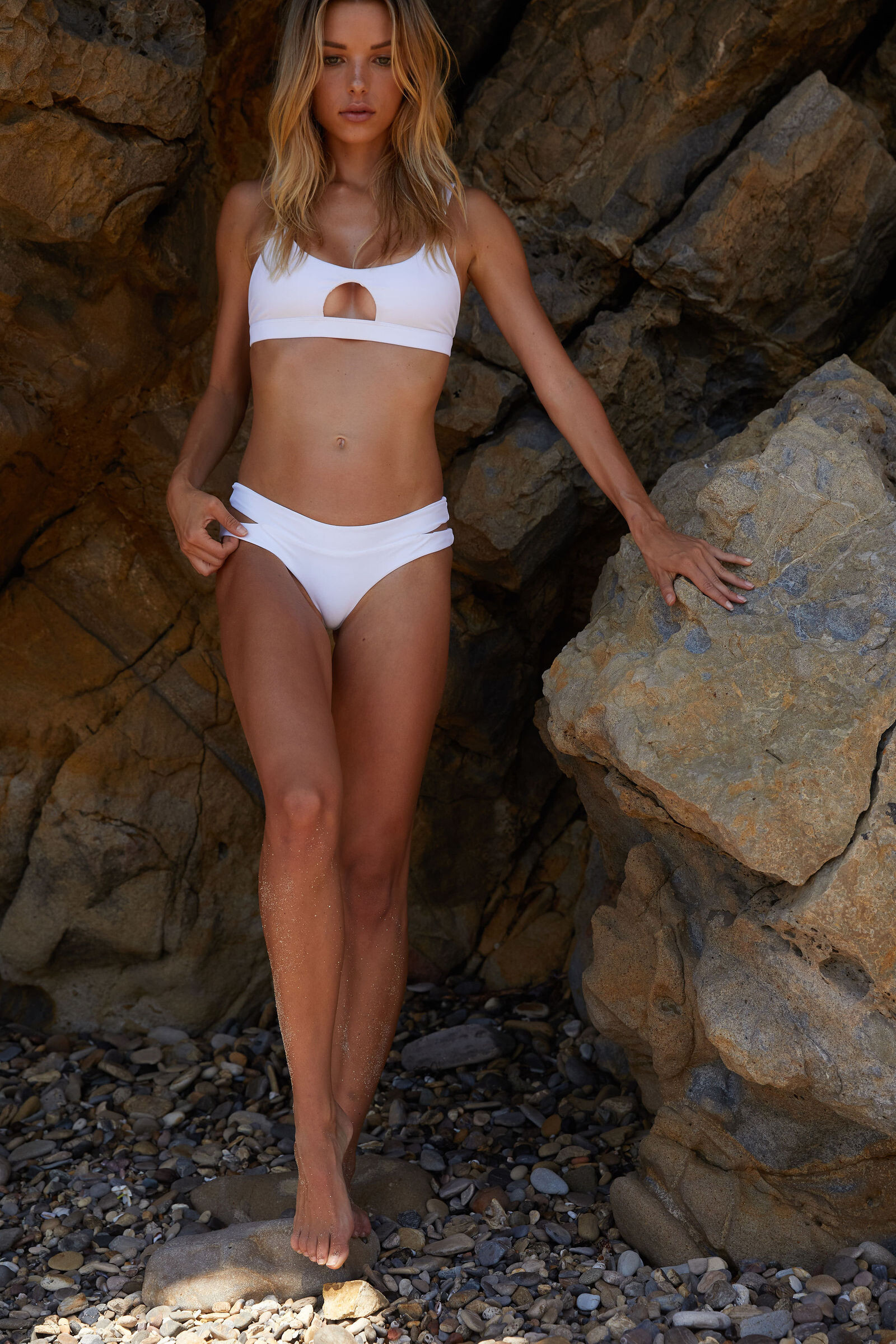
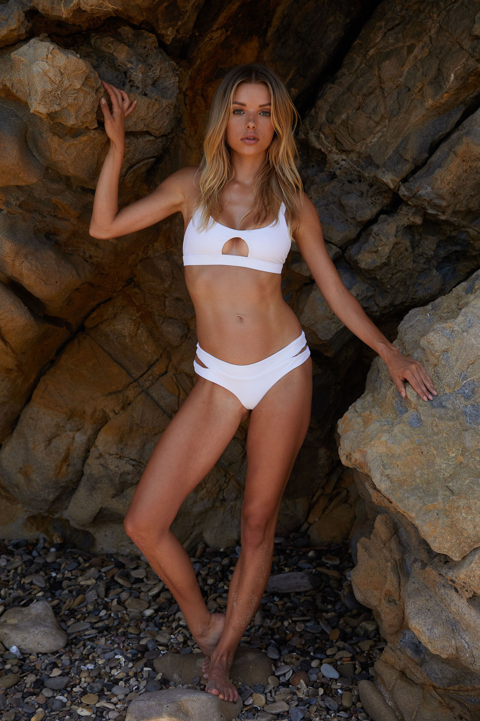
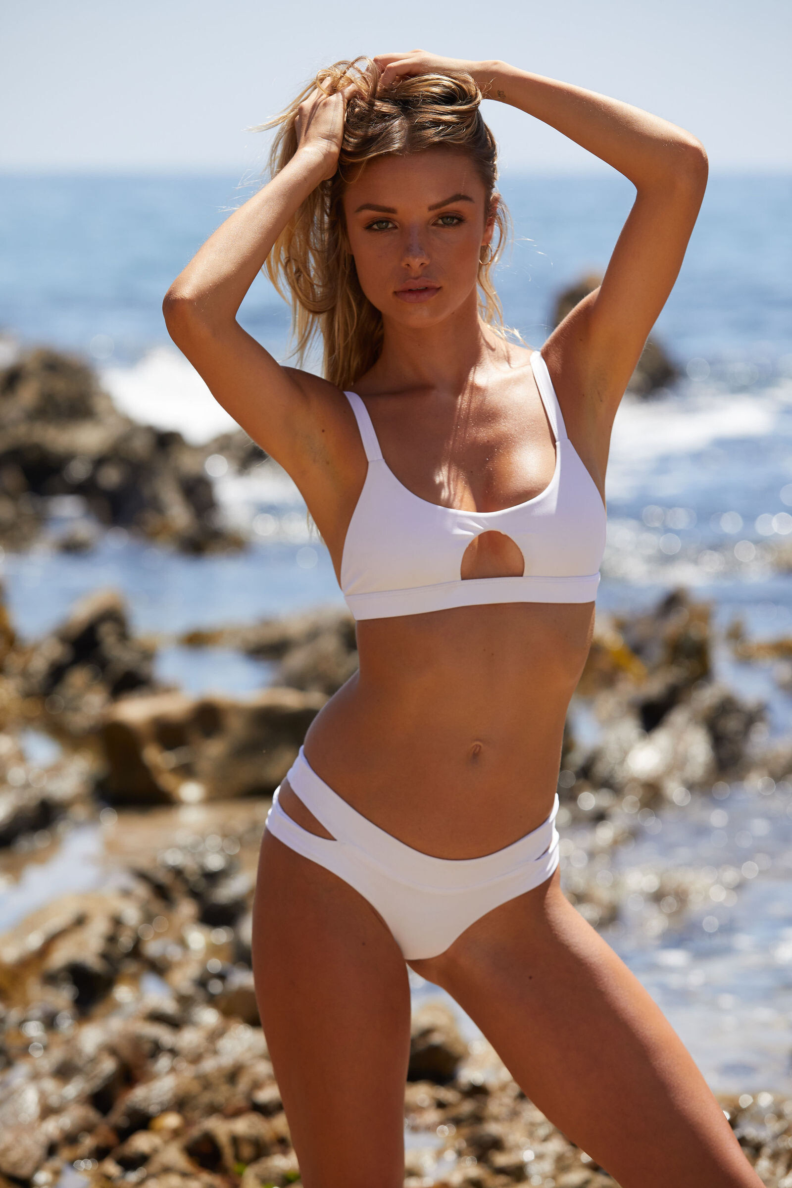
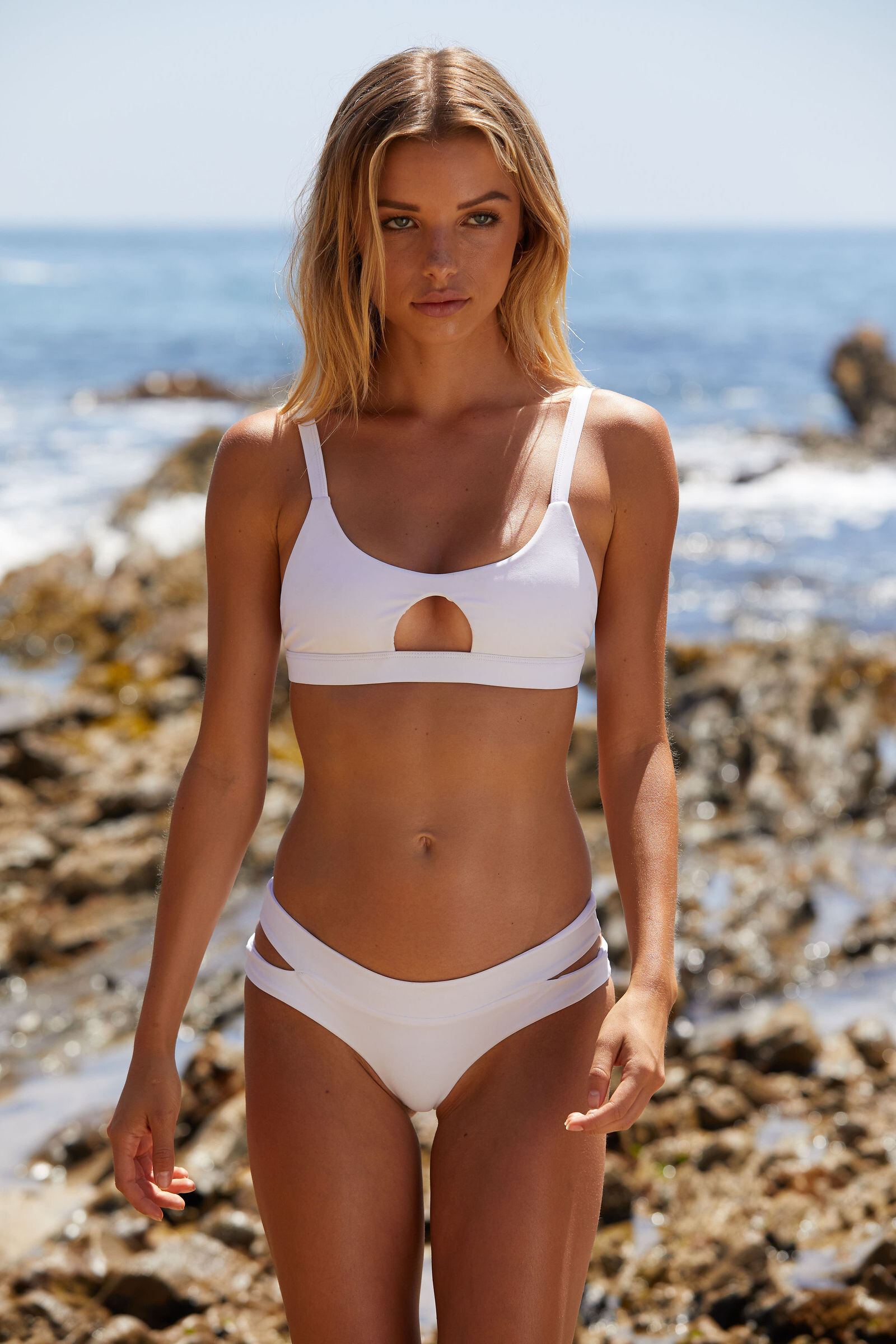
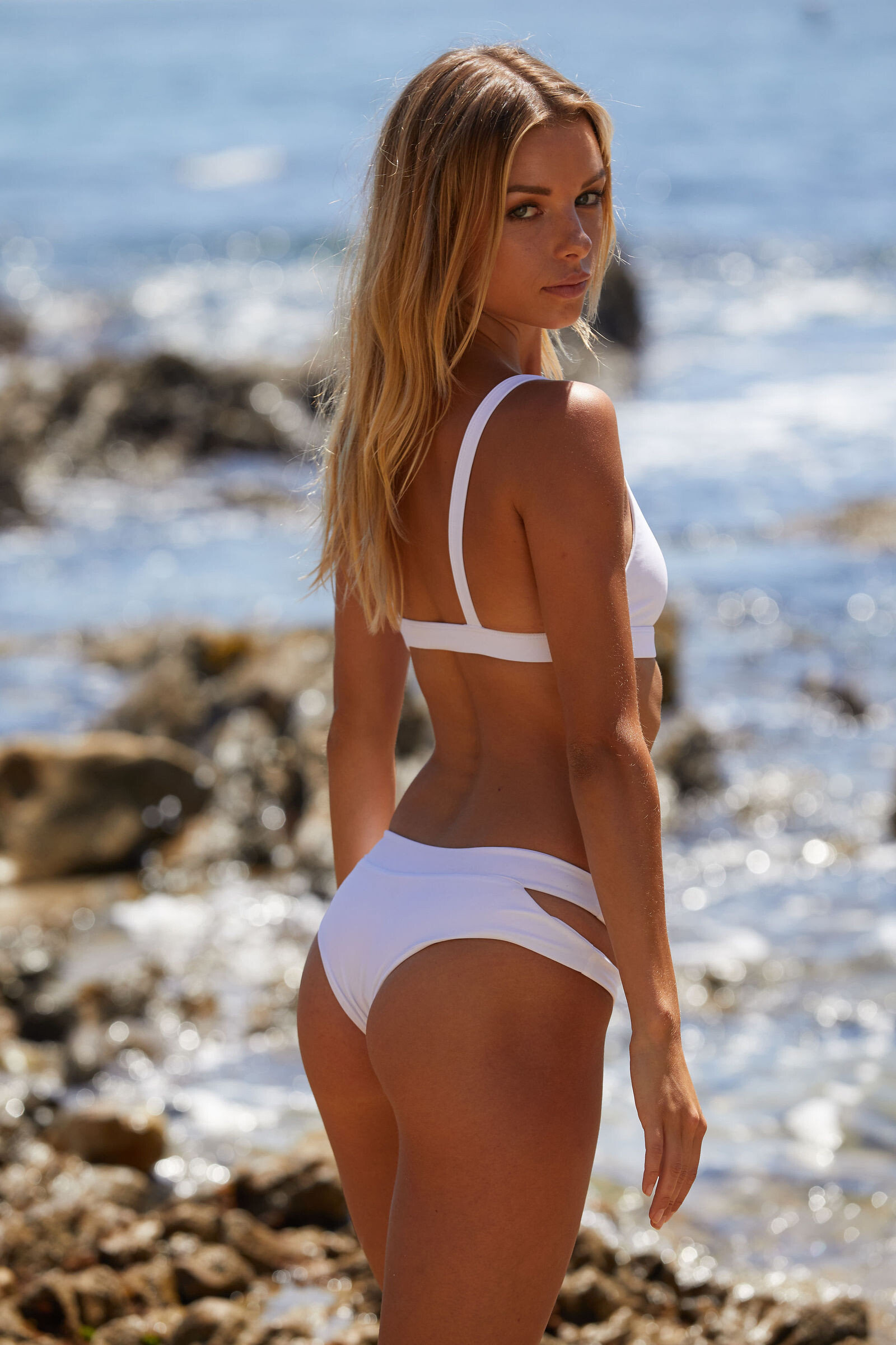
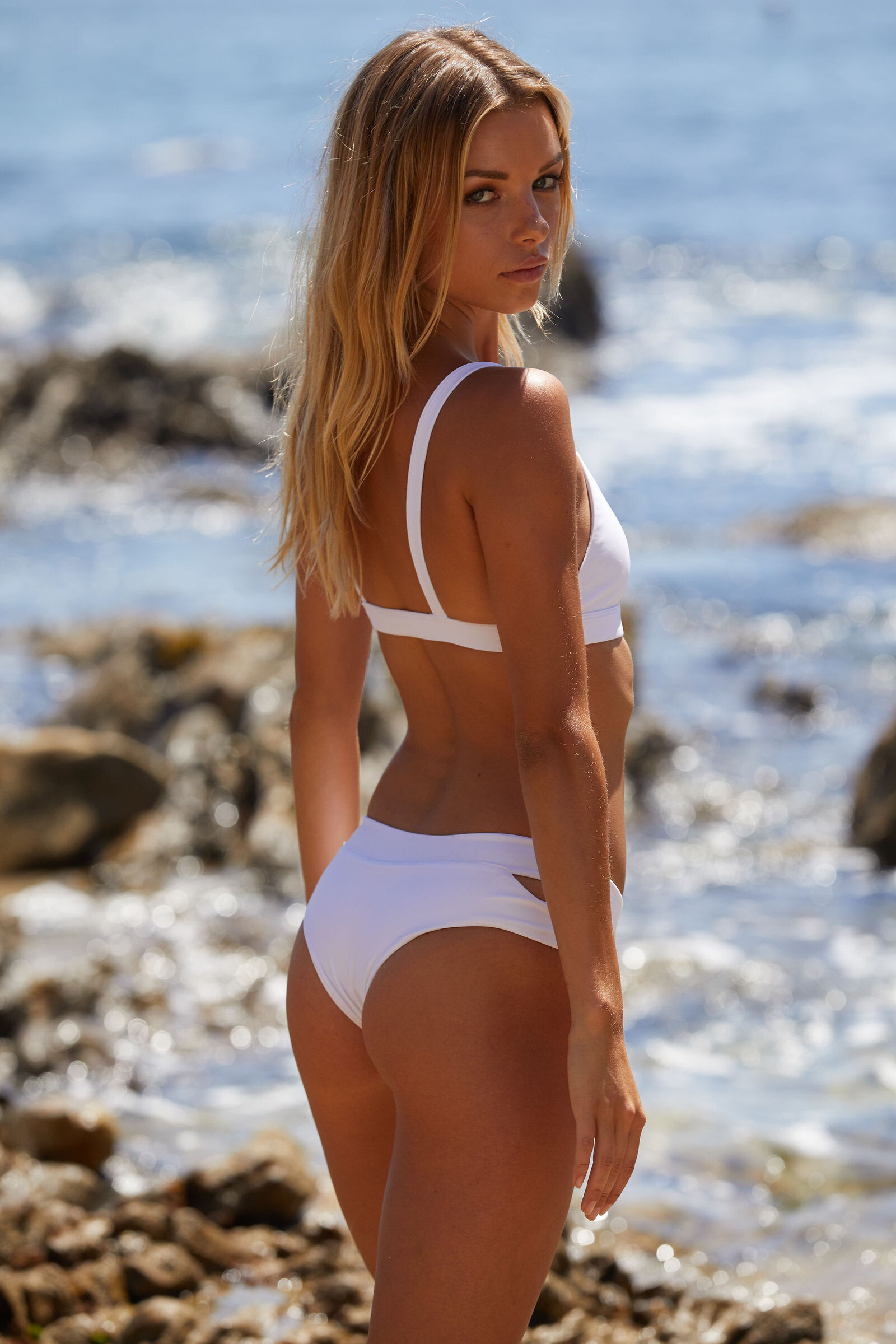
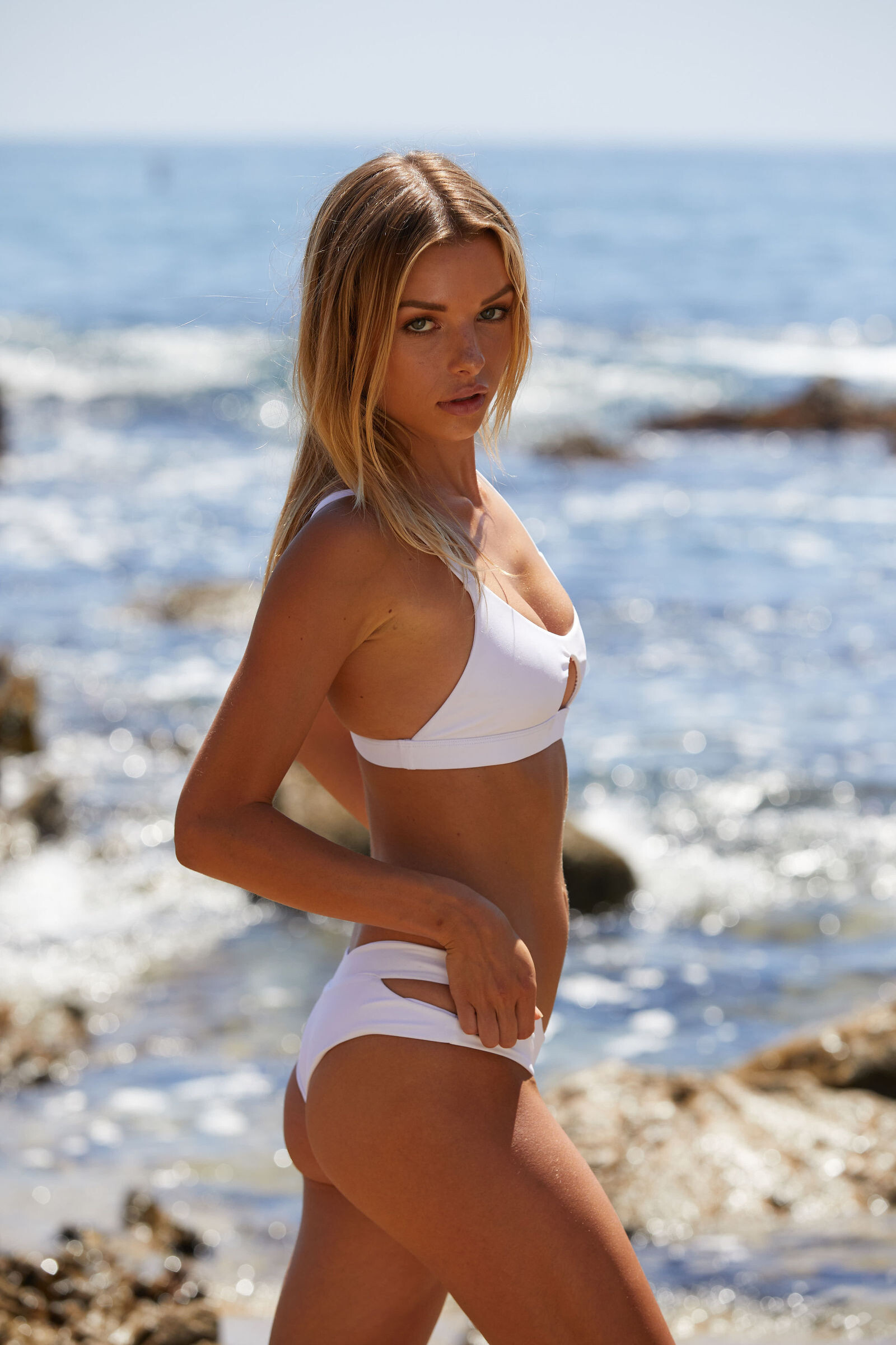
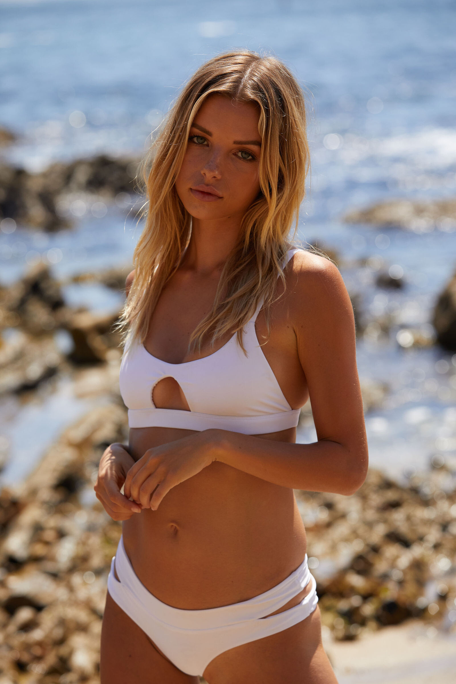
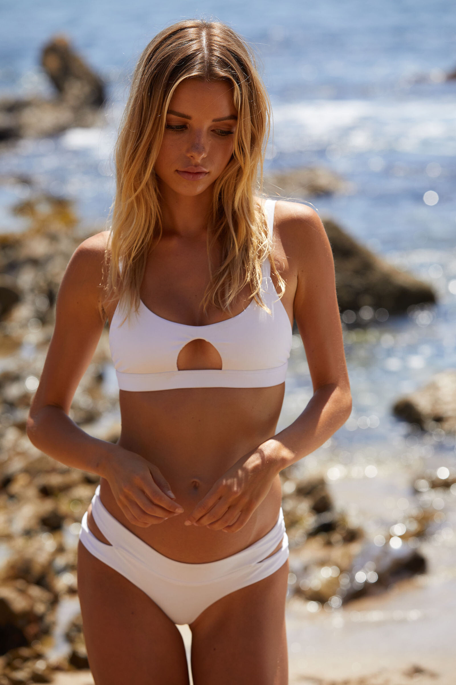
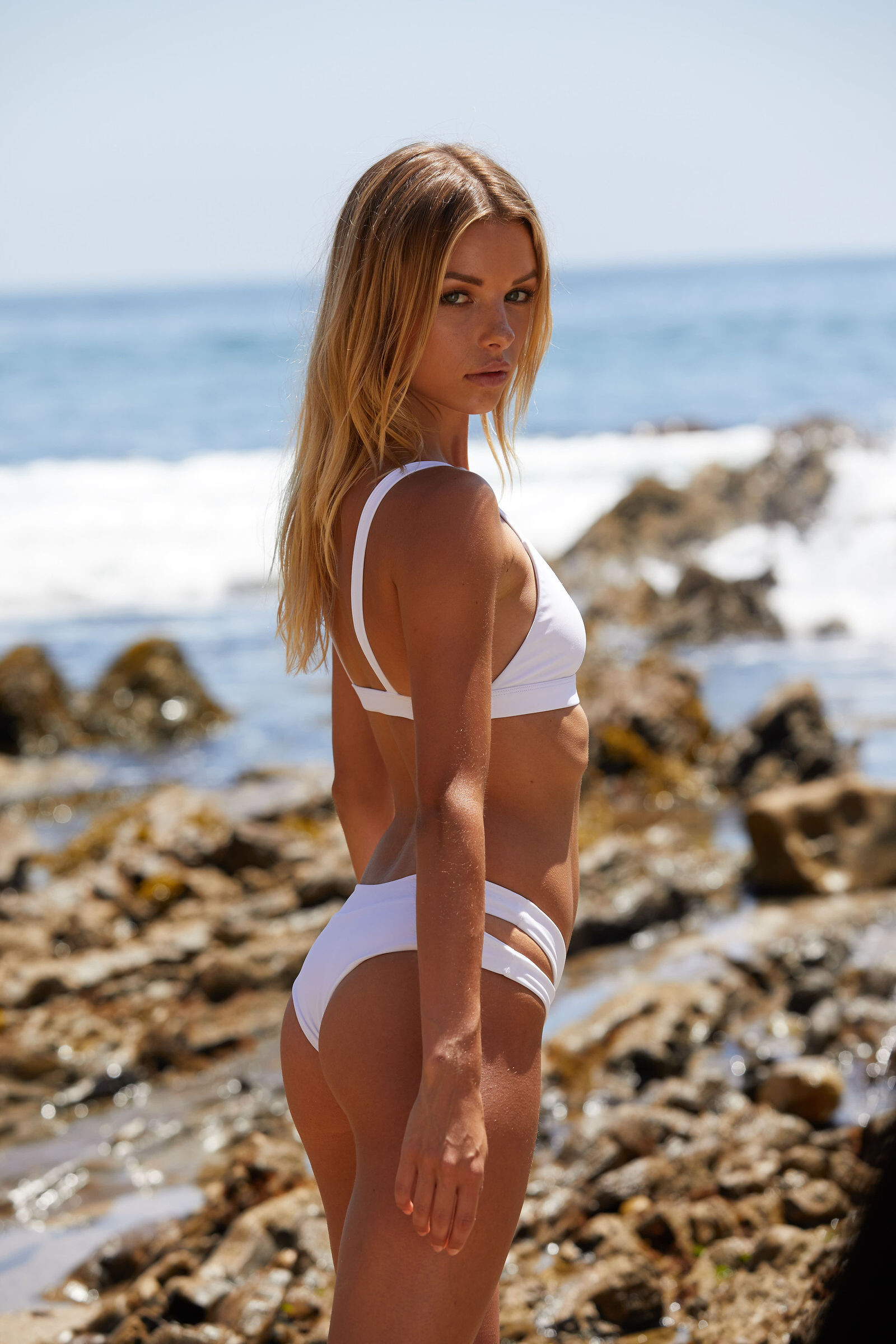
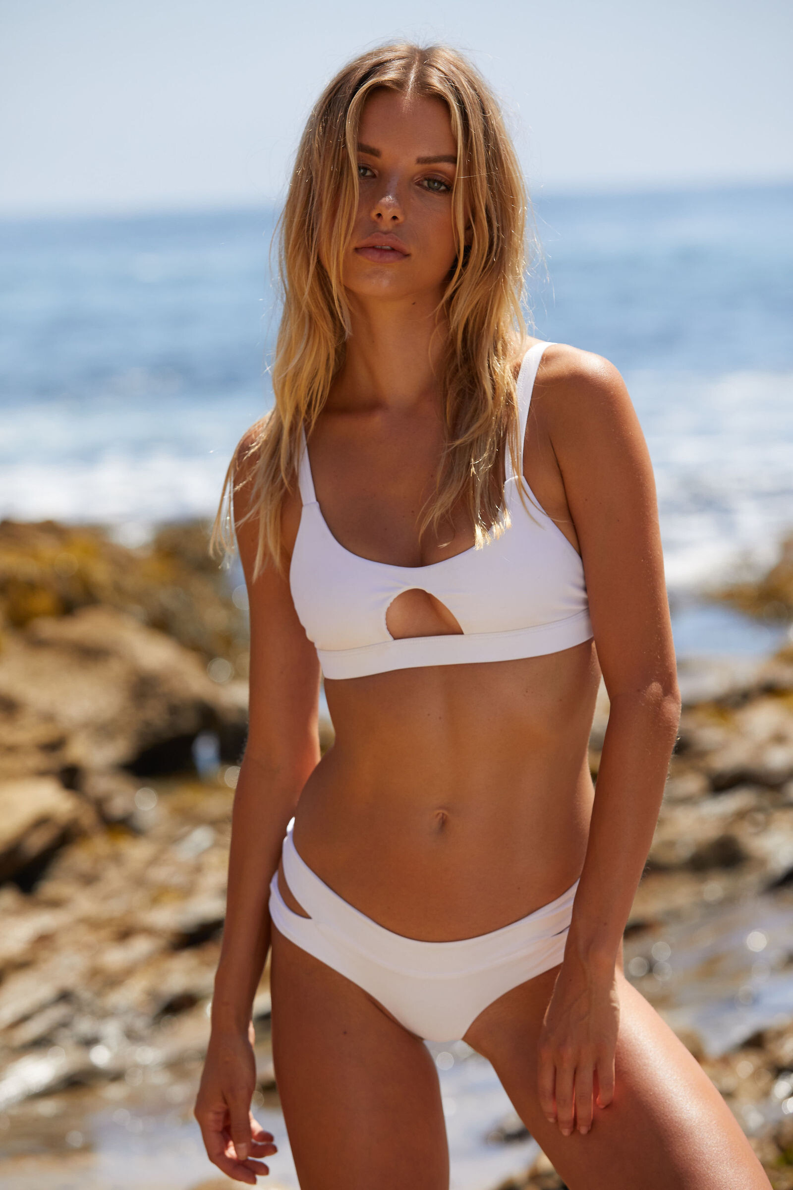
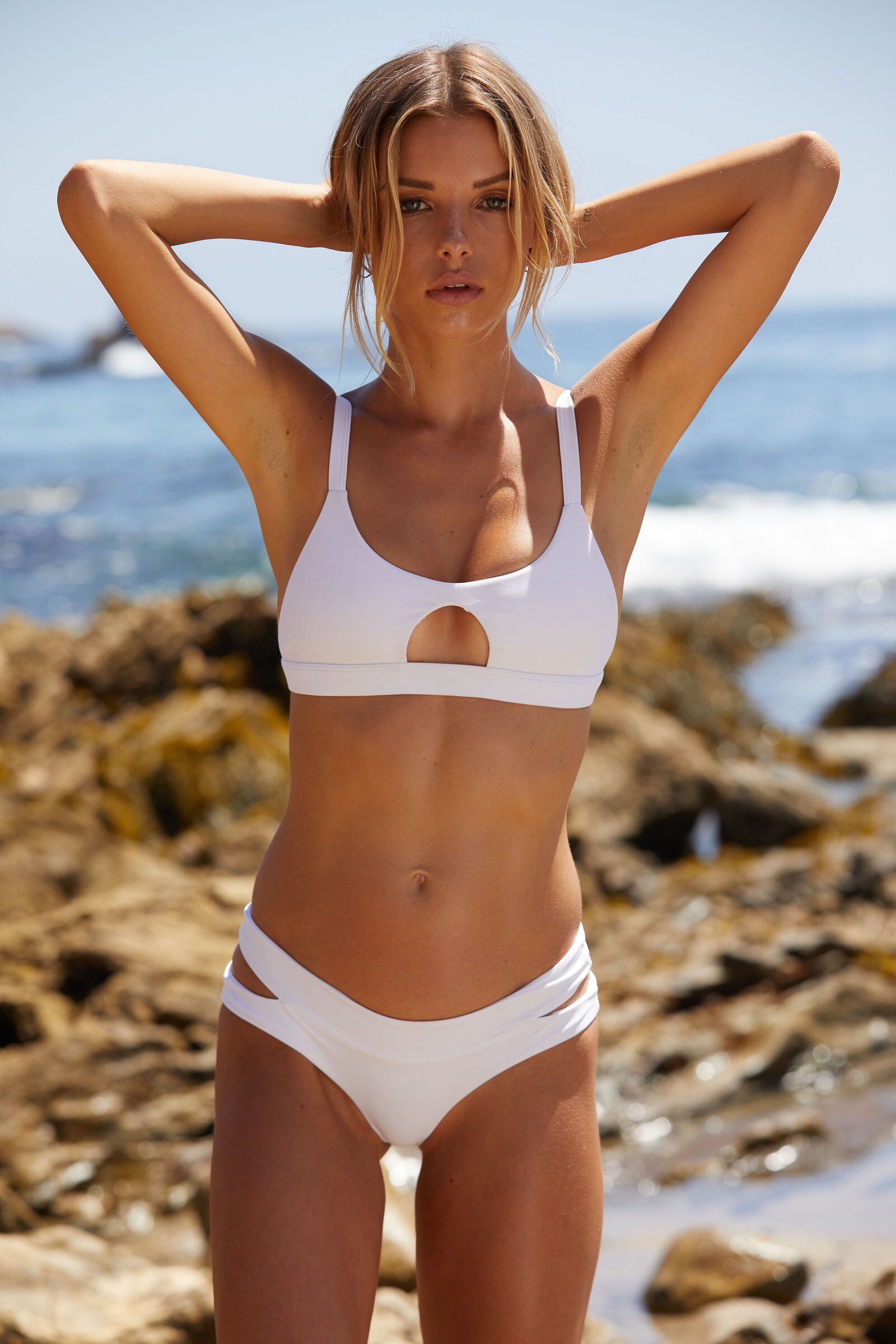
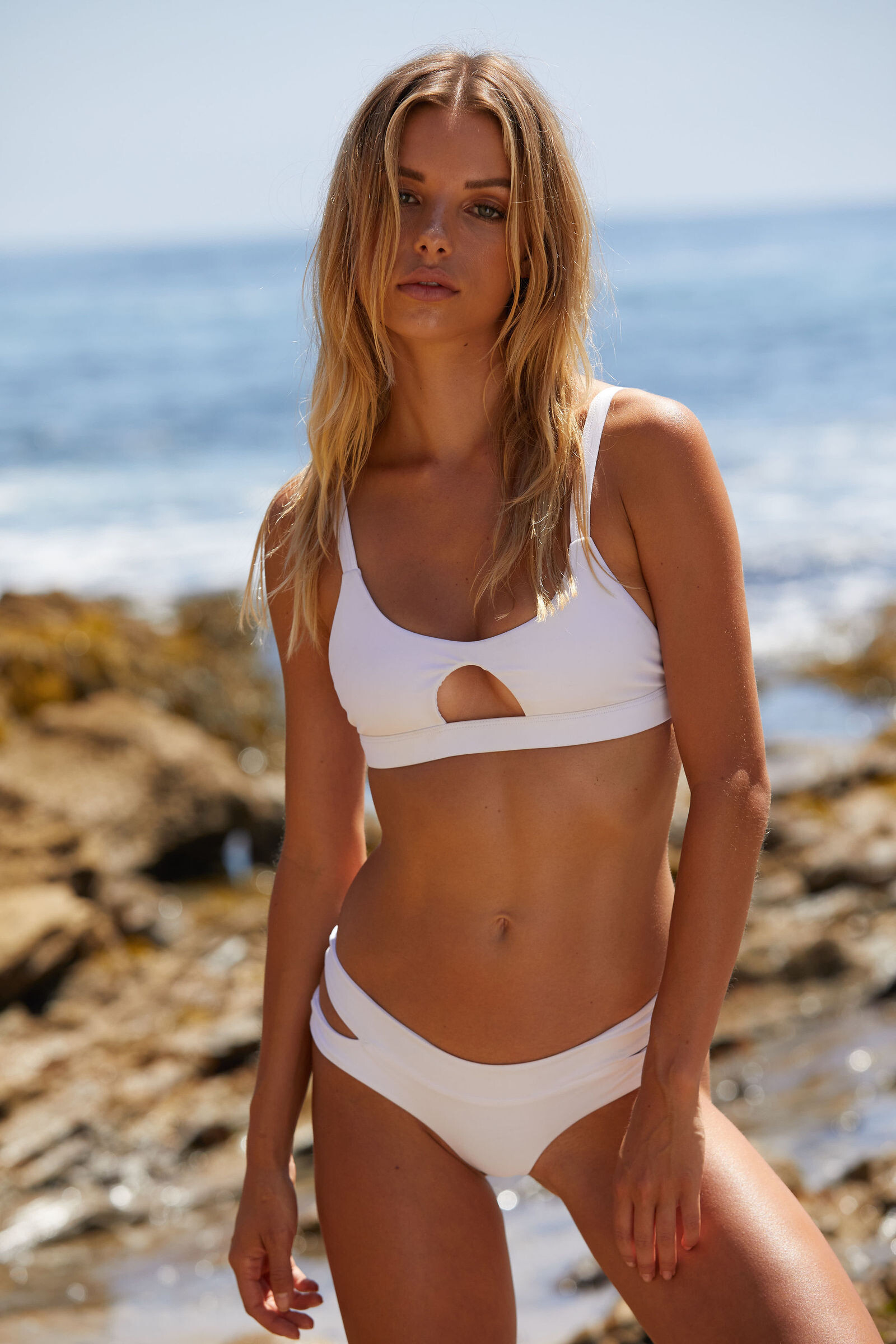
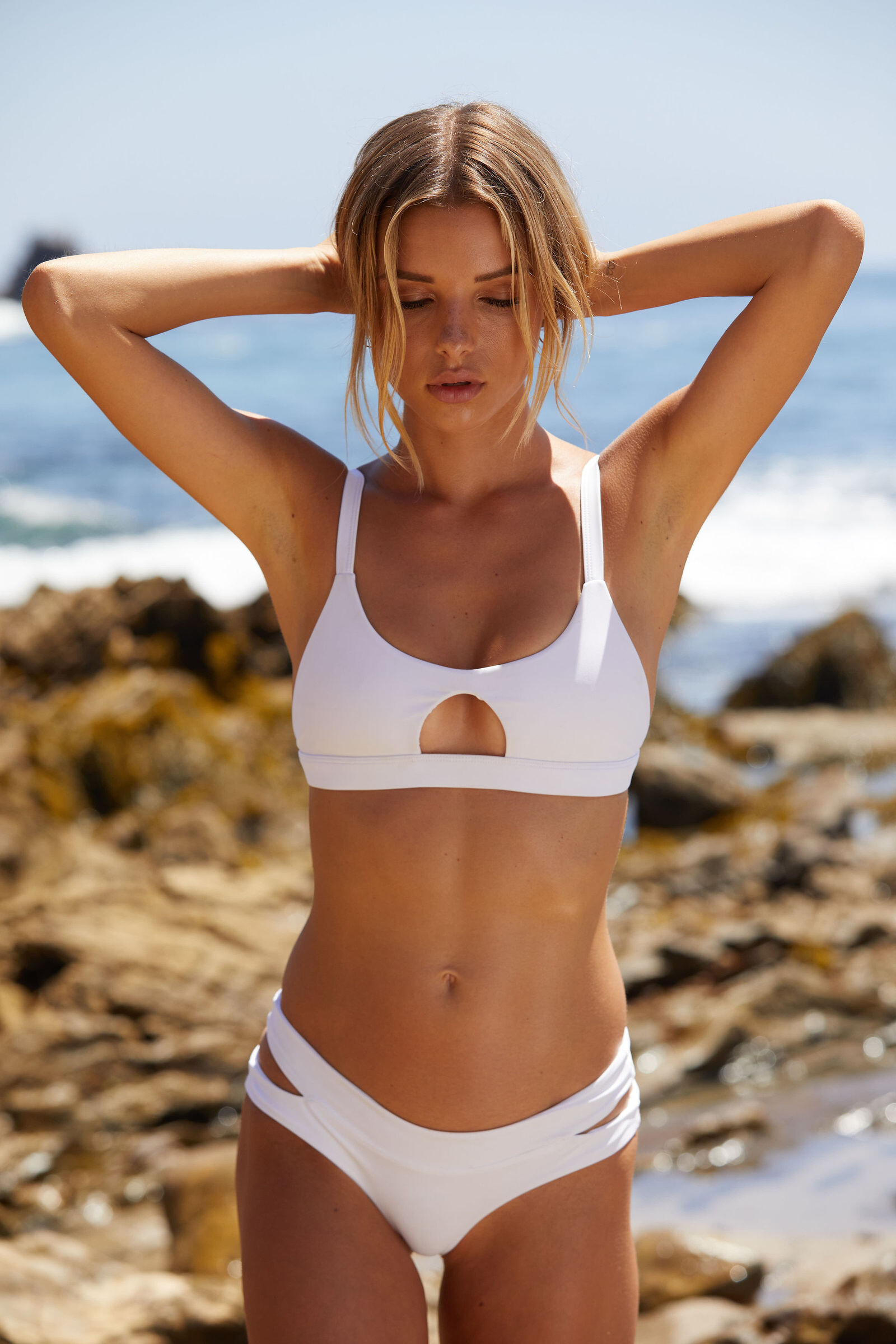
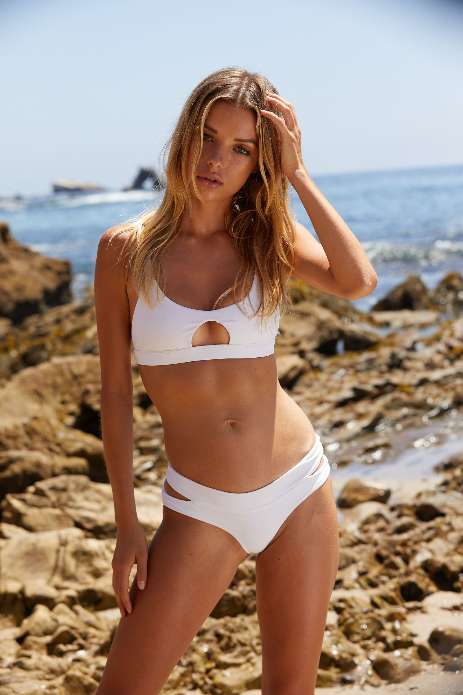
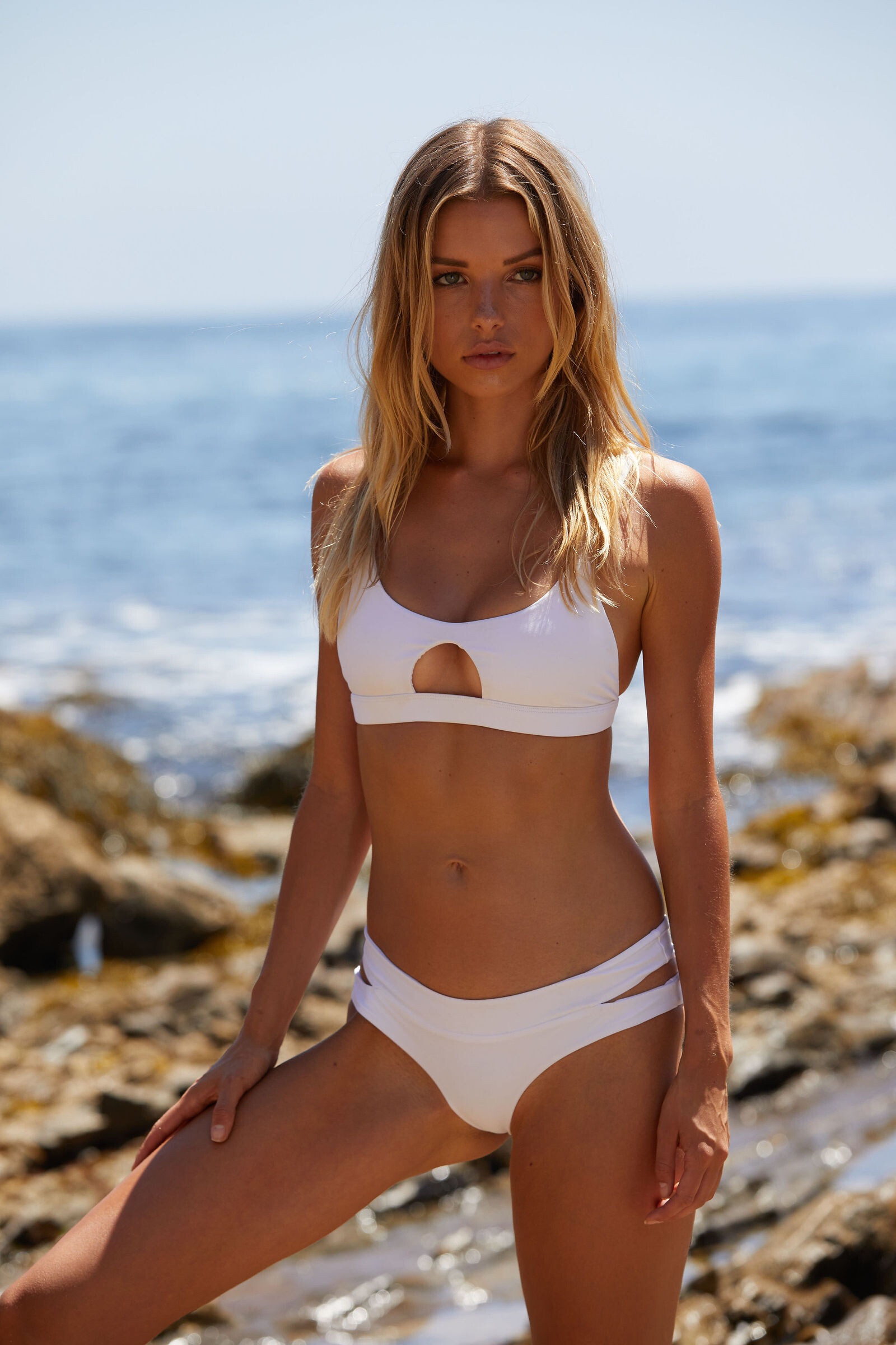
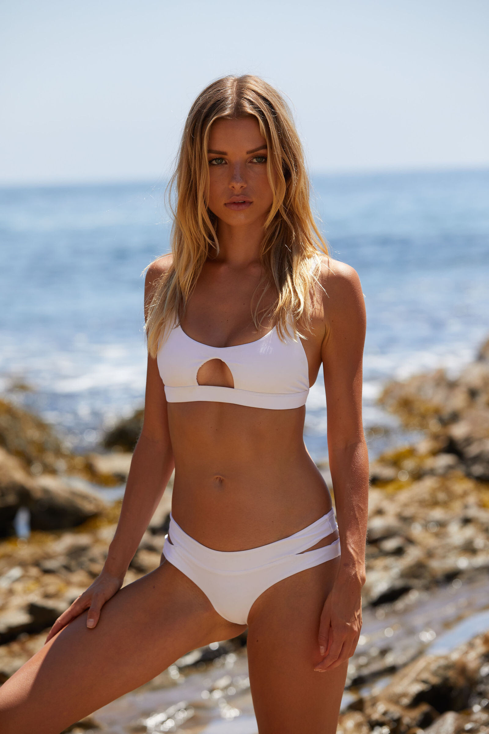
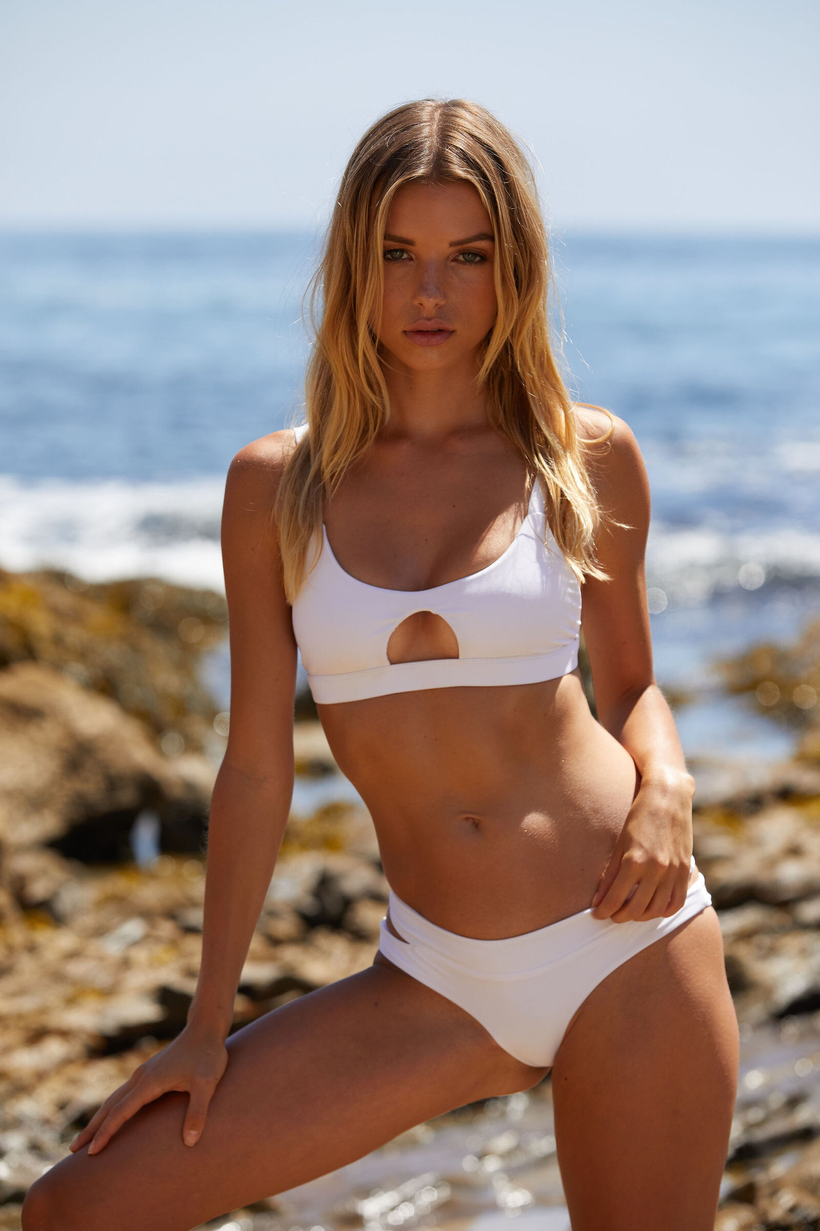
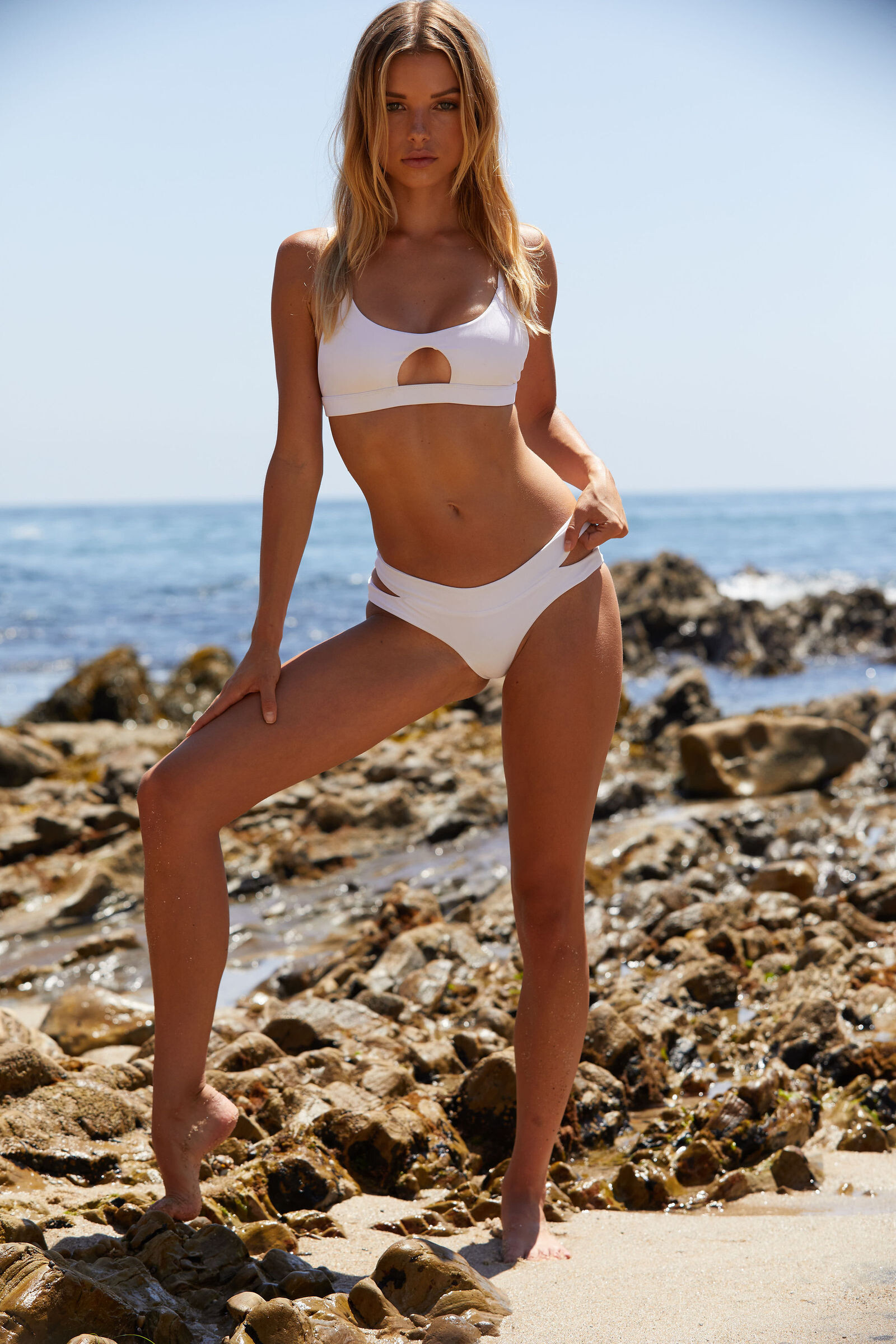
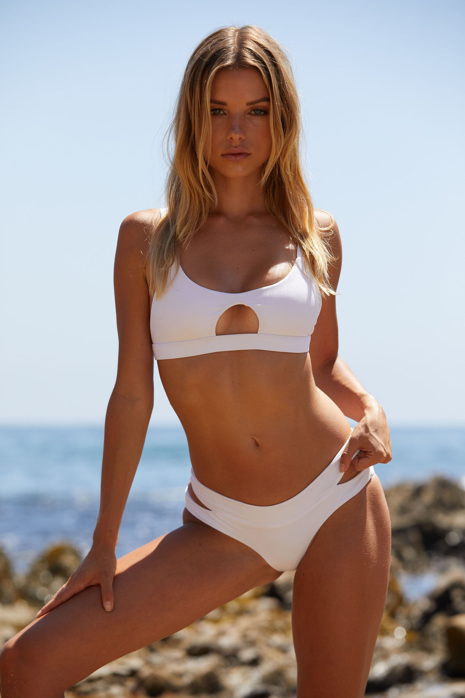
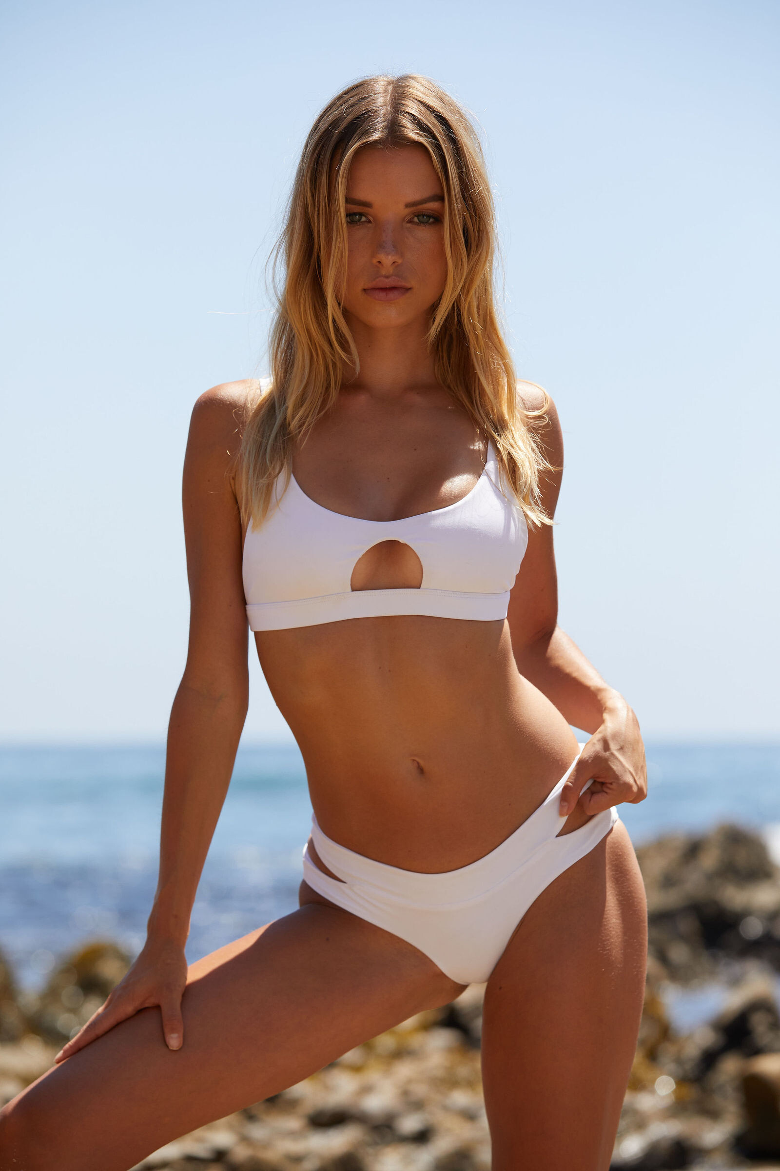
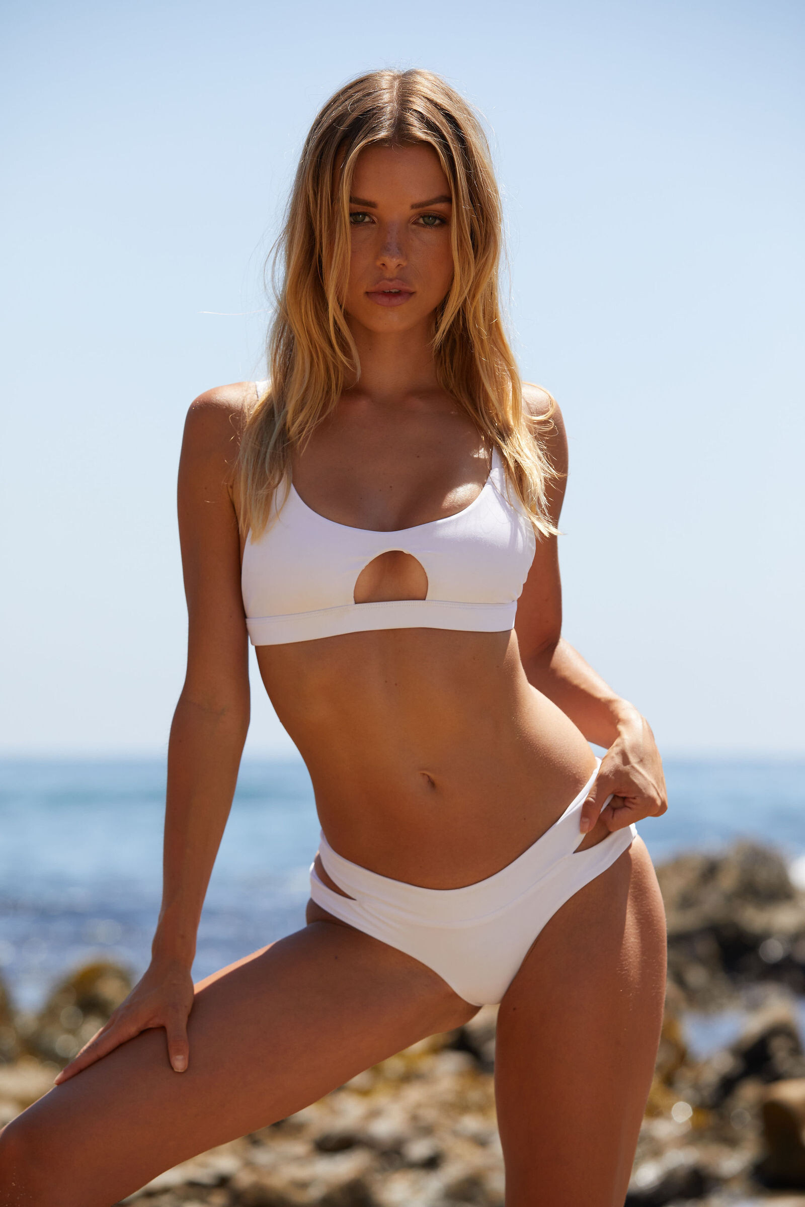
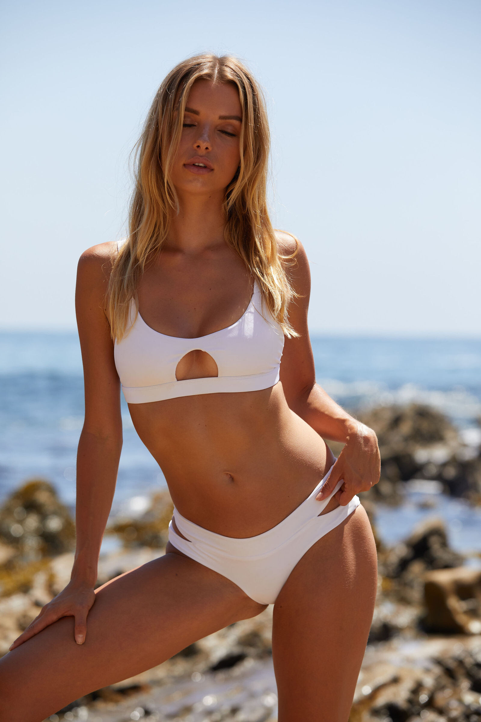
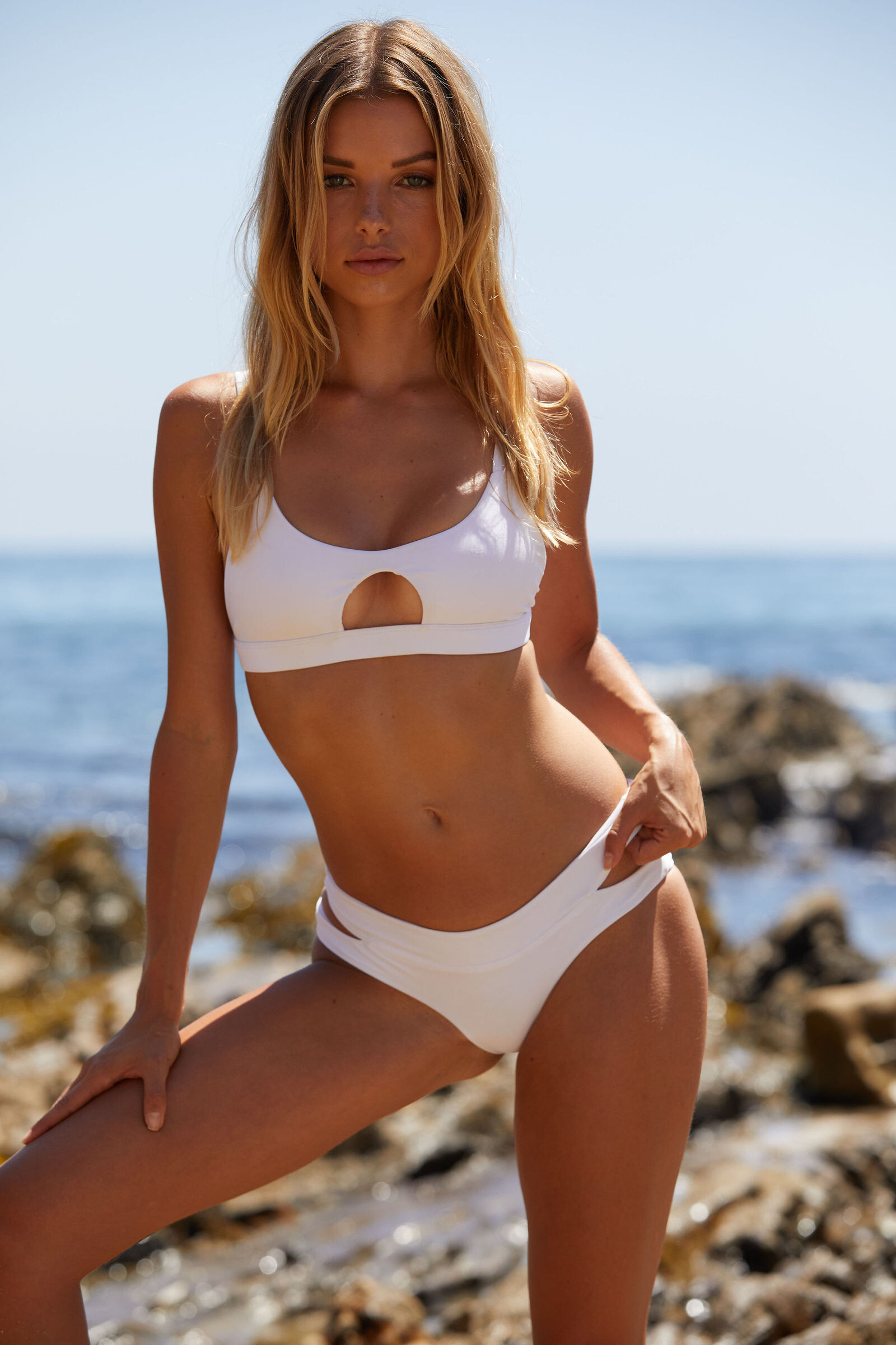
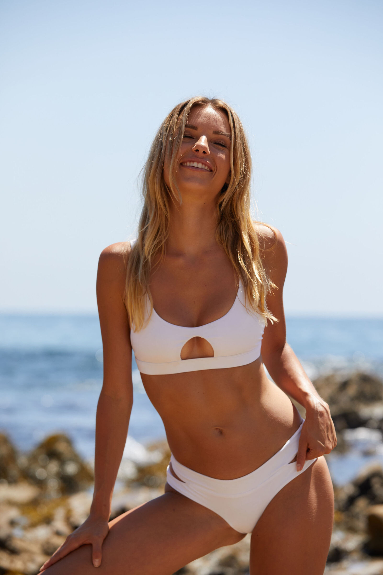
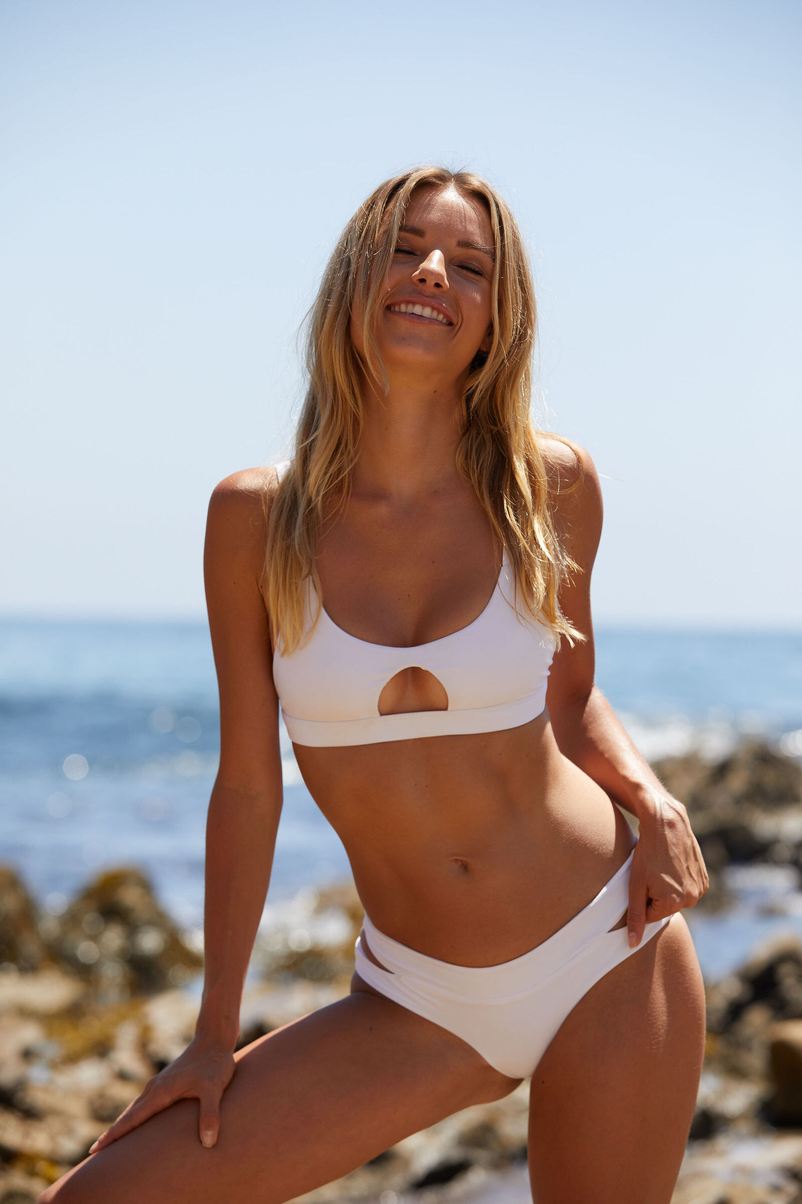
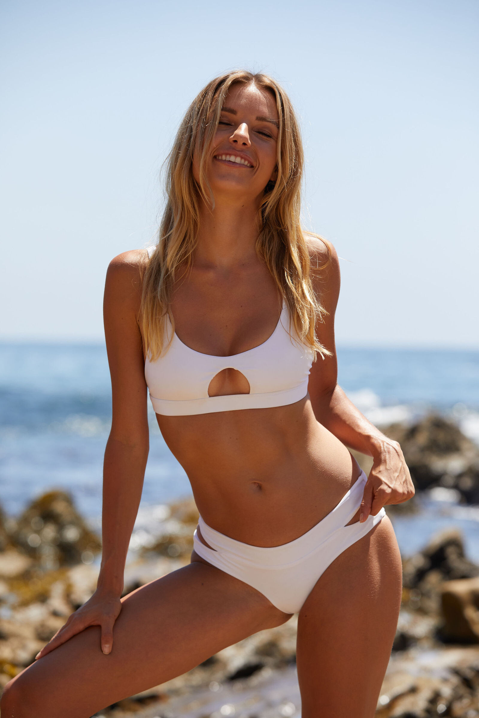
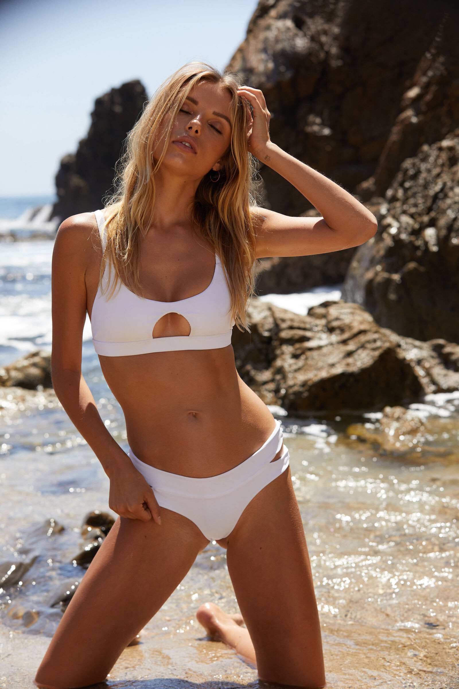
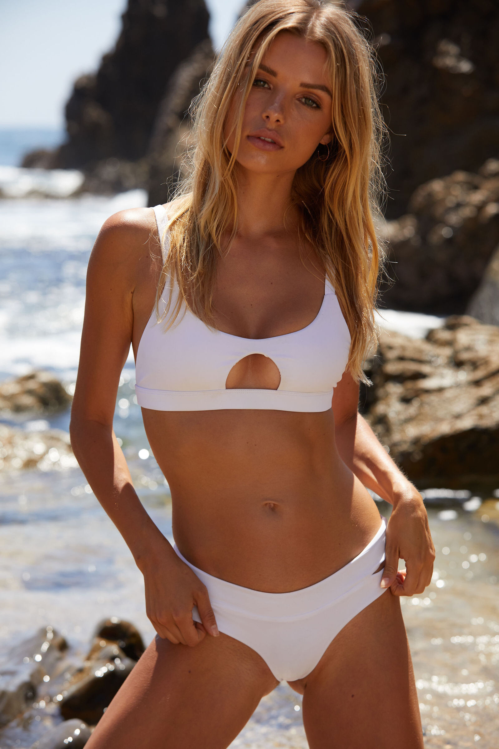
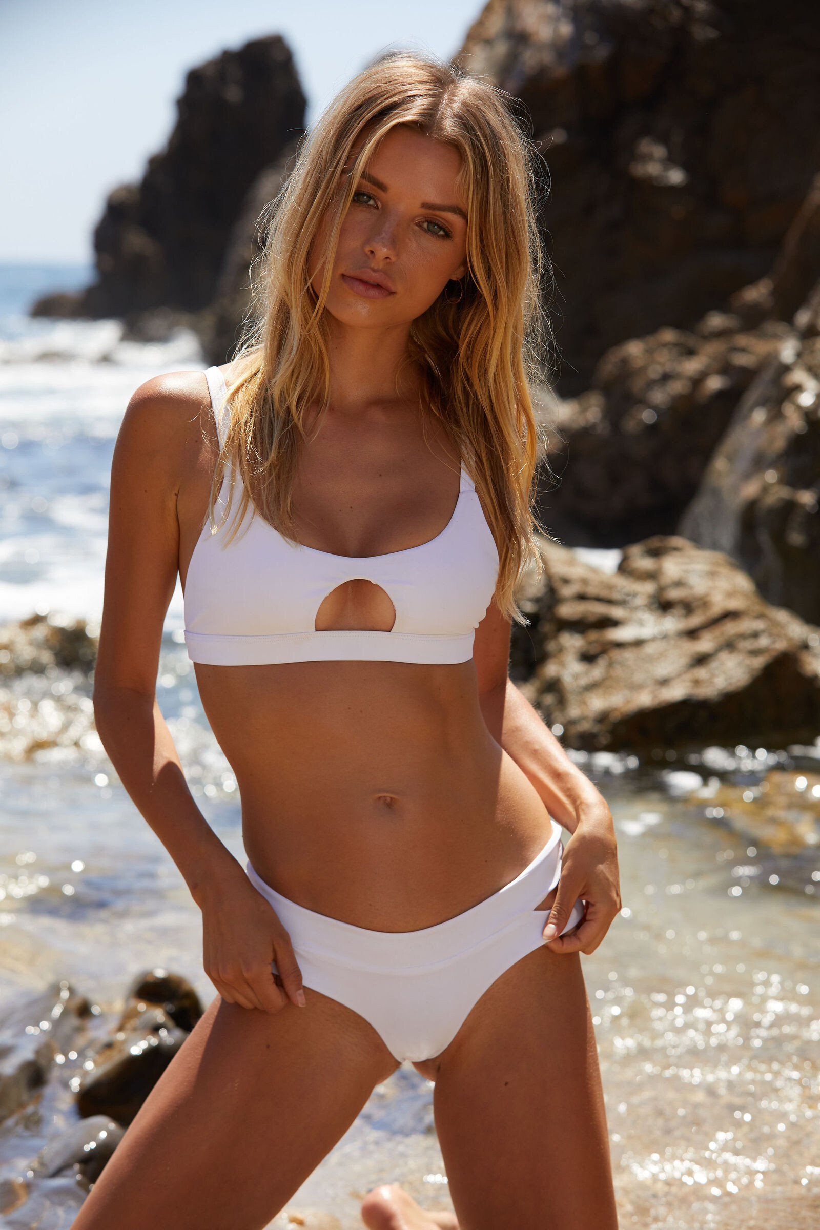
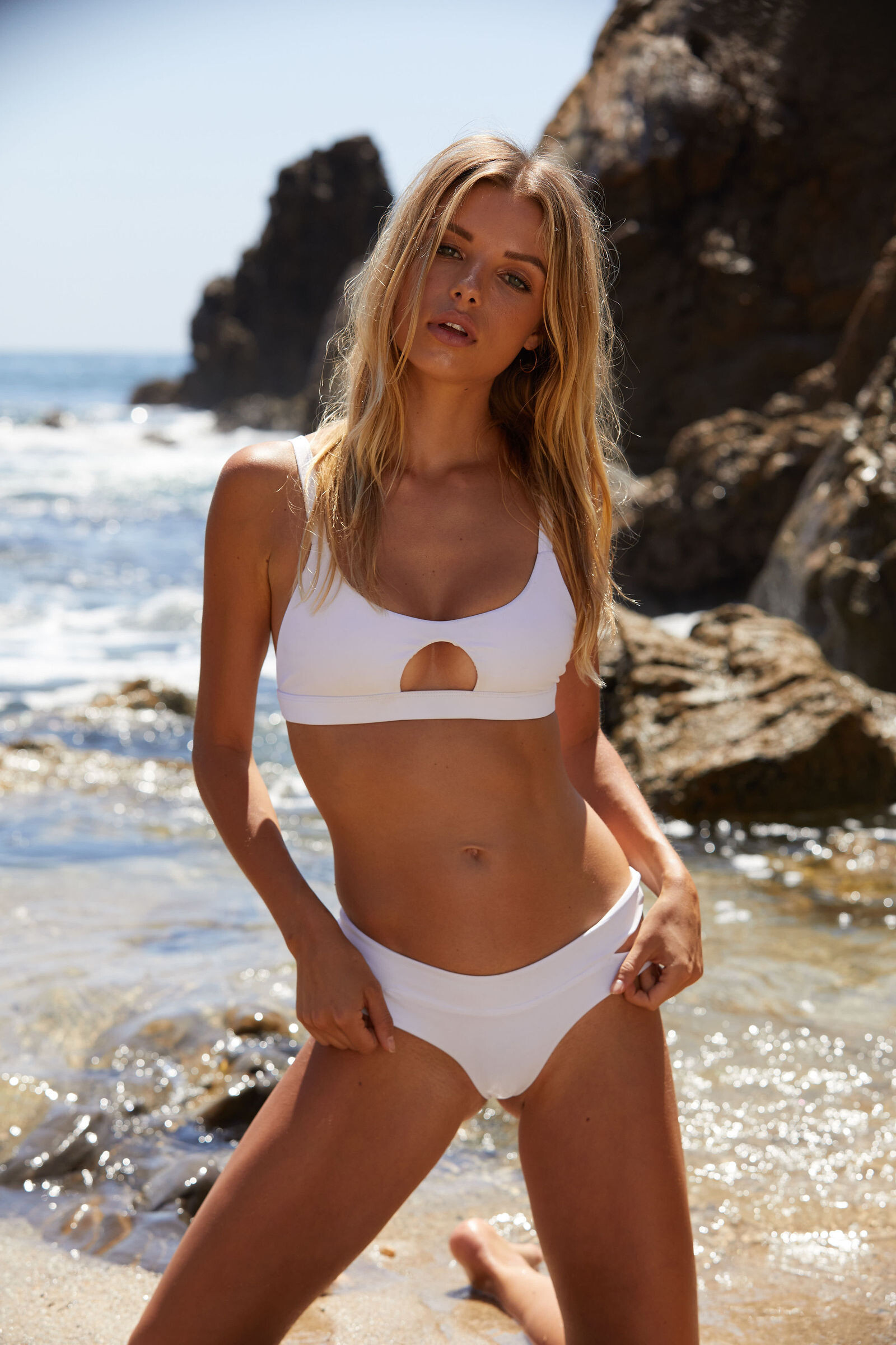
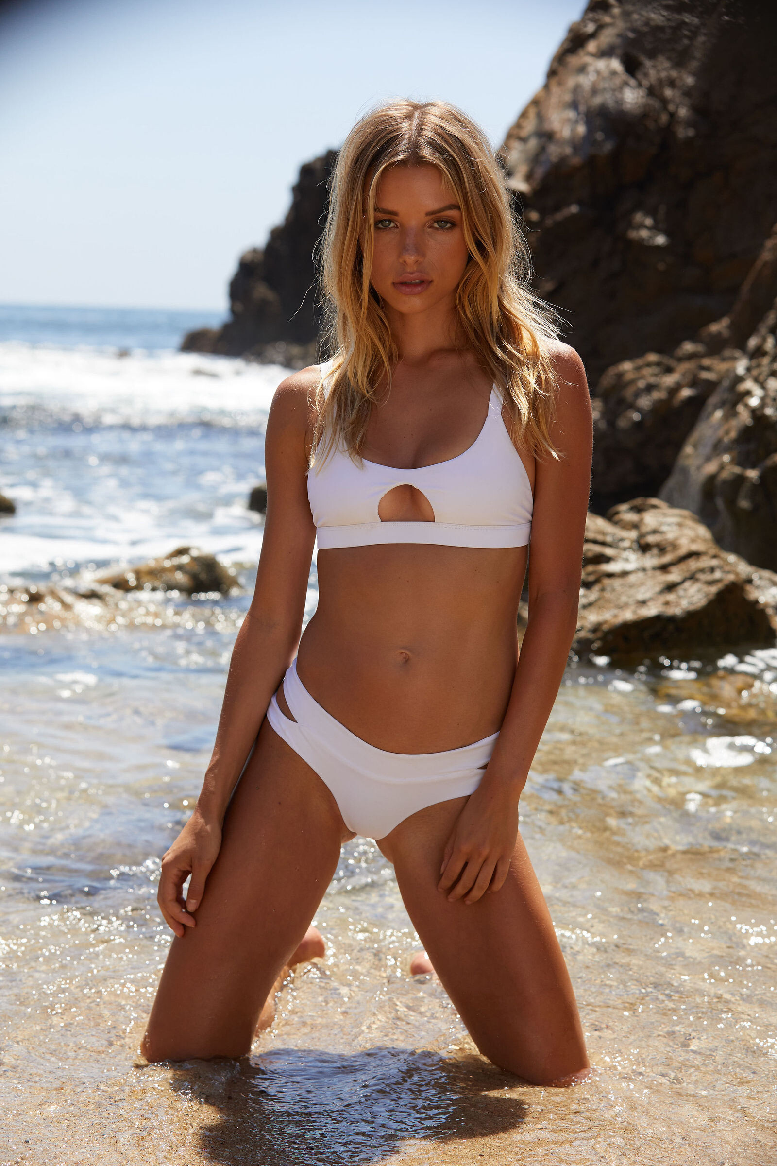
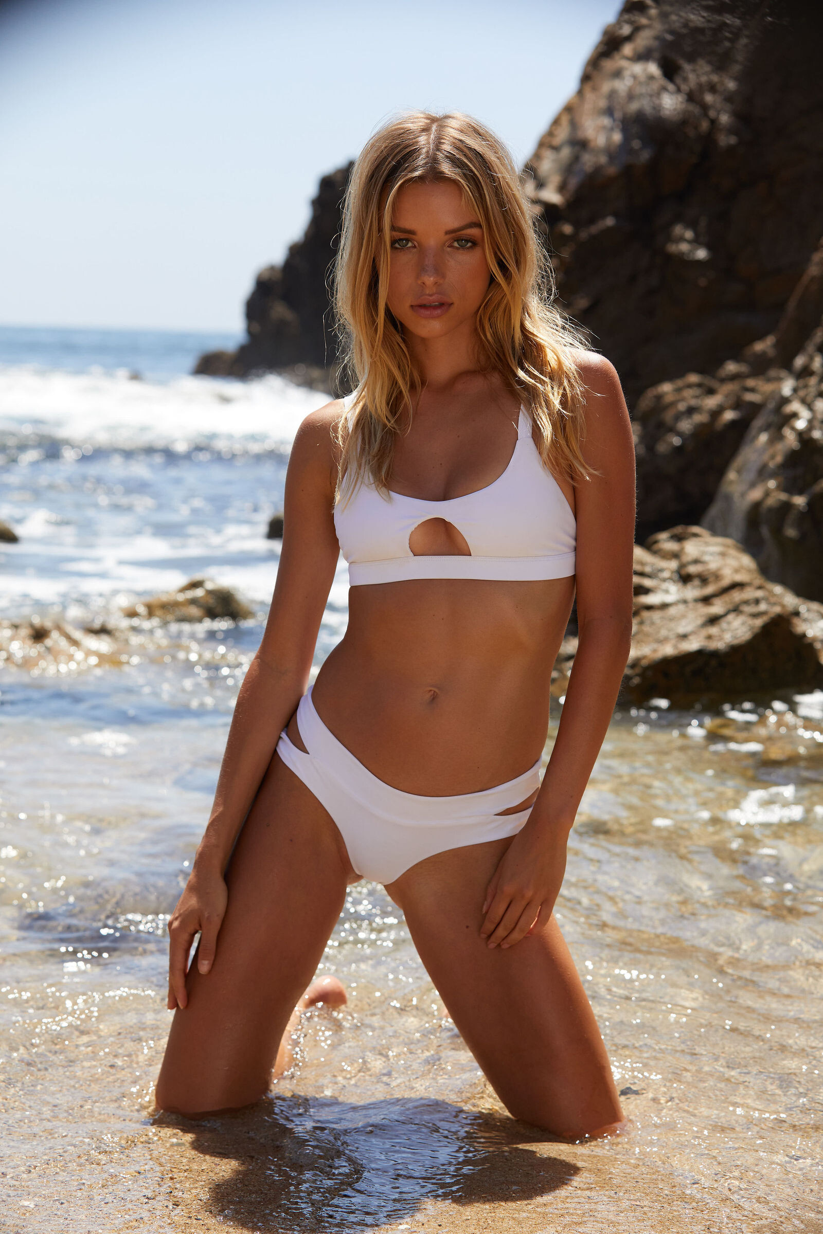
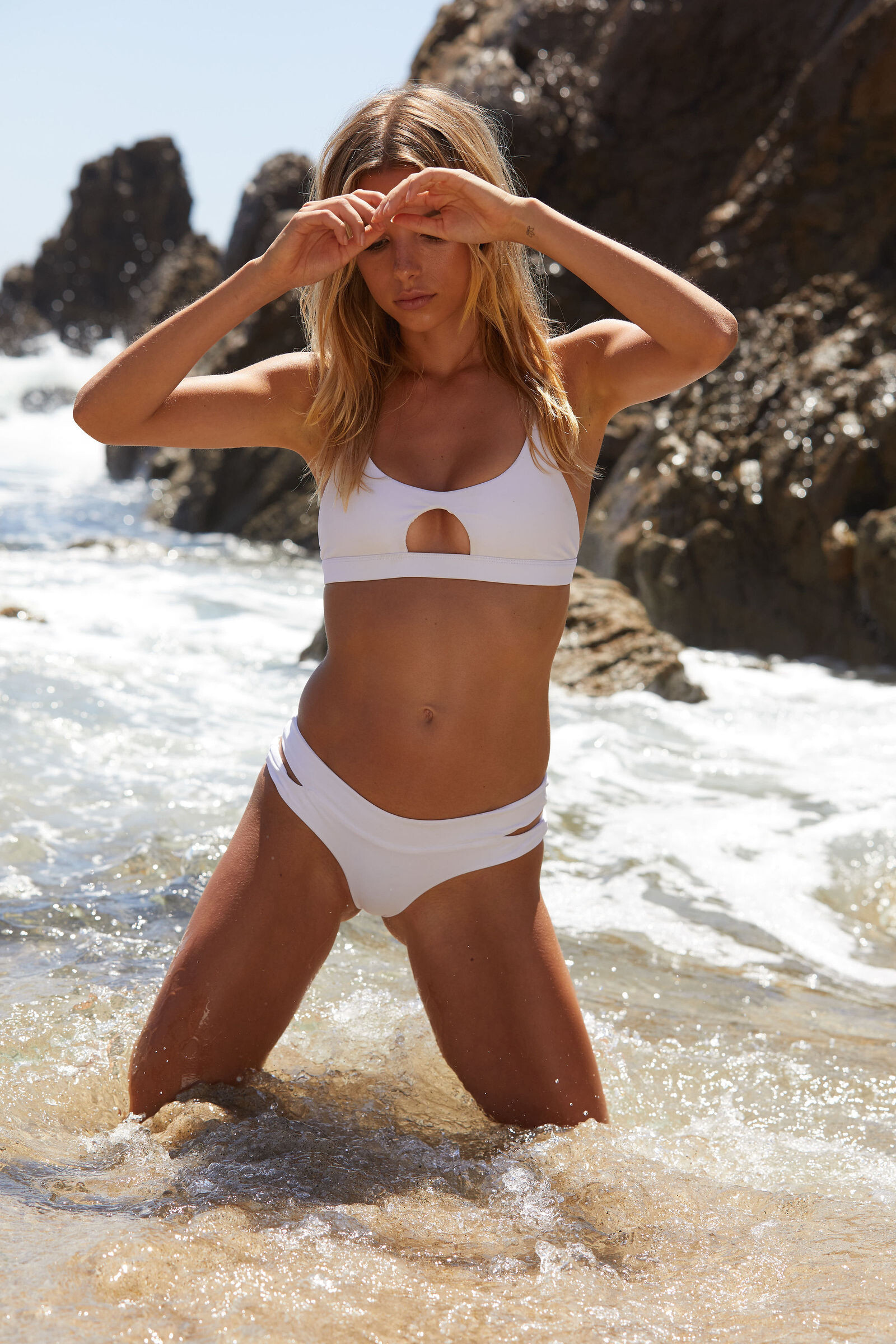
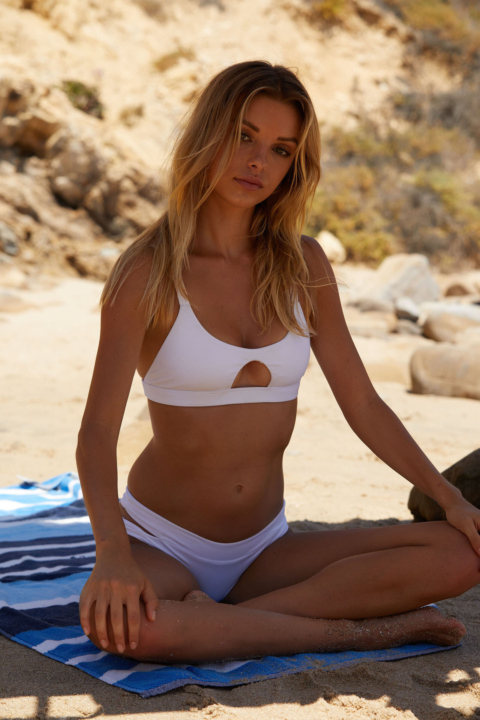
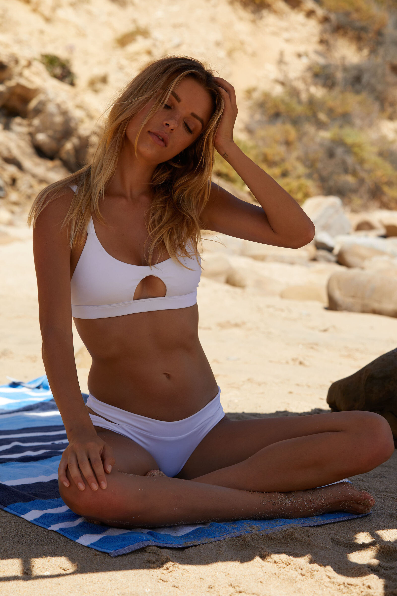
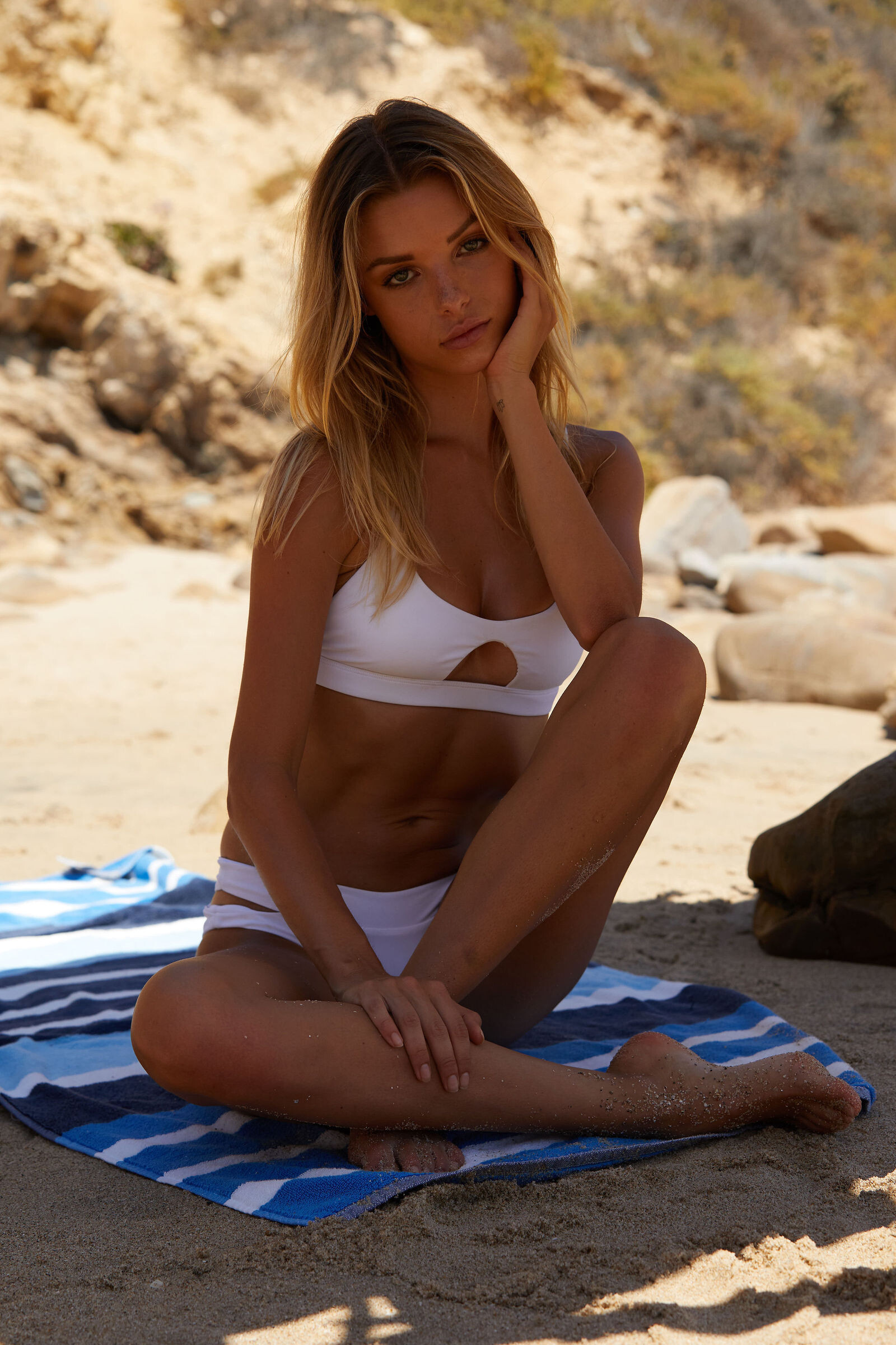
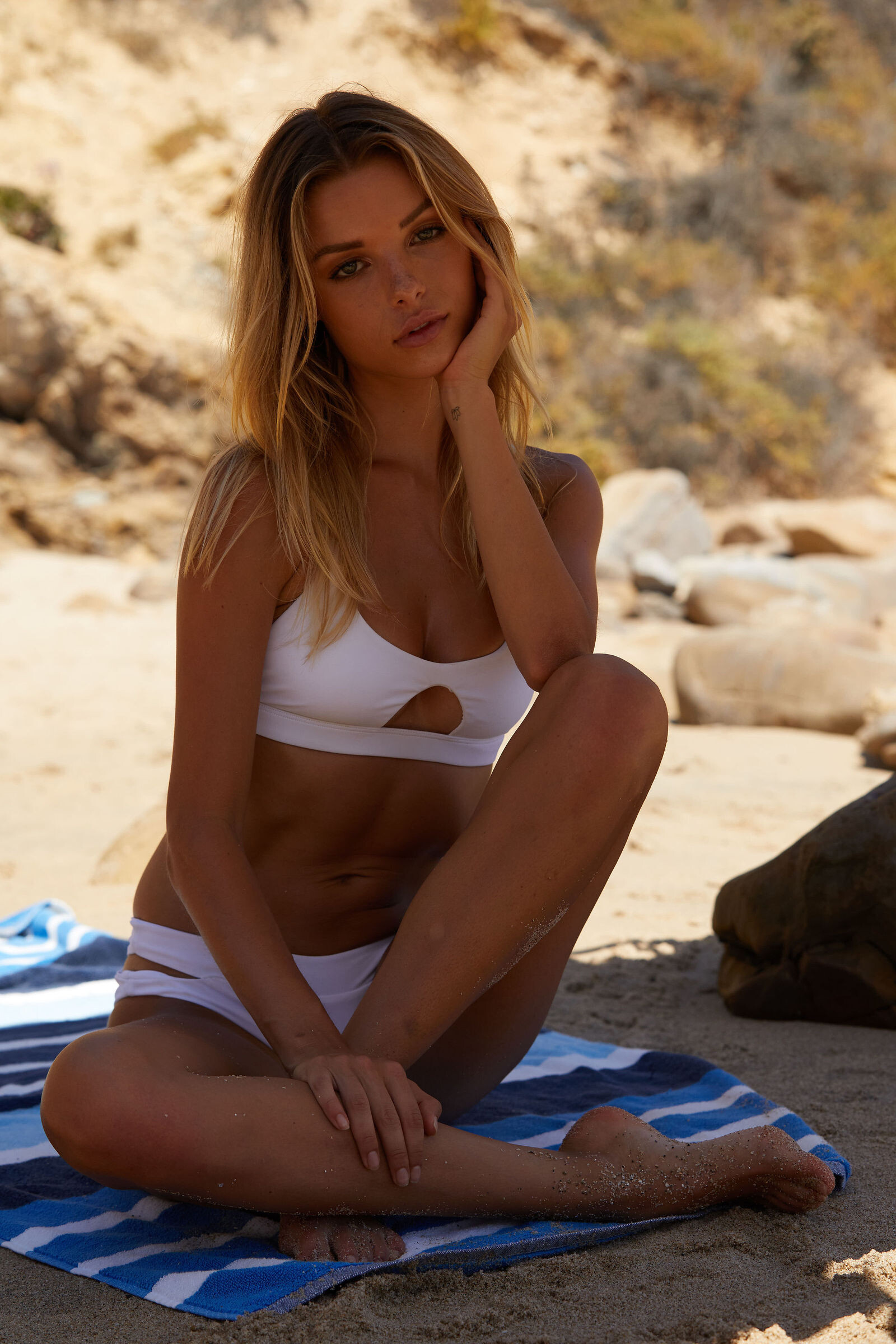
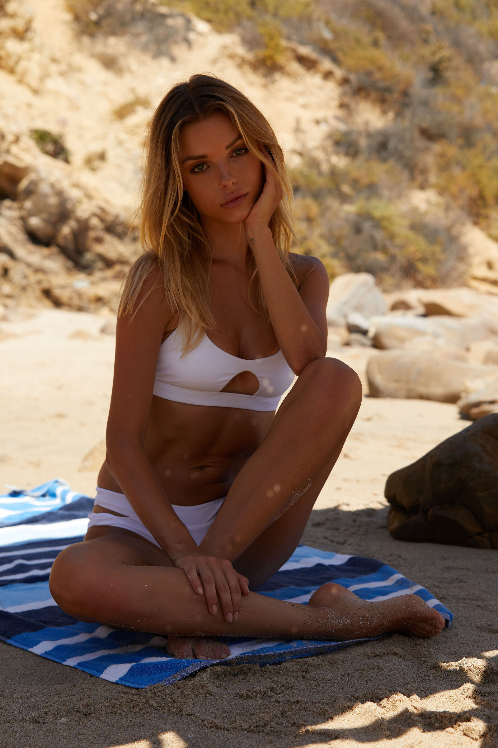
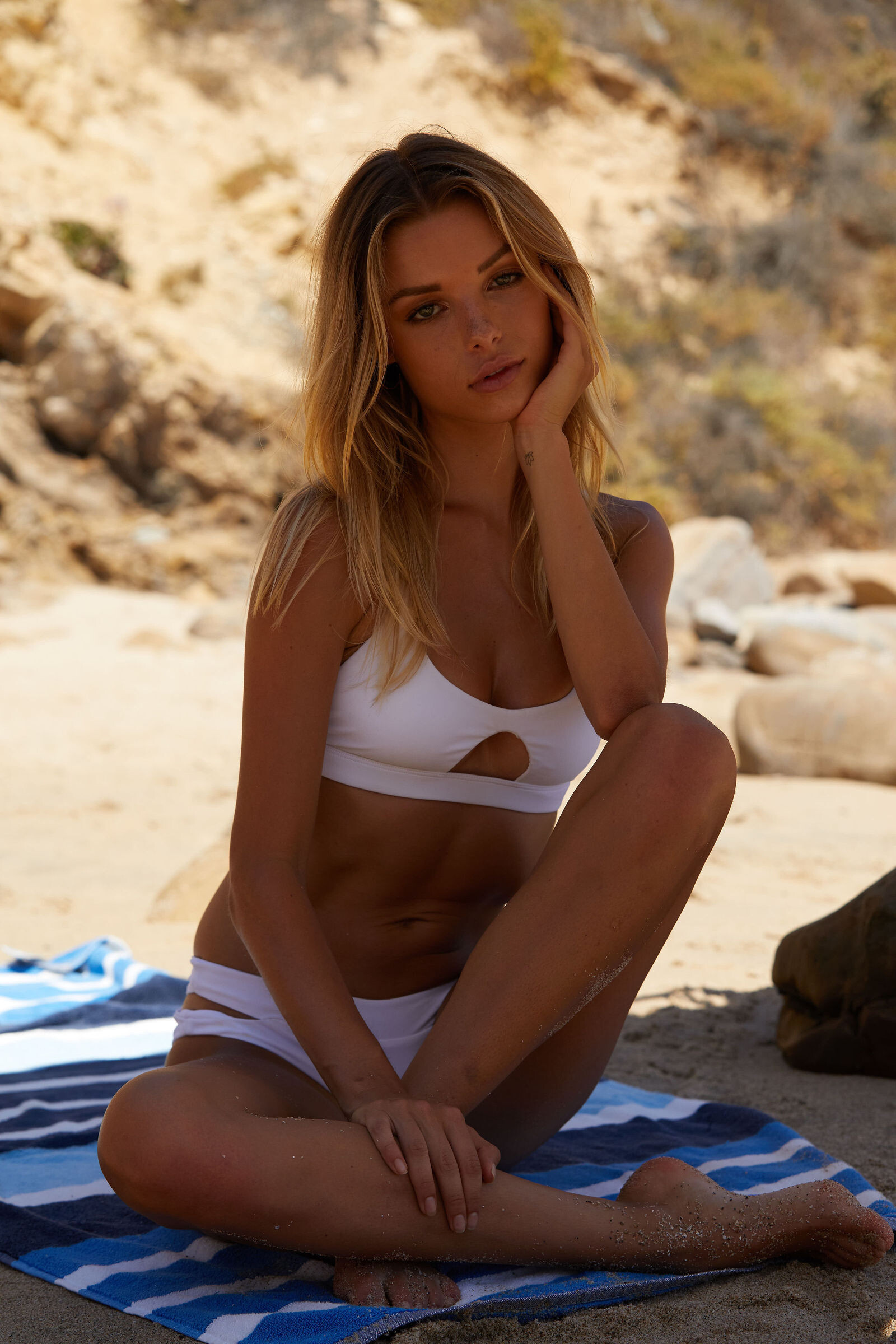
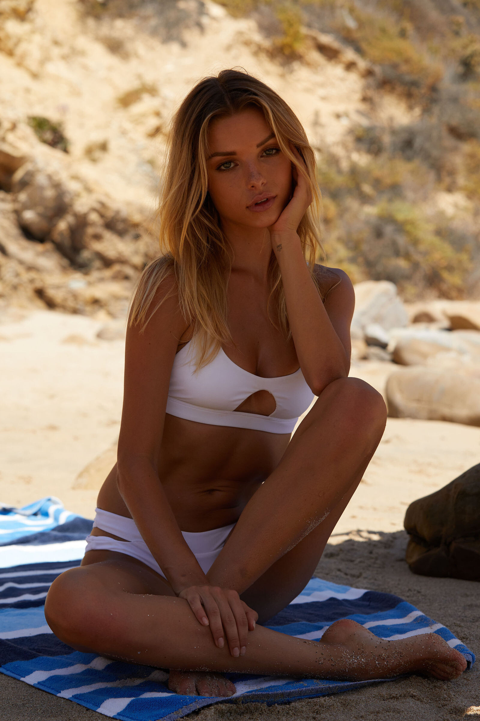
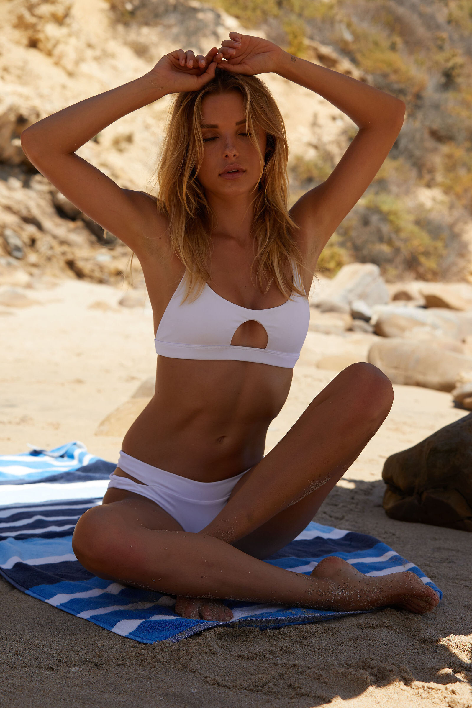
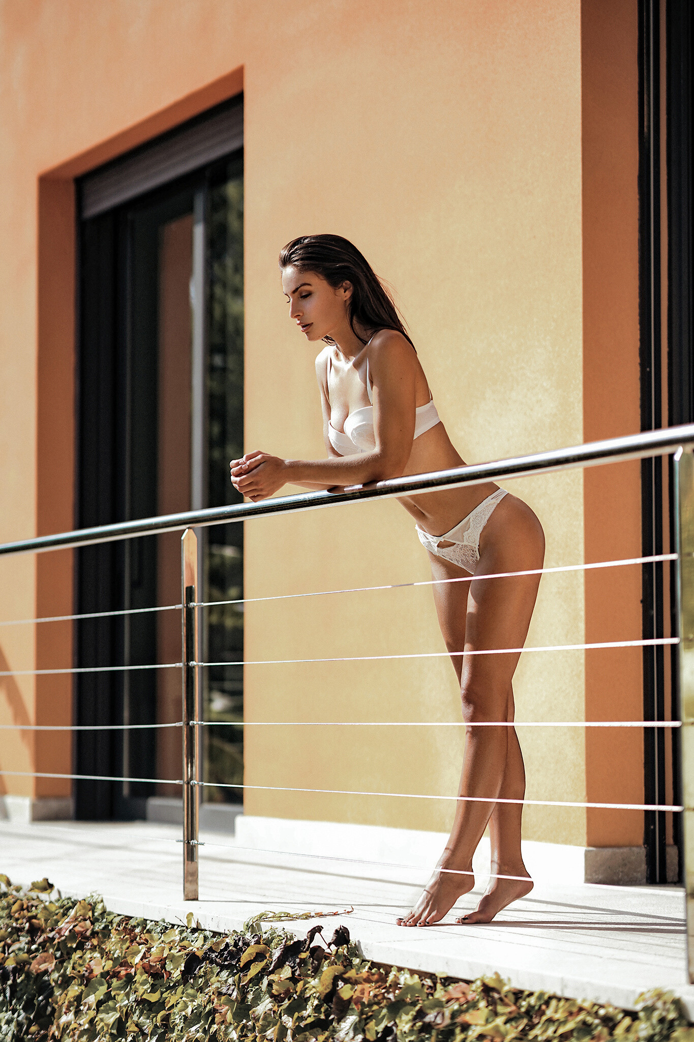
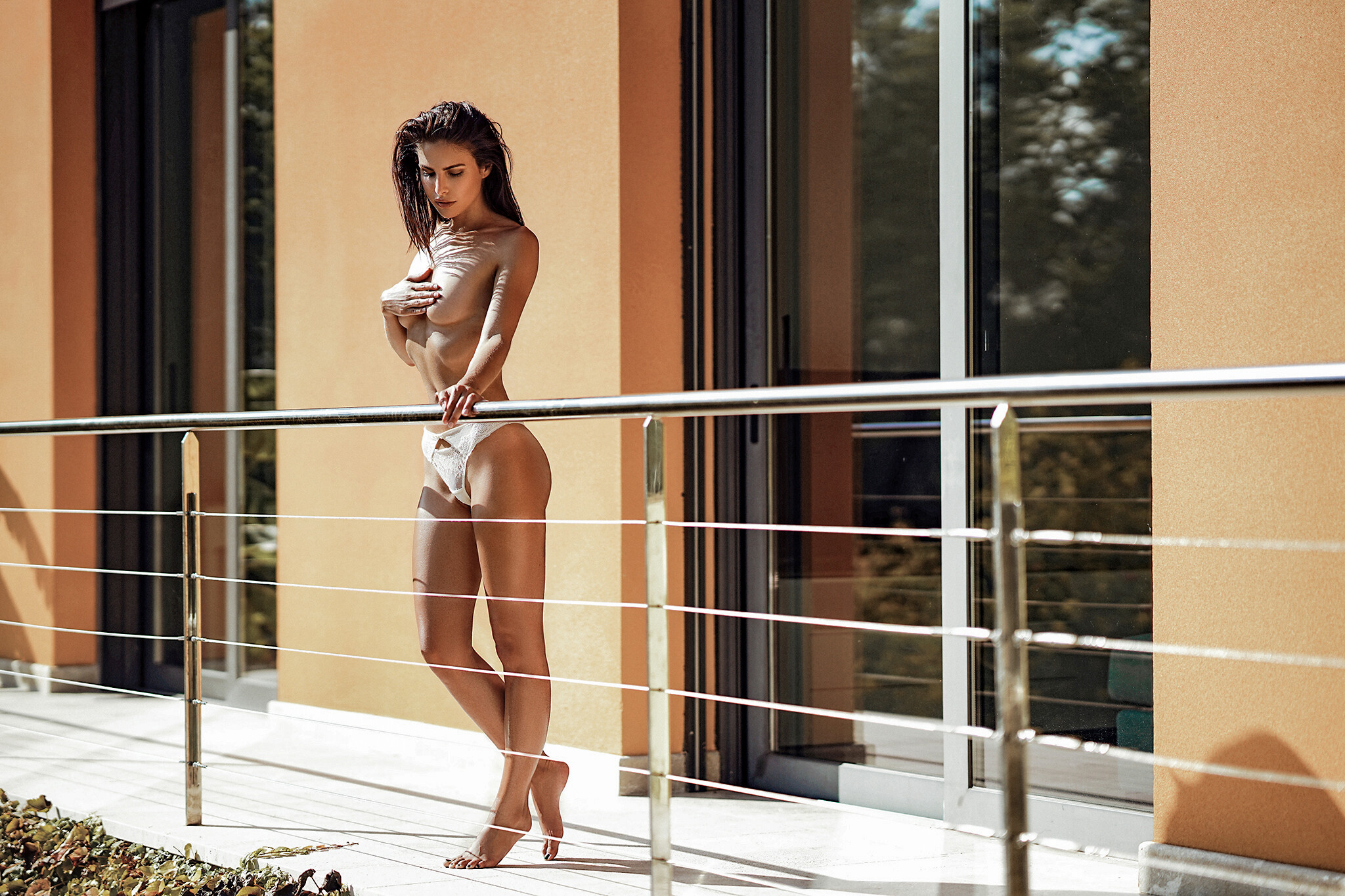
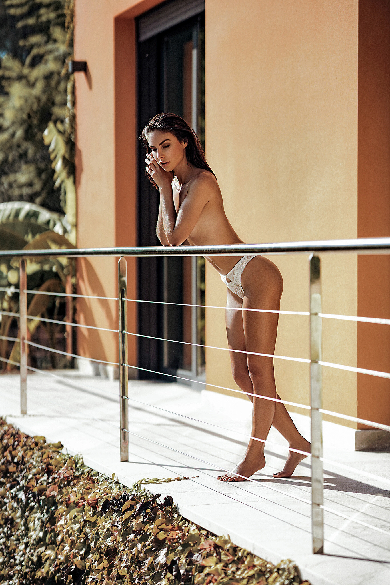
Joyride by SONIA (rd.: Friday the 13th of September 2019)
 Joyride by SONIA (rd.: Friday the 13th of September 2019)
LUL
First I want to say thank you for finally making uploaded videos responsive: Thats awesome! WooHoo responsive.mp4 But unfortunately this comes with a BUG...: (view in full screen to properly see it) Videos now get stretched to a width of 700px even if they are much smaller... see examples below (same video different resolutions: 1600w; 700w; 350w; 174w) ex No 1: 1600x750 (downsized to 700px in width / correct) 01_1600.mp4 ex No 2: 700x328 (size stays at 700px width / correct) 02_700.mp4 ex No 3: 350x164 (stretched to 700px in width / incorrect) 03_350.mp4 ex No 4: 174x82 (stretched to 700px in width / incorrect) 04_174.mp4 Below are examples on how it should look like: (I could achieve this by putting the video into a cell which prevents the video from stretching beyond its actual resolution) 1600x750 01_1600.mp4 700x328 02_700.mp4 350x164 03_350.mp4 174x82 04_174.mp4 Additional suggestion: currently videos are limited only in width (700px), so two videos can't be placed next to each other in fullscreen and vertical videos with an aspect ratio of 9:16 are 1245px tall, which is way too big for a full-hd-screen with a max height of 1080px. That might not be that big of a problem on a mobile device since you can simply just switch orientation by rotating the device but you can't do that on your home pc with your monitor or laptop. - I would suggest to decrease the max width from 700px to something between 505px and 530px which would 1. make it possible to post two videos next to each other in fullscreen and 2. would not cut off the top/bottom of a 9:16 video anymore, in fullscreen. - The same could be achieved by limiting the height to 900px or less.
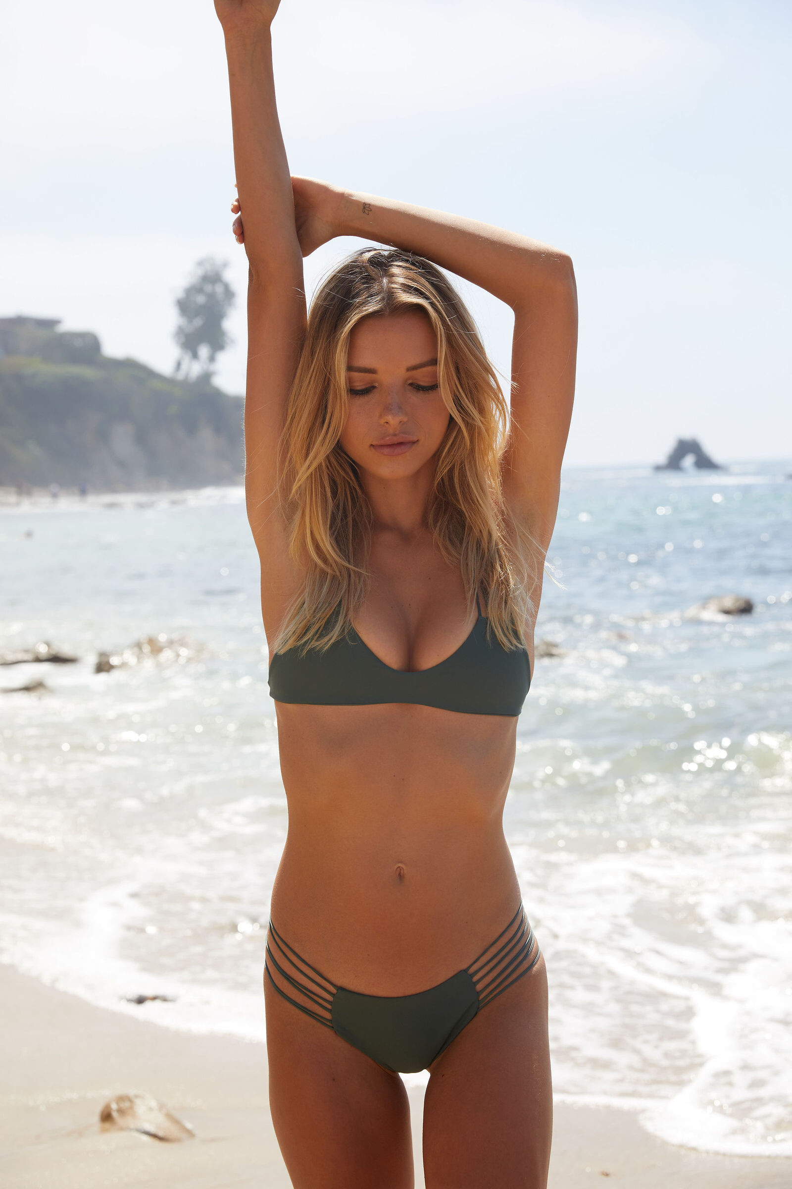
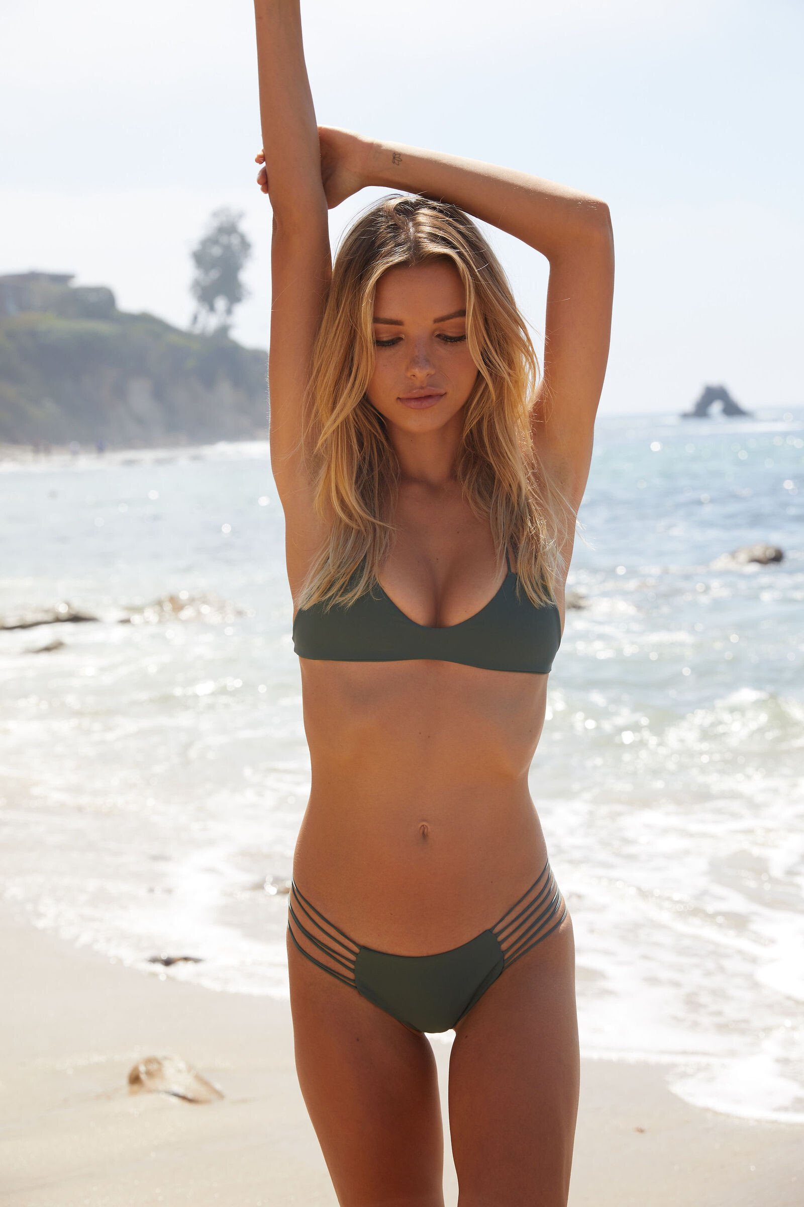
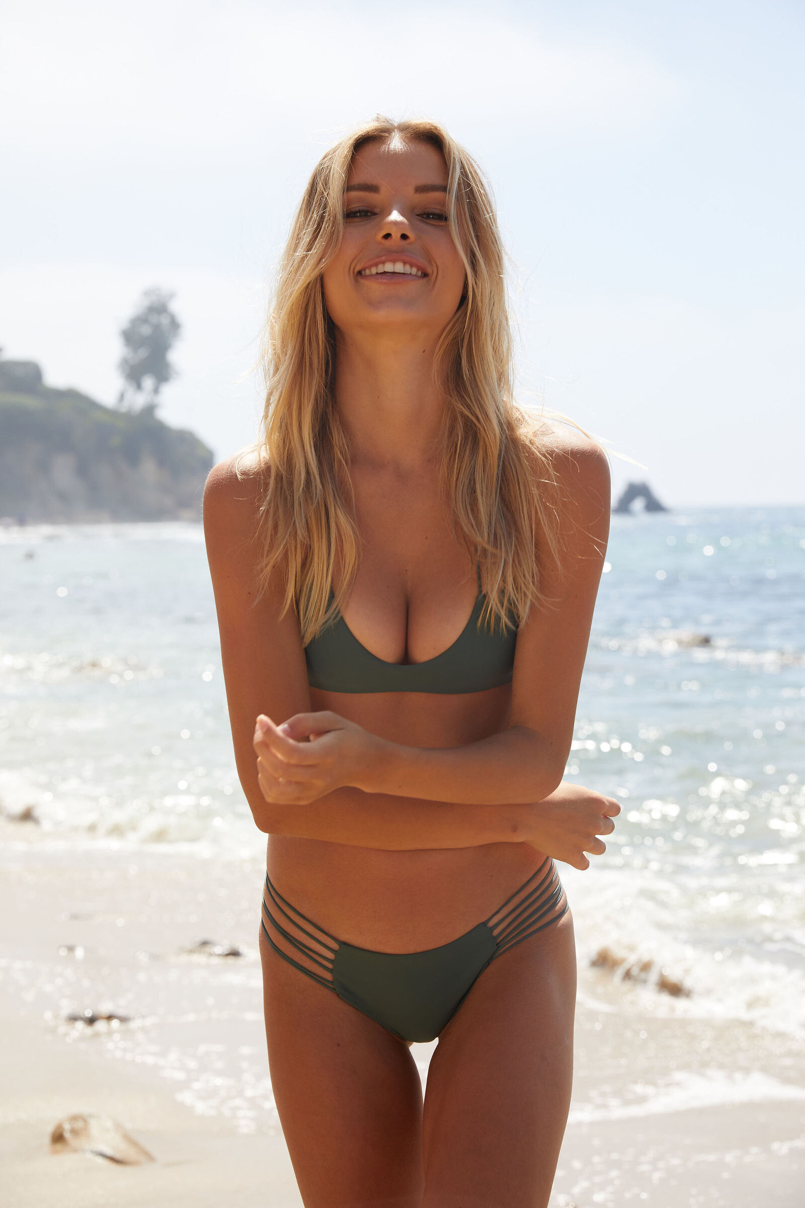
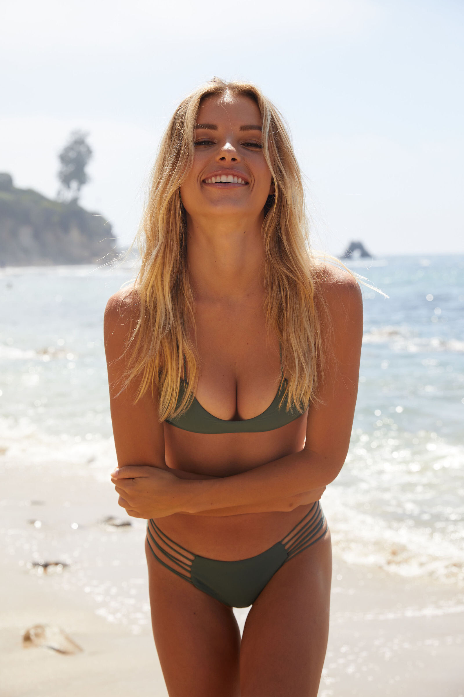
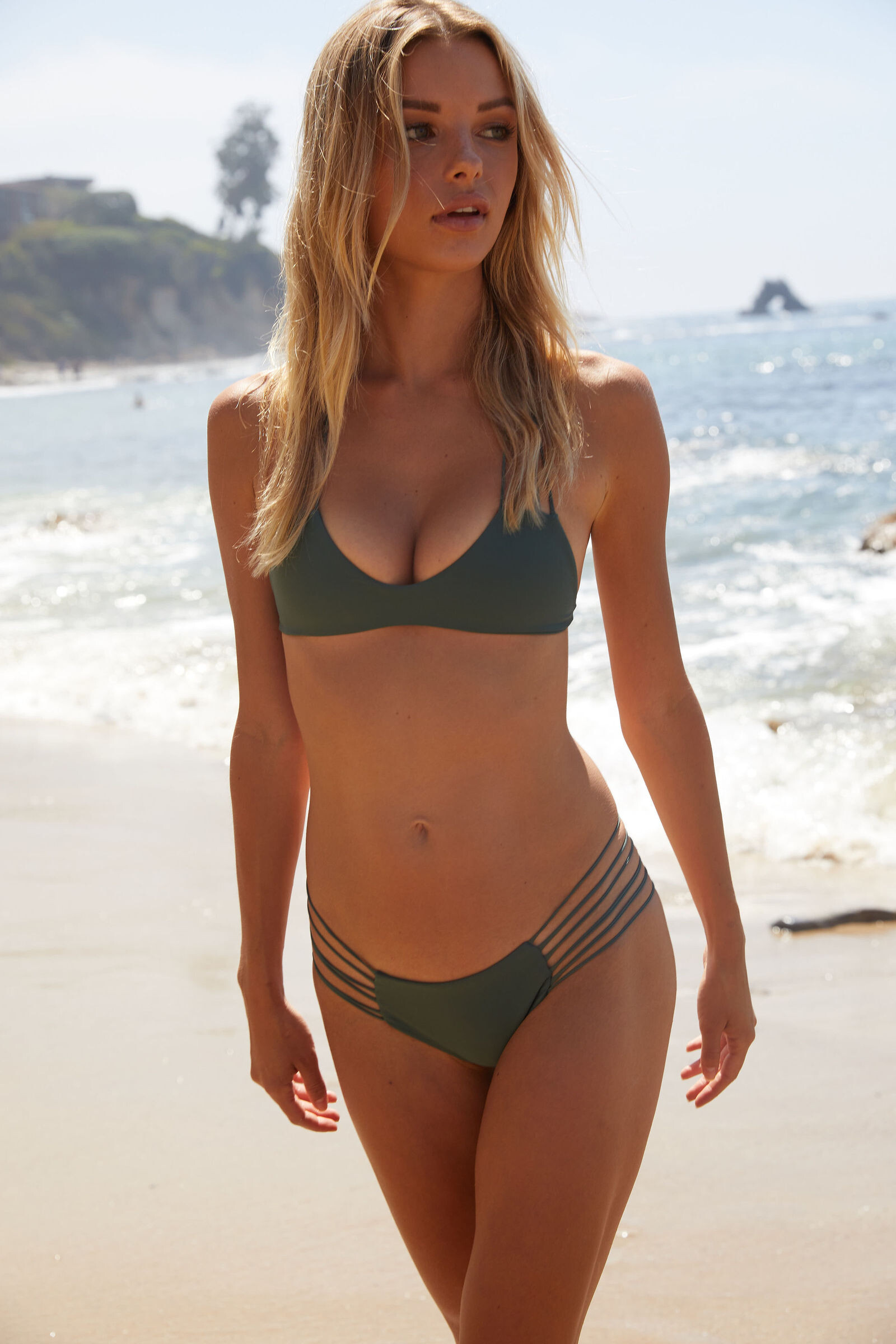
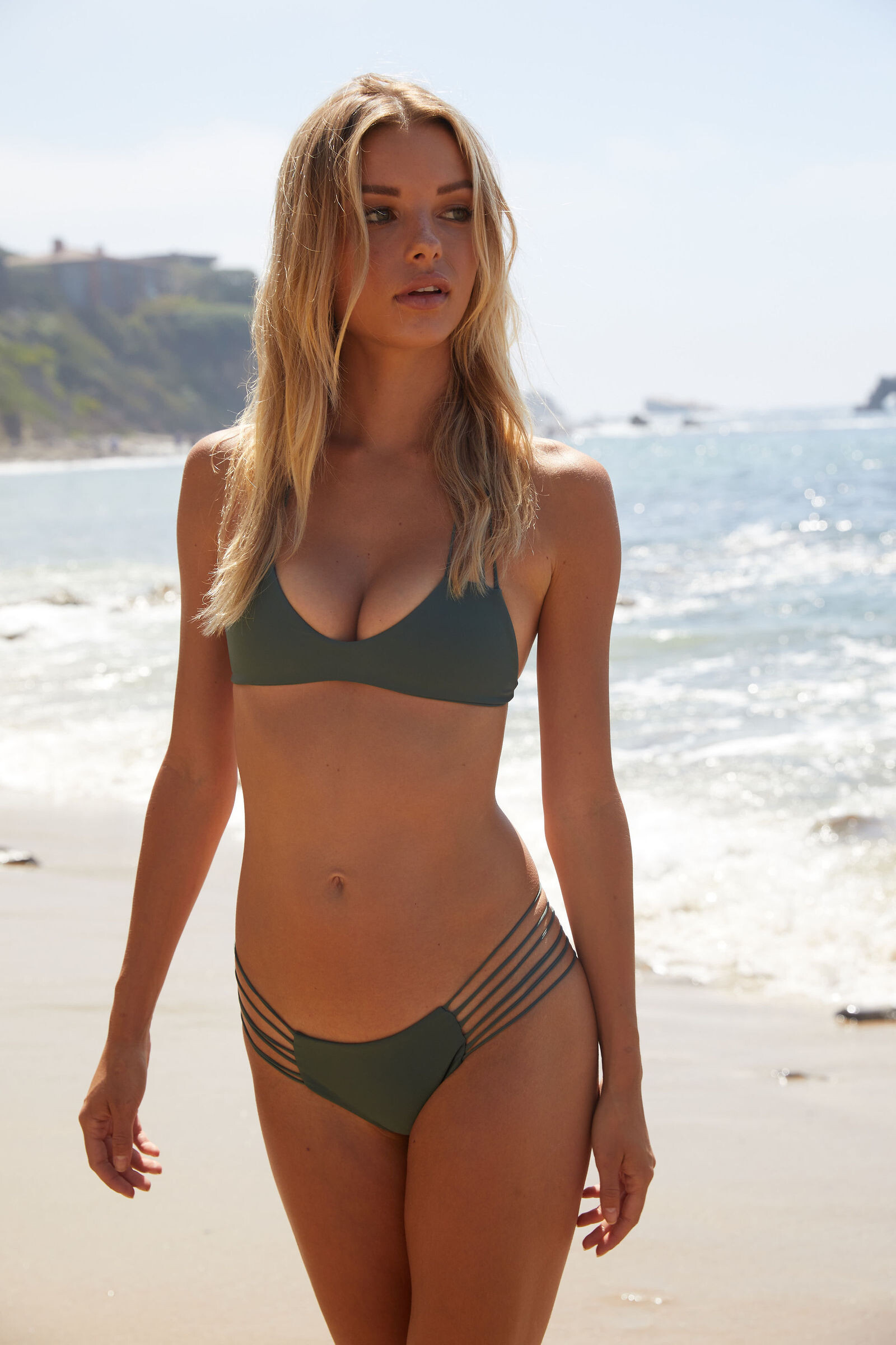
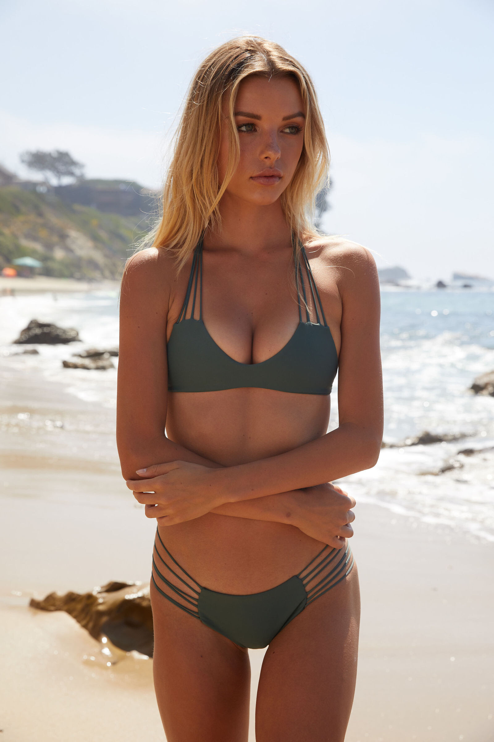
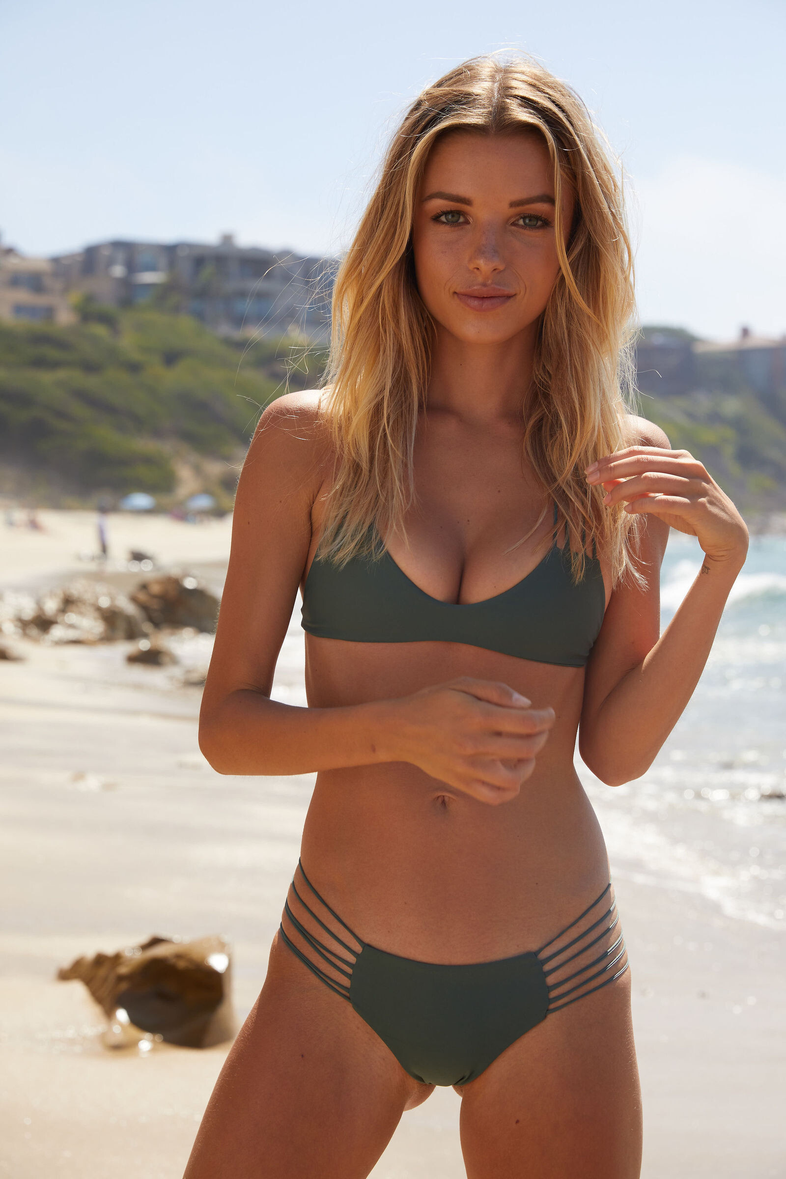
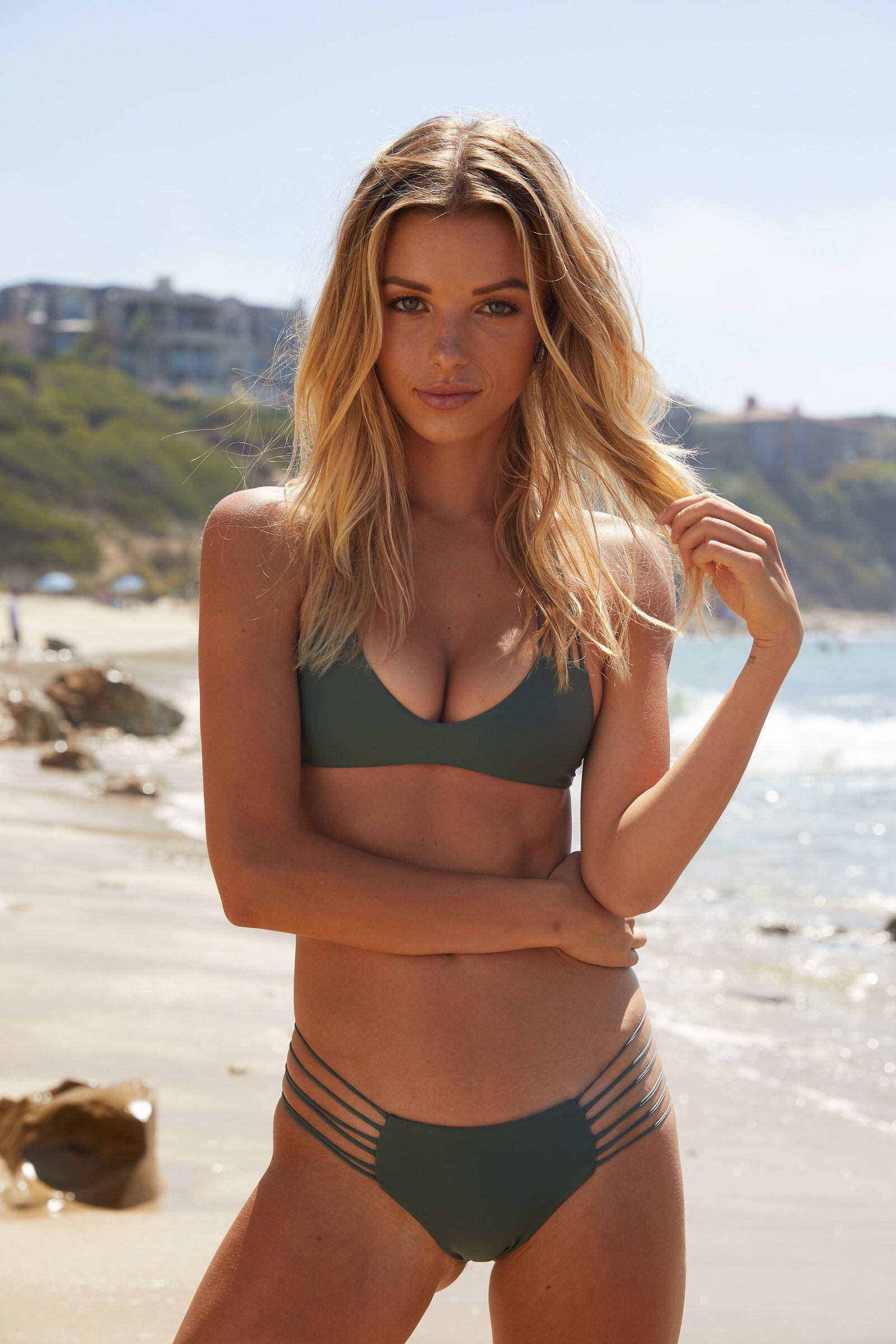
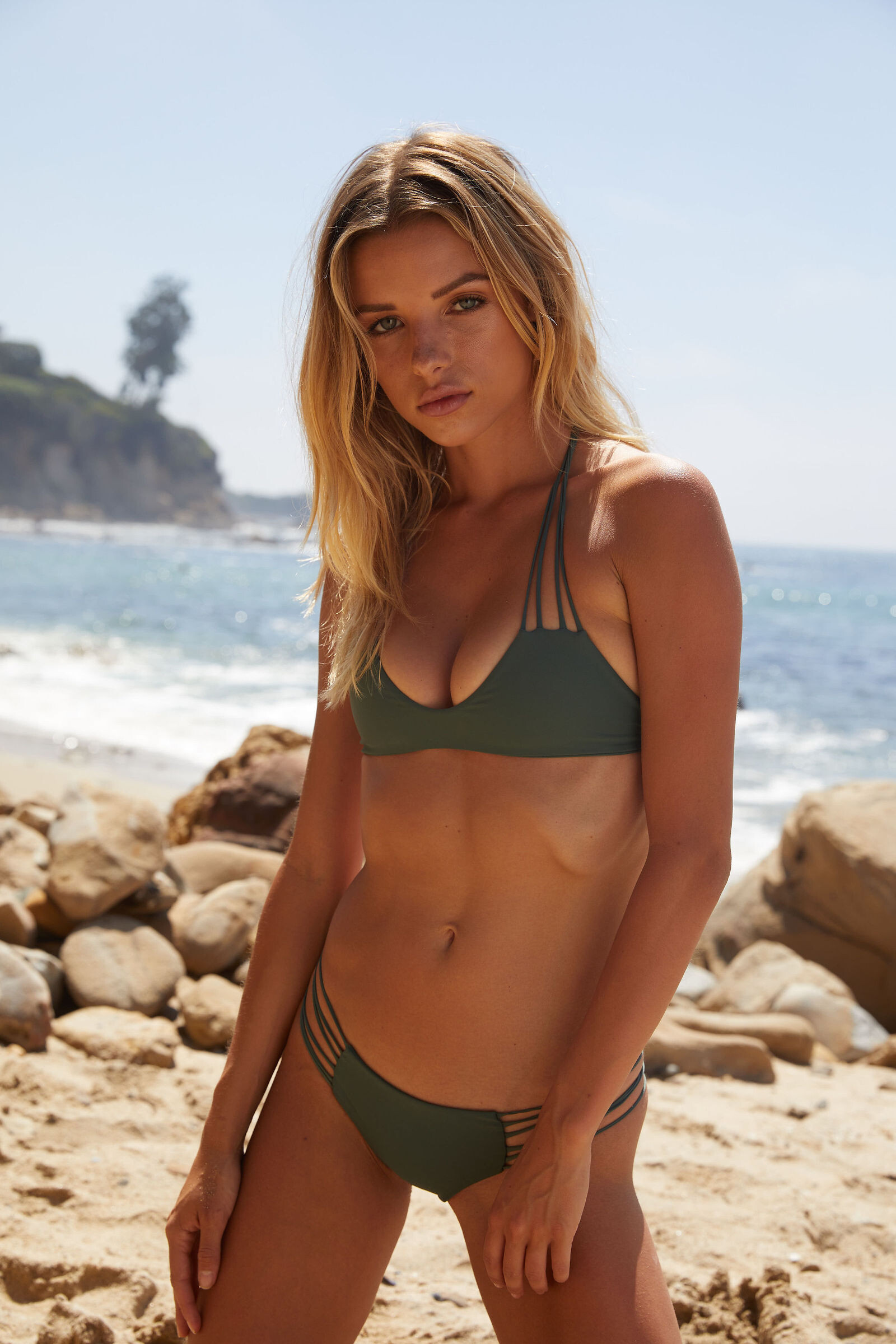
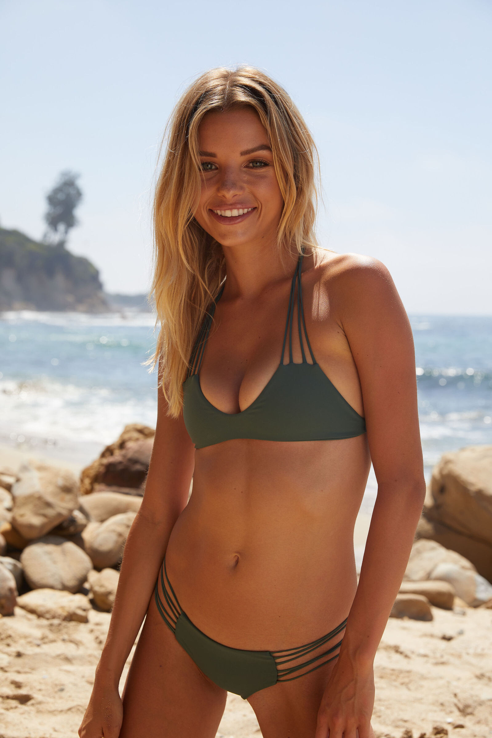
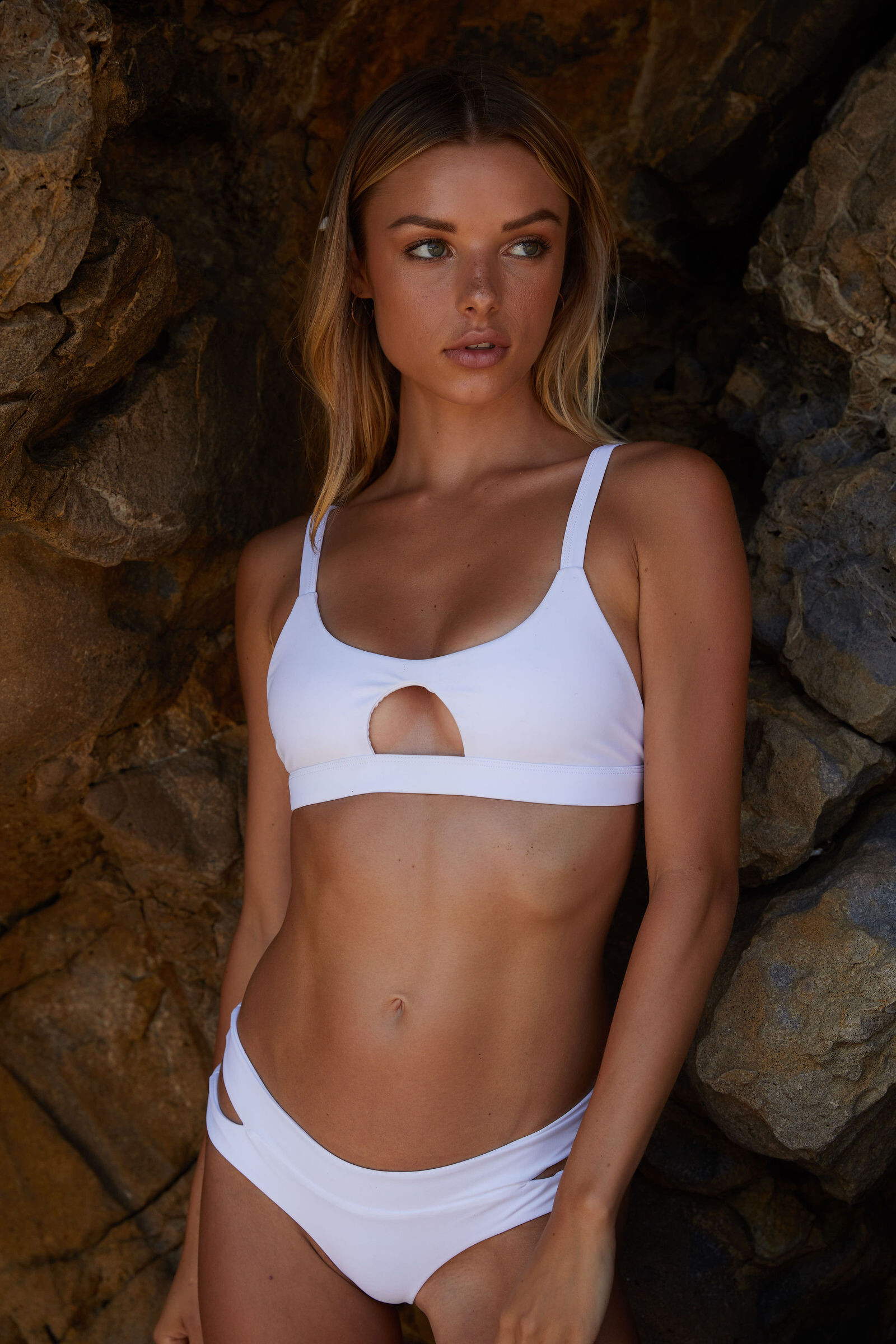
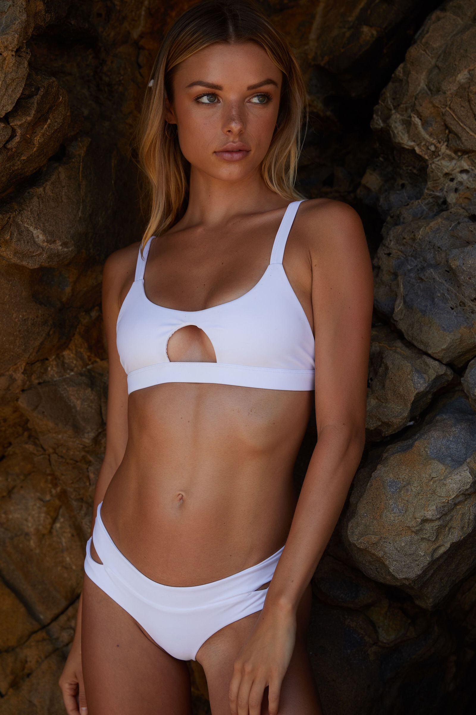
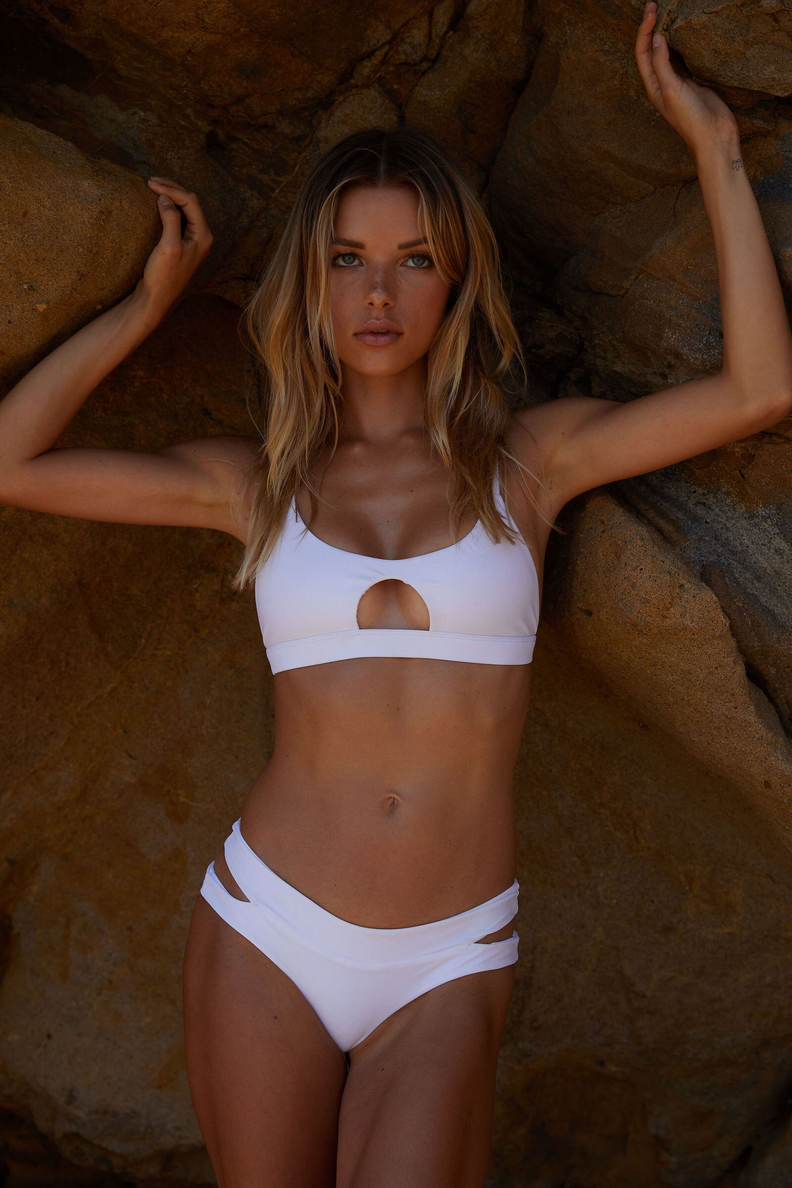
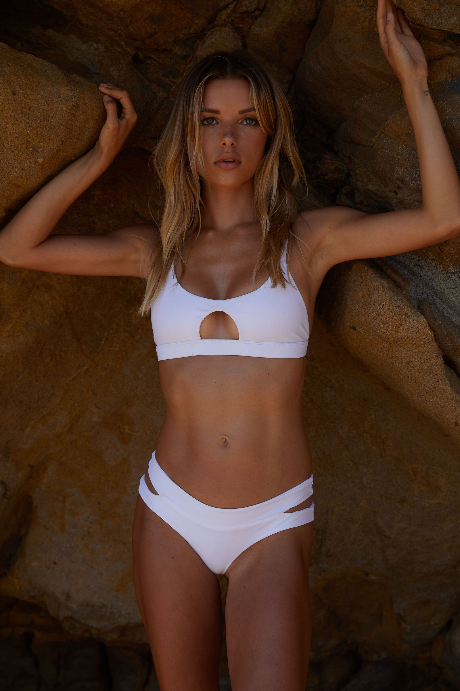
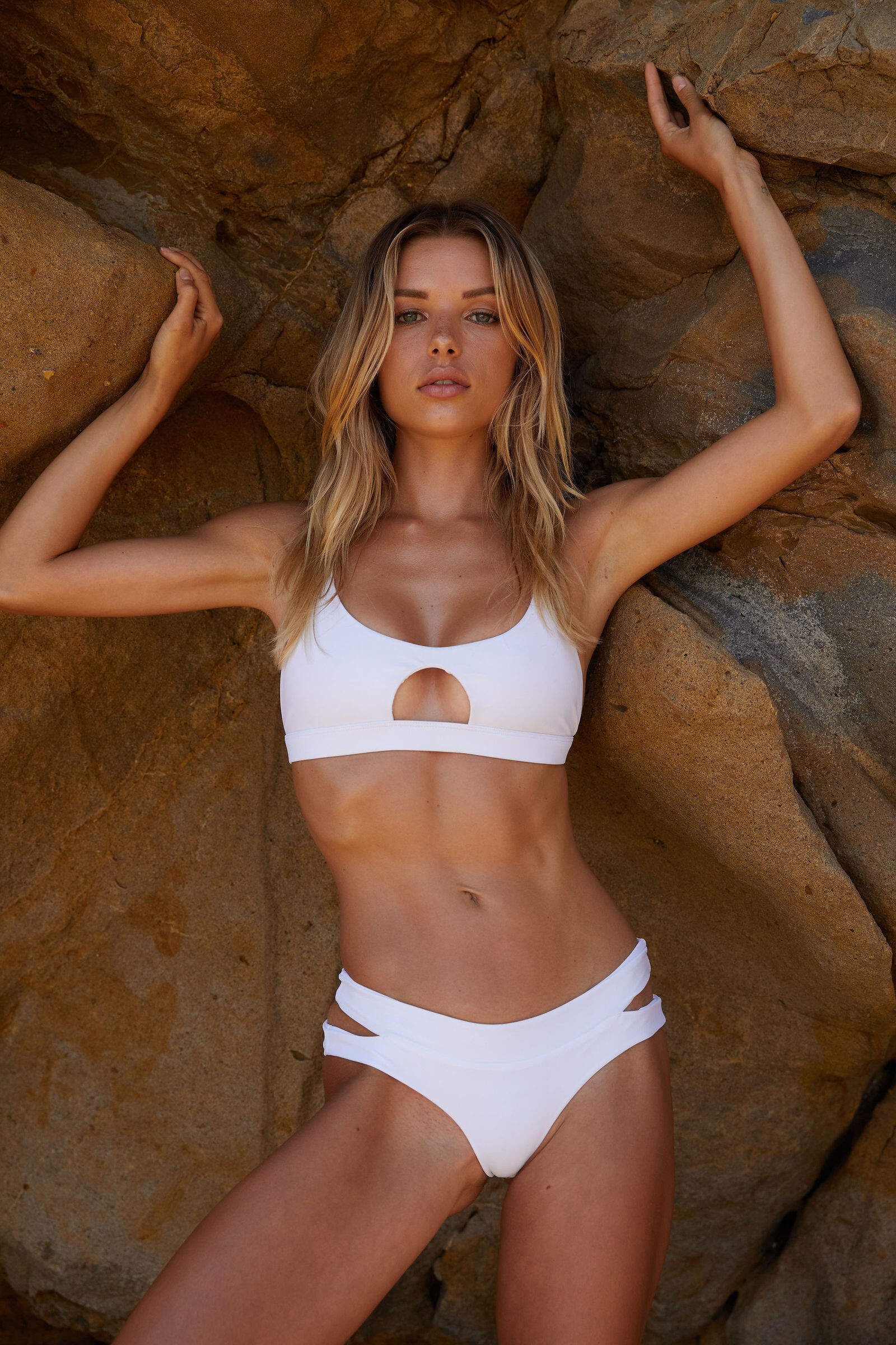
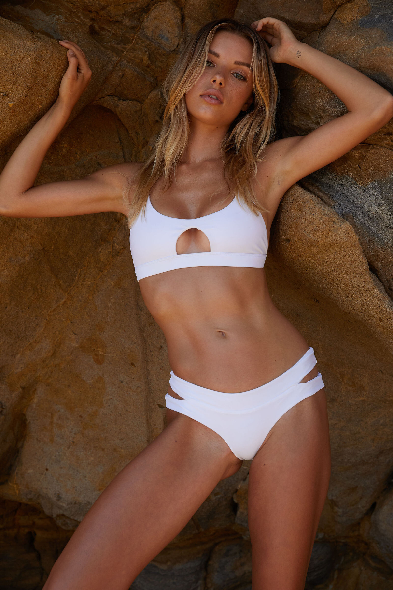
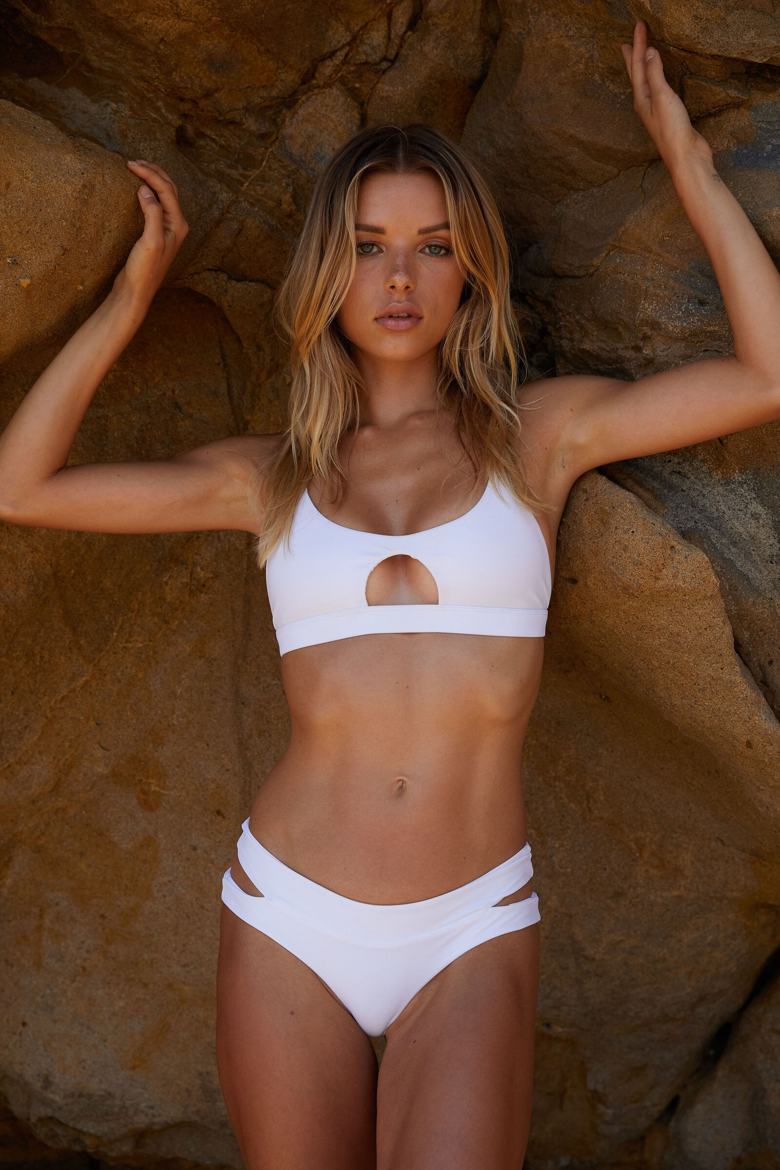
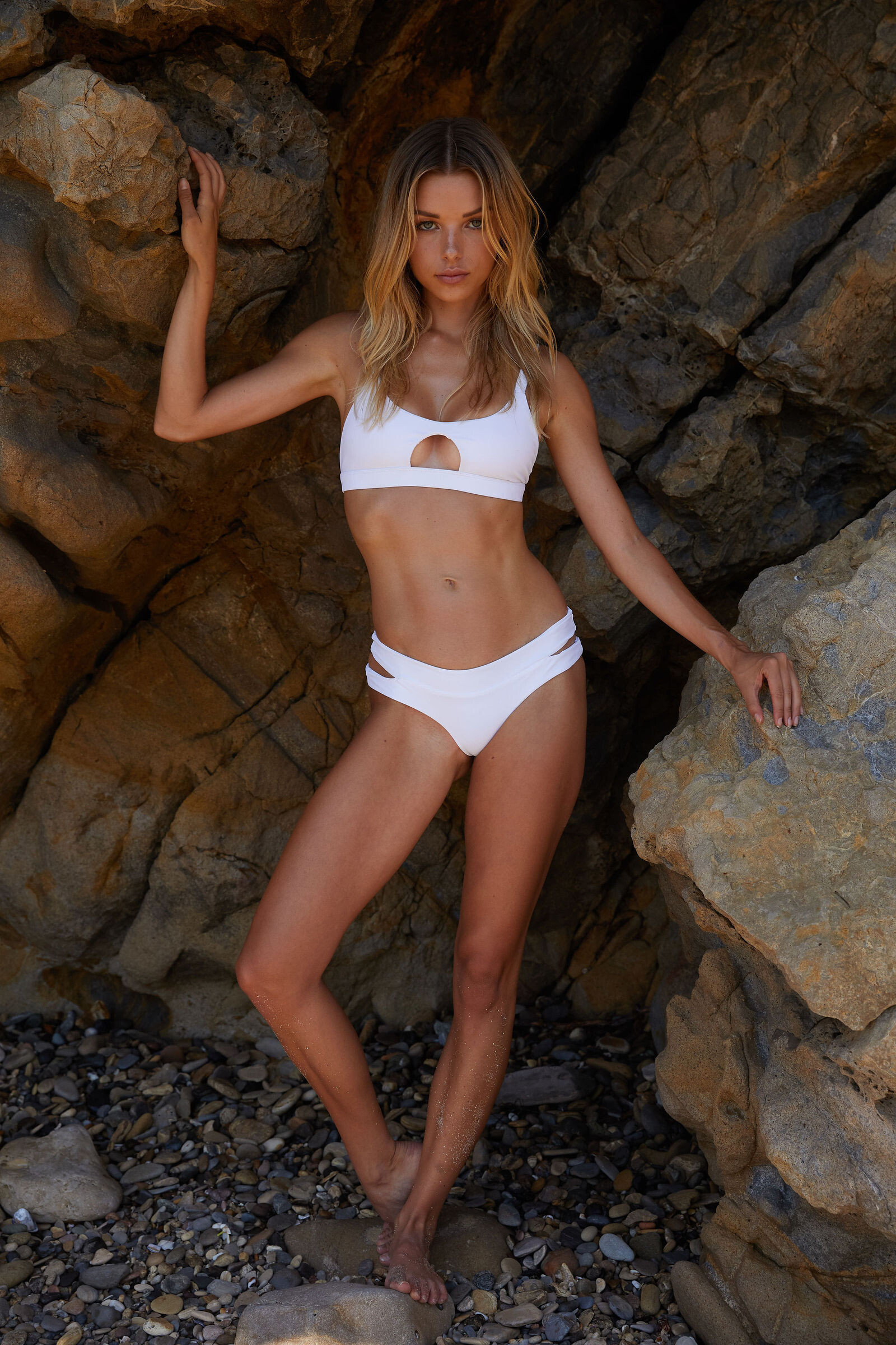
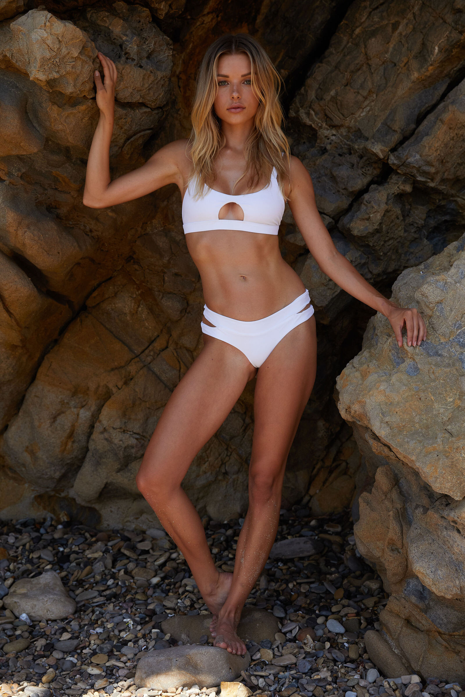
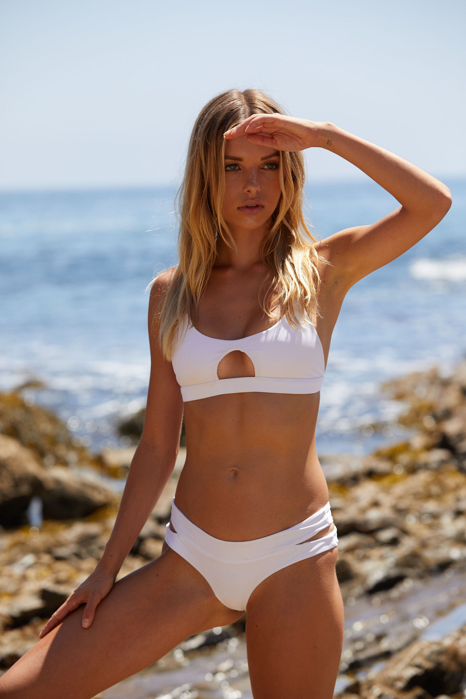
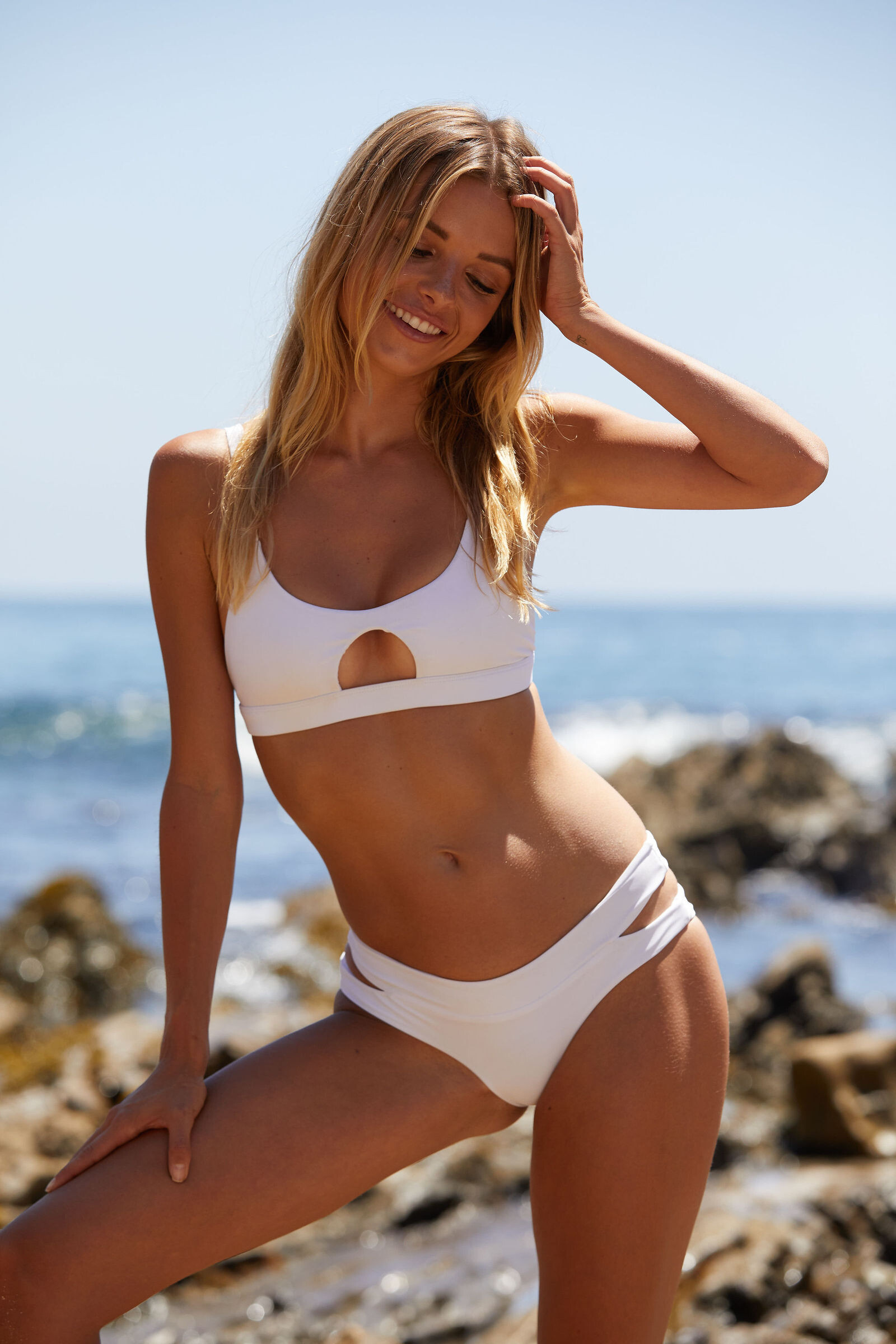
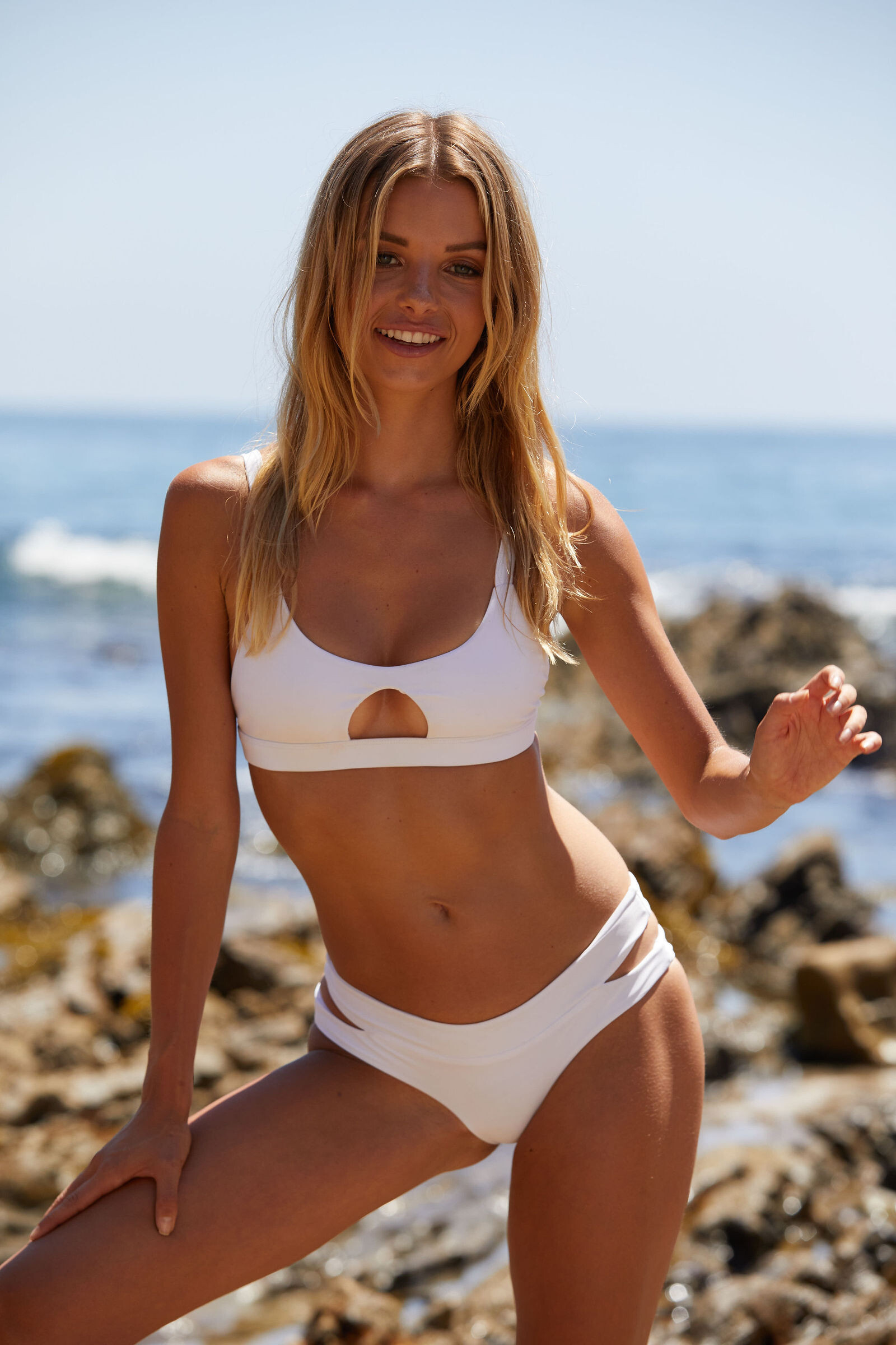
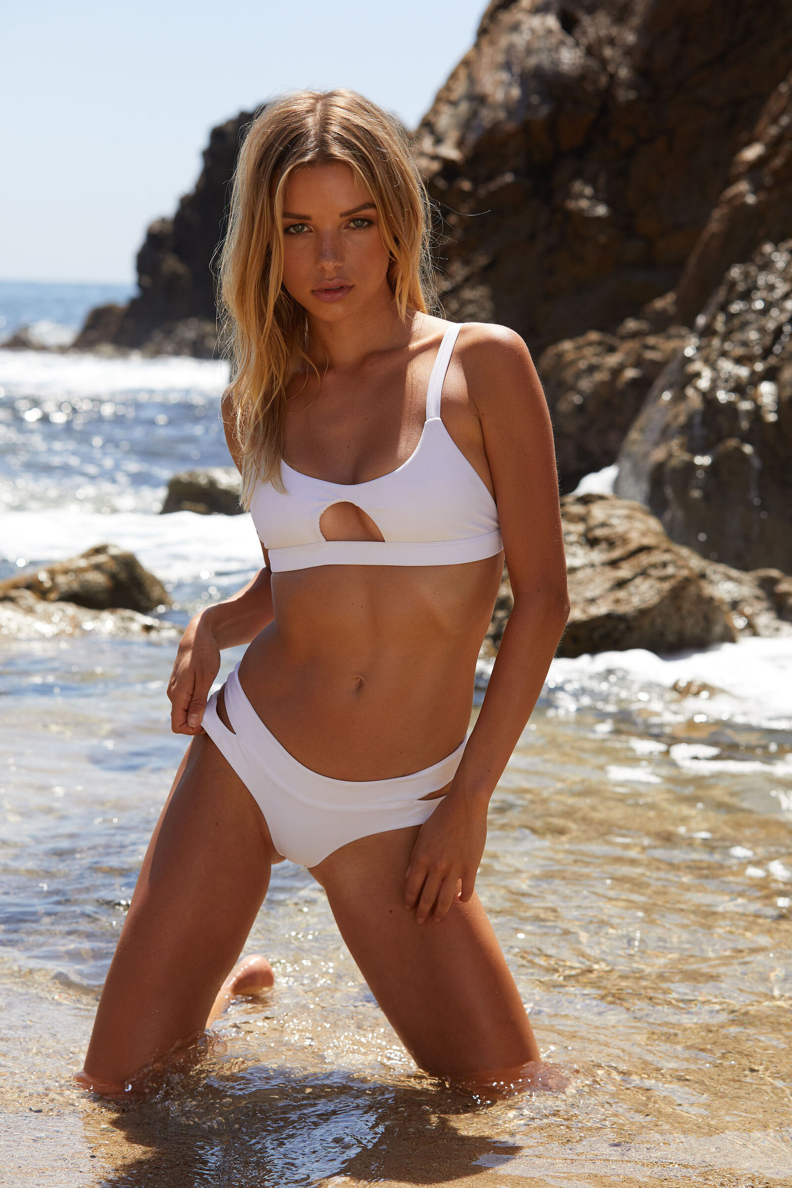
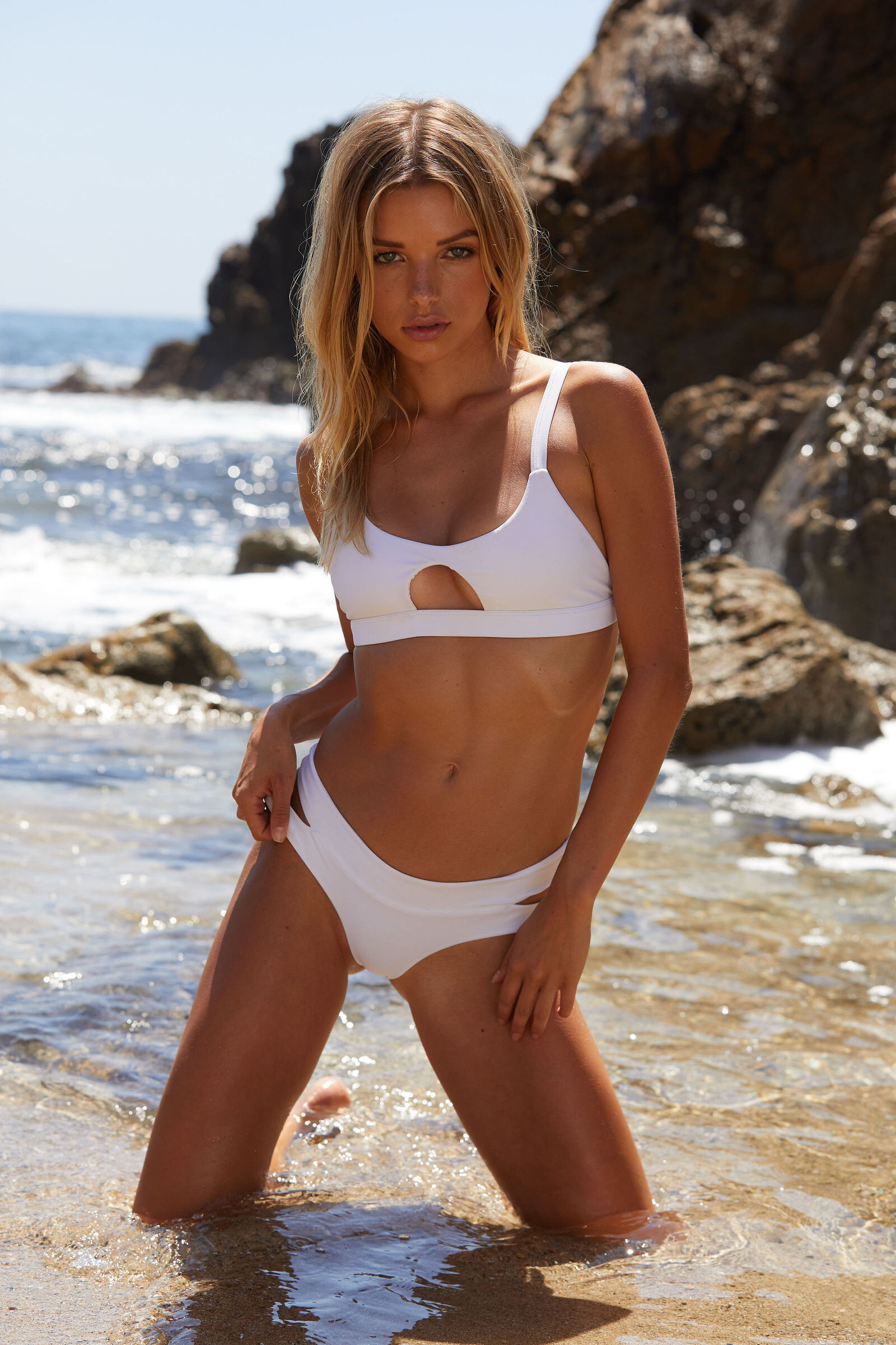
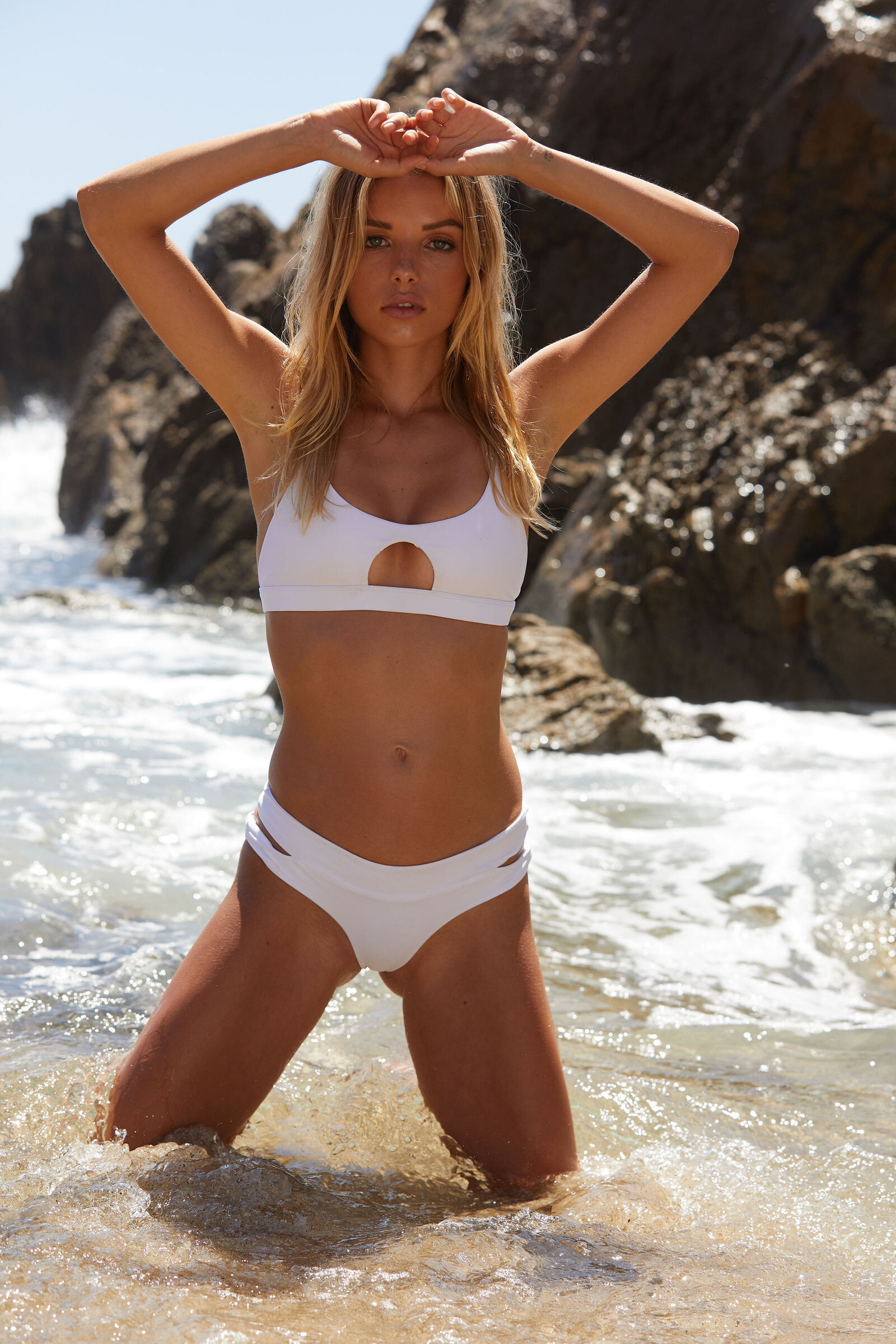
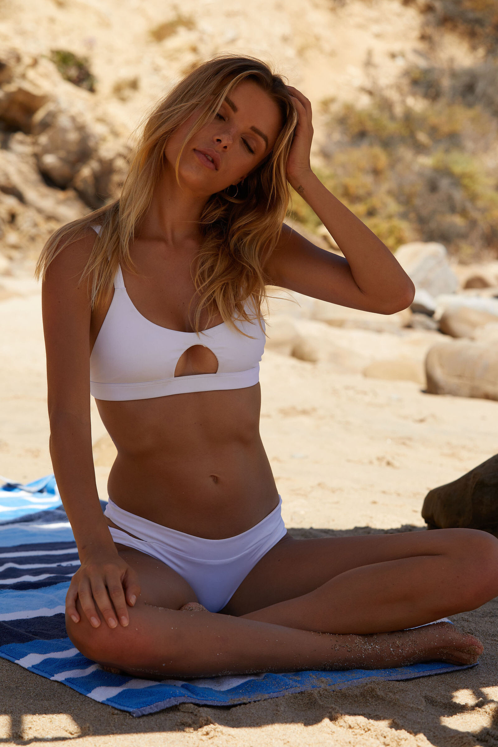
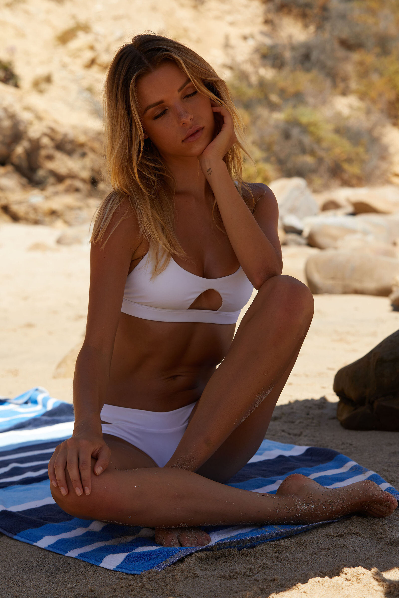
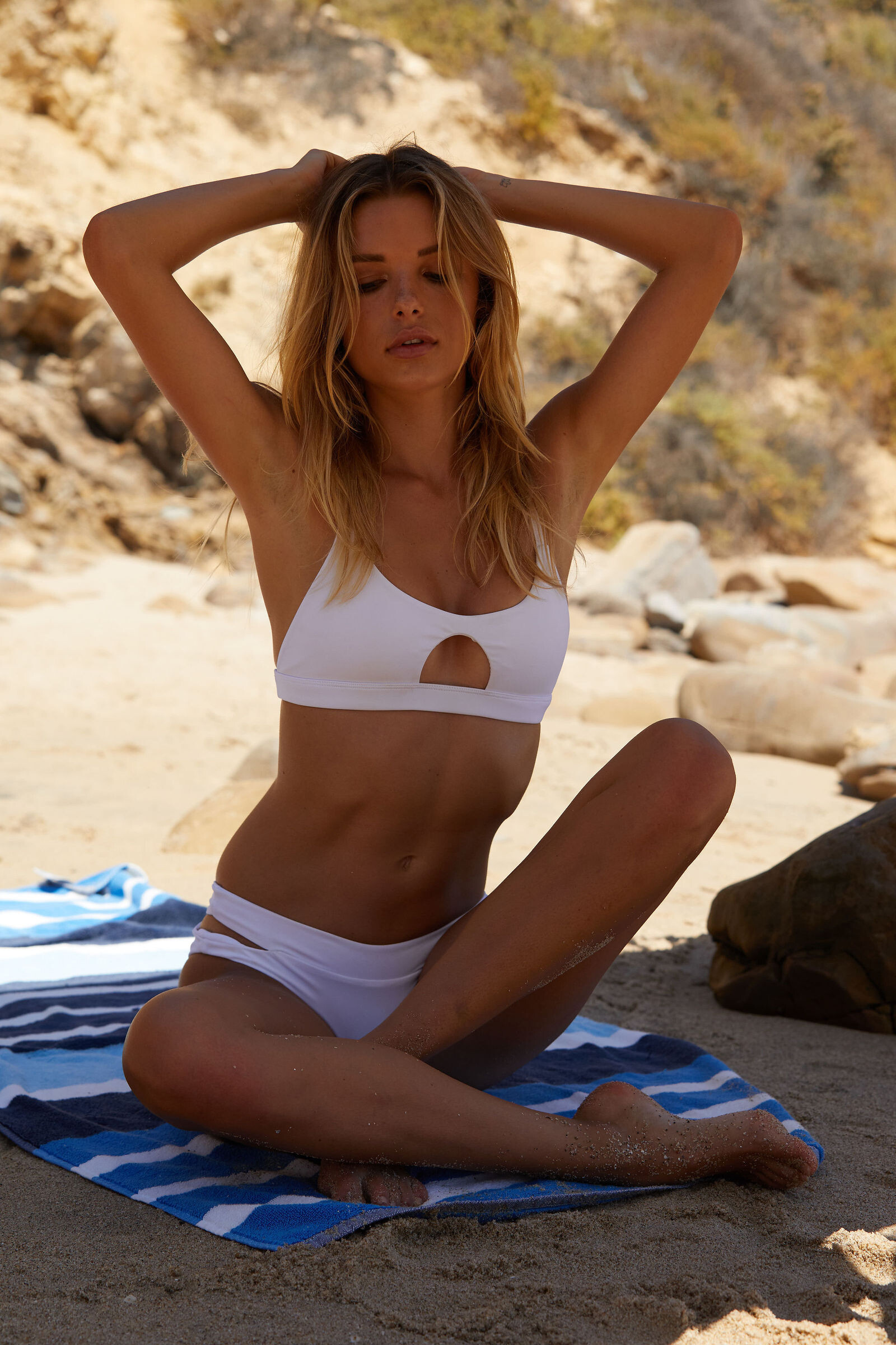
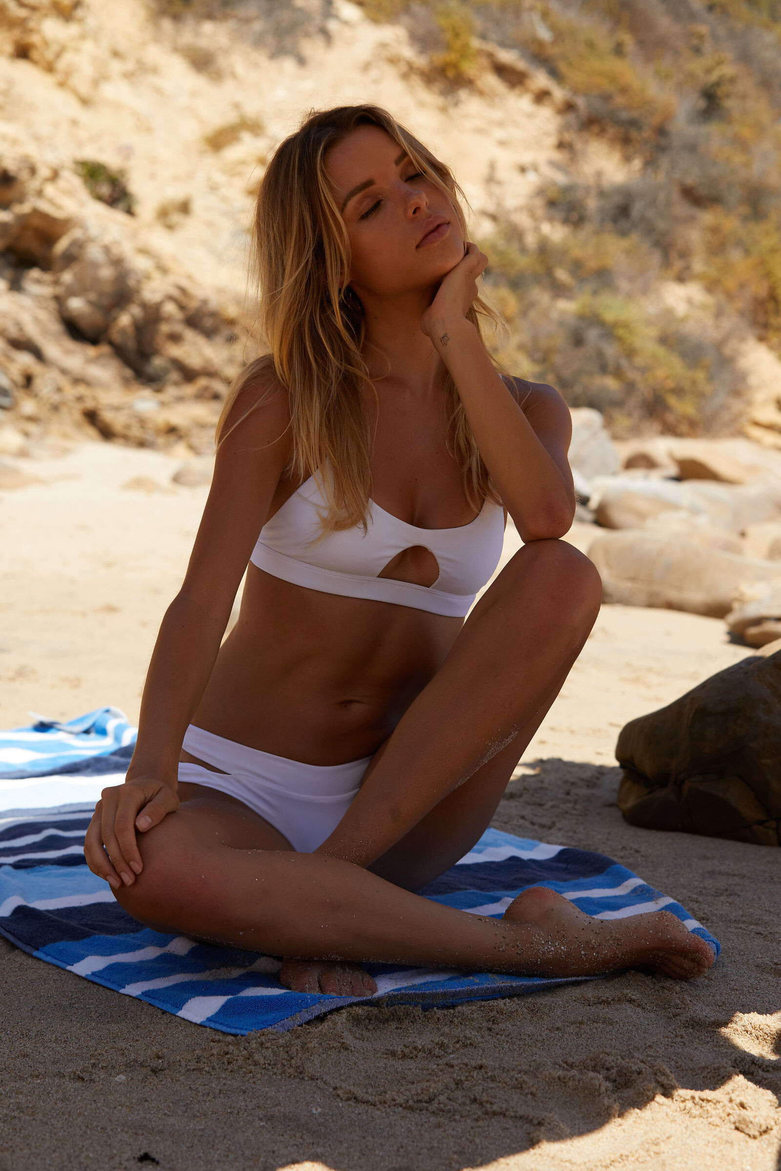
Joyride by SONIA (rd.: Friday the 13th of September 2019)
LUL
First I want to say thank you for finally making uploaded videos responsive: Thats awesome! WooHoo responsive.mp4 But unfortunately this comes with a BUG...: (view in full screen to properly see it) Videos now get stretched to a width of 700px even if they are much smaller... see examples below (same video different resolutions: 1600w; 700w; 350w; 174w) ex No 1: 1600x750 (downsized to 700px in width / correct) 01_1600.mp4 ex No 2: 700x328 (size stays at 700px width / correct) 02_700.mp4 ex No 3: 350x164 (stretched to 700px in width / incorrect) 03_350.mp4 ex No 4: 174x82 (stretched to 700px in width / incorrect) 04_174.mp4 Below are examples on how it should look like: (I could achieve this by putting the video into a cell which prevents the video from stretching beyond its actual resolution) 1600x750 01_1600.mp4 700x328 02_700.mp4 350x164 03_350.mp4 174x82 04_174.mp4 Additional suggestion: currently videos are limited only in width (700px), so two videos can't be placed next to each other in fullscreen and vertical videos with an aspect ratio of 9:16 are 1245px tall, which is way too big for a full-hd-screen with a max height of 1080px. That might not be that big of a problem on a mobile device since you can simply just switch orientation by rotating the device but you can't do that on your home pc with your monitor or laptop. - I would suggest to decrease the max width from 700px to something between 505px and 530px which would 1. make it possible to post two videos next to each other in fullscreen and 2. would not cut off the top/bottom of a 9:16 video anymore, in fullscreen. - The same could be achieved by limiting the height to 900px or less. Two spammers posting spam... https://www.bellazon.com/main/profile/146603-zamila/ https://www.bellazon.com/main/topic/80335-zamila-hyderabad-girl/ https://www.bellazon.com/main/profile/146588-foundationschool/ https://www.bellazon.com/main/topic/80331-best-schools-in-sarjapur-road/
01.mp4 02.mp4 03.mp4 04.mp4
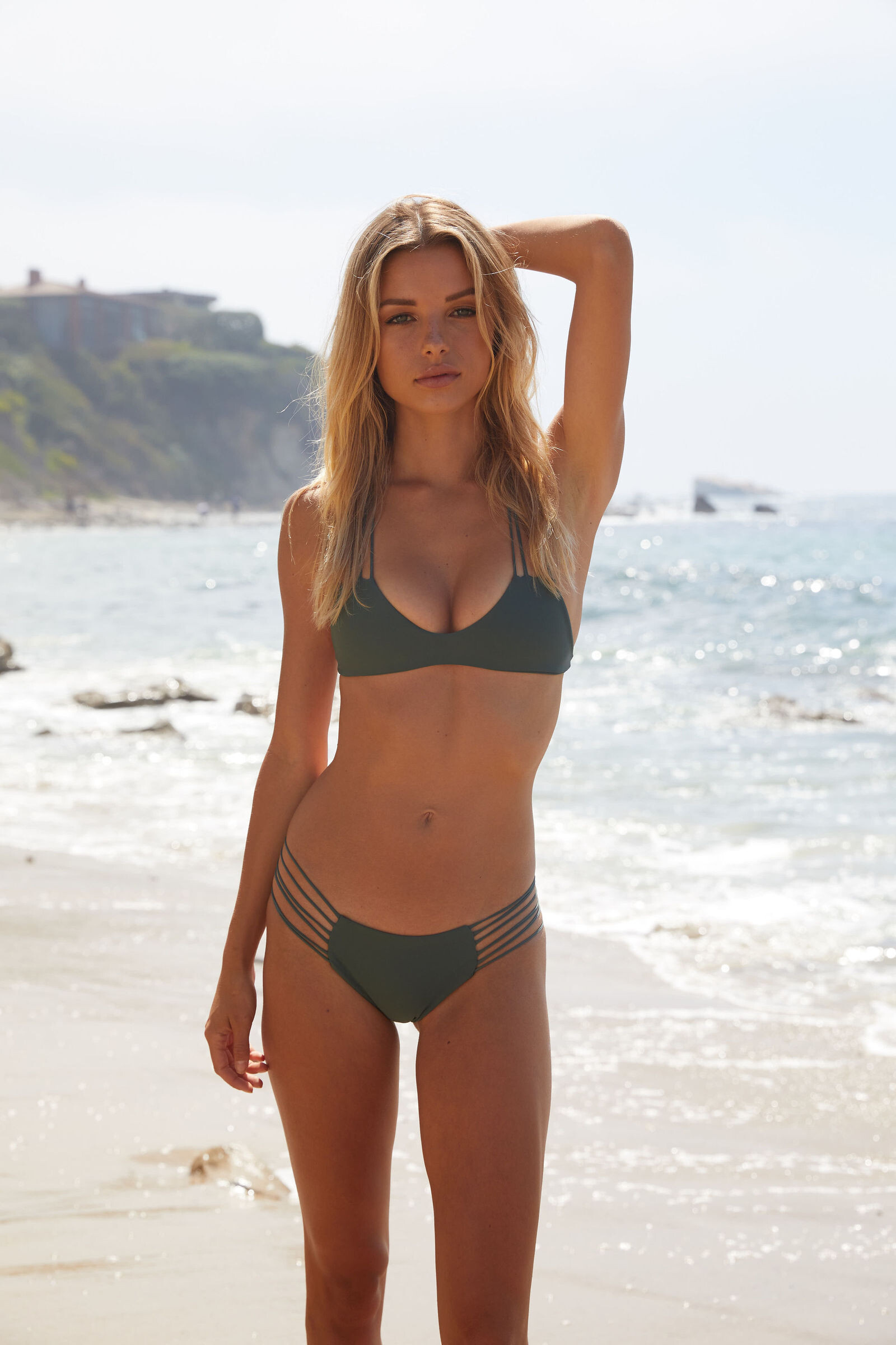
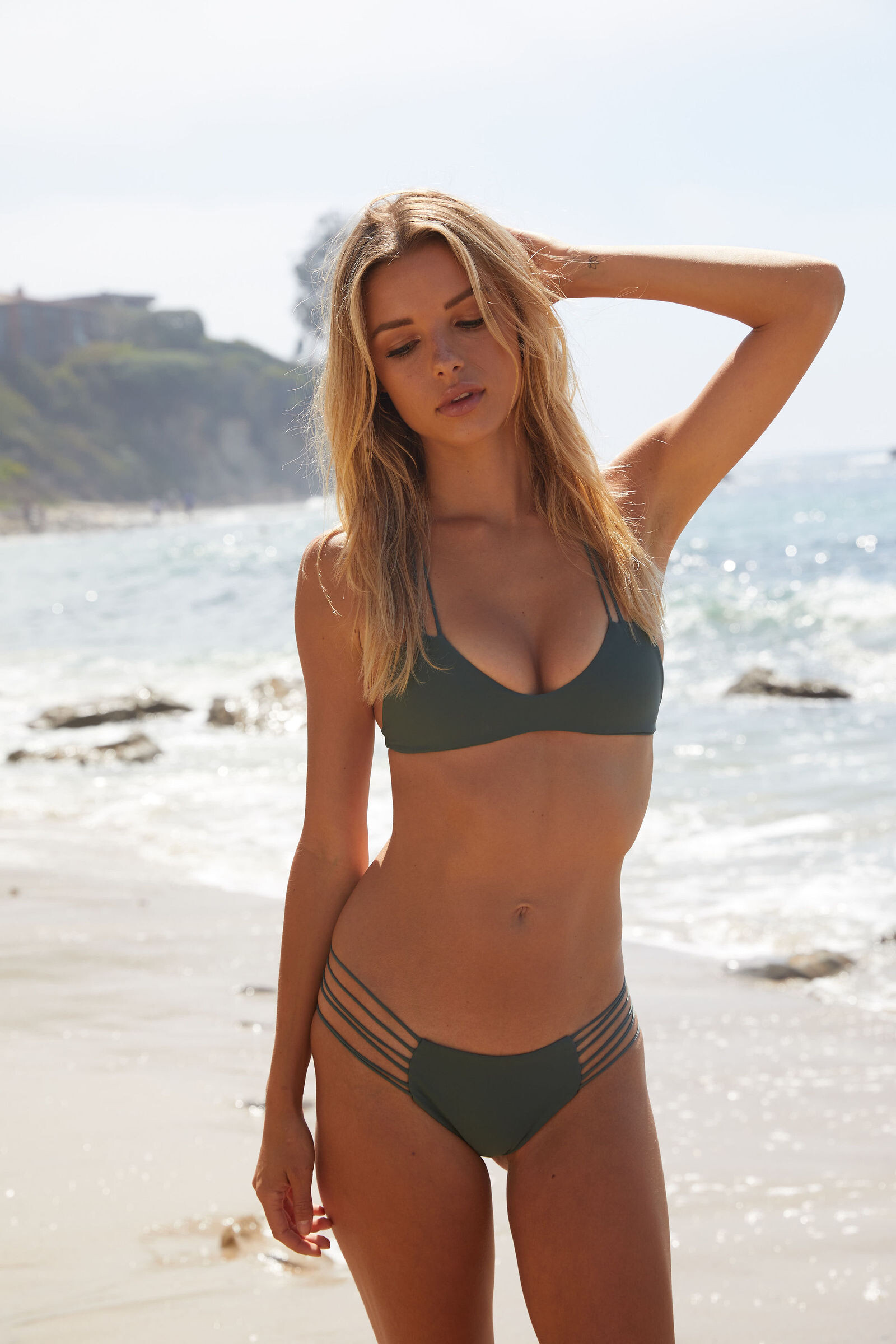
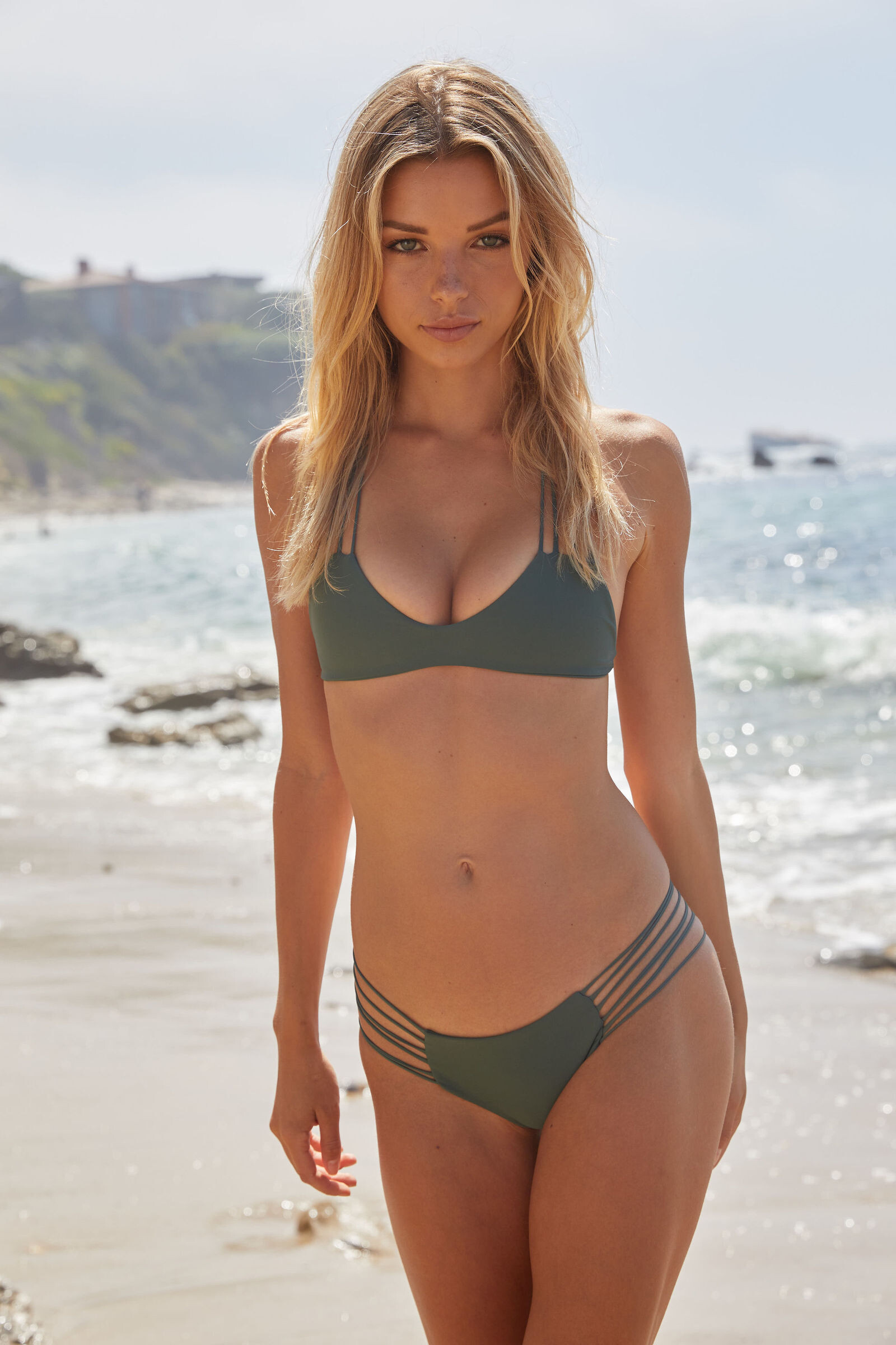
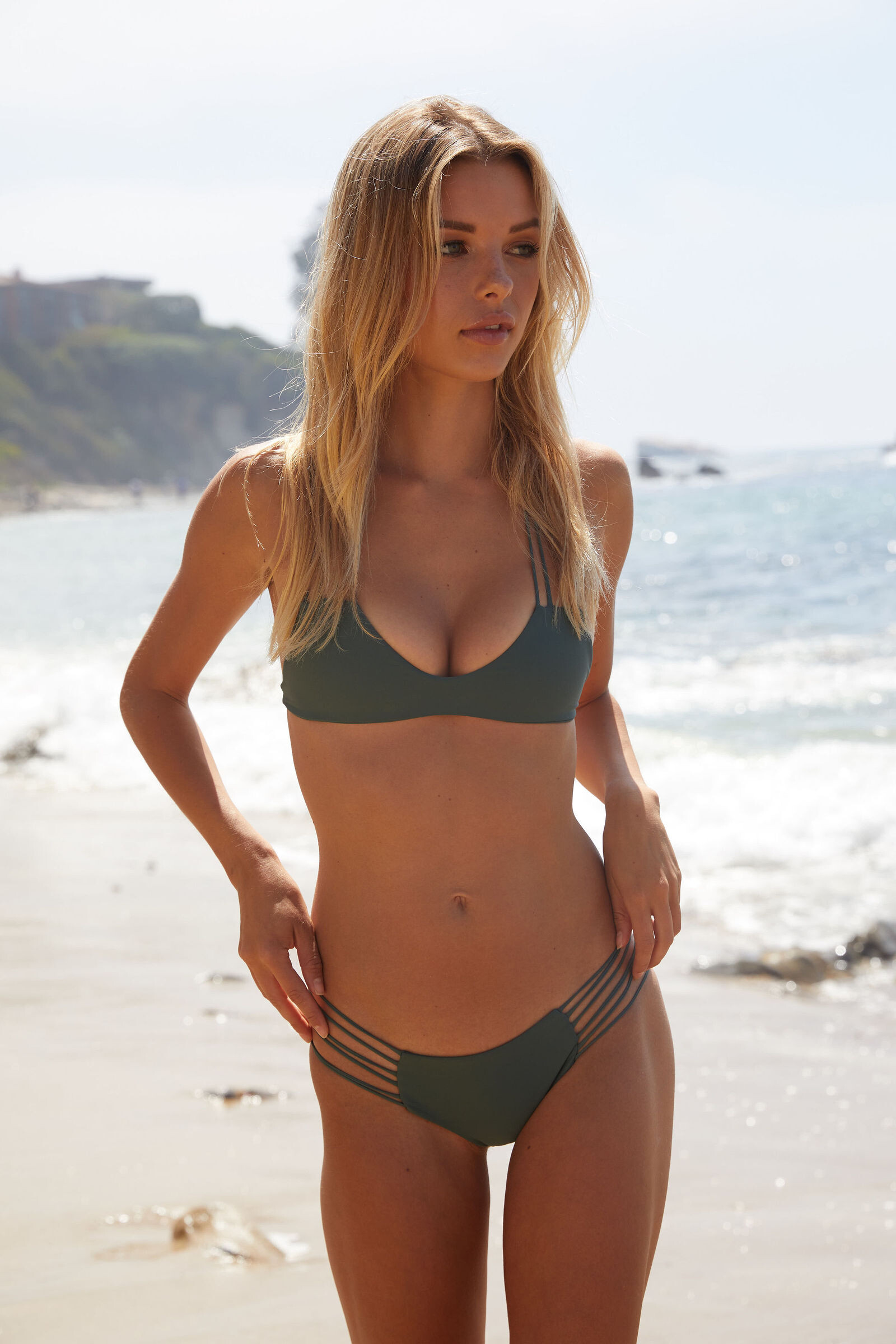
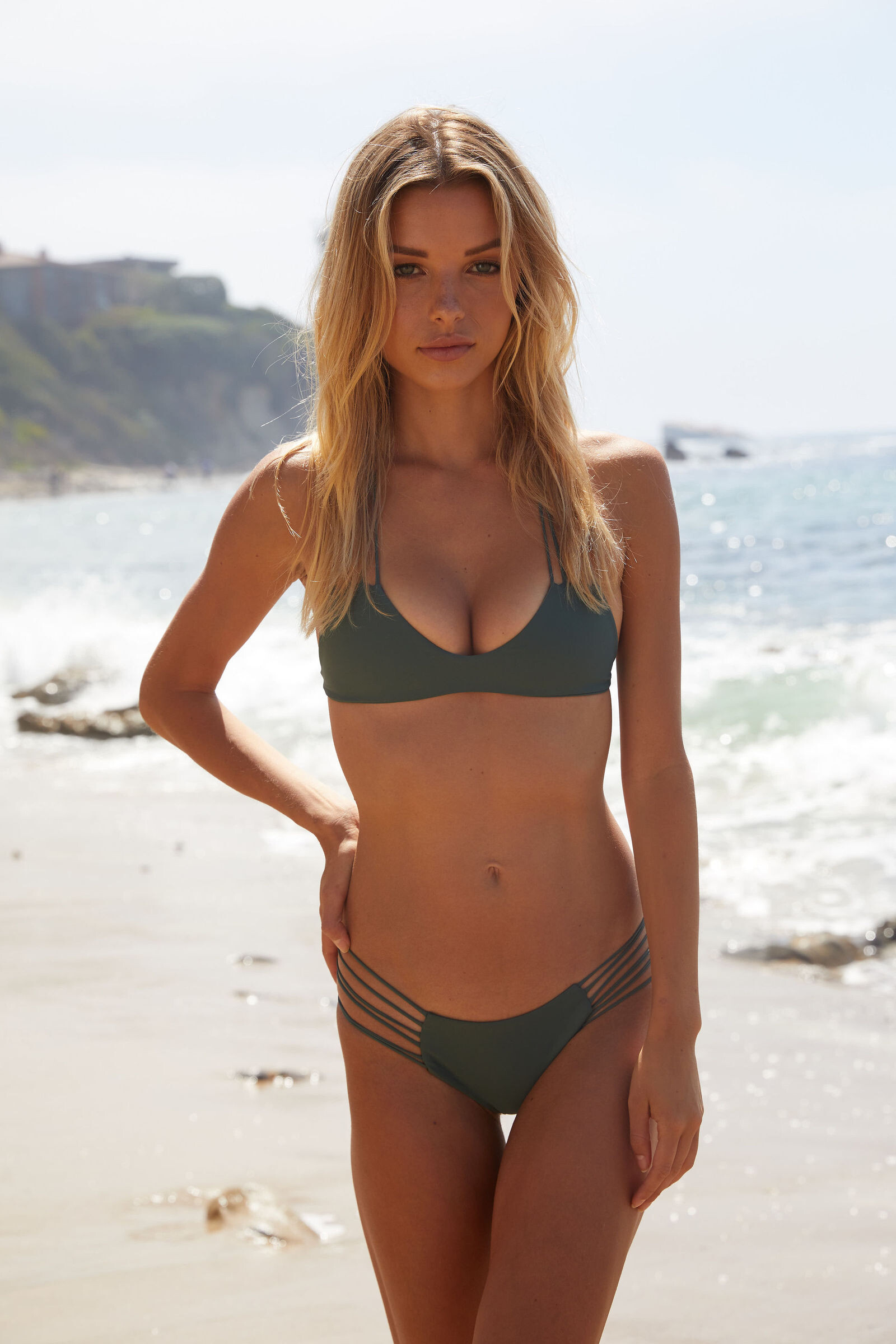
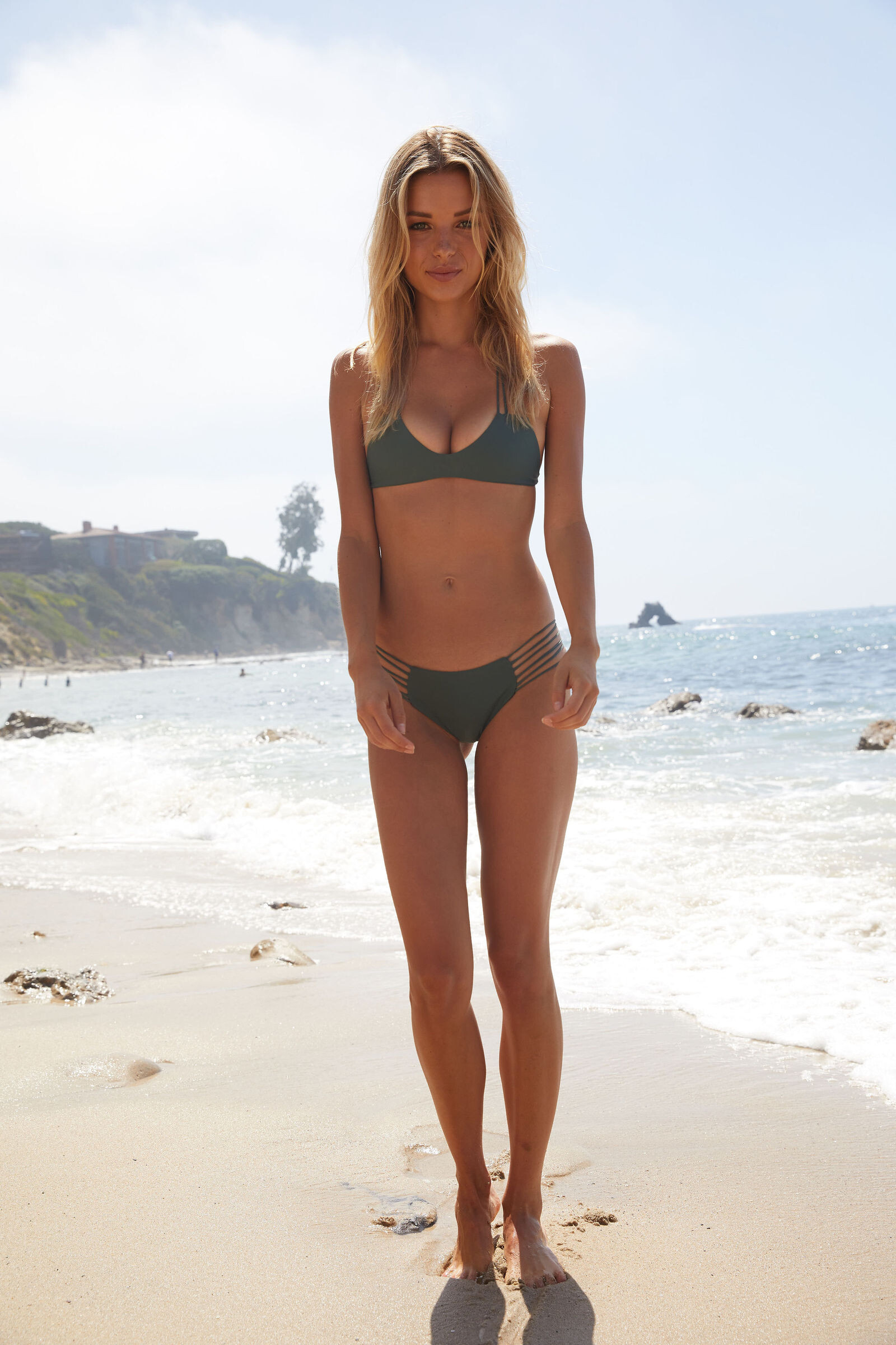
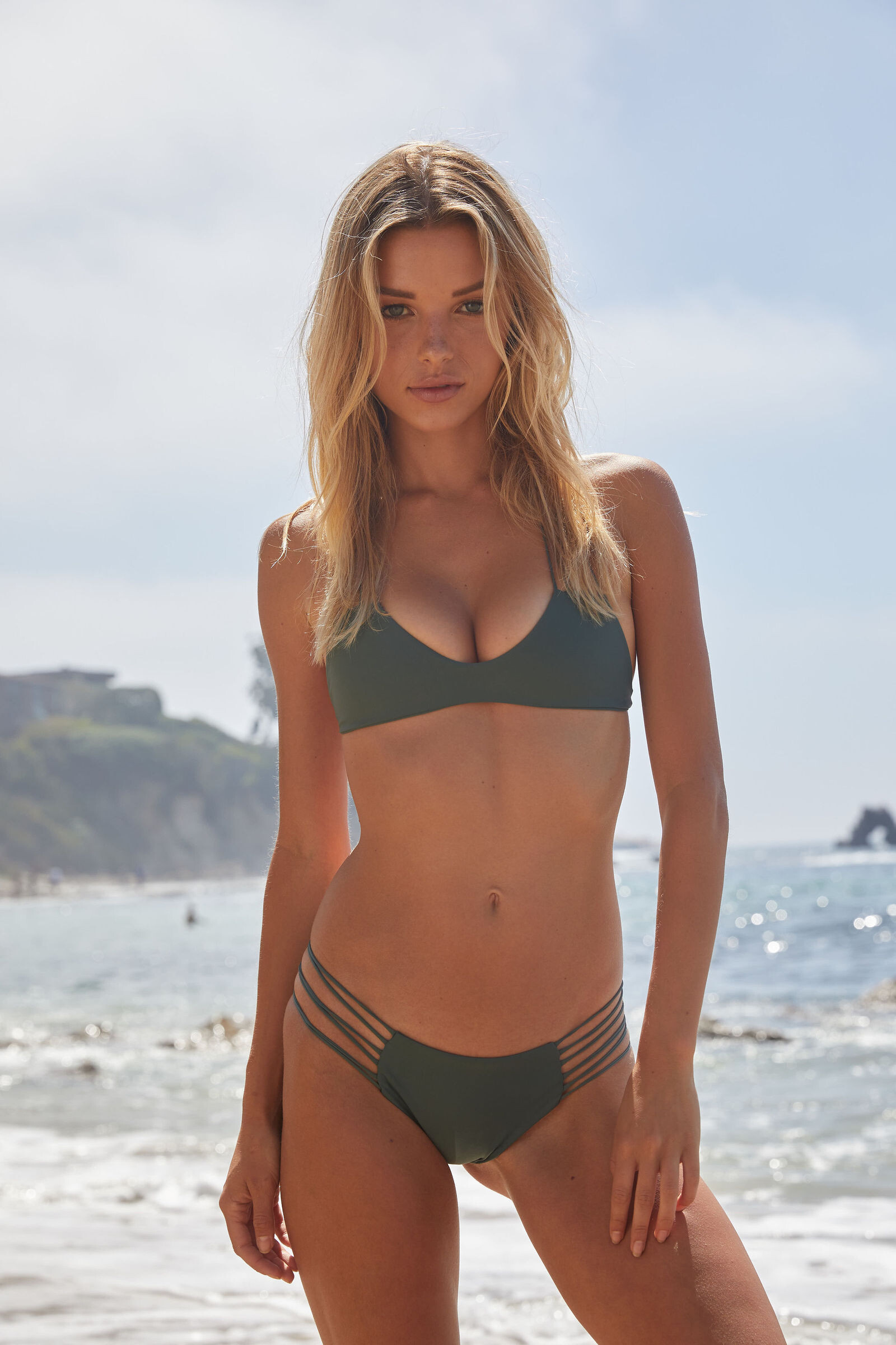
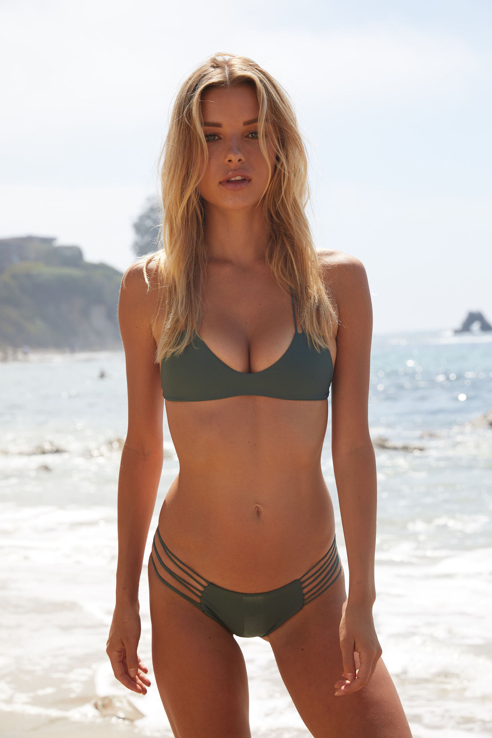
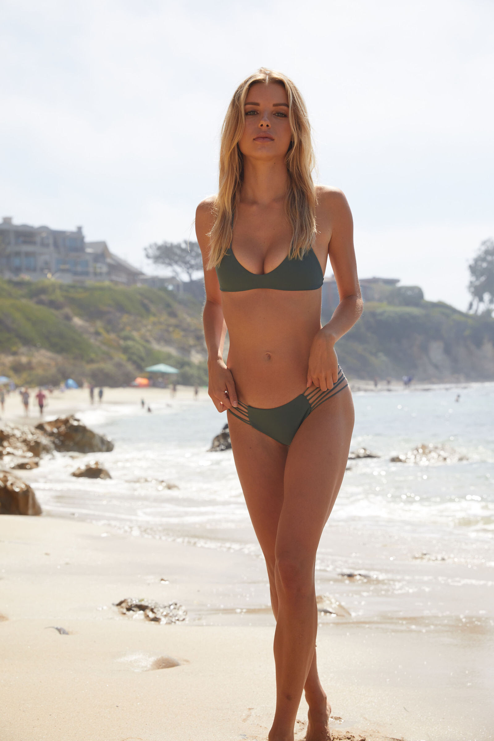
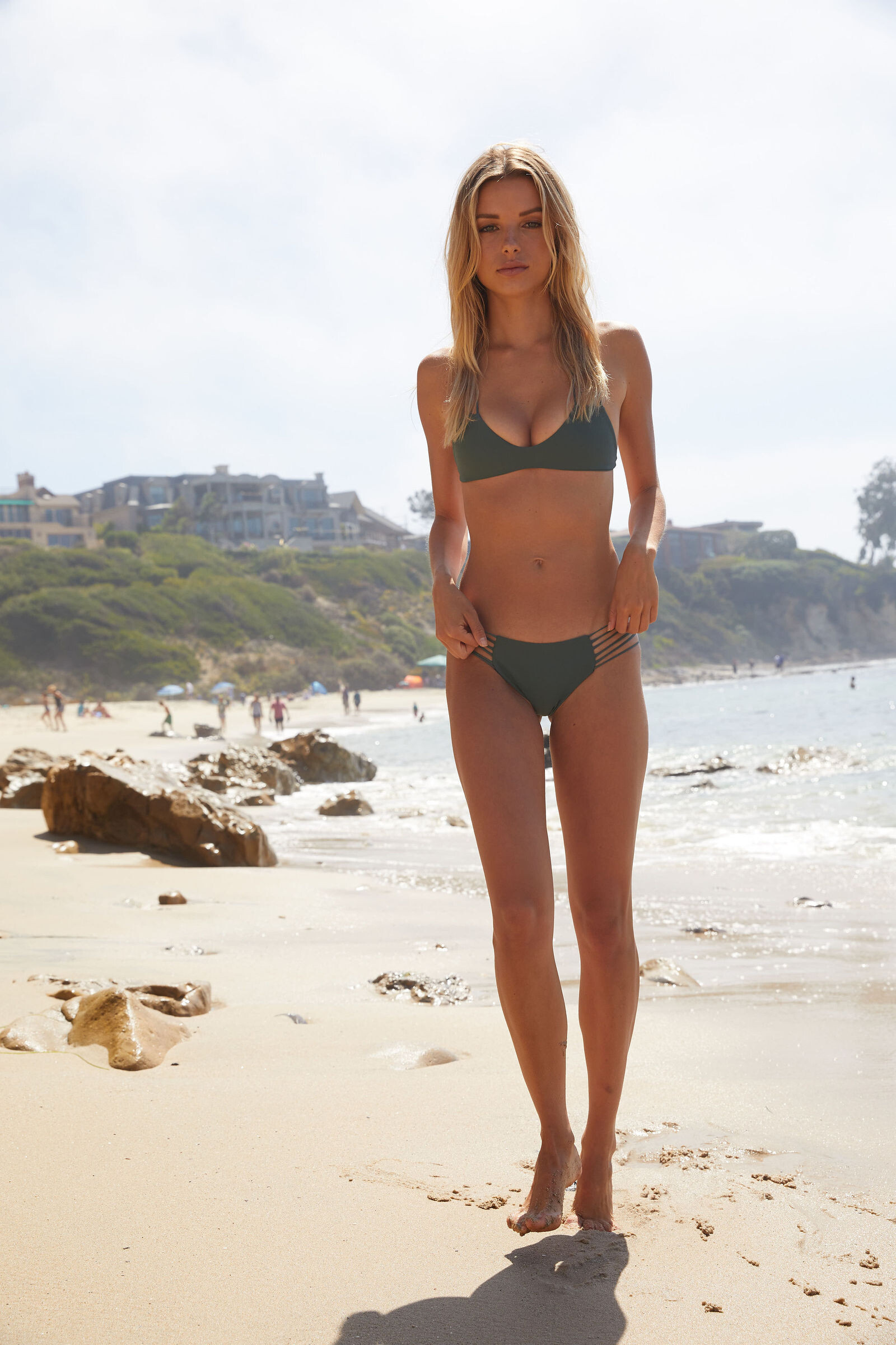
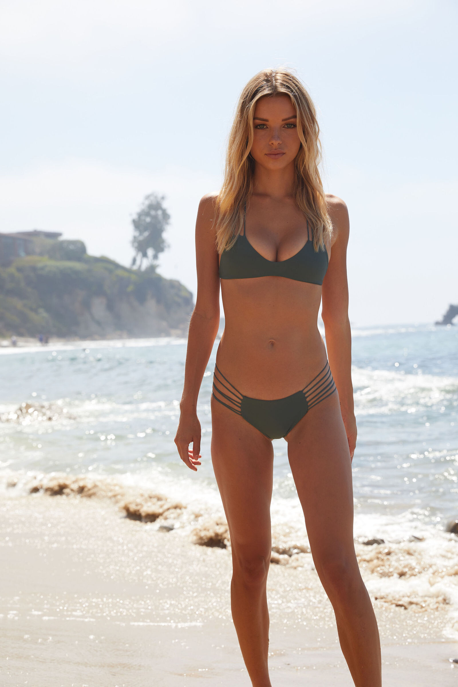
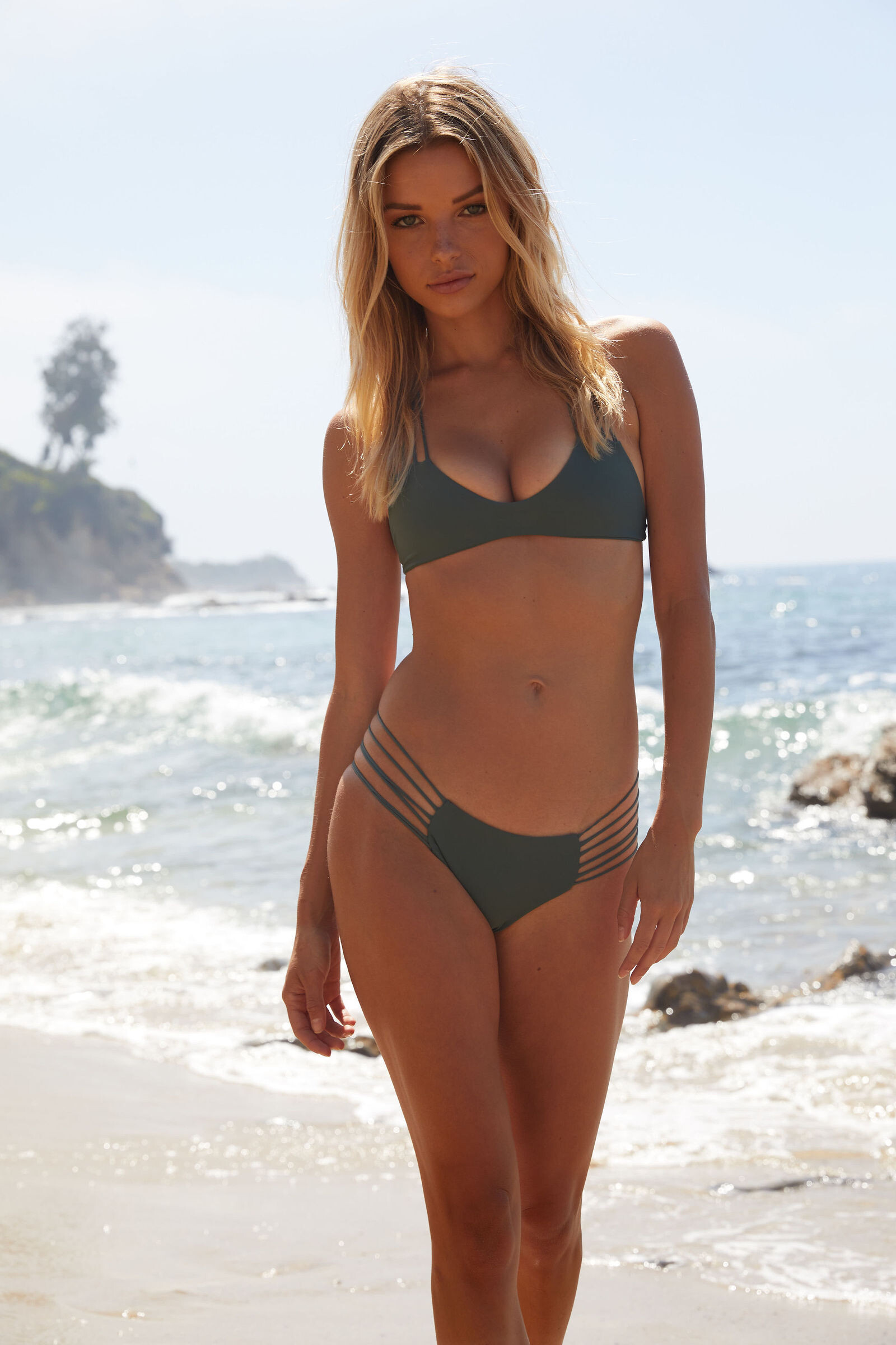
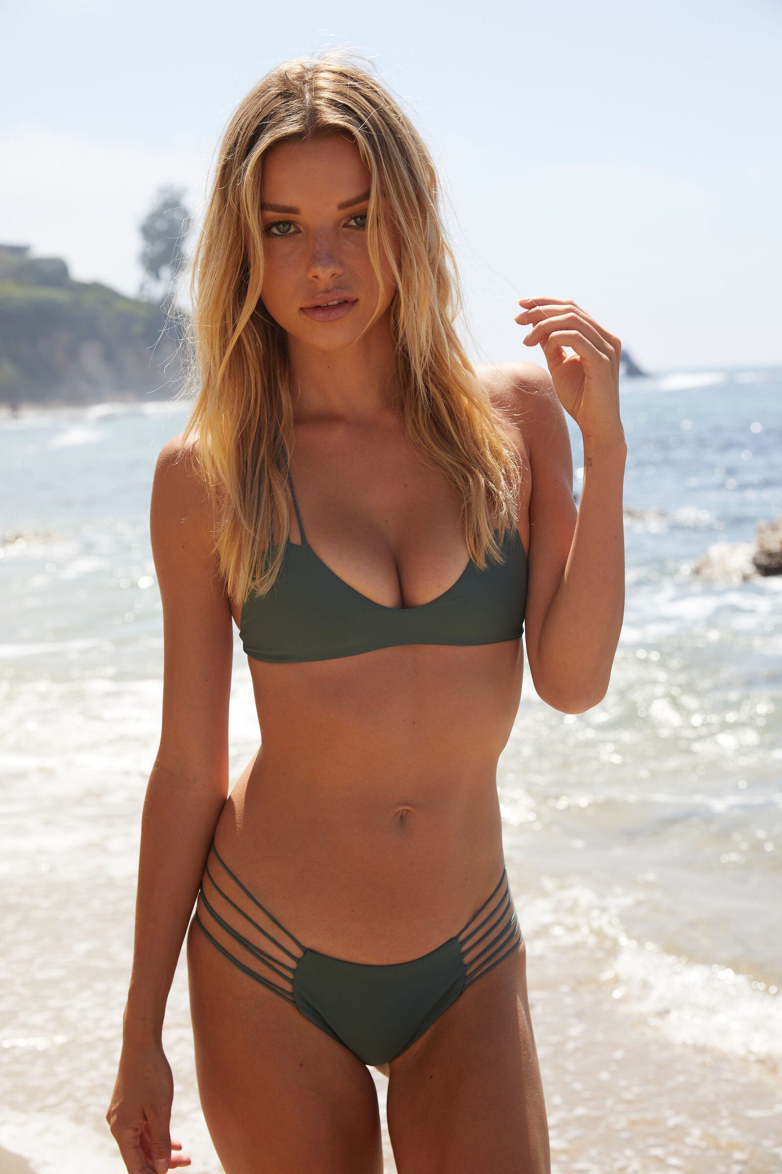
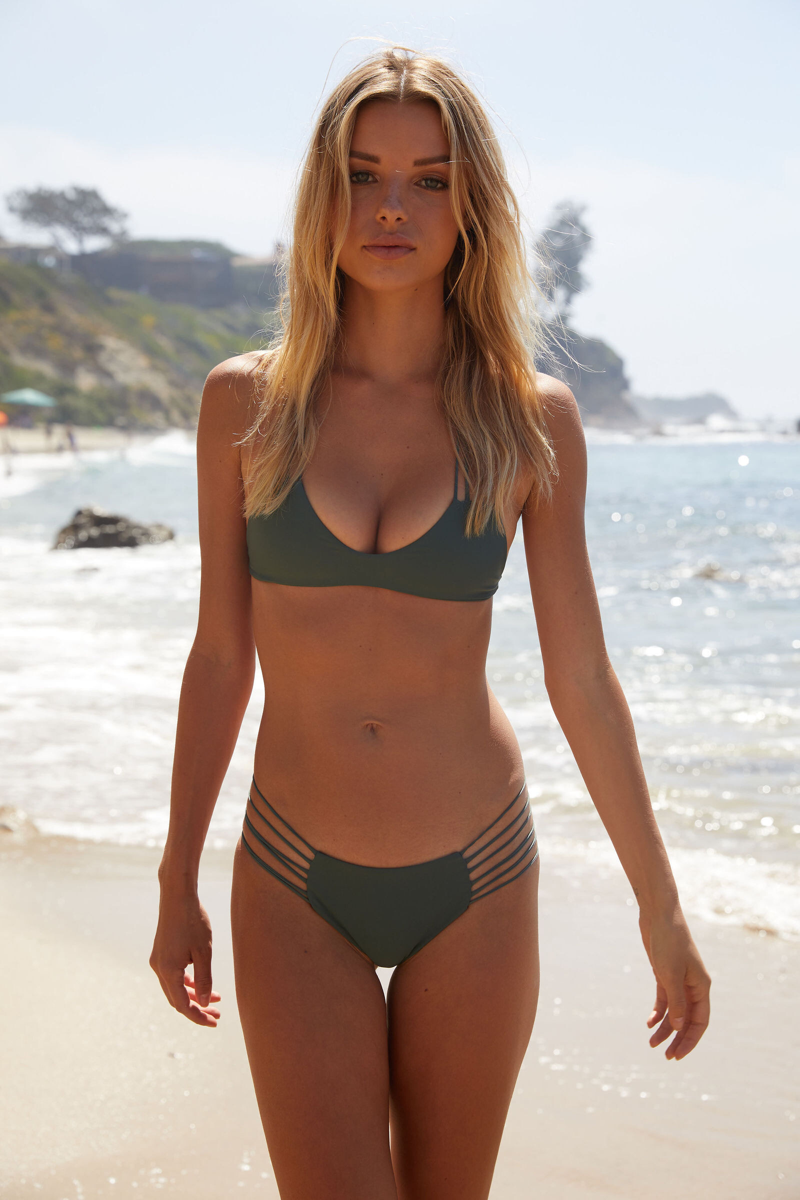
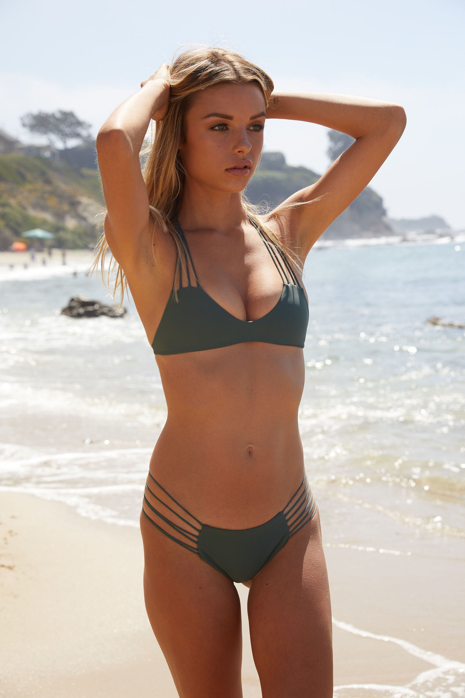
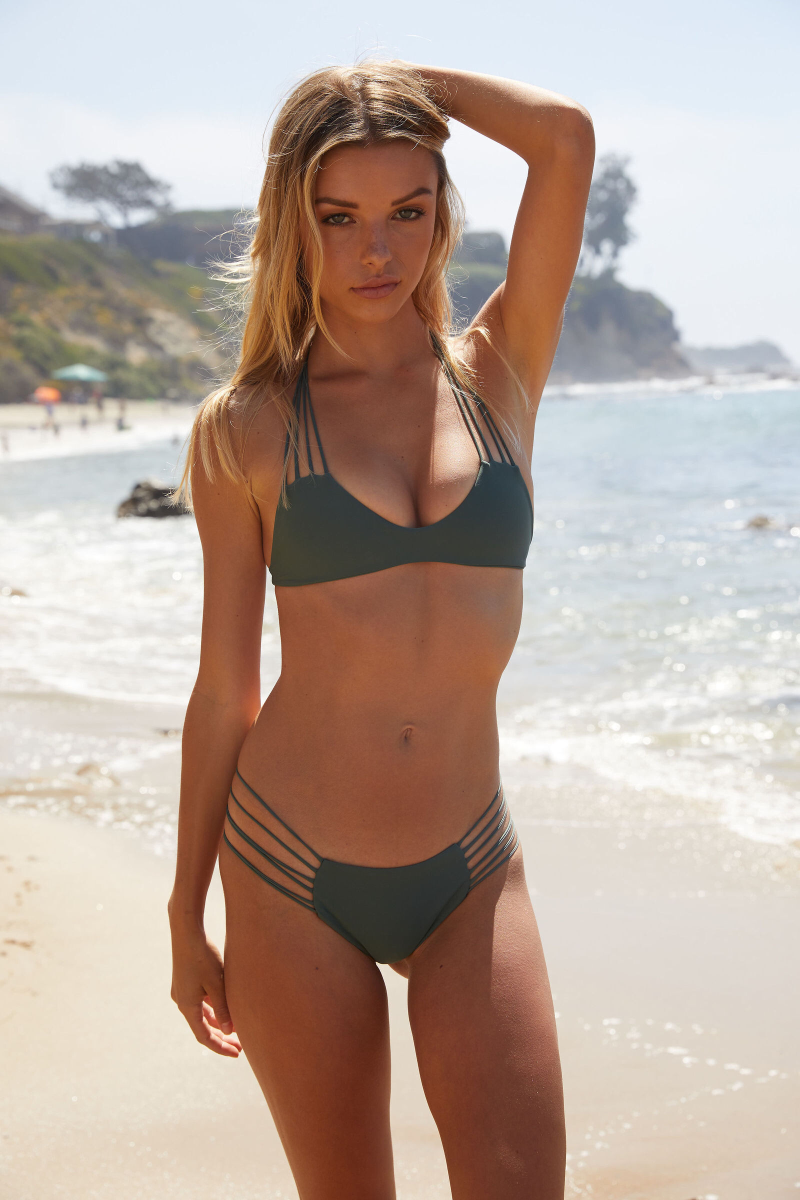
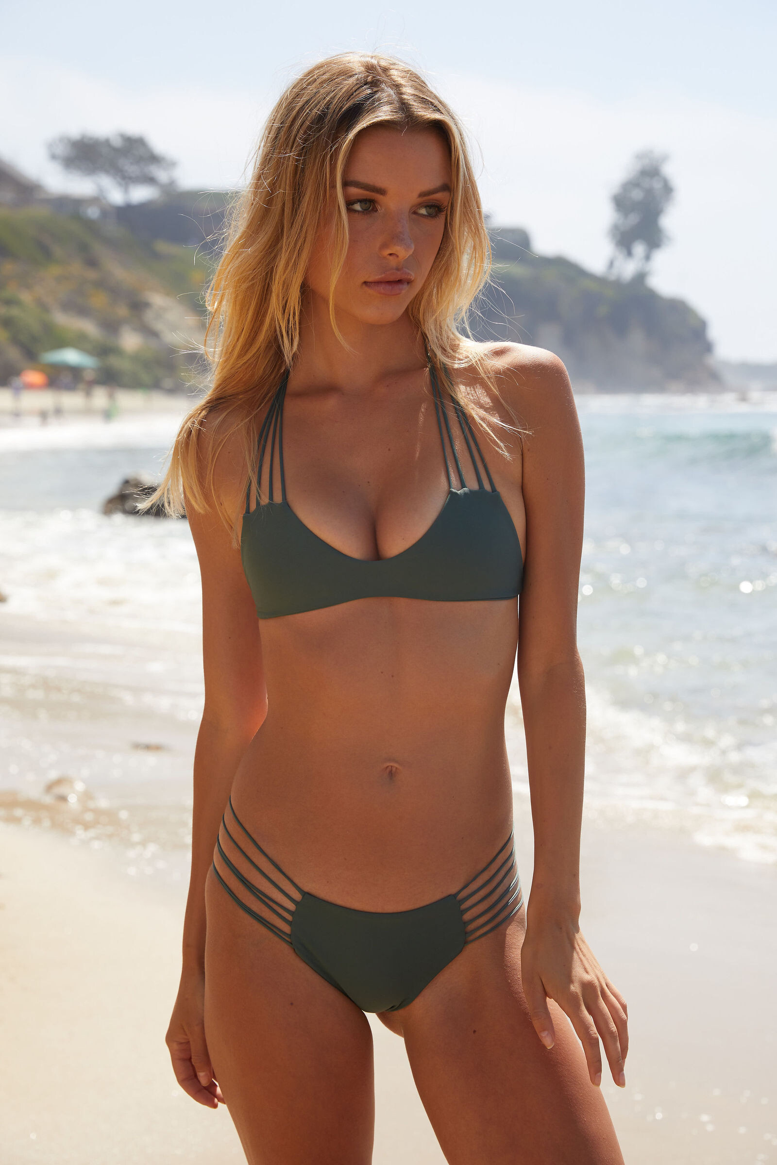
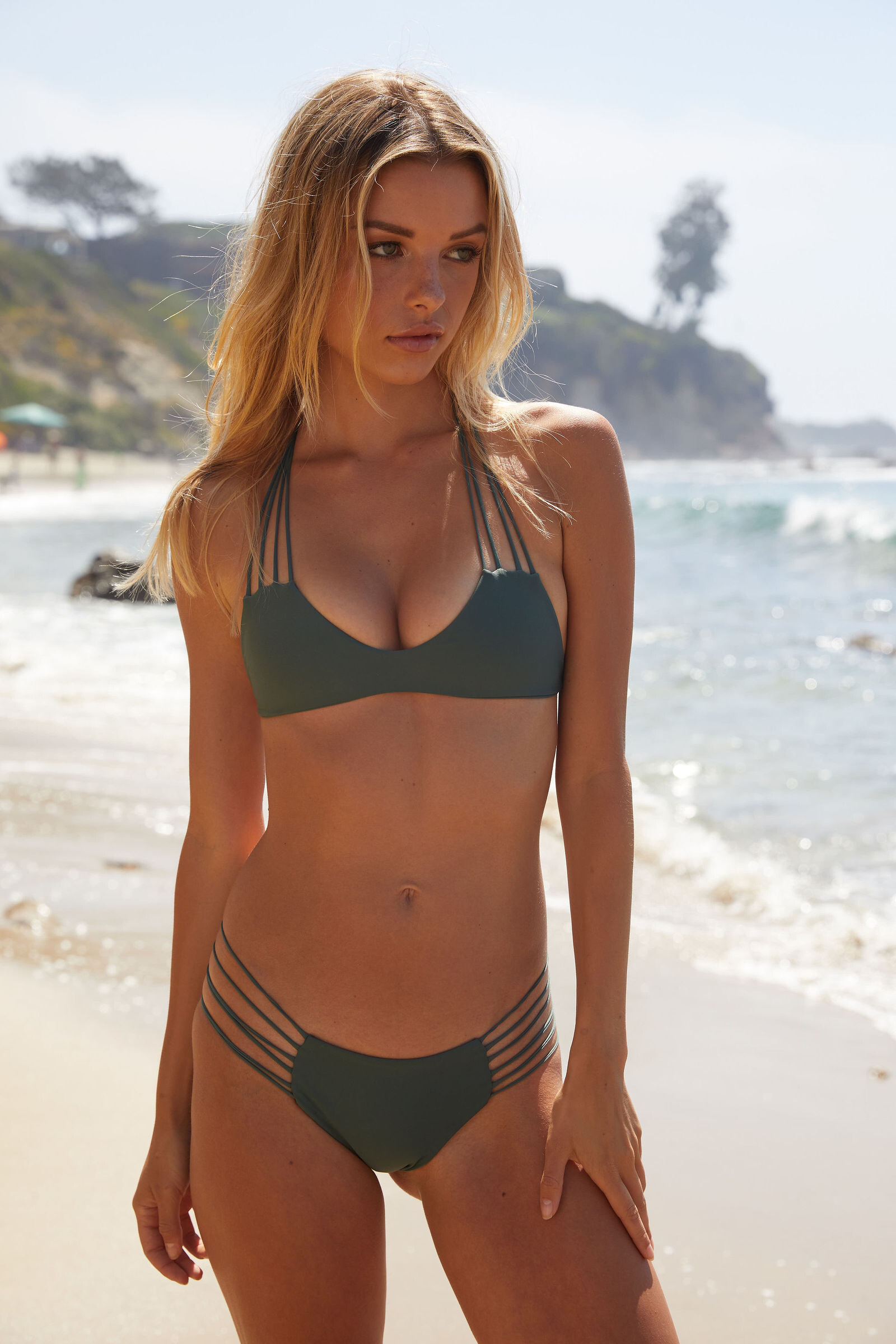
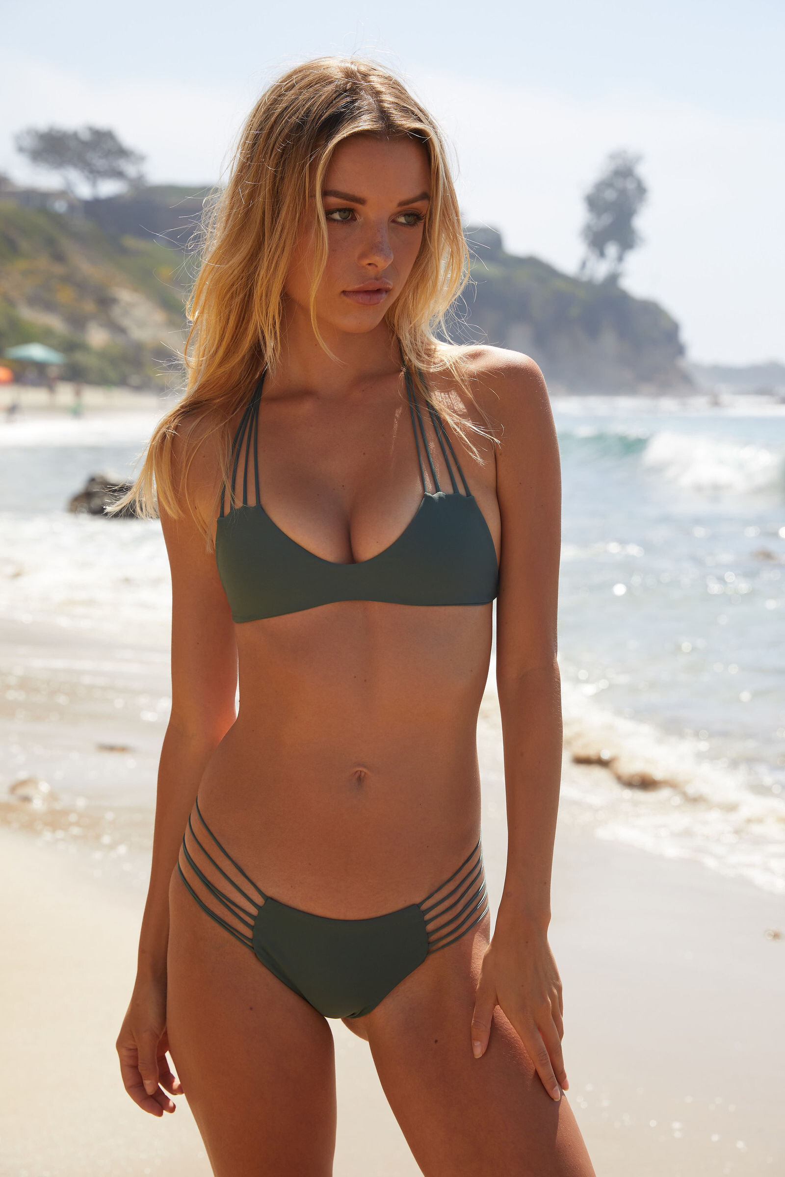
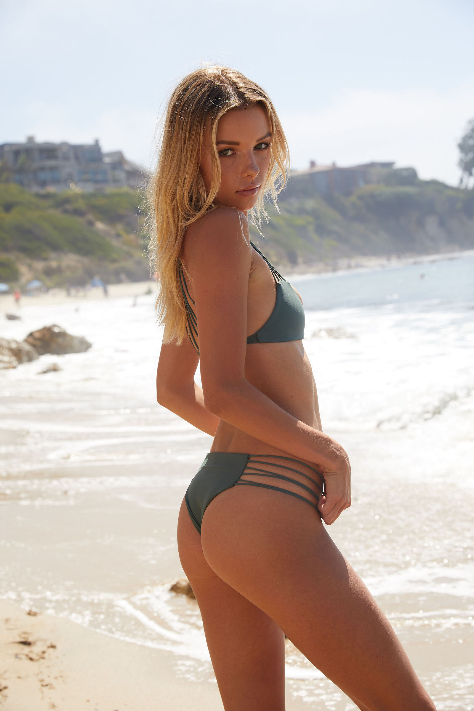
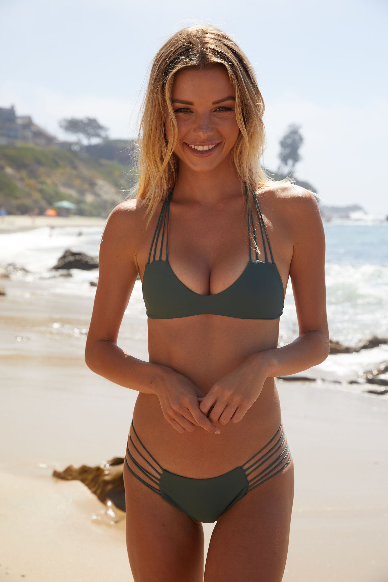
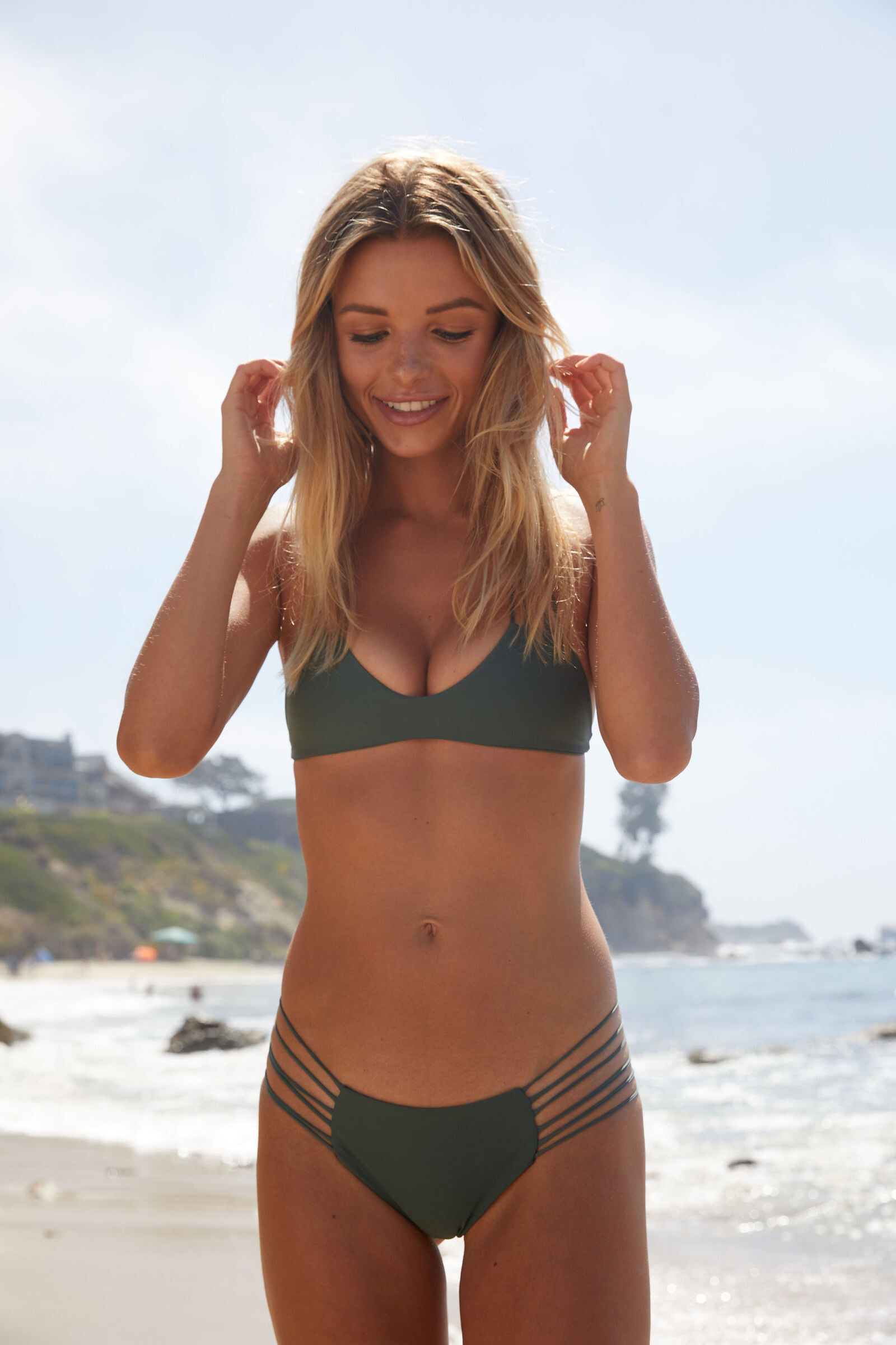
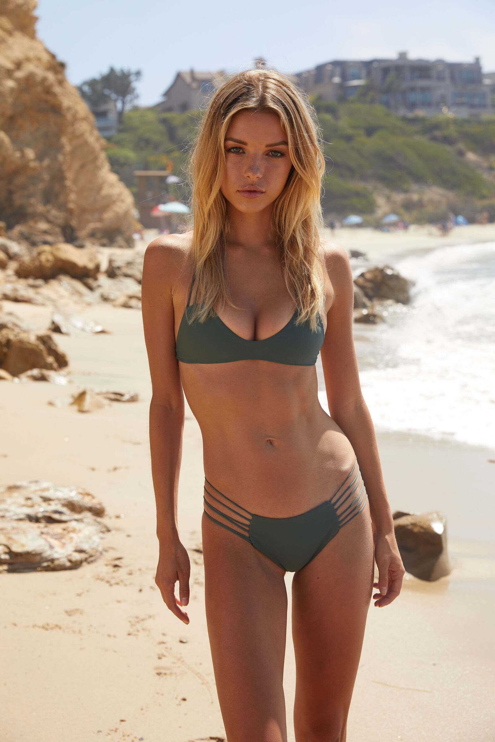
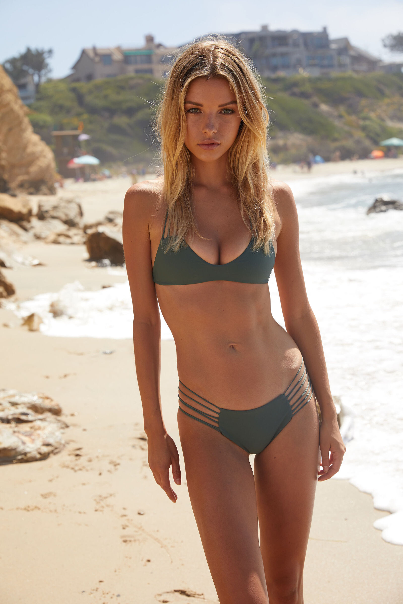
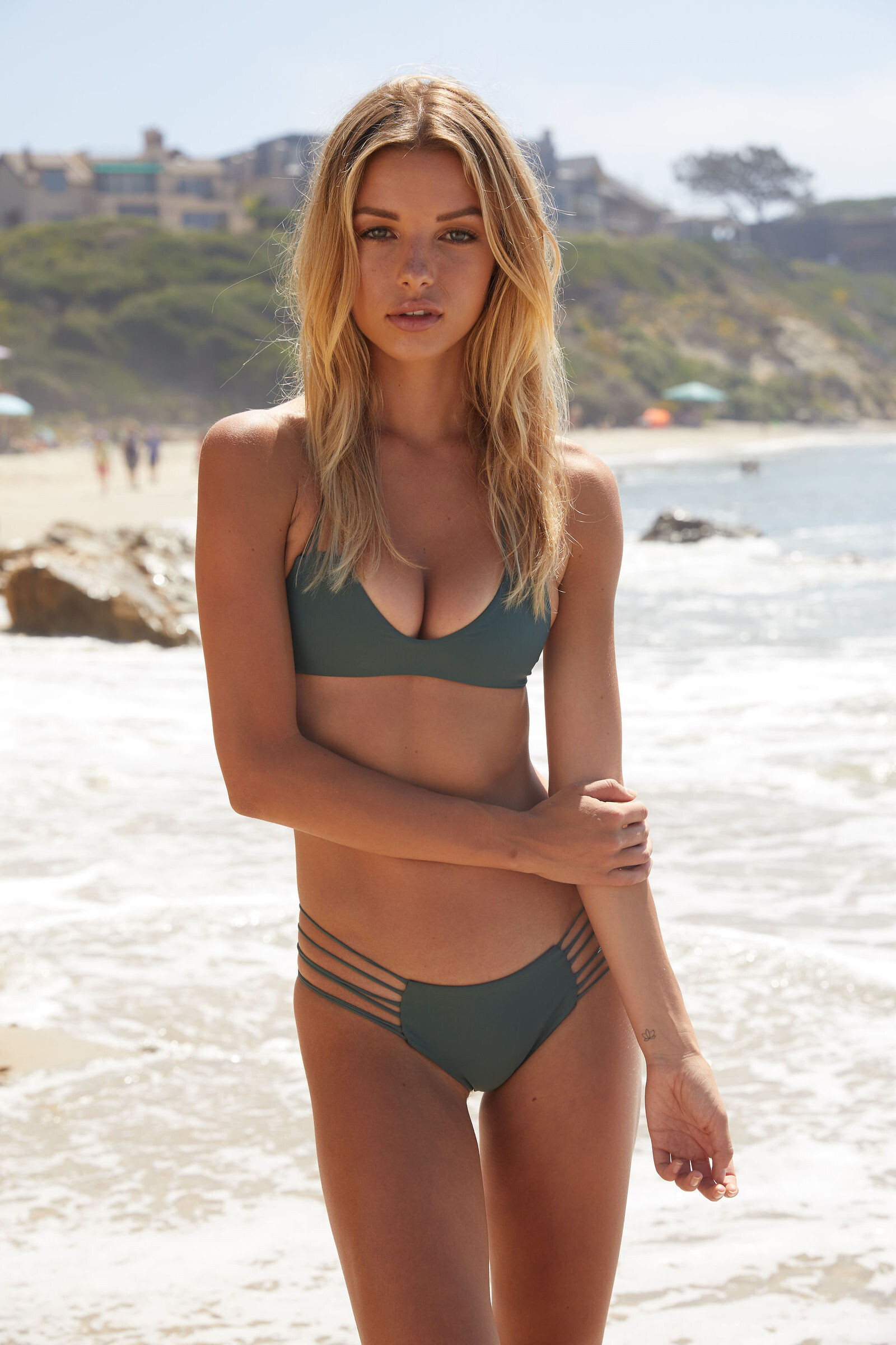
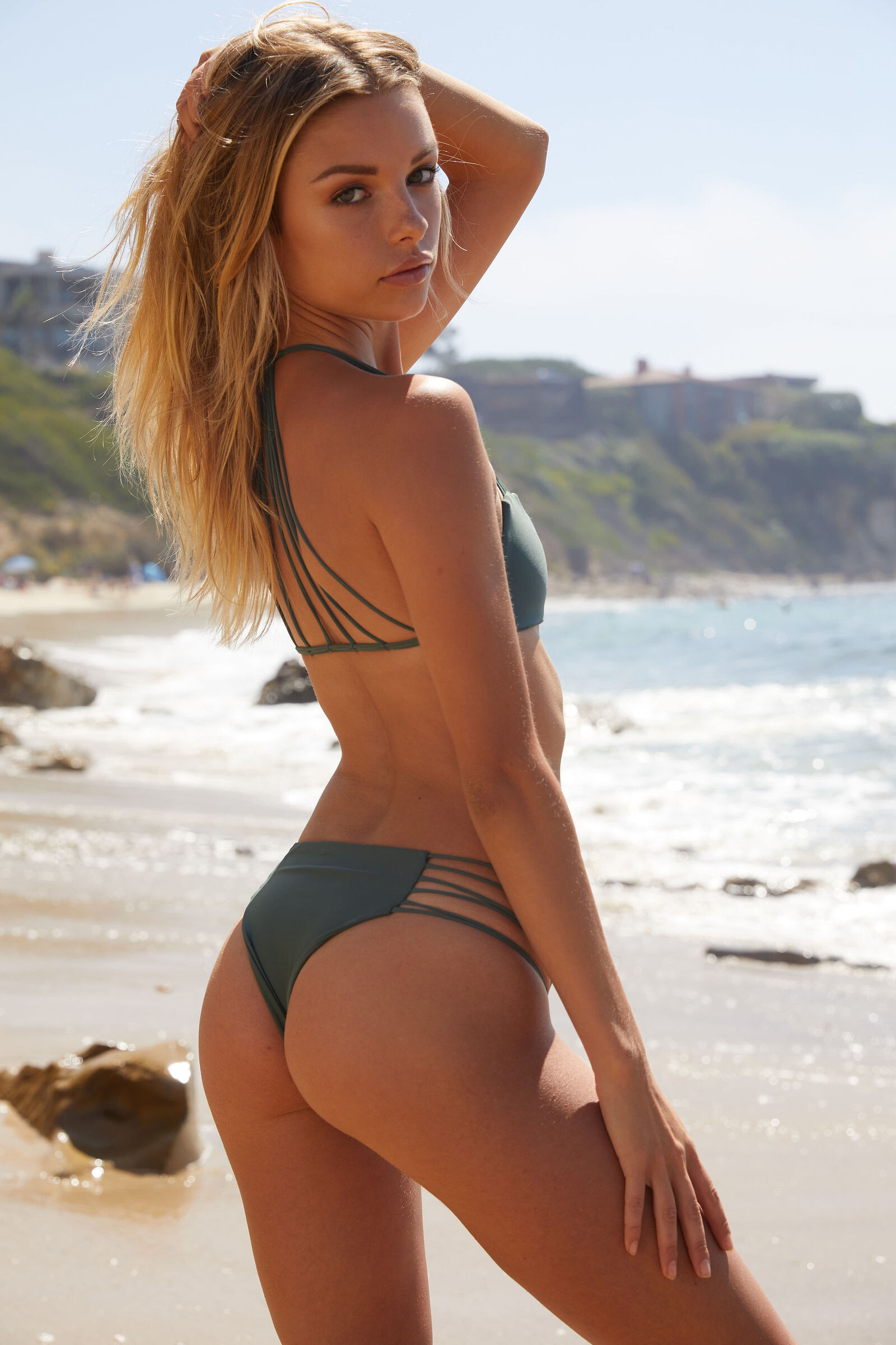
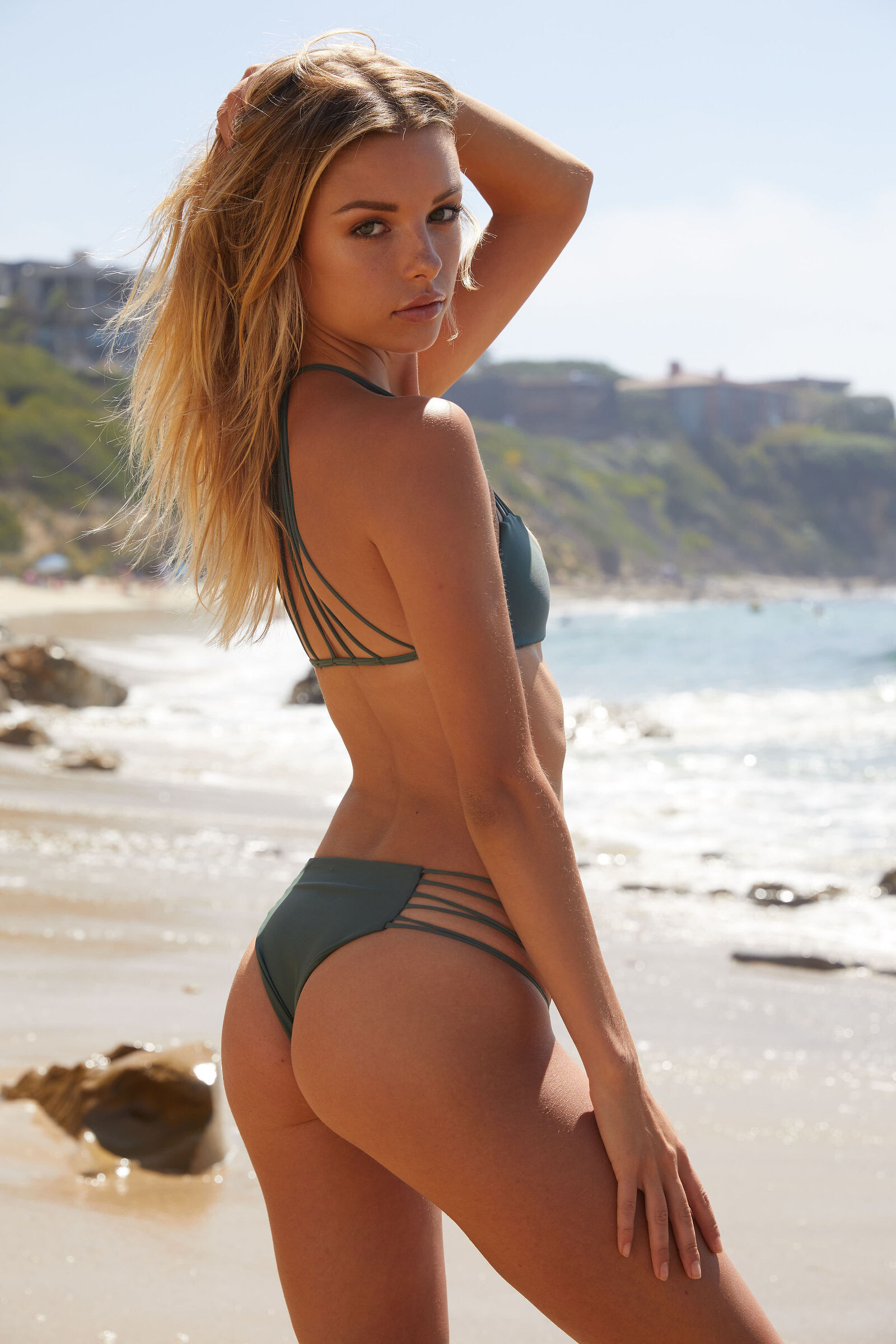
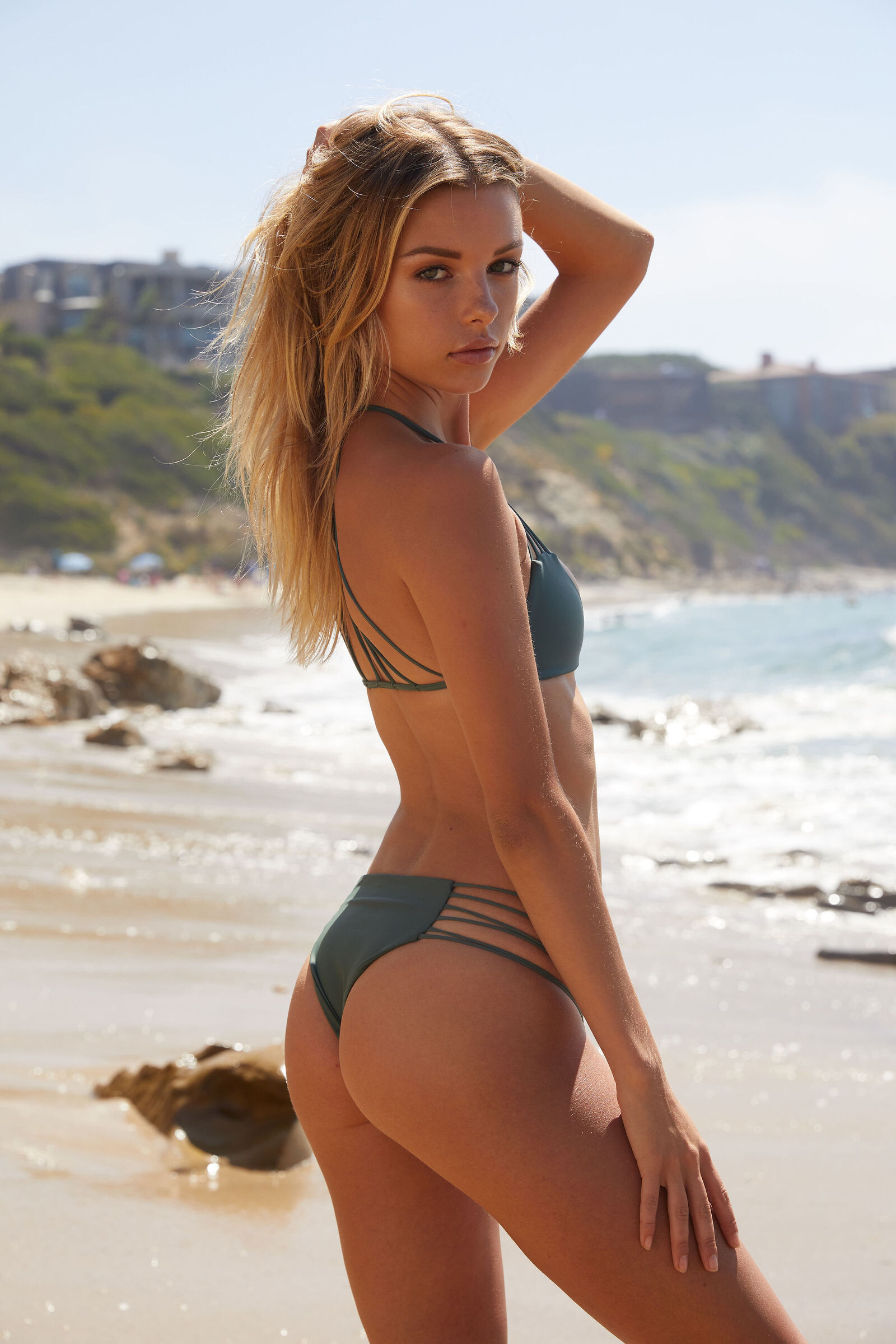
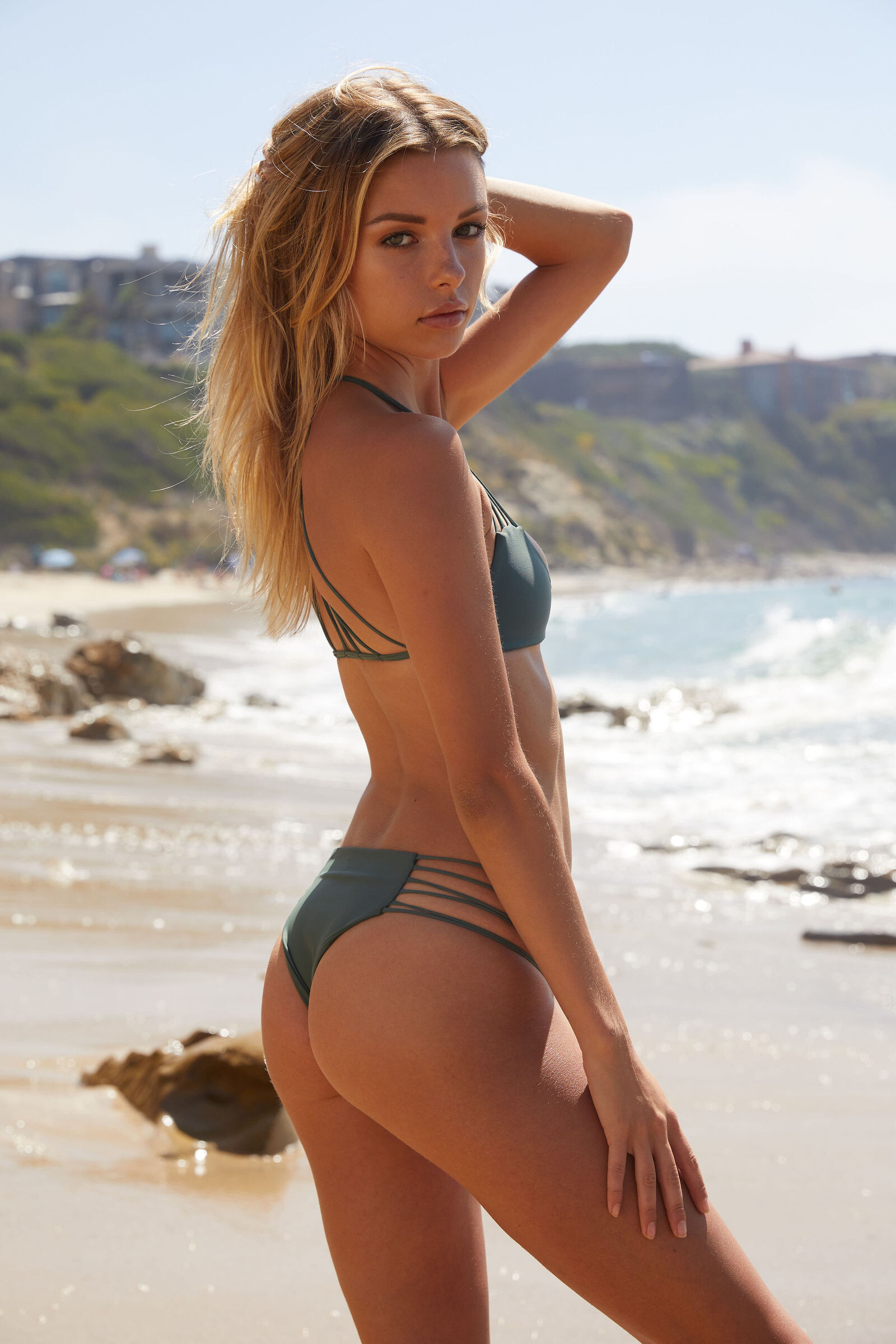
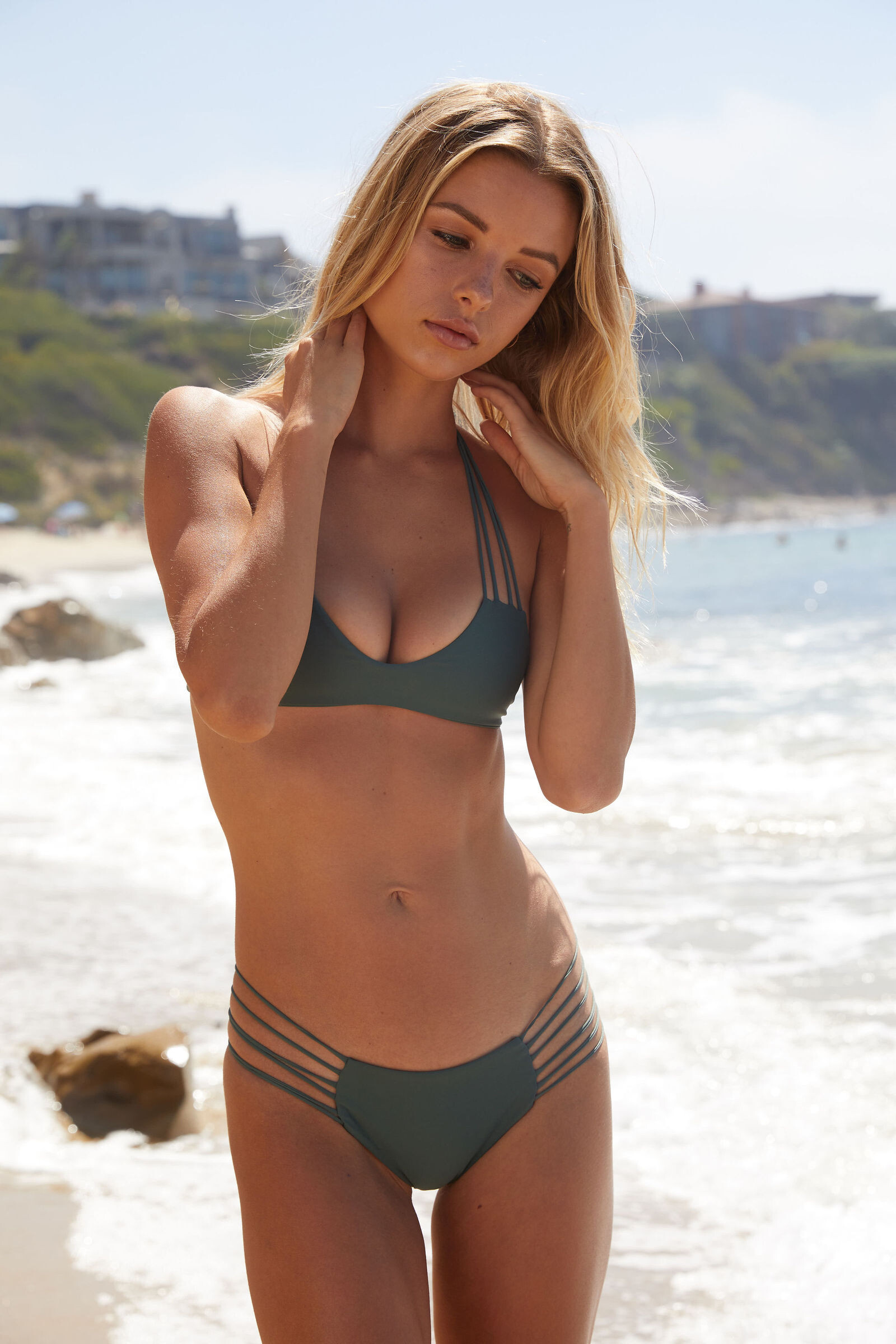
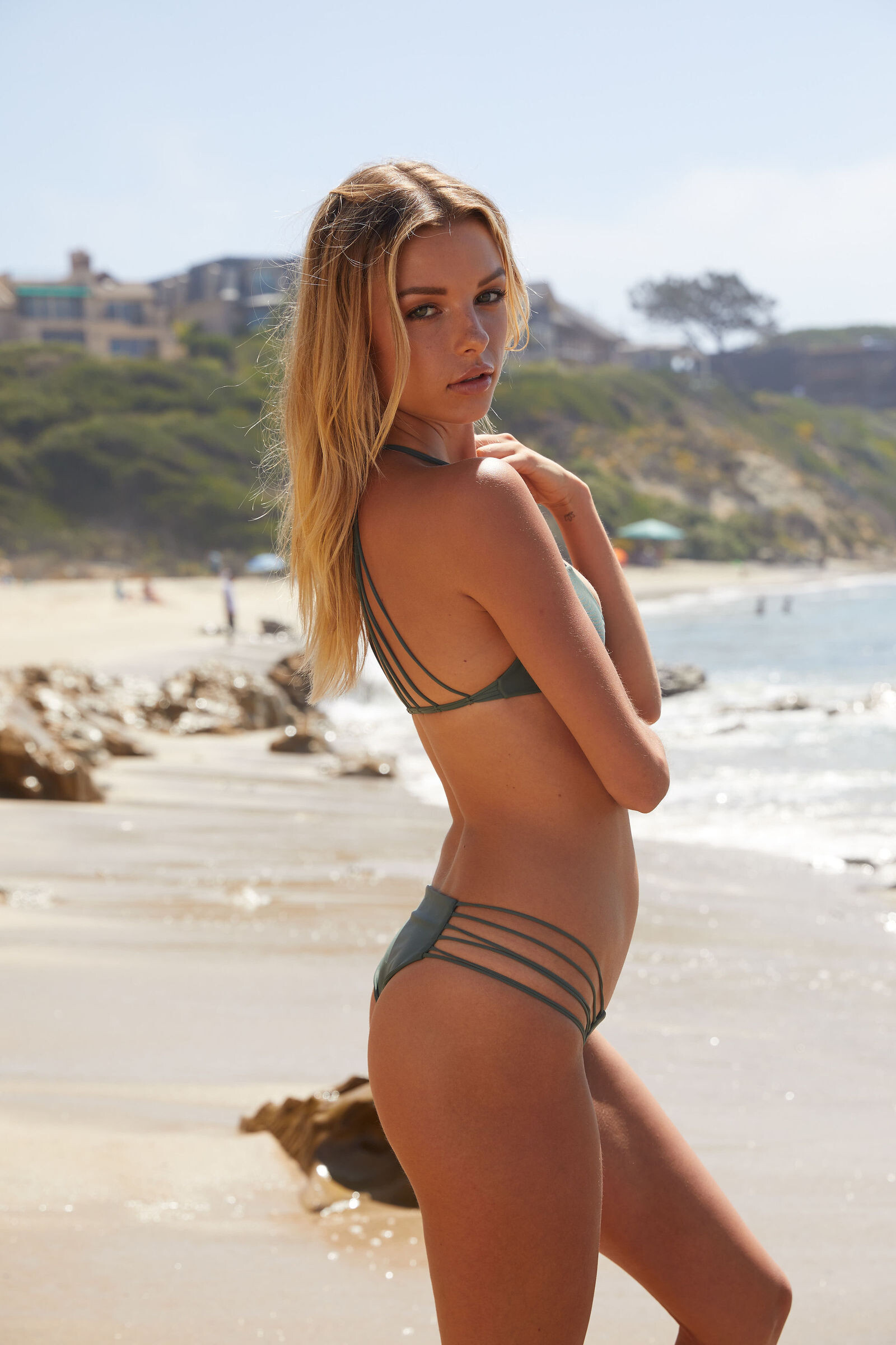
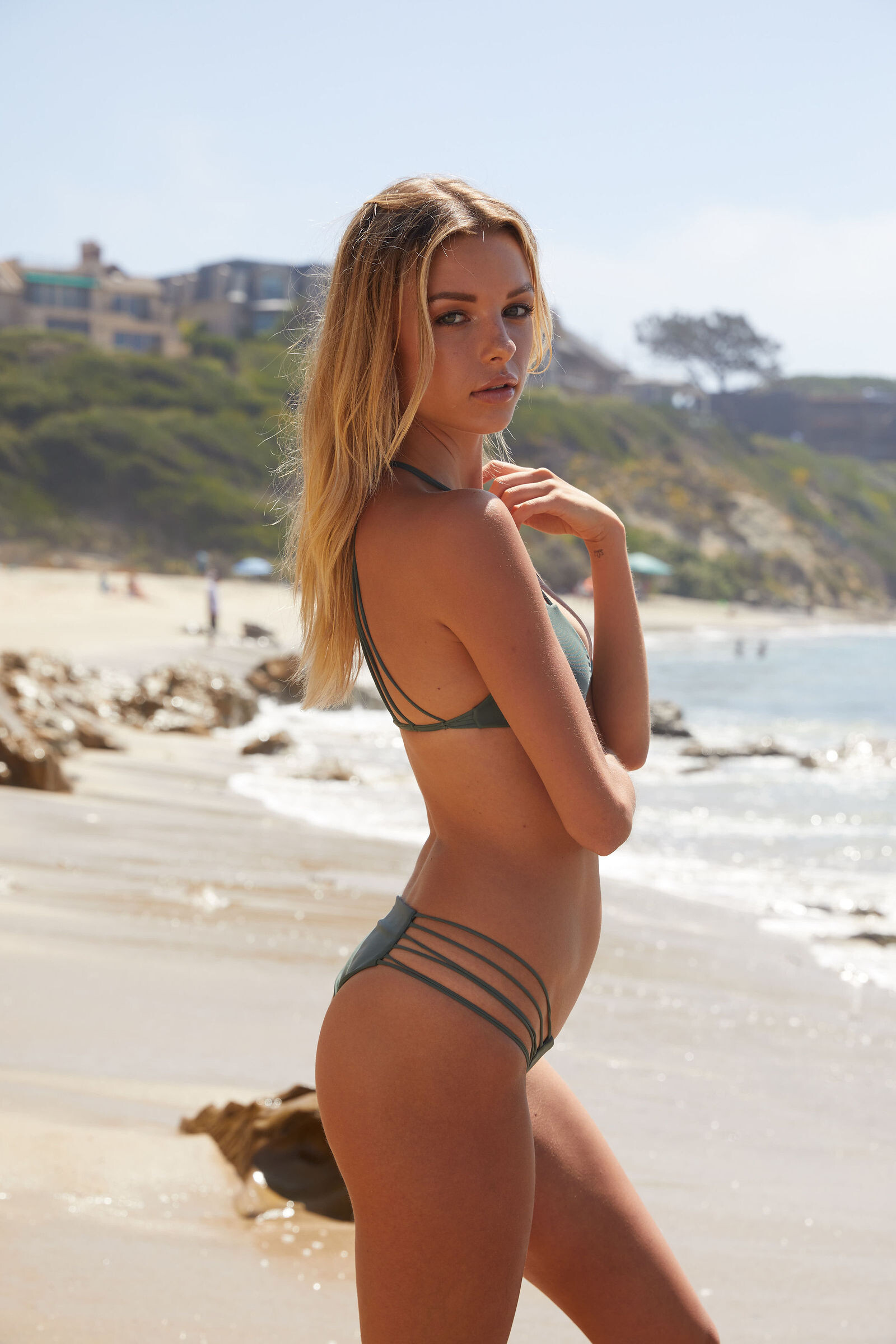
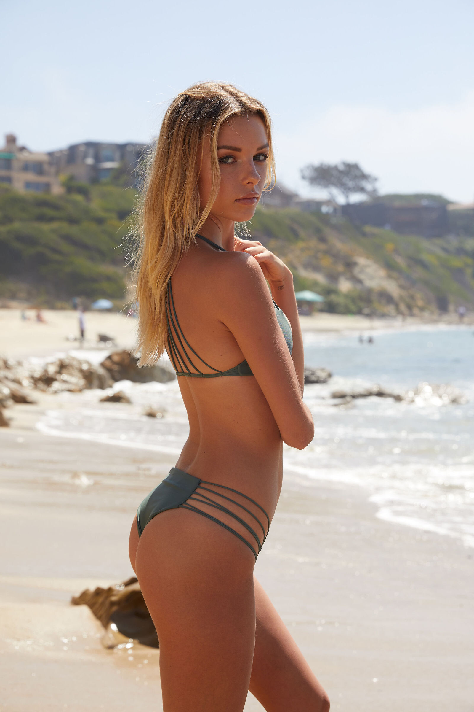
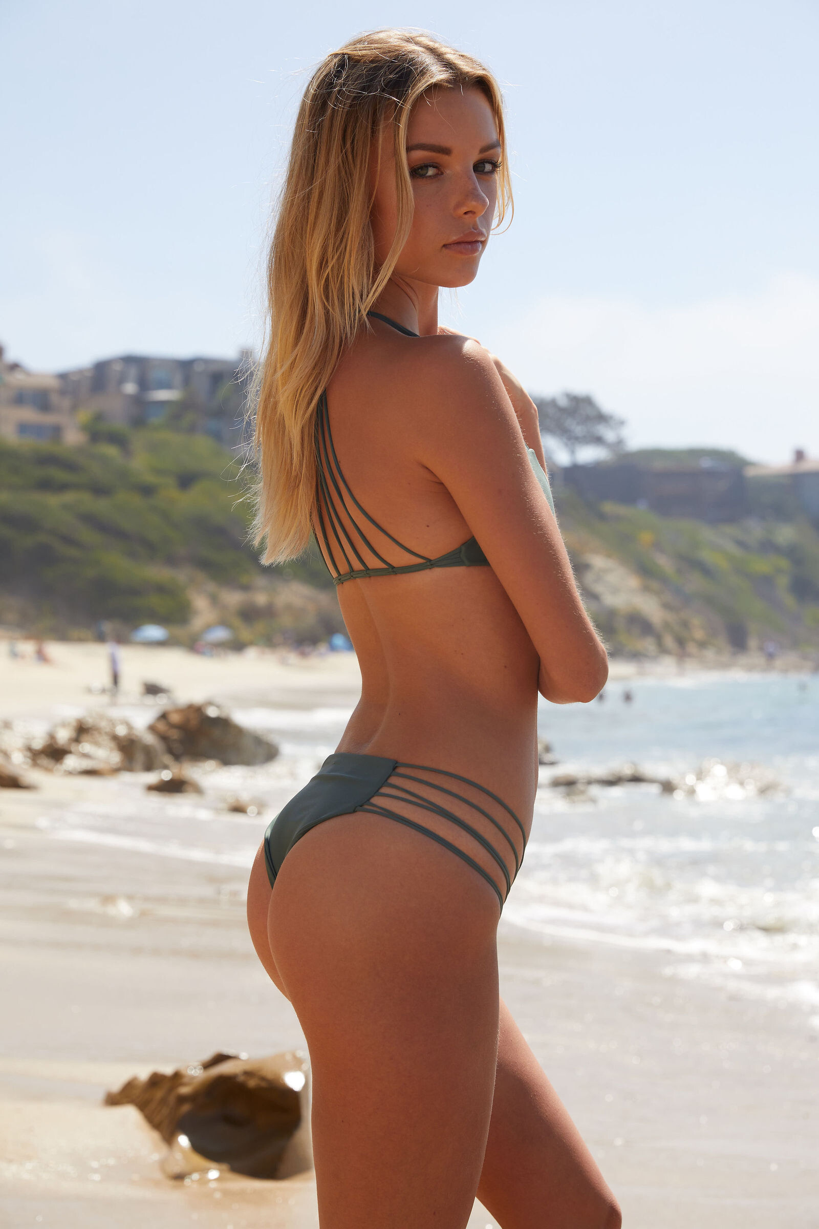
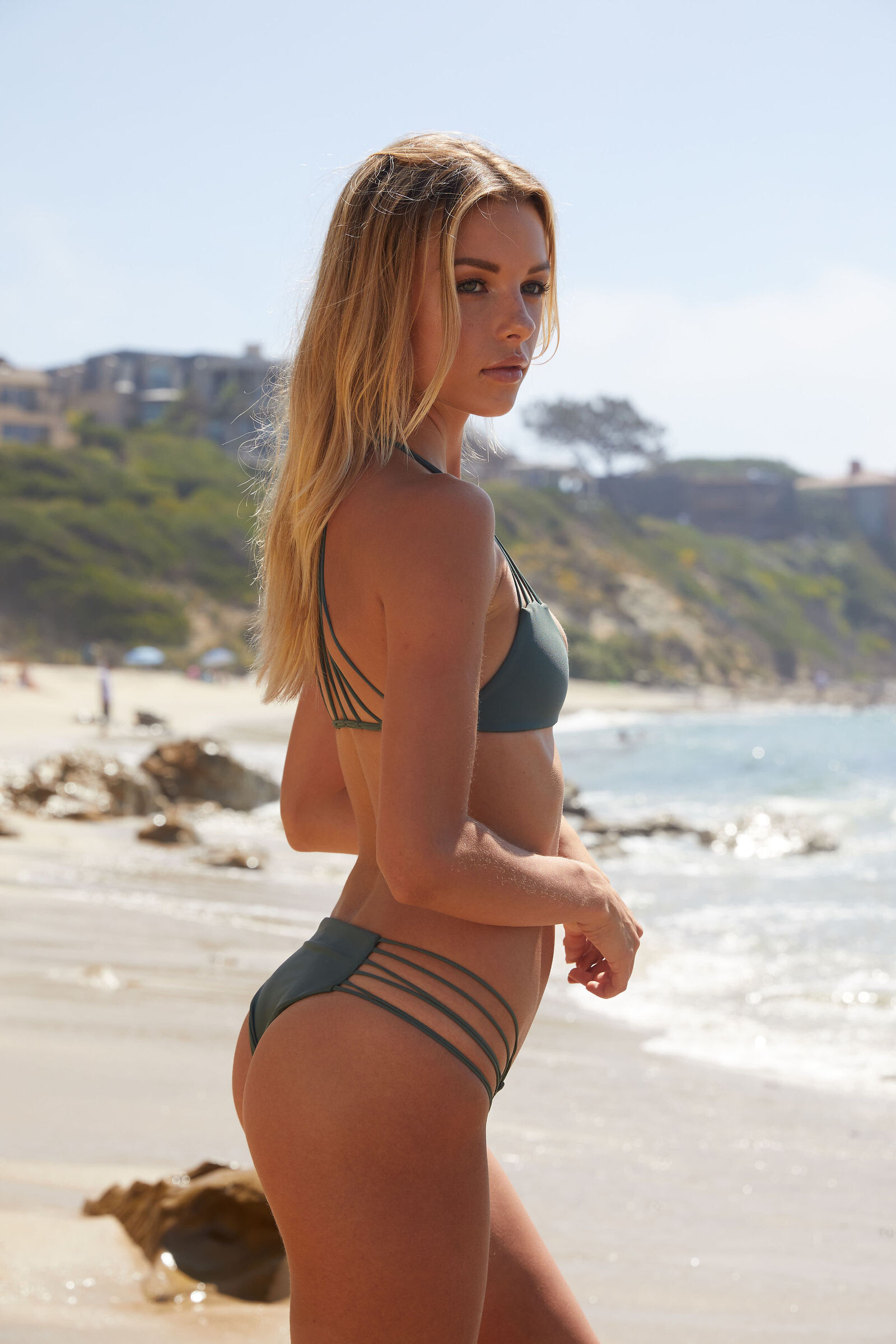
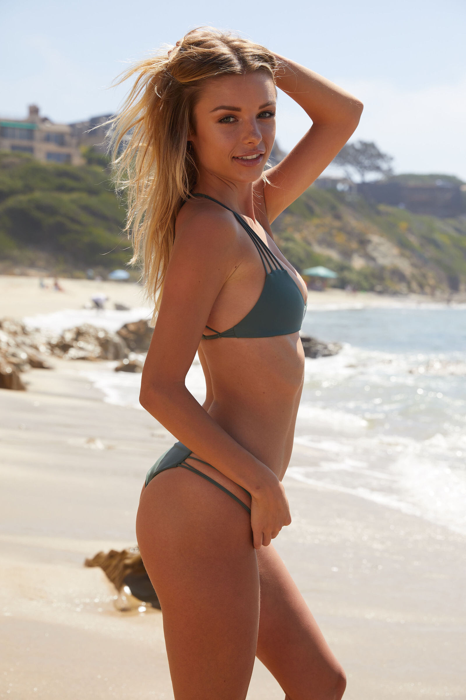
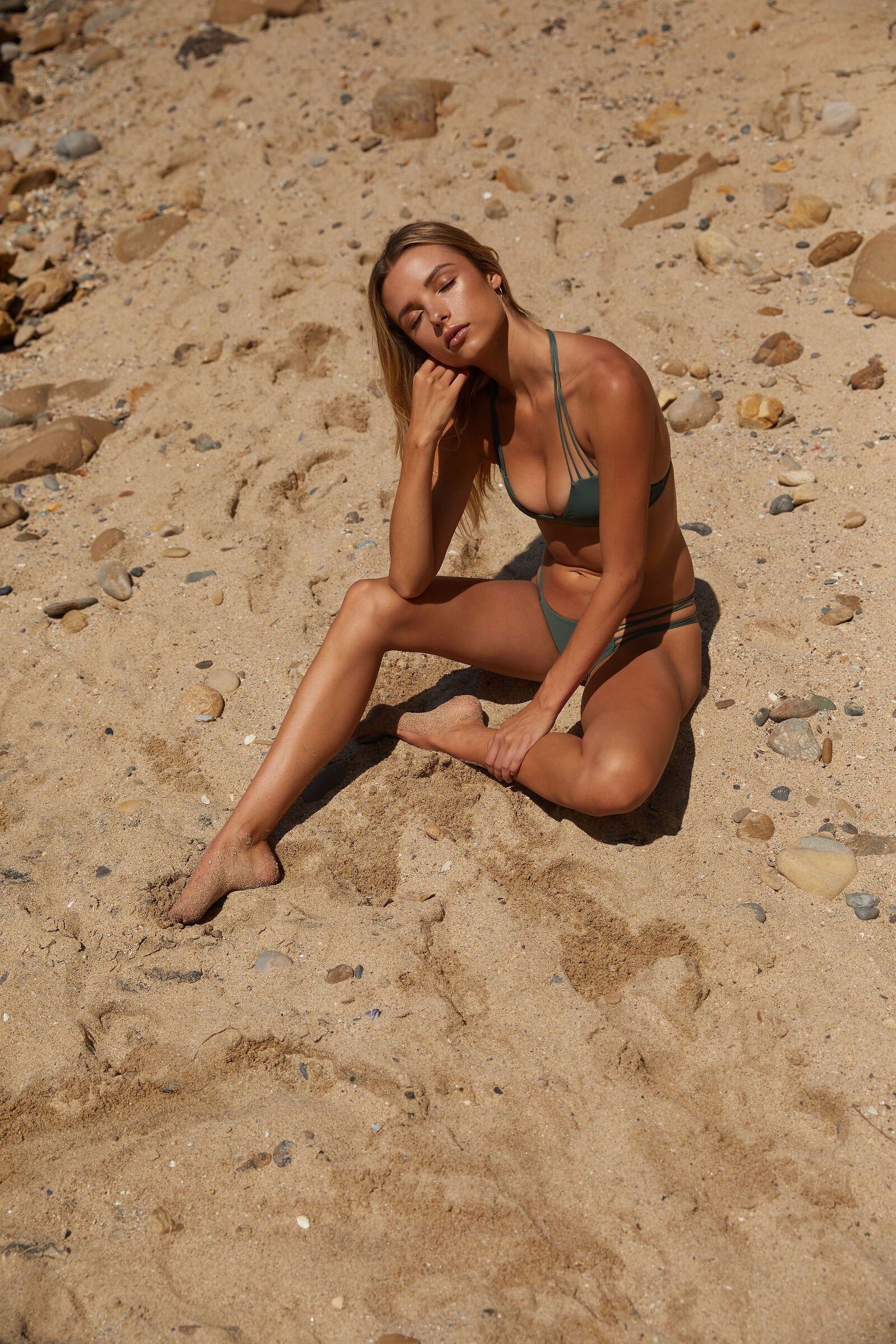
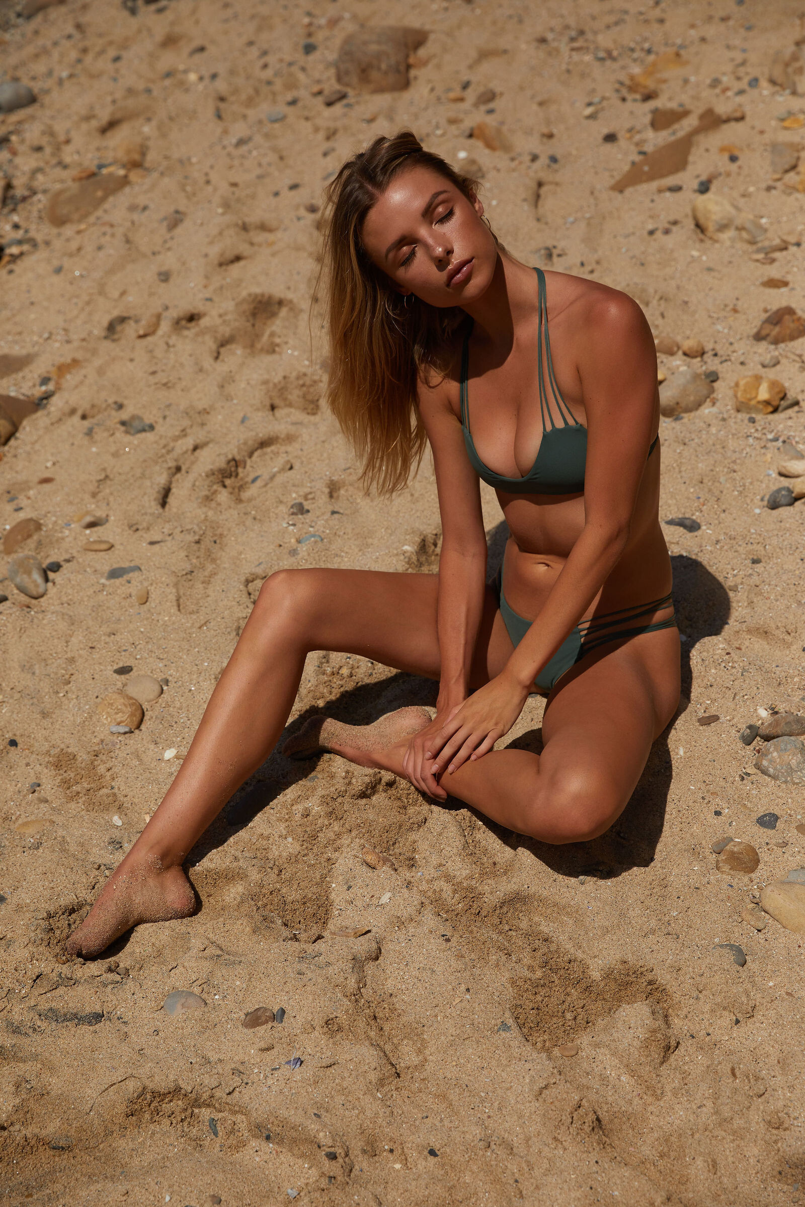
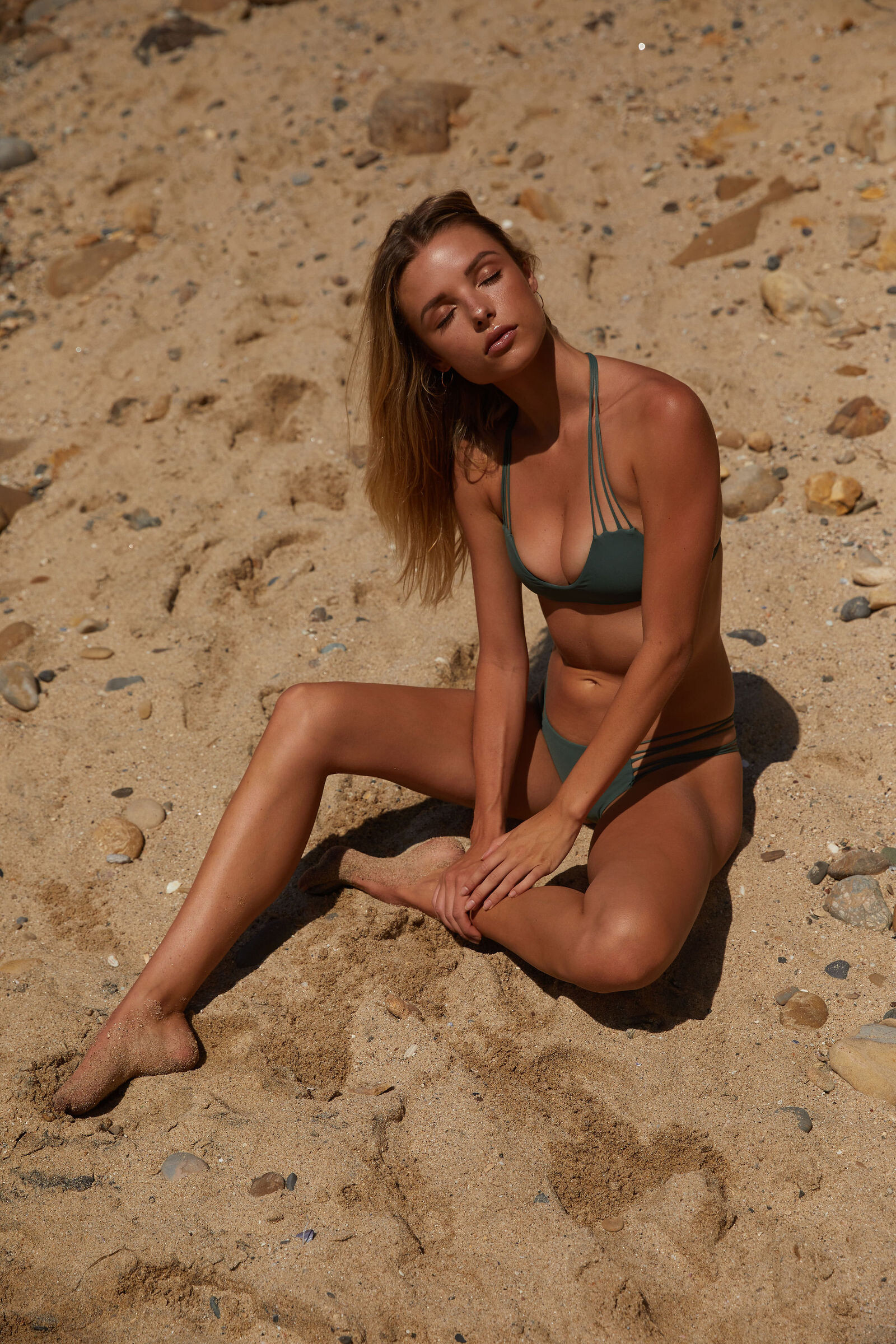
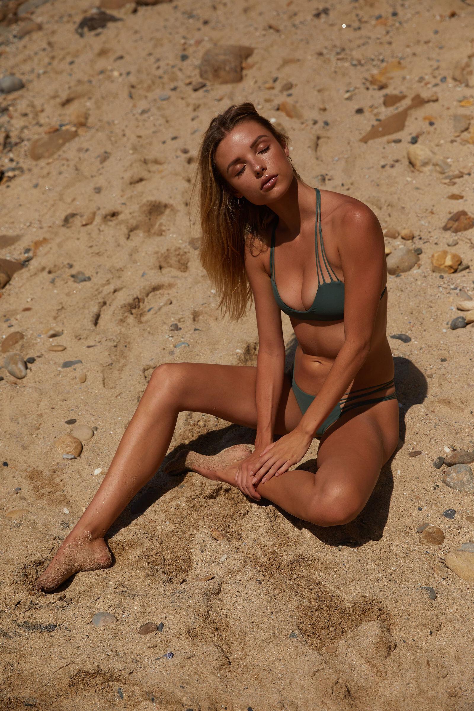
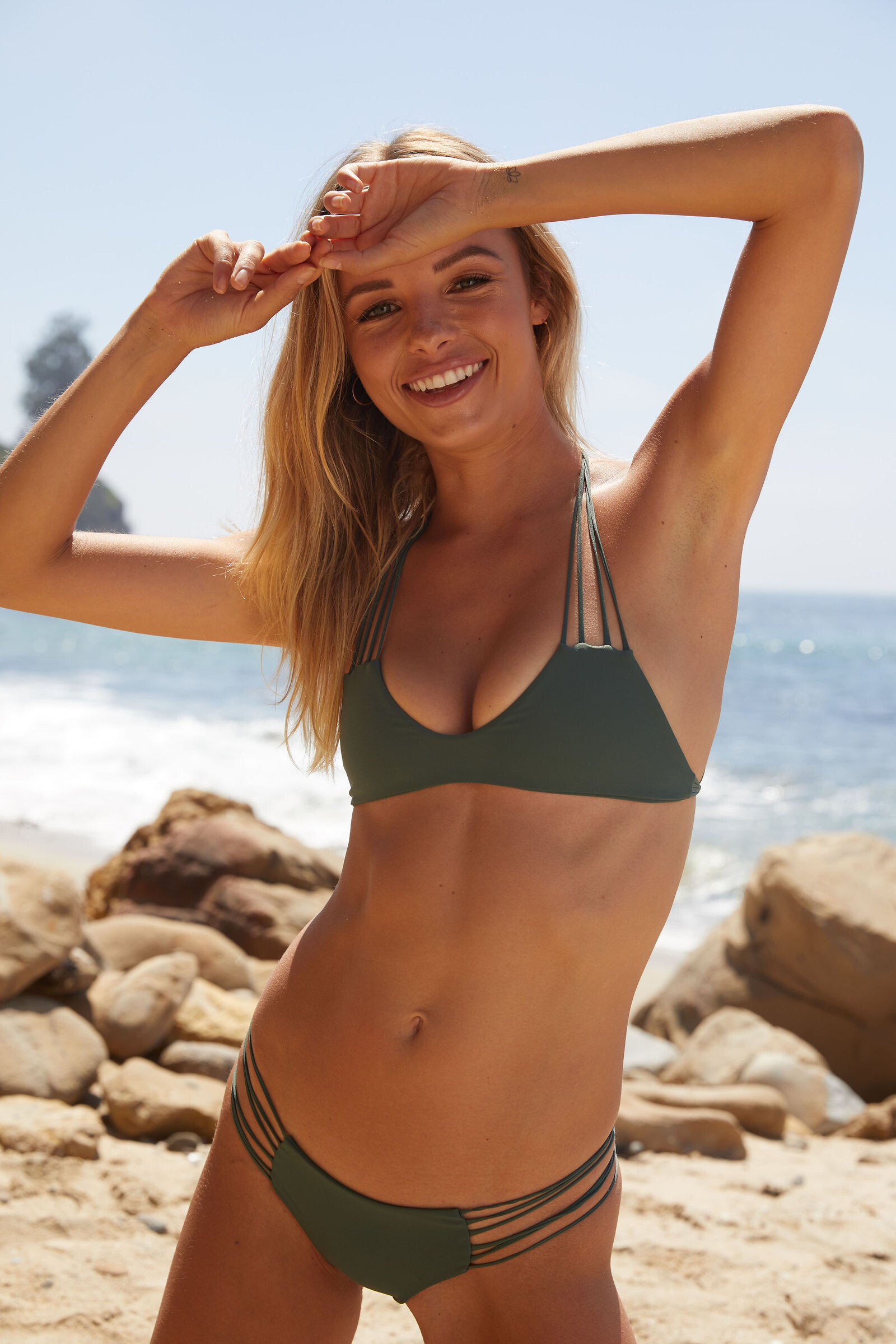
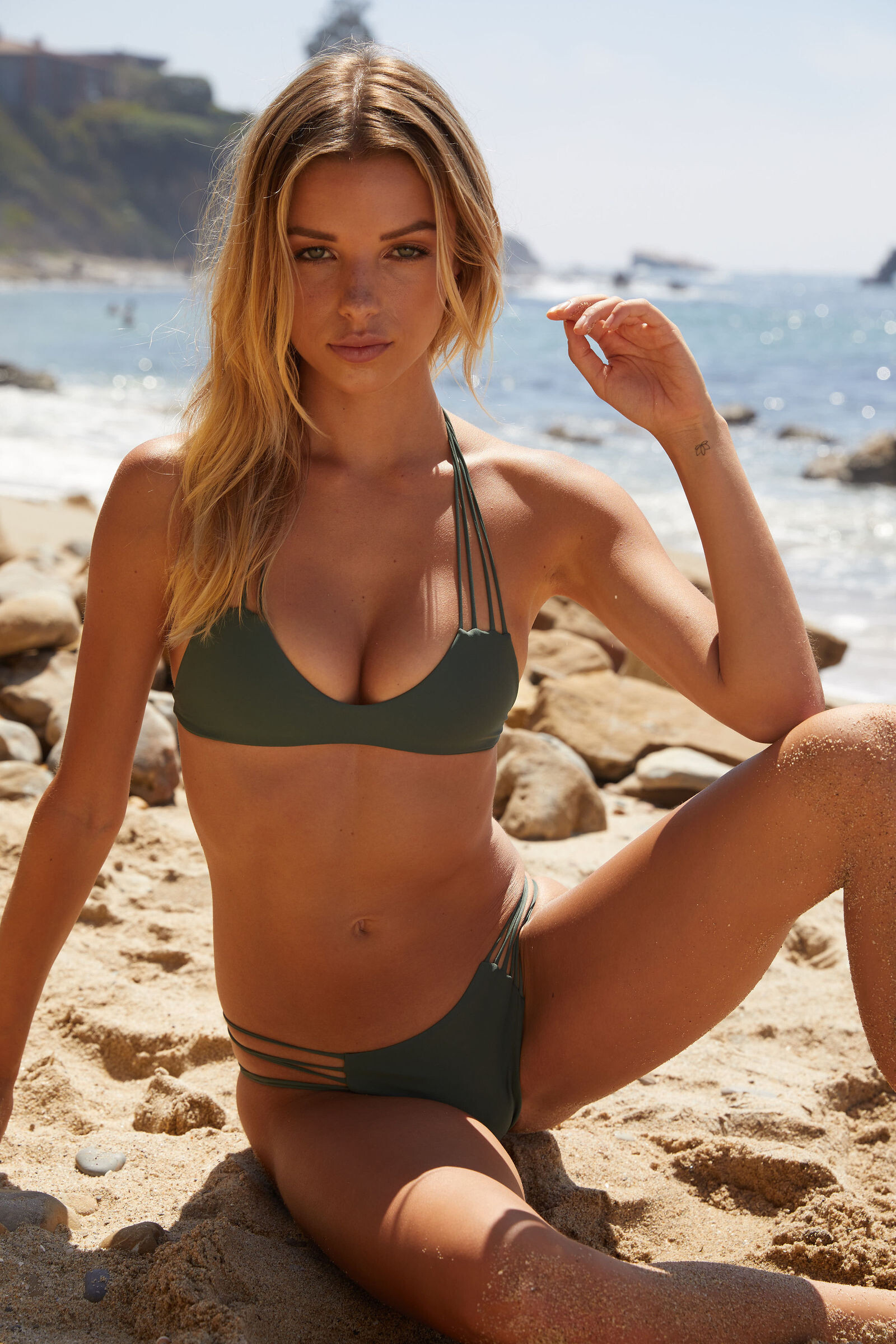
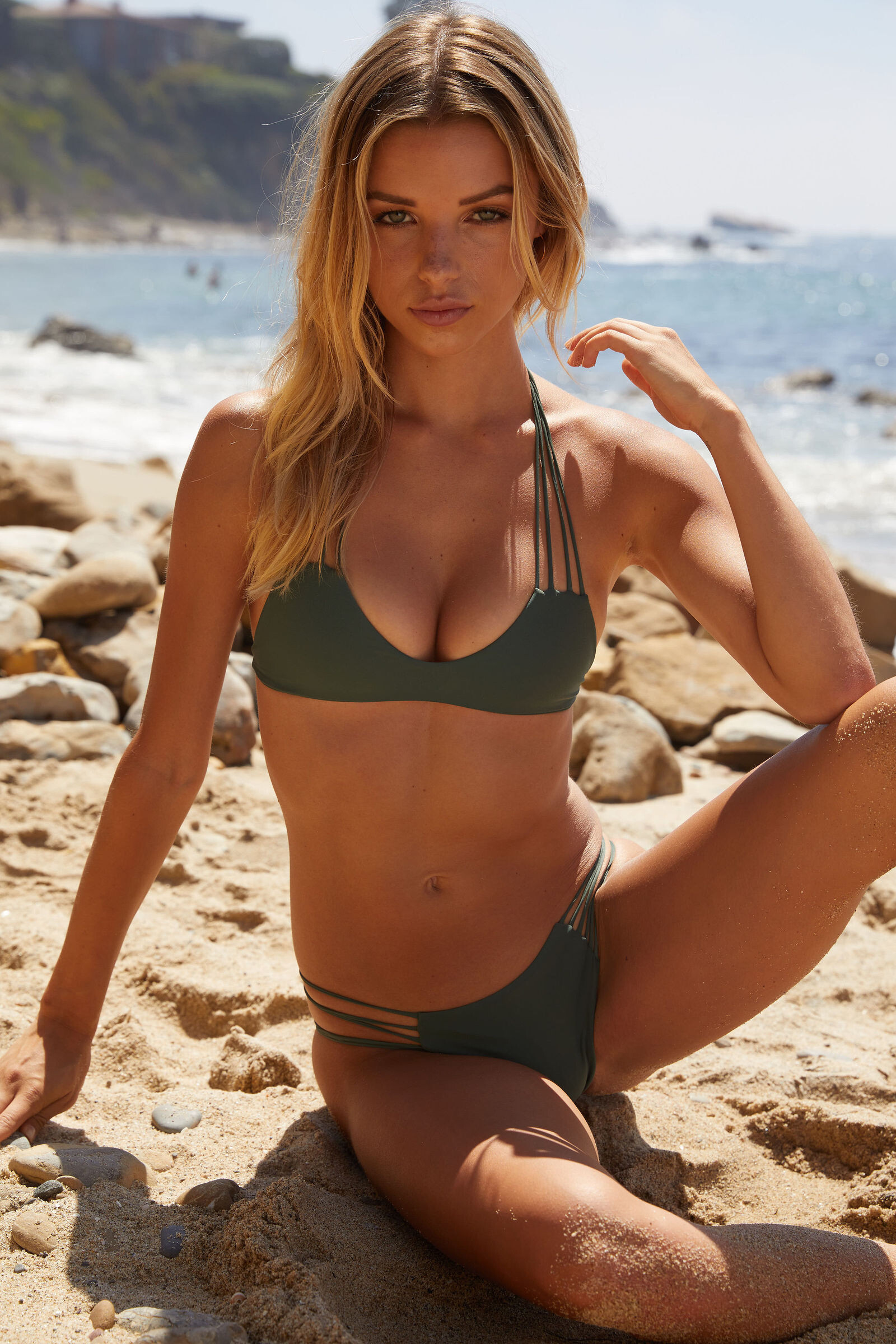
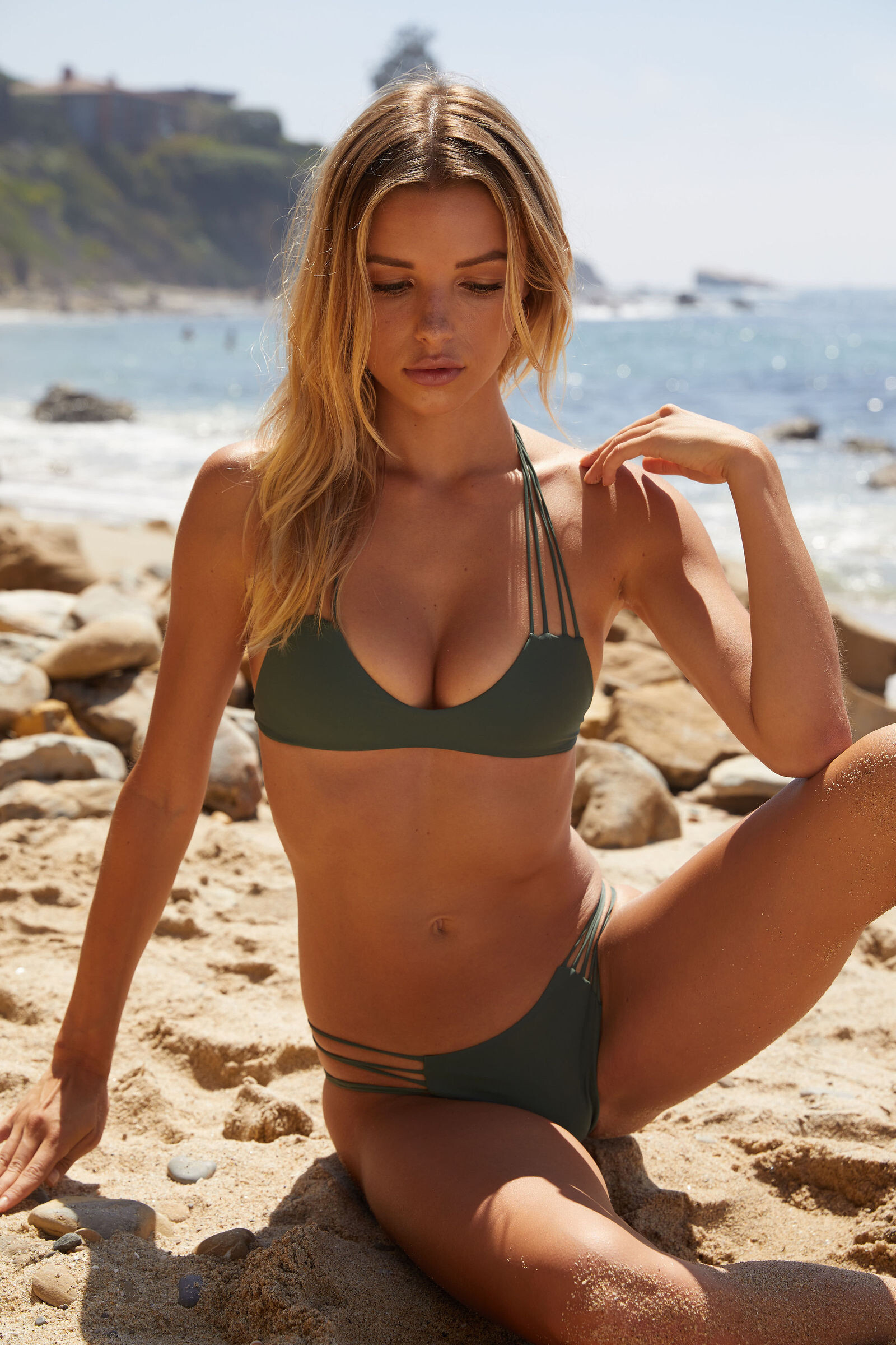
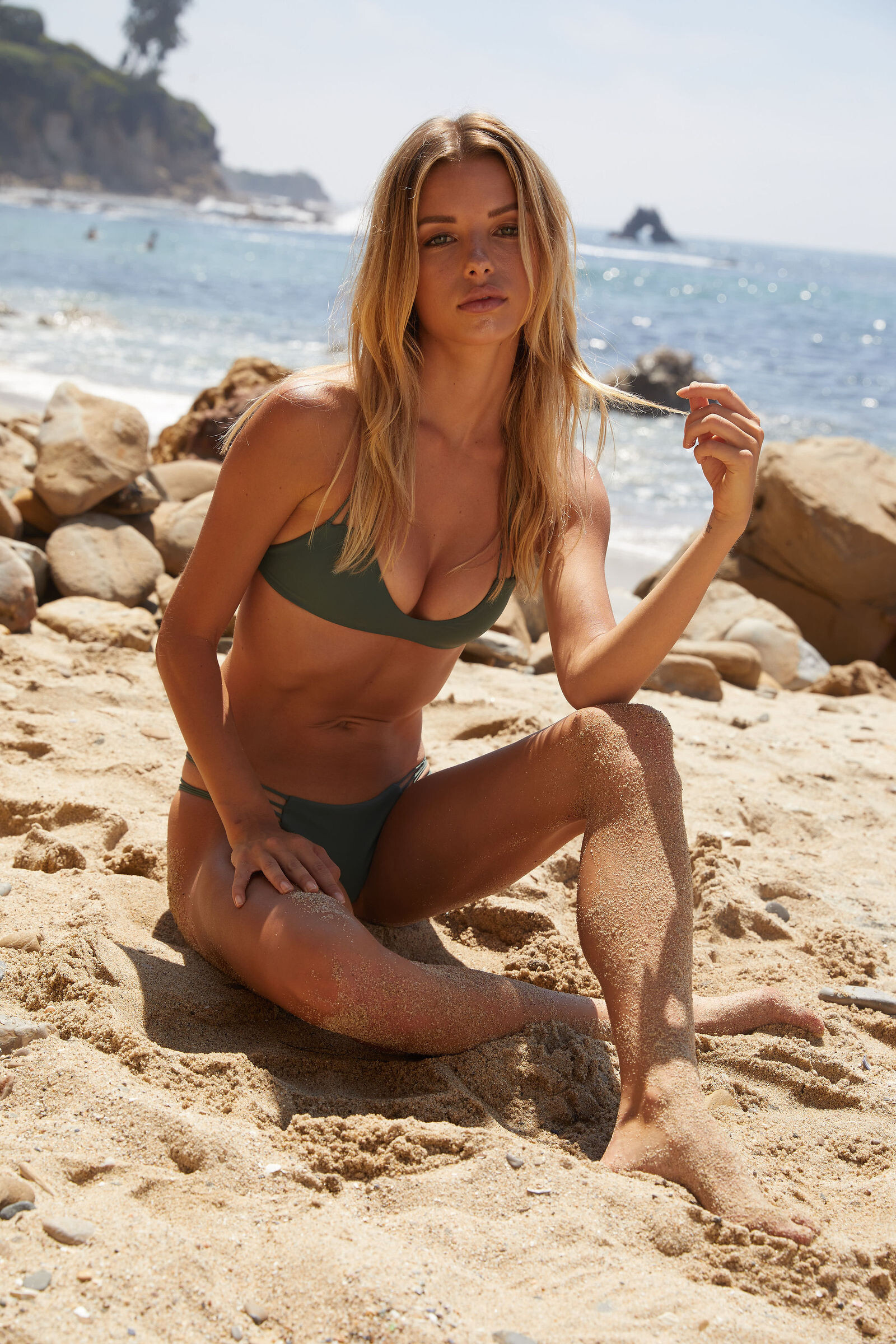
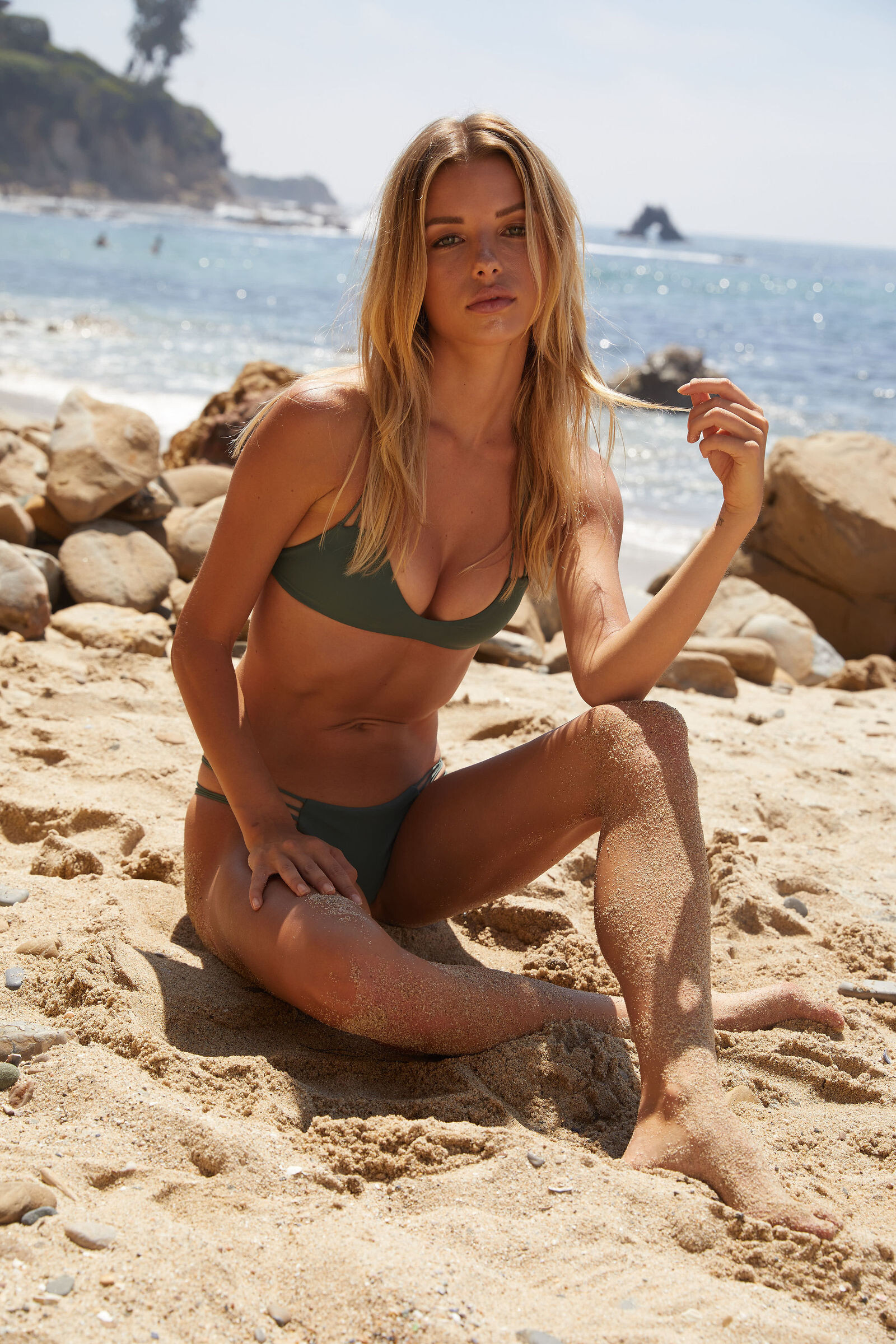
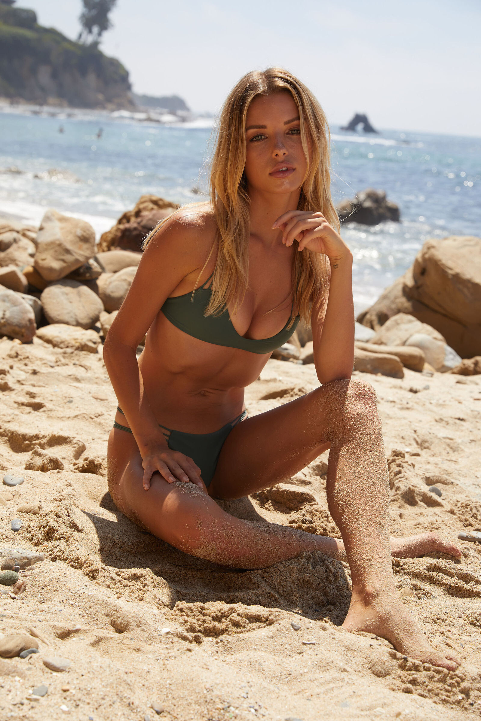
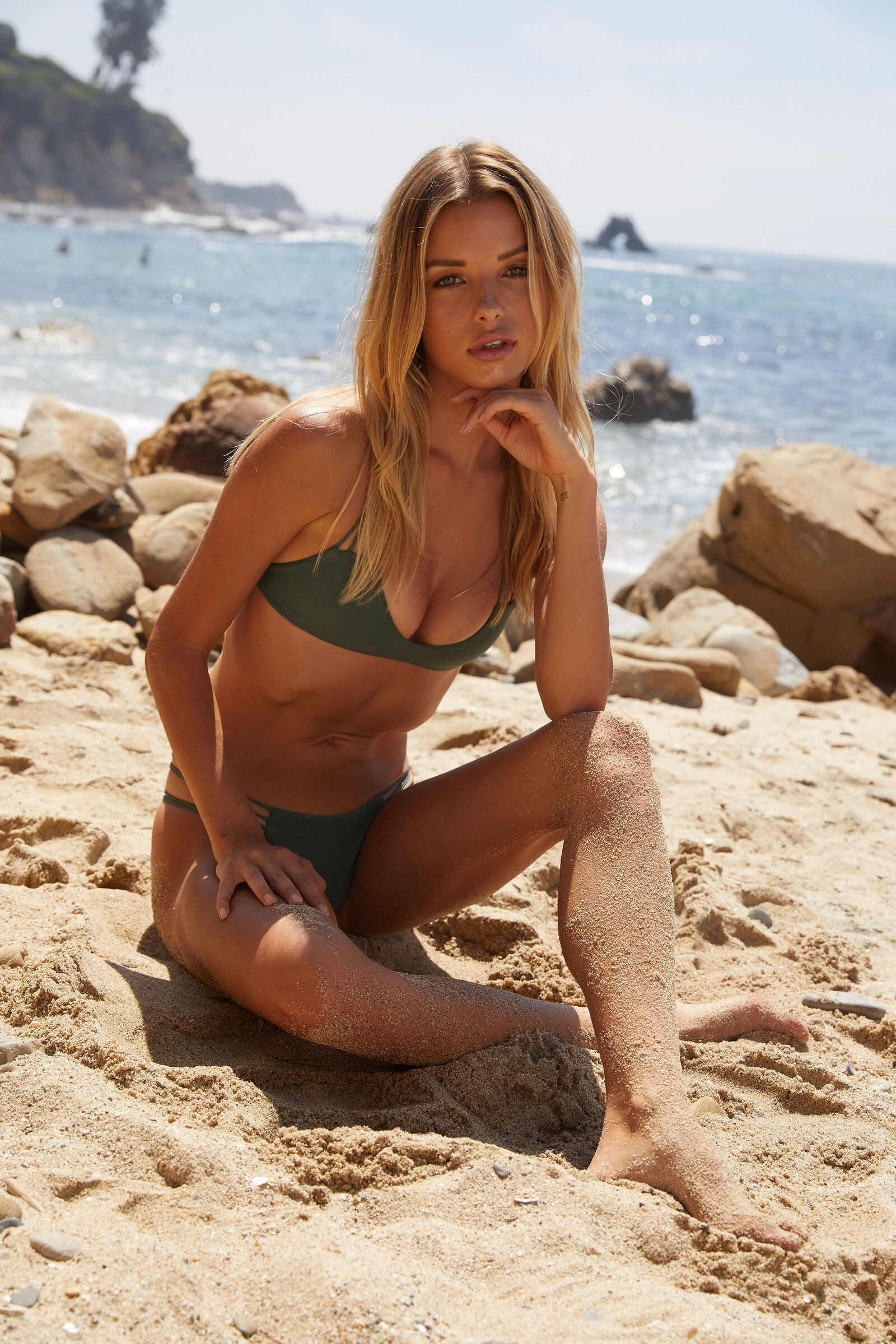
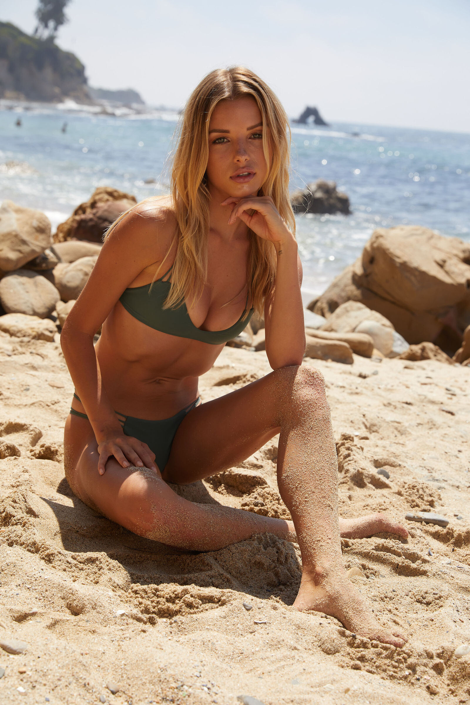
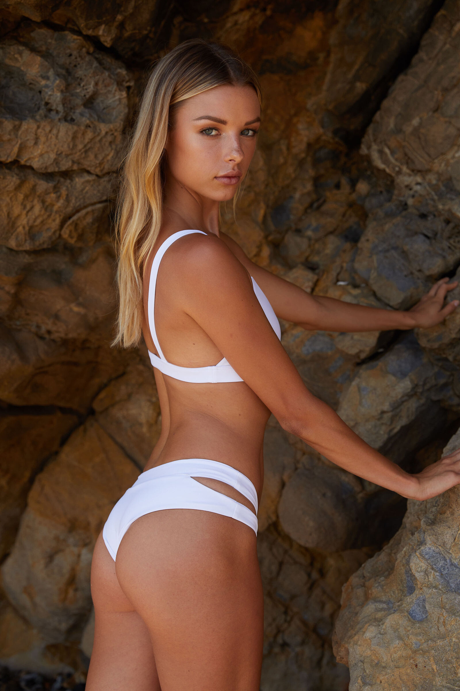
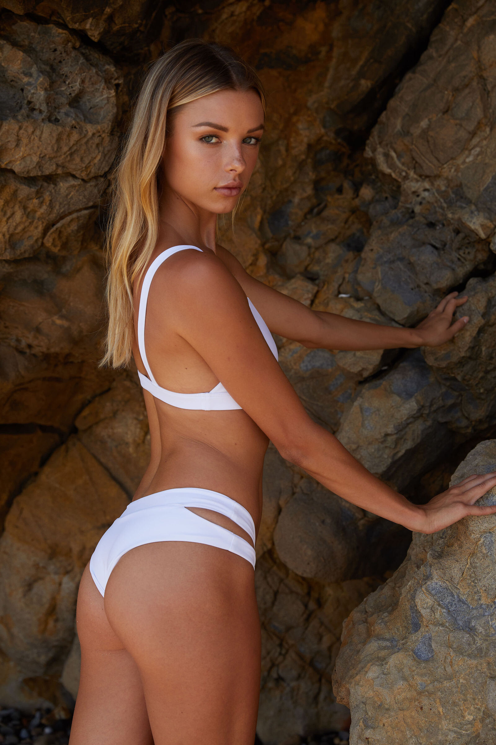
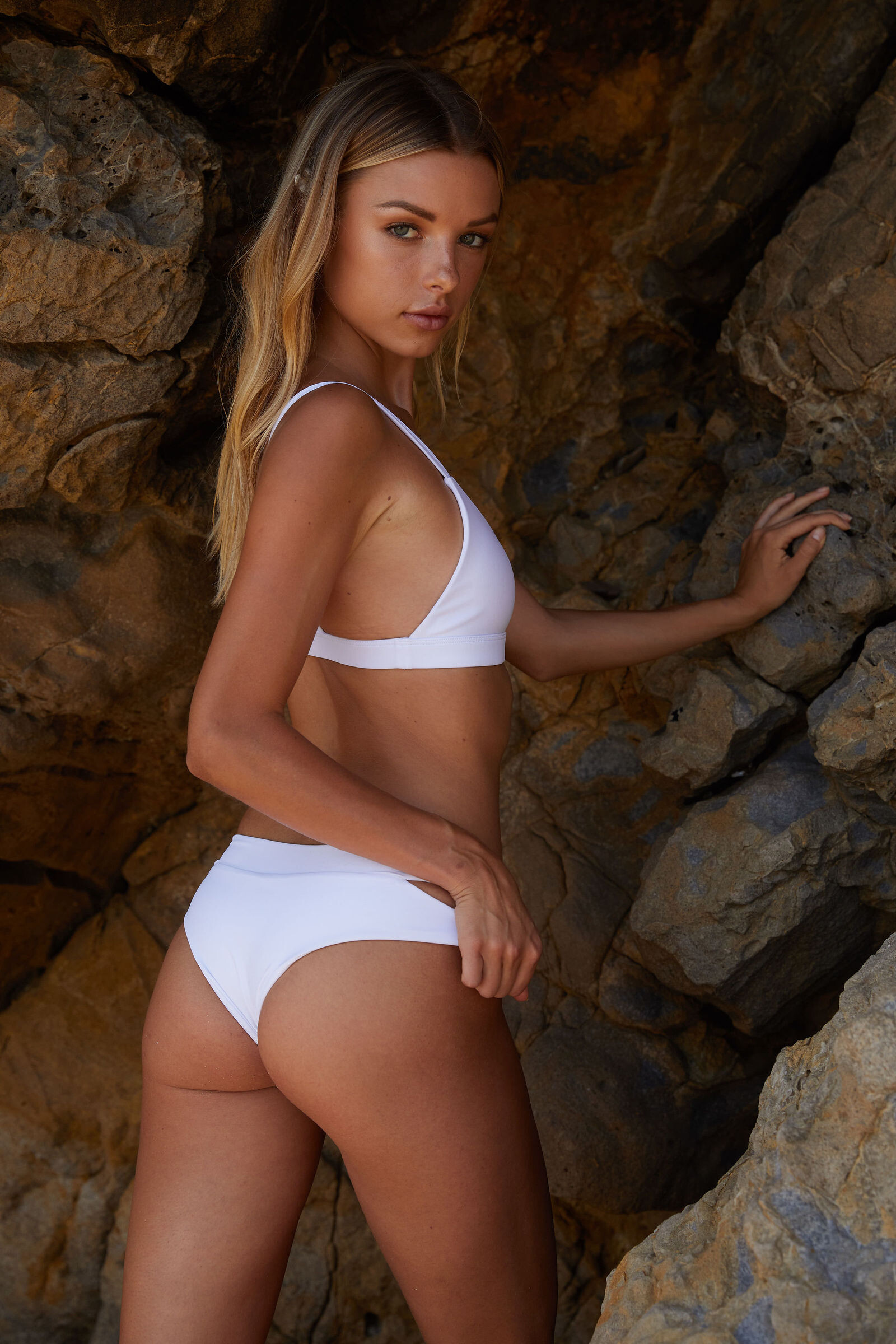
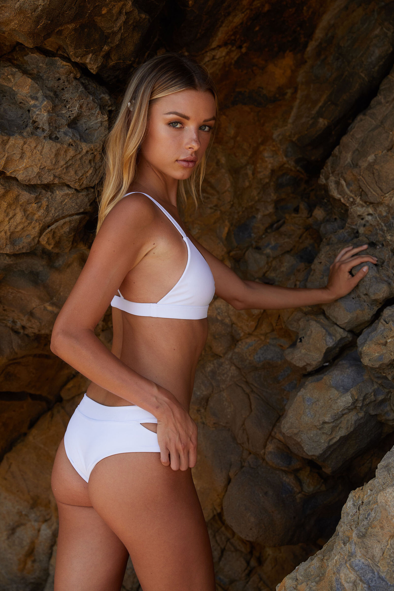
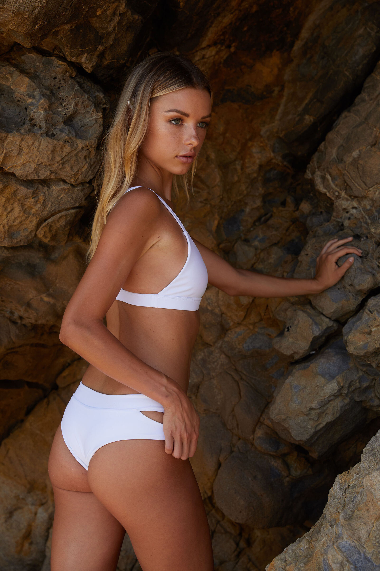
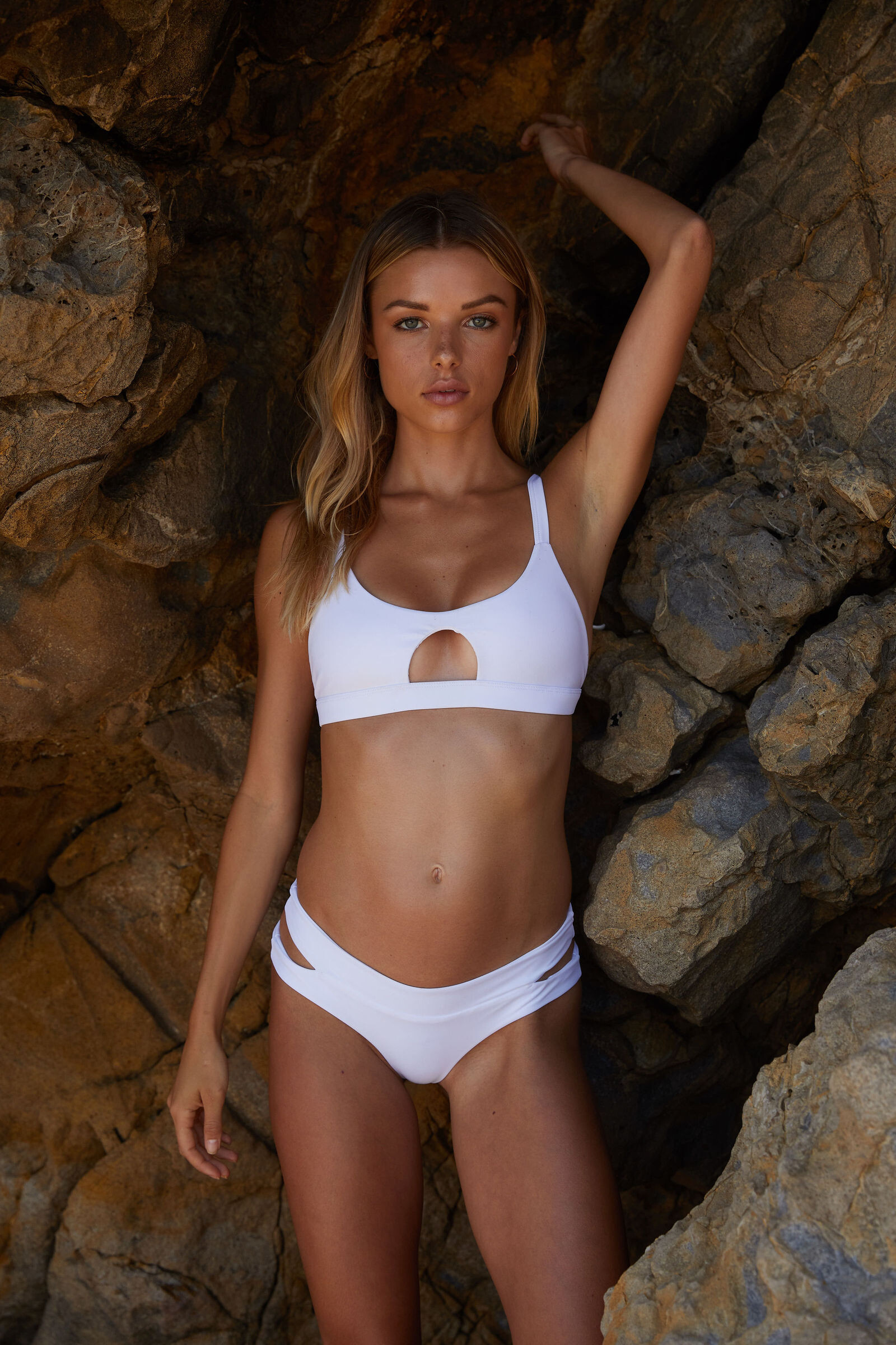
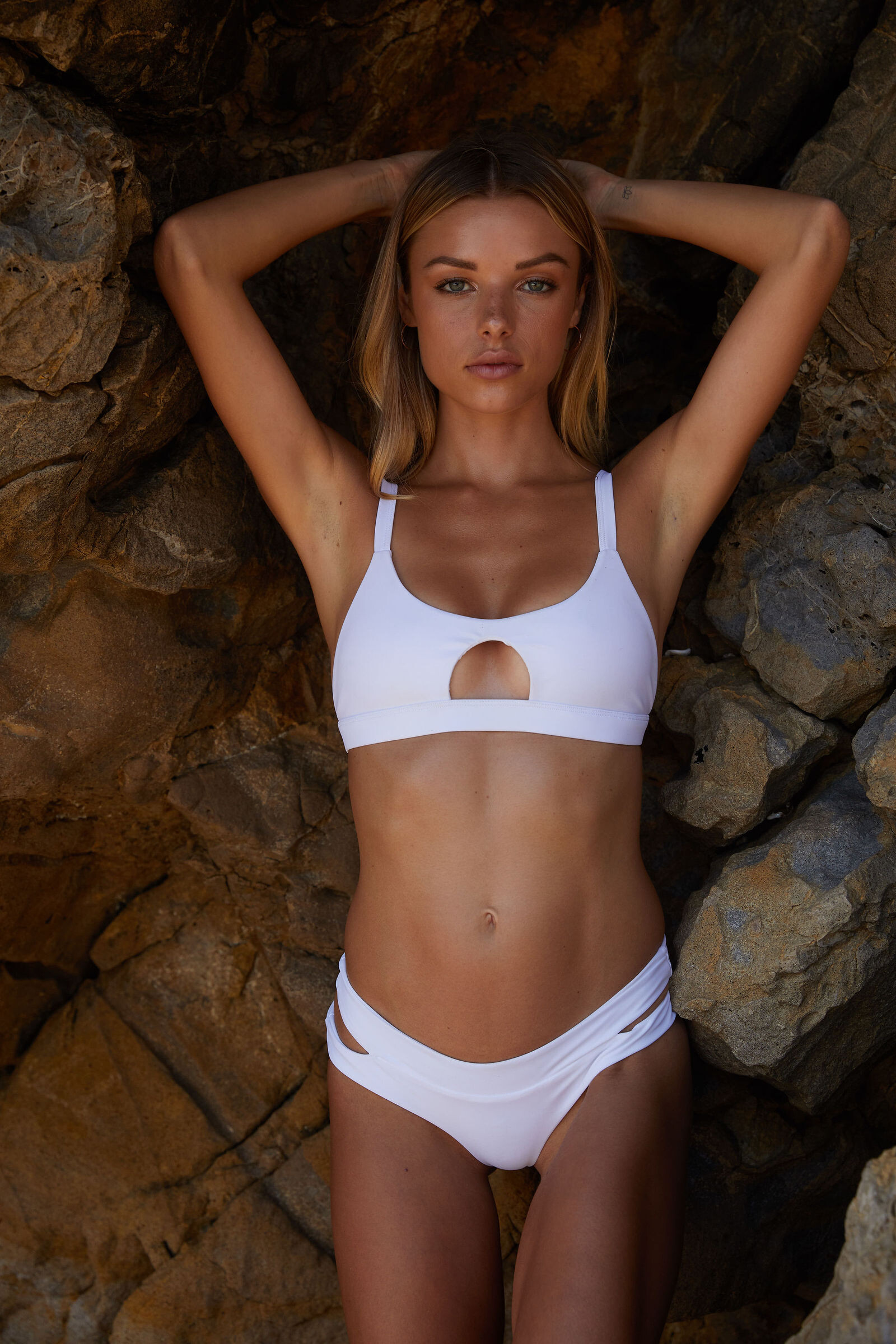
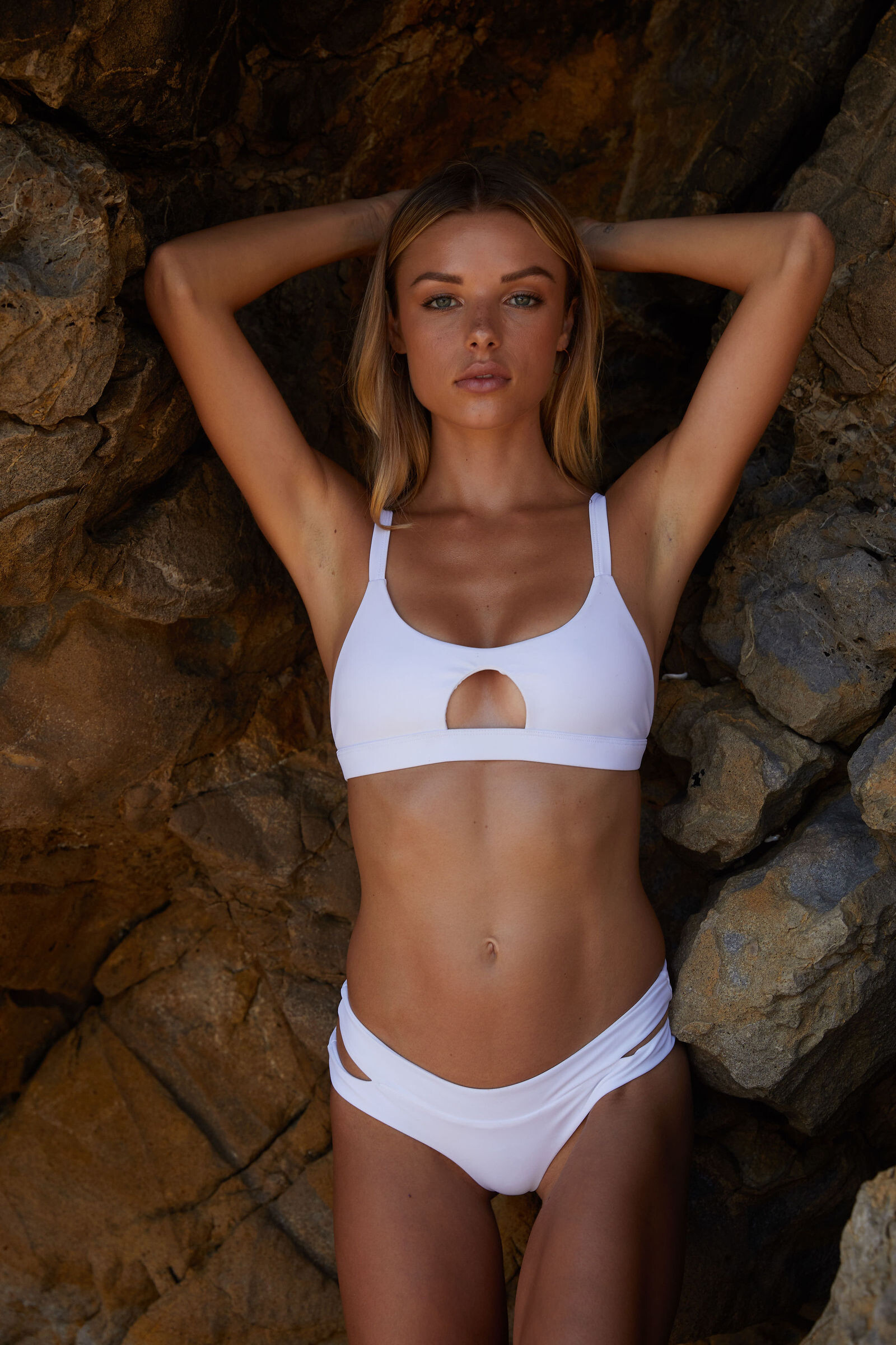
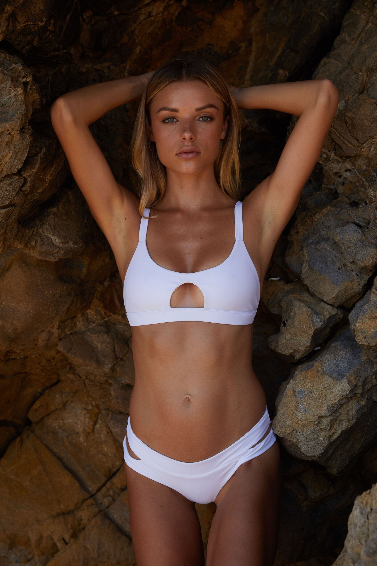
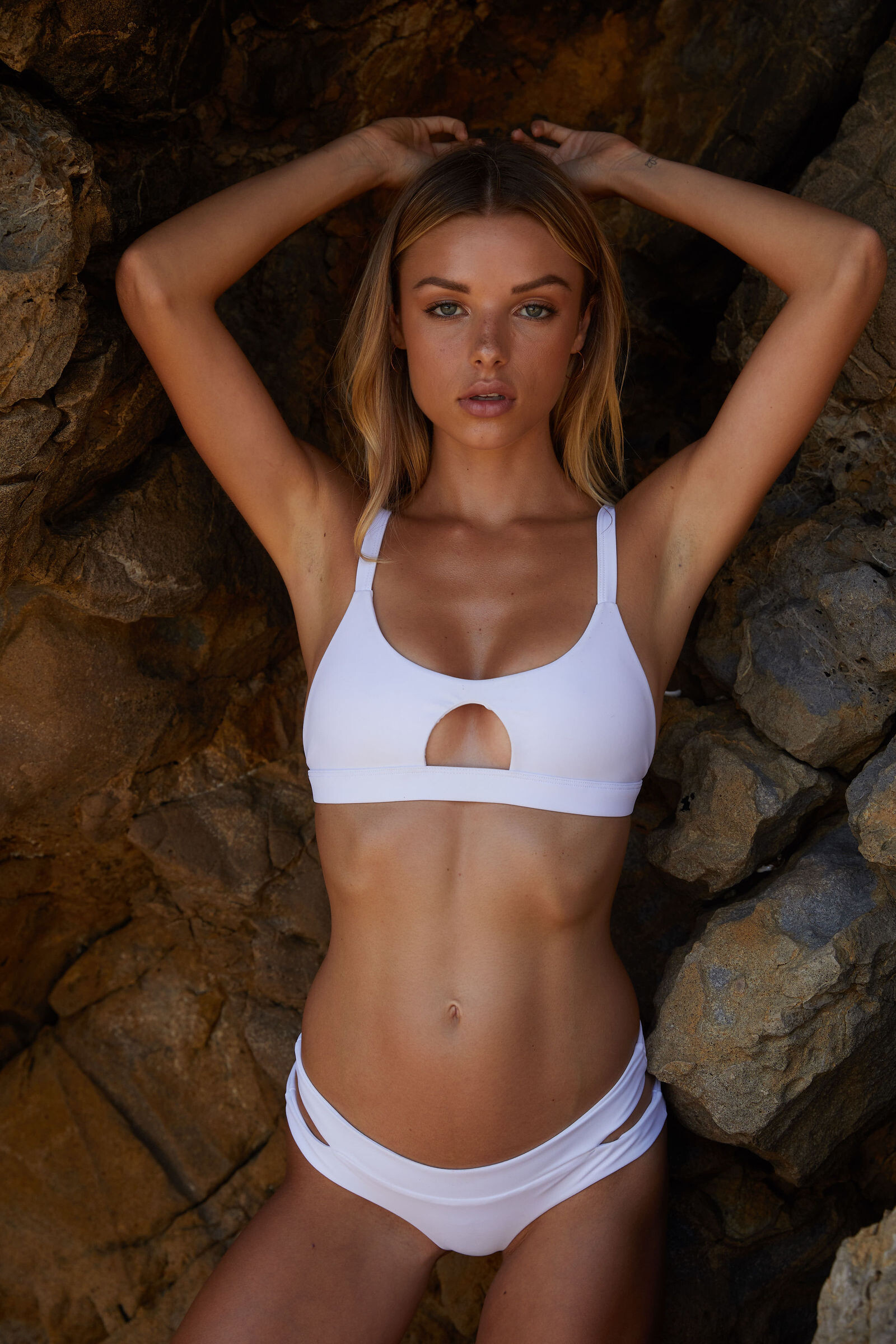
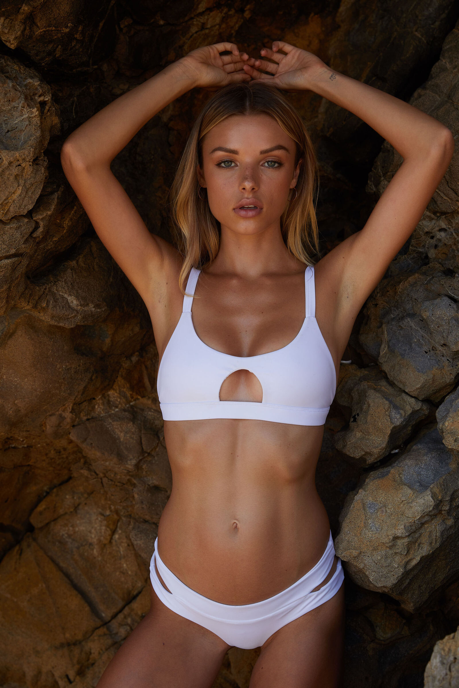
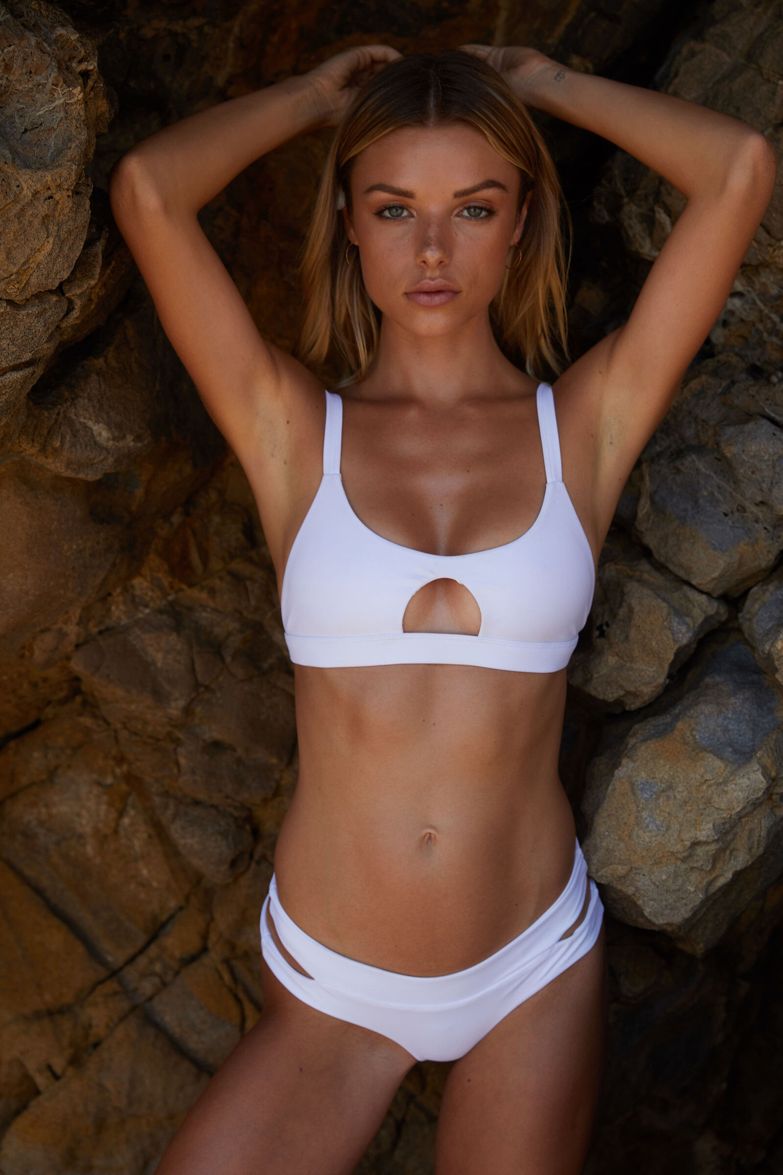
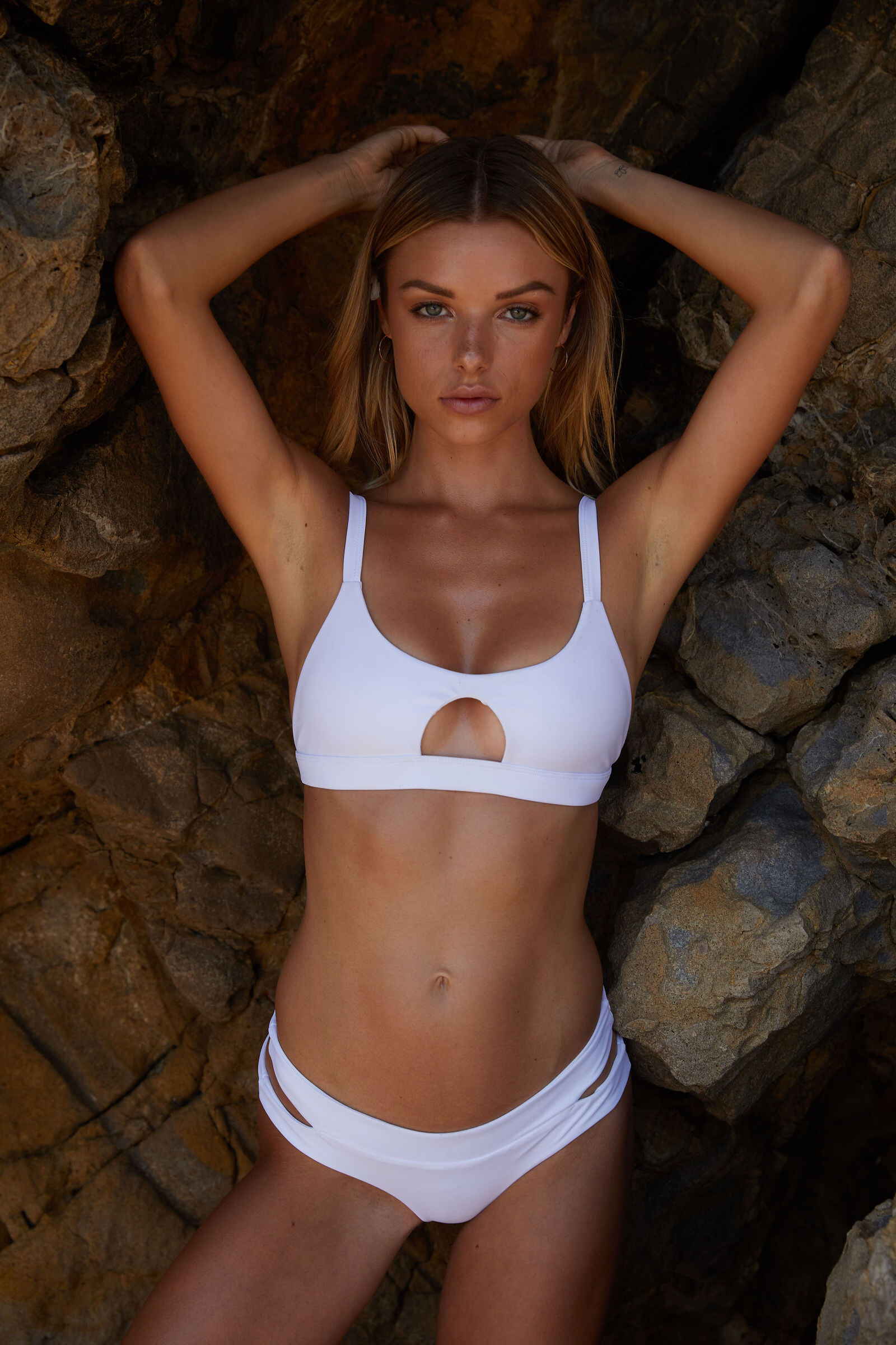
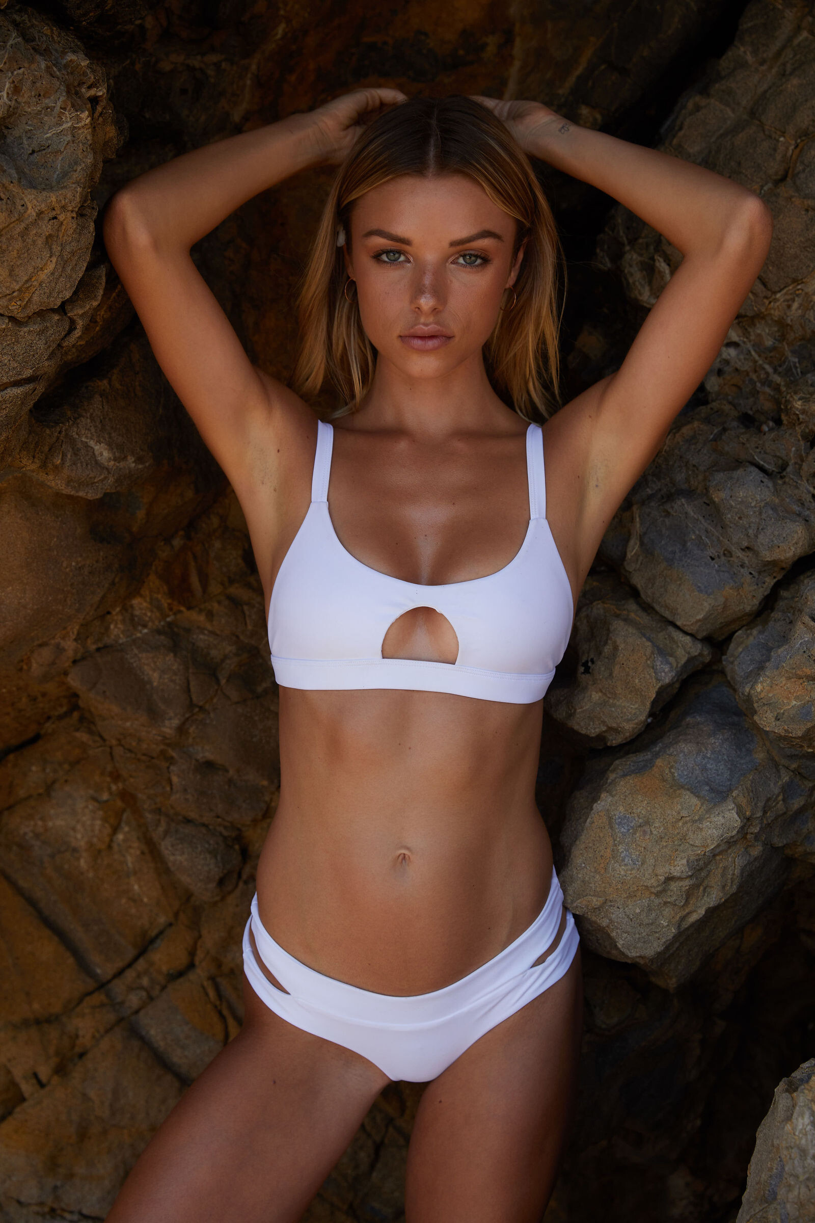
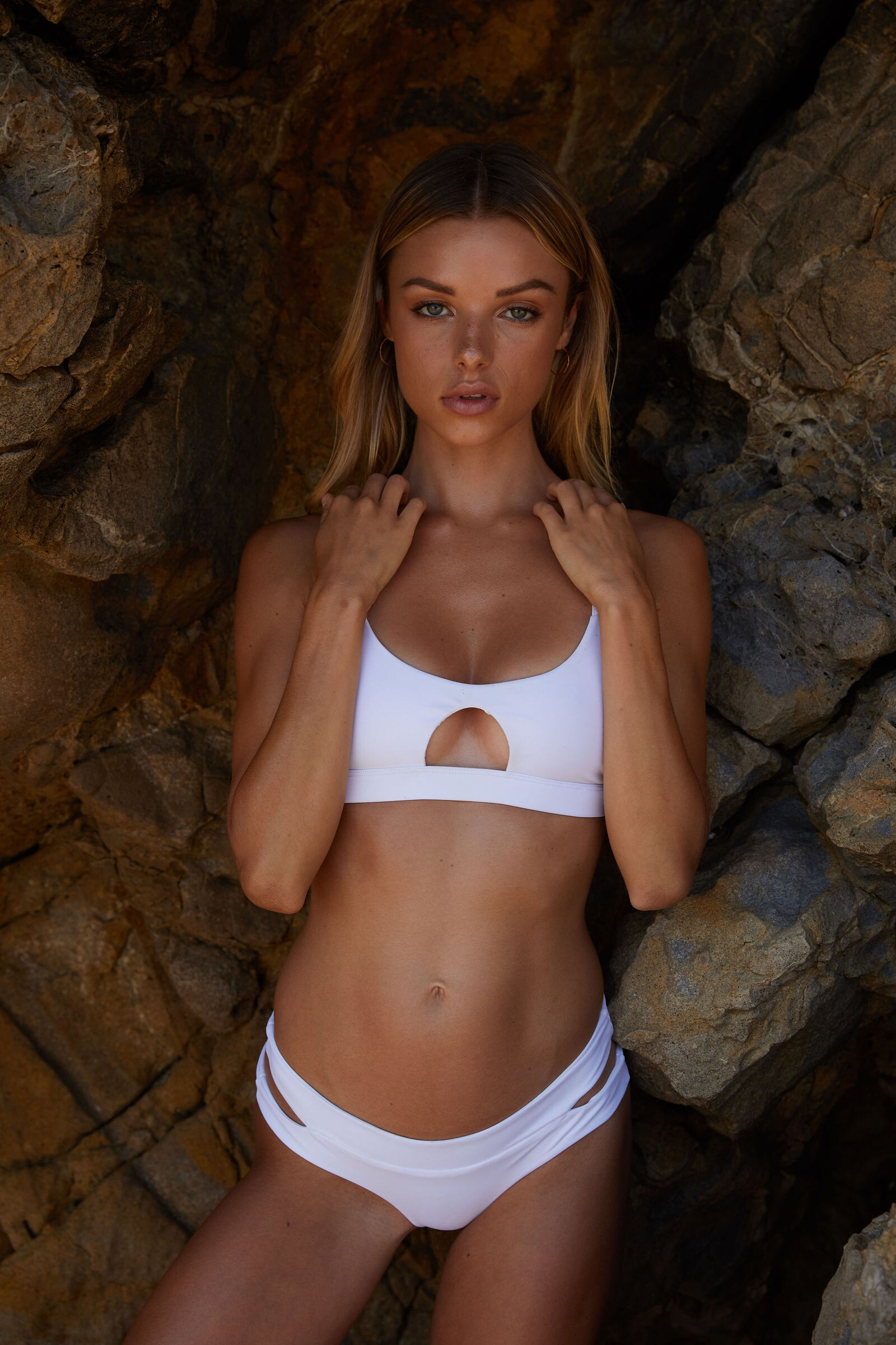
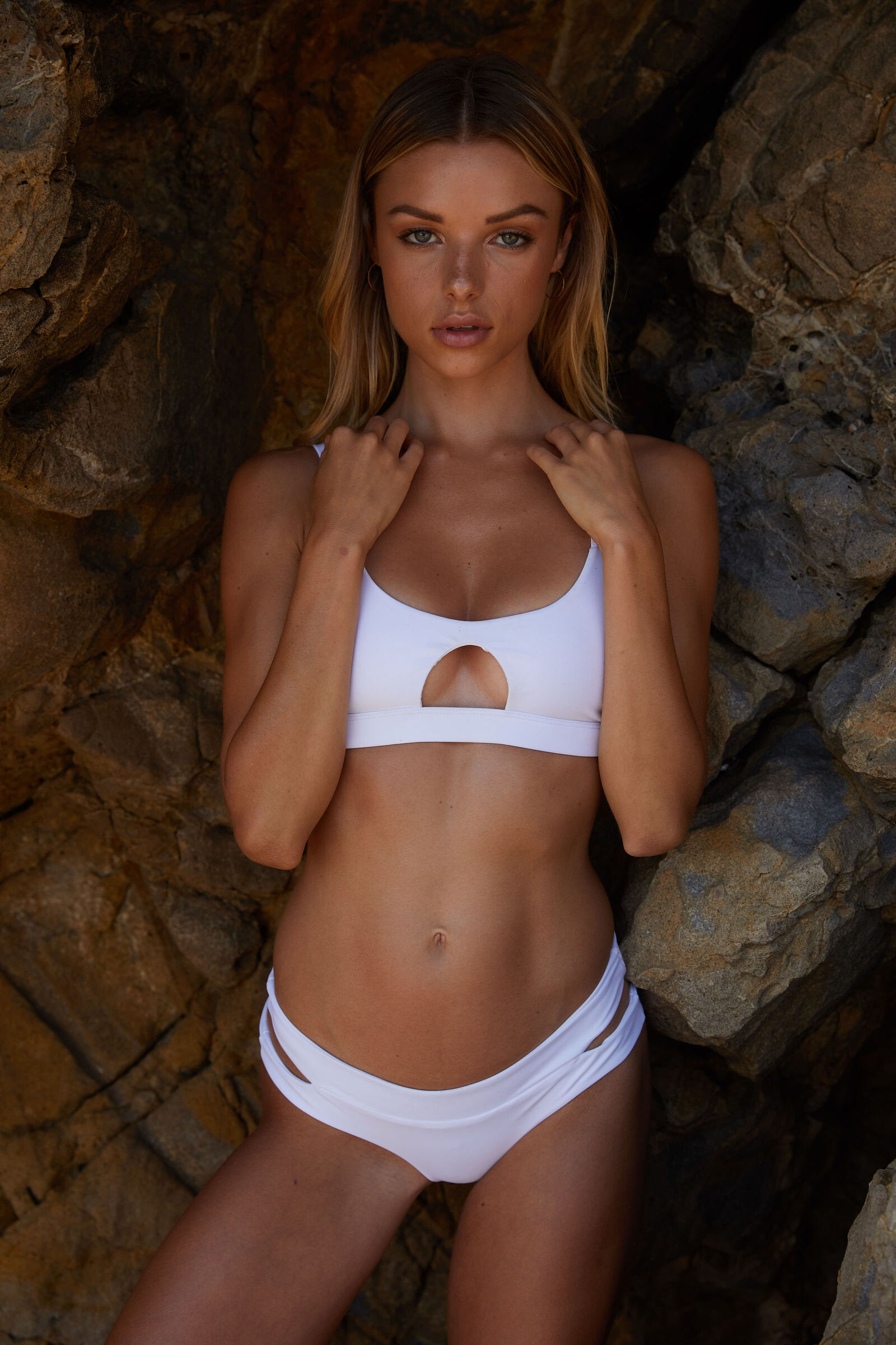
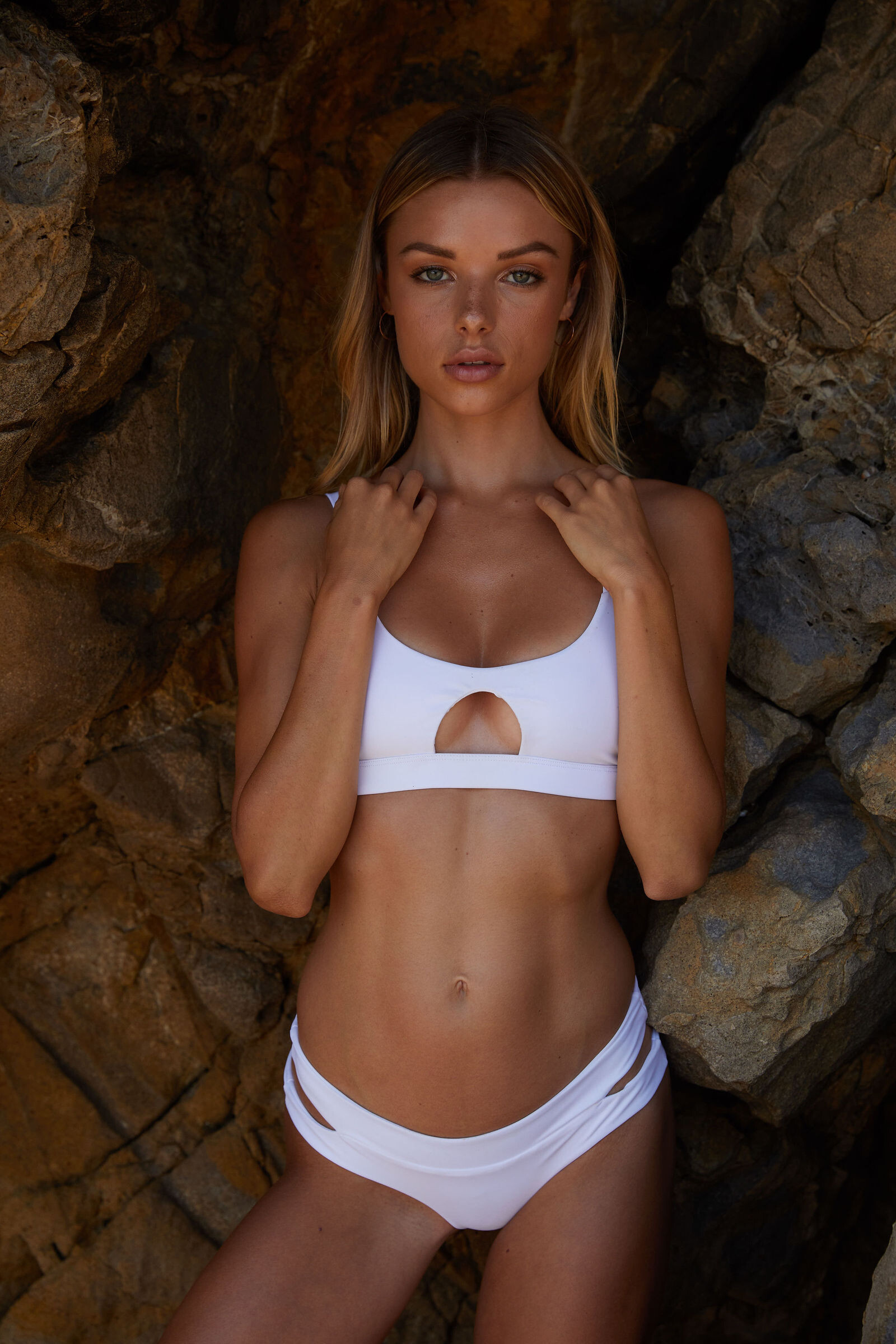
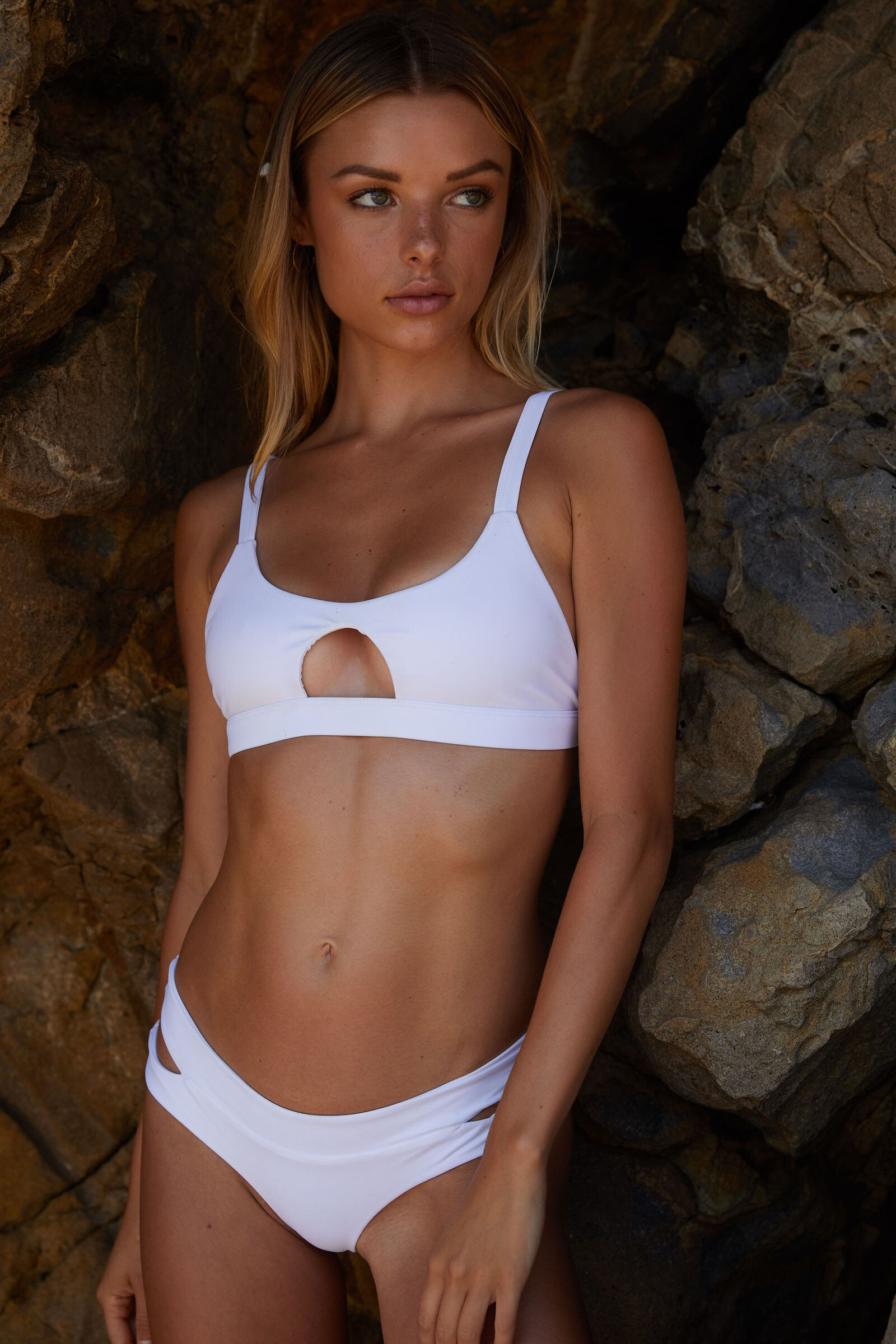
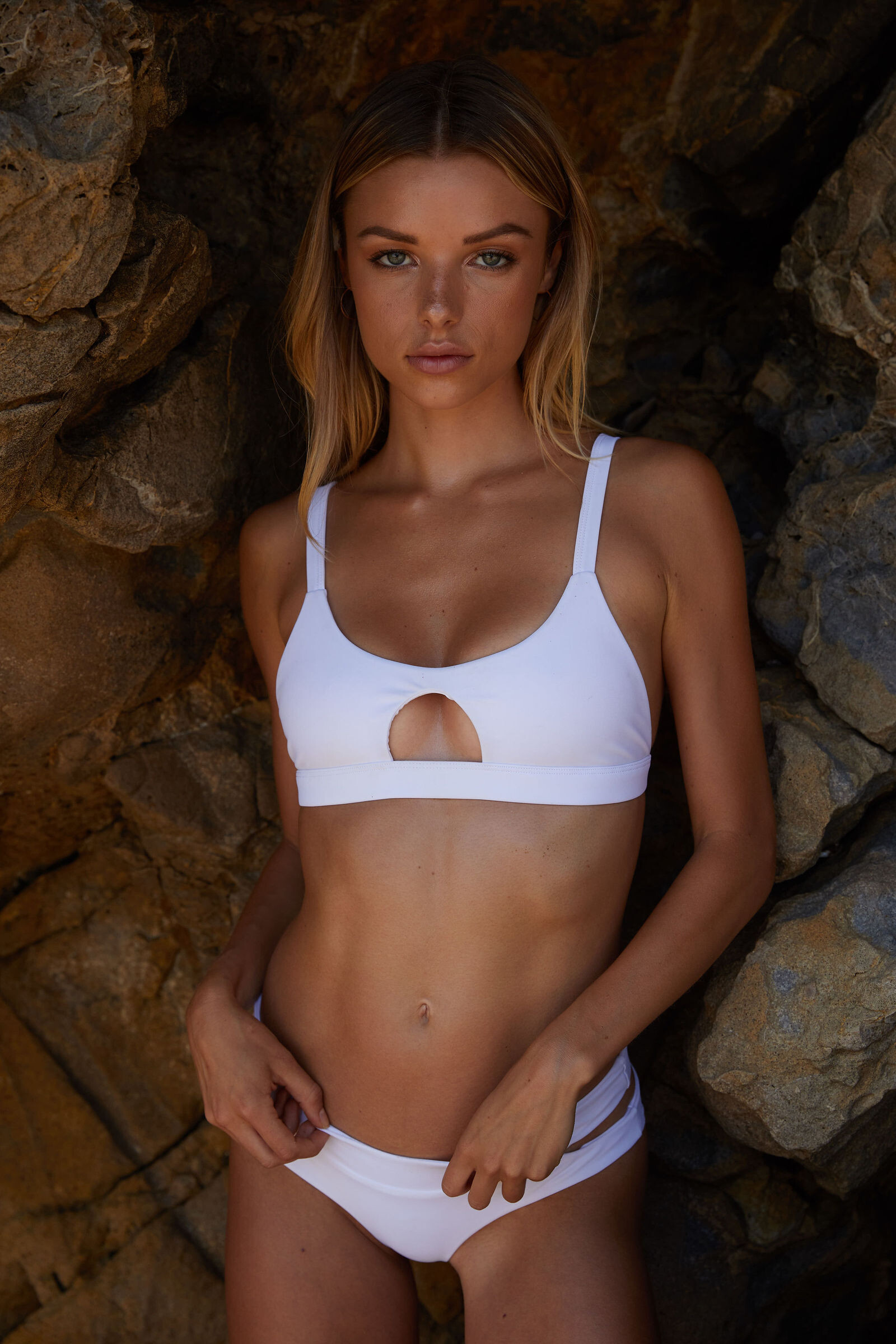
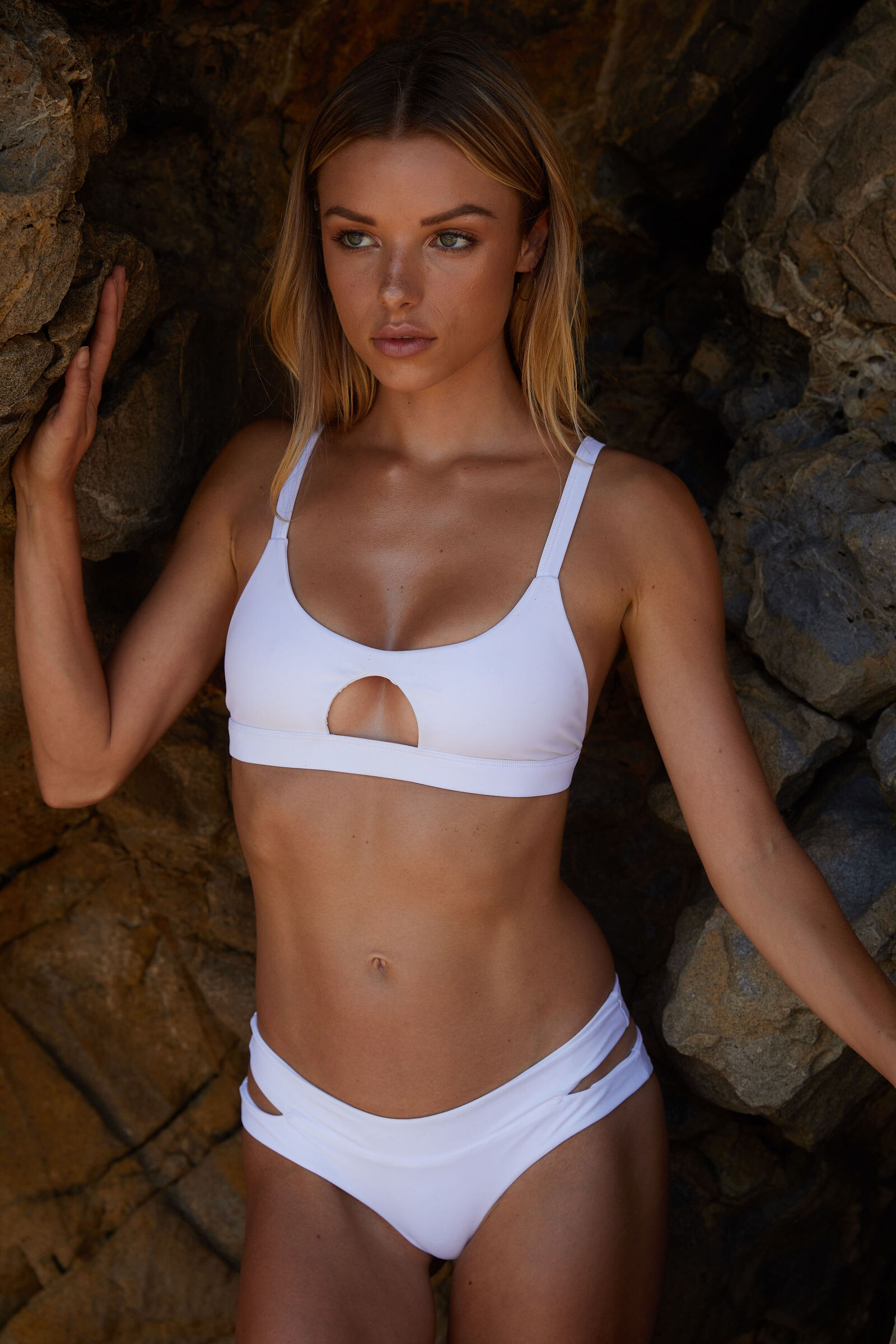
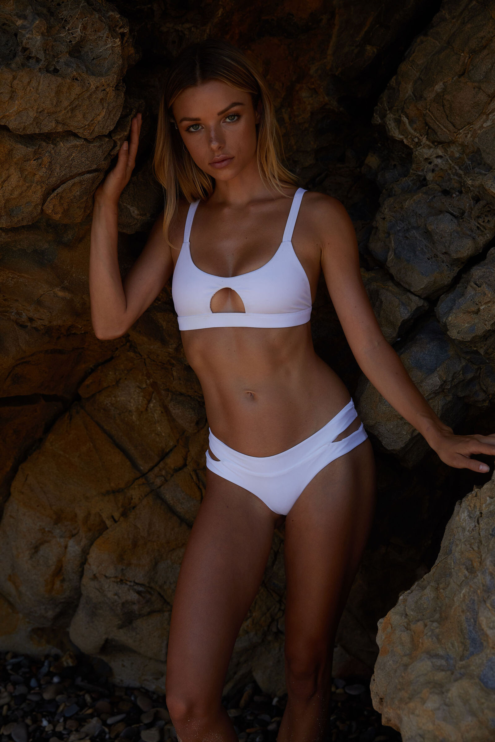
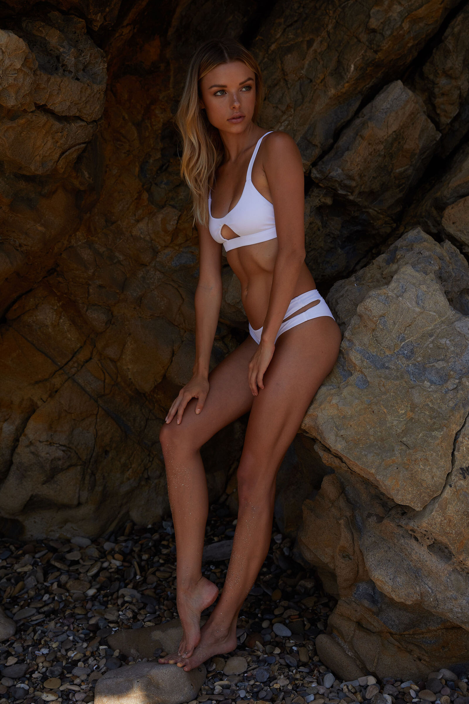
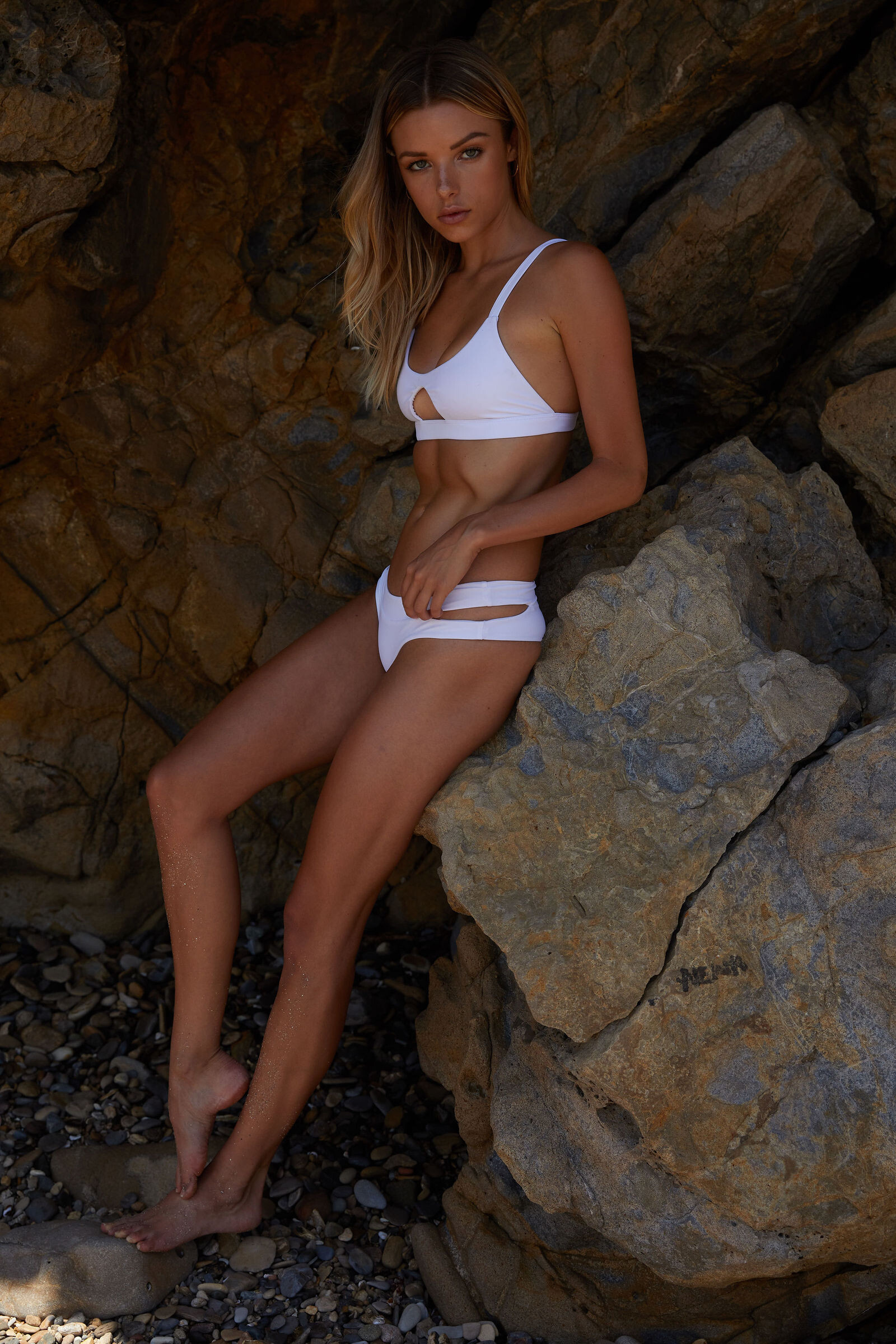
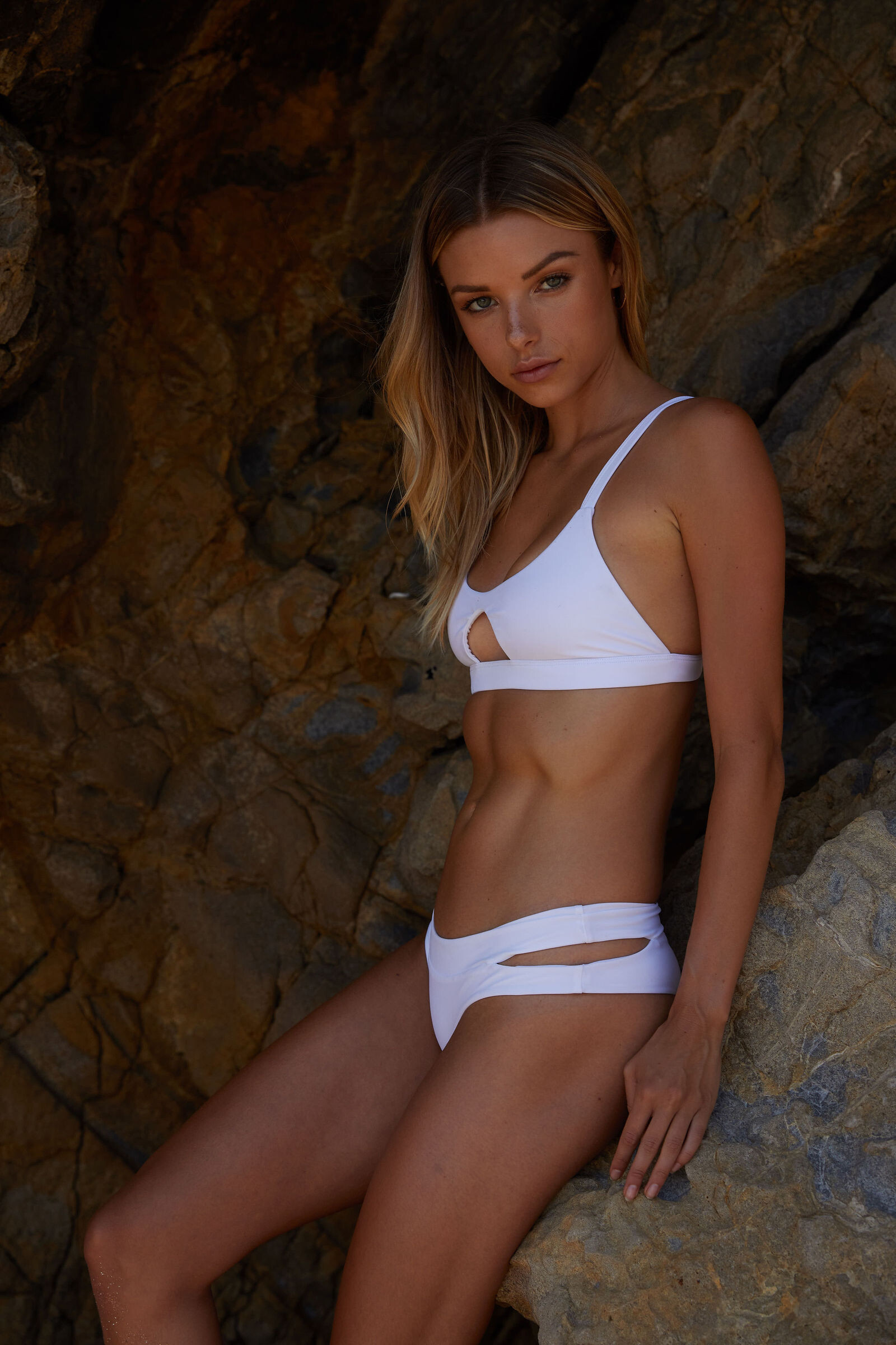
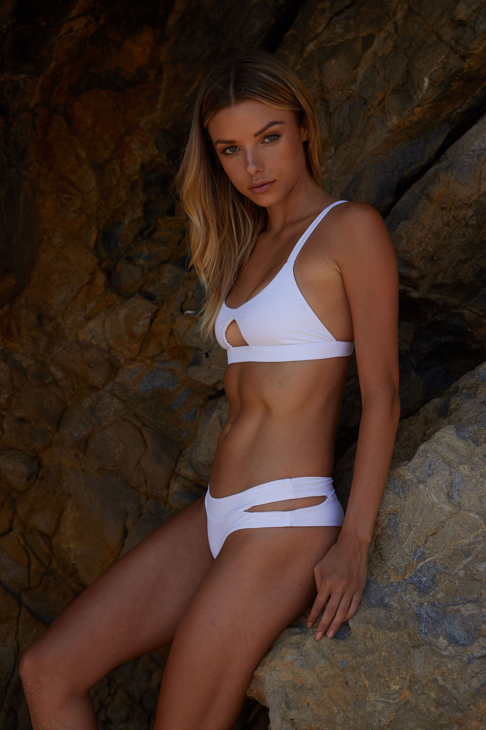
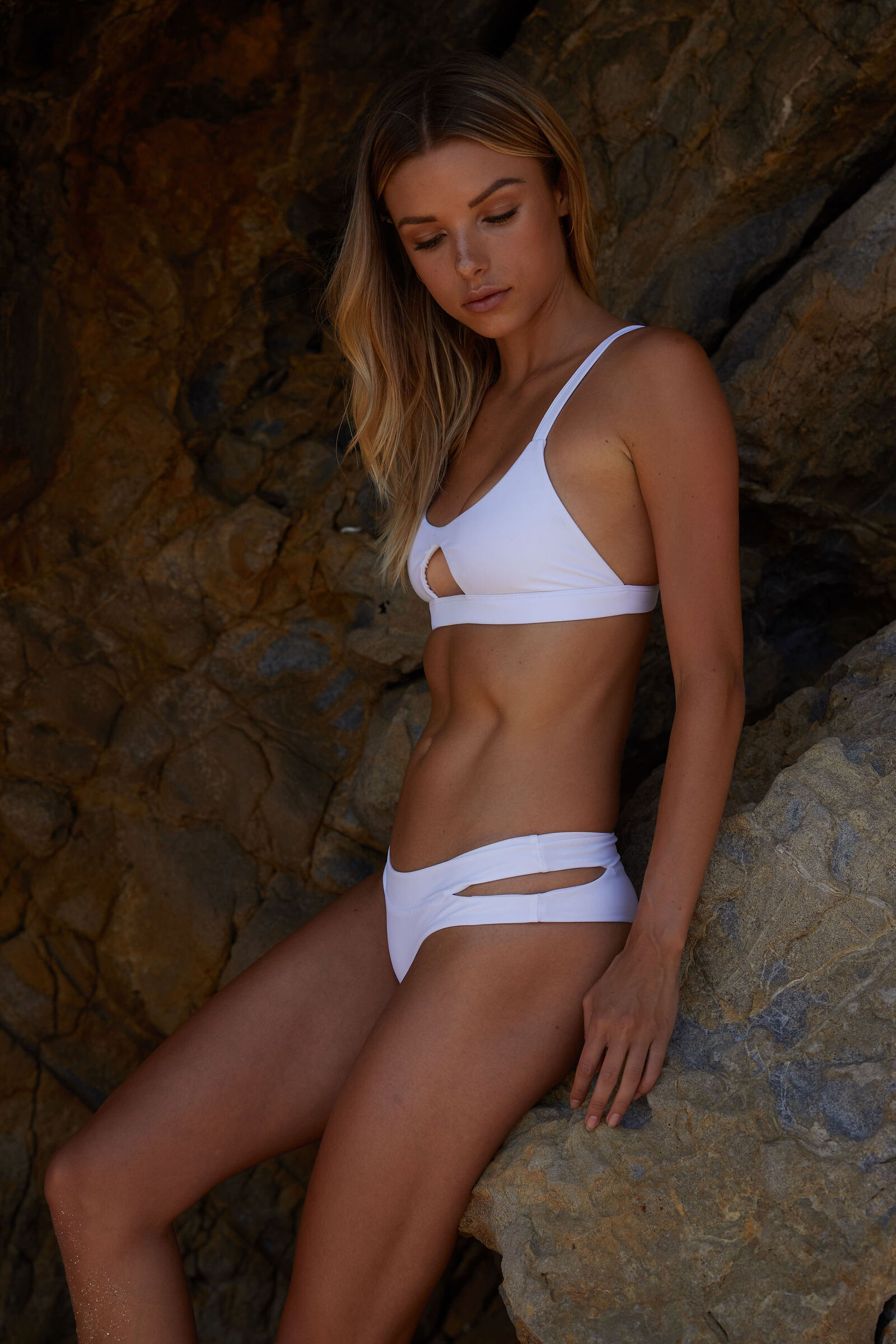
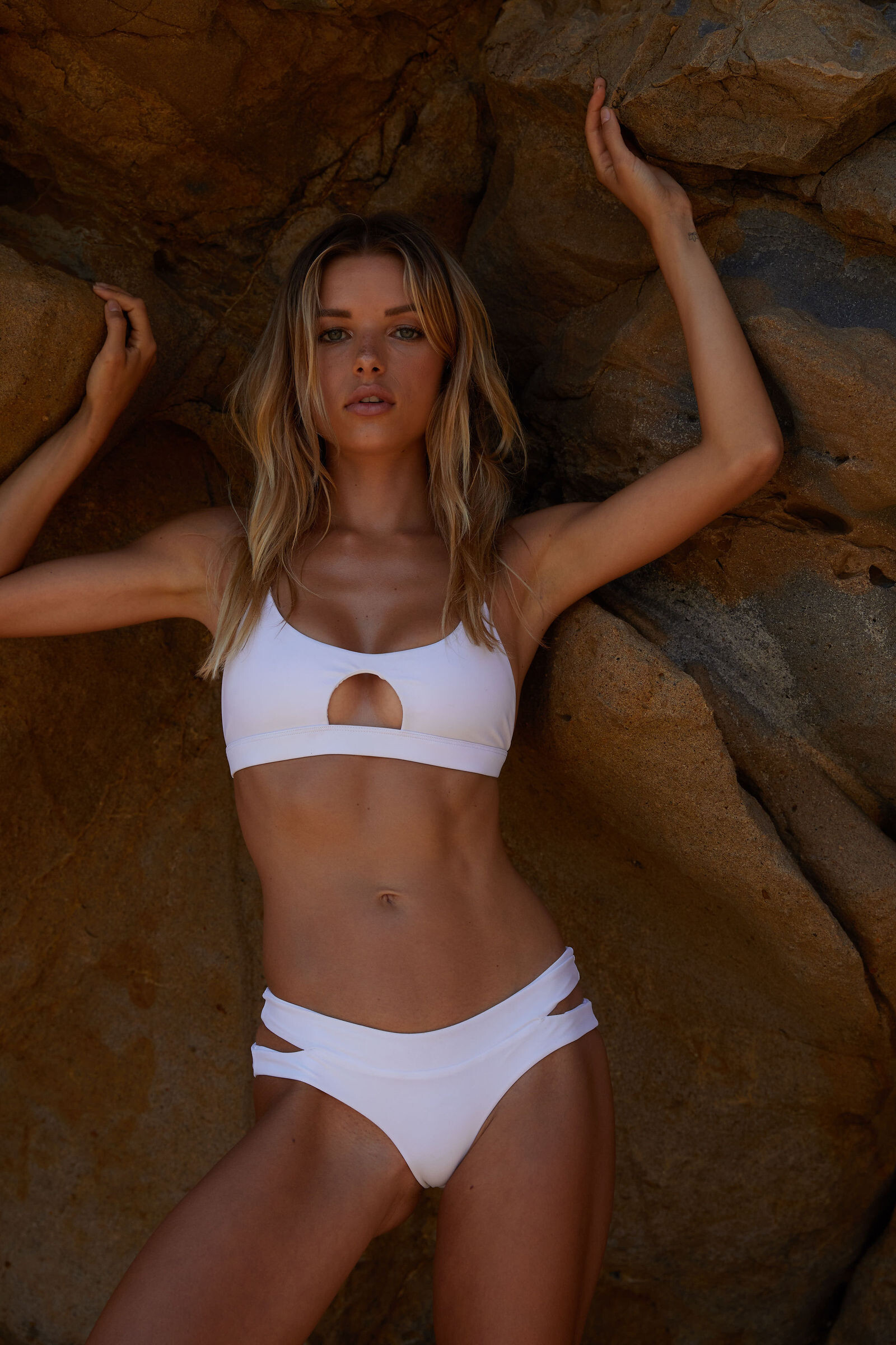
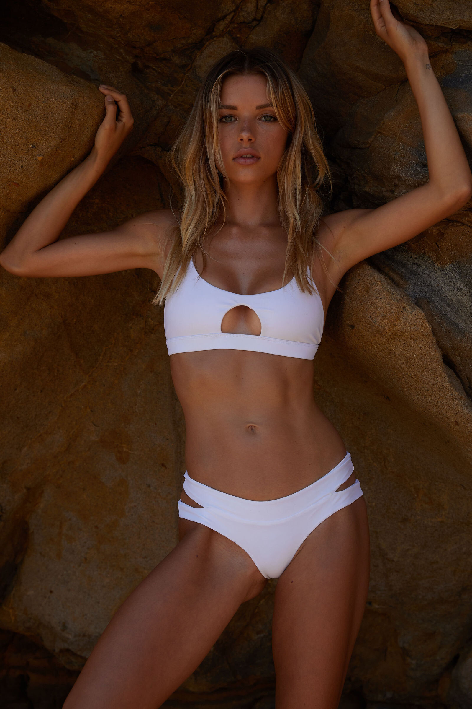
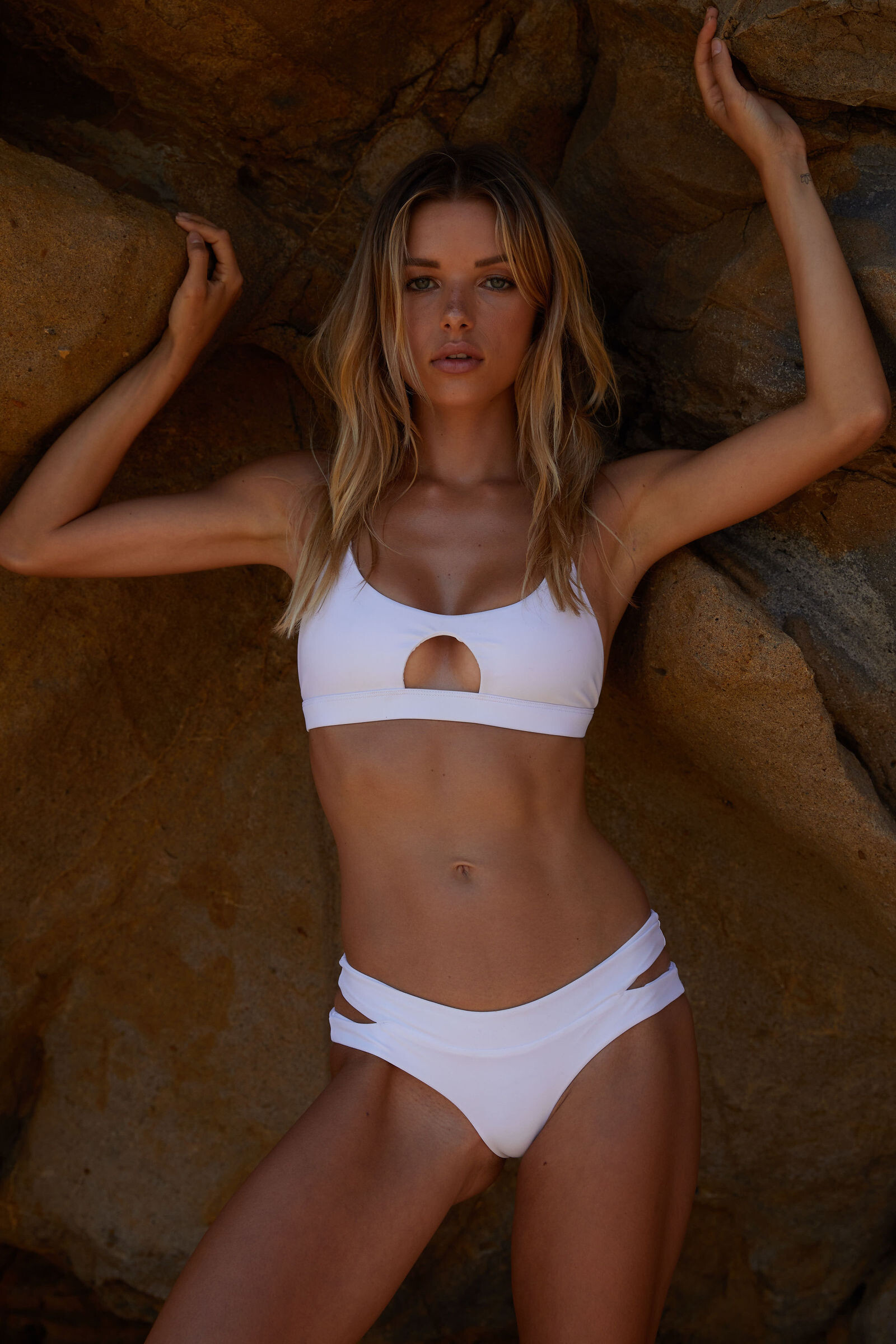
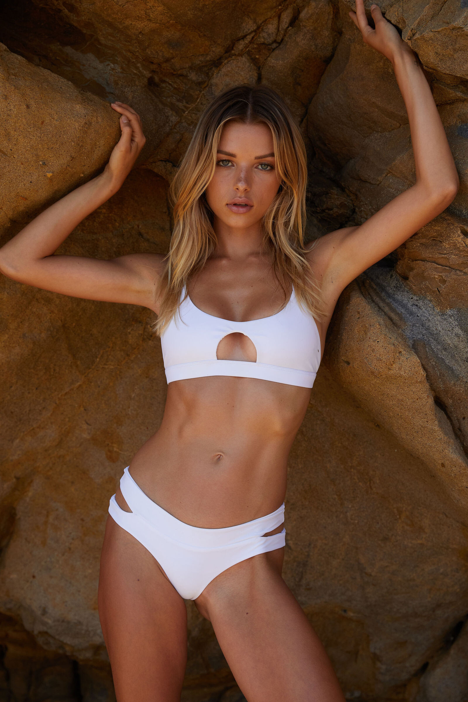
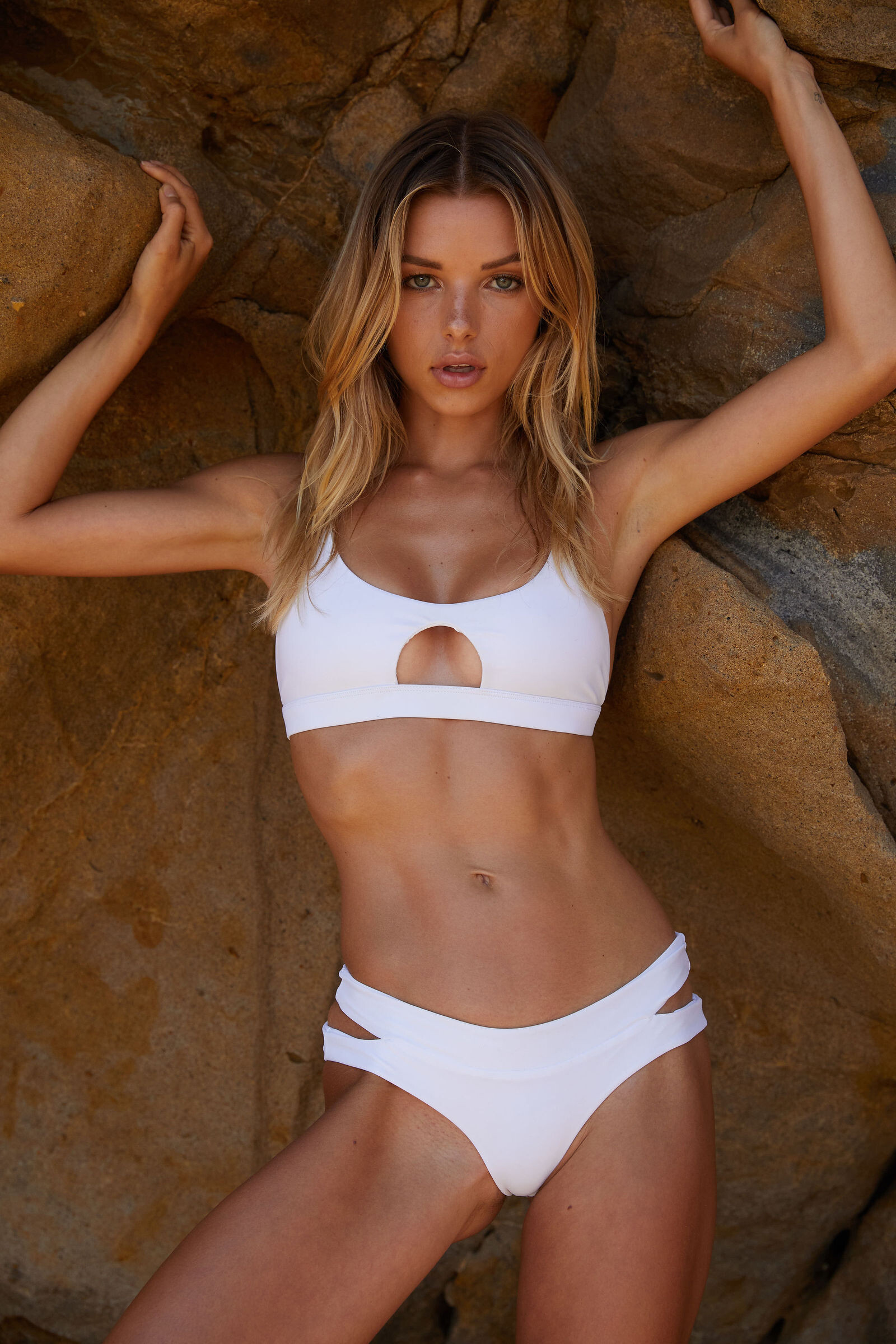
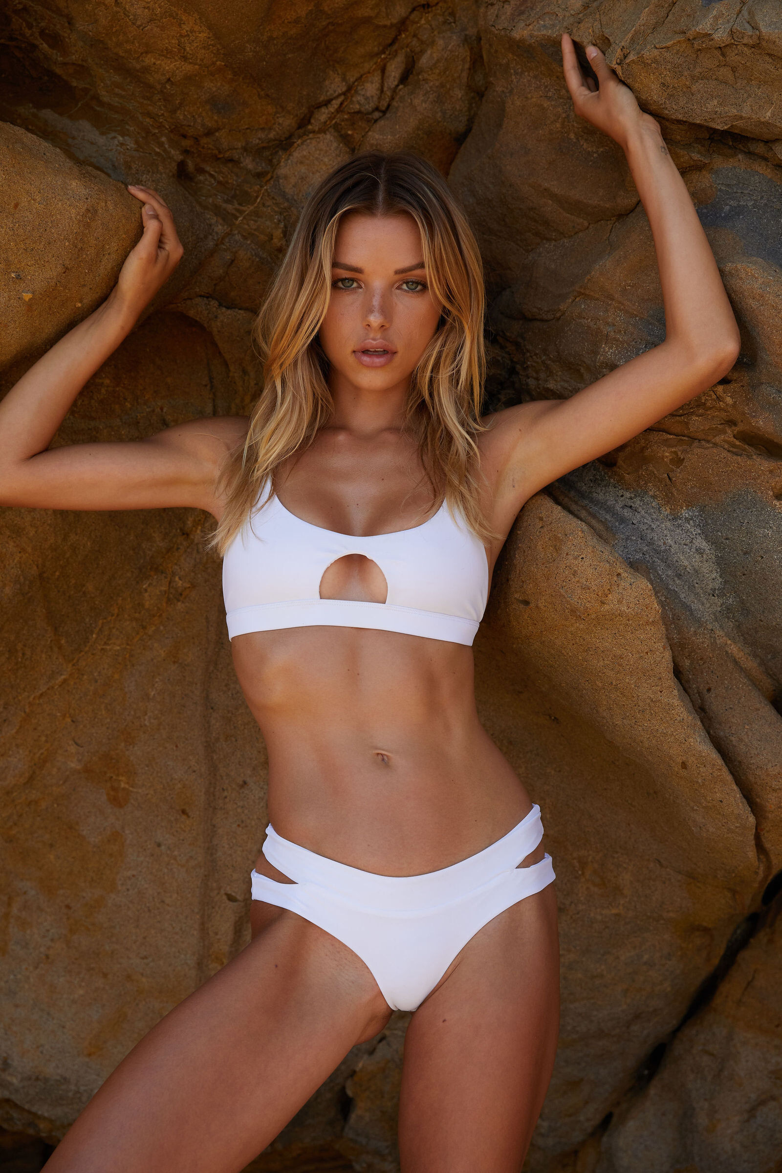
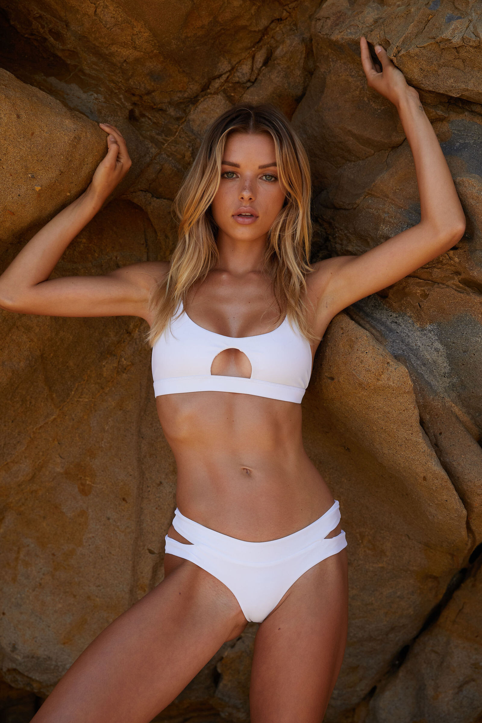
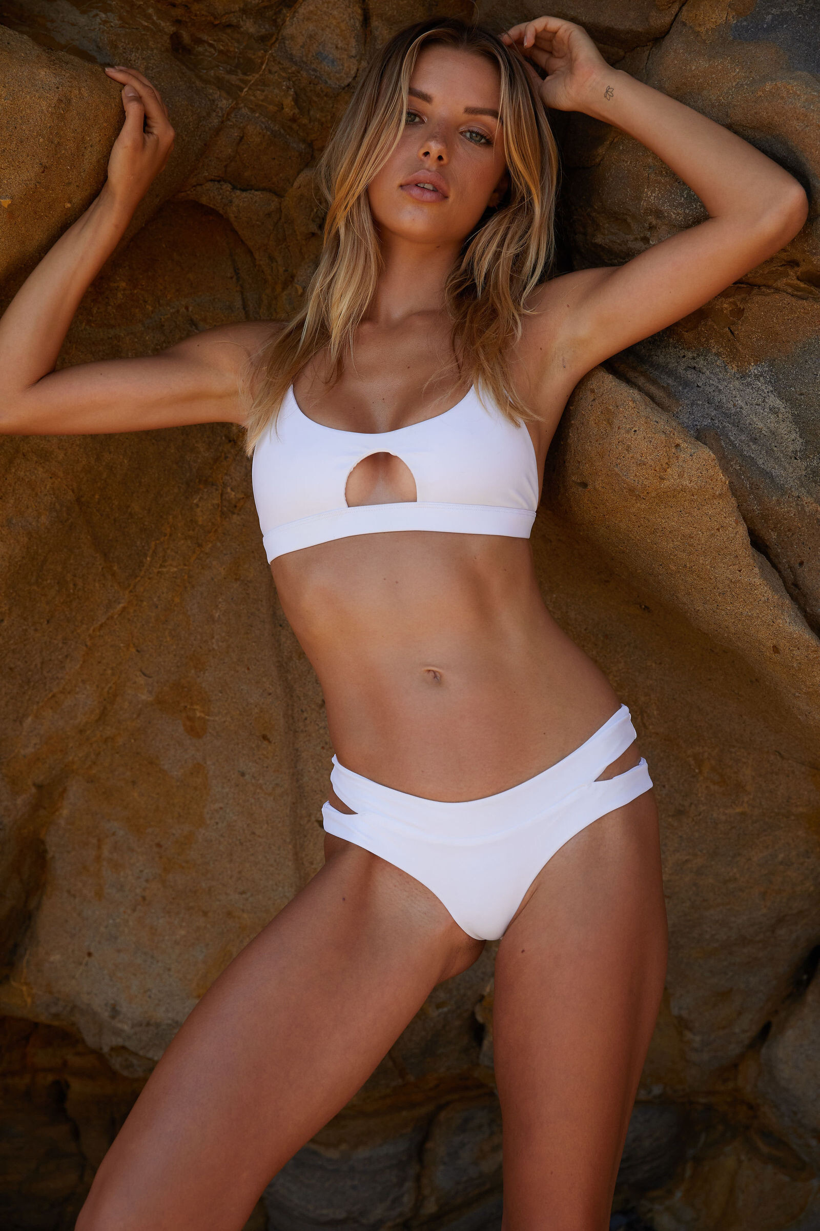
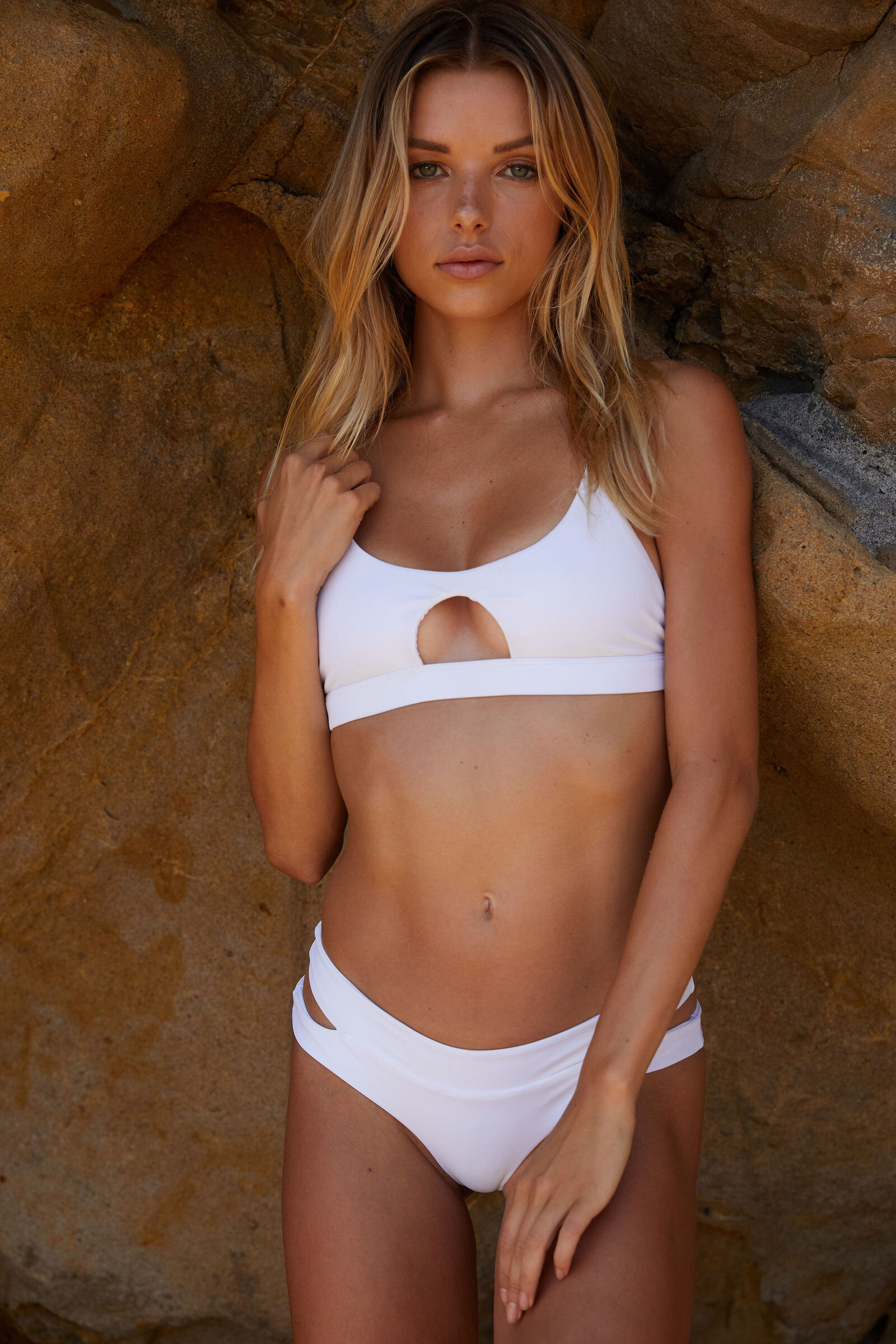
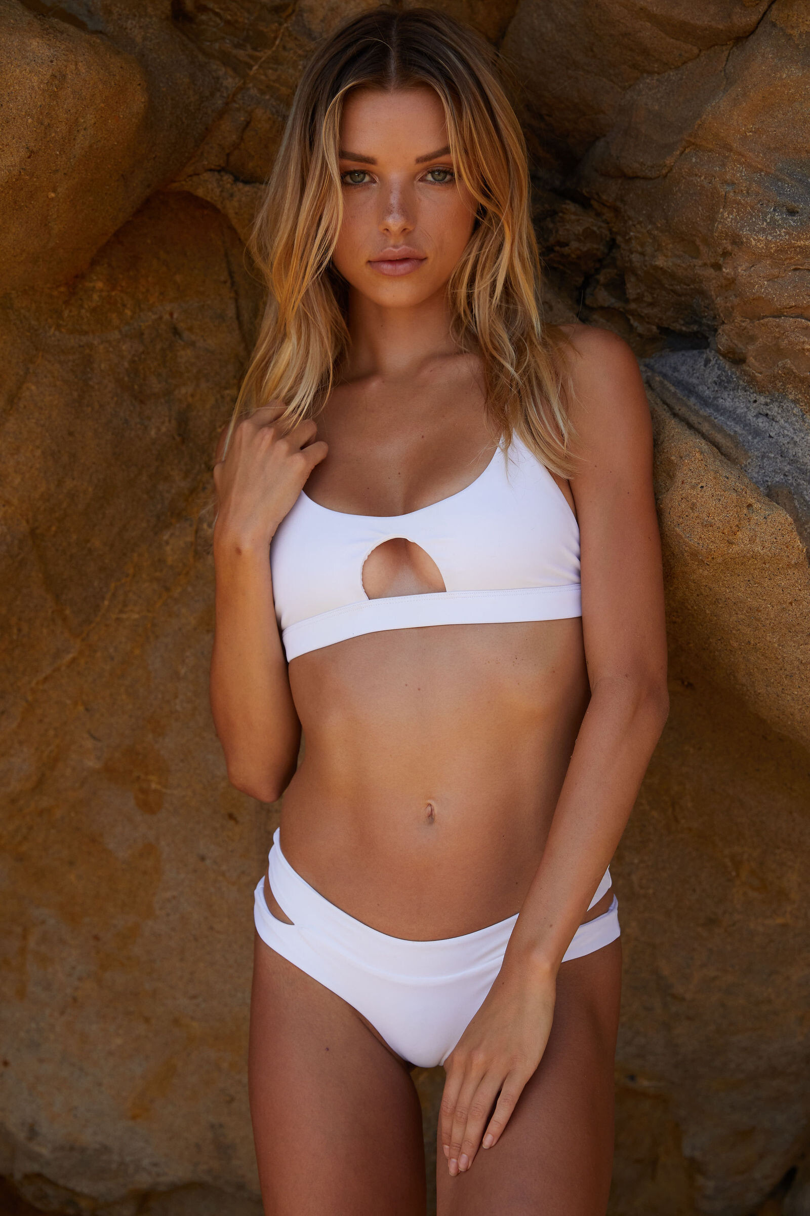
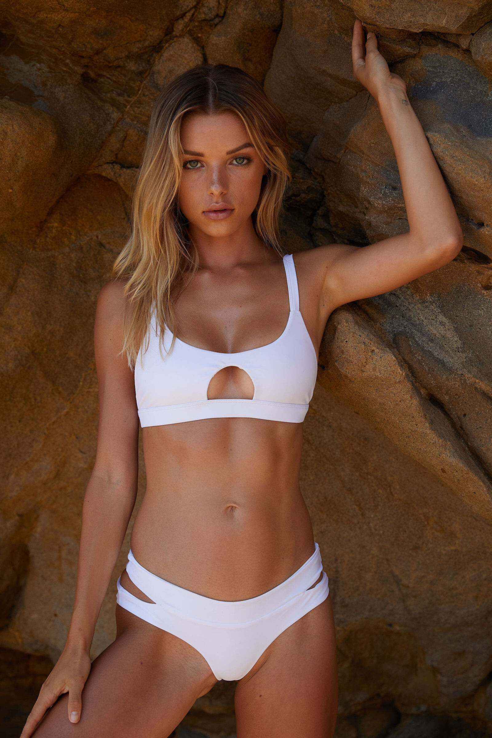
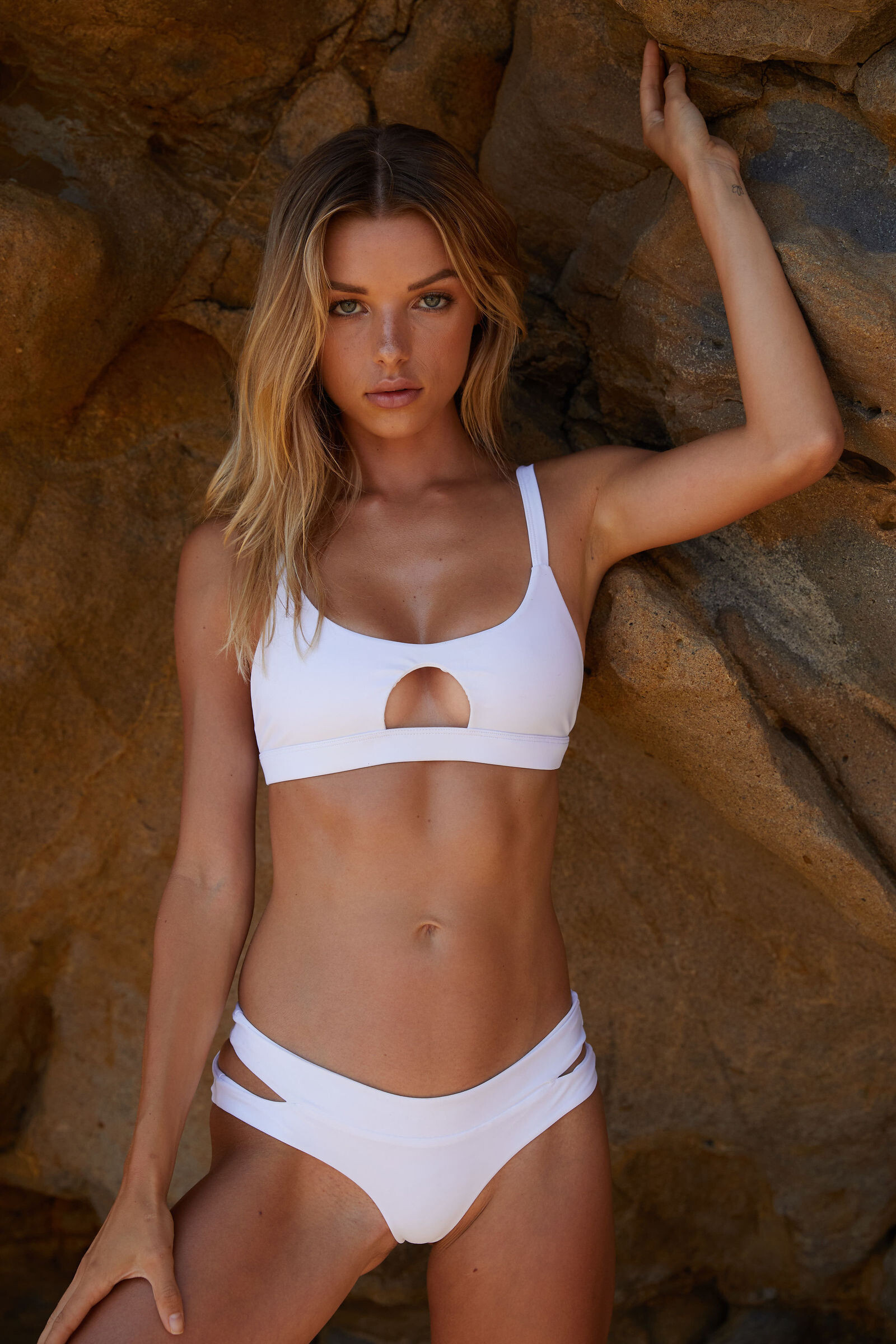
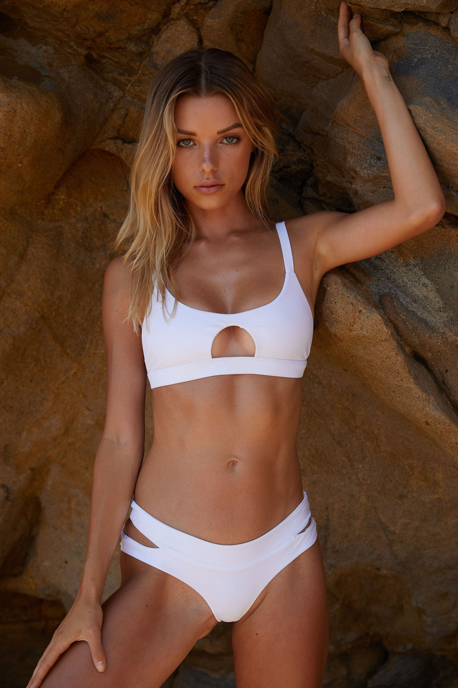
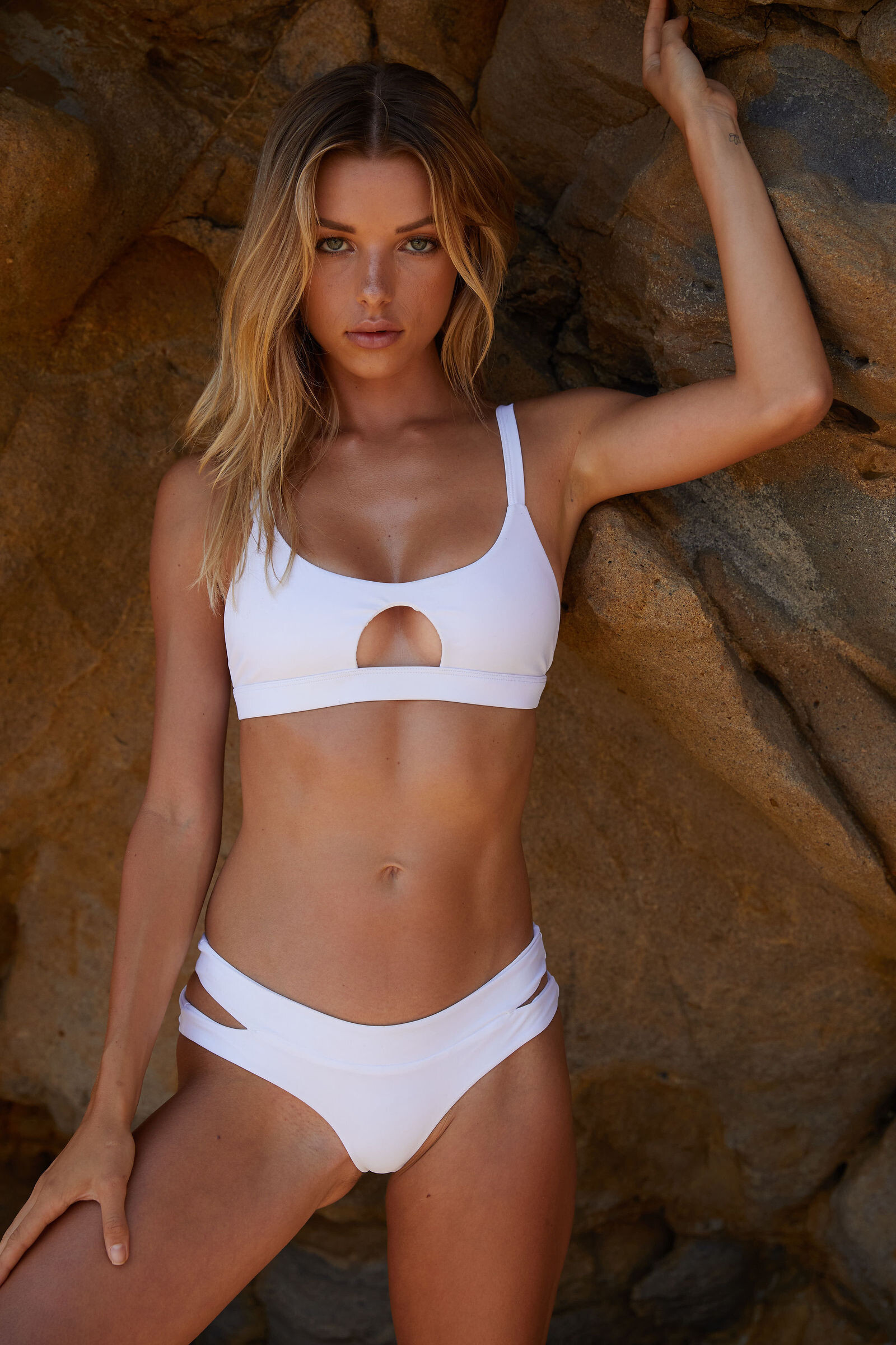
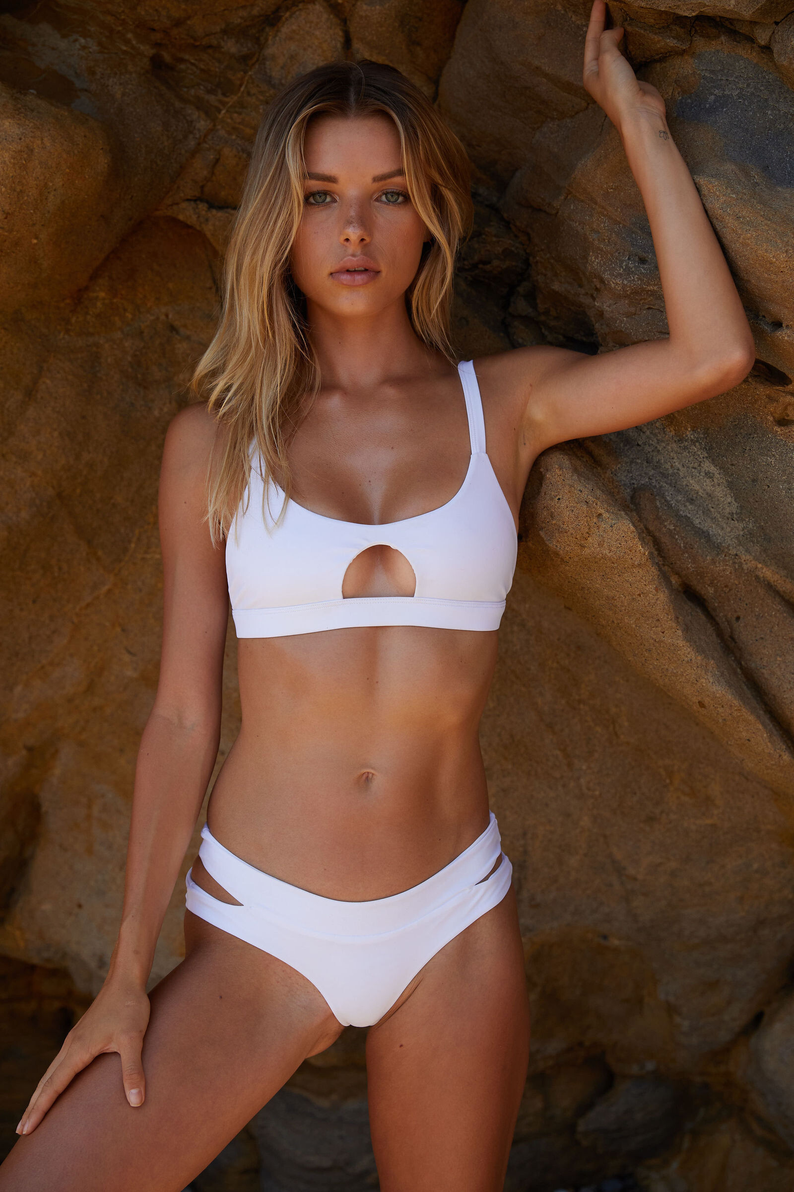
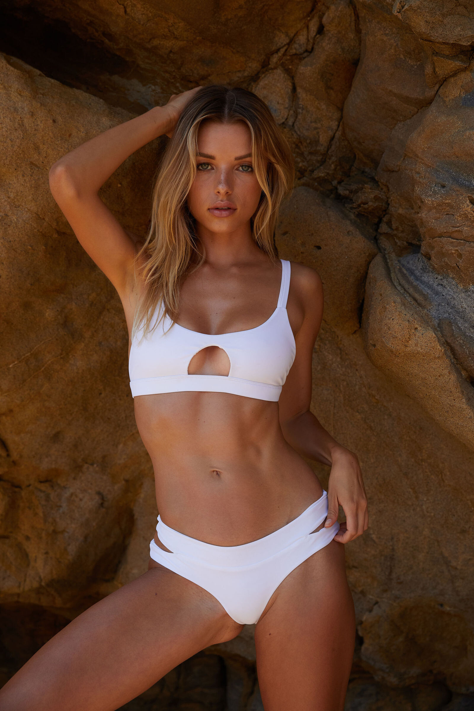
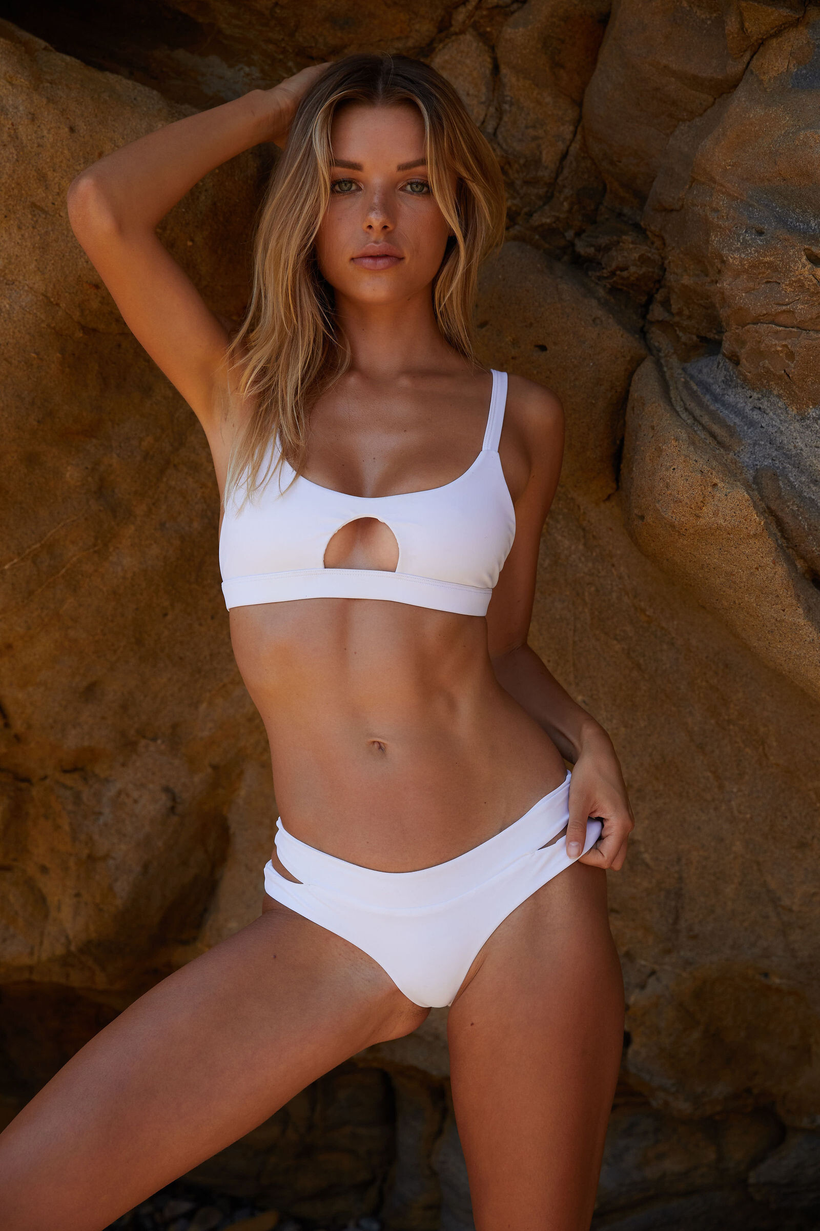
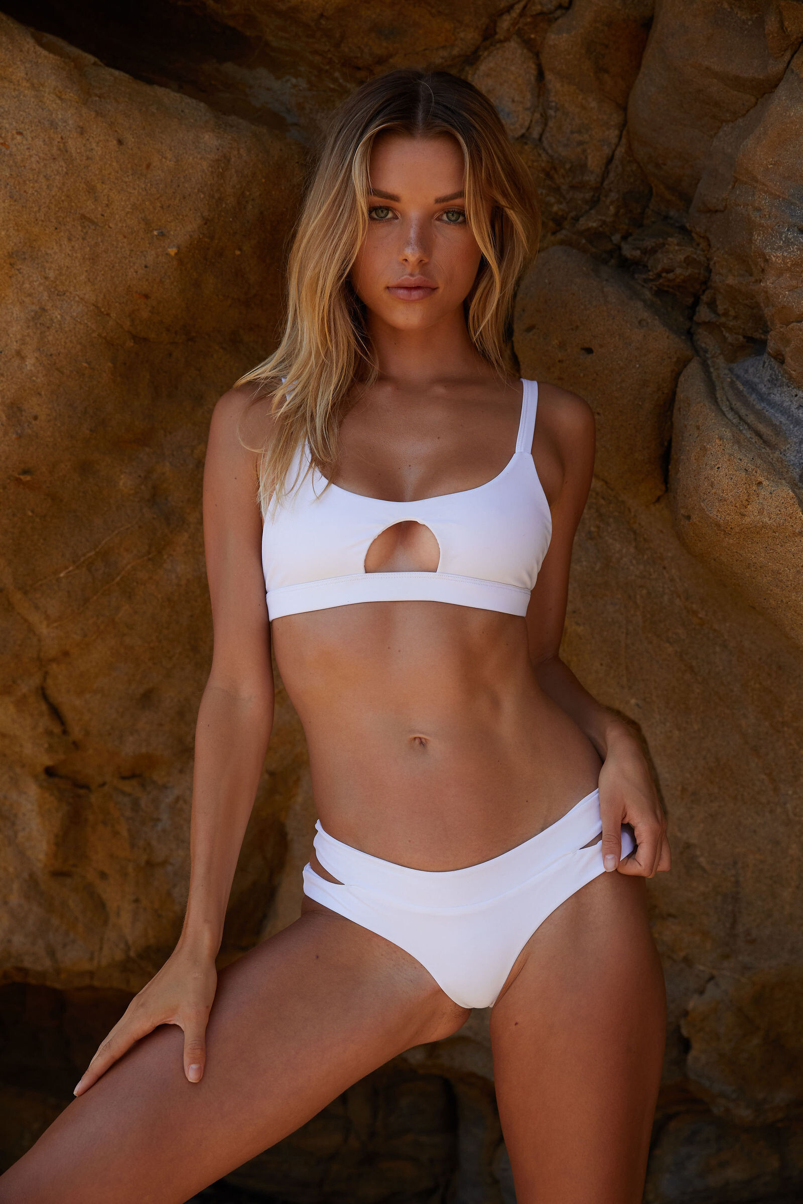
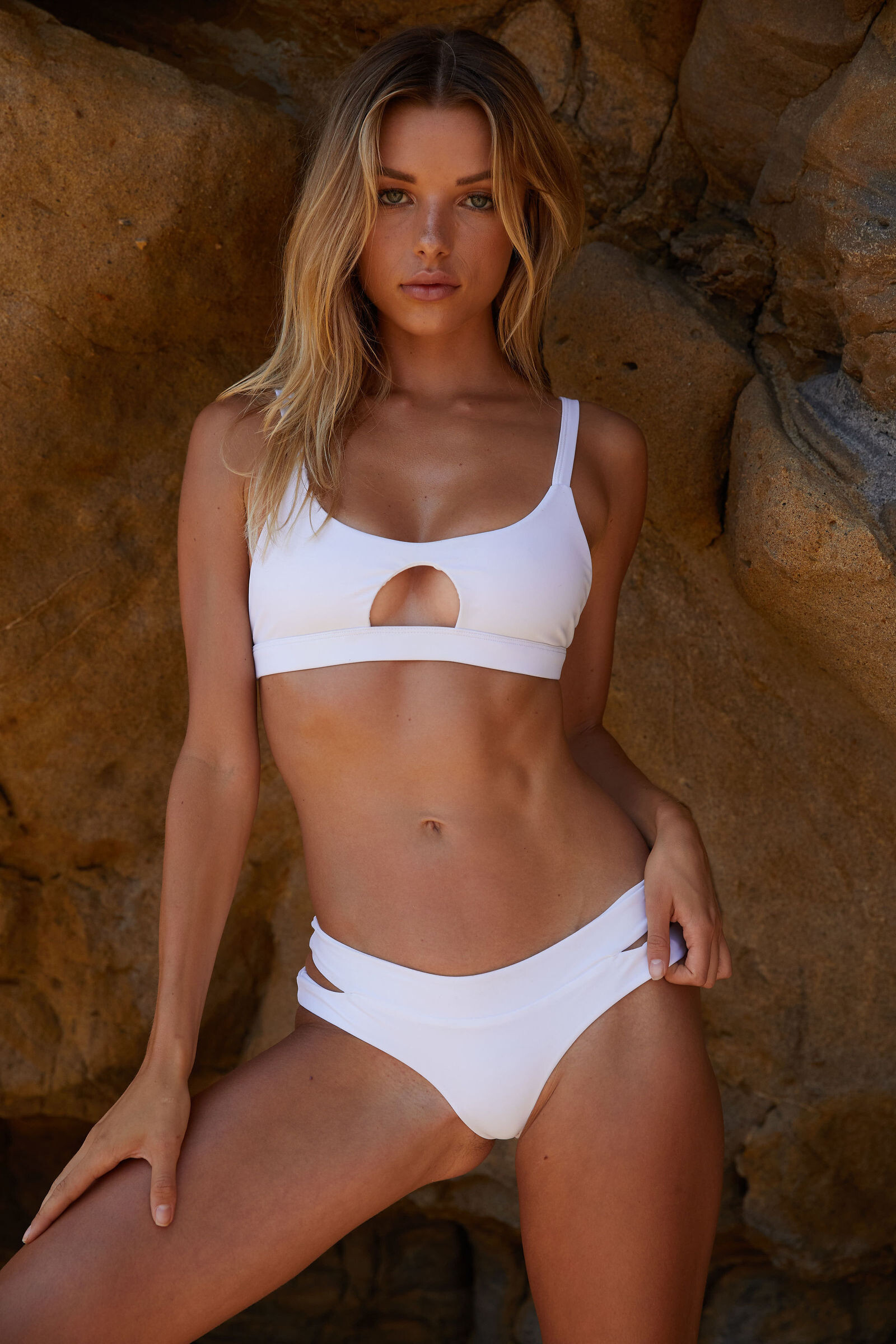
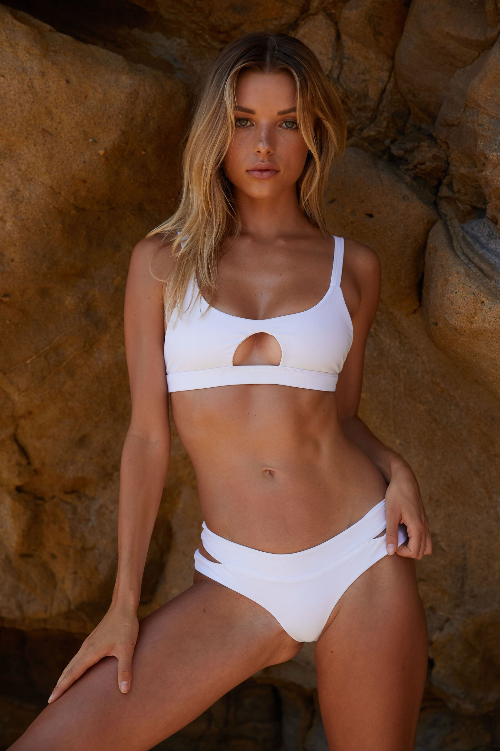
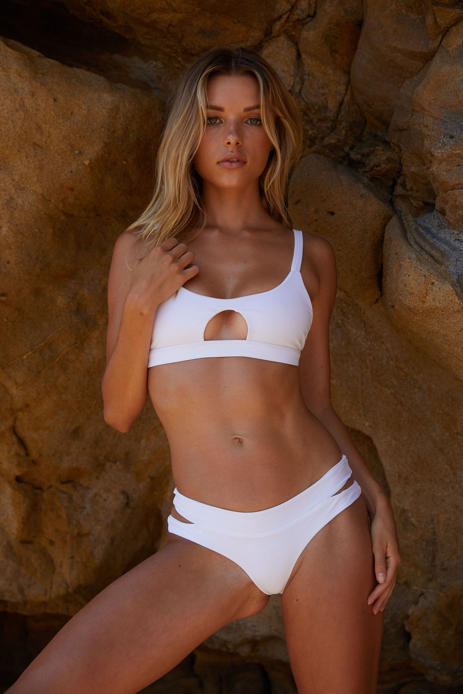
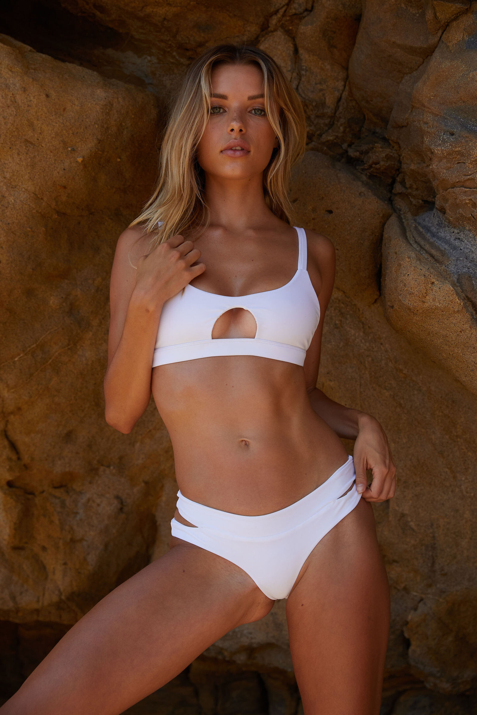
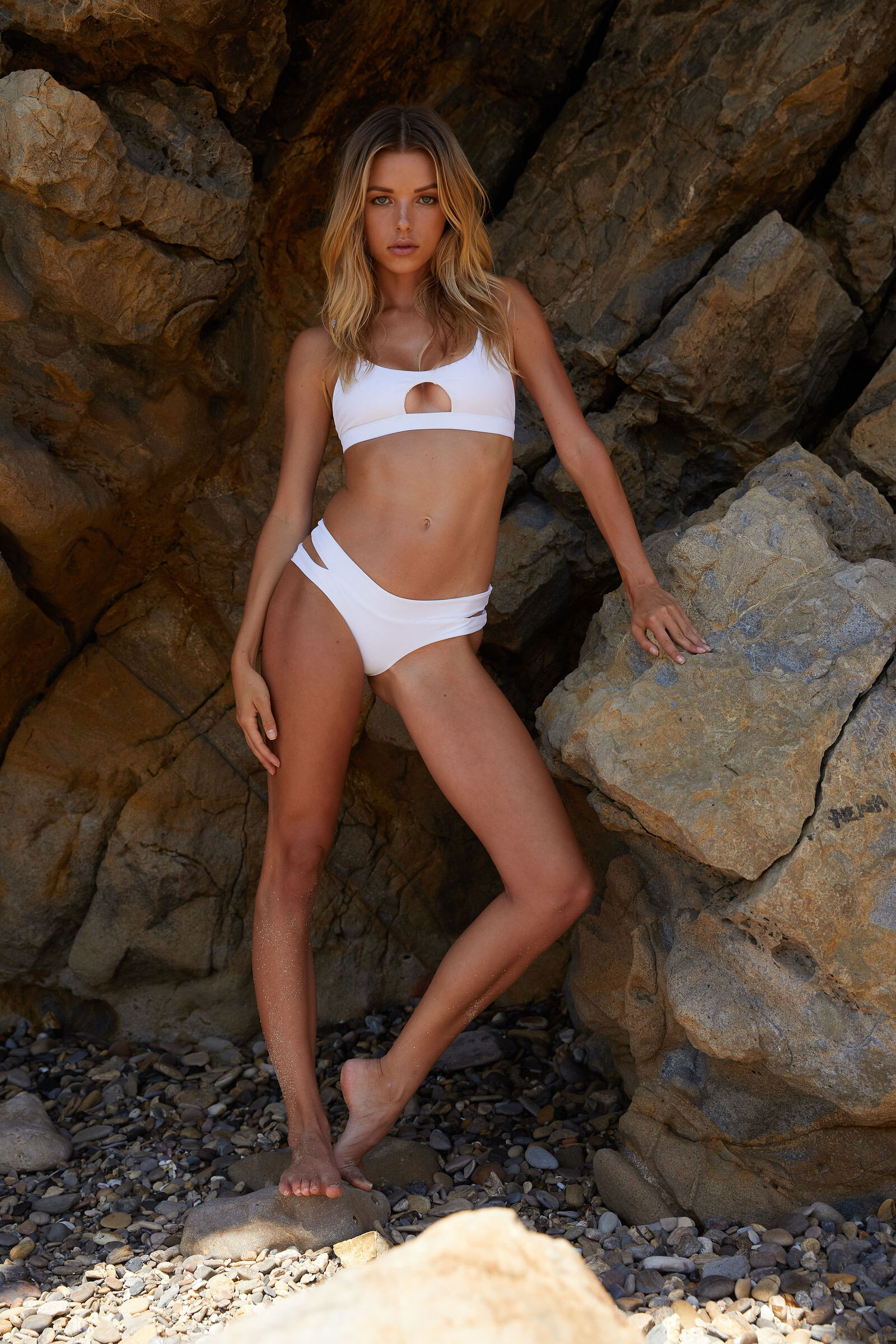
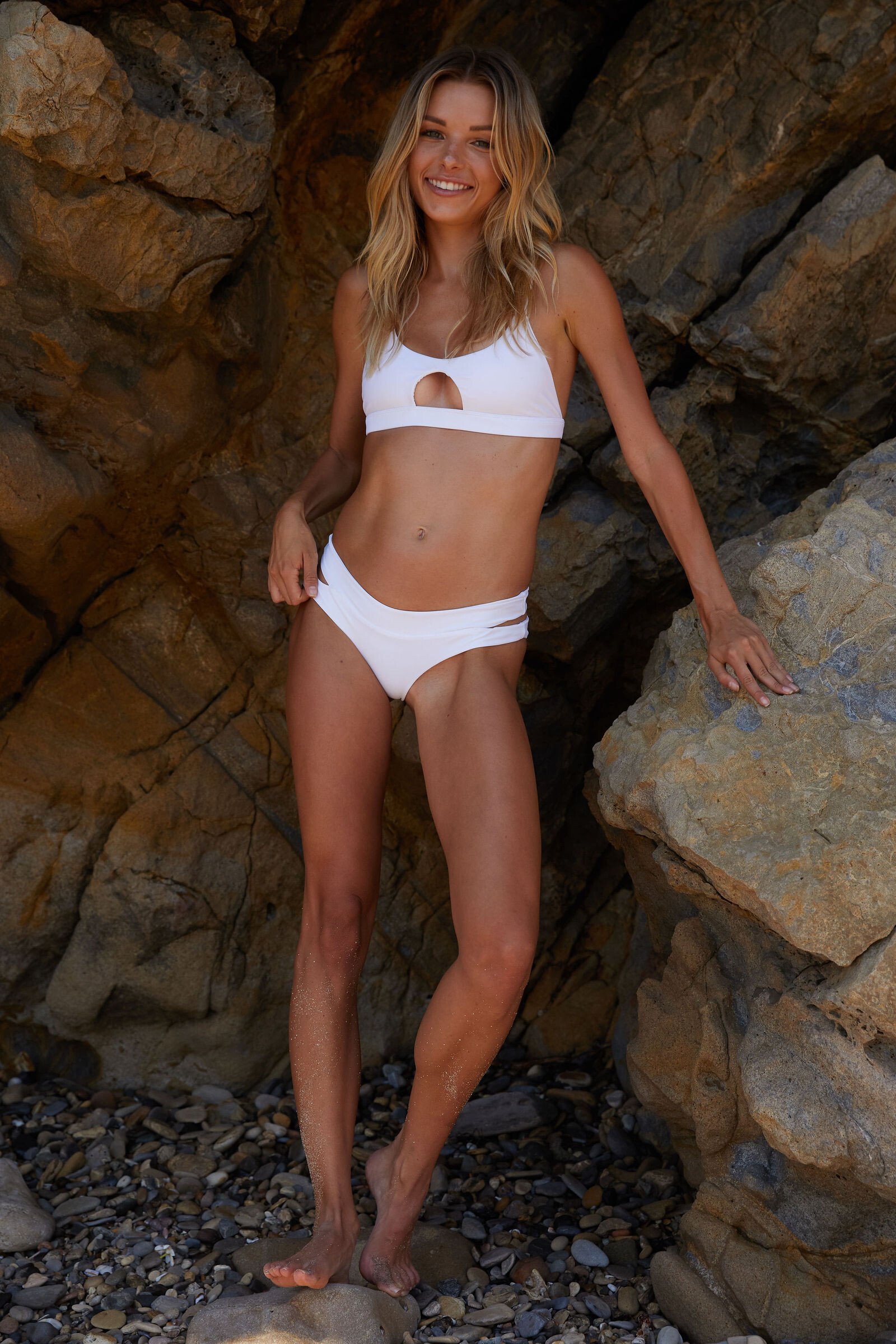
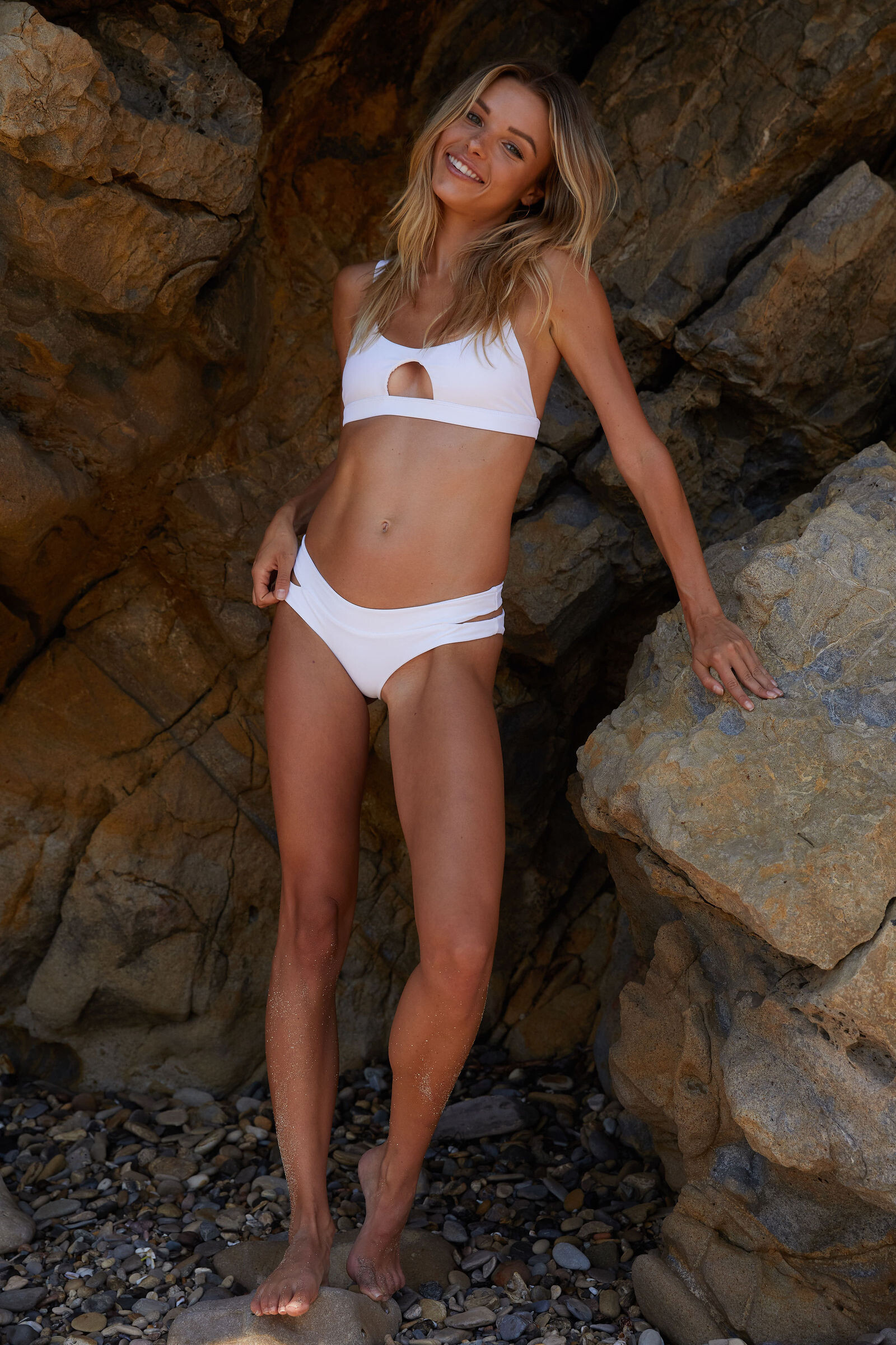
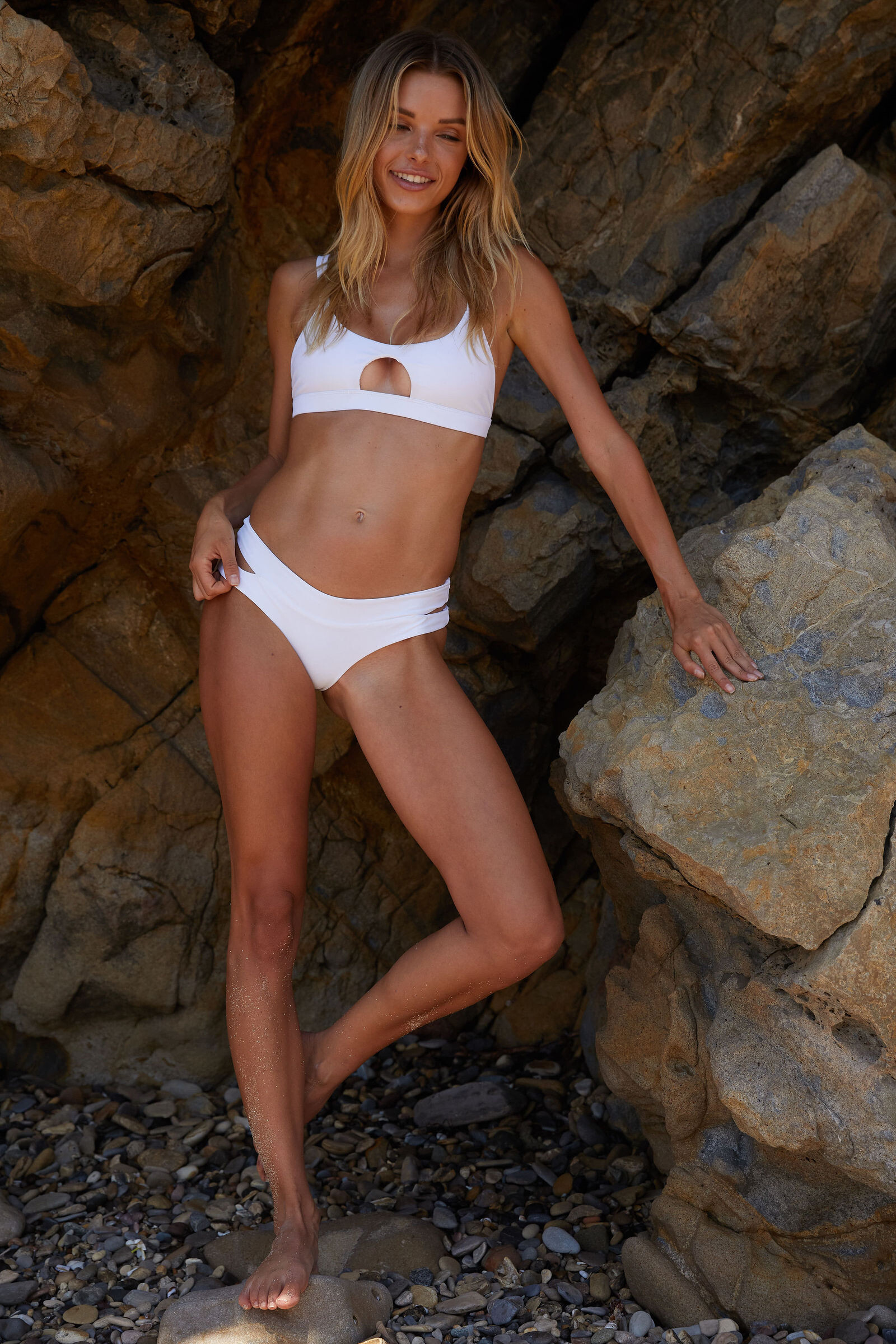
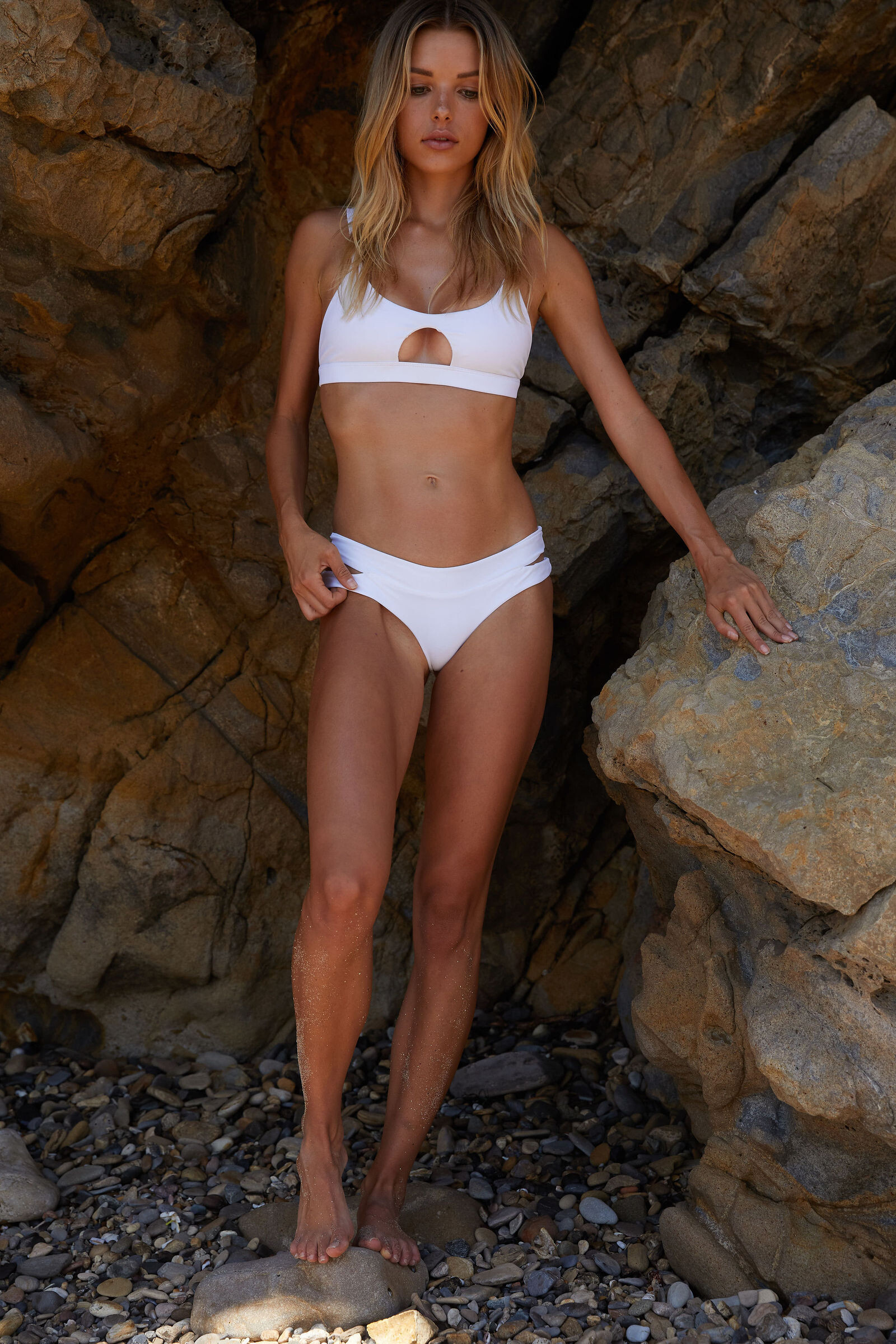
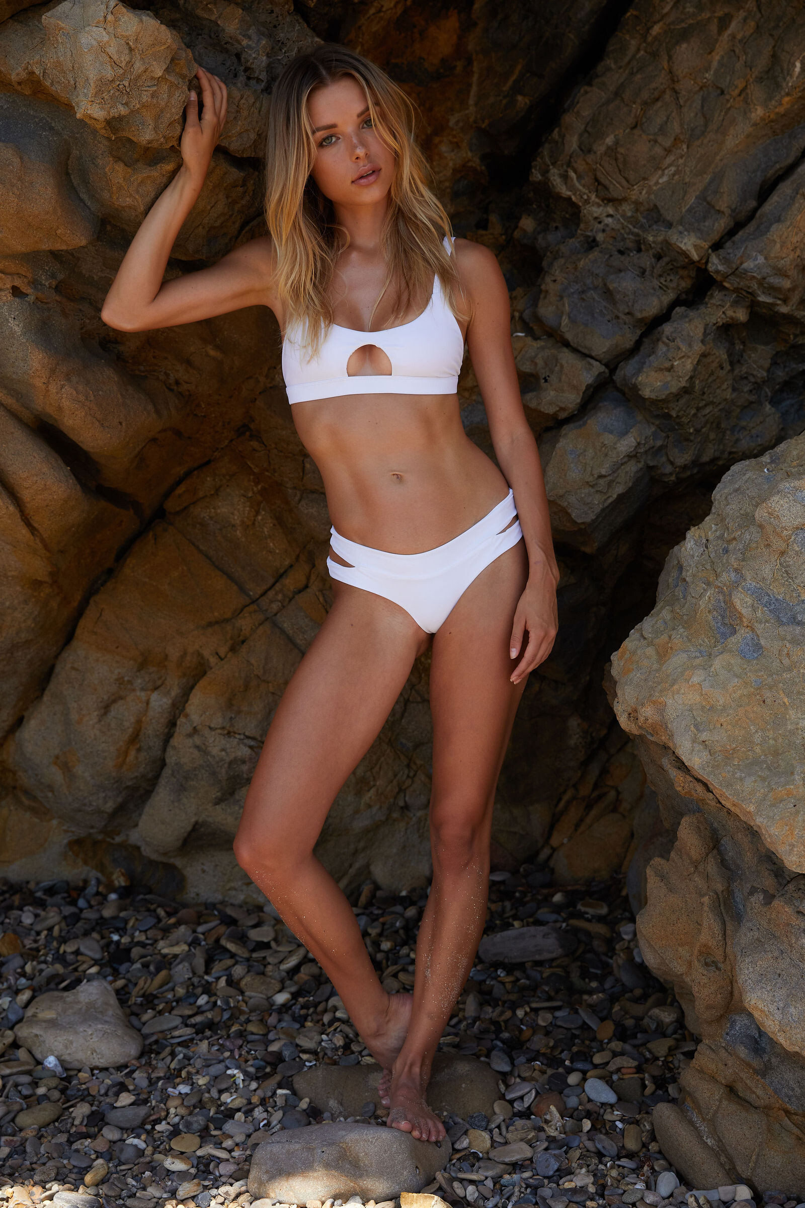
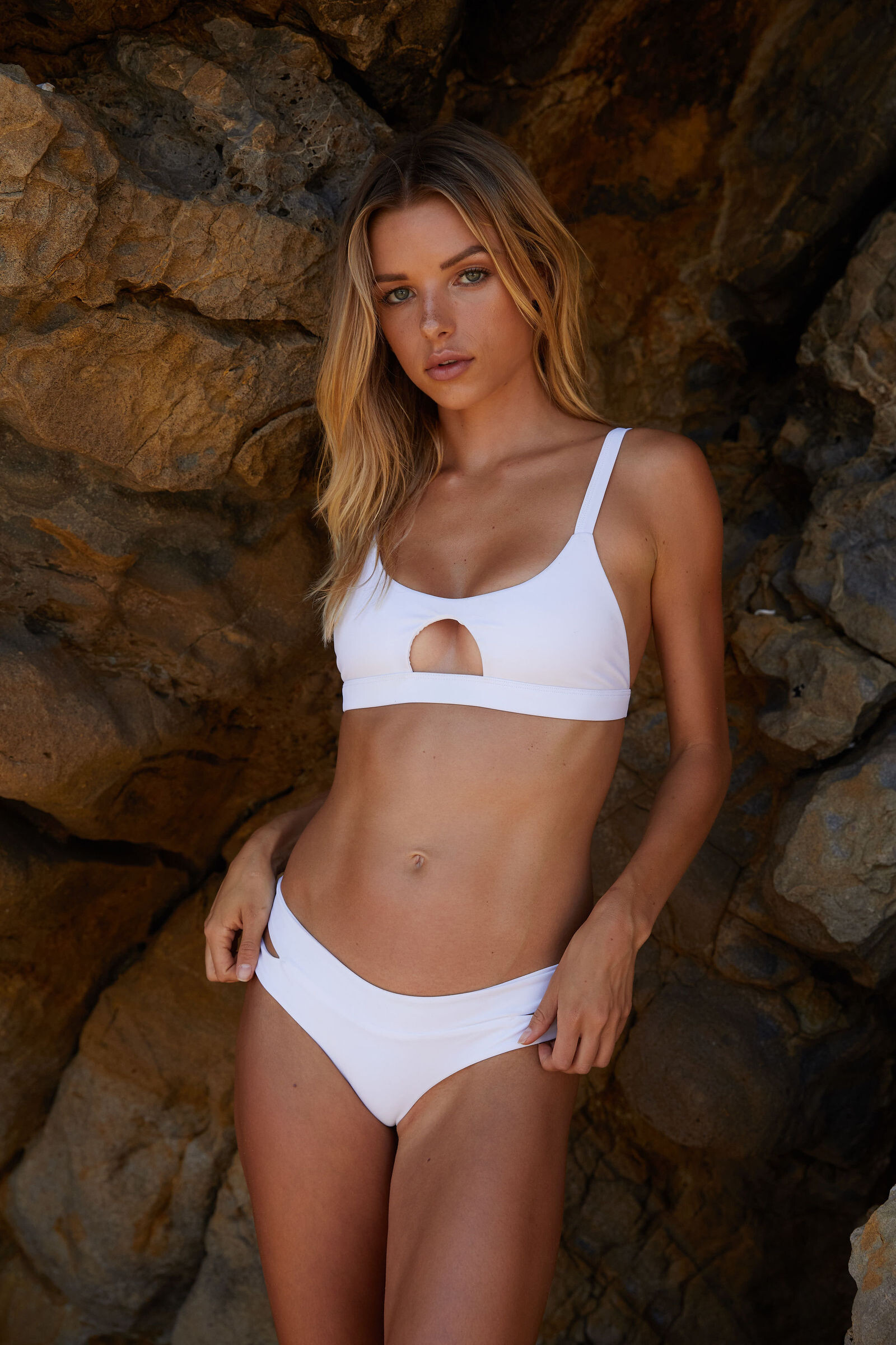
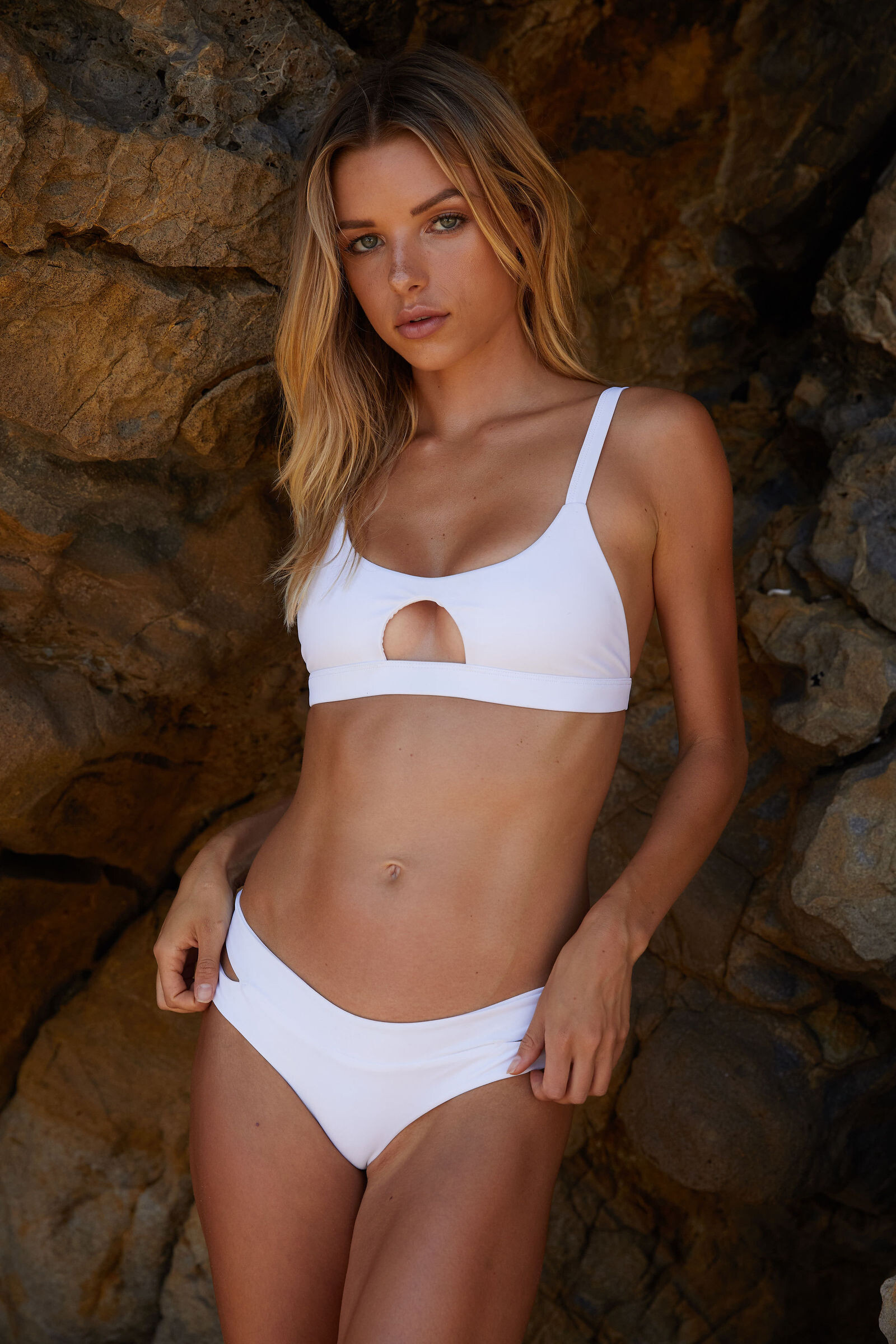
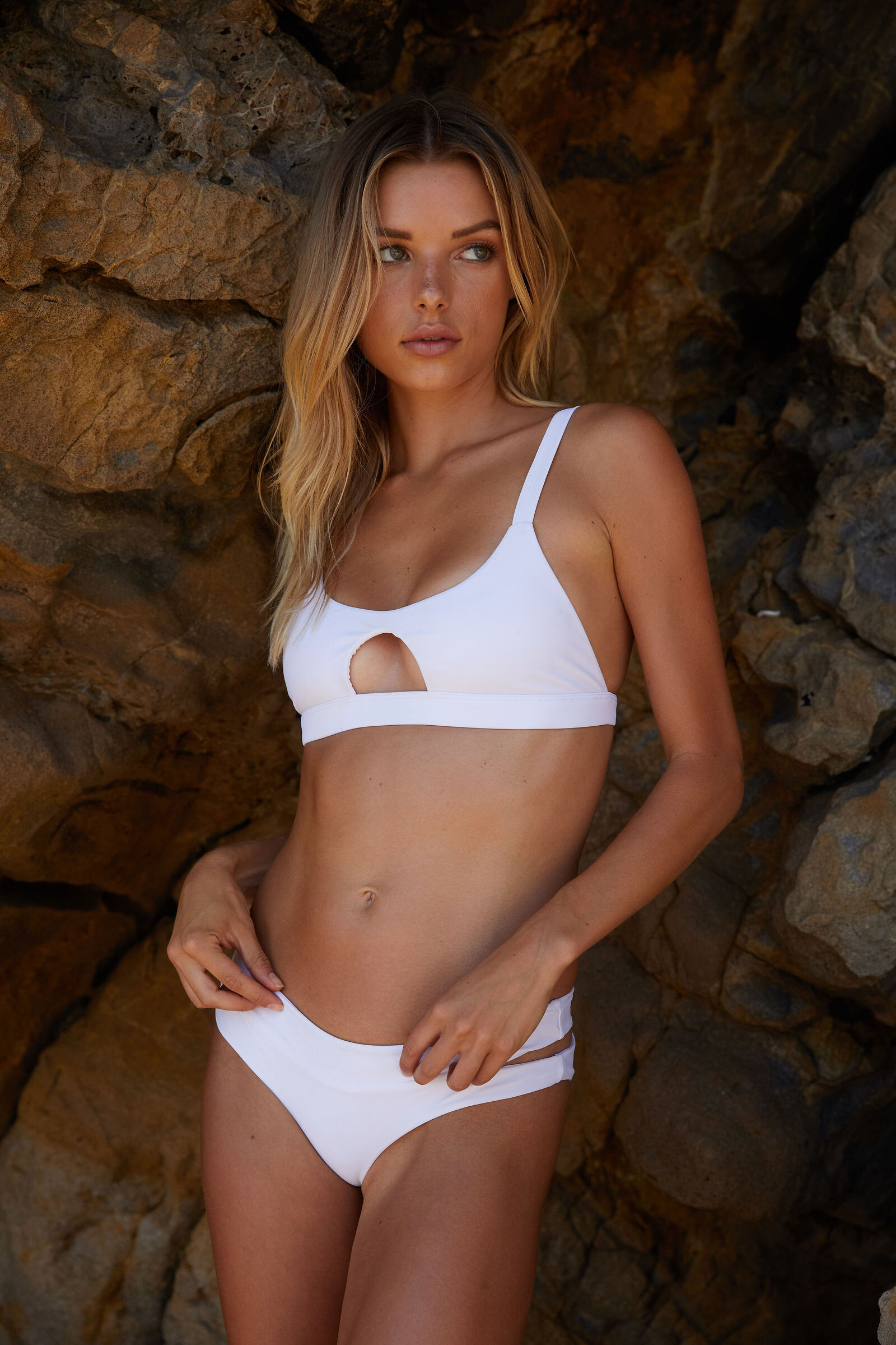
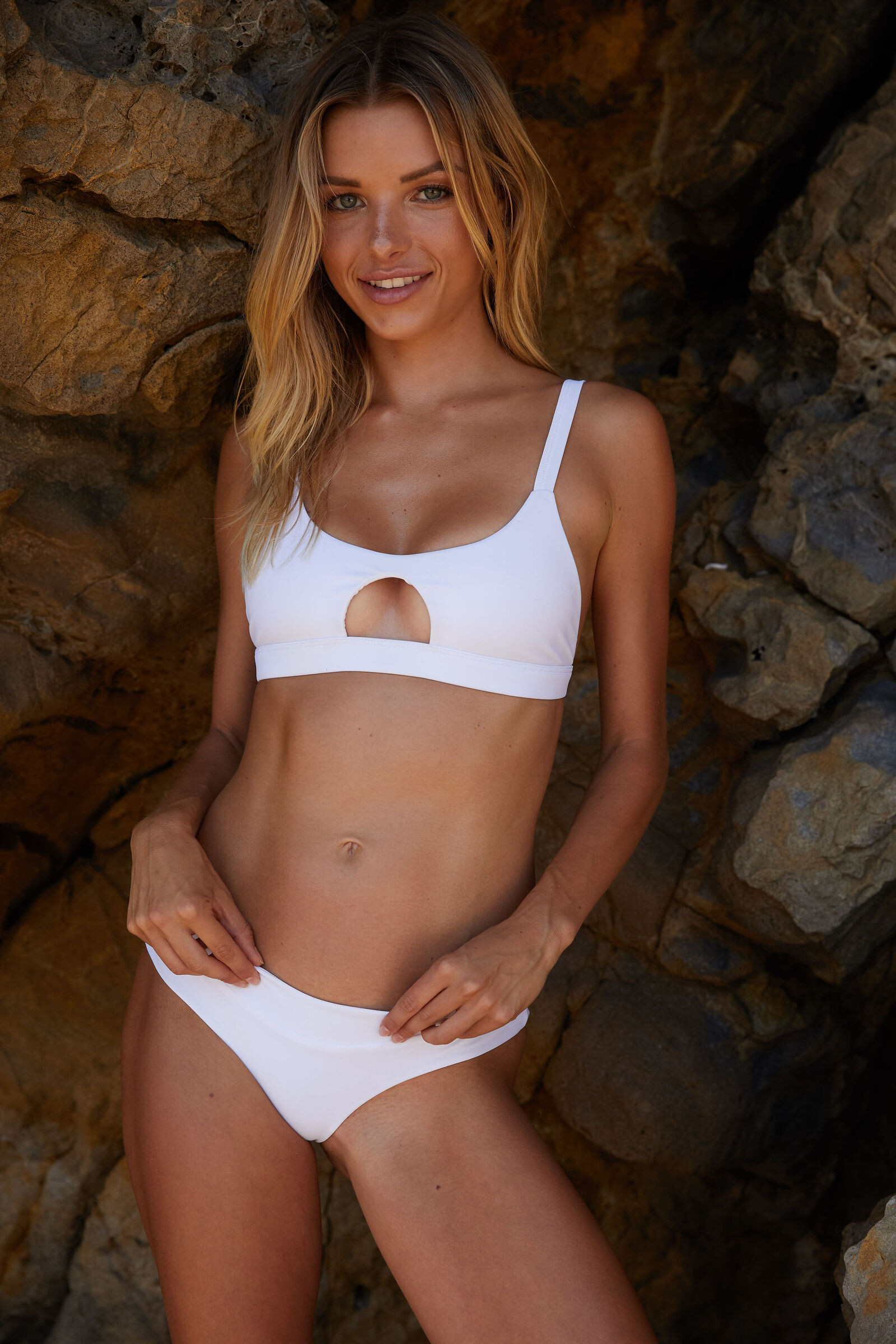
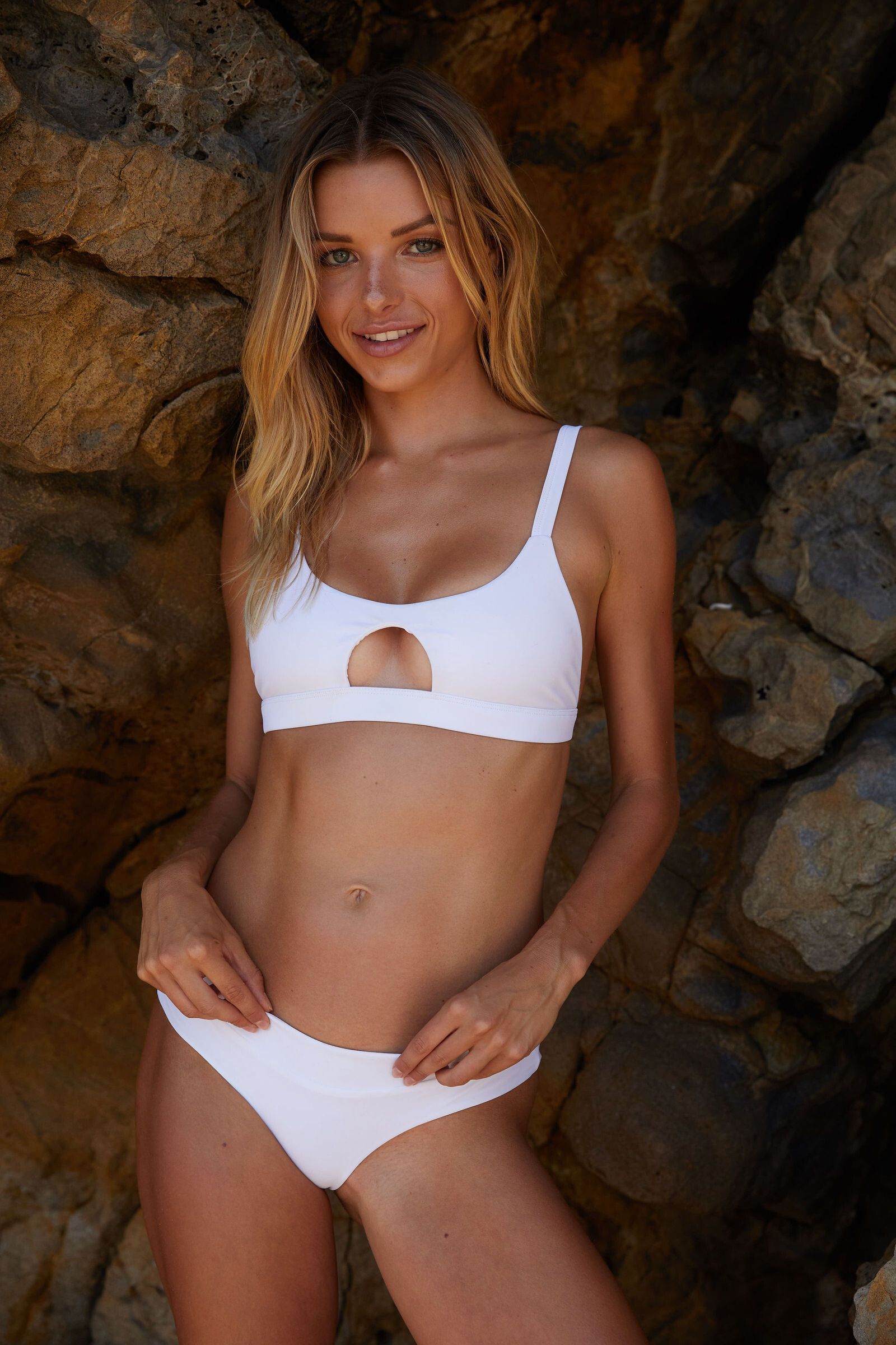
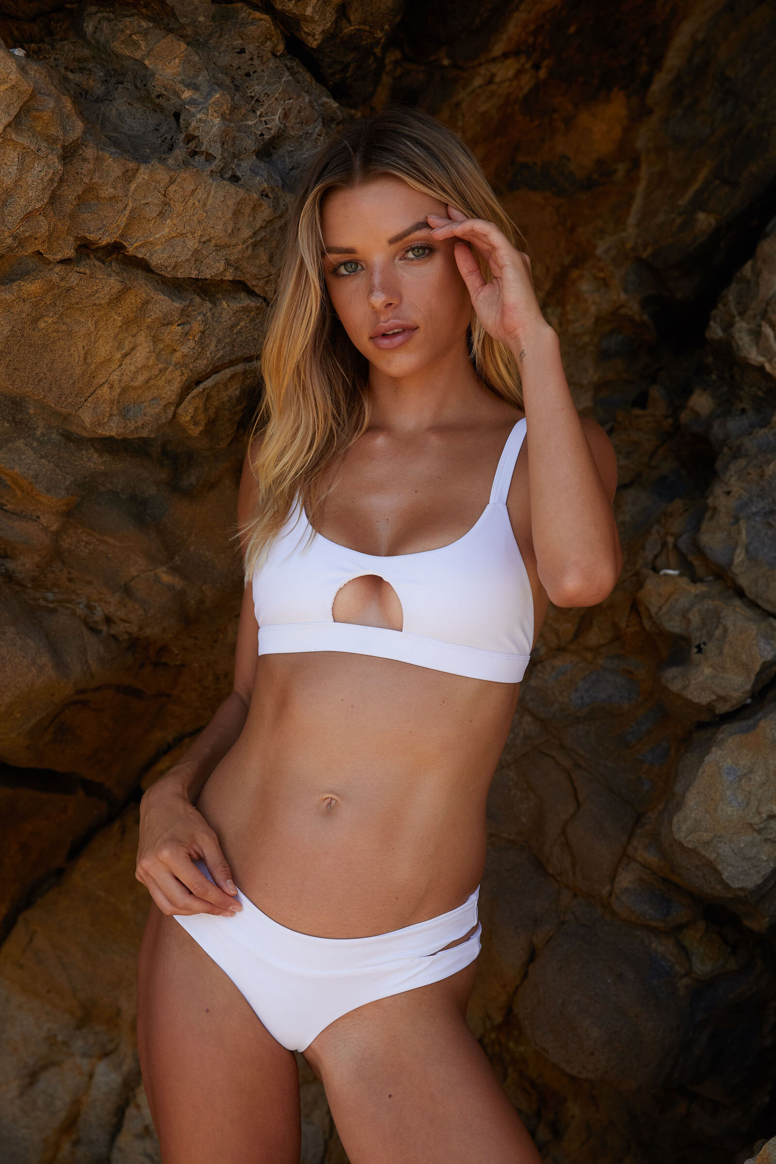
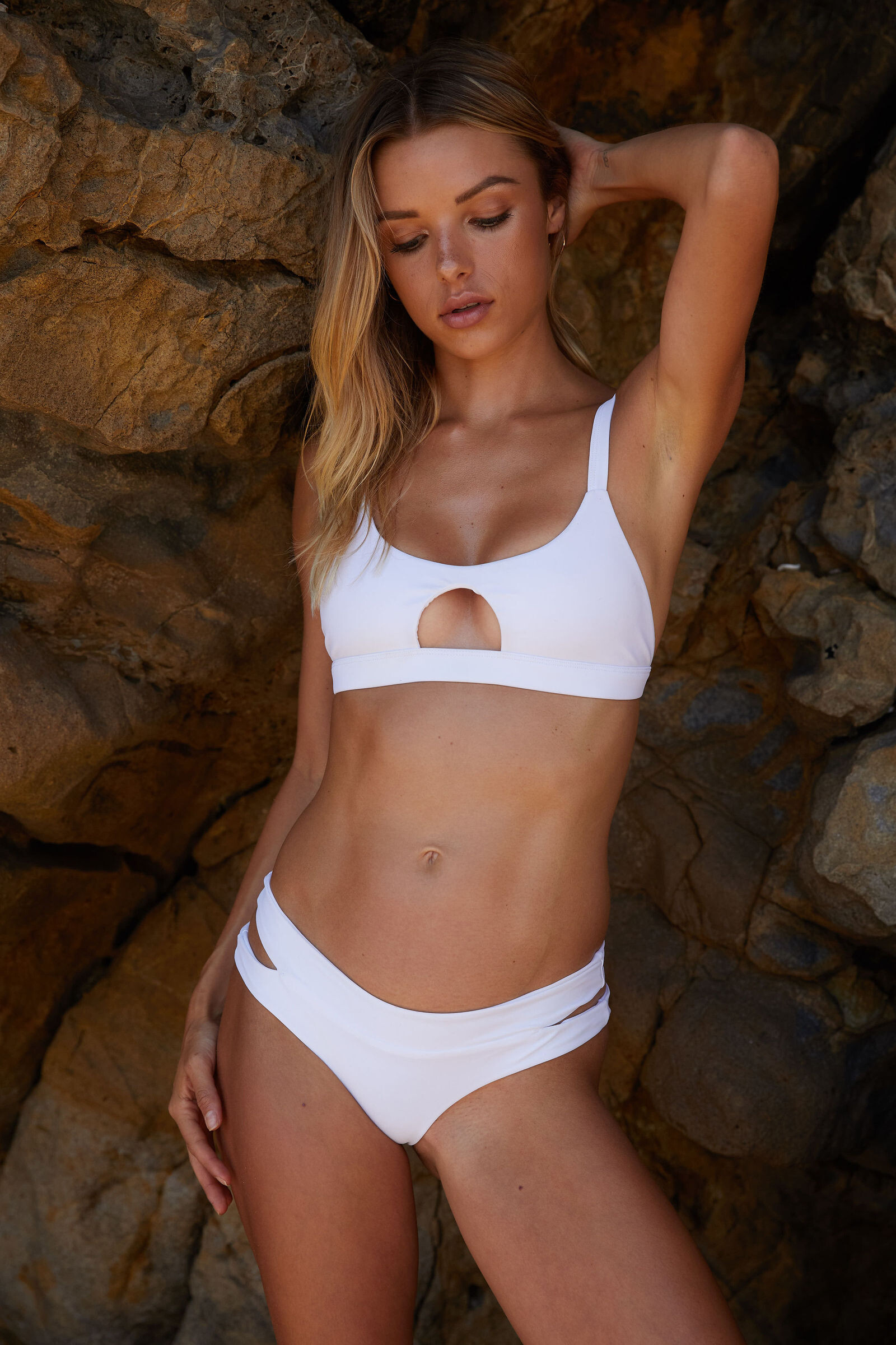
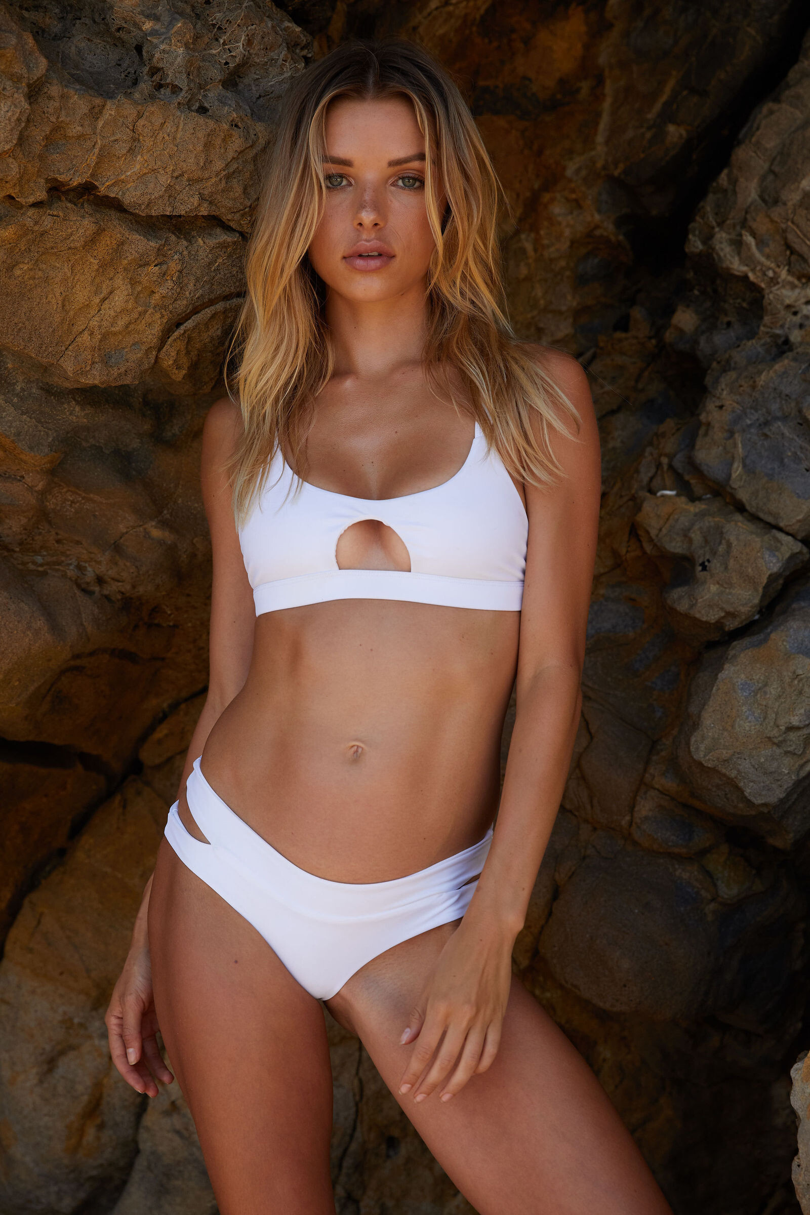
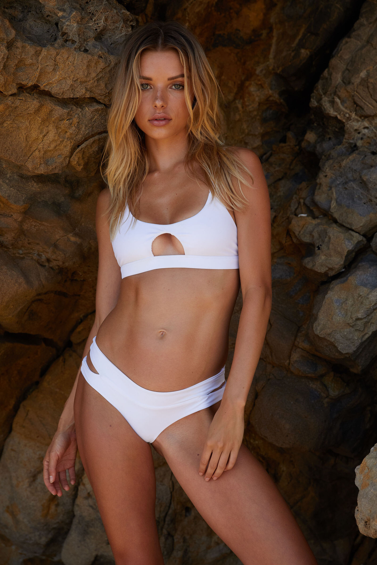
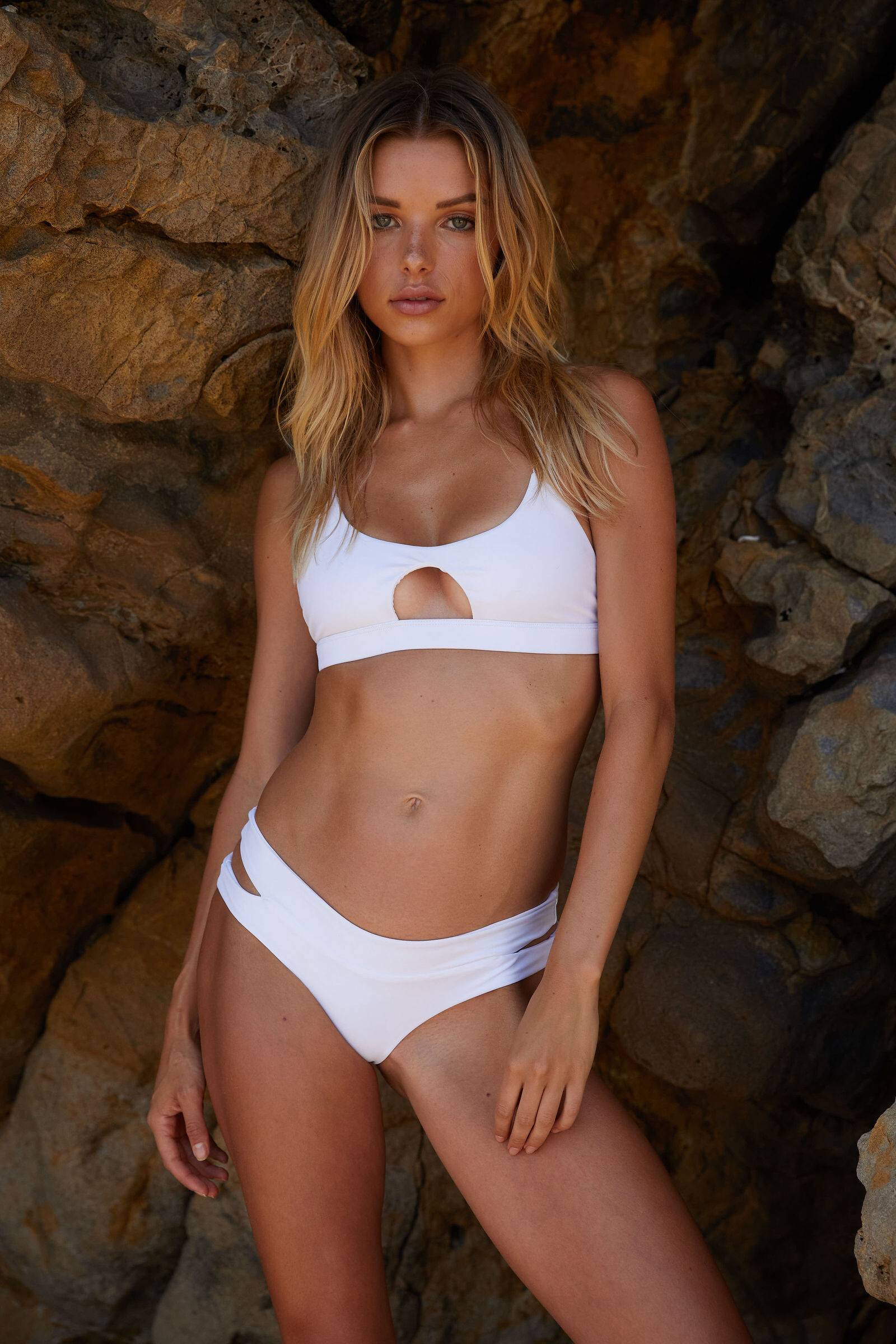
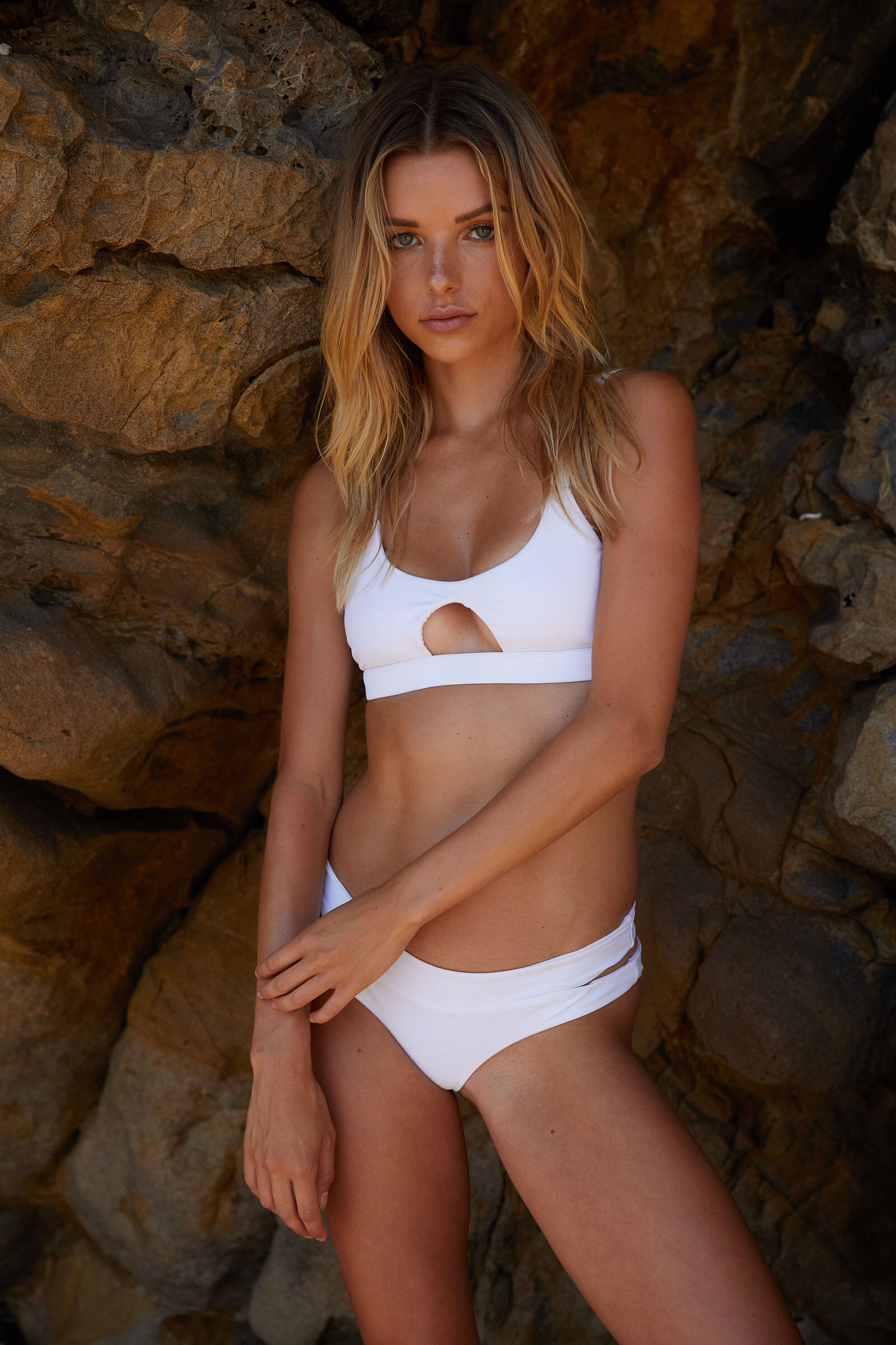
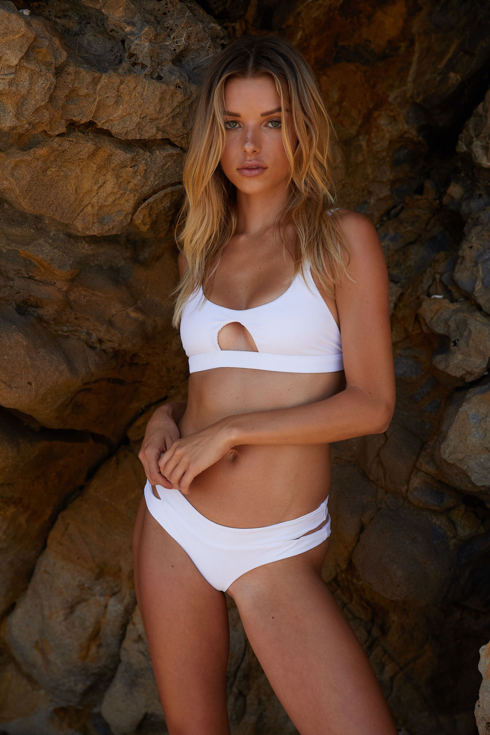
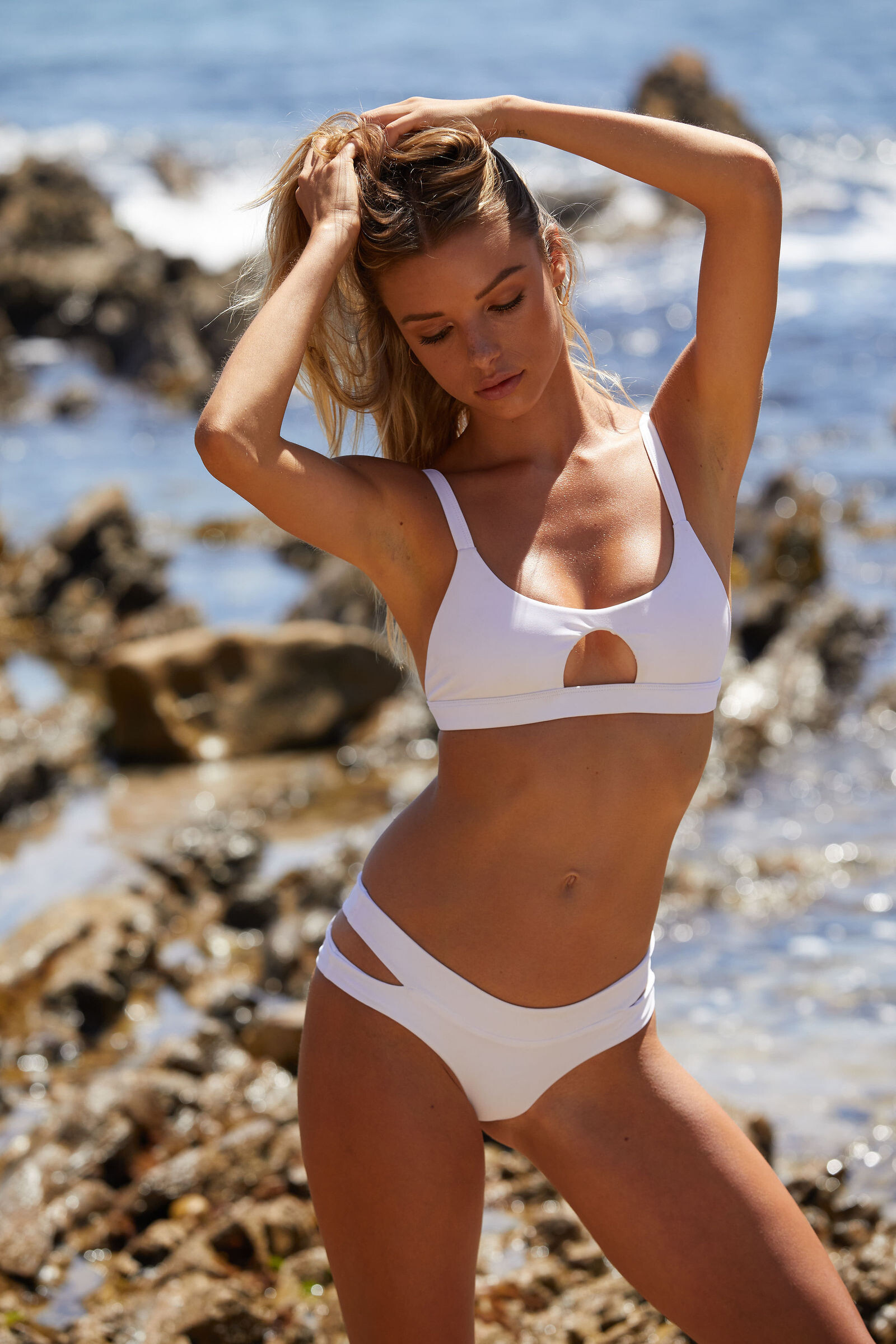
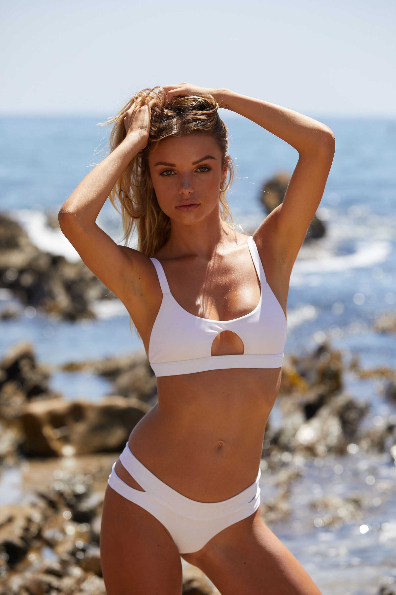
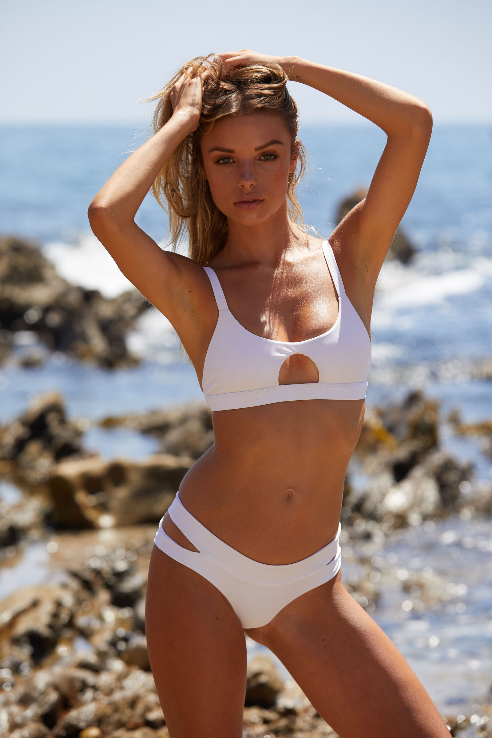
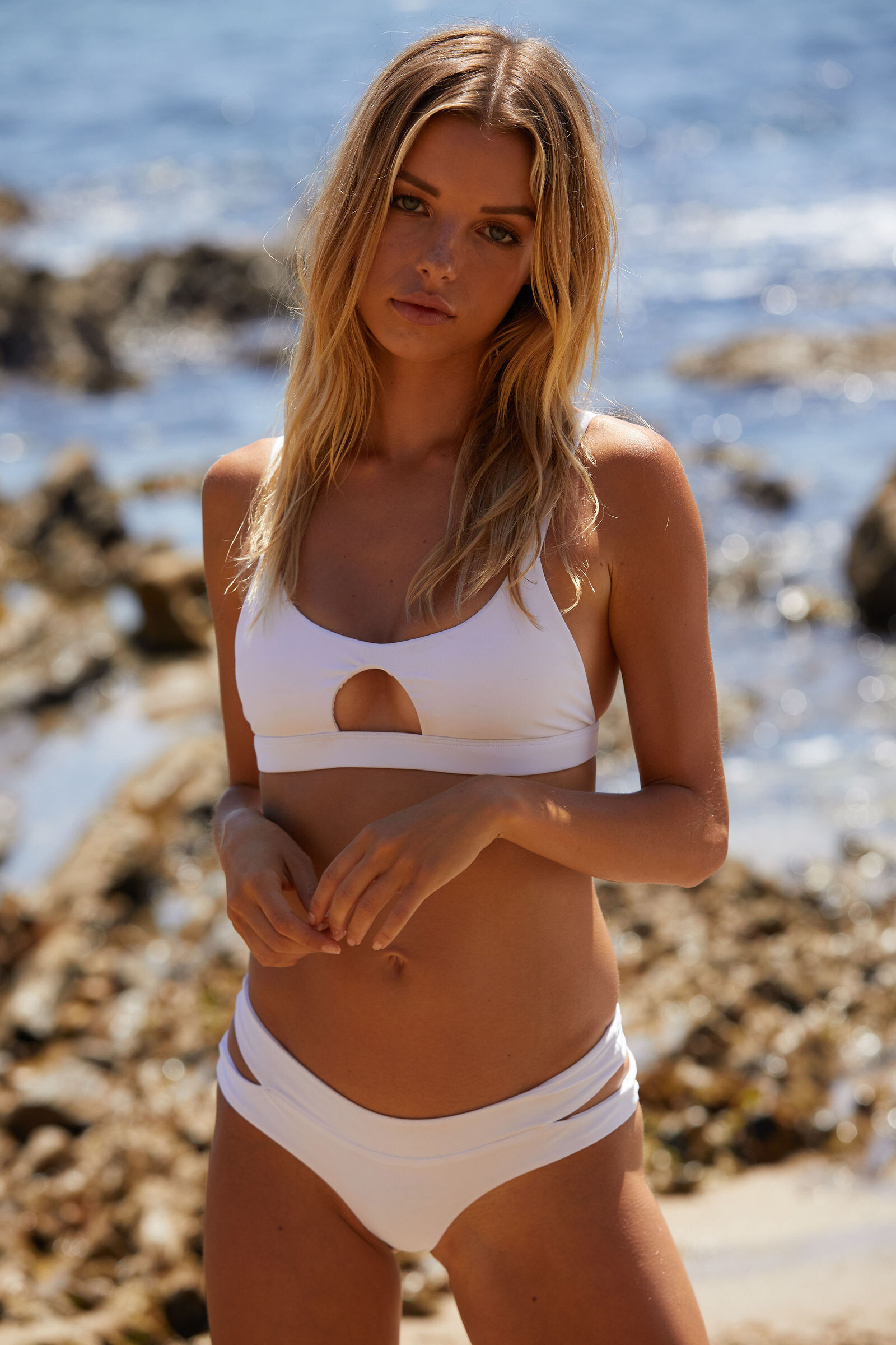
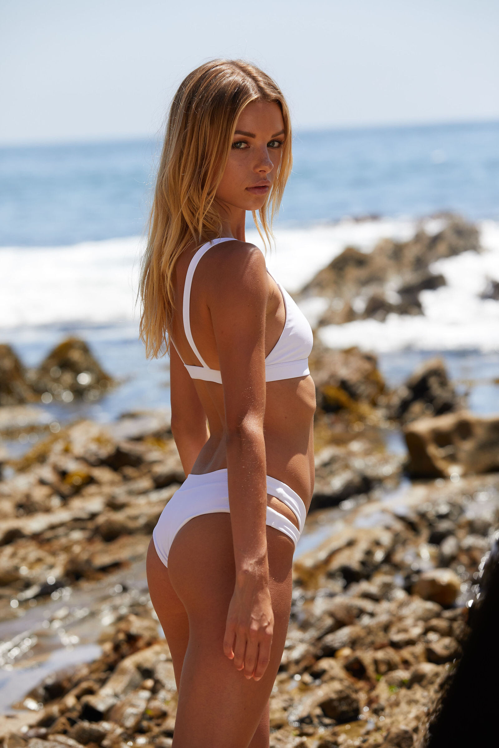
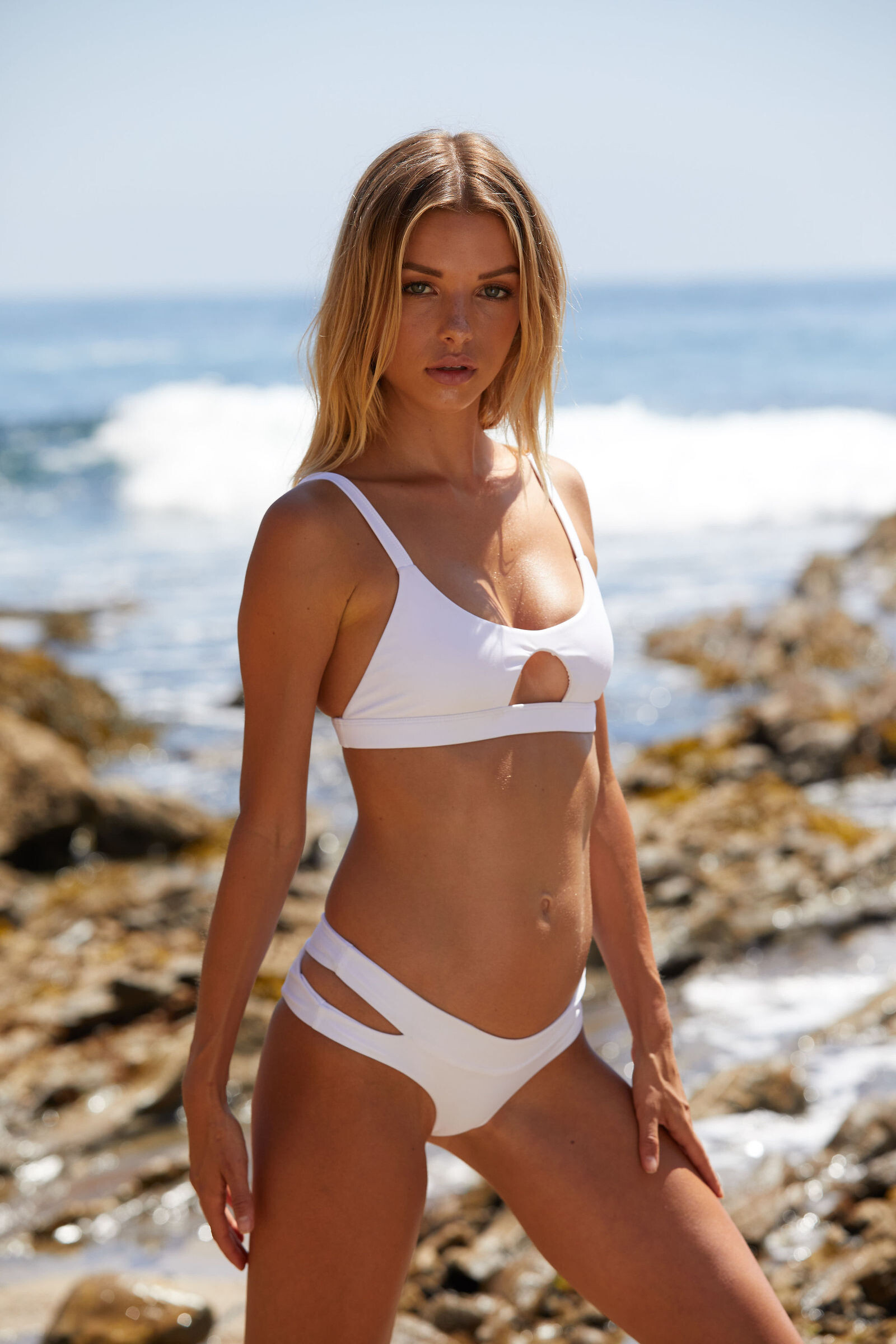
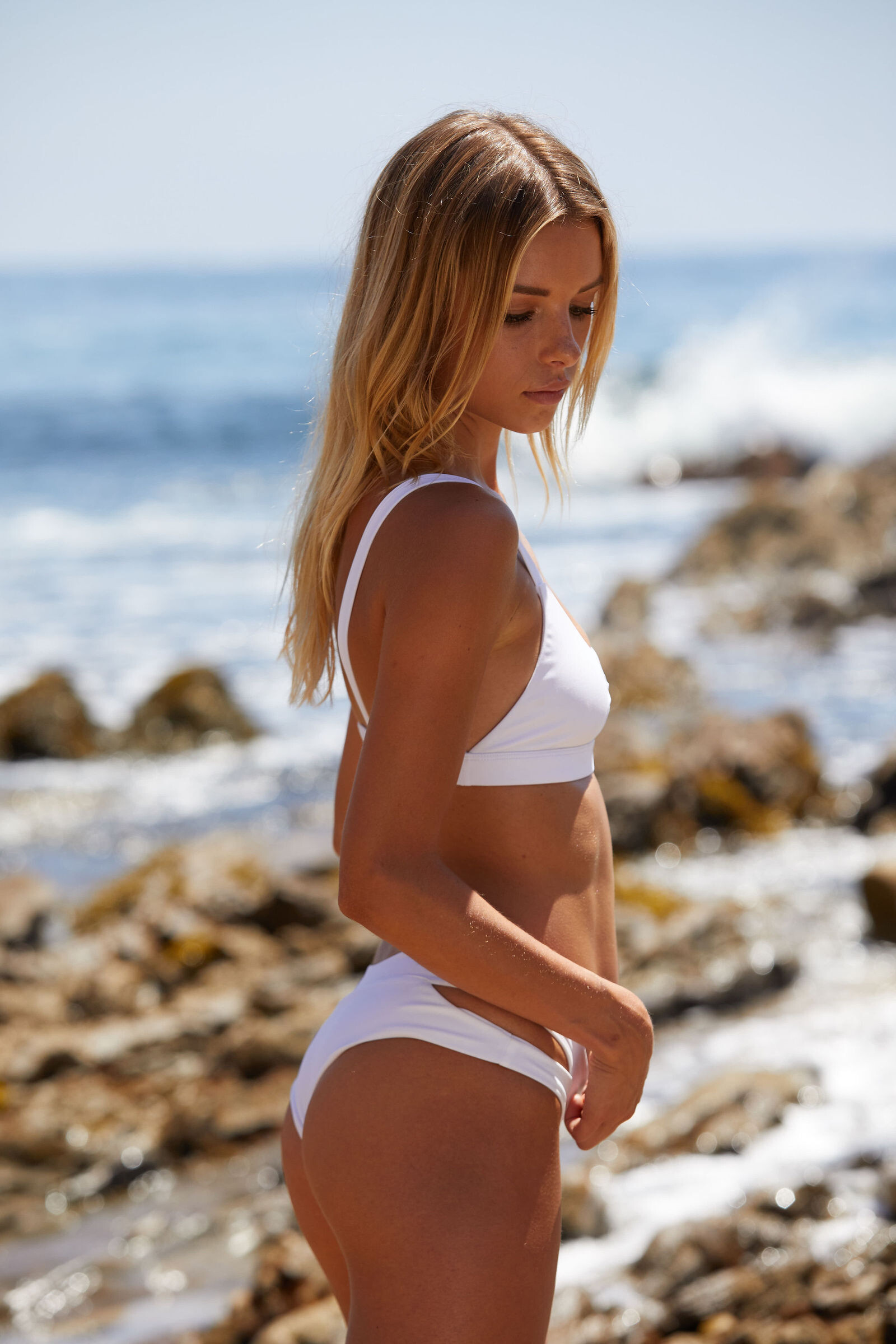
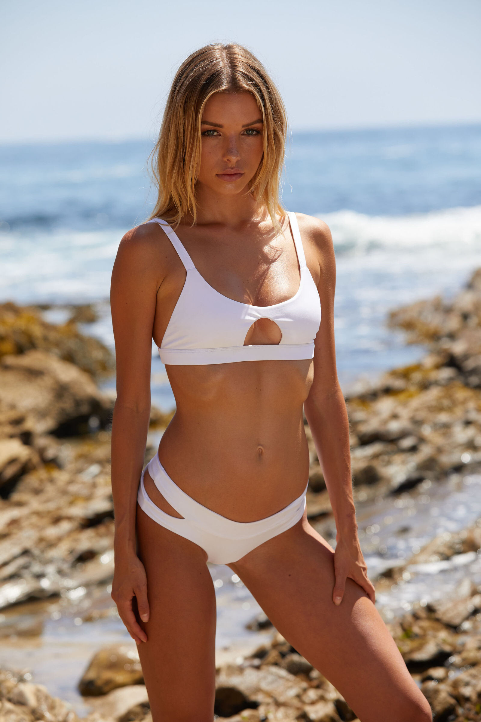
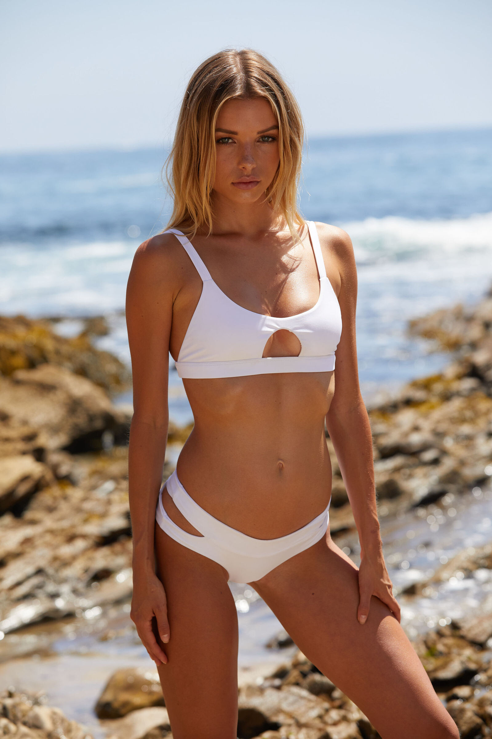
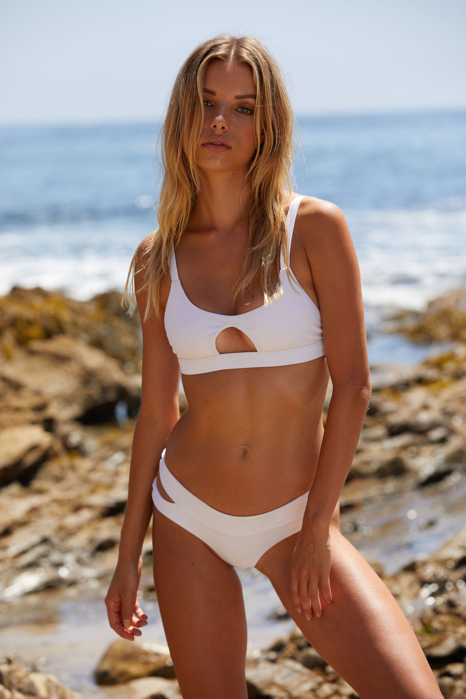
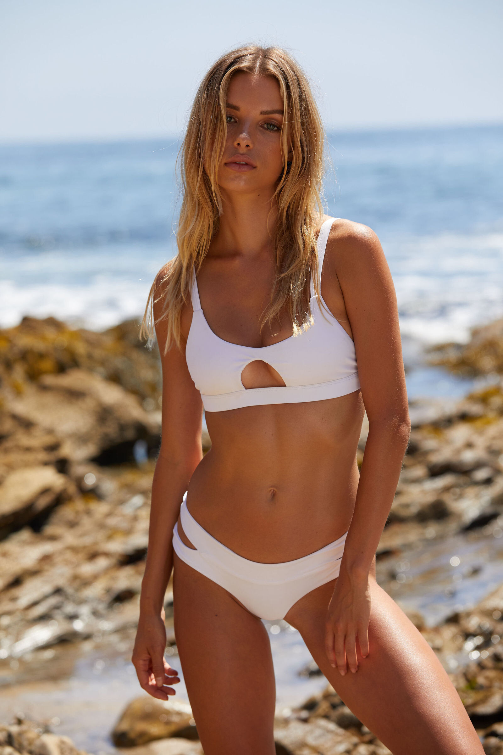
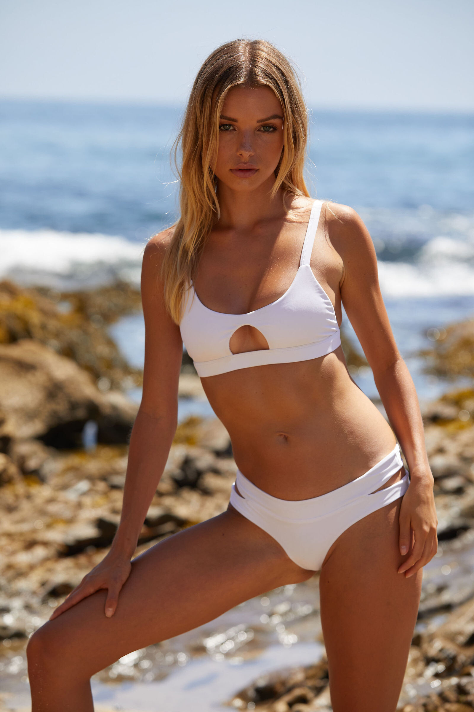
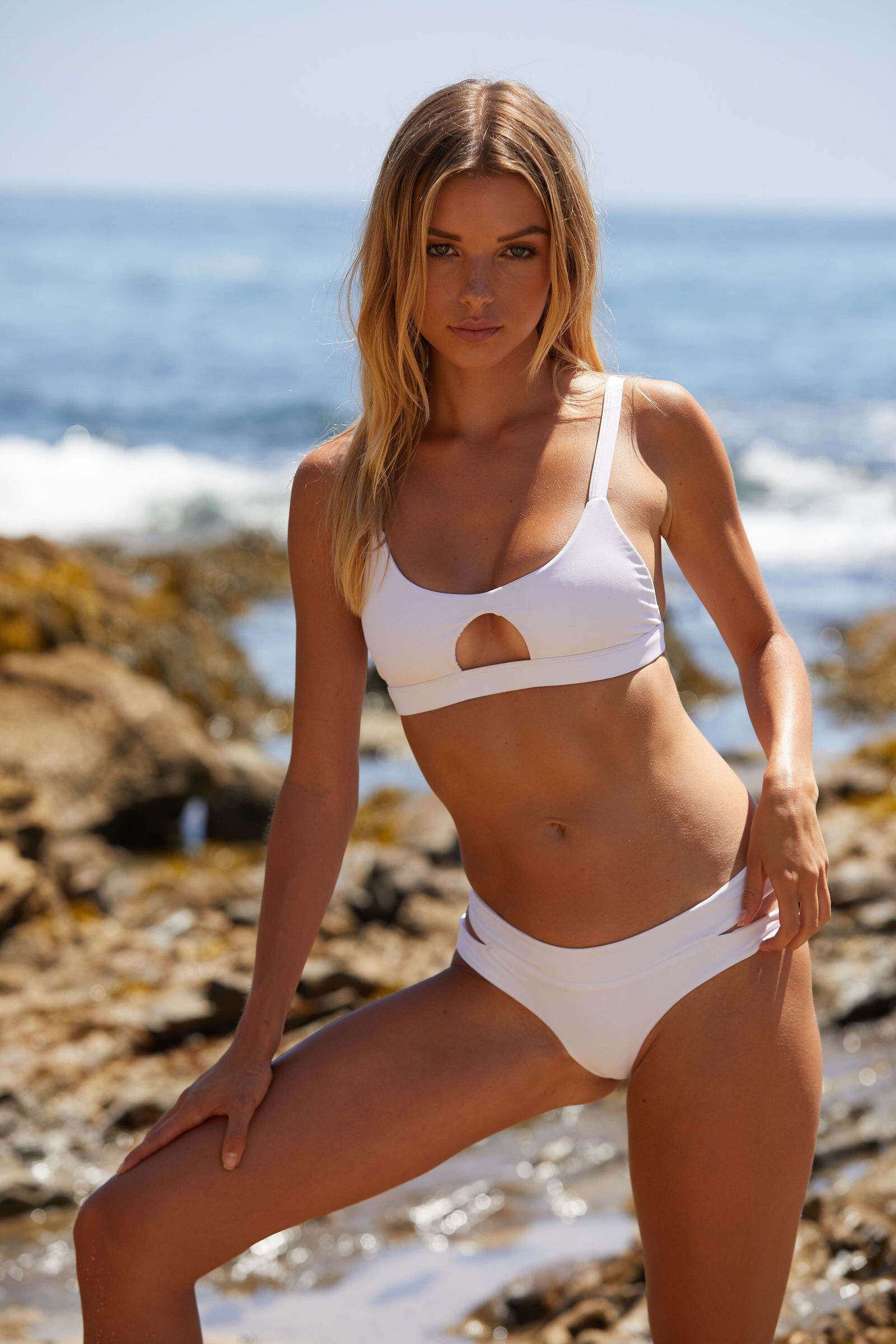
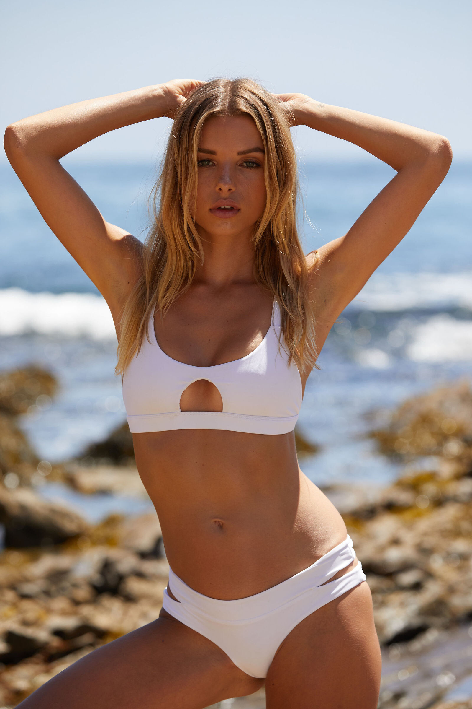
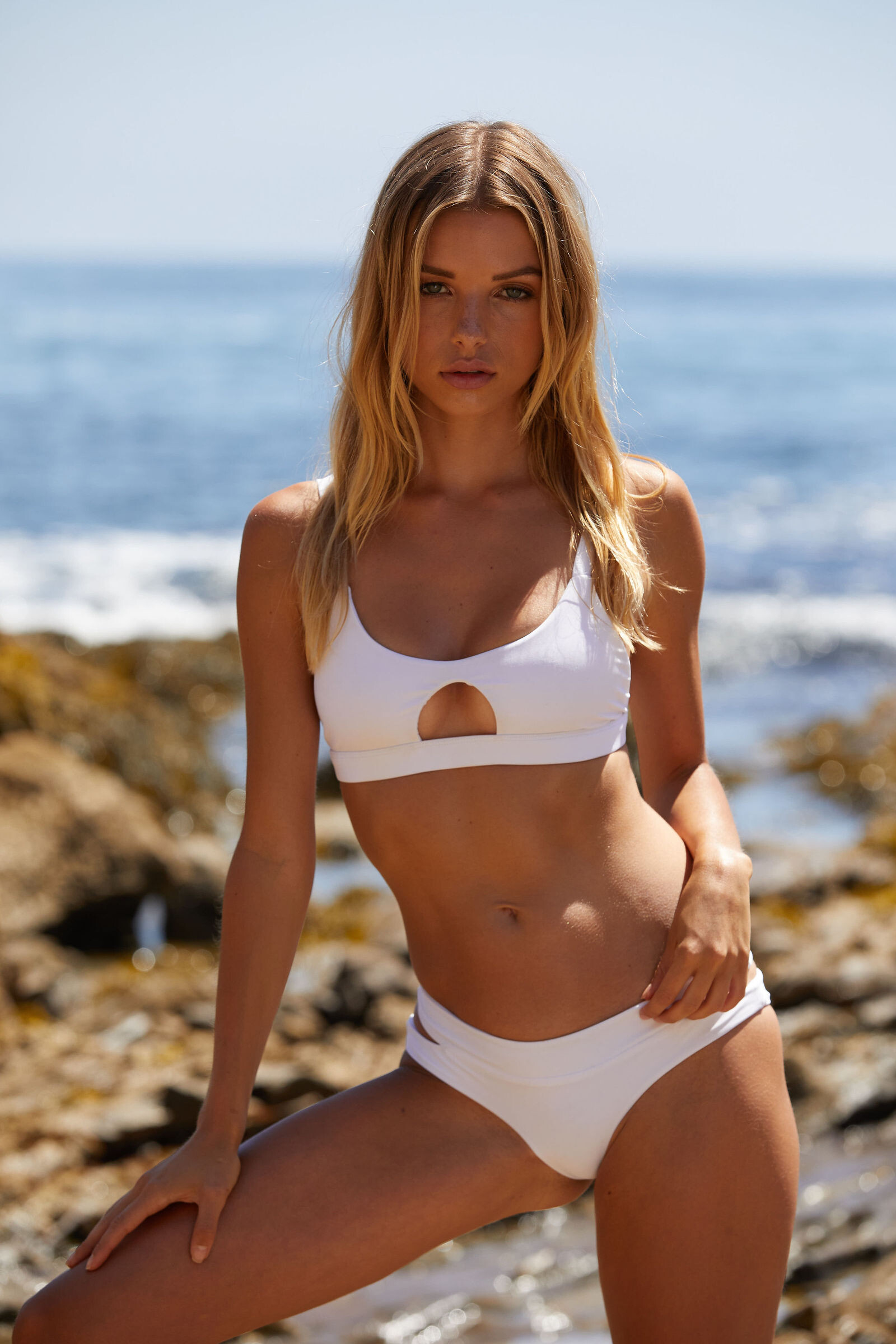
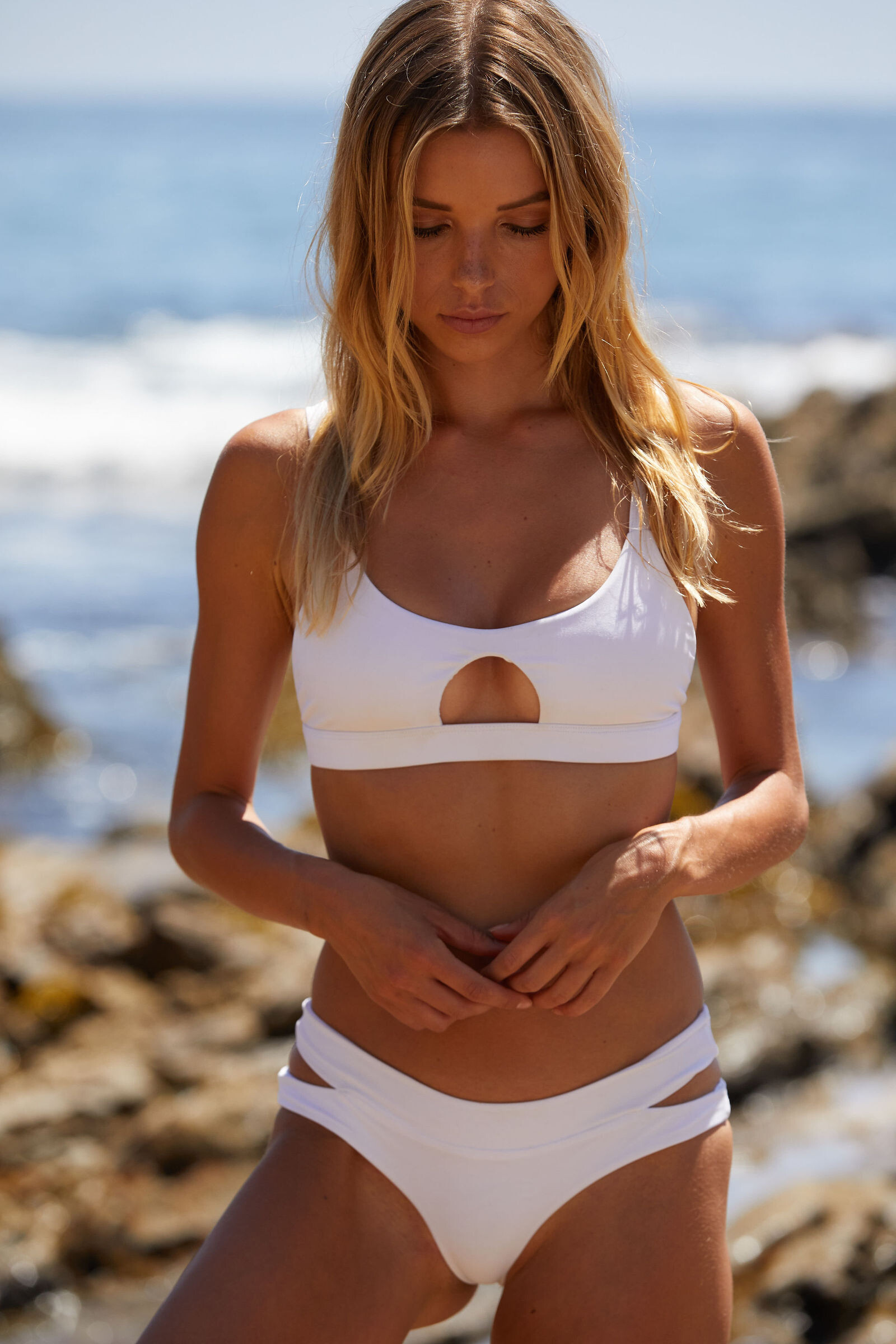
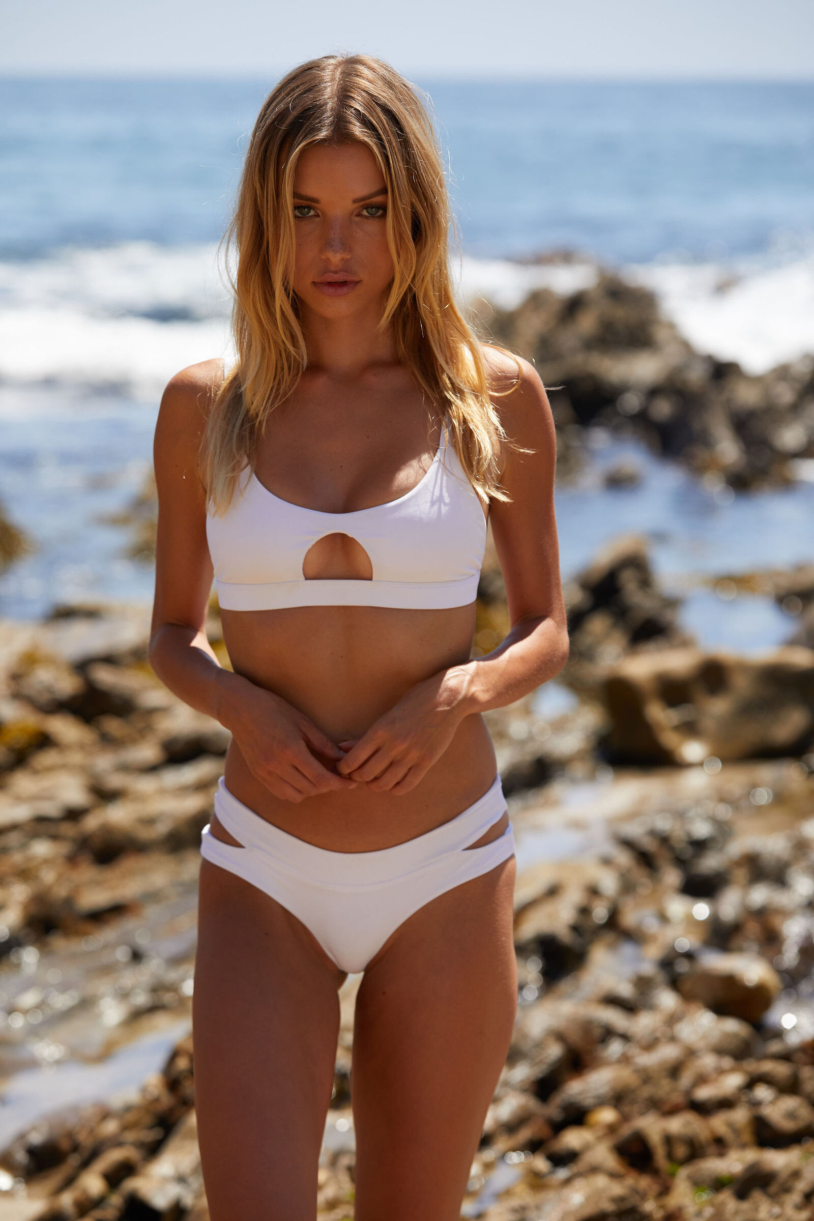
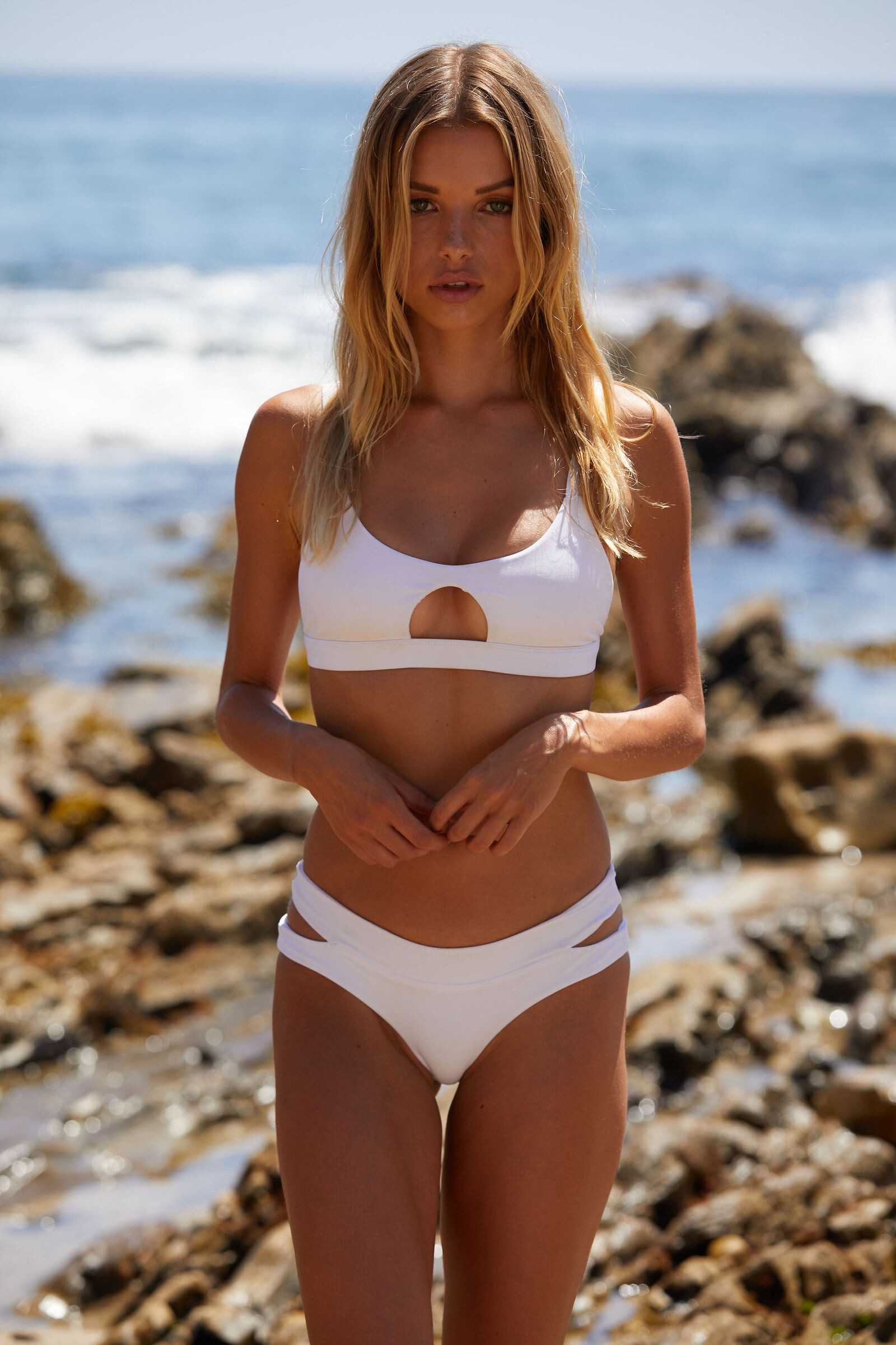
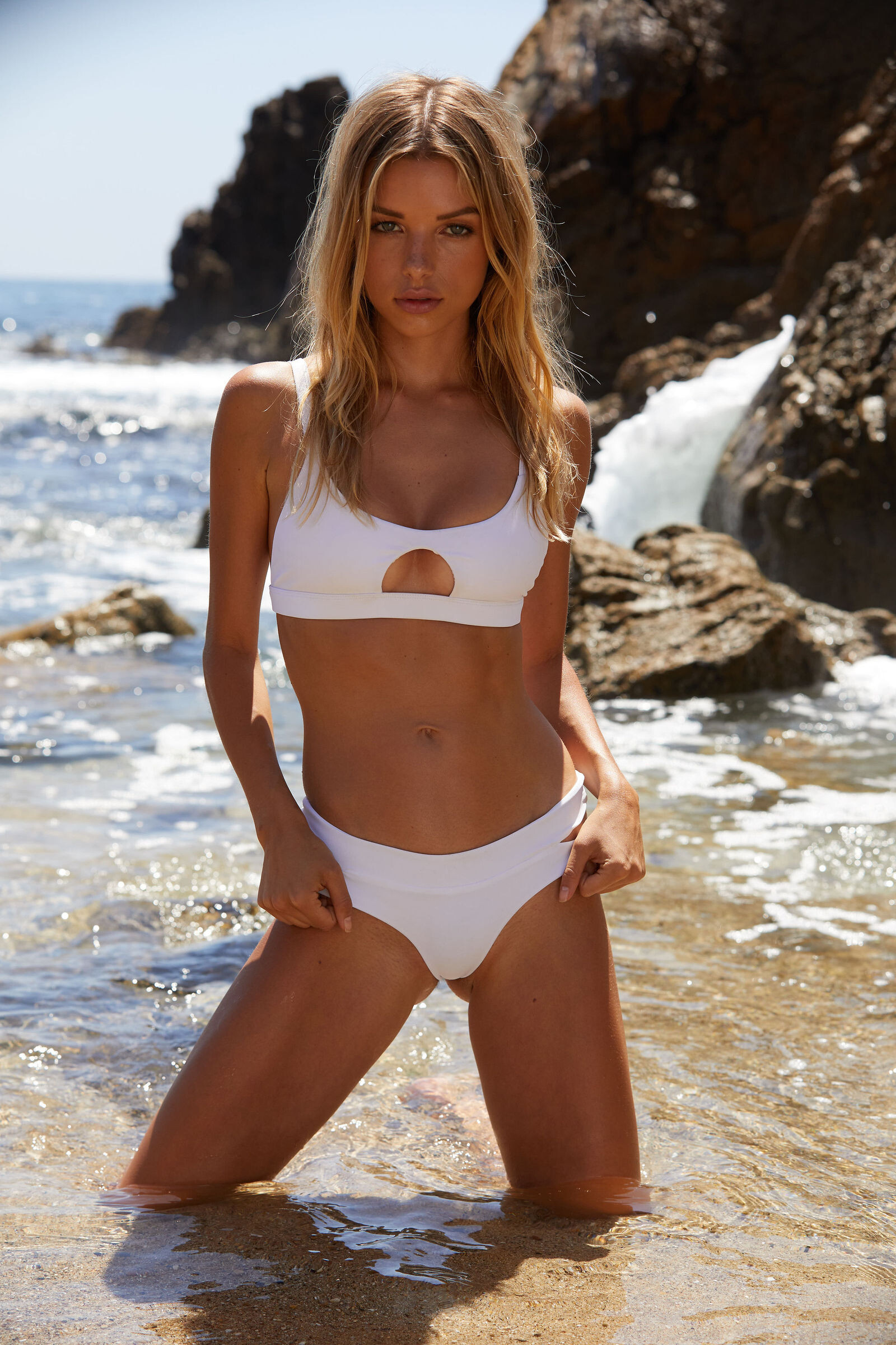
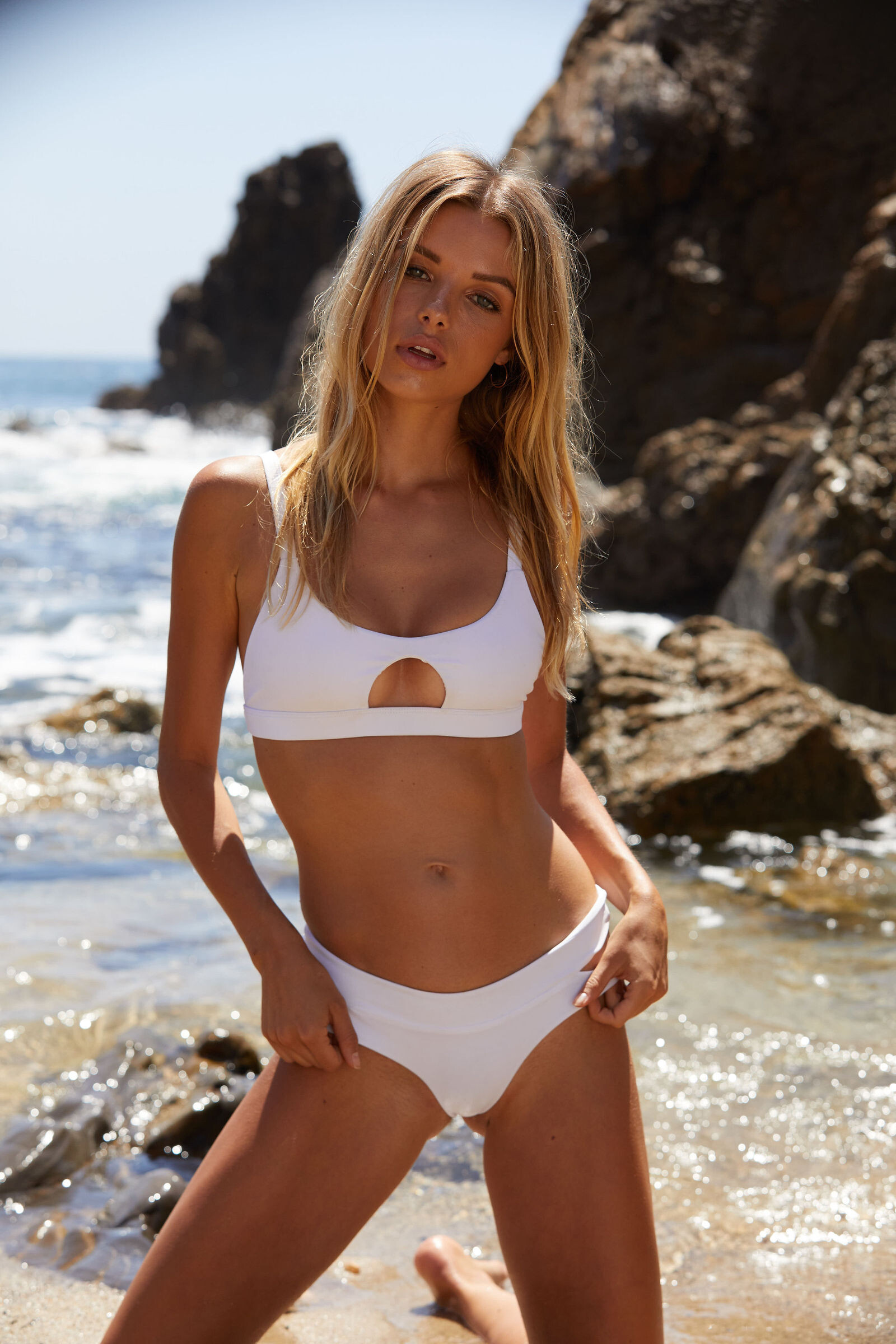
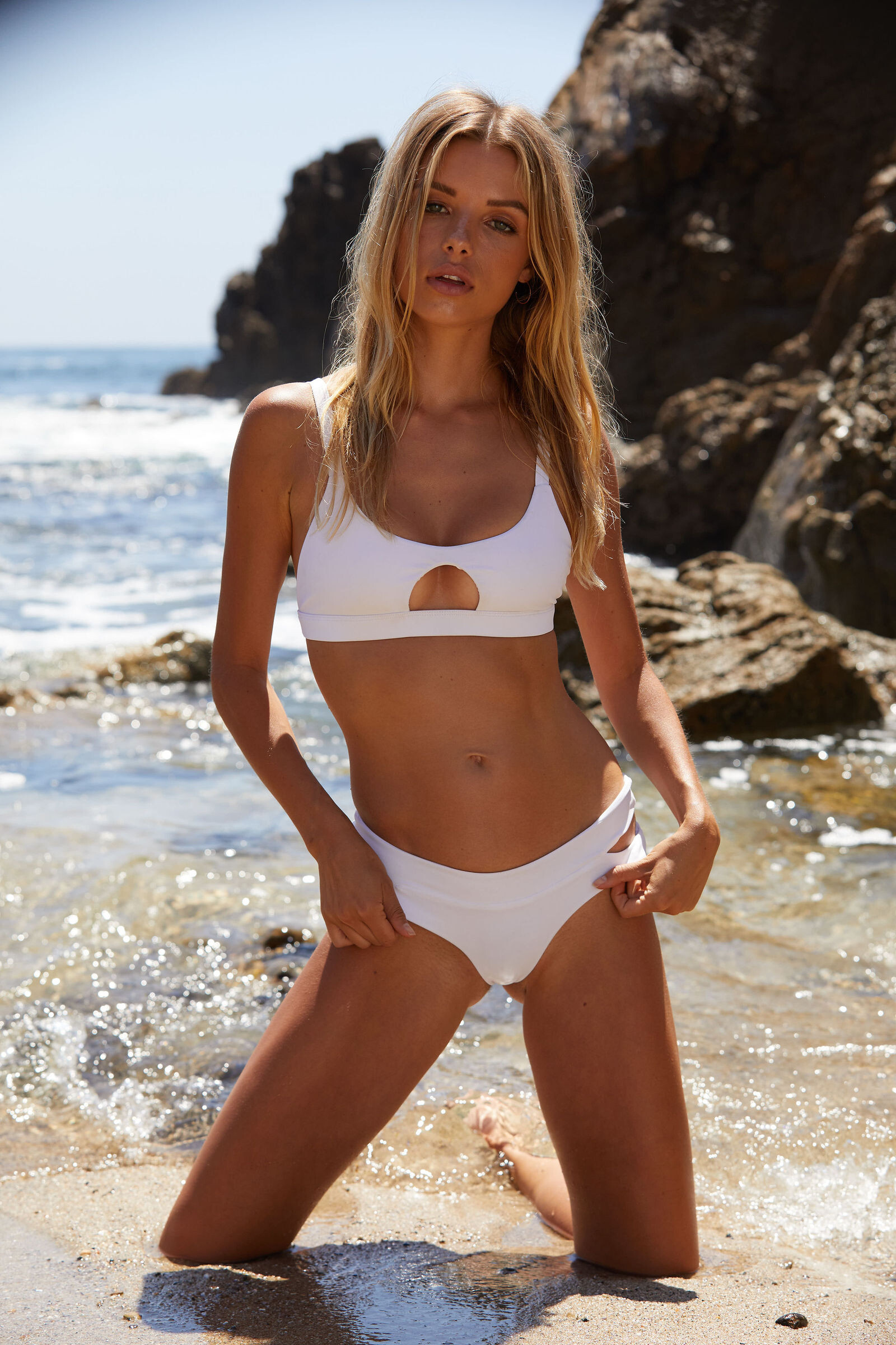
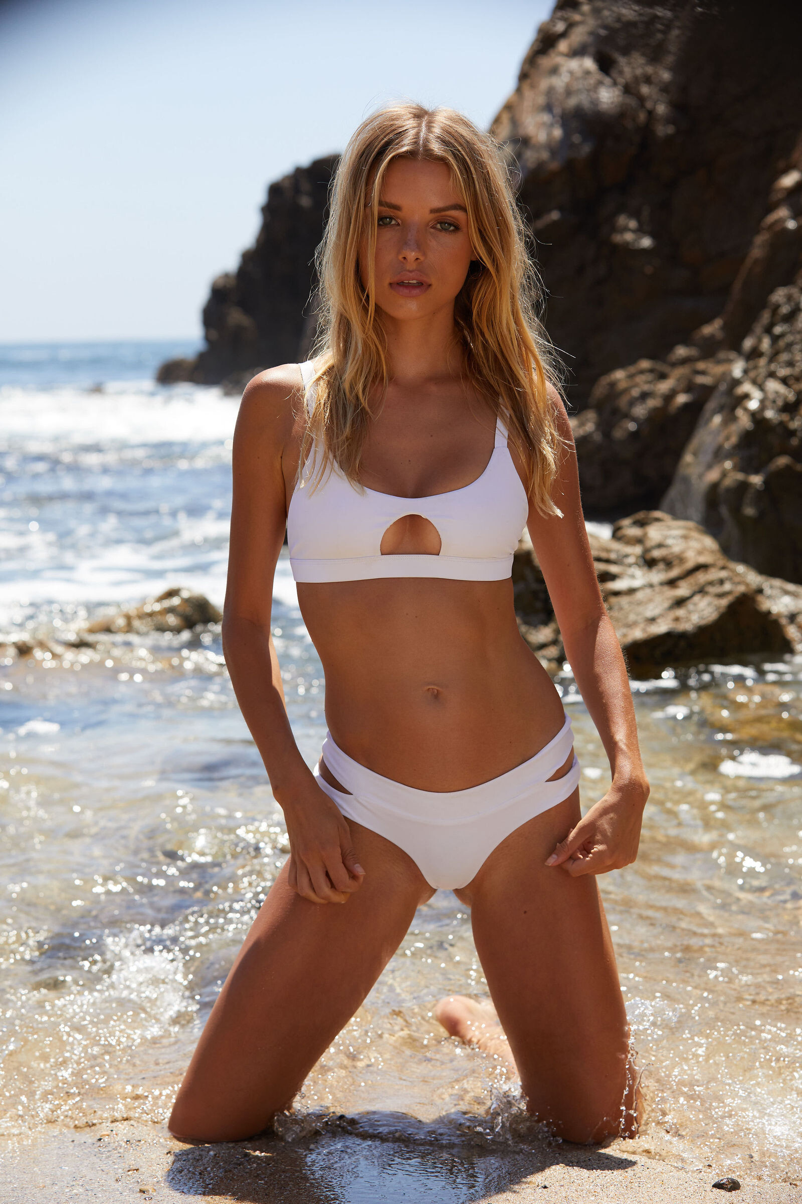
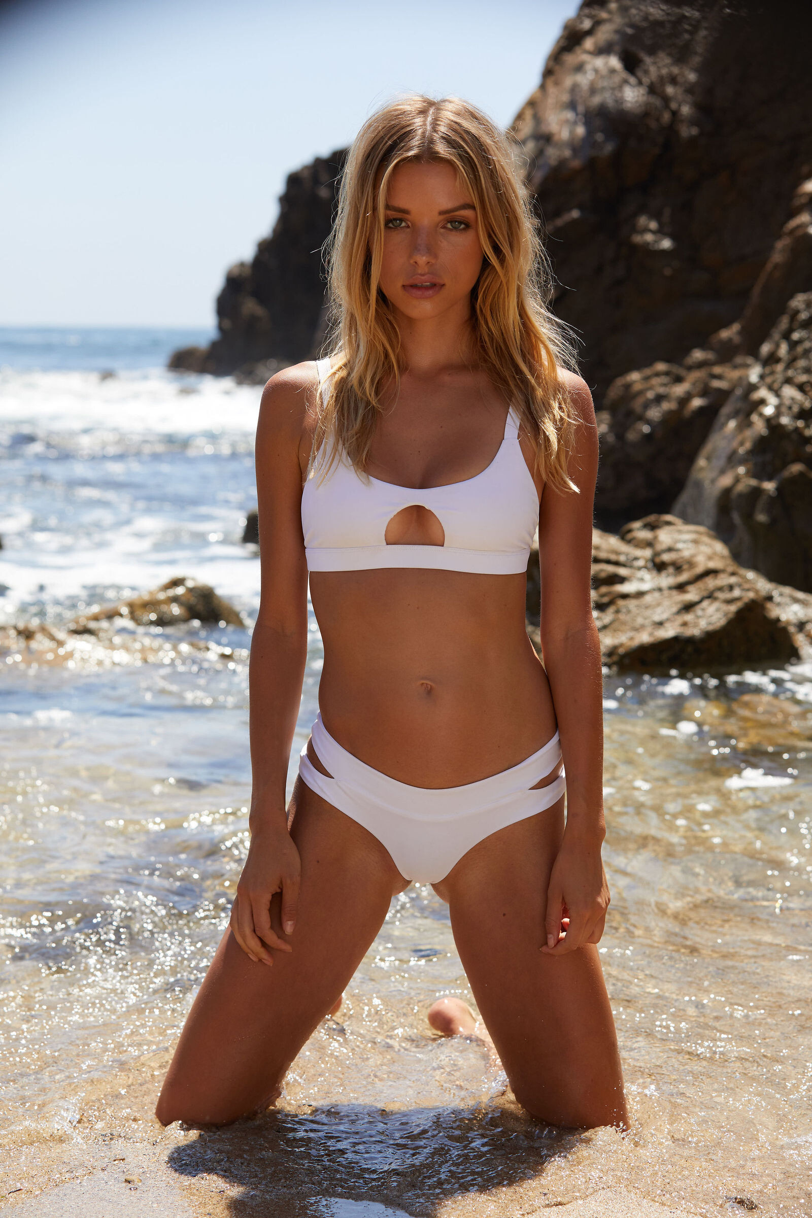
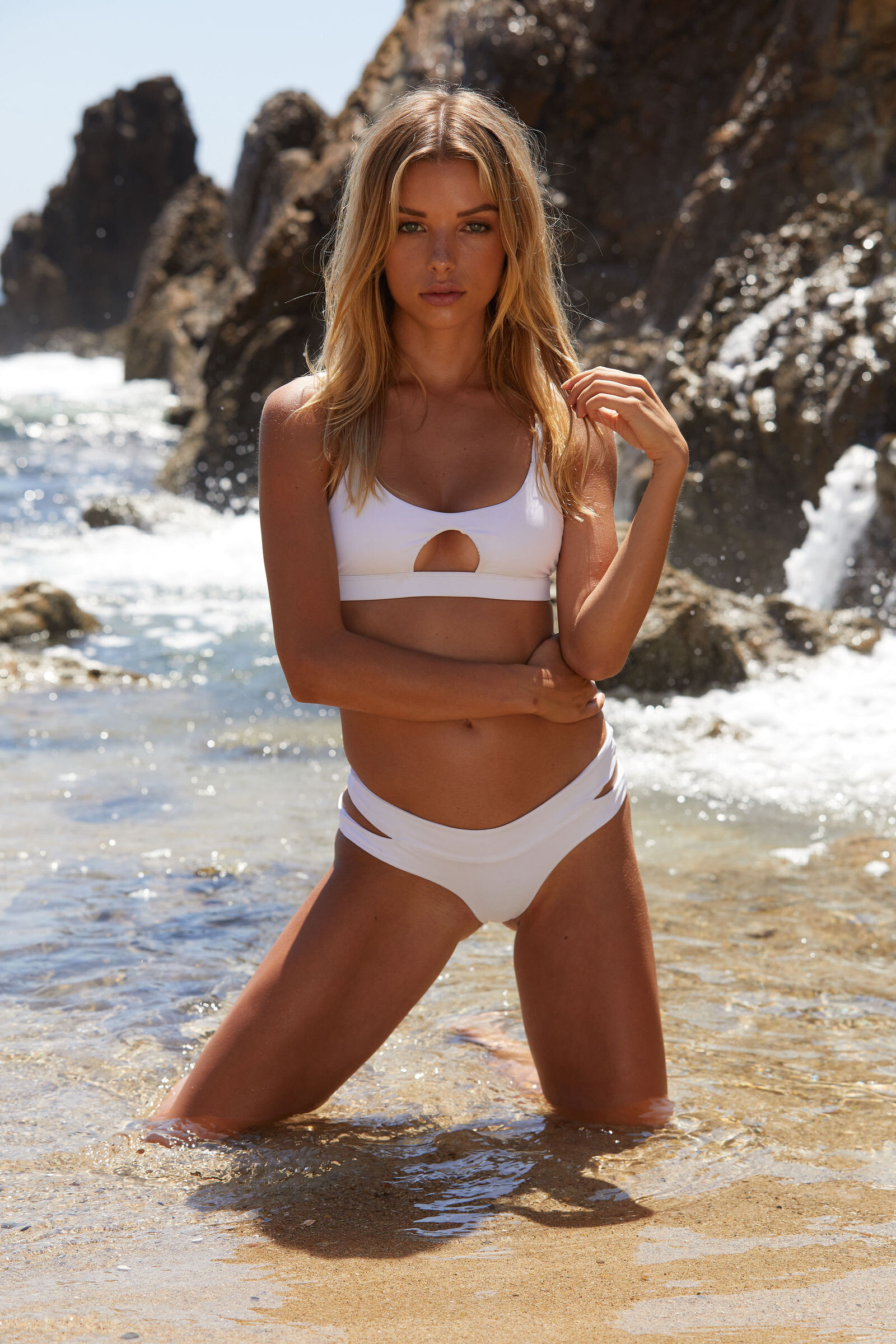
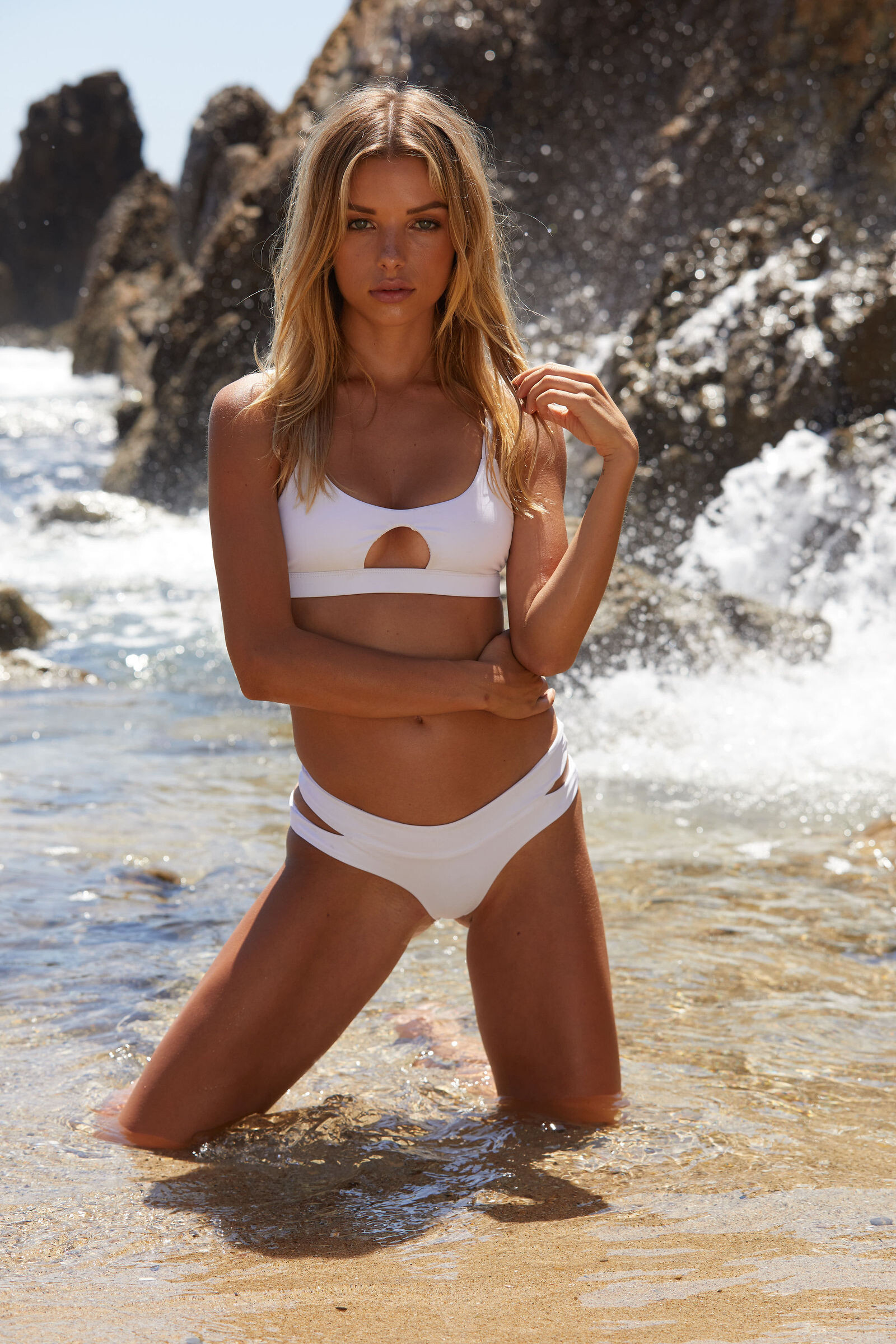
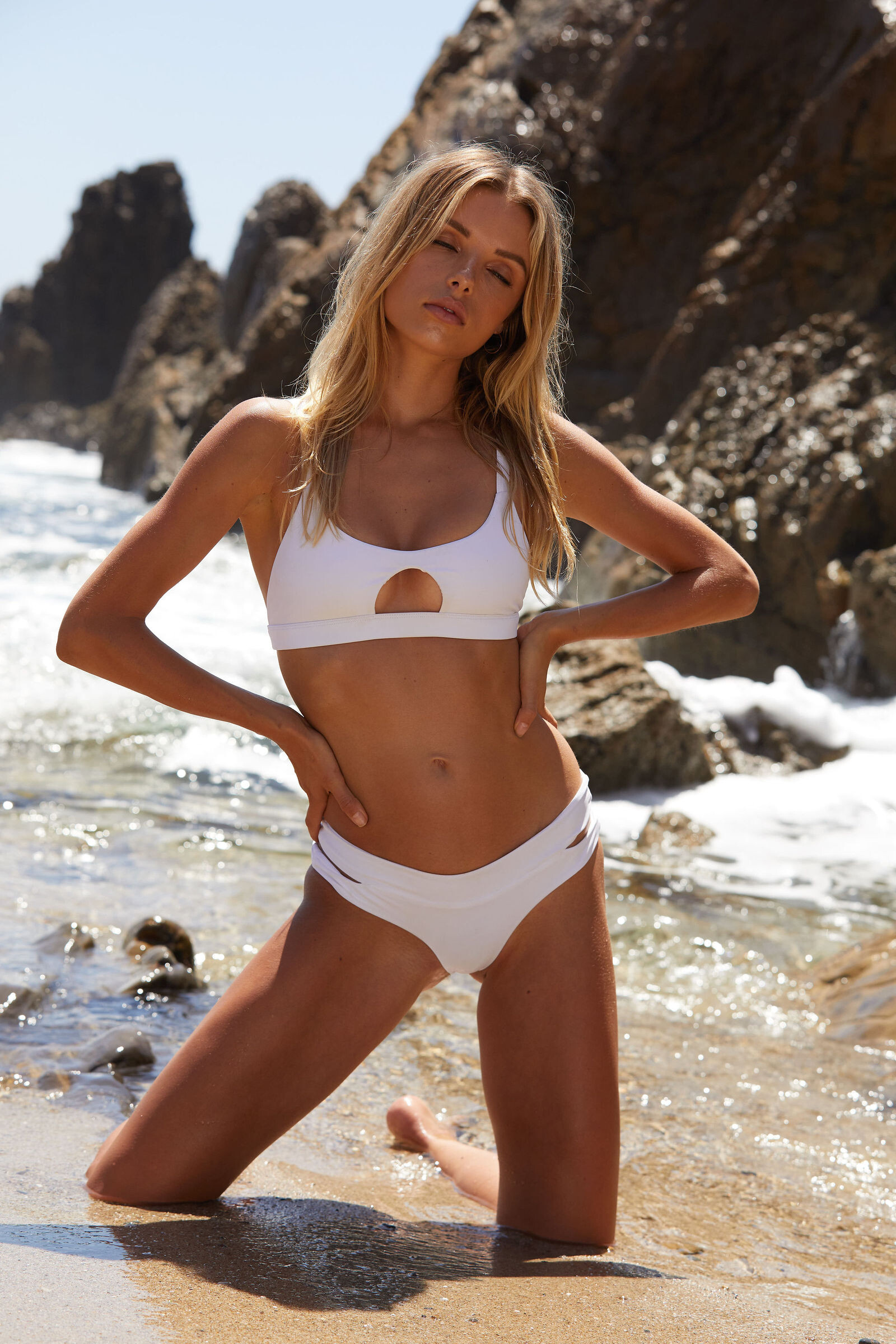
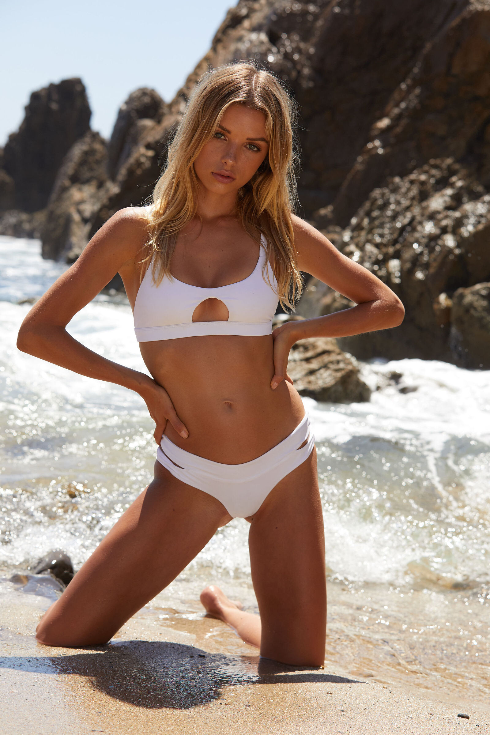
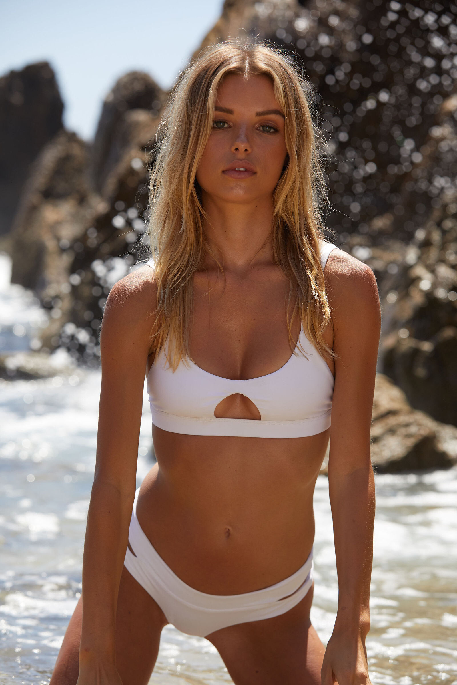
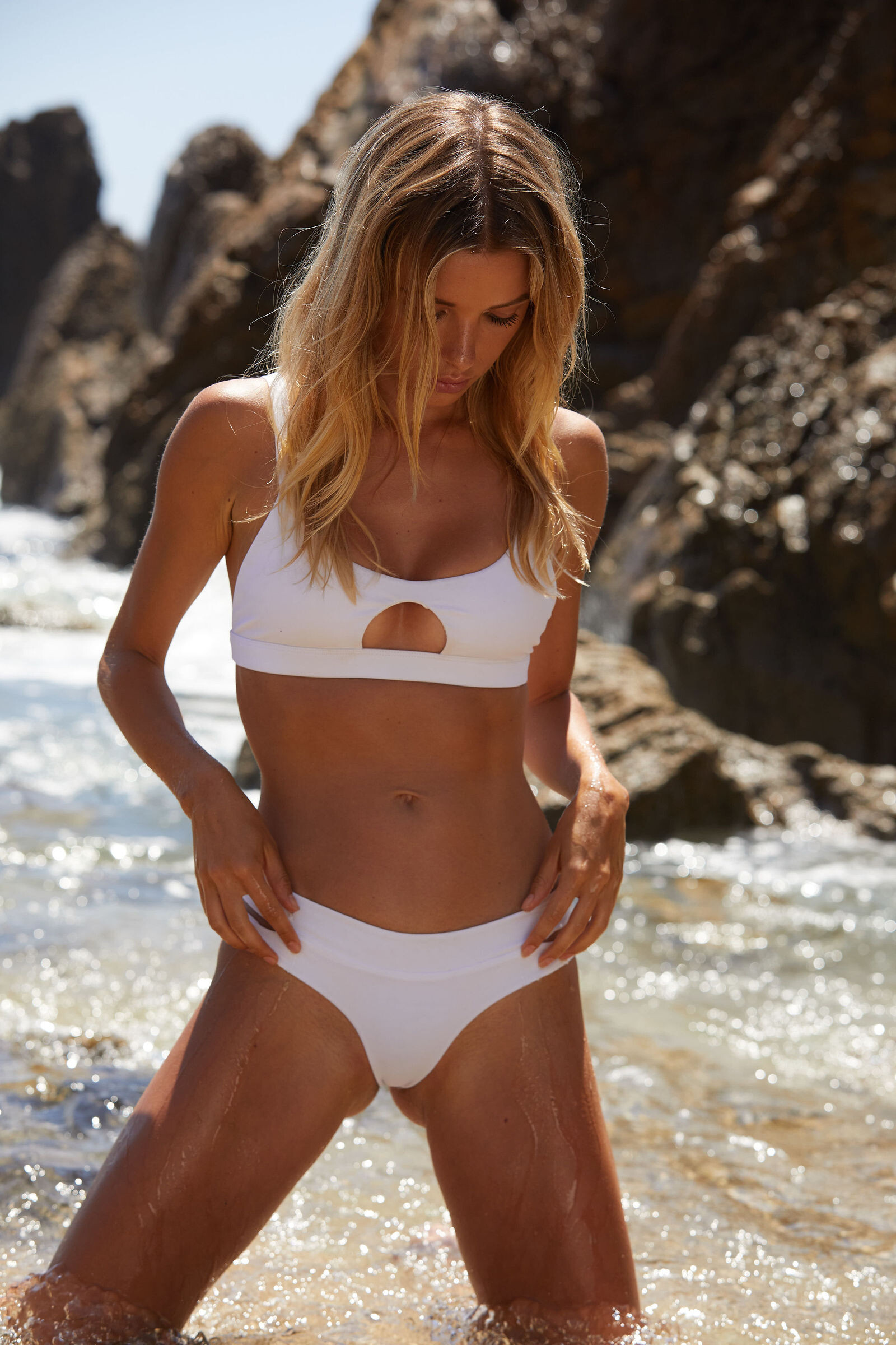
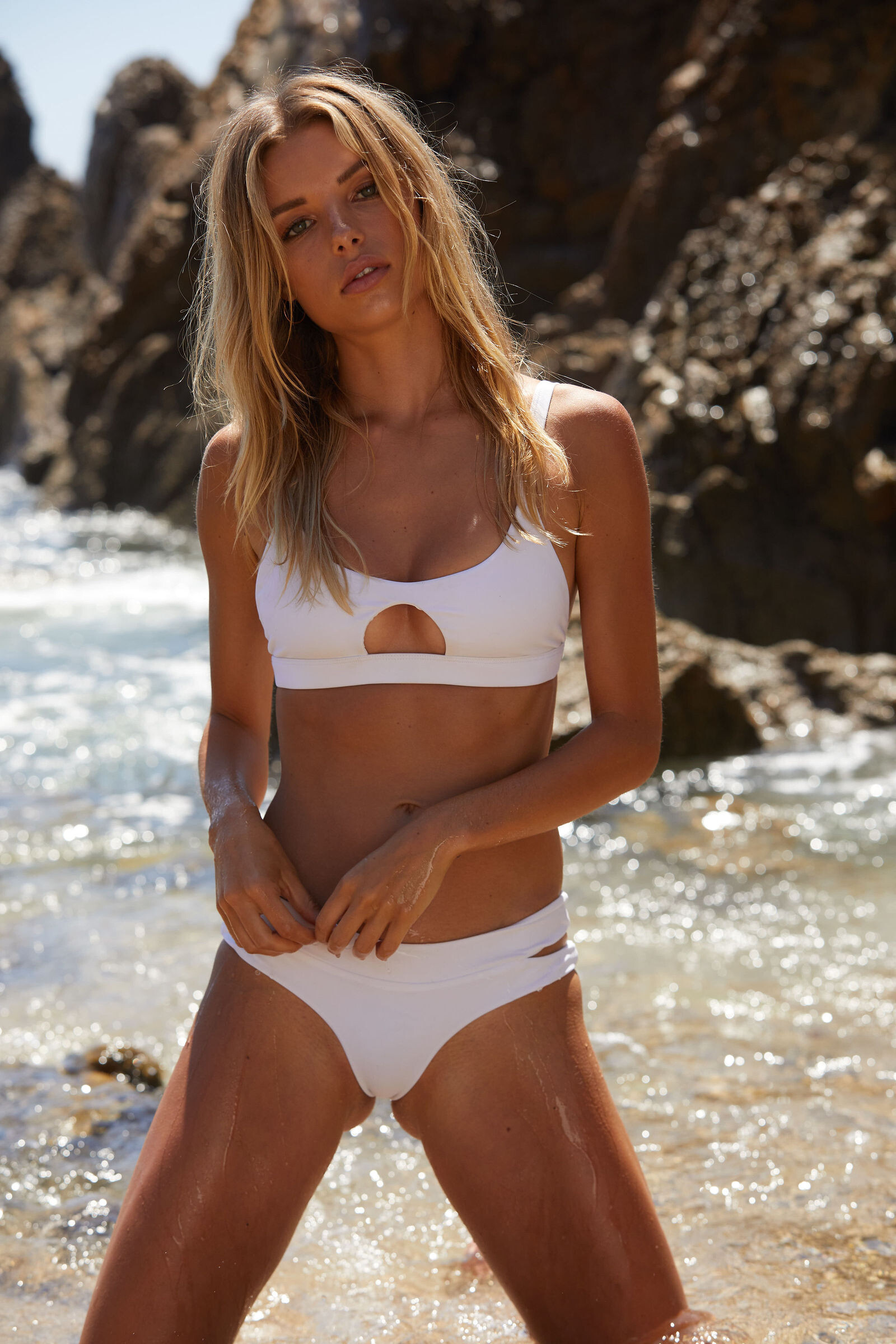
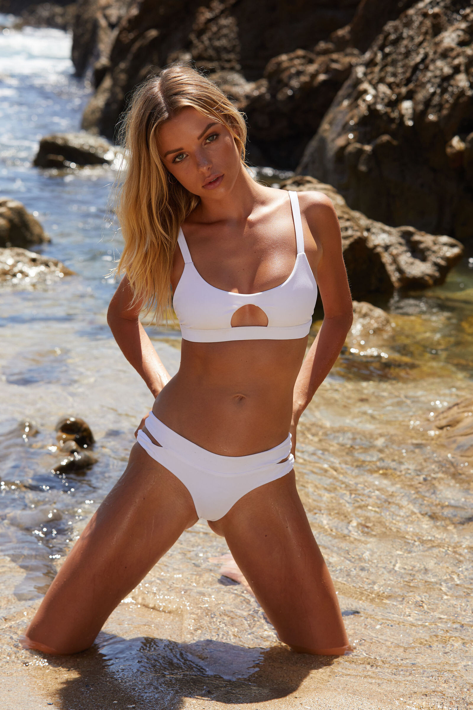
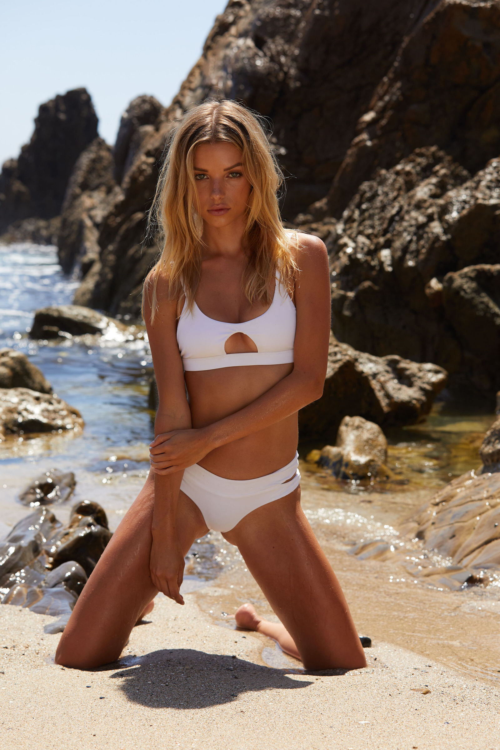
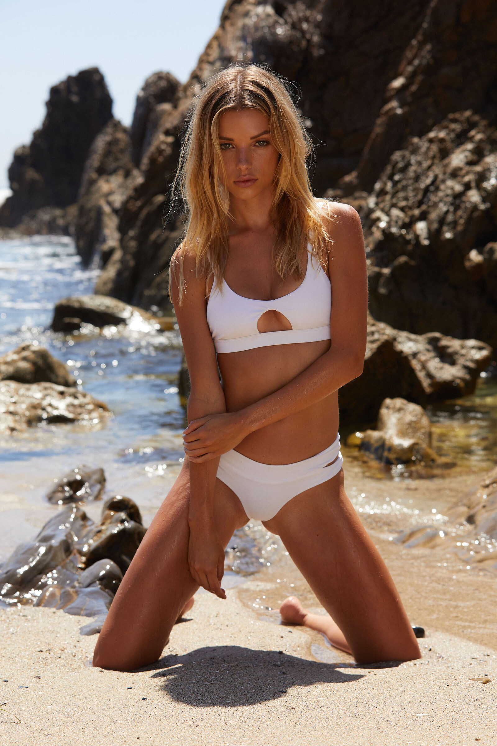
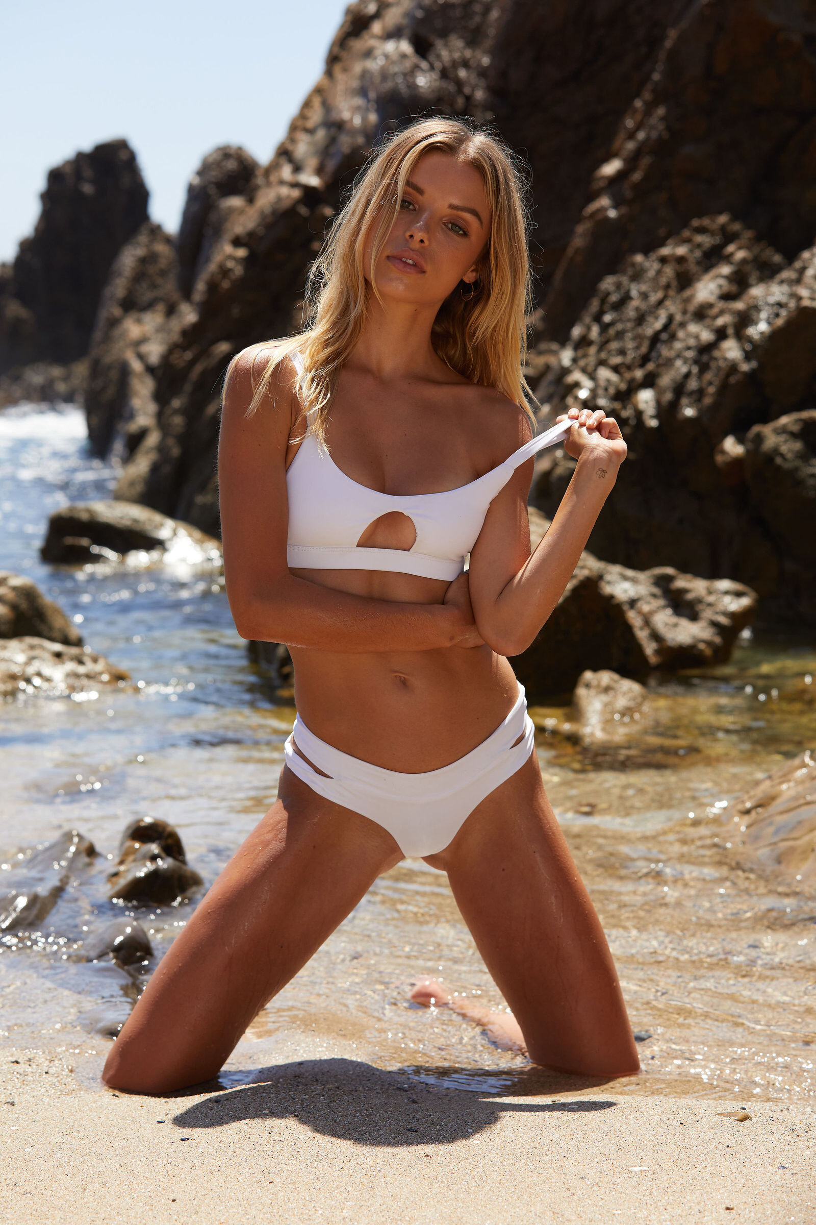
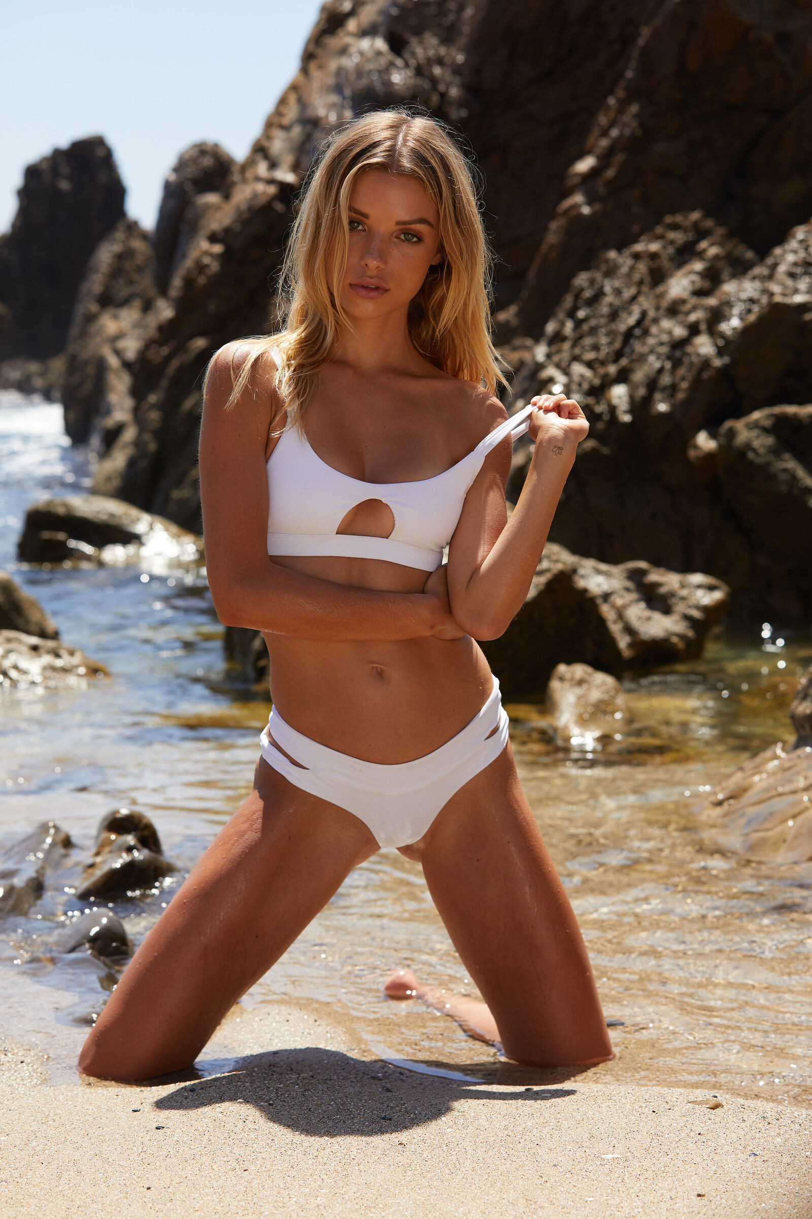
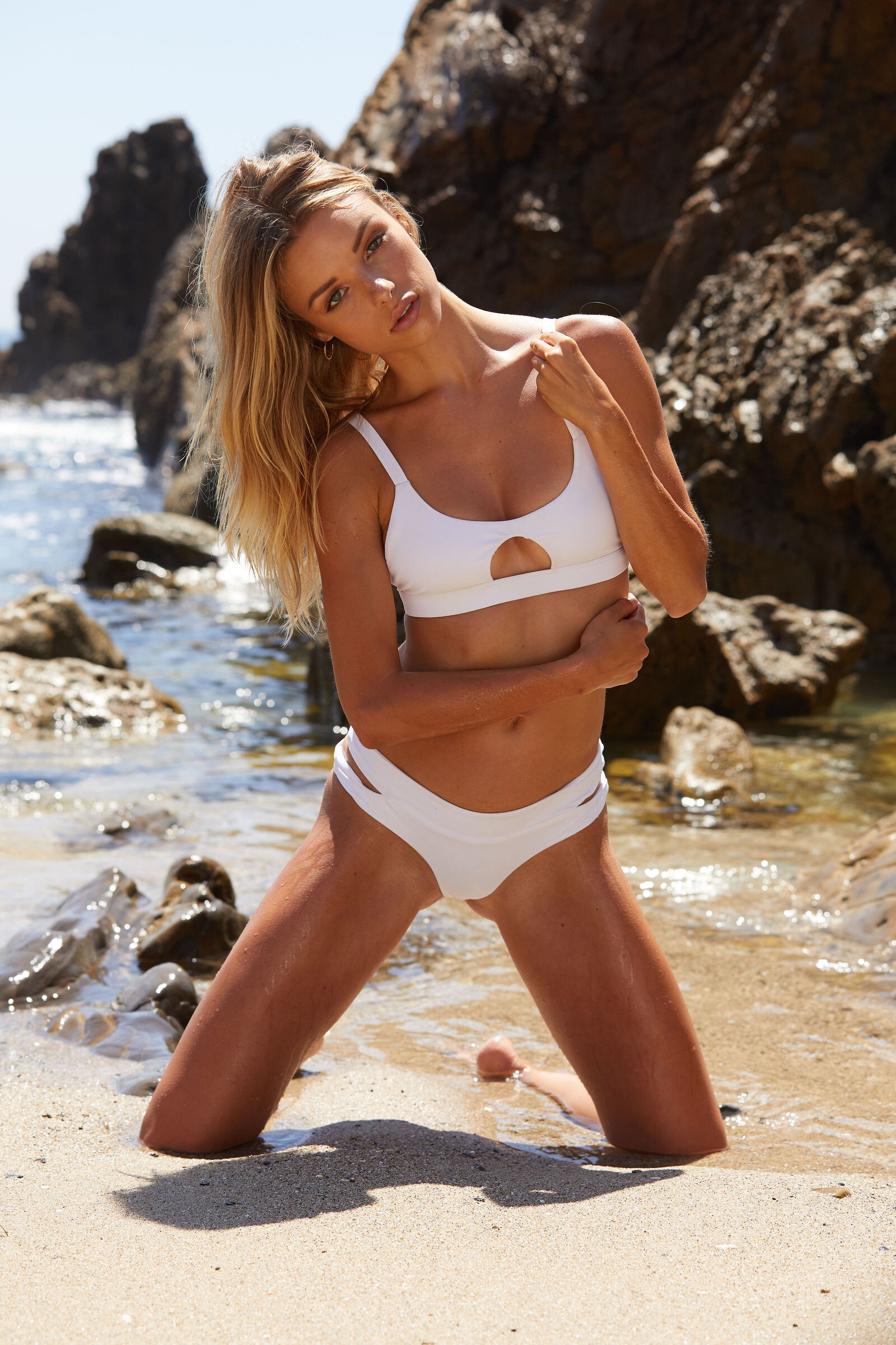
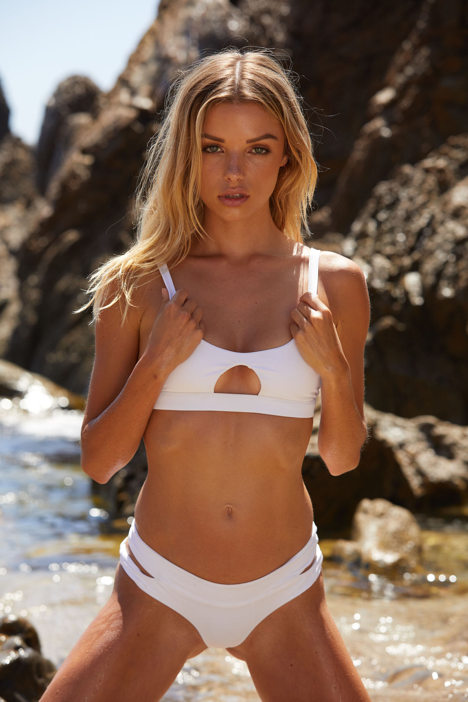
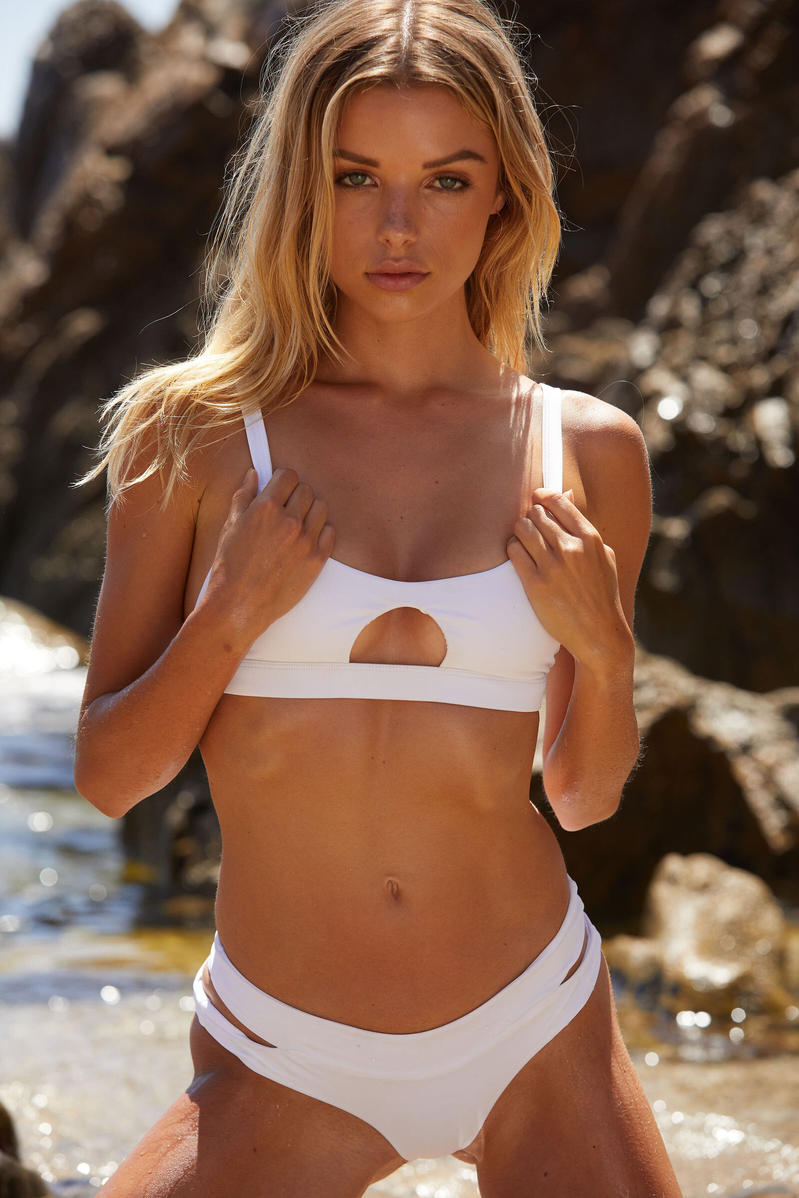
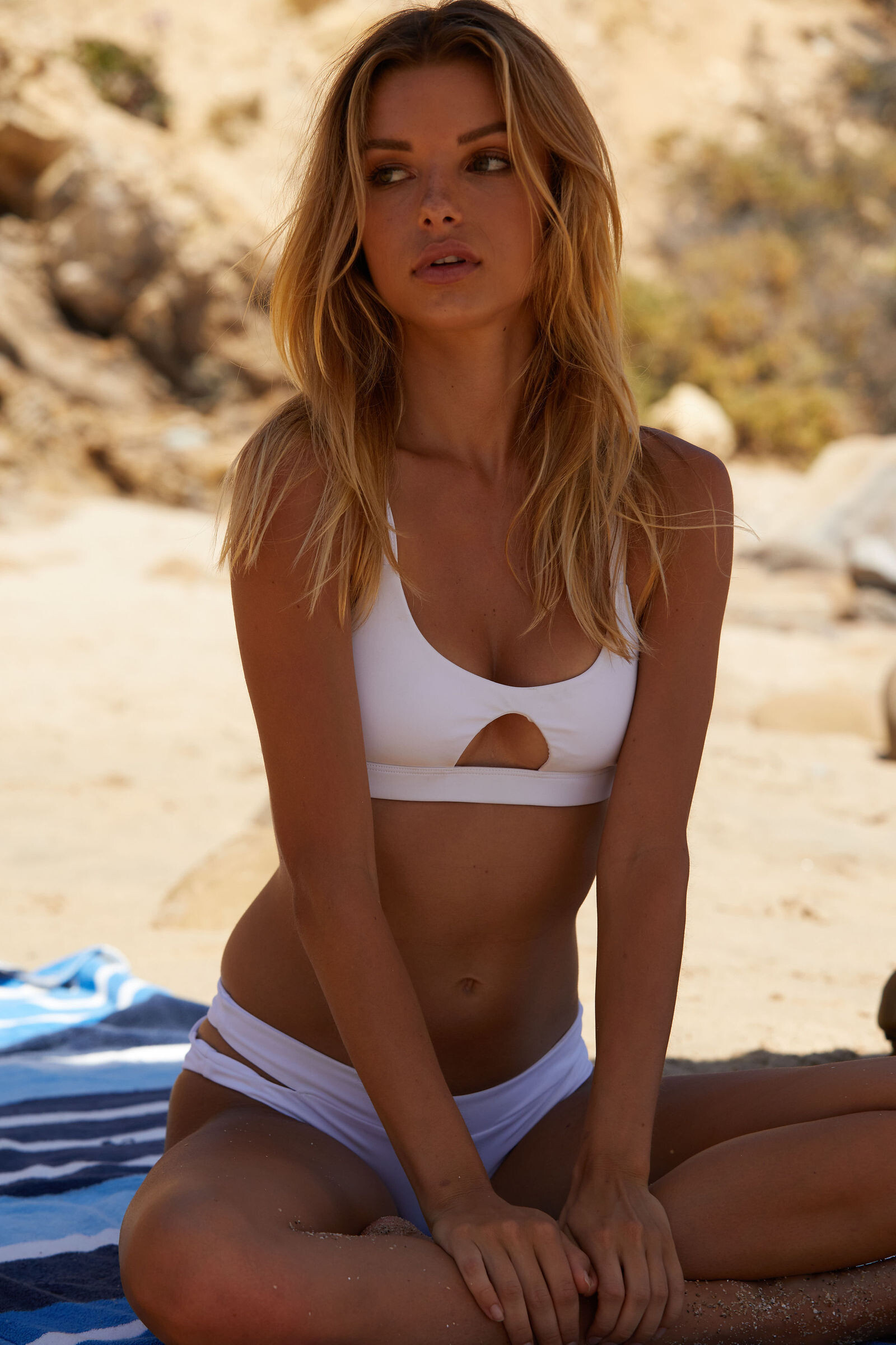
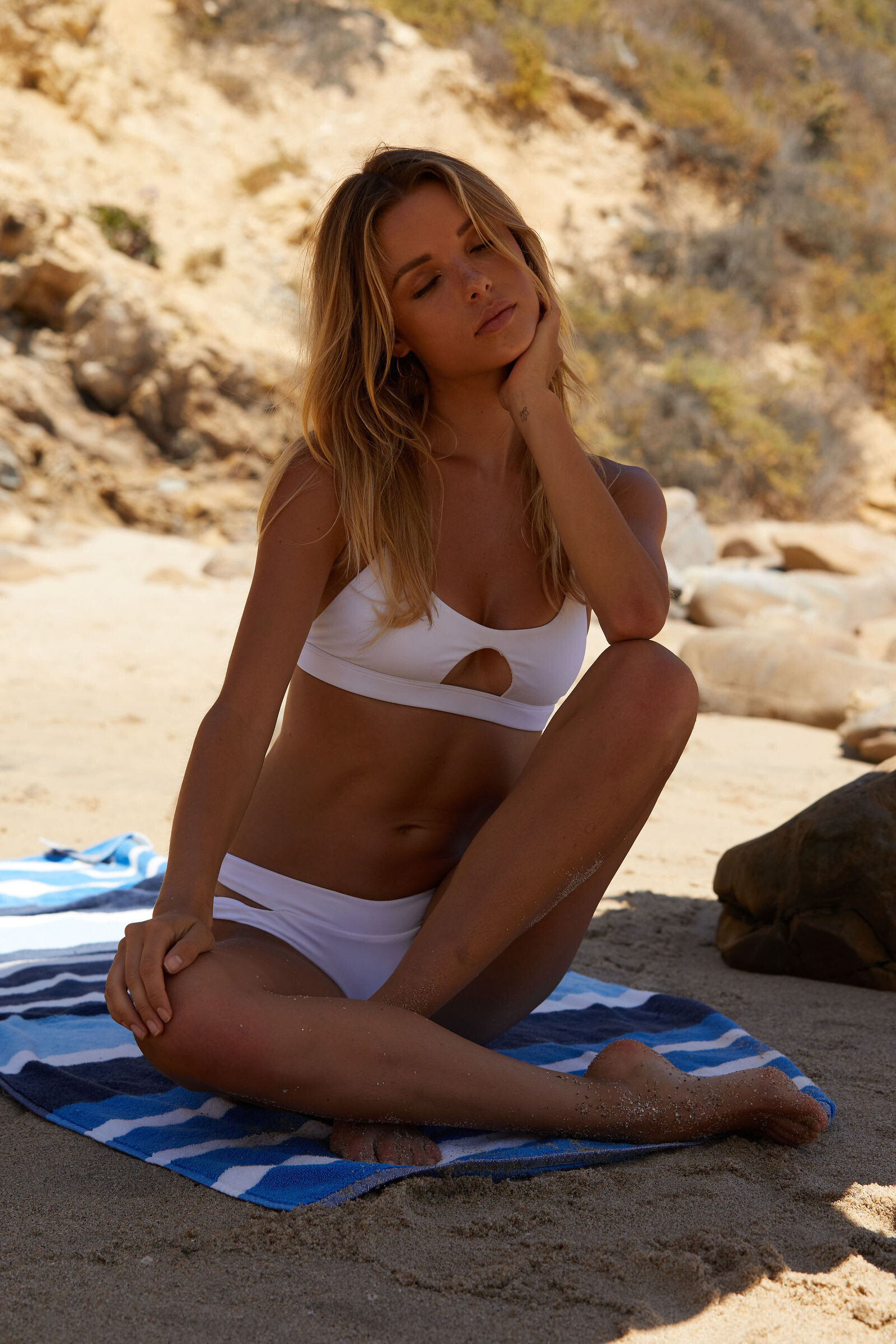
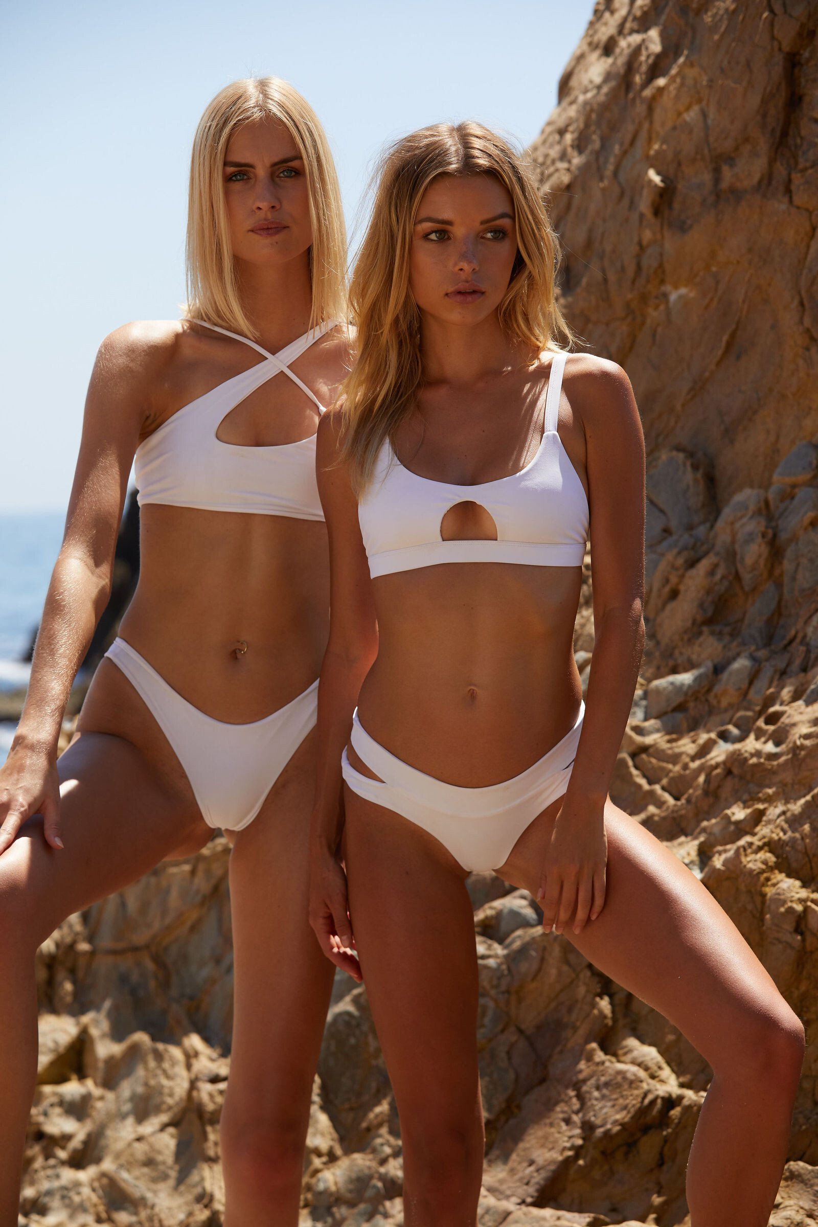
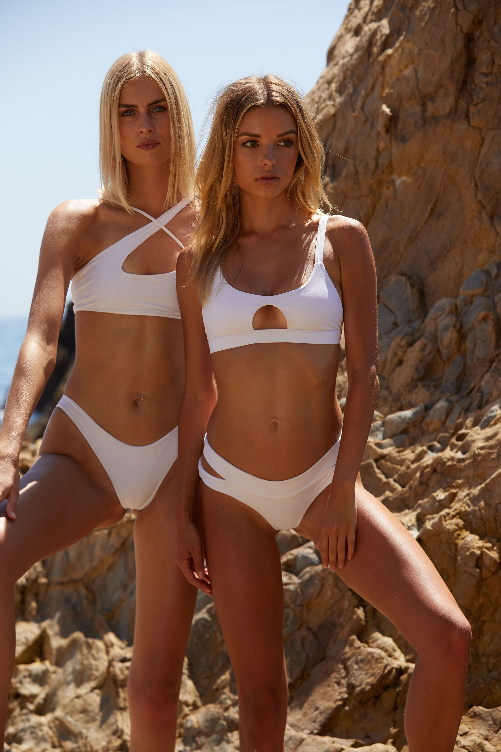
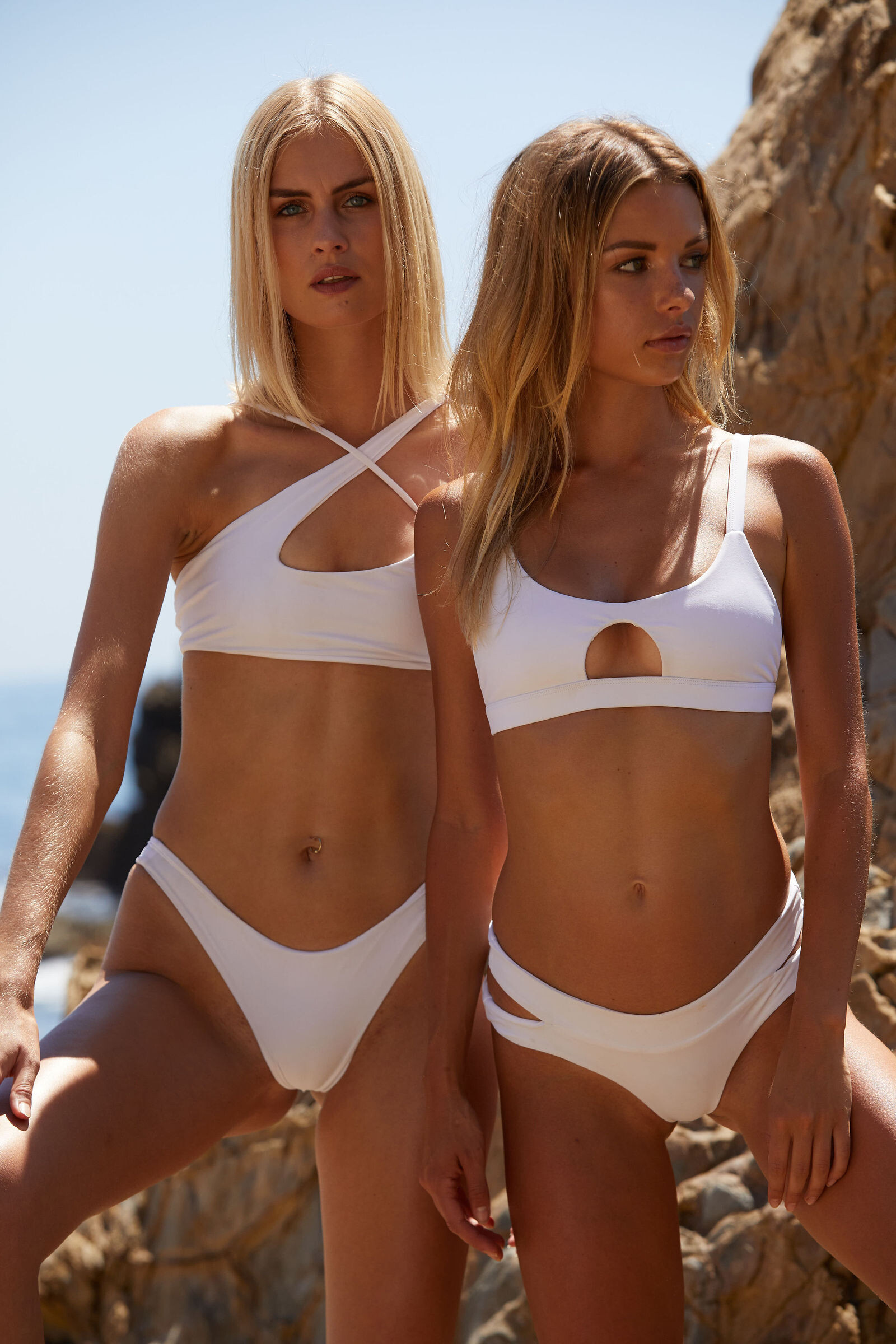
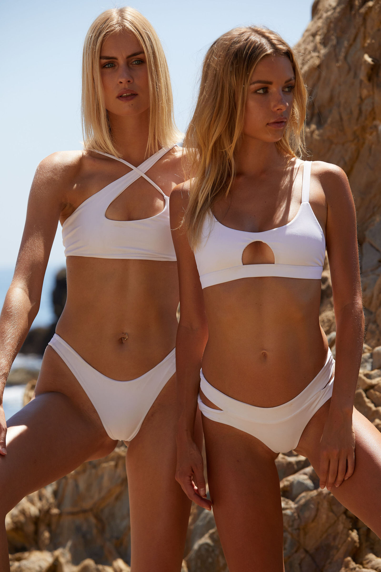
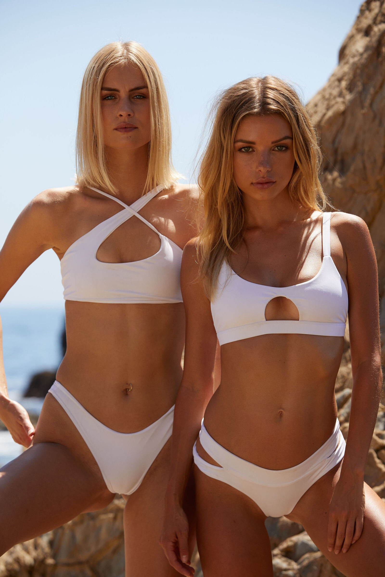
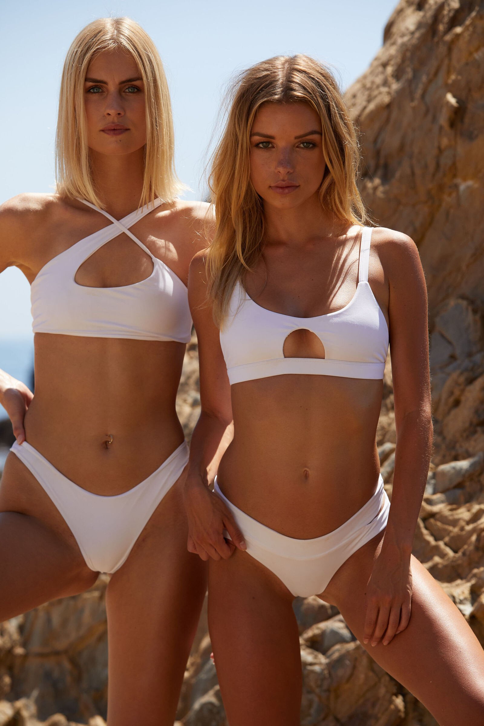
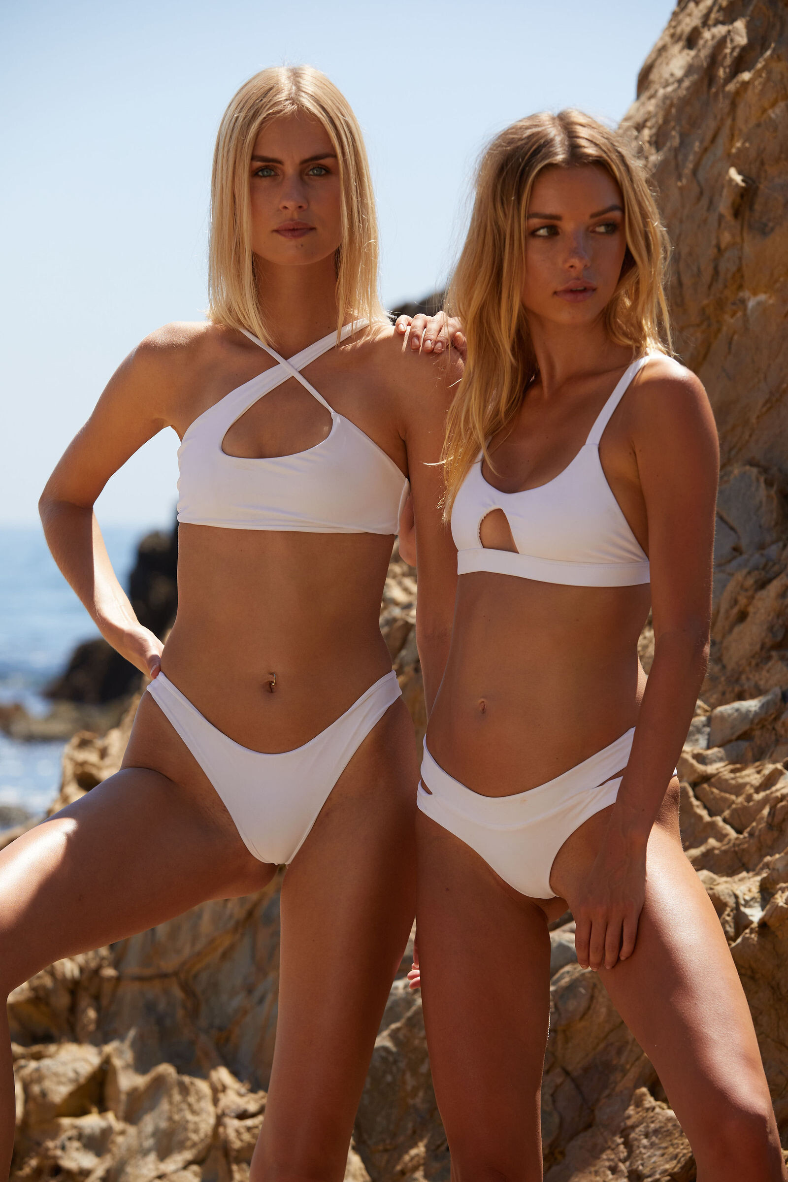
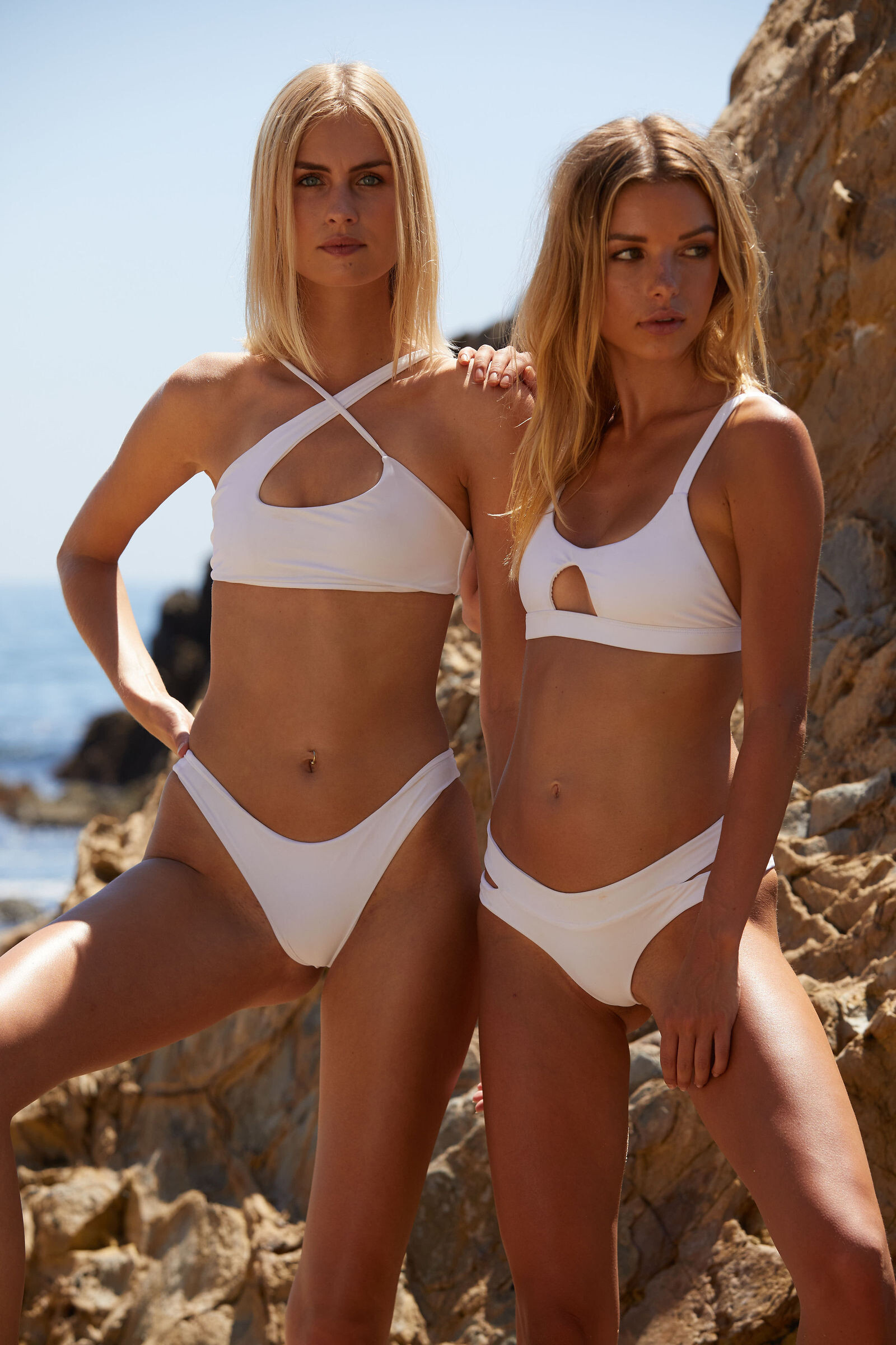
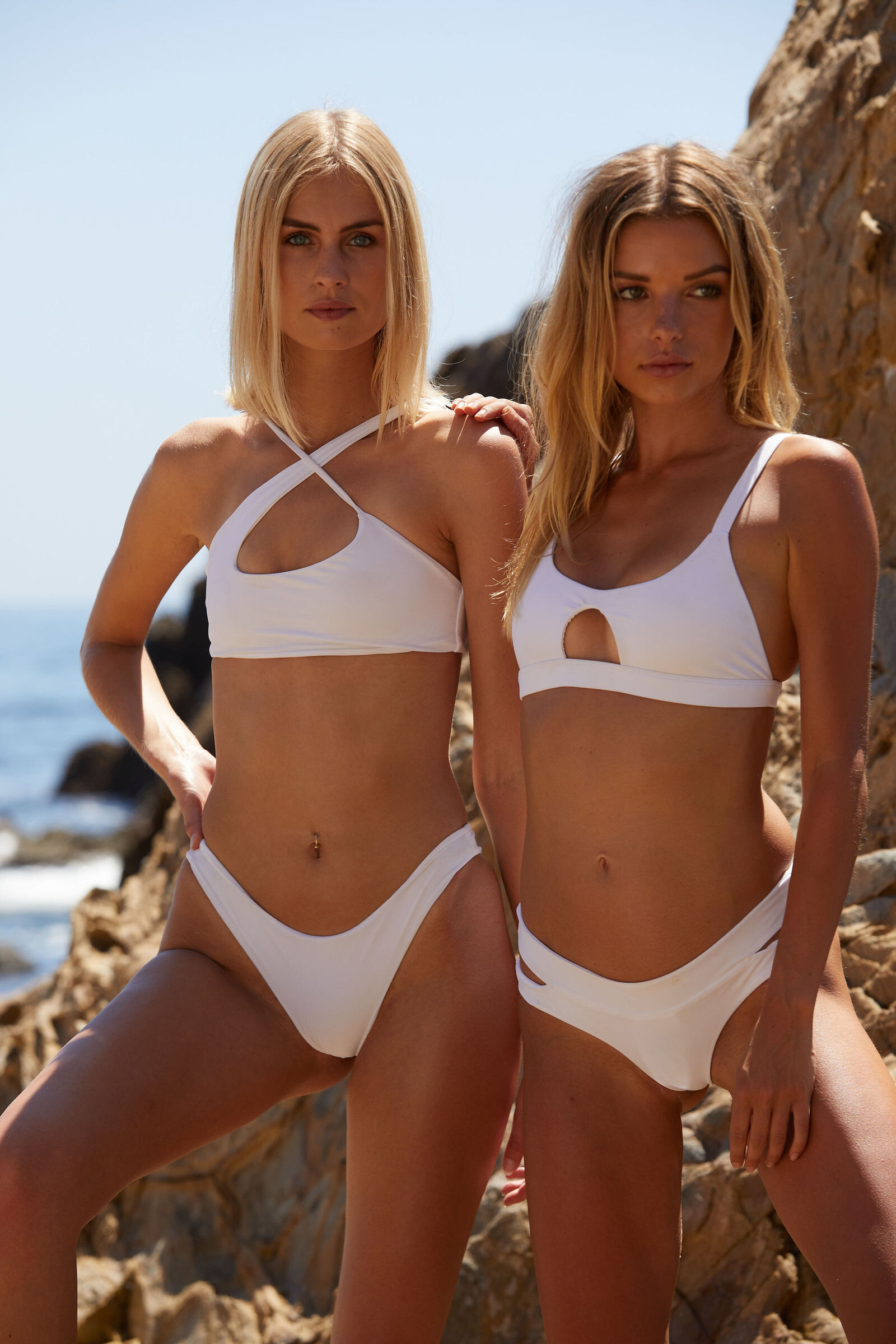
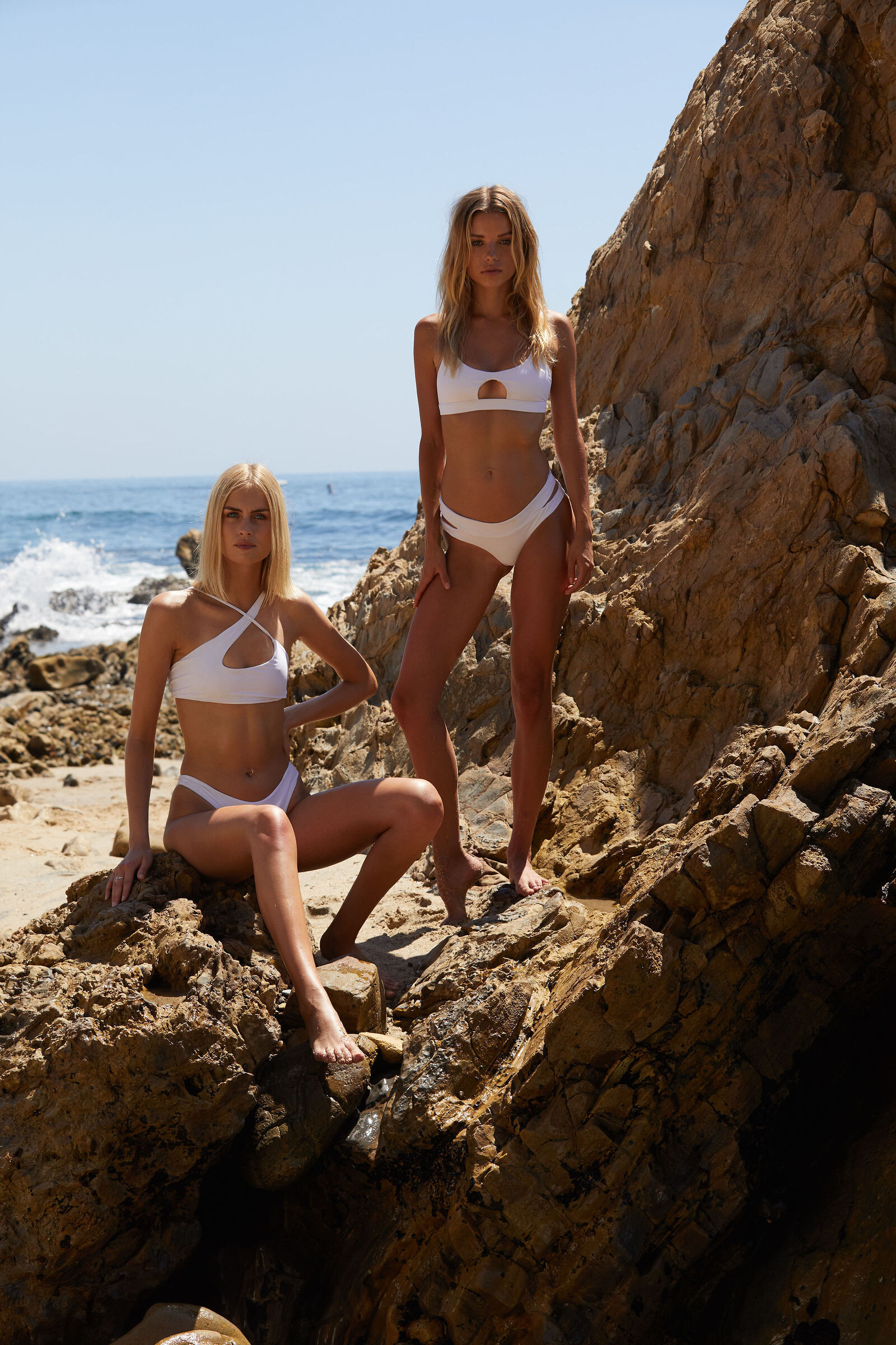
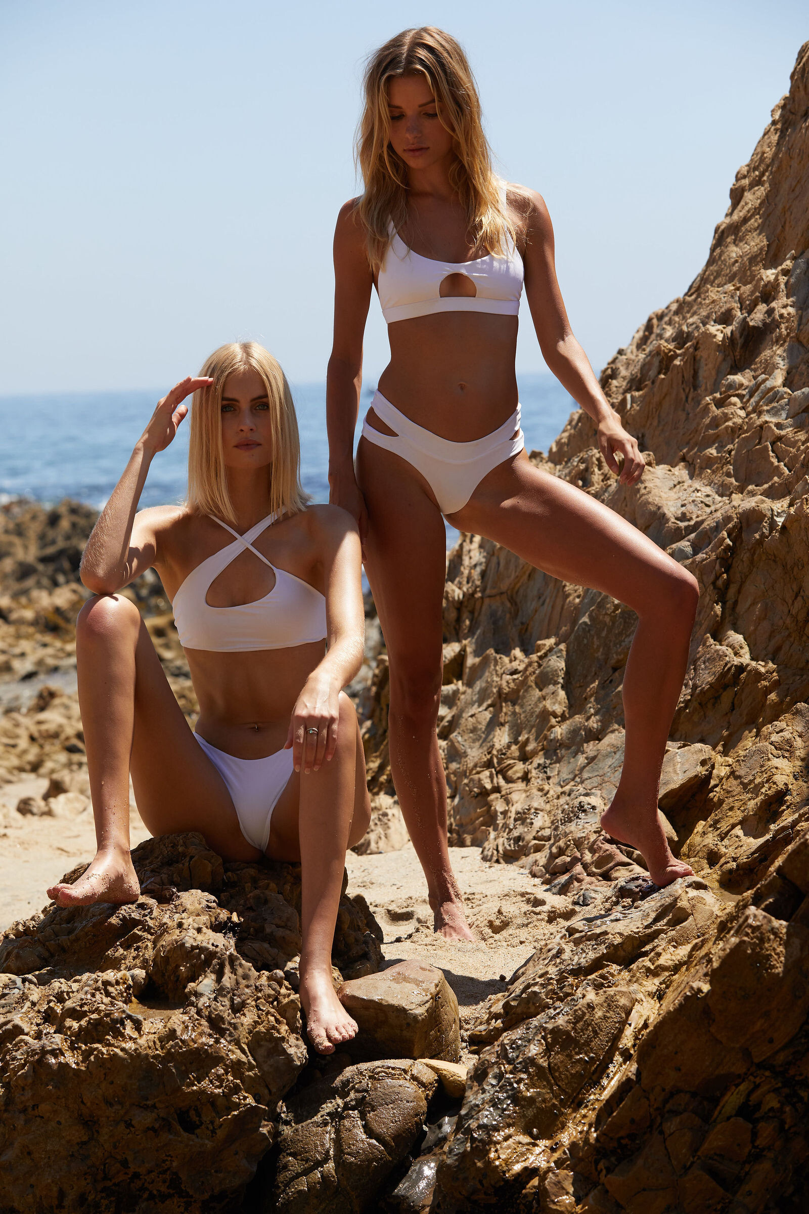
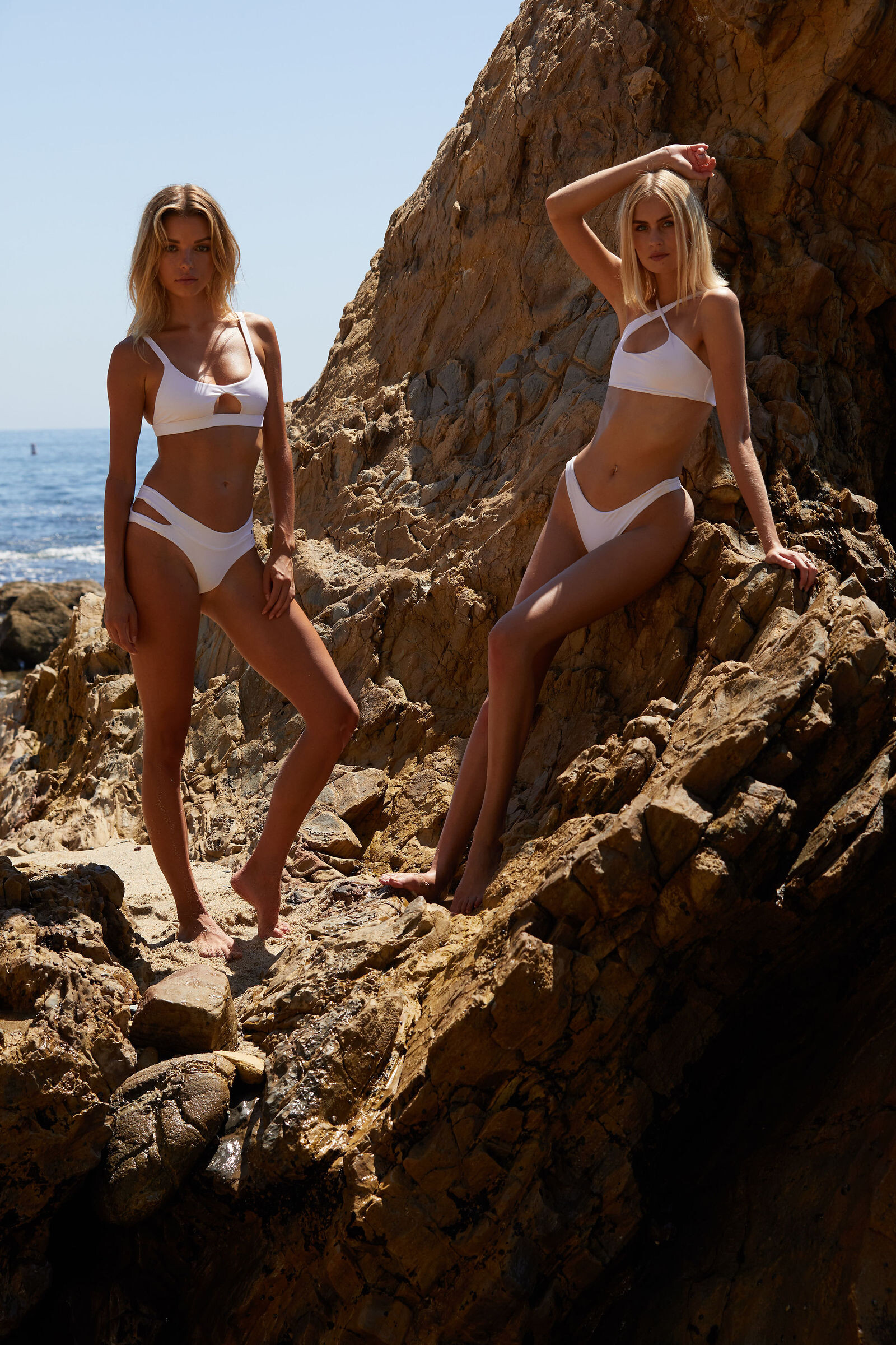
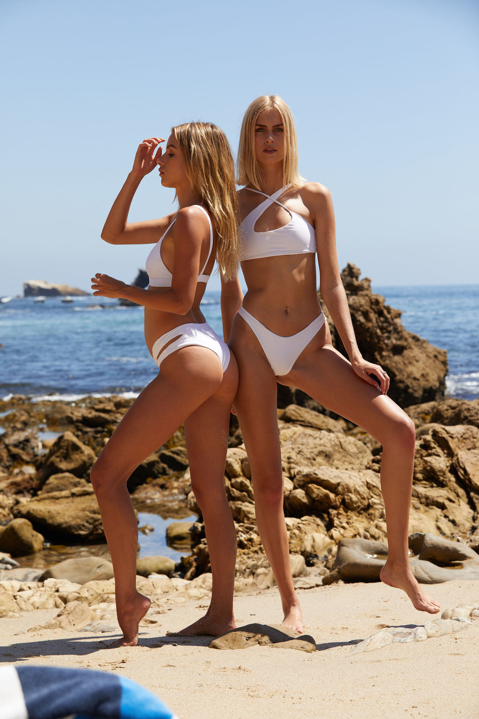
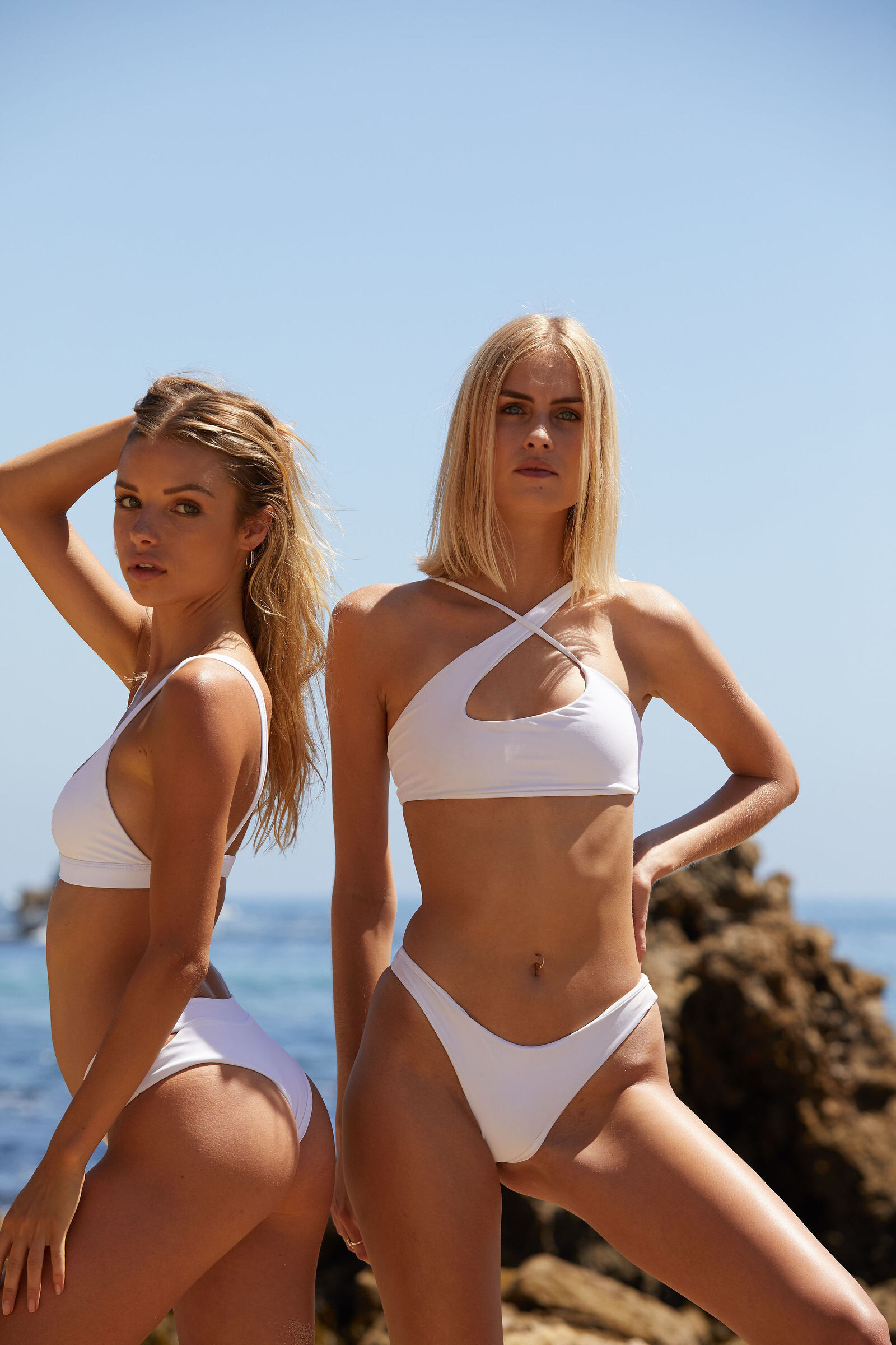
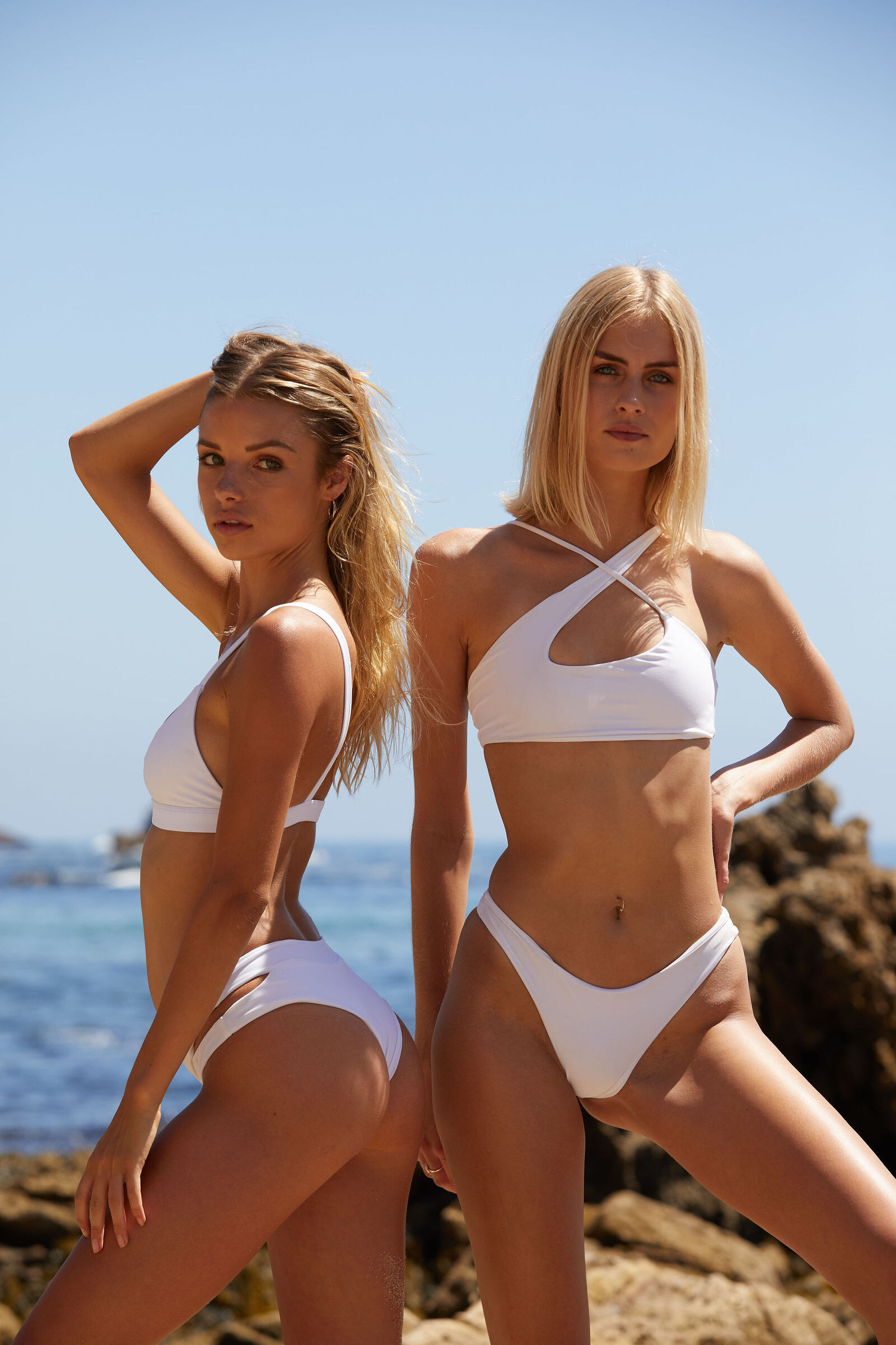
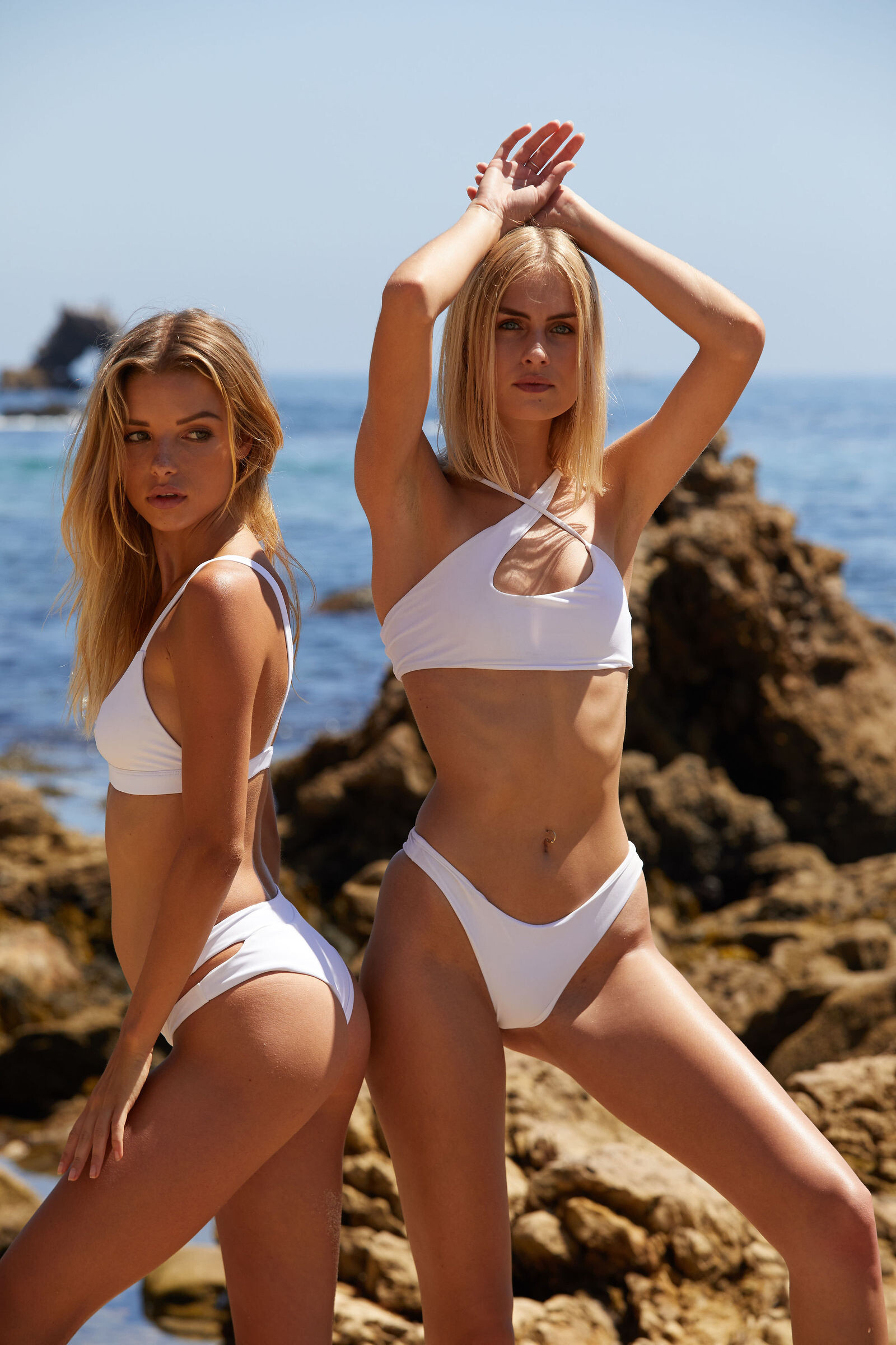
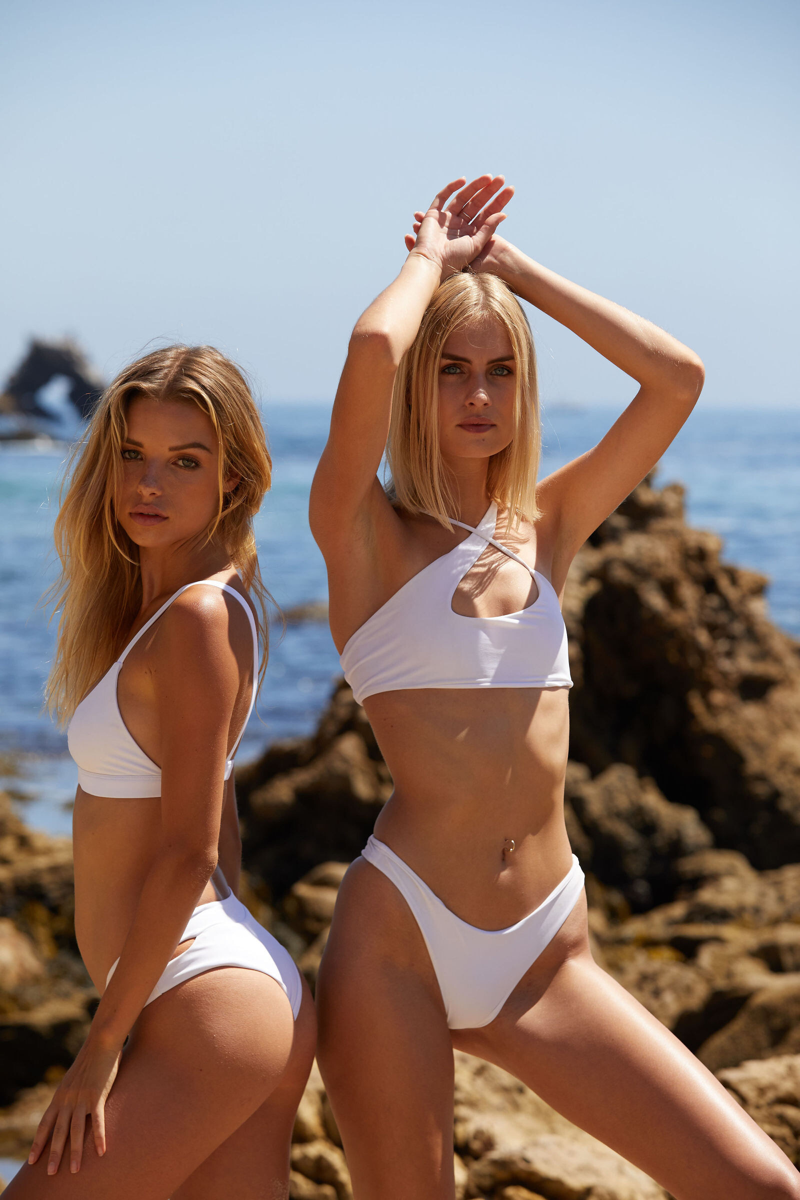
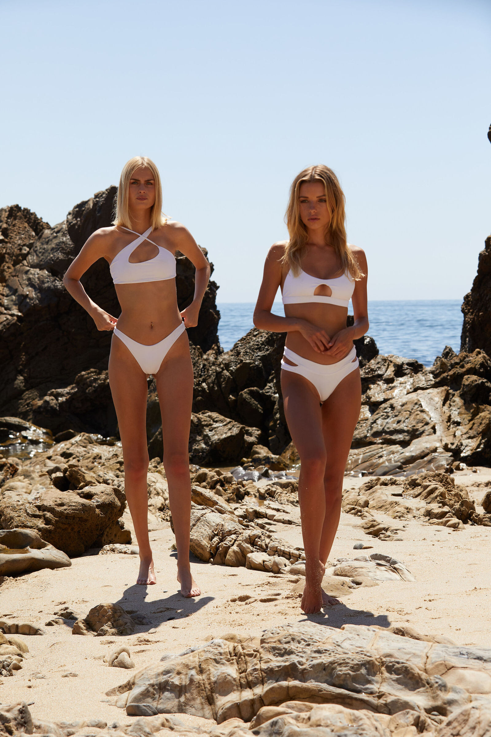
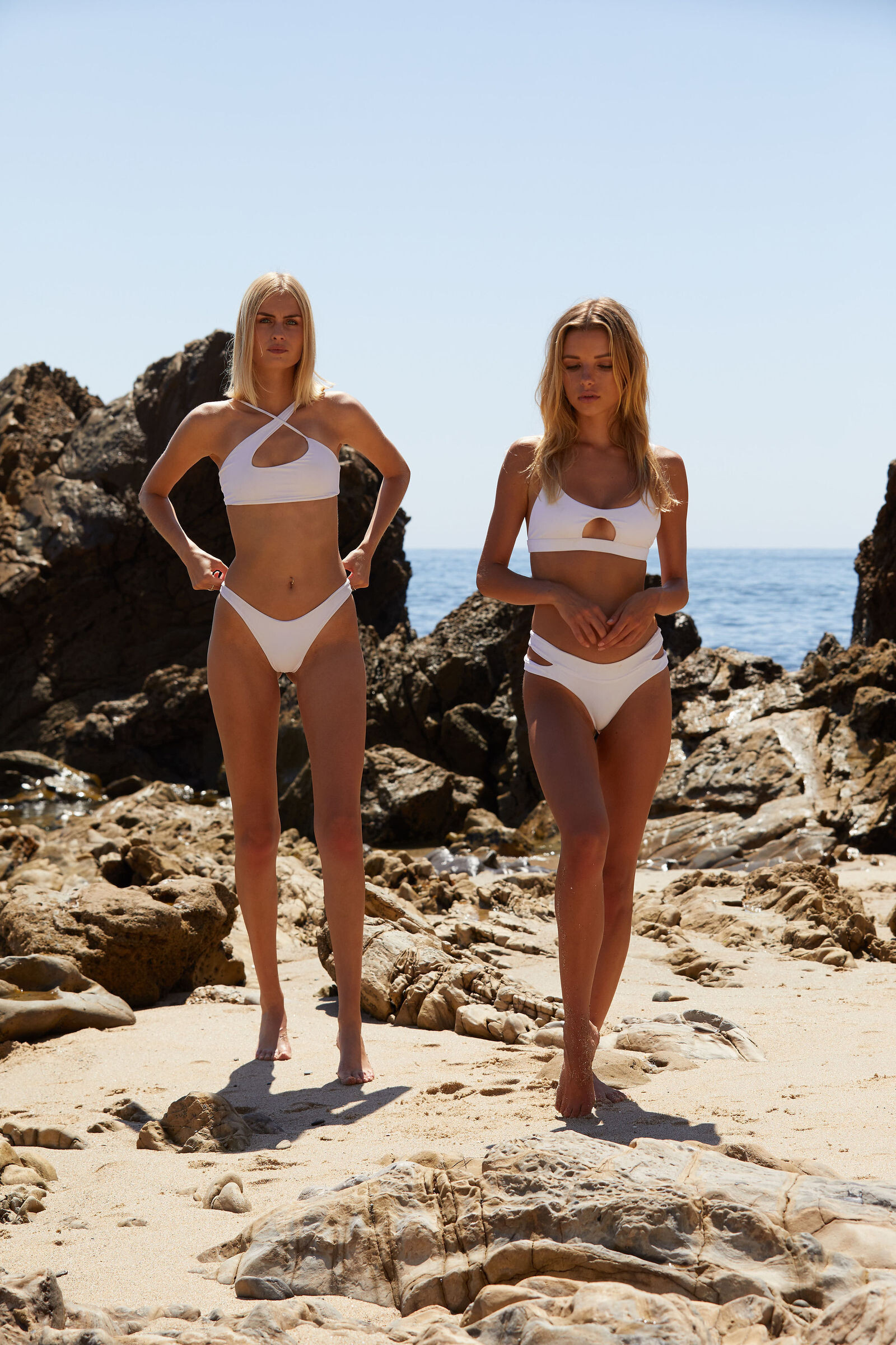
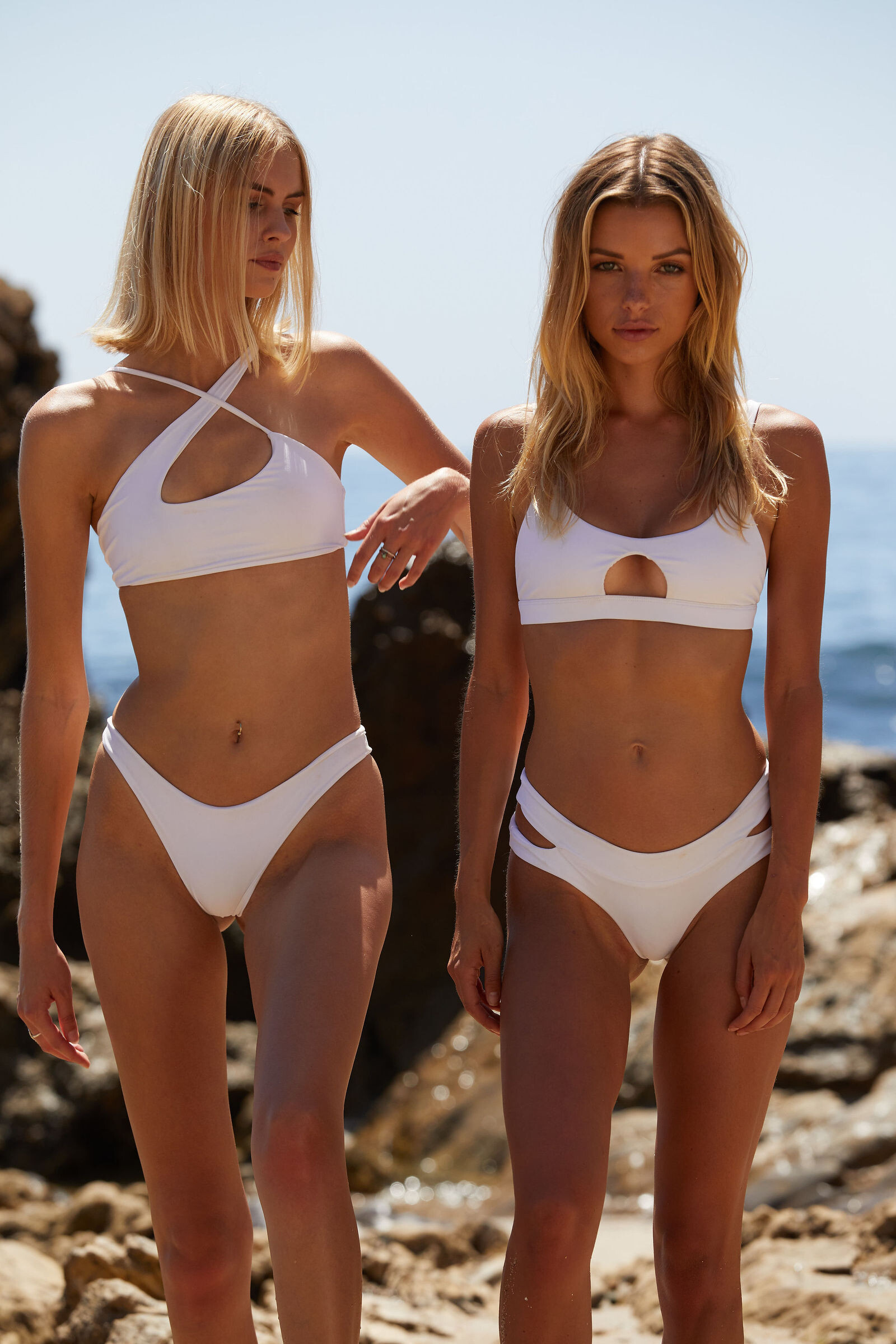
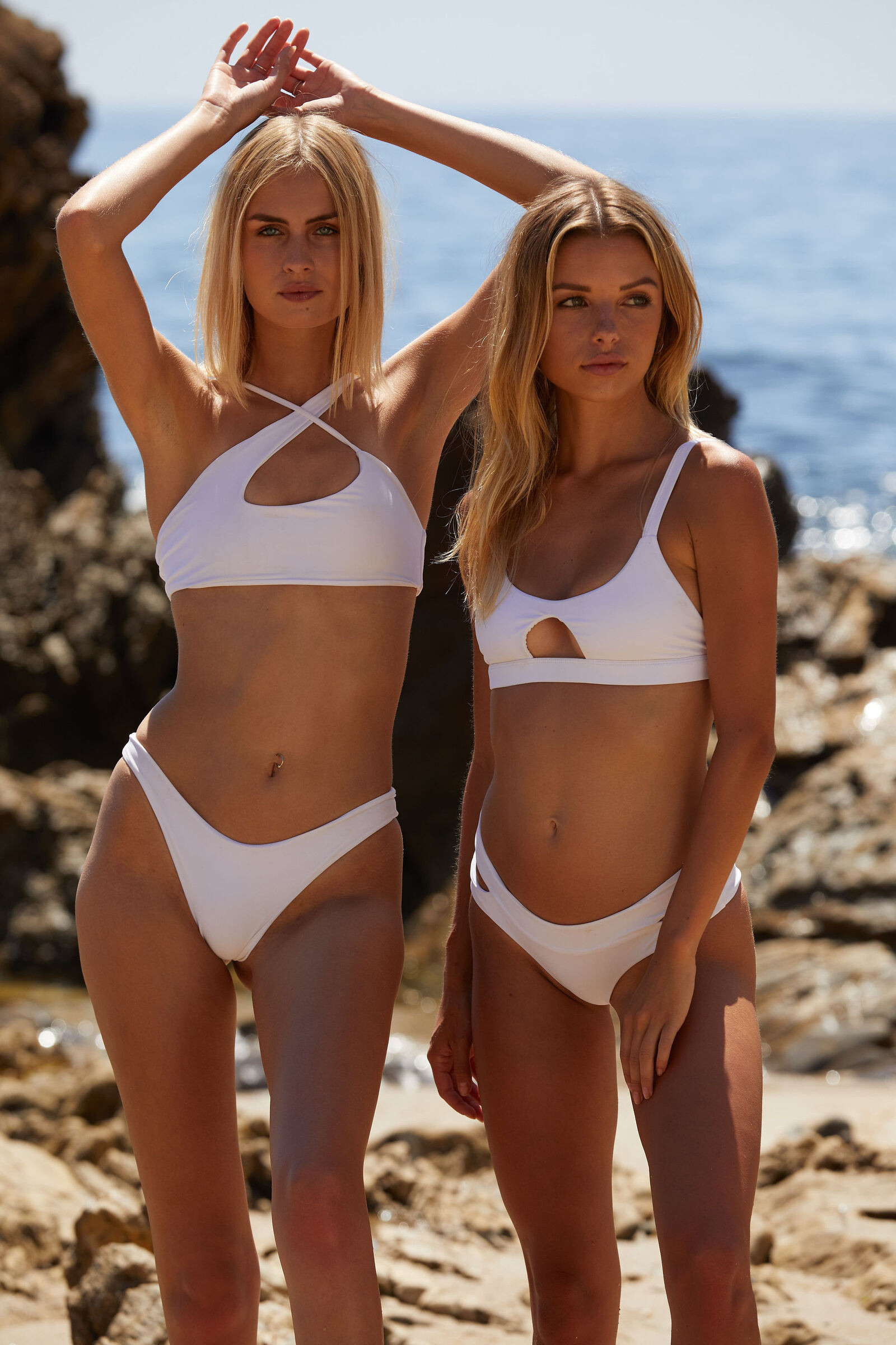
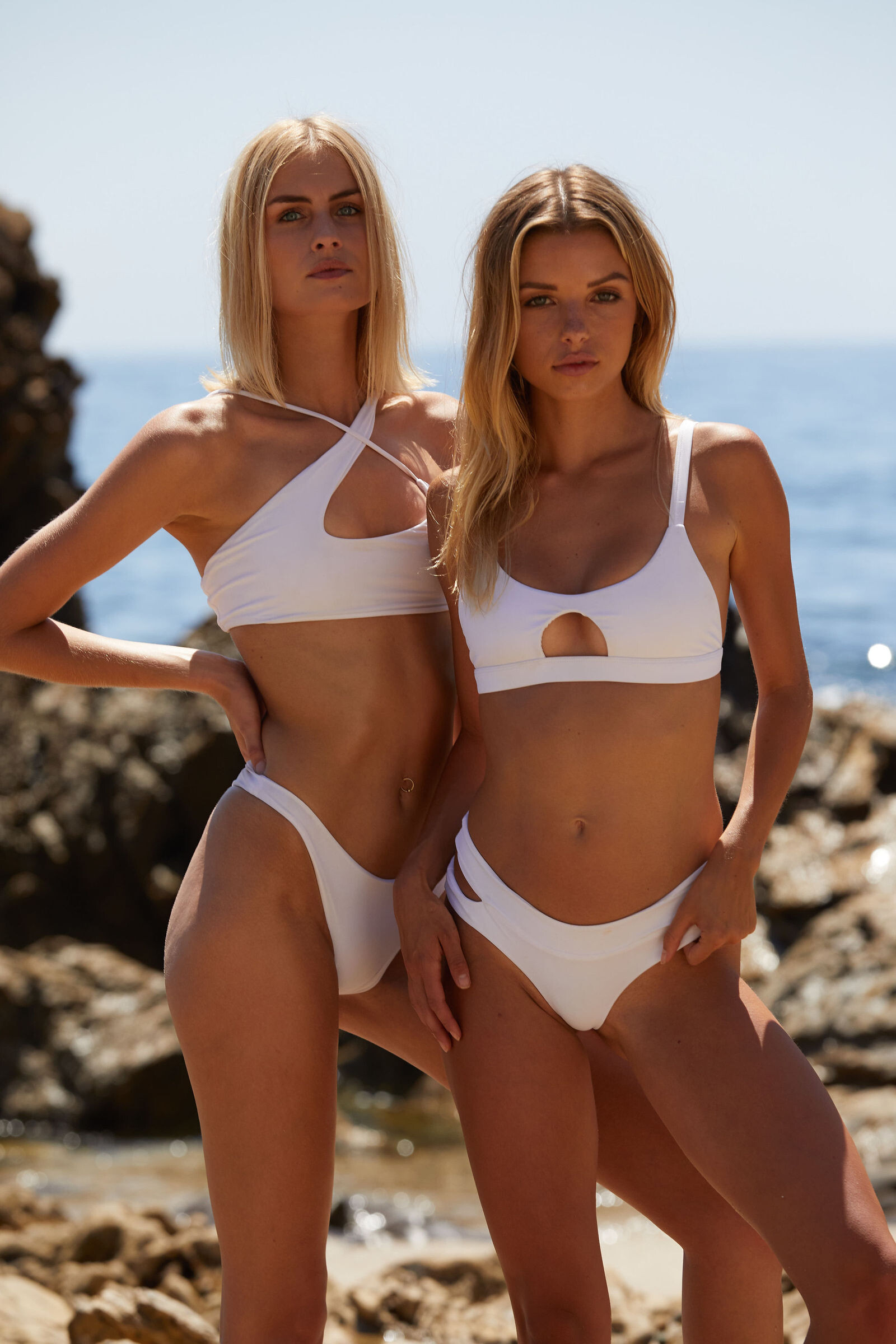
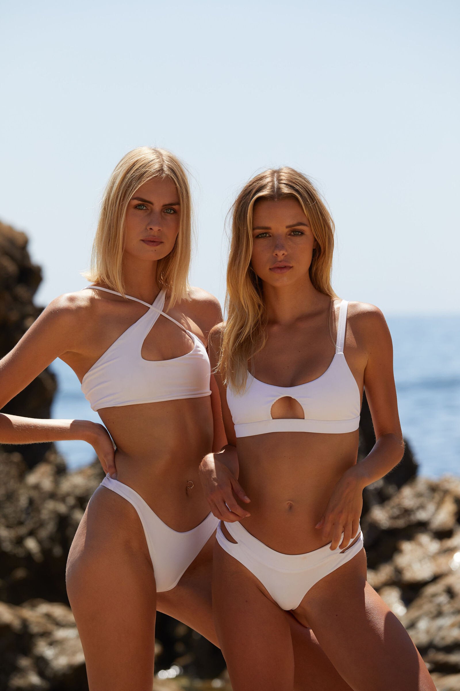
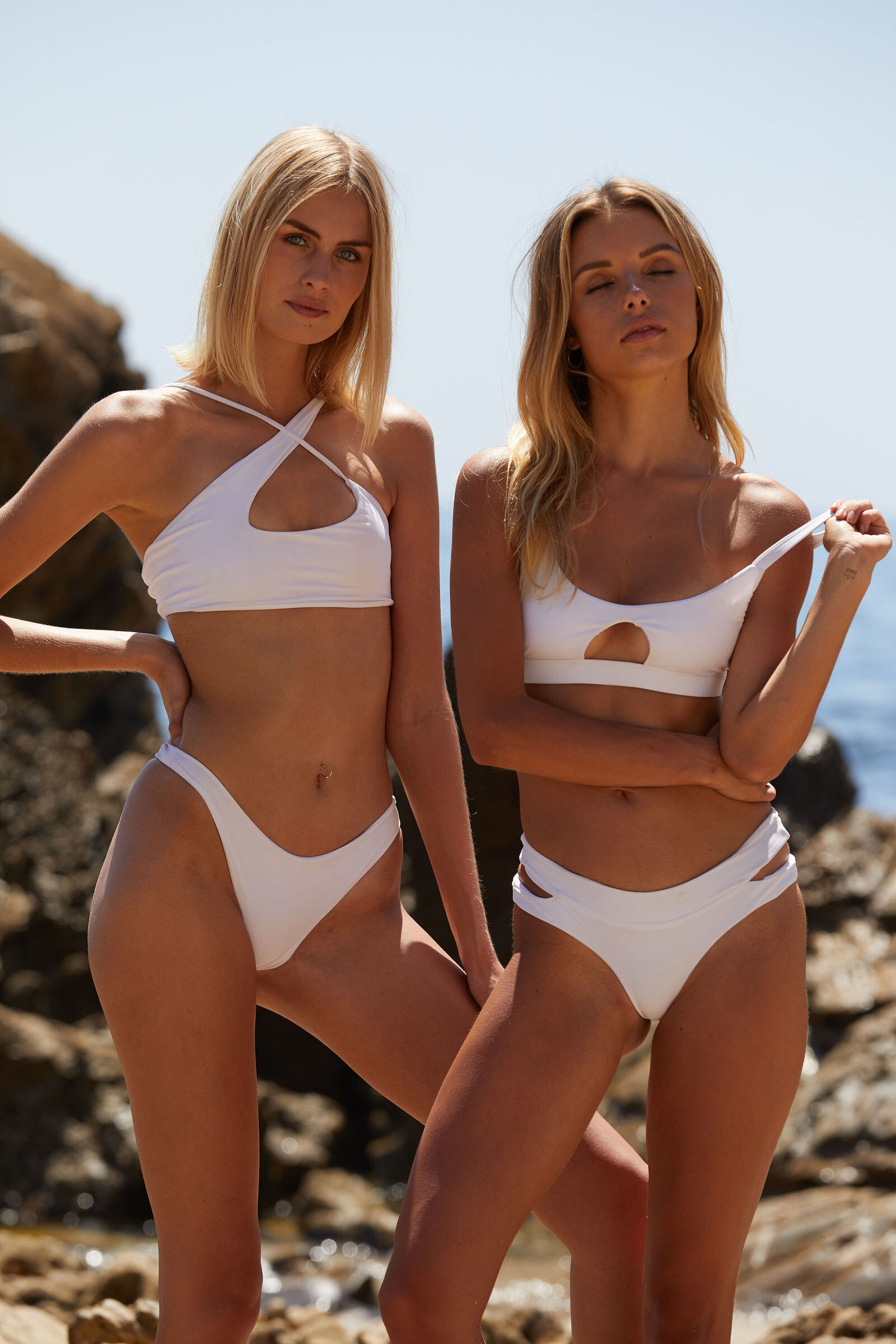
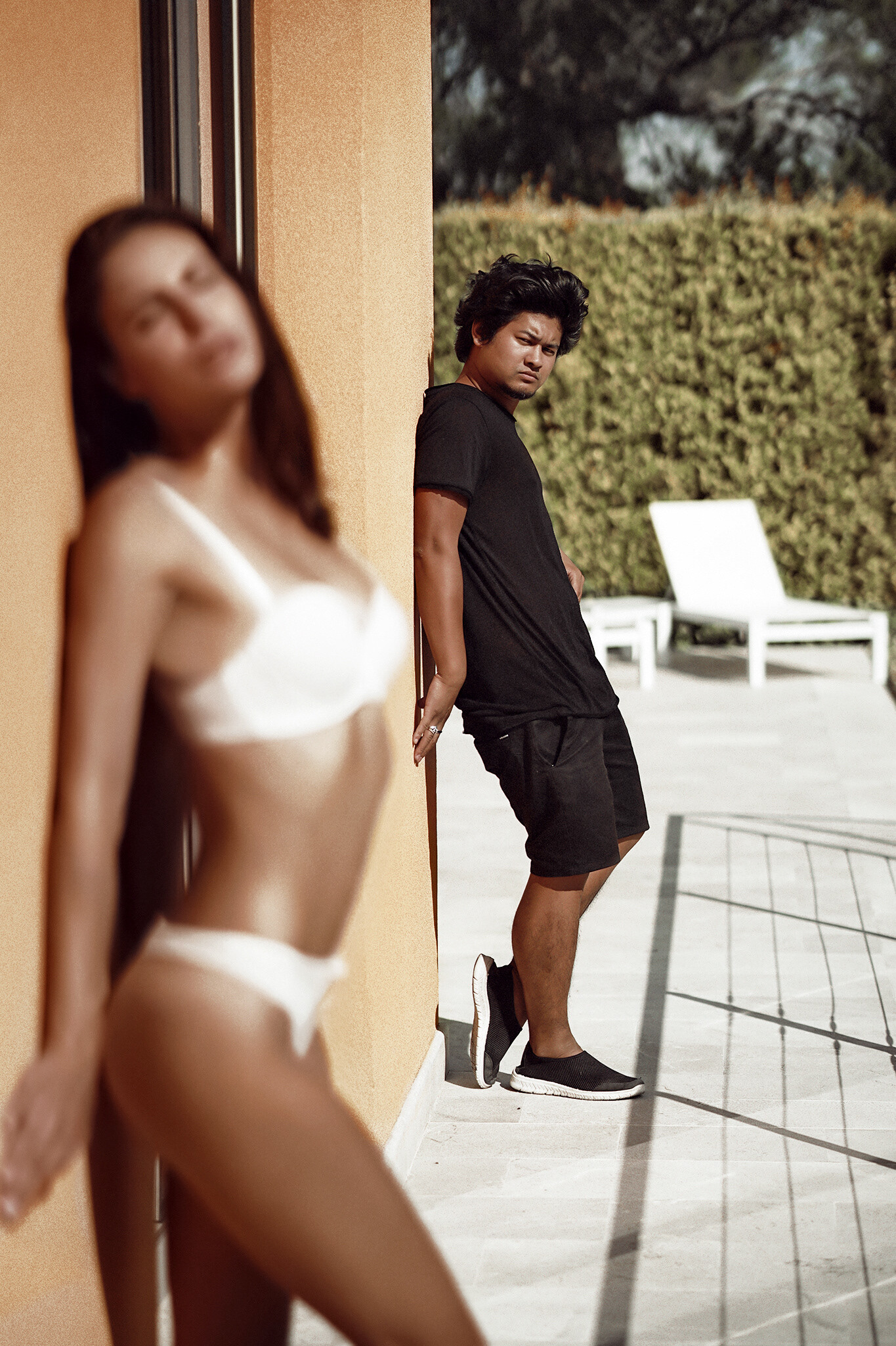
MIKOH Test By Adam Mont HQ+ Source: All 704 In Four Zips: 01.zip / 02.zip / 03.zip / 04.zip
Two spammers posting spam... https://www.bellazon.com/main/profile/146603-zamila/ https://www.bellazon.com/main/topic/80335-zamila-hyderabad-girl/ https://www.bellazon.com/main/profile/146588-foundationschool/ https://www.bellazon.com/main/topic/80331-best-schools-in-sarjapur-road/
01.mp4 02.mp4 03.mp4 04.mp4
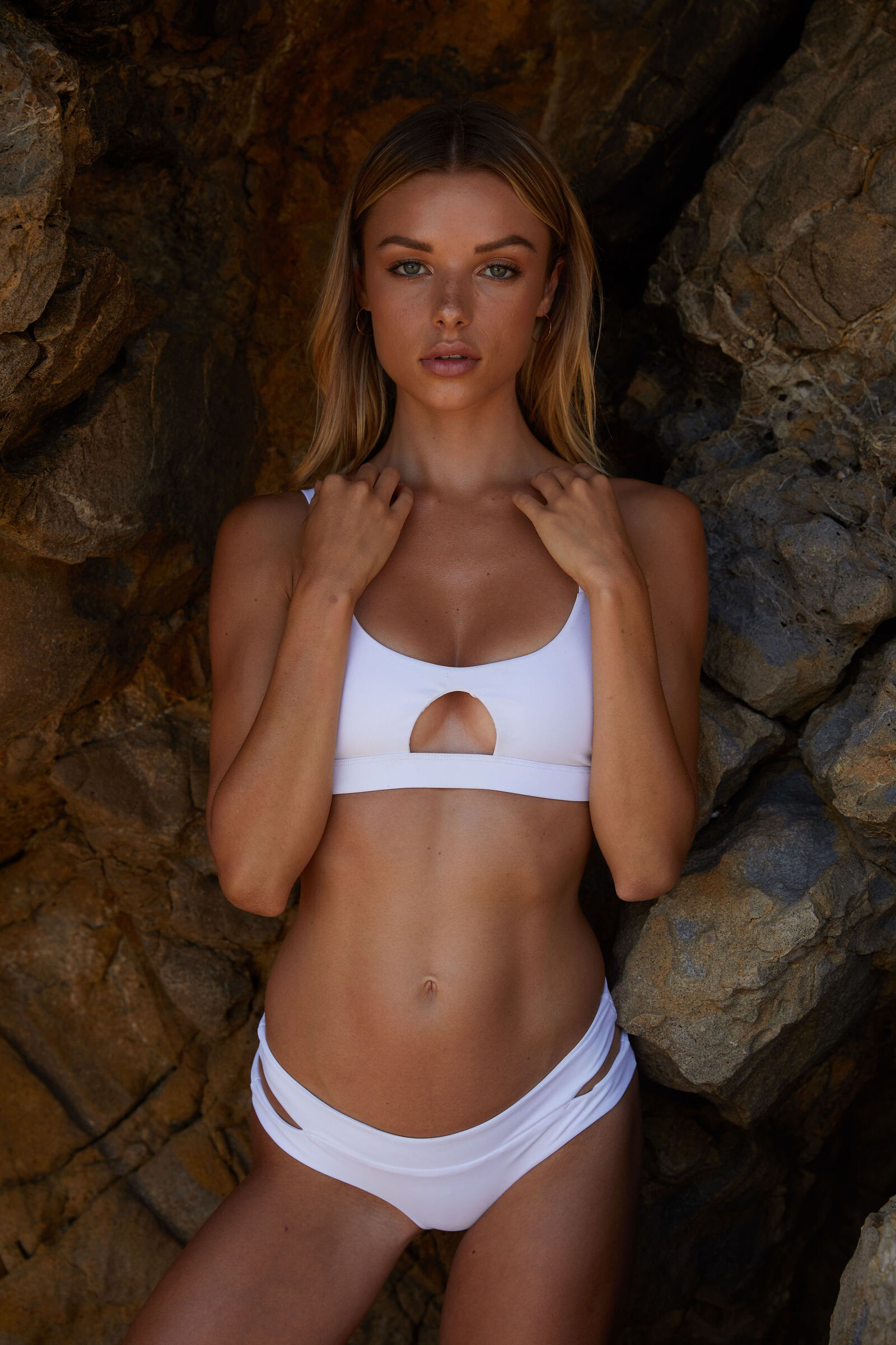
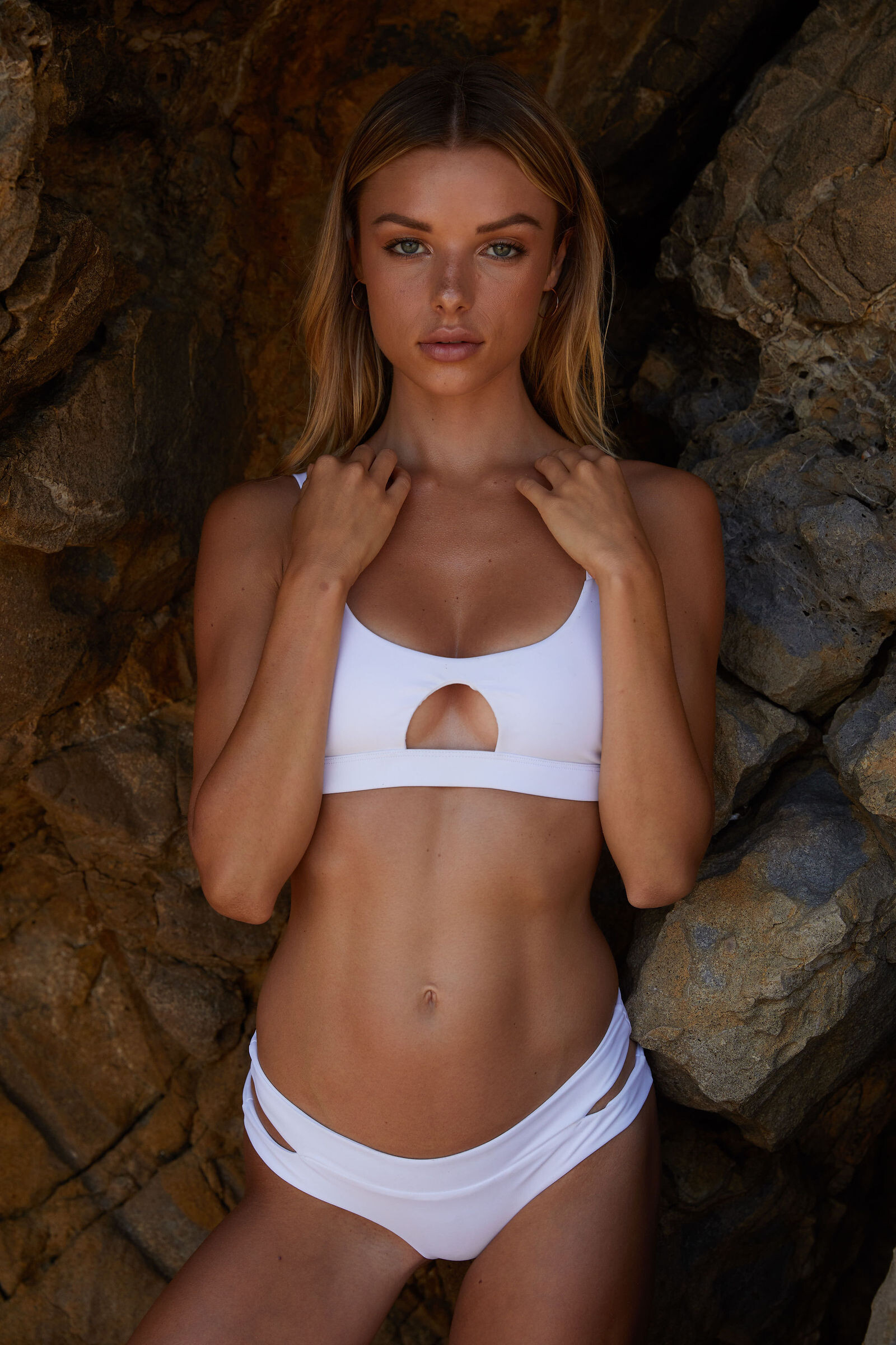
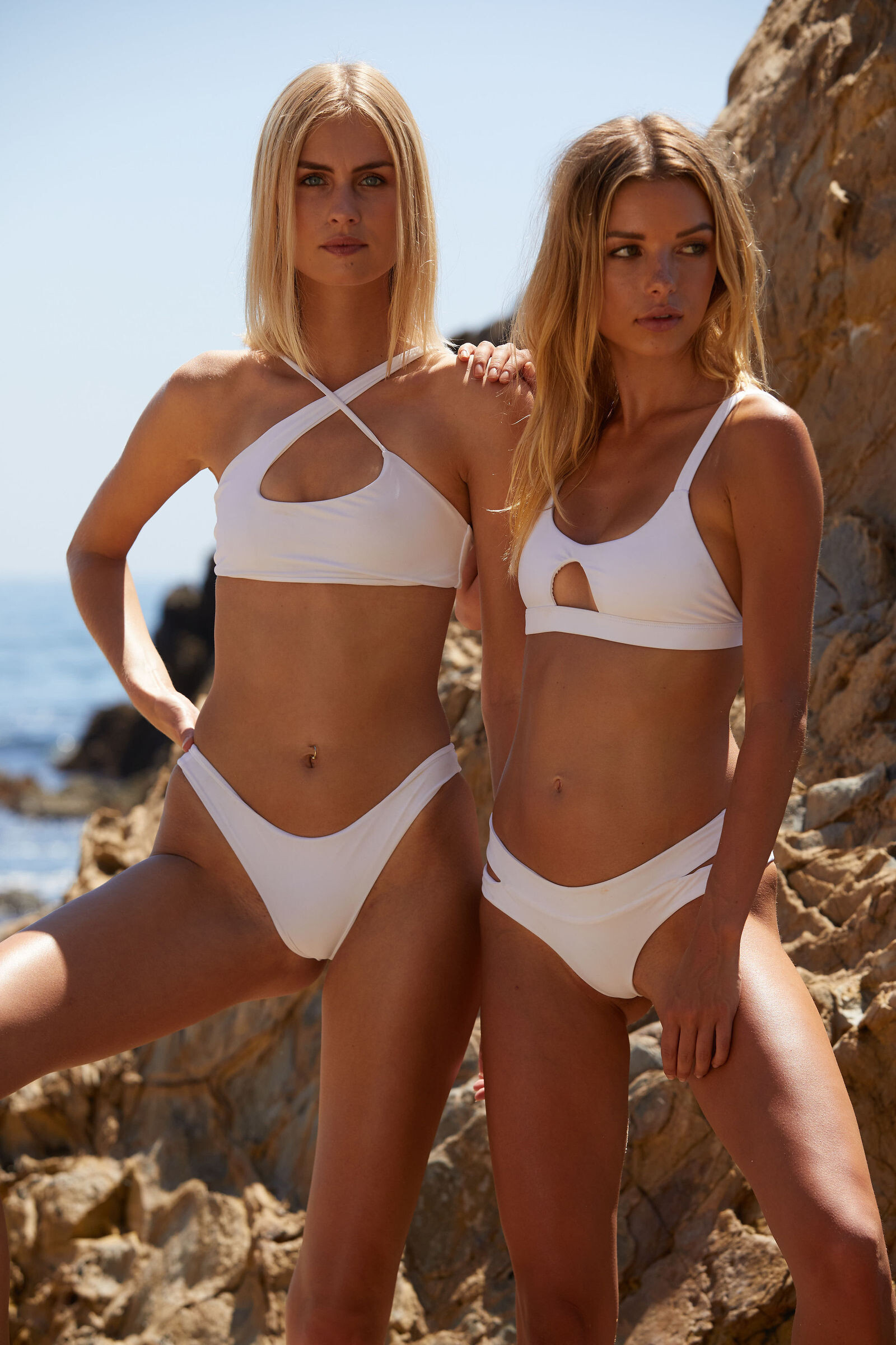
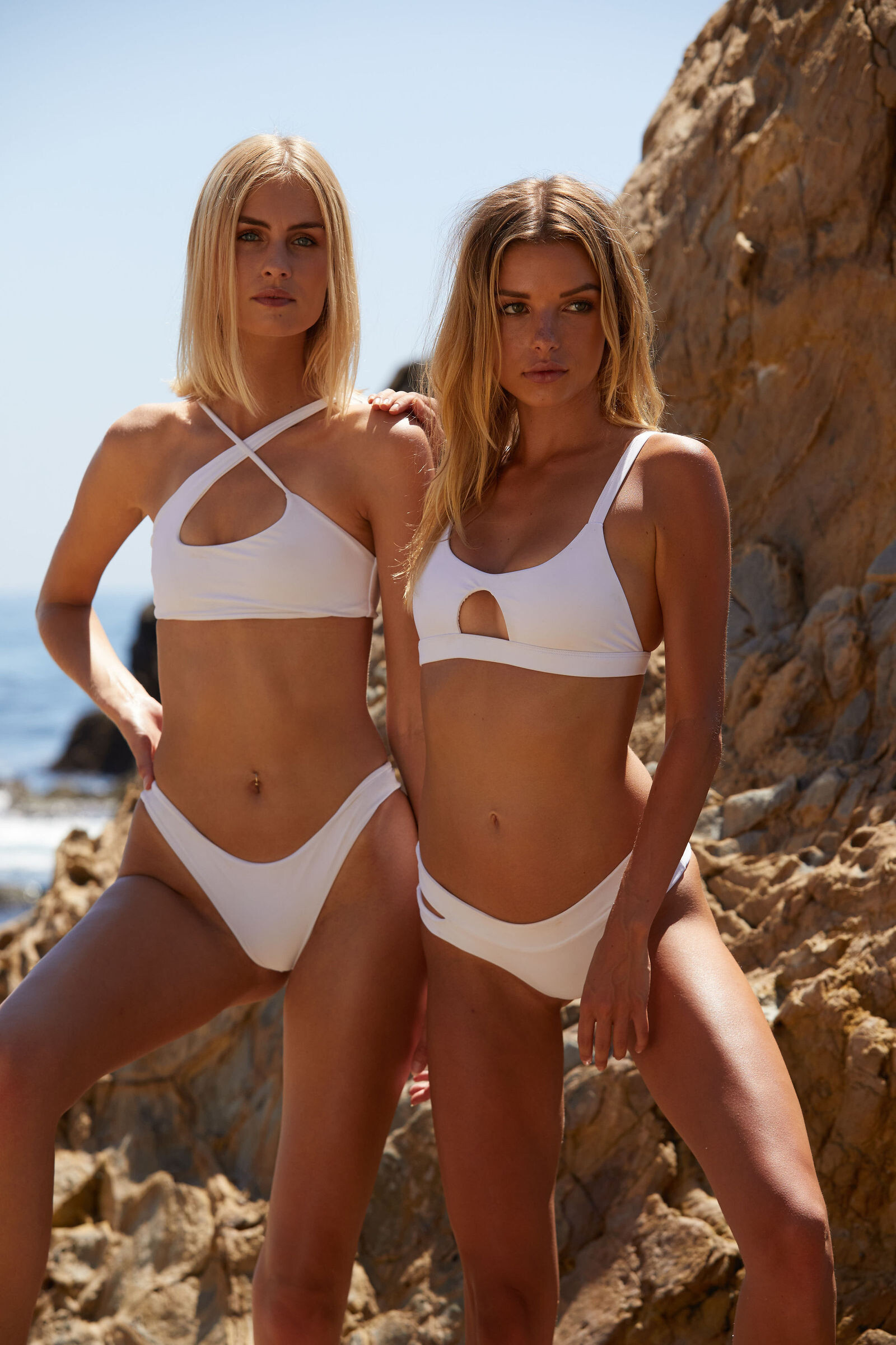
MIKOH Test By Adam Mont HQ+ Source: All 704 In Four Zips: 01.zip / 02.zip / 03.zip / 04.zip


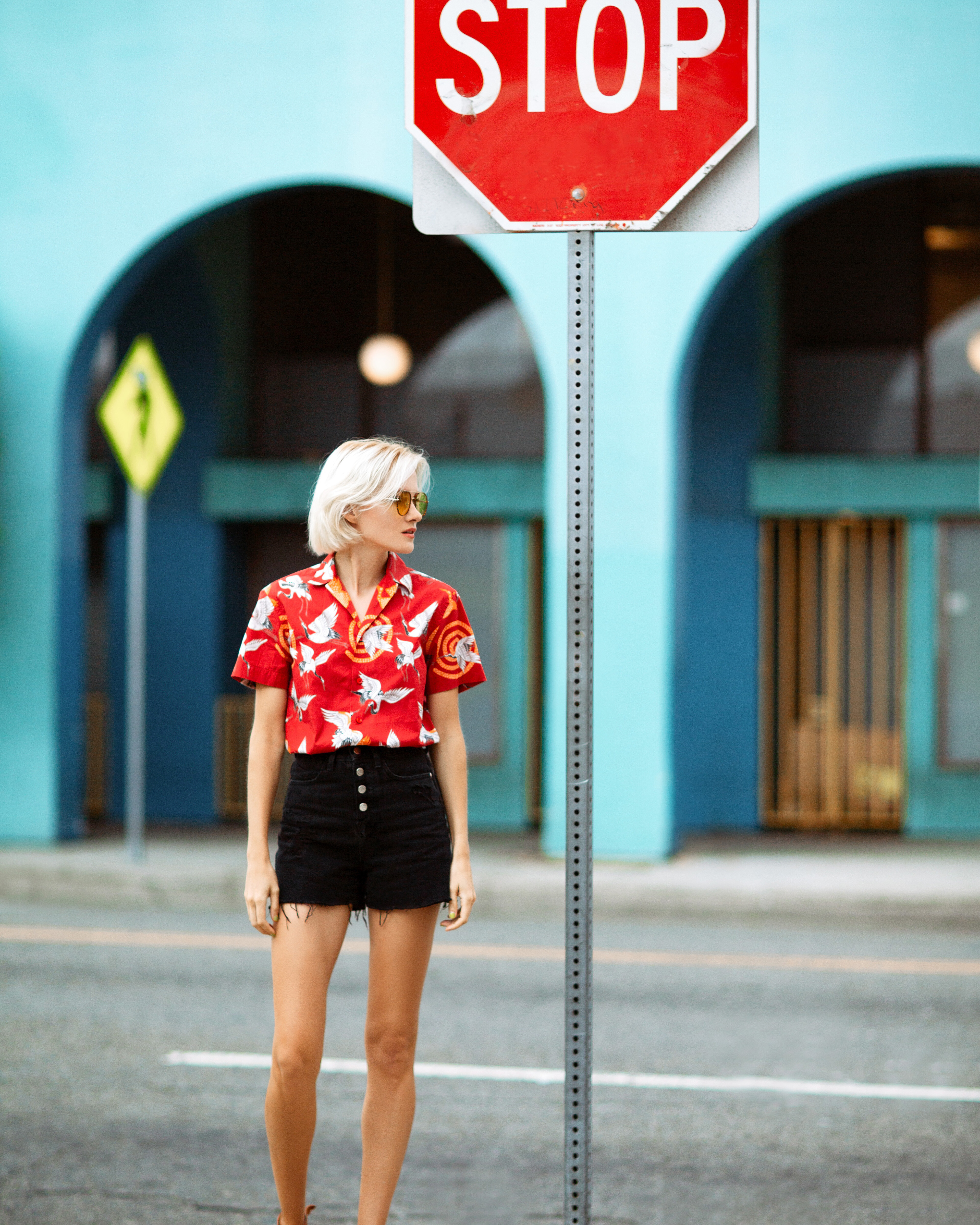
 "Venice, CA." By Sergey Goncharov UHQ Source:


 "LEONIE" By Per Florian Appelgren UHQ Source:


 For Safilo Group By Aleksei Dupliakov UHQ Source:


 "Meredith" By Michael Woloszynowicz UHQ Source:


 "Bianca" By Michael Woloszynowicz UHQ Source:


 "Tatyana" By Elena Volotova UHQ Source:


Account
Search
Configure browser push notifications
Chrome (Android)
- Tap the lock icon next to the address bar.
- Tap Permissions → Notifications.
- Adjust your preference.
Chrome (Desktop)
- Click the padlock icon in the address bar.
- Select Site settings.
- Find Notifications and adjust your preference.
Safari (iOS 16.4+)
- Ensure the site is installed via Add to Home Screen.
- Open Settings App → Notifications.
- Find your app name and adjust your preference.
Safari (macOS)
- Go to Safari → Preferences.
- Click the Websites tab.
- Select Notifications in the sidebar.
- Find this website and adjust your preference.
Edge (Android)
- Tap the lock icon next to the address bar.
- Tap Permissions.
- Find Notifications and adjust your preference.
Edge (Desktop)
- Click the padlock icon in the address bar.
- Click Permissions for this site.
- Find Notifications and adjust your preference.
Firefox (Android)
- Go to Settings → Site permissions.
- Tap Notifications.
- Find this site in the list and adjust your preference.
Firefox (Desktop)
- Open Firefox Settings.
- Search for Notifications.
- Find this site in the list and adjust your preference.