radolgc
Members
-
Joined
-
Last visited
Everything posted by radolgc
-
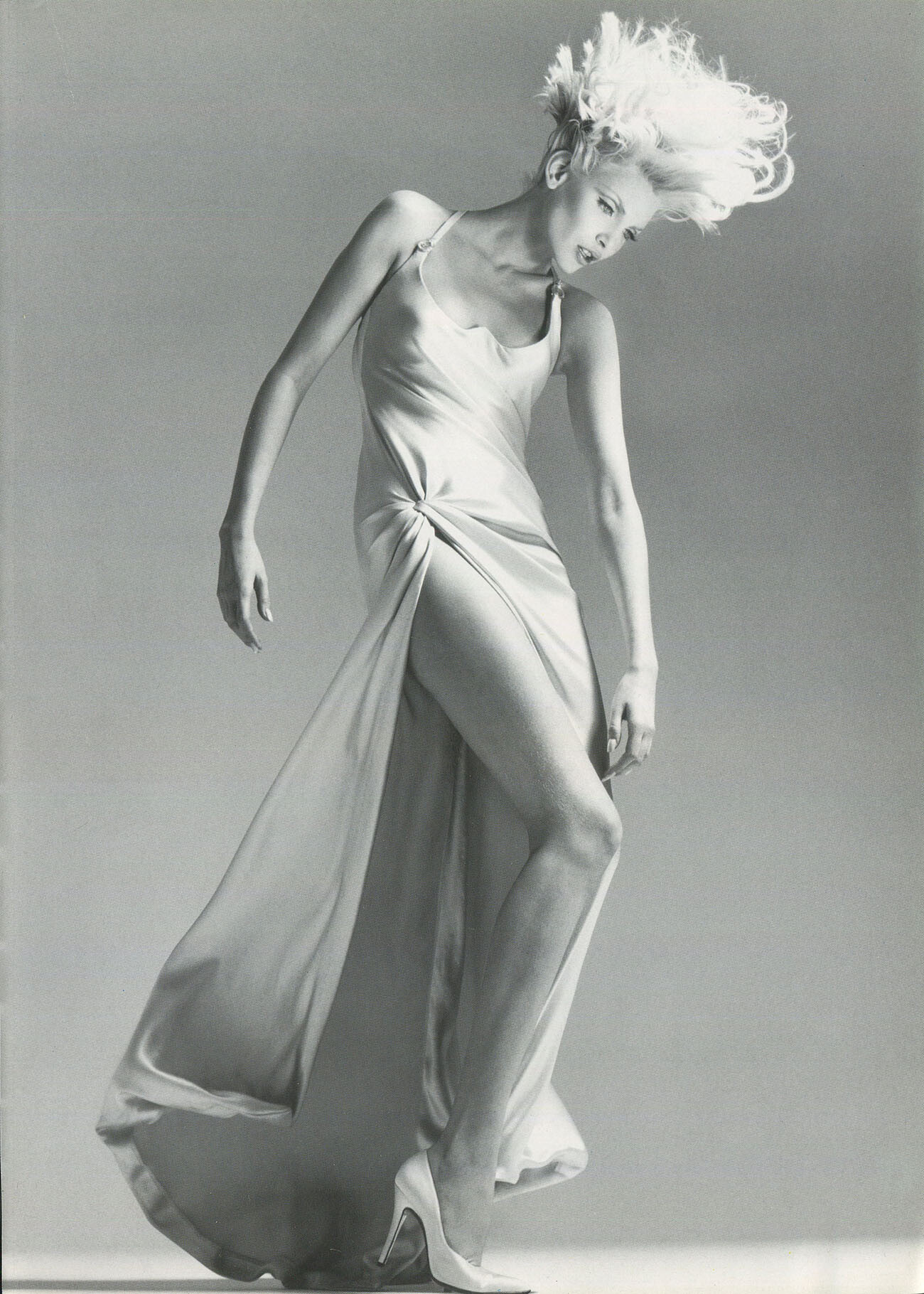
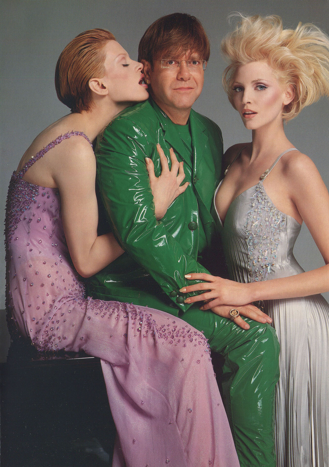
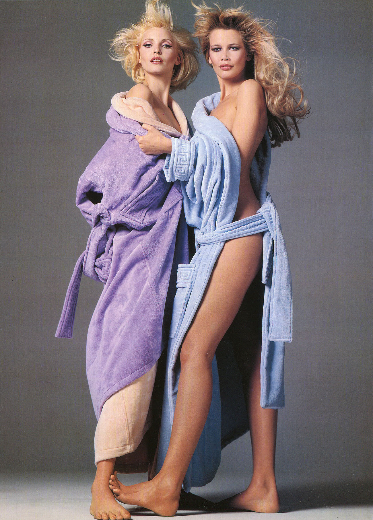
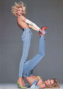
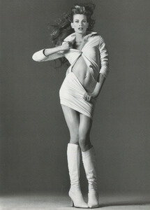
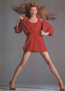
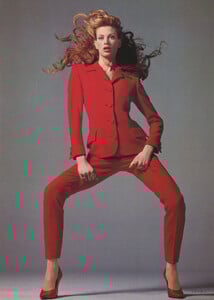
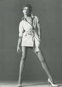
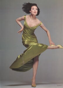
 Gianni Versace Donna Catalog AW 1995/1996, my scans:
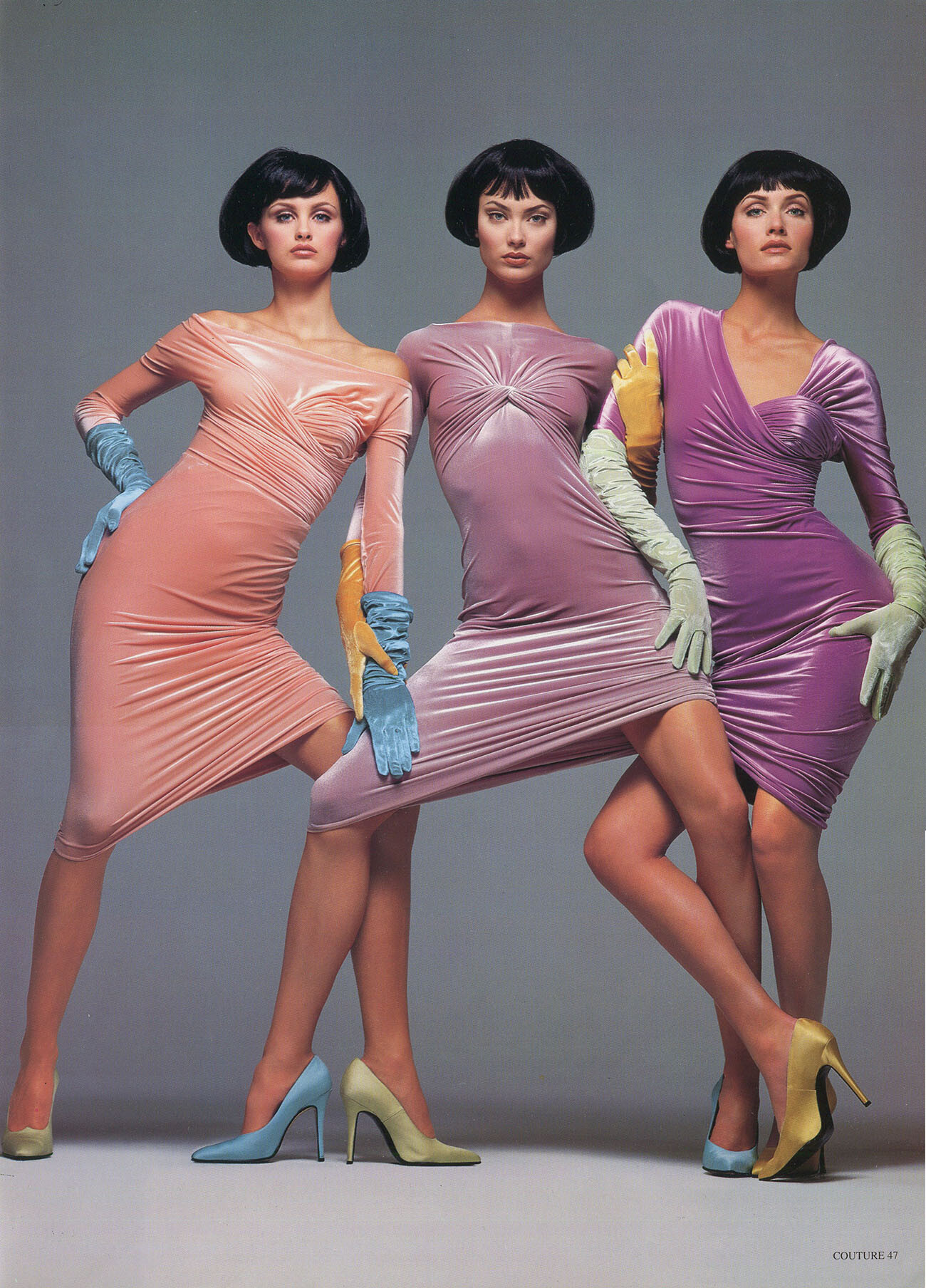


-
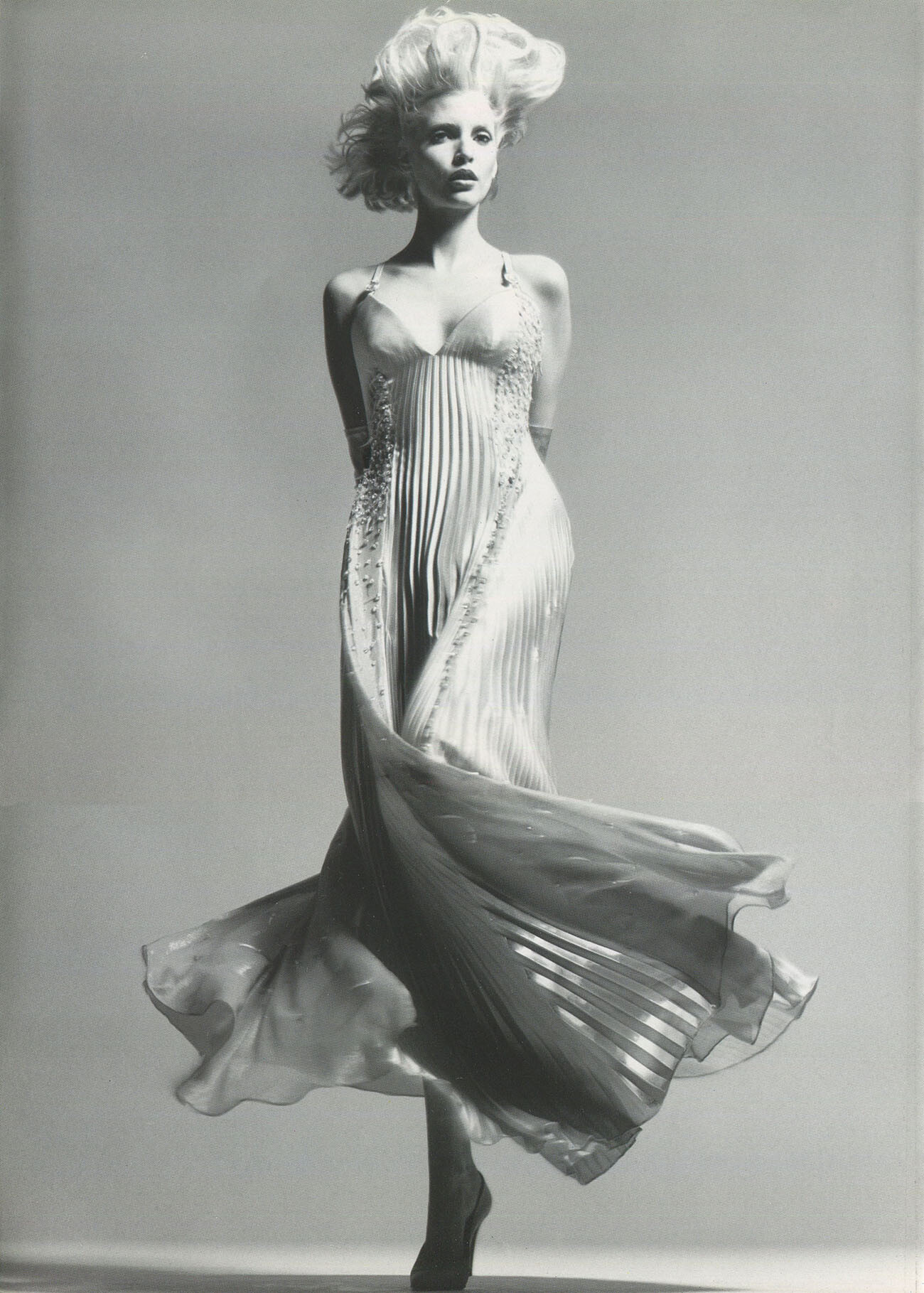
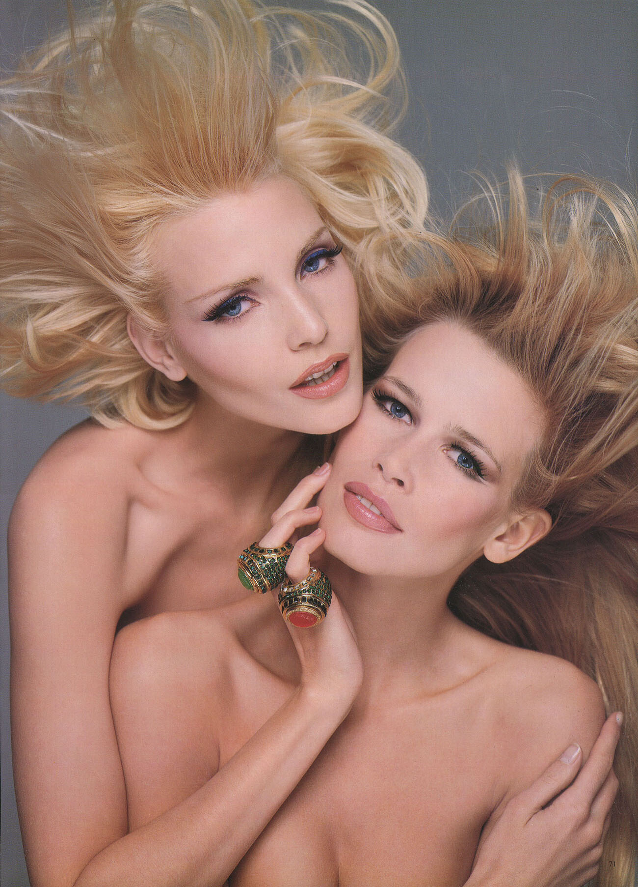
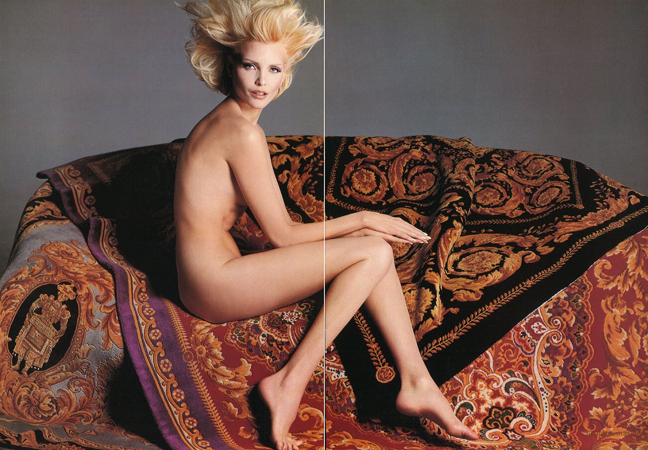
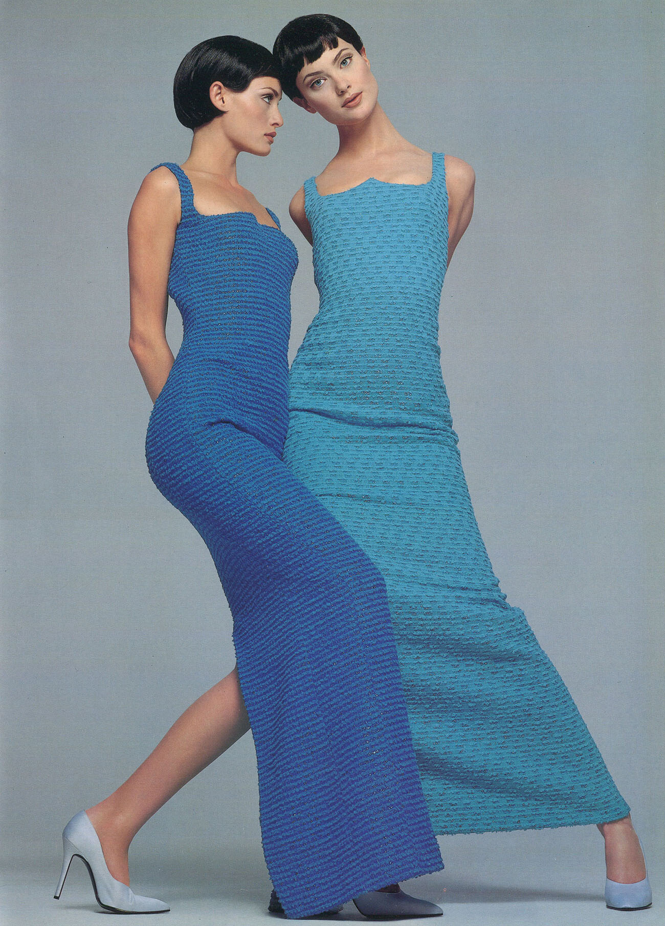
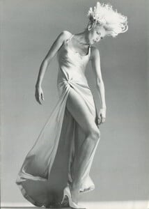
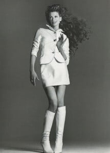
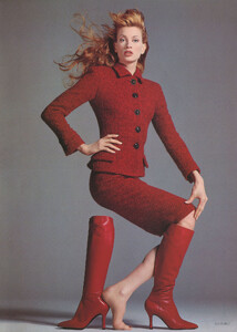
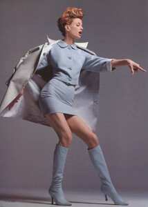
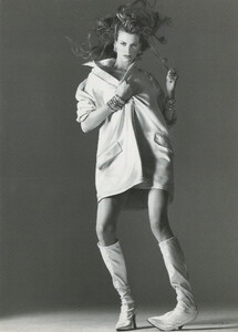
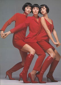
Gianni Versace catalog, Donna Autumn Winter 1995/1996, Part 2, my scans:


-
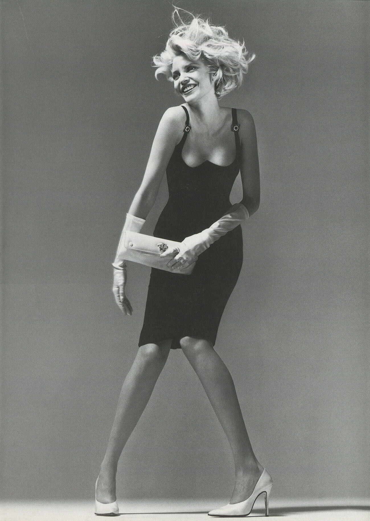
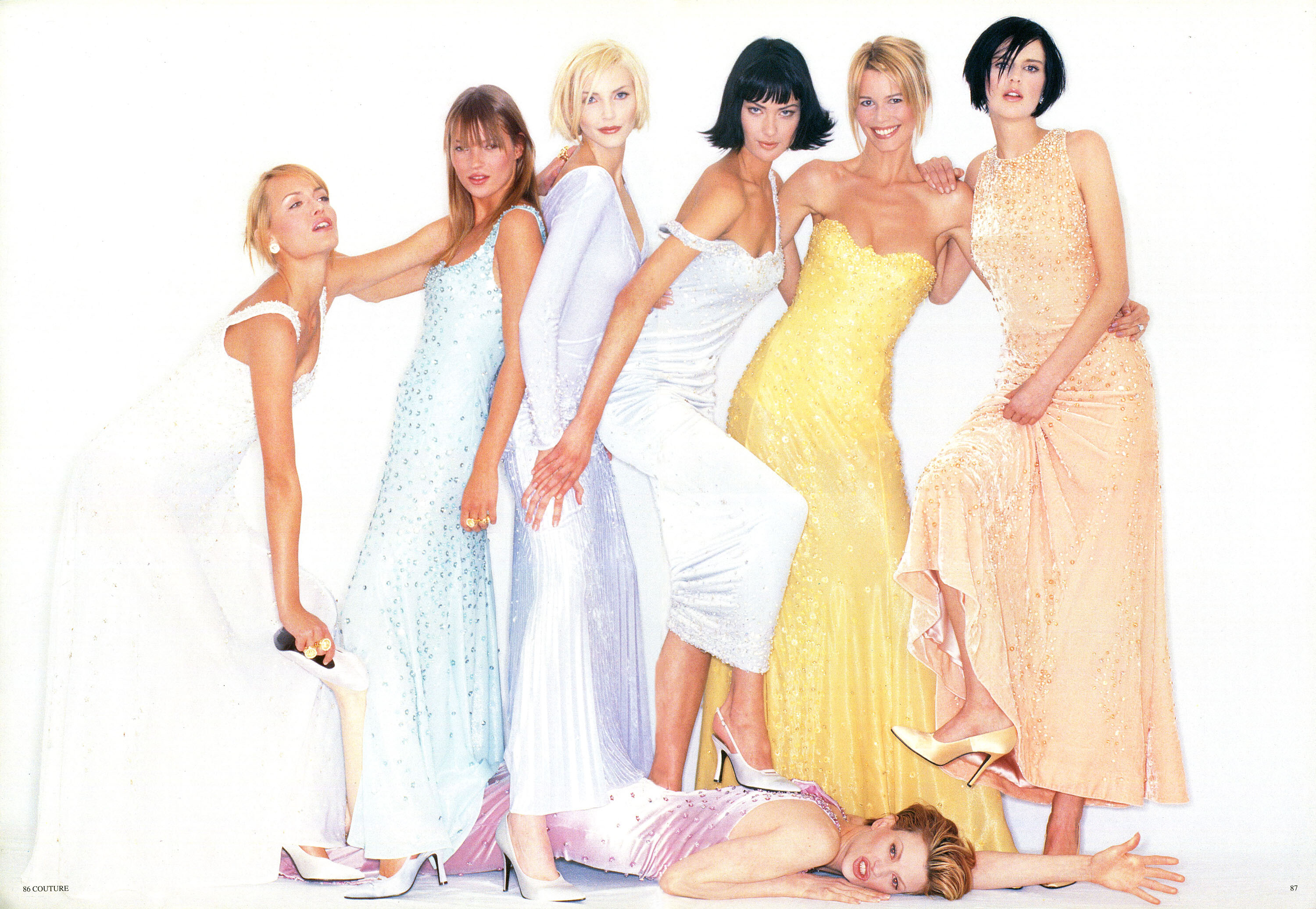
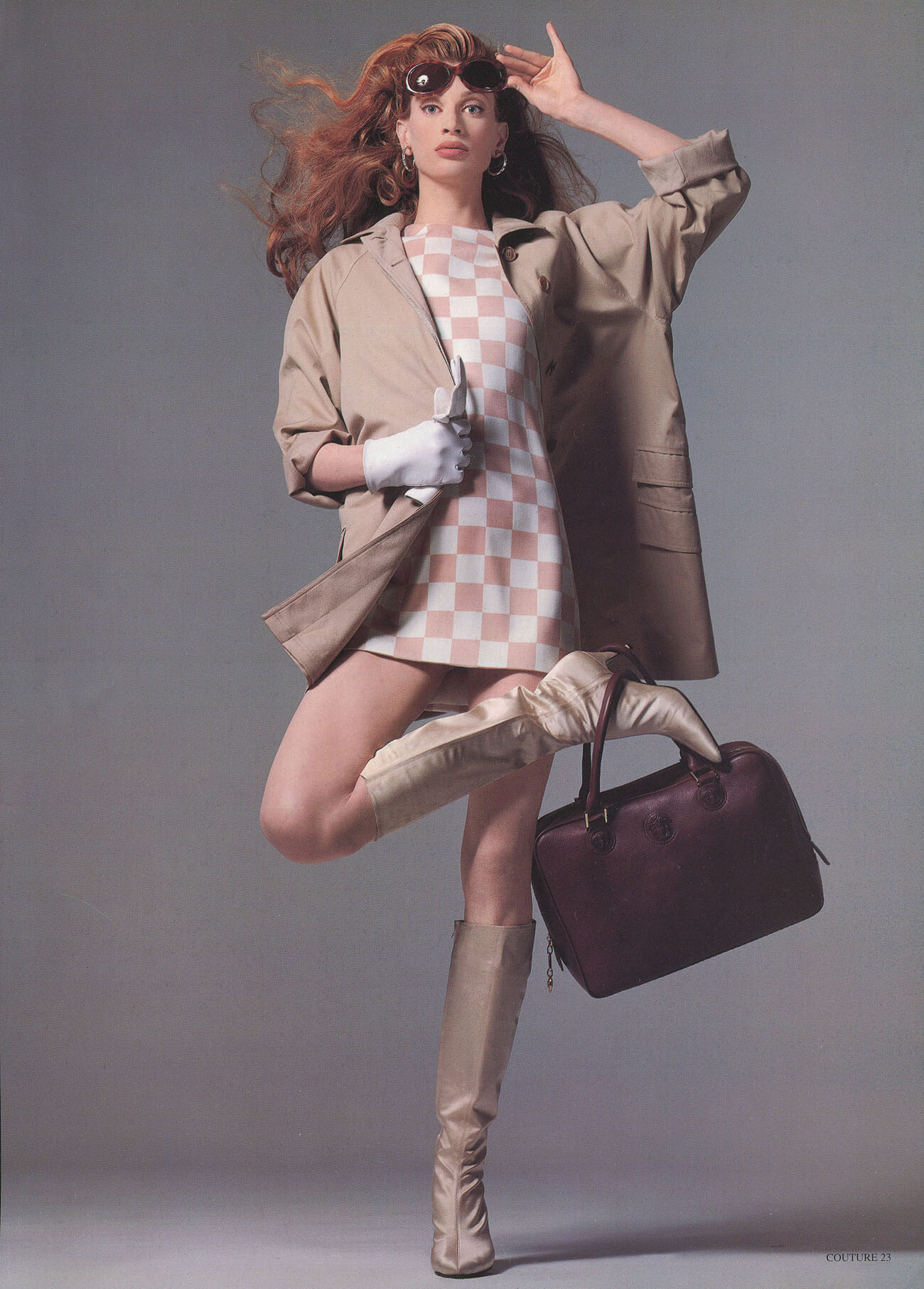
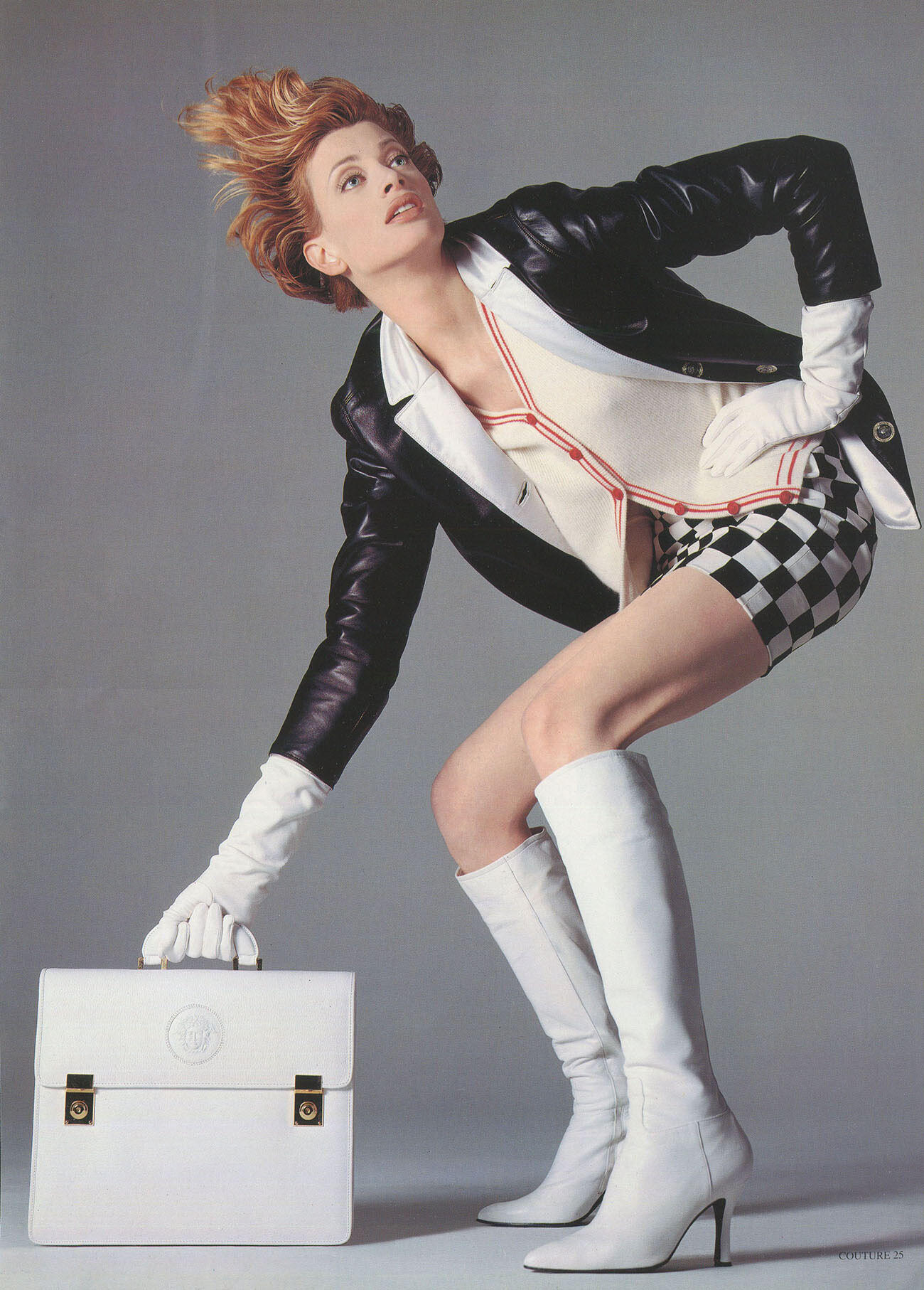
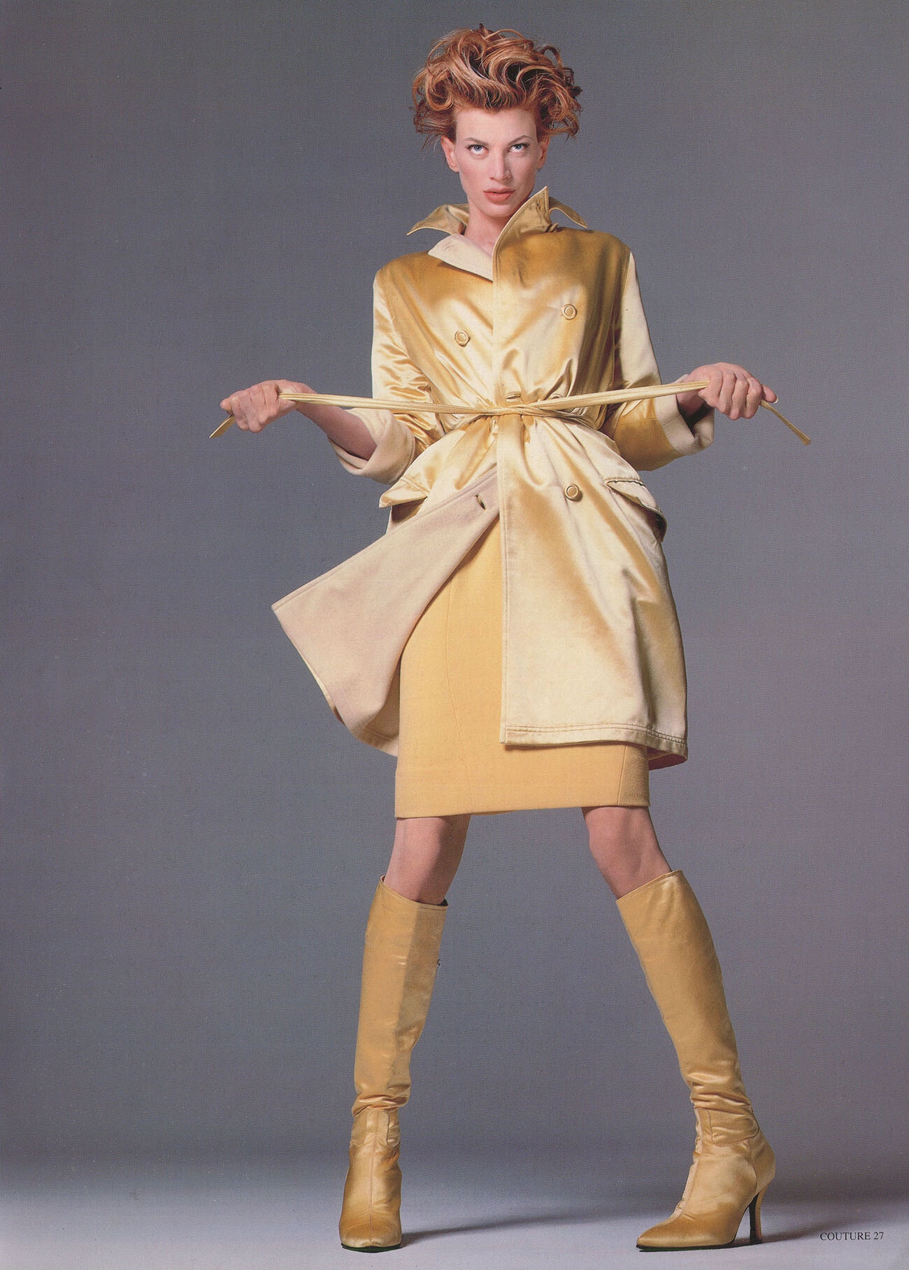
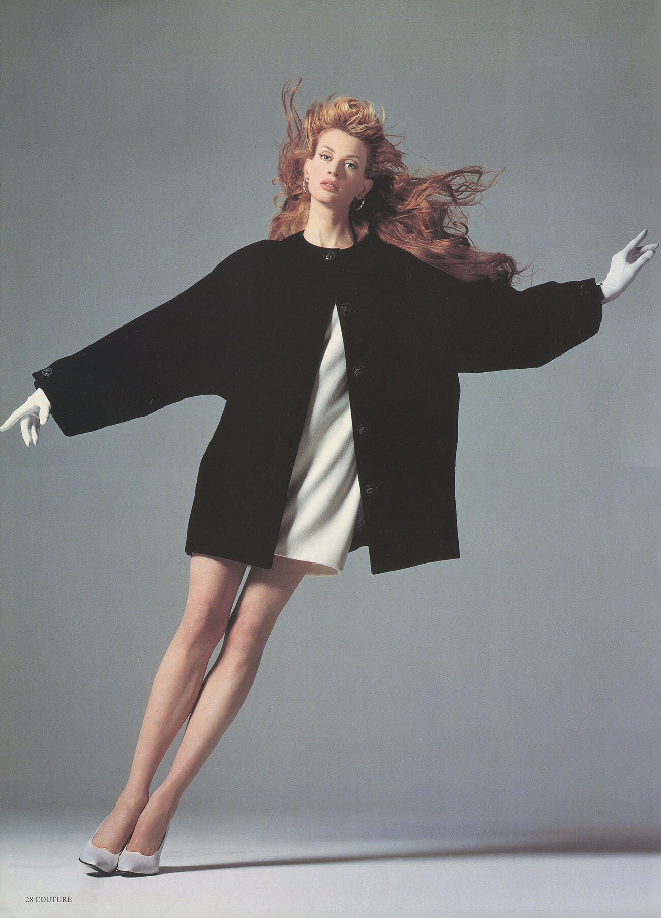
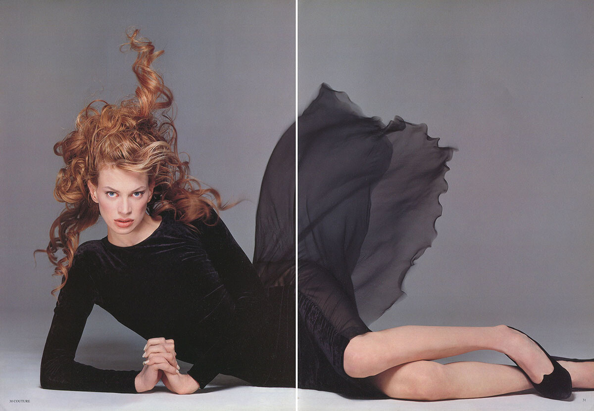
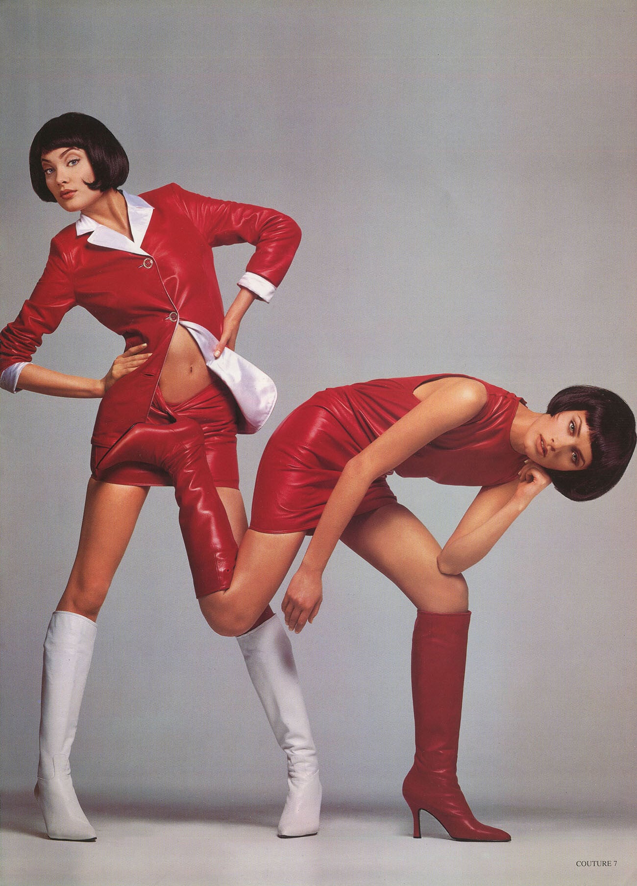
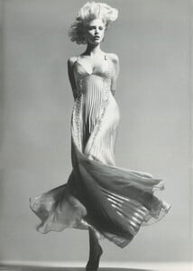
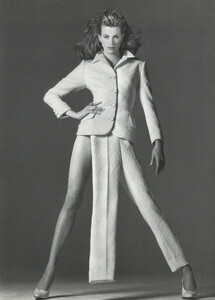
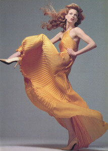
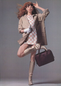
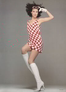
Gianni Versace catalog, Donna Autumn Winter 1995/1996, my scans:
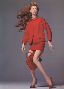

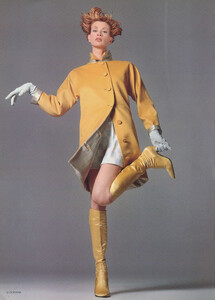


-
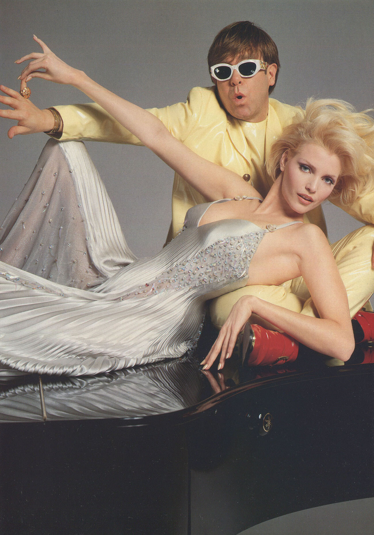
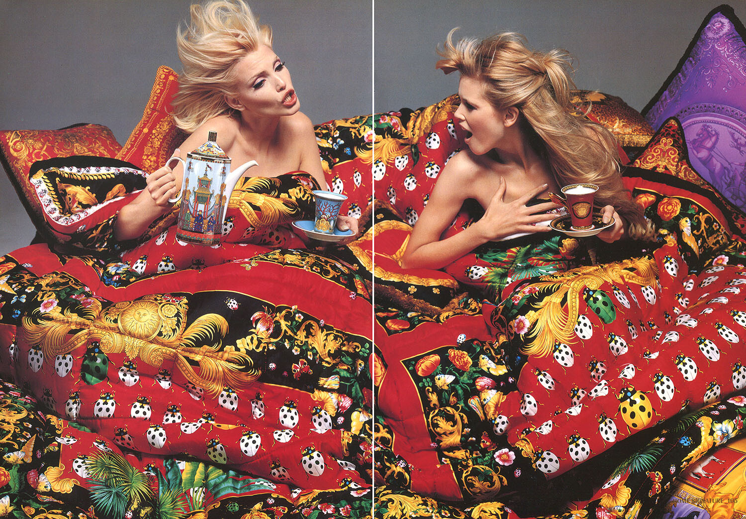
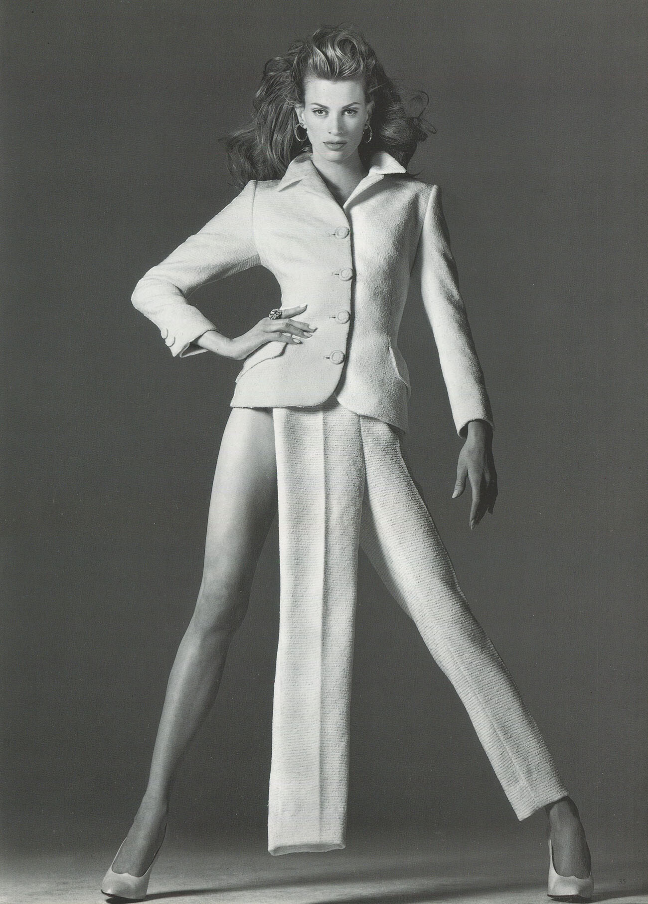
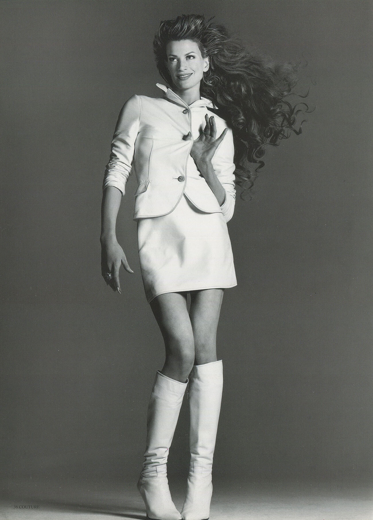
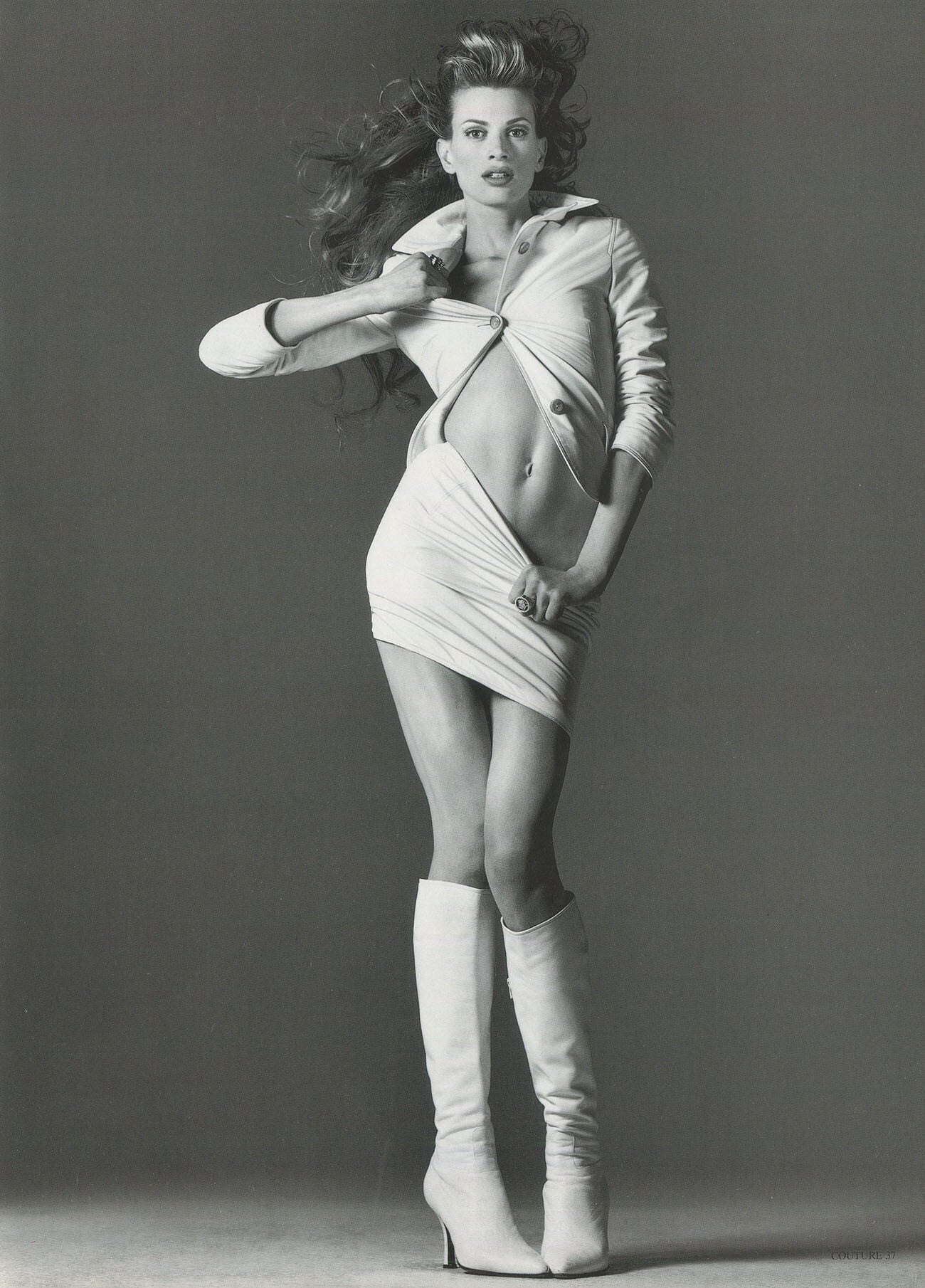
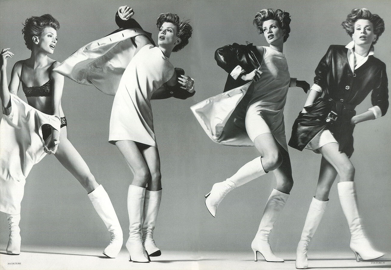
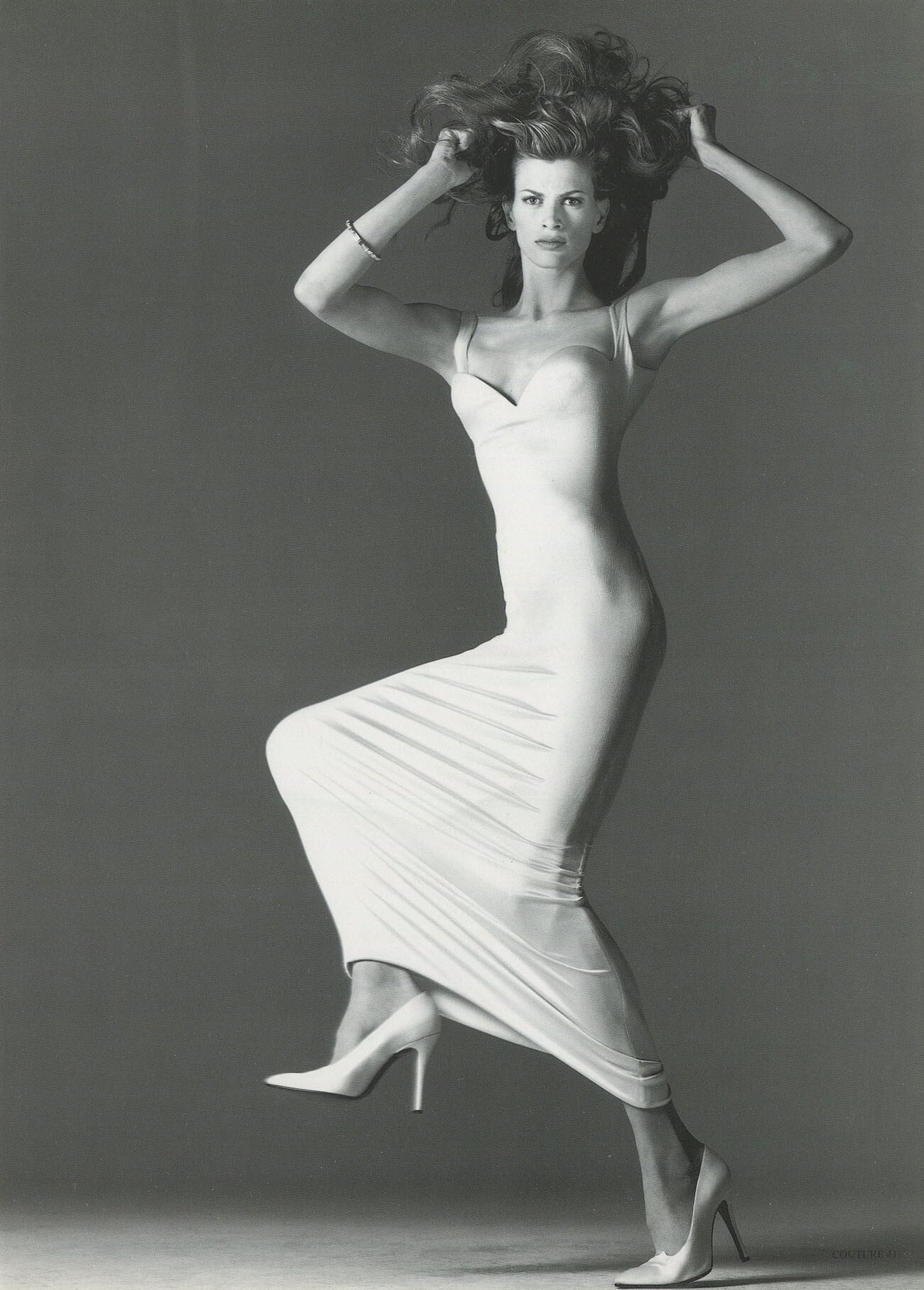
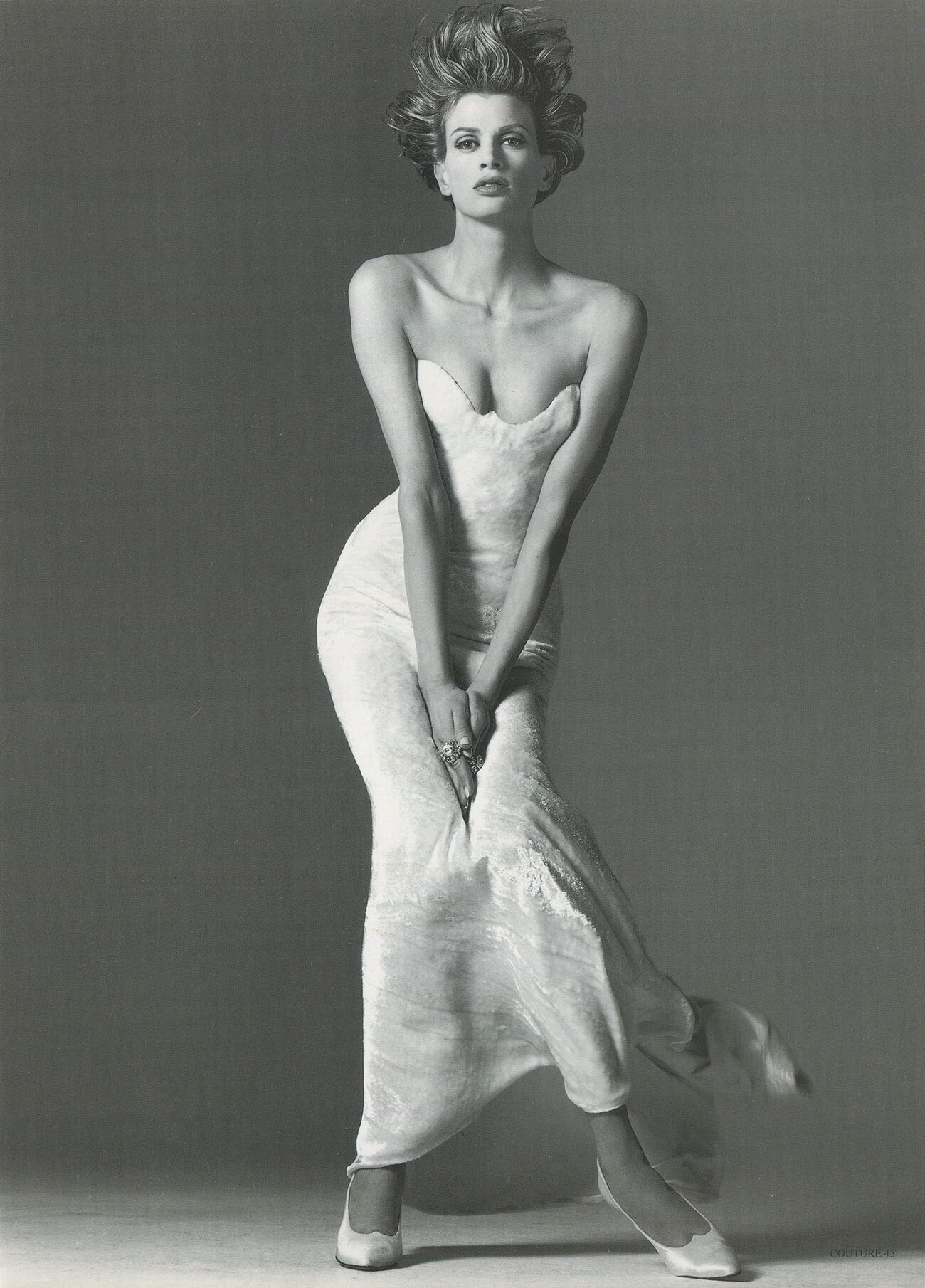
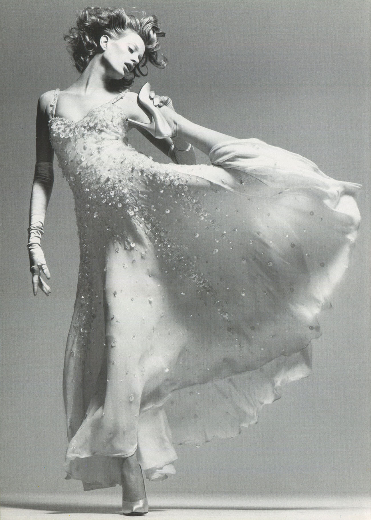
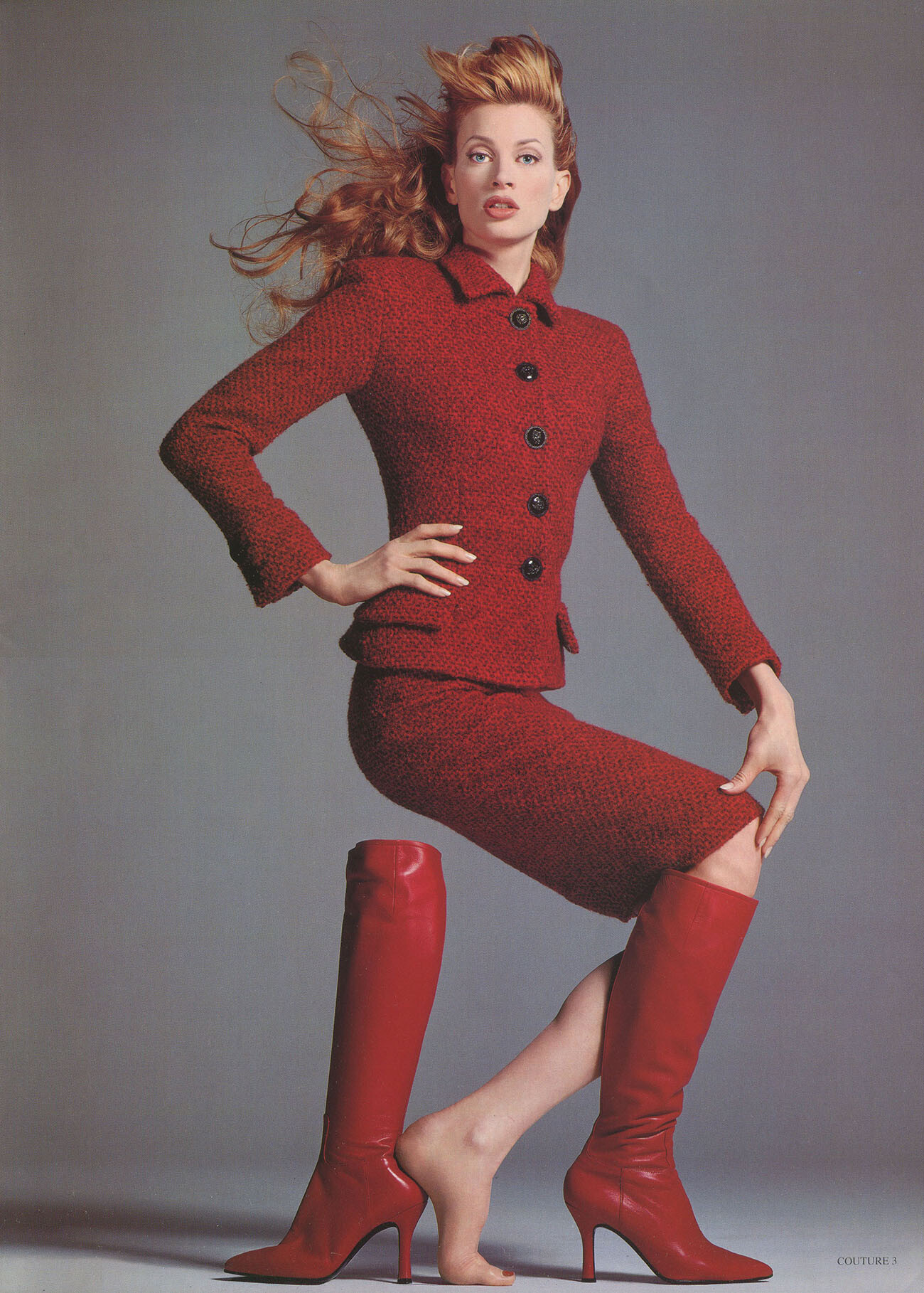
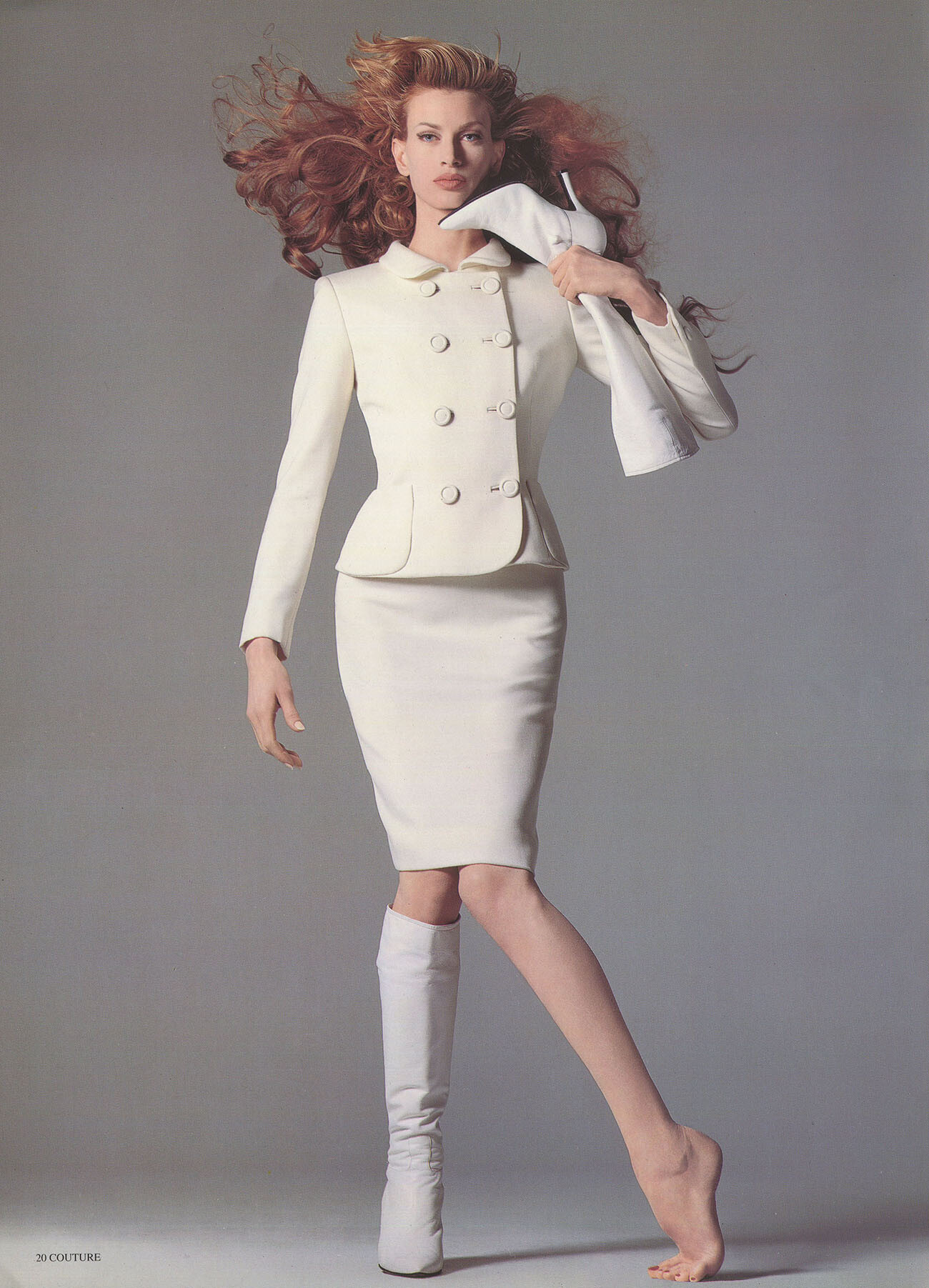
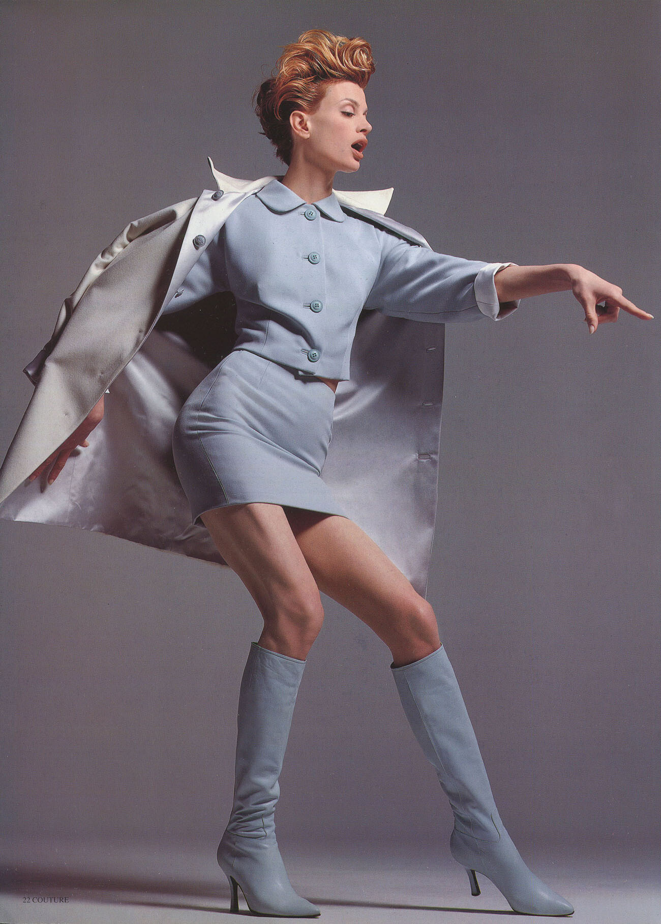
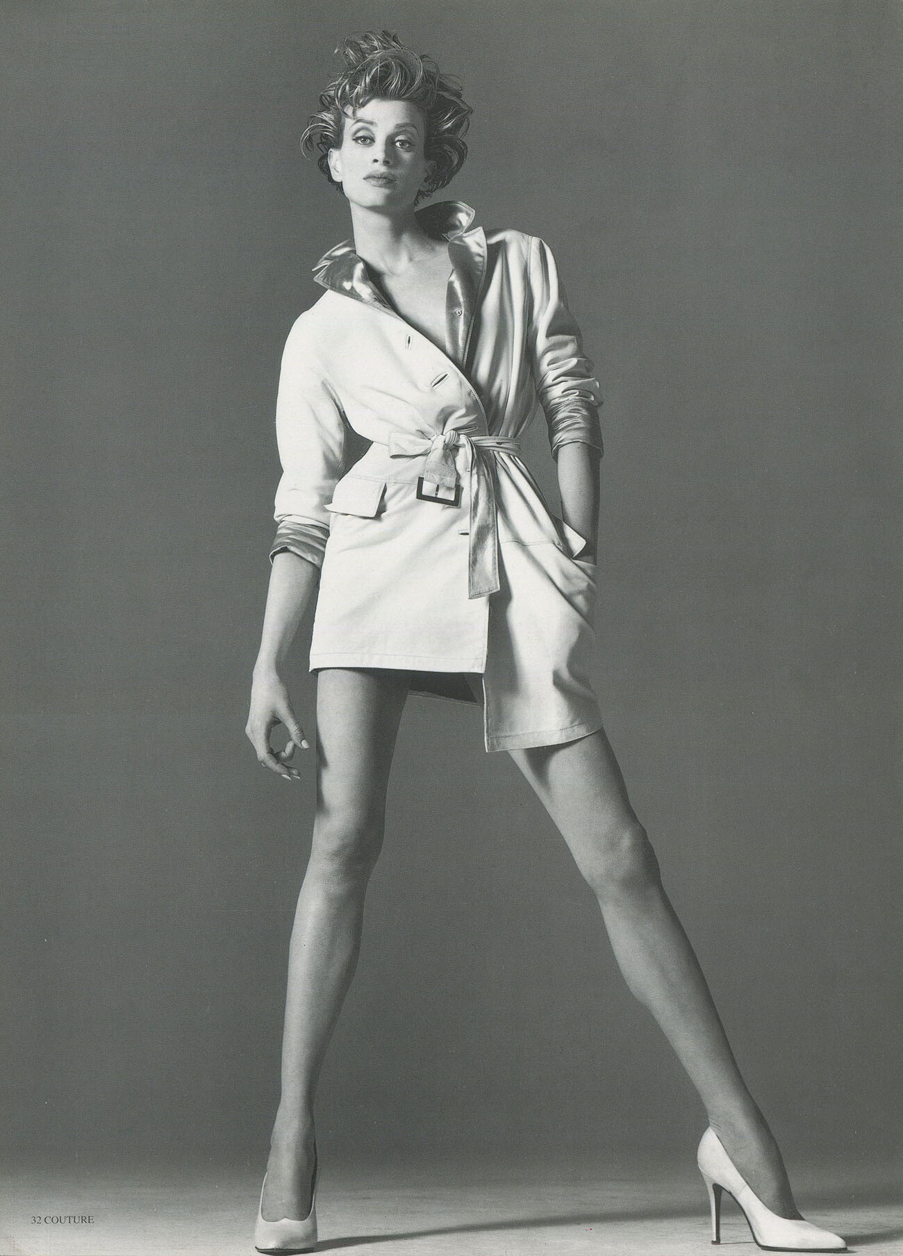
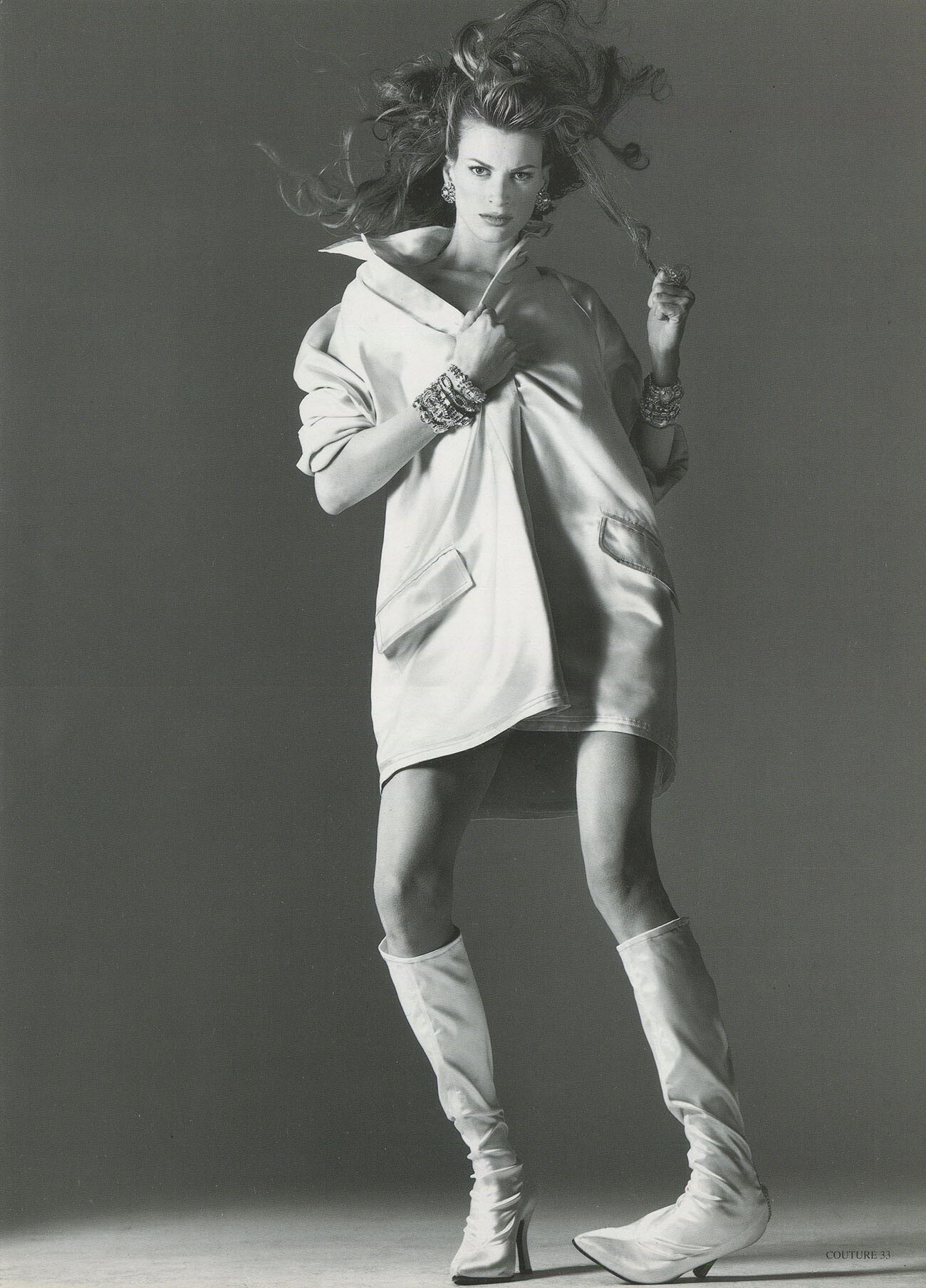
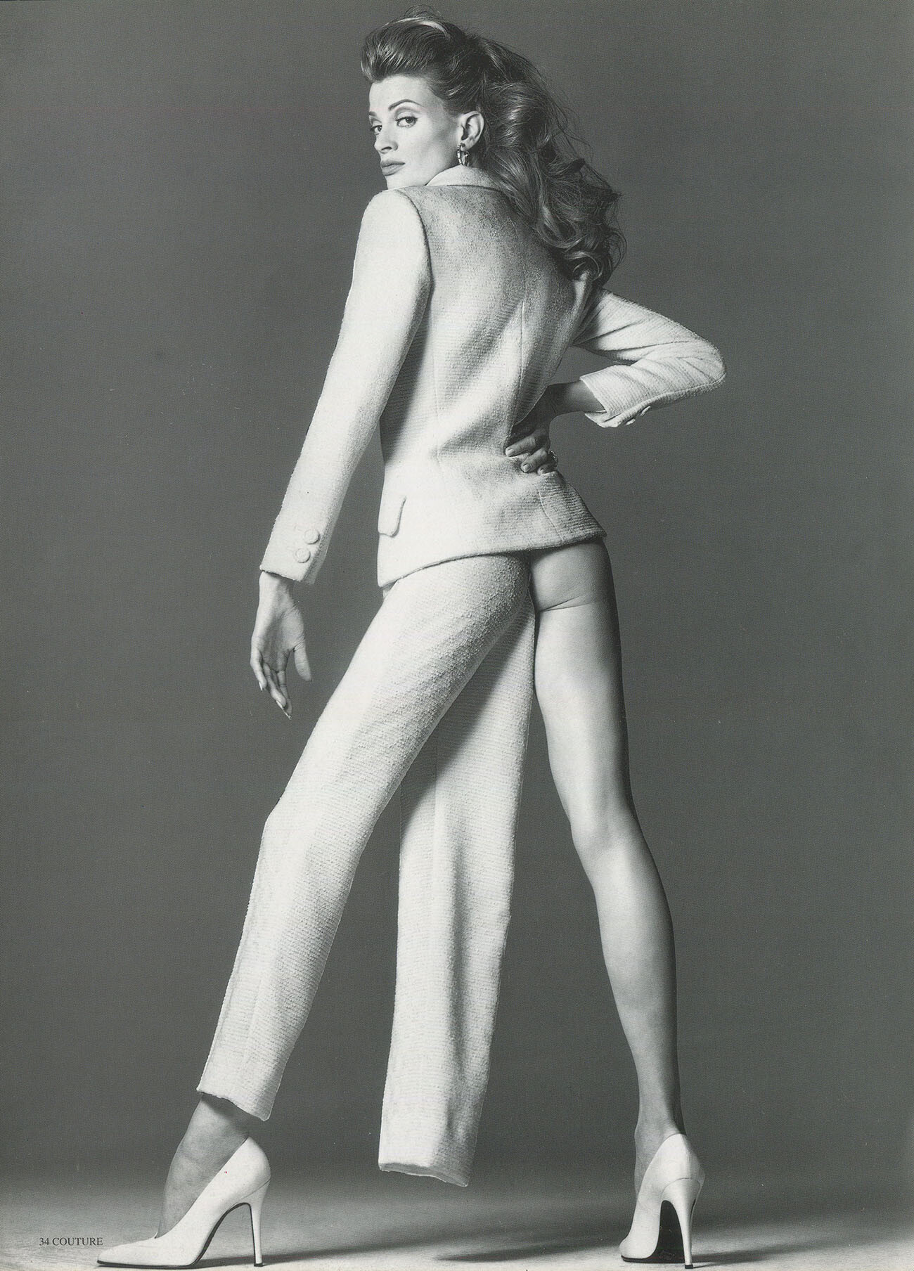
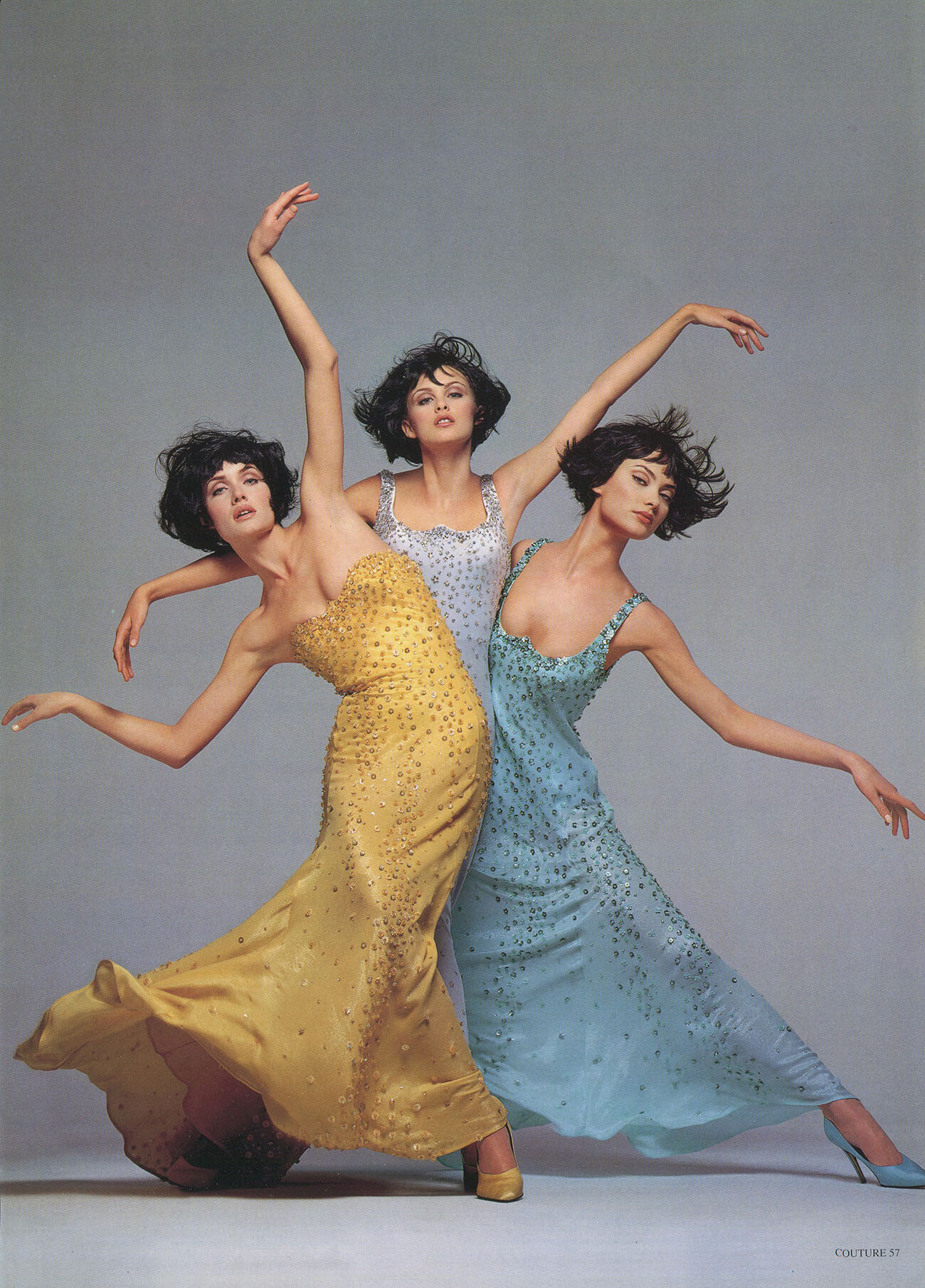
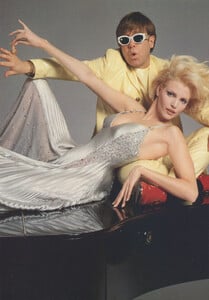
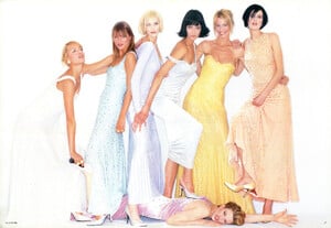
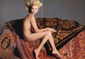
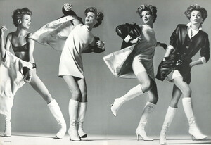
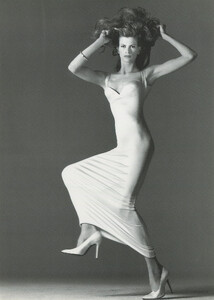
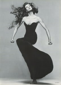
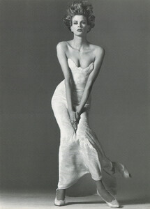
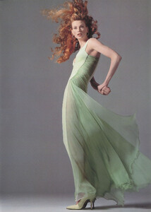
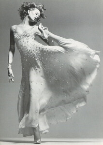
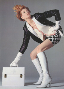
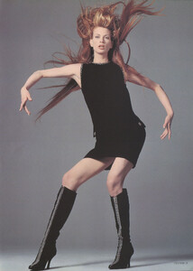
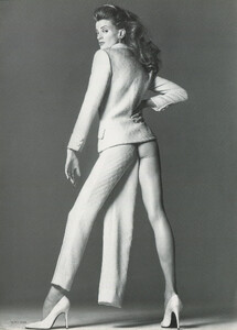
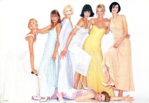
Gianni Versace catalog, Donna Autumn/Winter 1995-1996, ph. Richard Avedon, my scans:


-
The model on the right is not Beri Smither, it is Sarah O'Hare
-
It is really strange sometimes to see such cheap looking bad photos with supermodels and taken by a good photographer....
-
We all follow her on Instagram
-
It looks very much like her. Could be her, but we should ask her to confirm.
-
The photo is published in a book, i just bought it in Germany a few days ago, you can easily find it in a big book store. I can show you the look of the cover, there is a black female model wearing glasses. I think it was even on a discount.
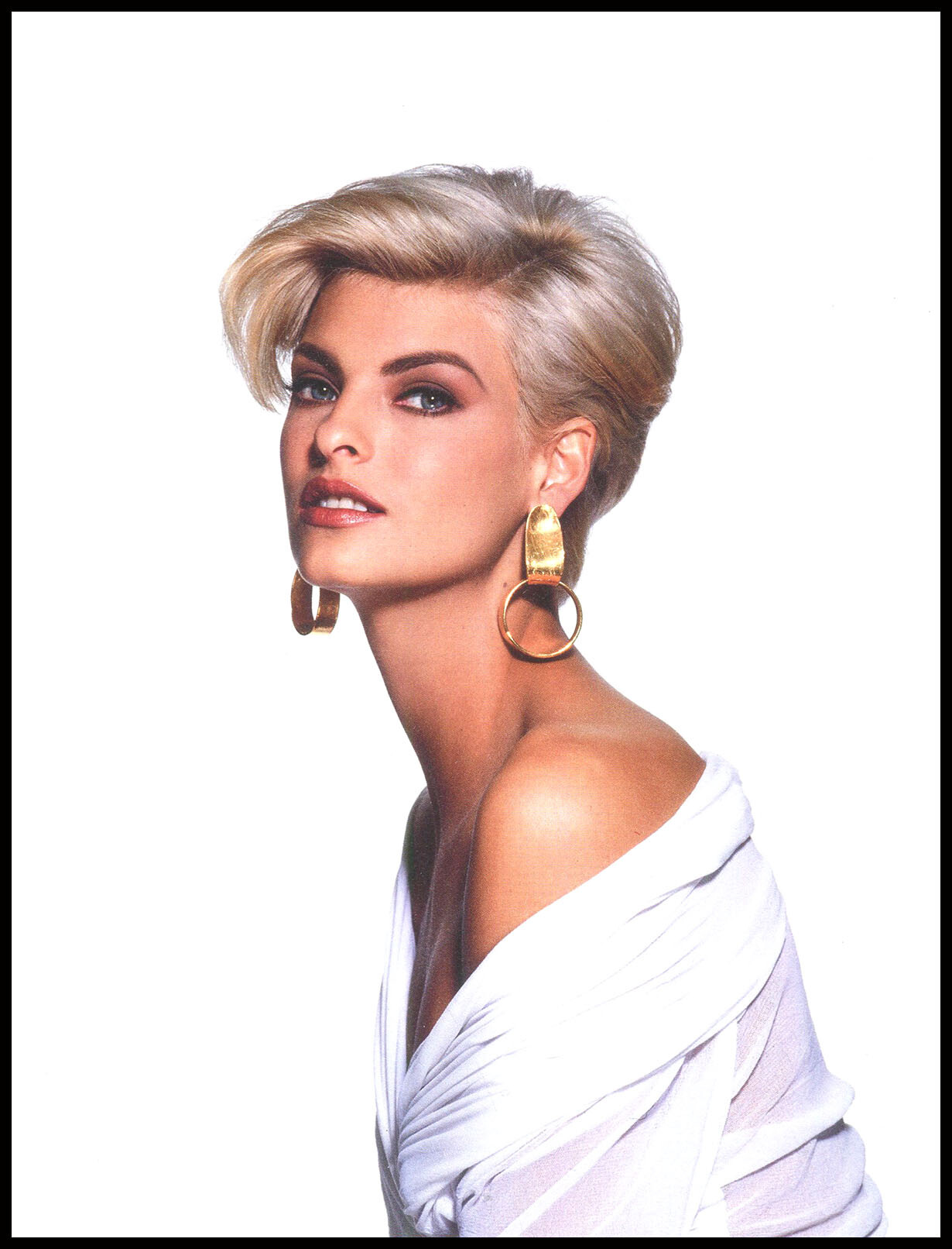
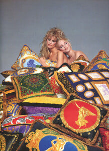
Linda for Revlon, 1991, photographed by Rico Puhlmann, scanned by me:
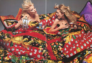
 Linda for Escada Fall/Winter 1993/1994 photographed by Herb Ritts, scanned by me:
 Christy from the Rico Puhlmann book, scanned by me:
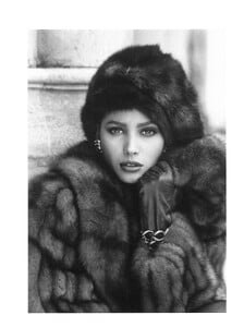 DUDE, SHAME ON YOU FOR WRITING SUCH NONSENCE. I HOPE THERE ARE MODERATORS HERE WHO CAN TAKE THE RIGHT MEASURES FOR SUCH INAPPROPRIATE, HATEFULL AND UNTRUE COMMENTS. YOU SHOULD BE BANNED FOR LIFE FROM PLACES LIKE THIS ONE!!!!!!
The third one looks like the cover of the book Models or something like that by Arthur Elgort i think...
Thank you so much for sharing these beautiful and rare images from Escada!!!
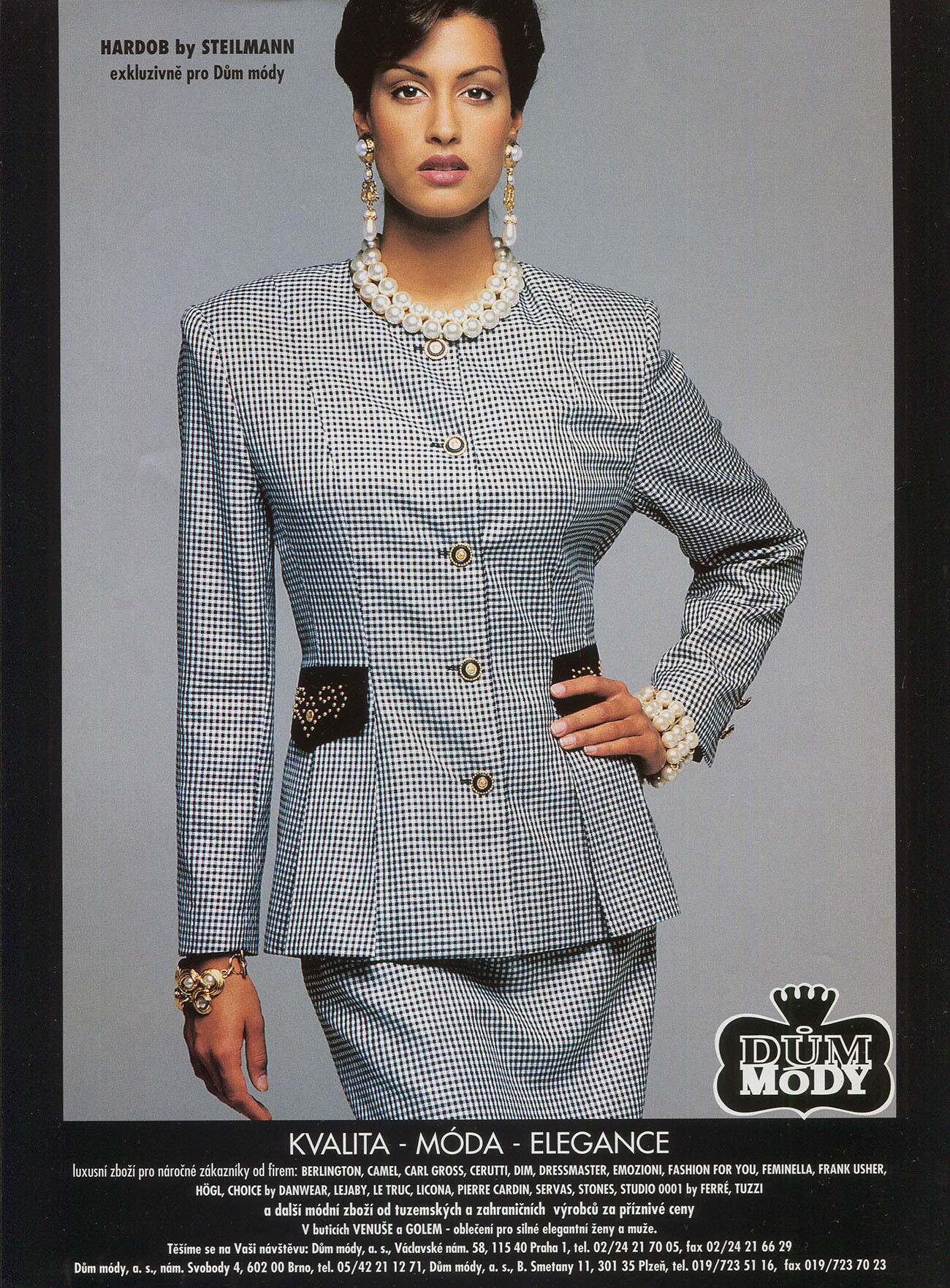
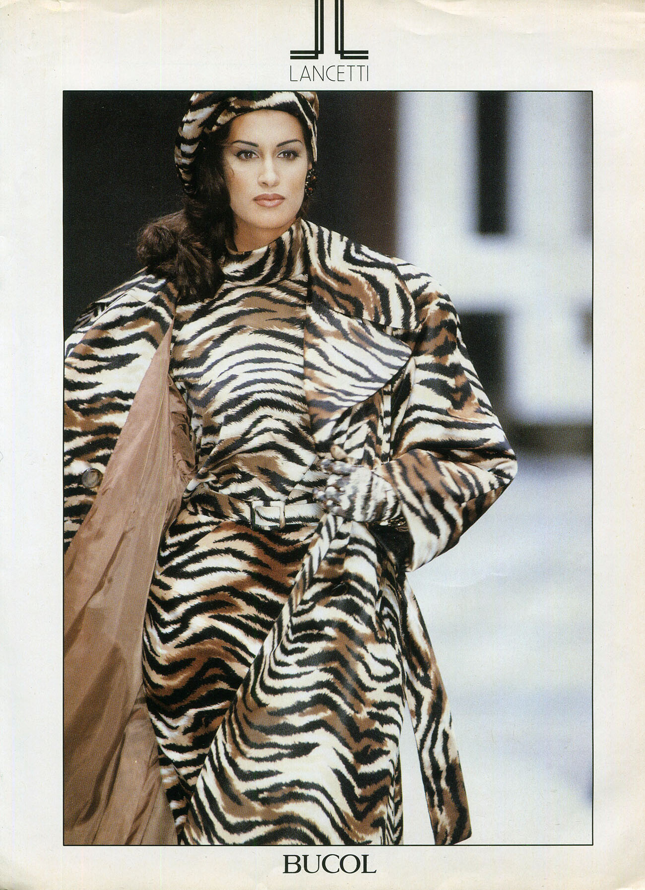
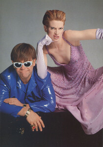
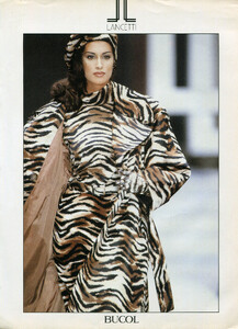
Hardob and Lancetti ads, my scans:
DUDE, SHAME ON YOU FOR WRITING SUCH NONSENCE. I HOPE THERE ARE MODERATORS HERE WHO CAN TAKE THE RIGHT MEASURES FOR SUCH INAPPROPRIATE, HATEFULL AND UNTRUE COMMENTS. YOU SHOULD BE BANNED FOR LIFE FROM PLACES LIKE THIS ONE!!!!!!
The third one looks like the cover of the book Models or something like that by Arthur Elgort i think...
Thank you so much for sharing these beautiful and rare images from Escada!!!
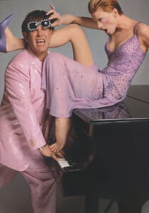
Hardob and Lancetti ads, my scans: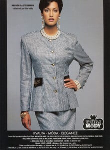
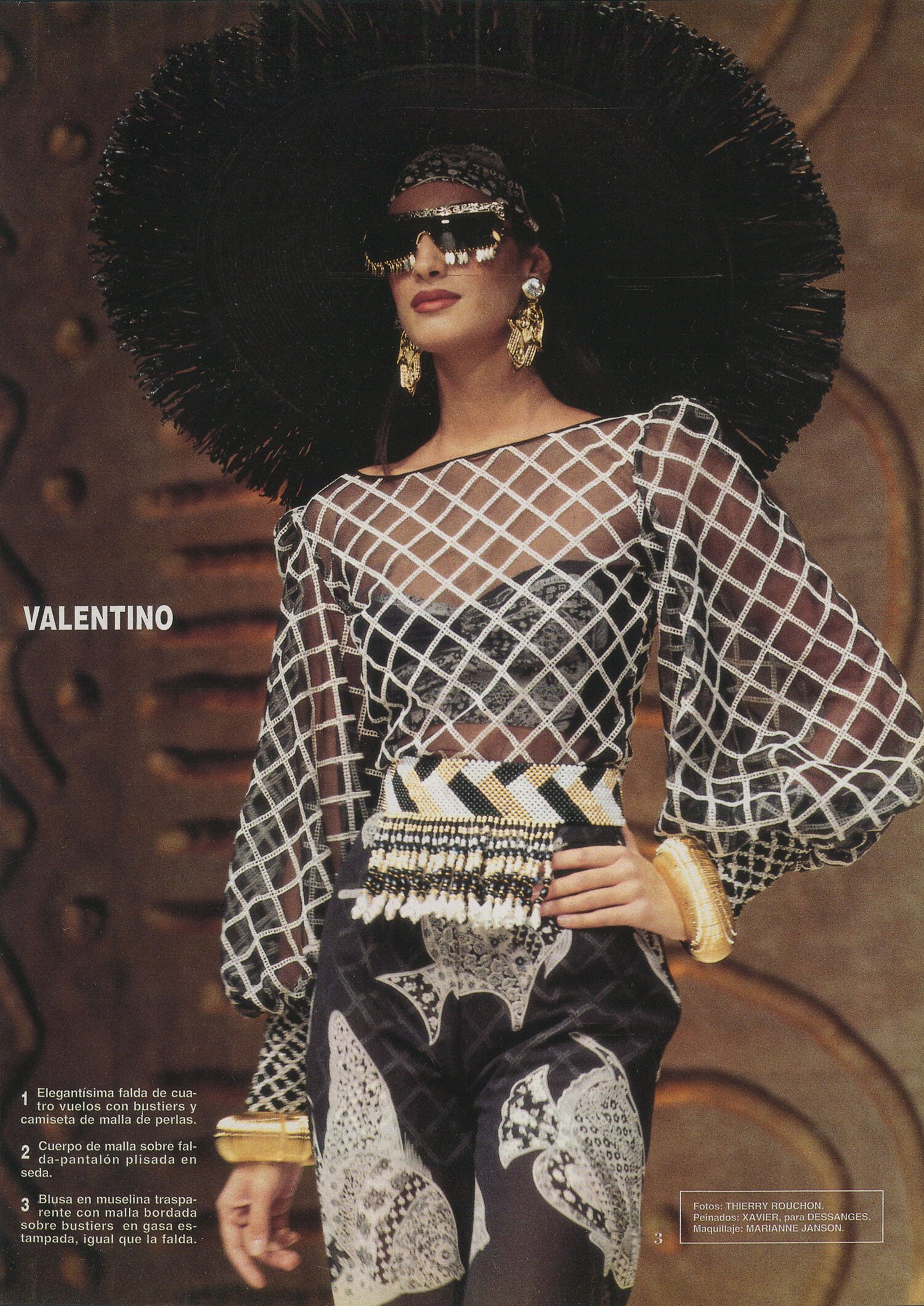
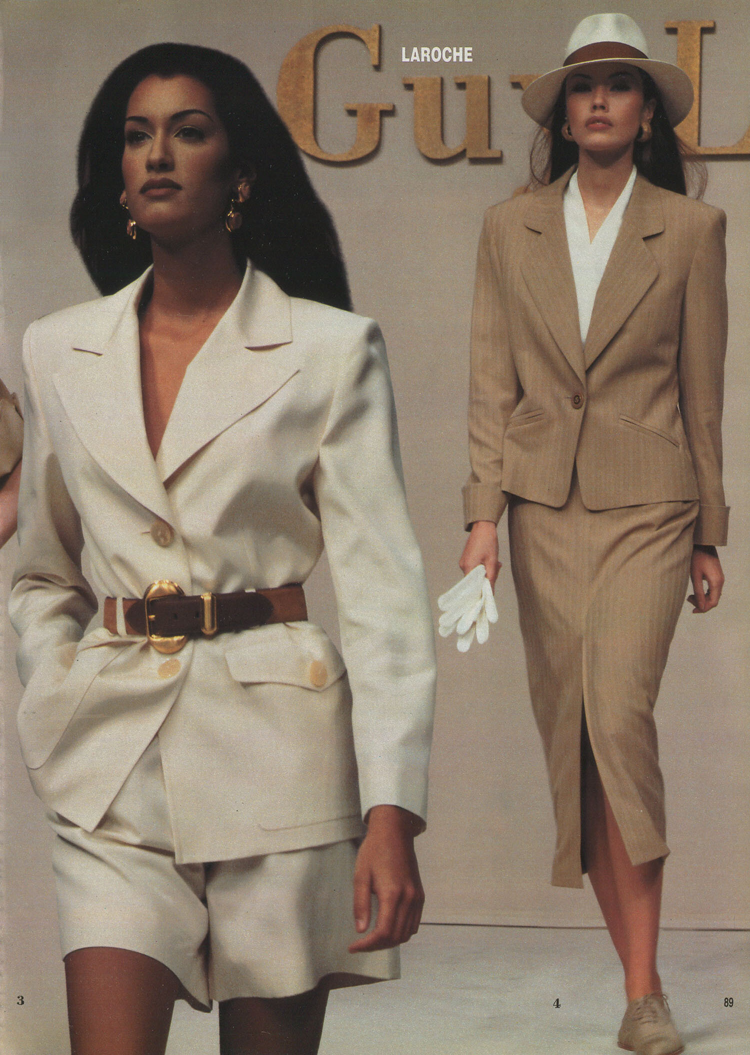
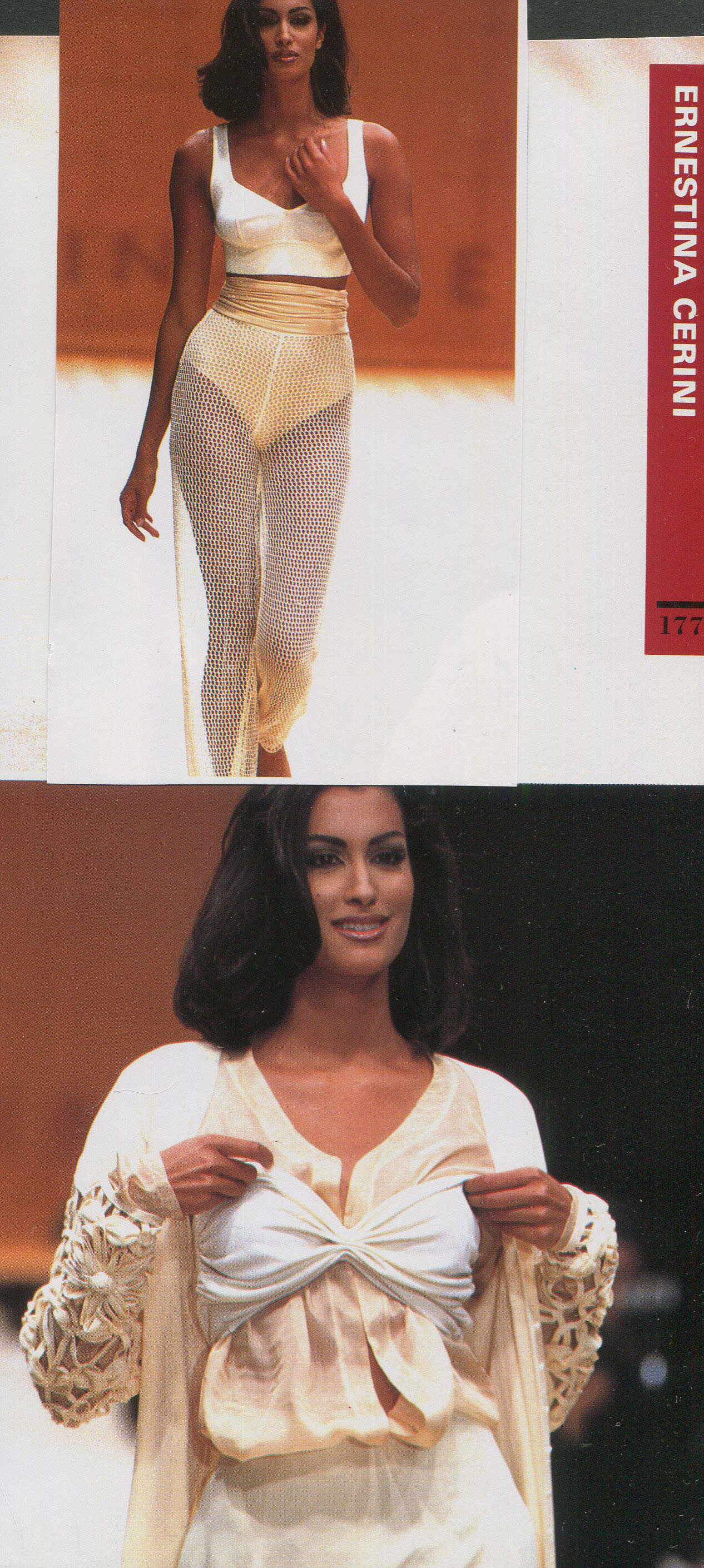
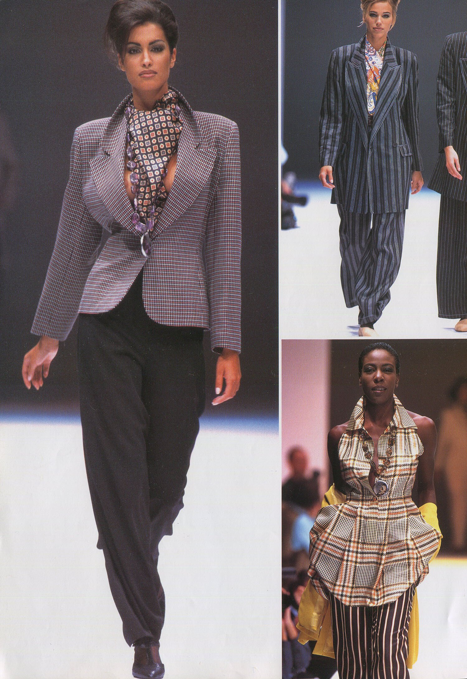
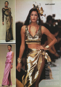
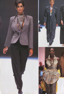
 spring/summer 1993 shows, my scans:
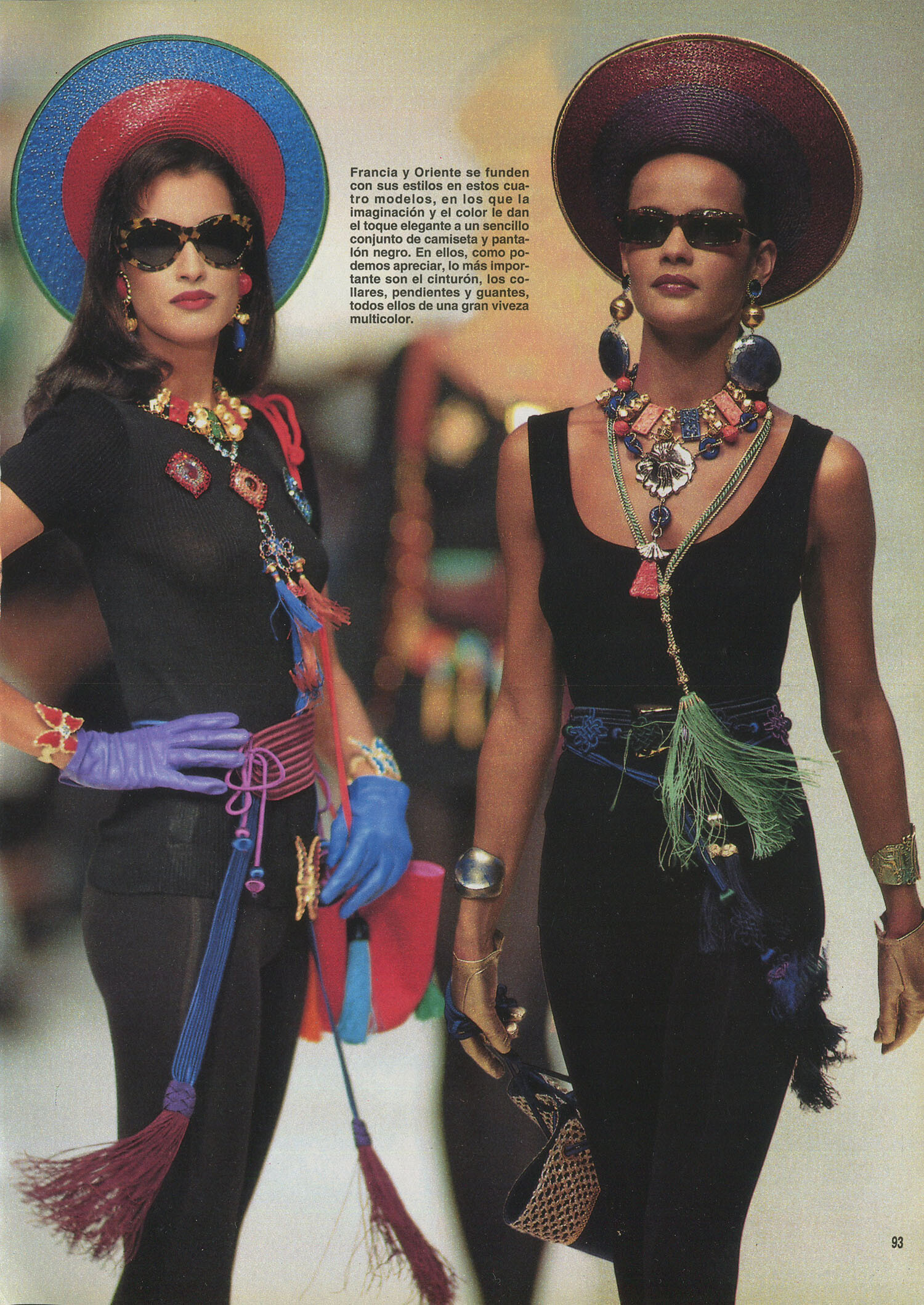
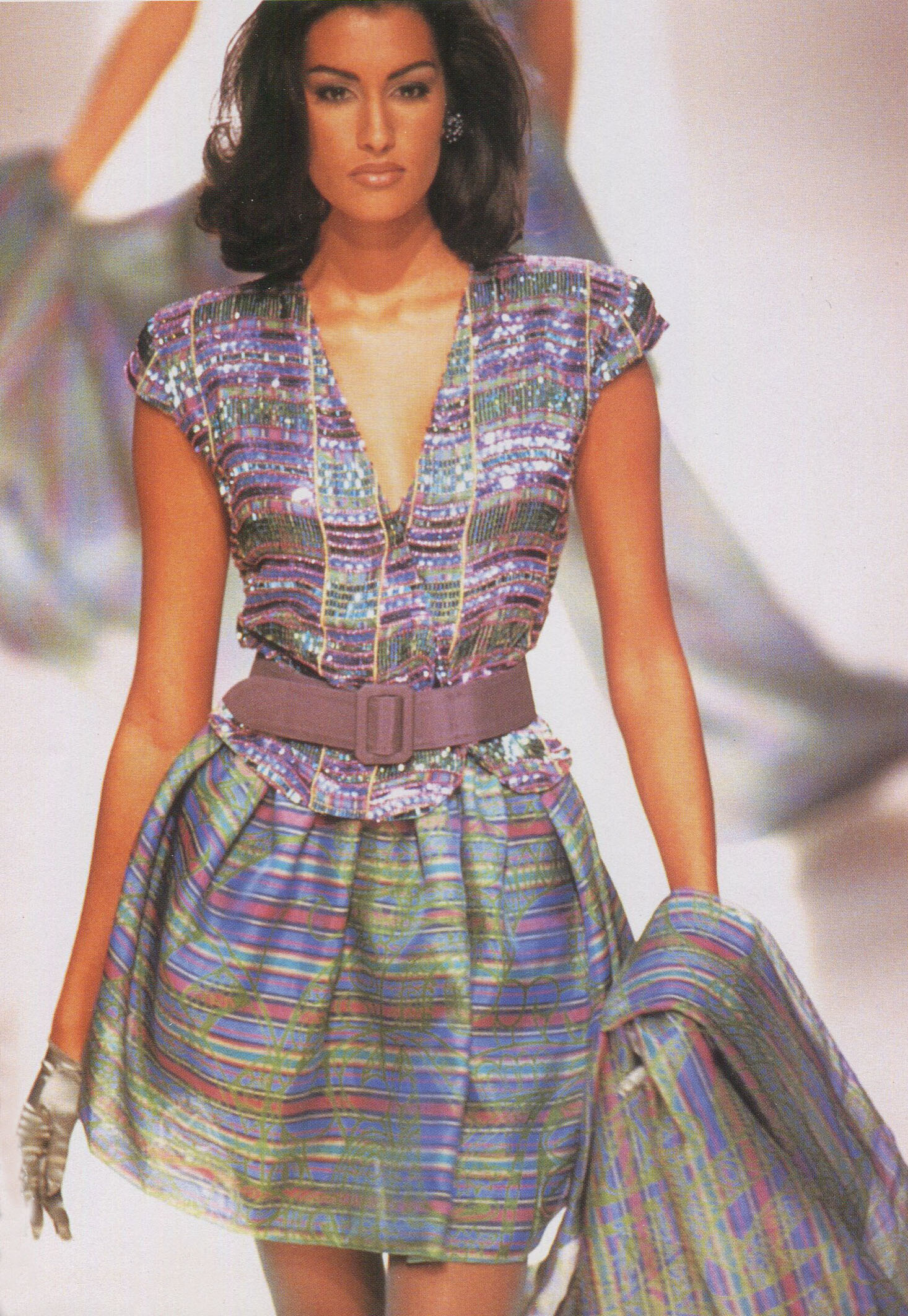
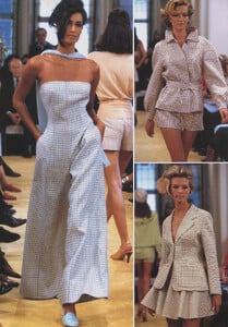
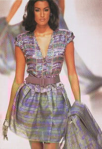
 spring/summer 1993, my scans:
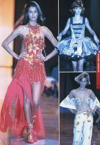
 spring/summer 1993 shows, my scans:

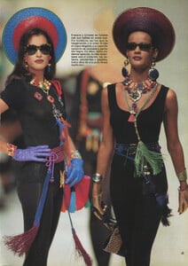
 spring/summer 1992, my scans:
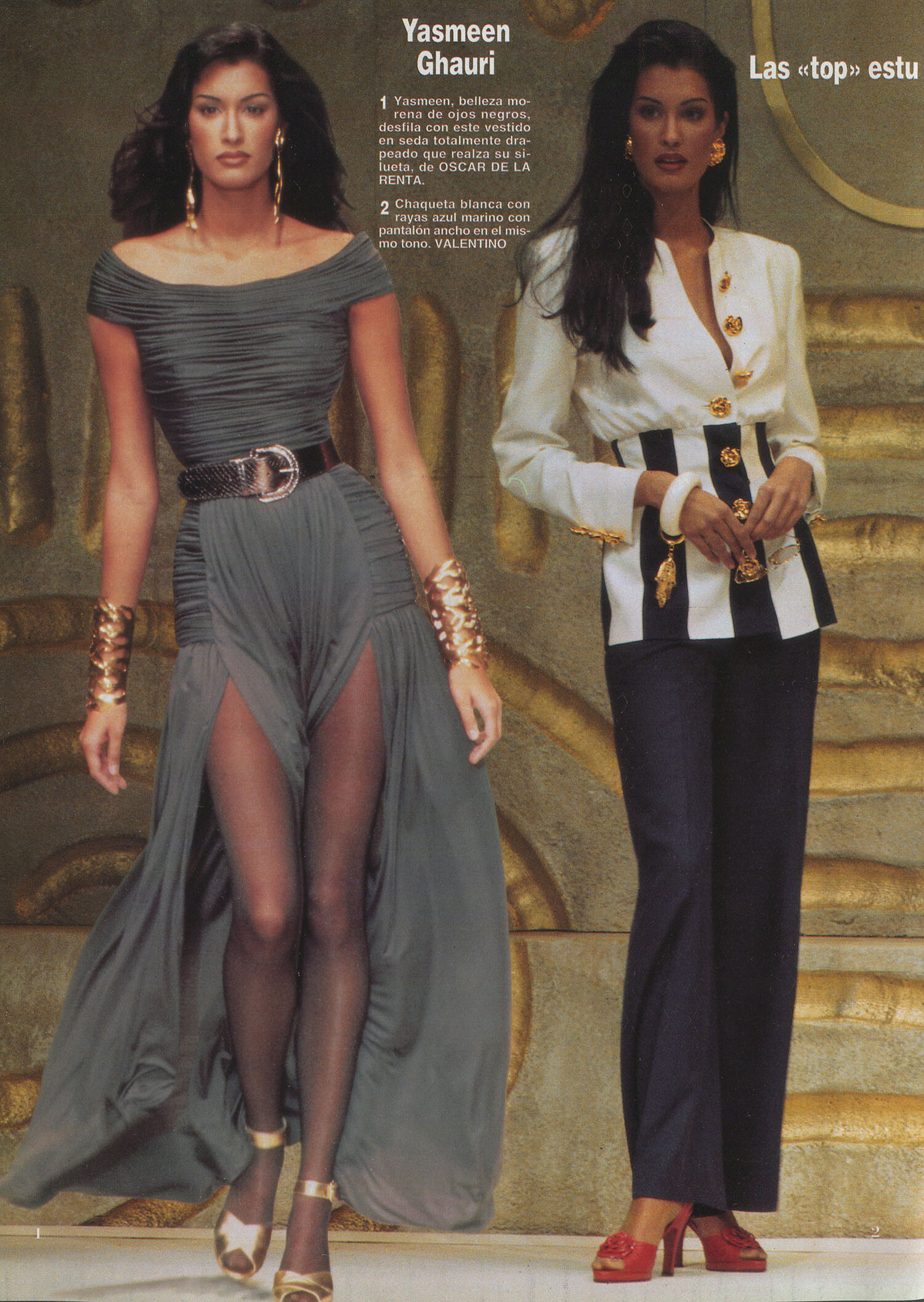
 Yasmeen for Giorgio Armani, spring/summer 1992, my scans:
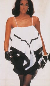
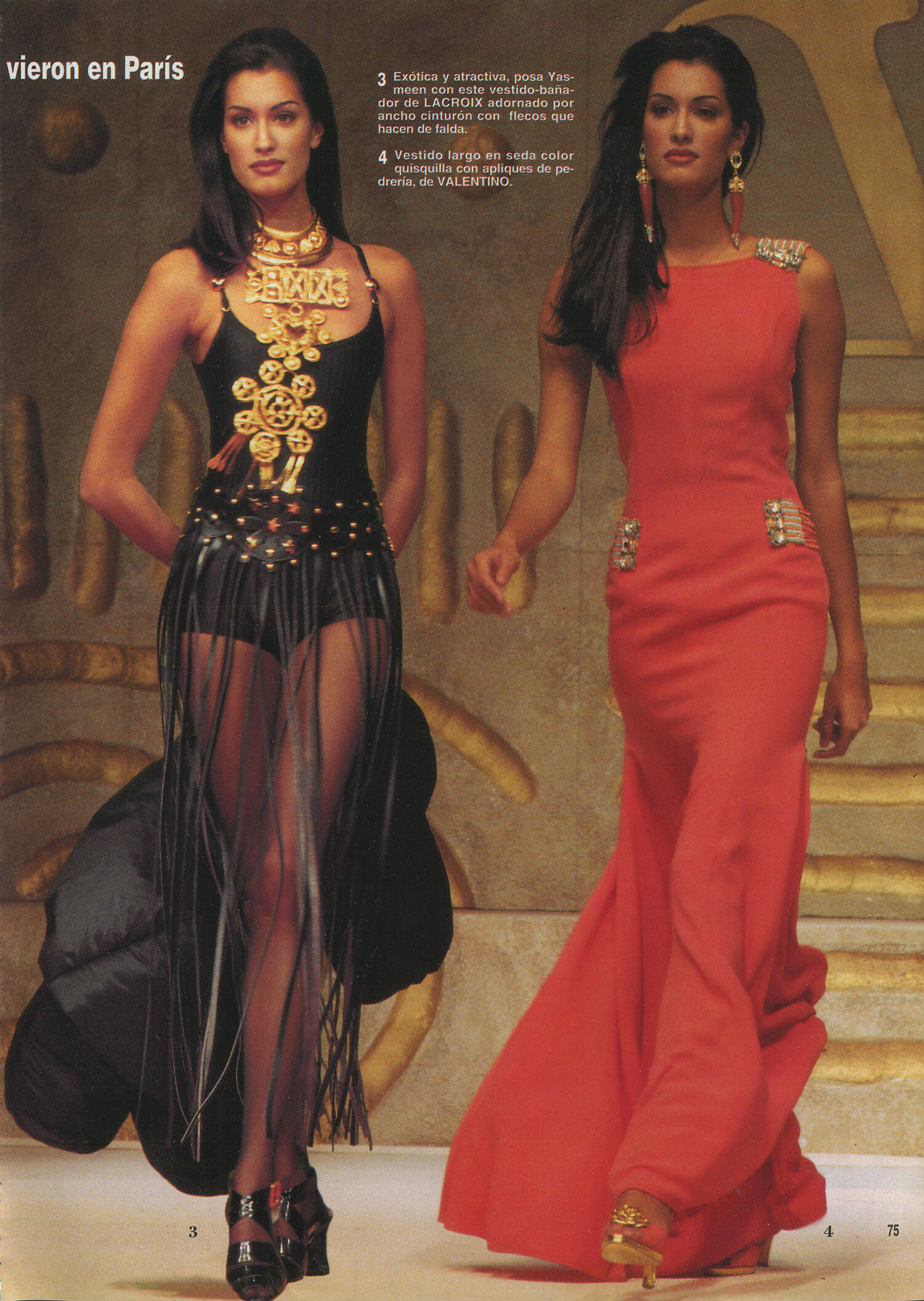
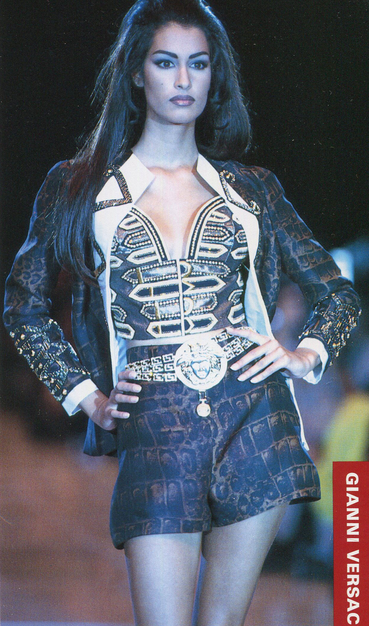
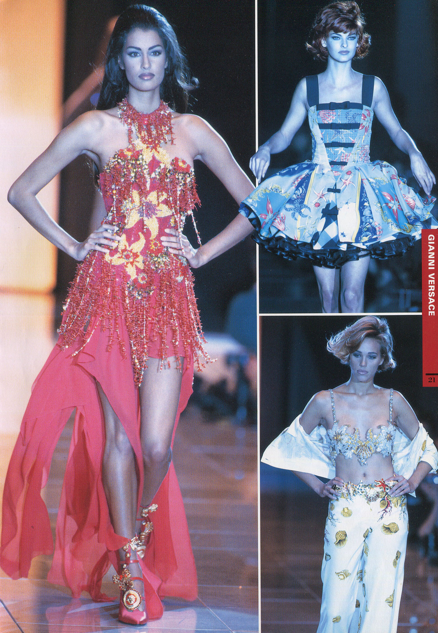
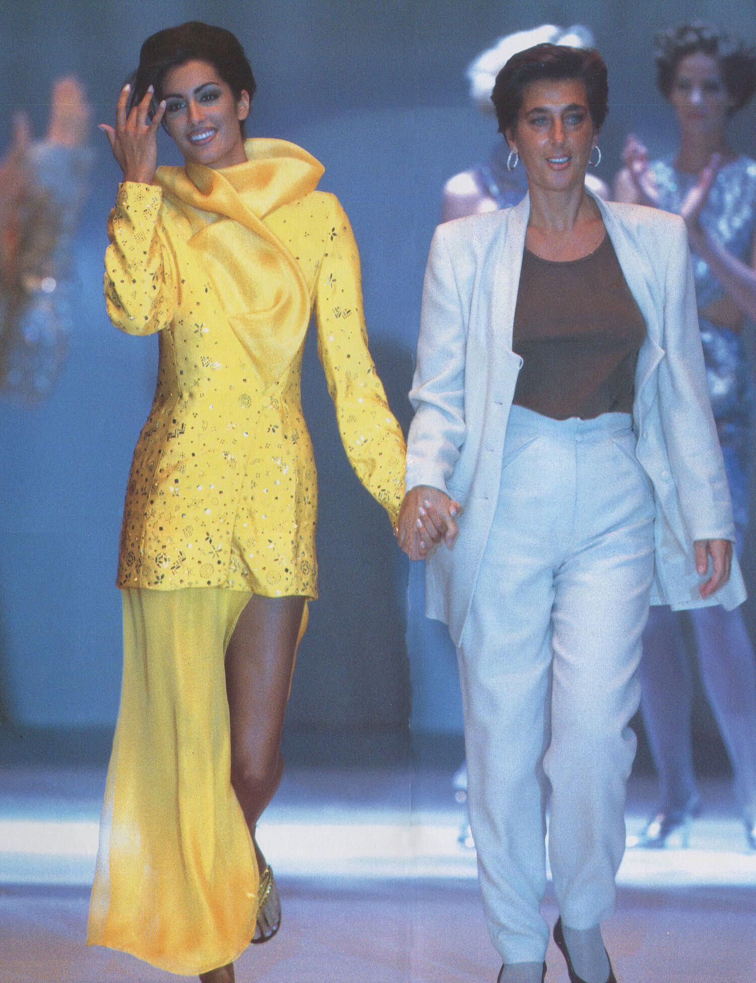
 Yasmeen for Gianni Versace, spring/summer 1992, my scans:
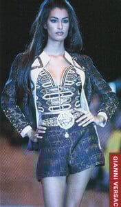
 for Erreuno spring/summer 1992, my scans:
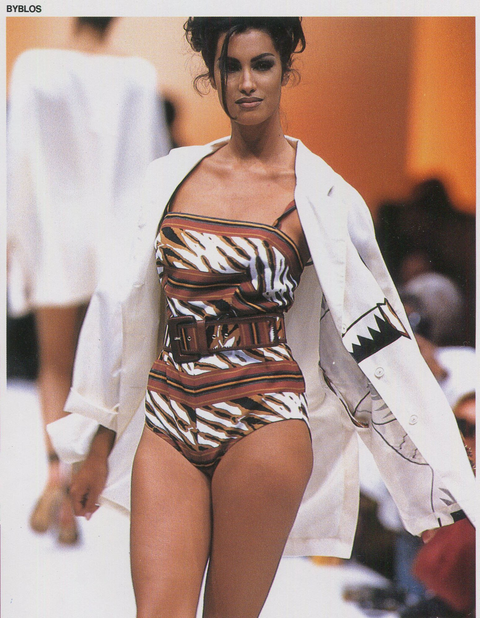
 Yasmeen for Byblos, spring/summer 1992, my scan: