Hyperion
Members
-
Joined
-
Last visited
Everything posted by Hyperion
-
^ I wouldn't doubt it. The two months that I tallied votes, nina didn't vote and Jeisa missed the cut by a small margin.
-
Hayden & Stephen. I have no idea who Stephen Colletti is but anyone who spells Stephen with a "ph" instead of a "v" is good in my book
-
Sorry I went AWOL. Everyone just nominate two models which is easy enough. We'll see how things go from here as it might take a month or two to iron the kinks out in the process. But everyone nominate 2 models apiece. Once there have been enough nominations, voting will begin. That could be in a week or so, it depends how long it takes to get enough nominations. The more competition, the better. Oh and I nominate Heidi Klum and Gisele Bundchen. So that means that right now the ballot has Heidi, Gisele, Ana and Cintia on it.
-
1. Heather Marks (1) 3. Julia Stegner (1) 6. Bianca Balti (1) 9. Mona Johannesson (1)
-
i want to steal the gifs but it wont let me <_< thanks cyrielle You just need to know the right way to steal those gifs. I guess I'm a few months late on this, but here are all the background animations. After a conversion from swf to avi to gif...


-
^You're welcome -- nice to see life back in this forum. Some great Neo scans too.
-
1. Heather Marks (7) 3. Julia Stegner (7) 4. Laetitia Casta (6) 6. Bianca Balti (10) 7. Jennifer Lopez (4) 8. Brittany Murphy (7) 9. Mona Johannesson (9)
-
Always nice to hear from you Heather Altough I'm kinda scared, I gotta say... What can I do? Can I upload the video somewhere else? Well Ana seems to get a lot of first place votes, so I'm not surprised, but I am looking forward to that vid. If youtube doesn't work out, you can always try http://www.metacafe.com/
-
Yes I do. Hard for it to live up to that first season. Have you ever been in an ambulance?
-
Nah, I need my teeth to stay healthy. Have you ever had to change a flat tire?
-
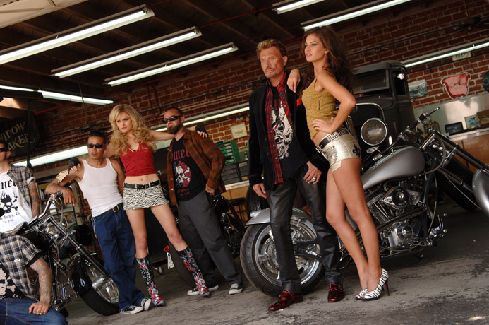
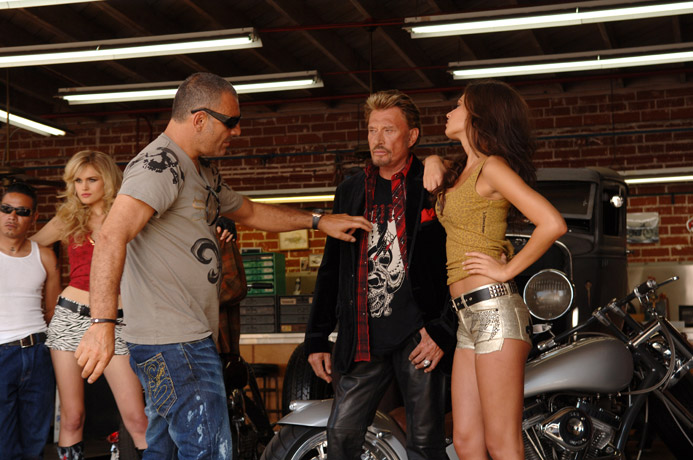
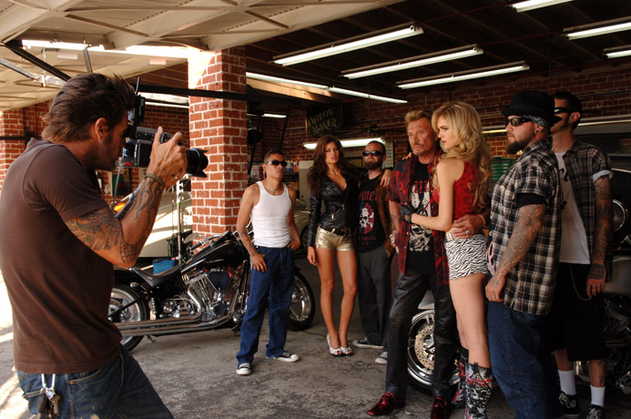
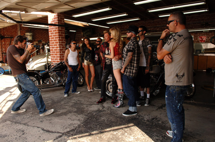
Also from smetshop.com


-
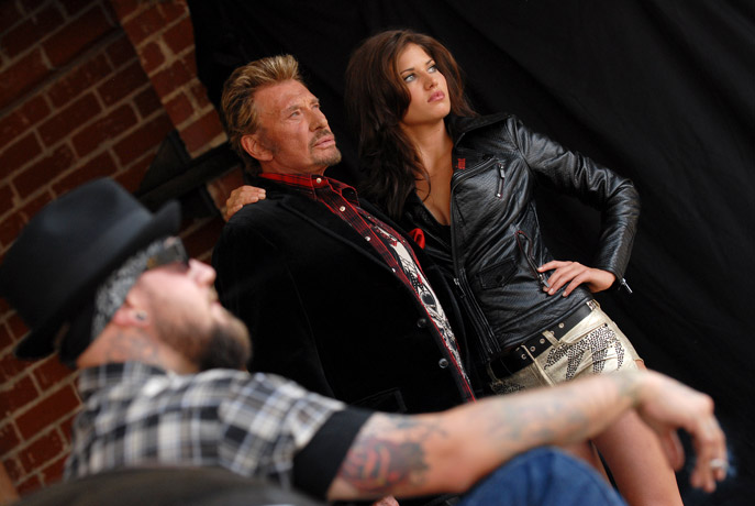
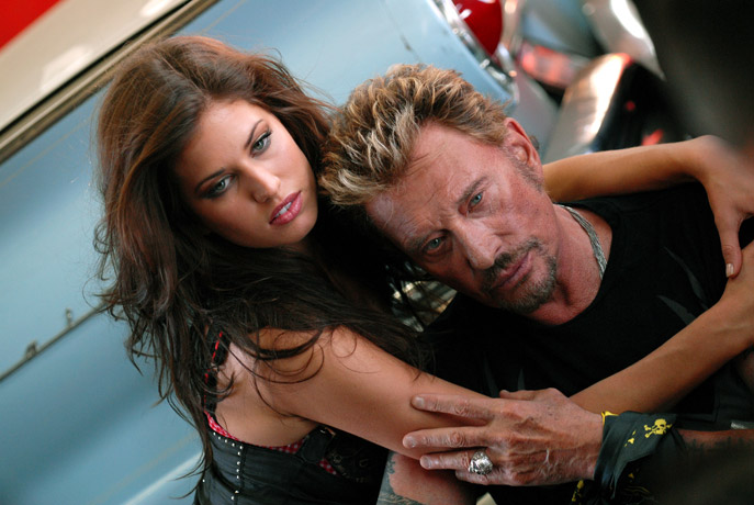
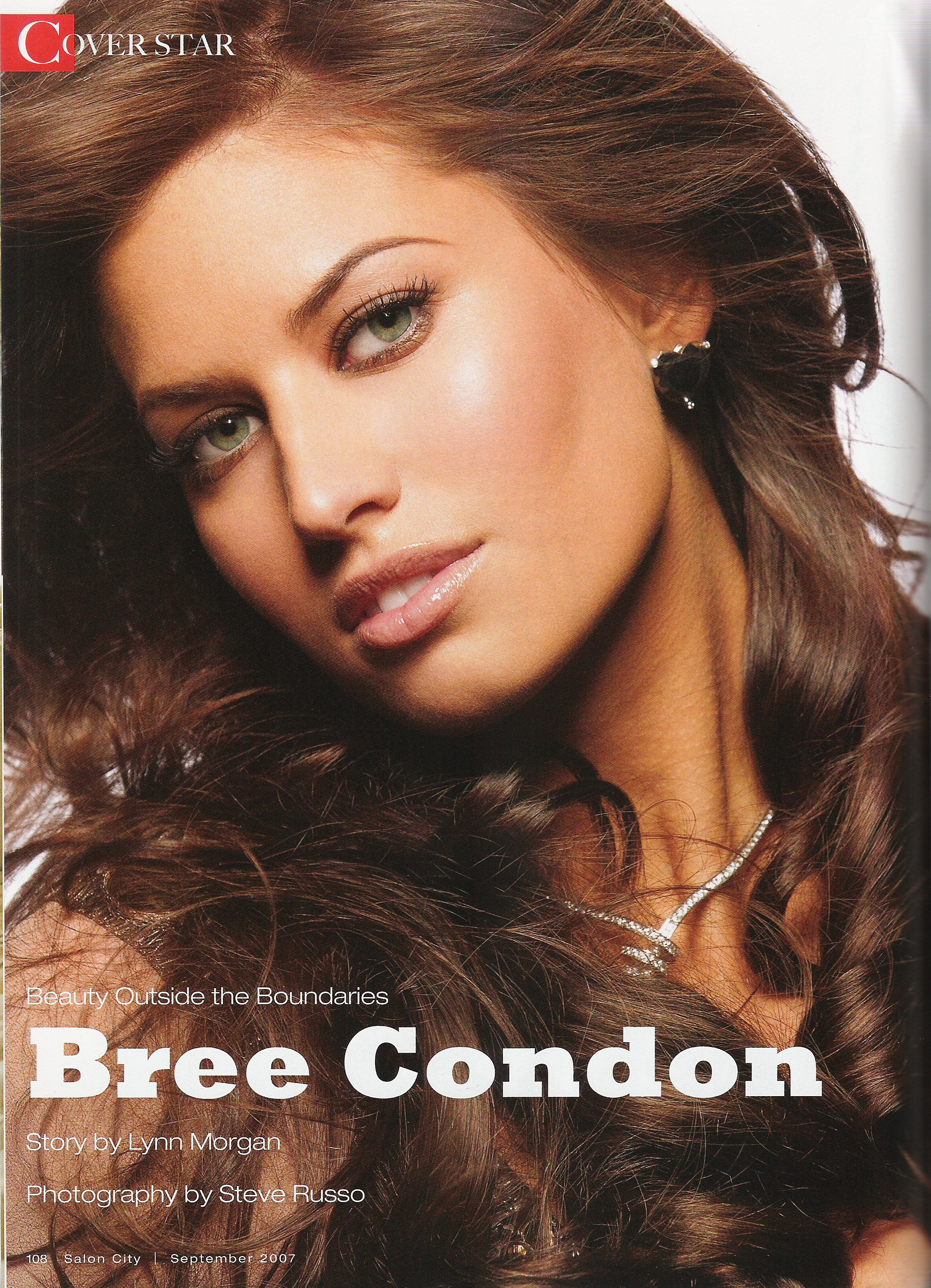
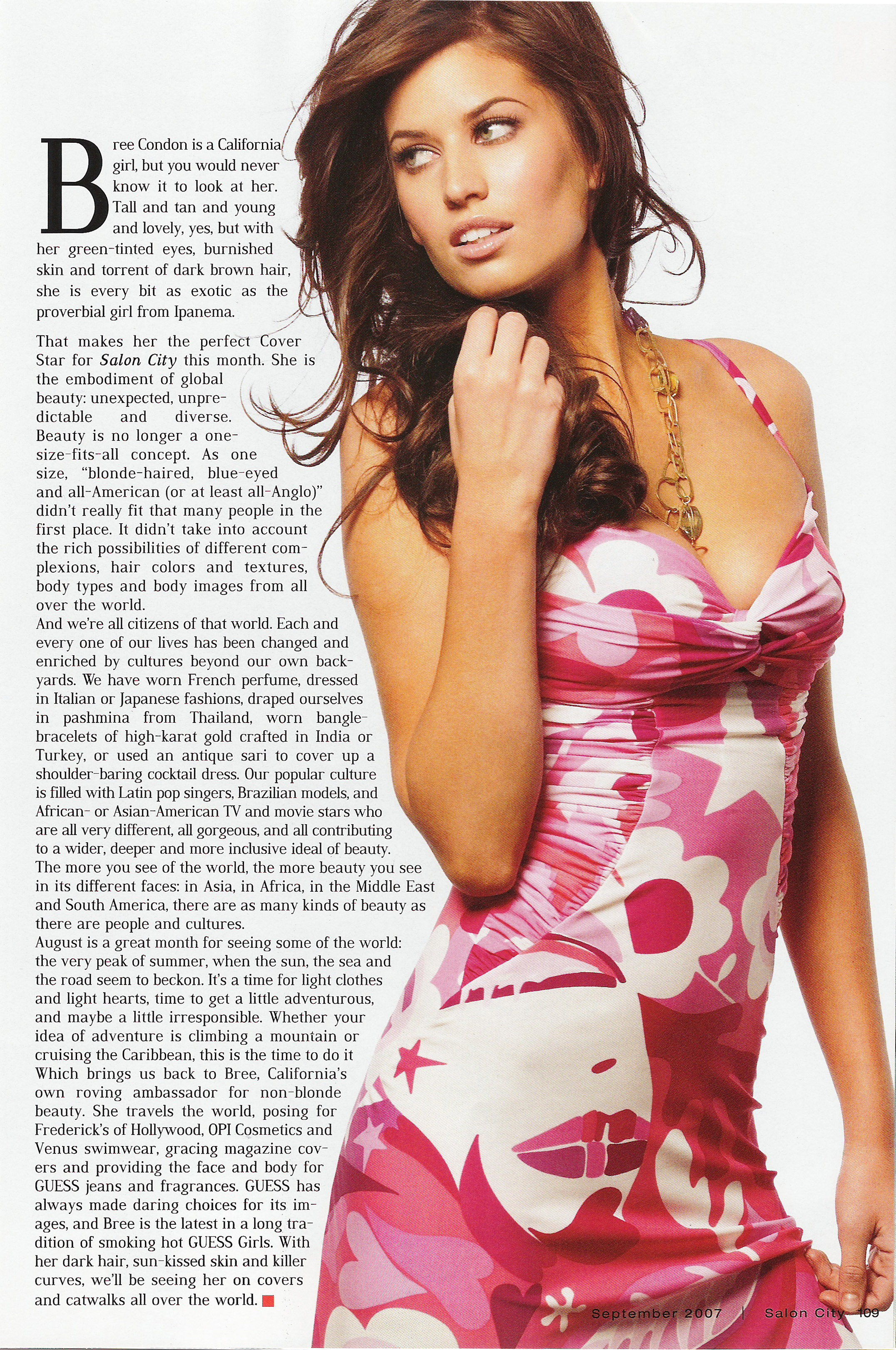
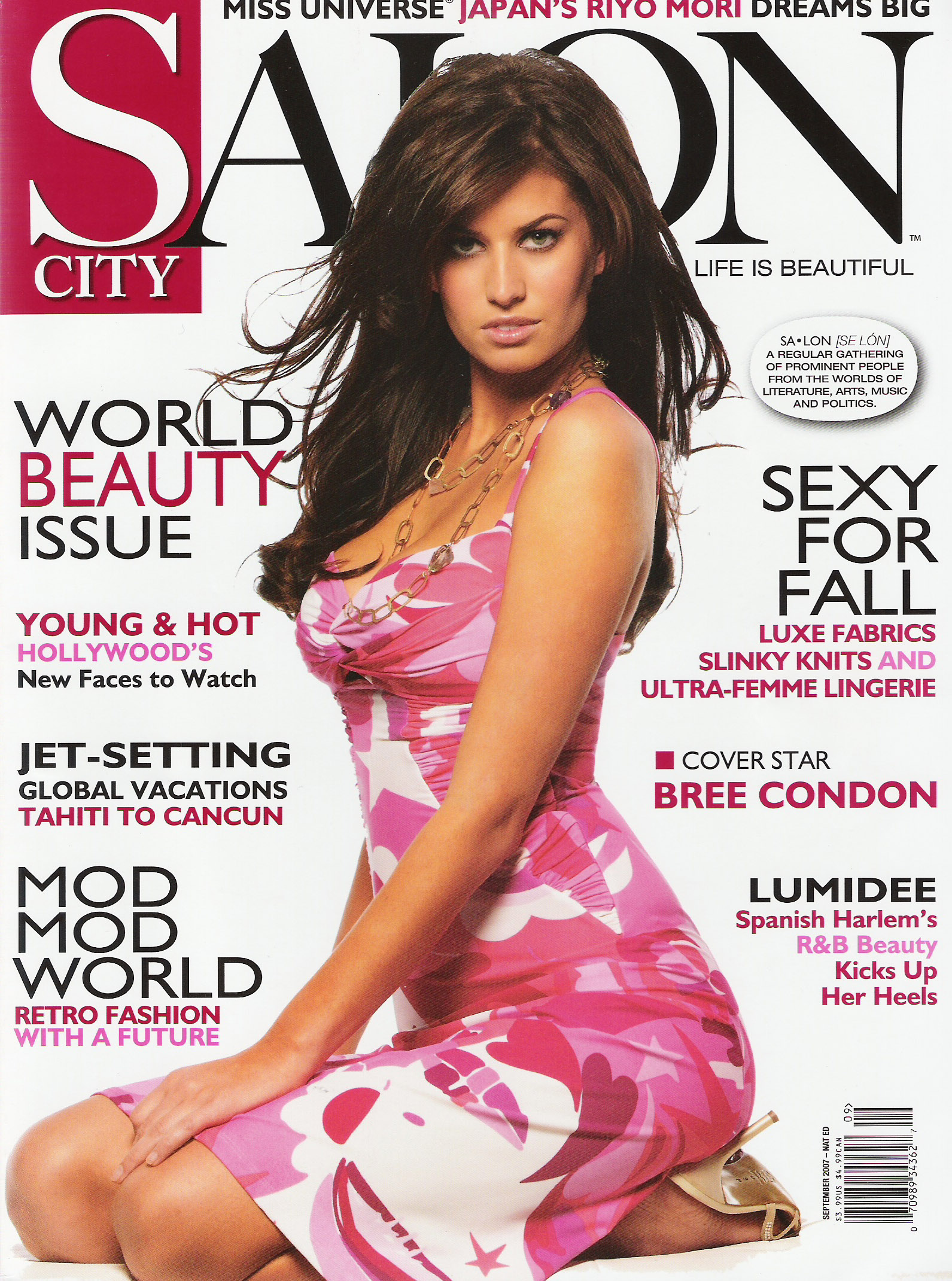
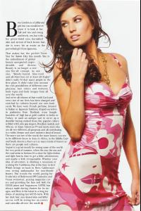
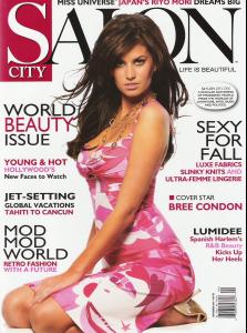
Thanks Dirrty. Those pics are great. I broke down and bought that Salon City magazine. So here are my scans.
-
Thanks both of you but I sort of ended up buying the magazine and stuff. Oh well. And damn there are a lot of pages in that issue.
-
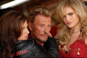
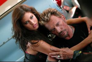
and another one...
 I might as well contribute something...
 Thanks for all the vids
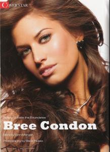
I have to say that Breezy is an interesting and totally corny name for a perfume but it works. FYI. Bree's on the cover of Salon City's World Beauty Issue and it's already out. I saw it in the store and contemplated getting it -- but it didn't happen. http://www.marketwatch.com/news/story/glob...=TQP_Mod_pressN
Is anyone going to scan that new Izod ad or am I going to have to go purchase an Instyle magazine?
Spice Girls (but neither are exactly my faves) Nacho Cheese Doritos or Cool Ranch Doritos?
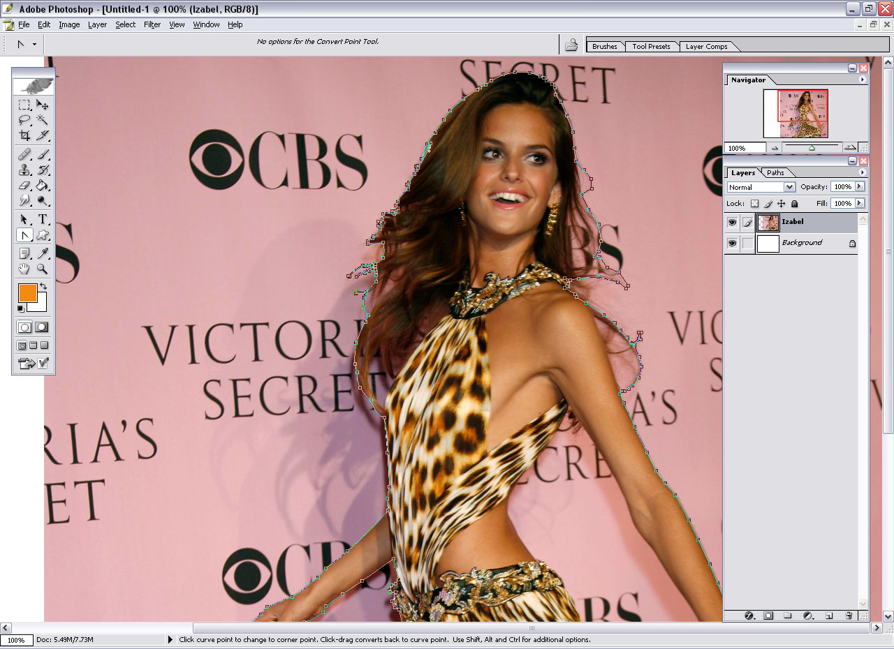
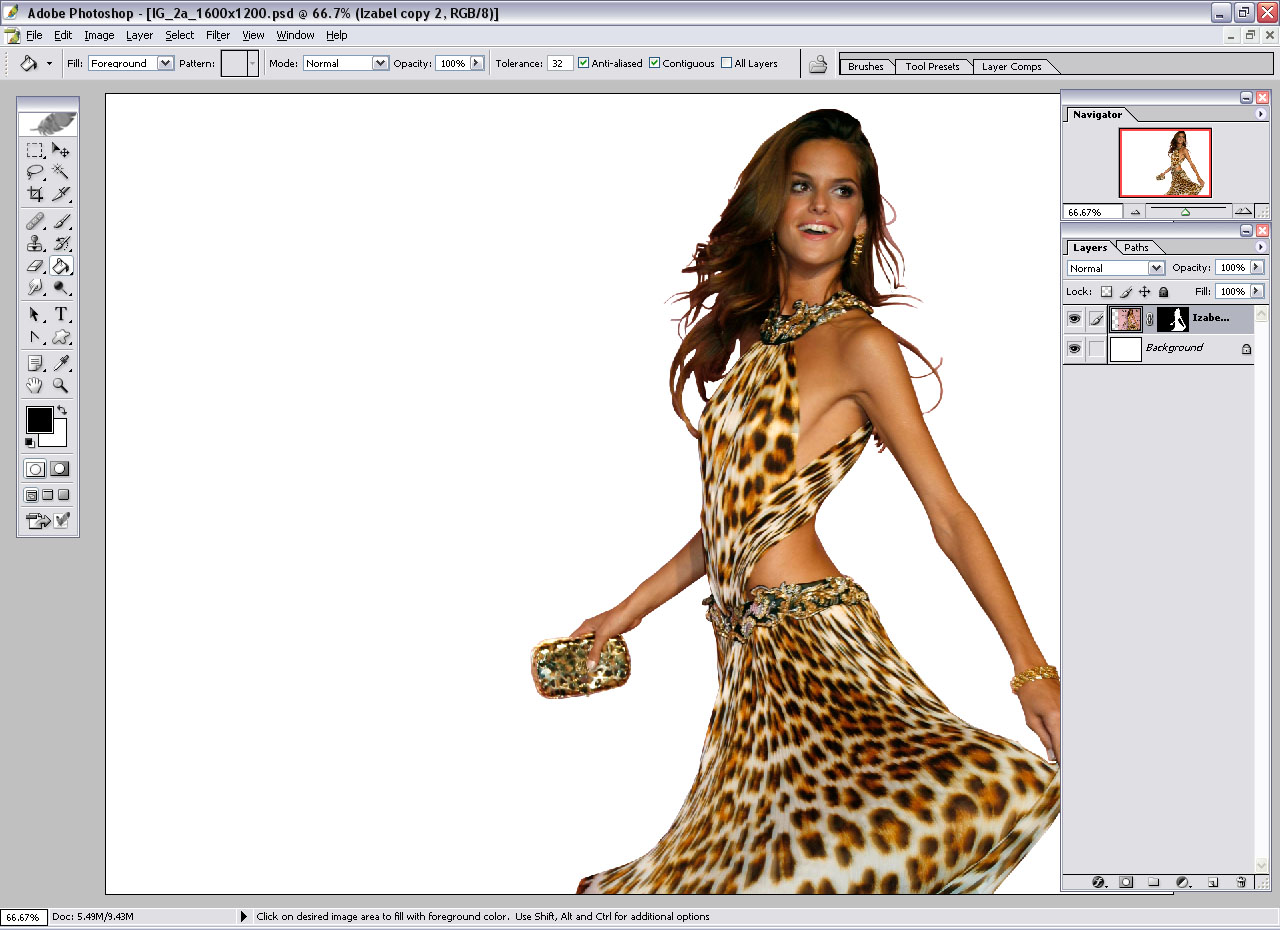
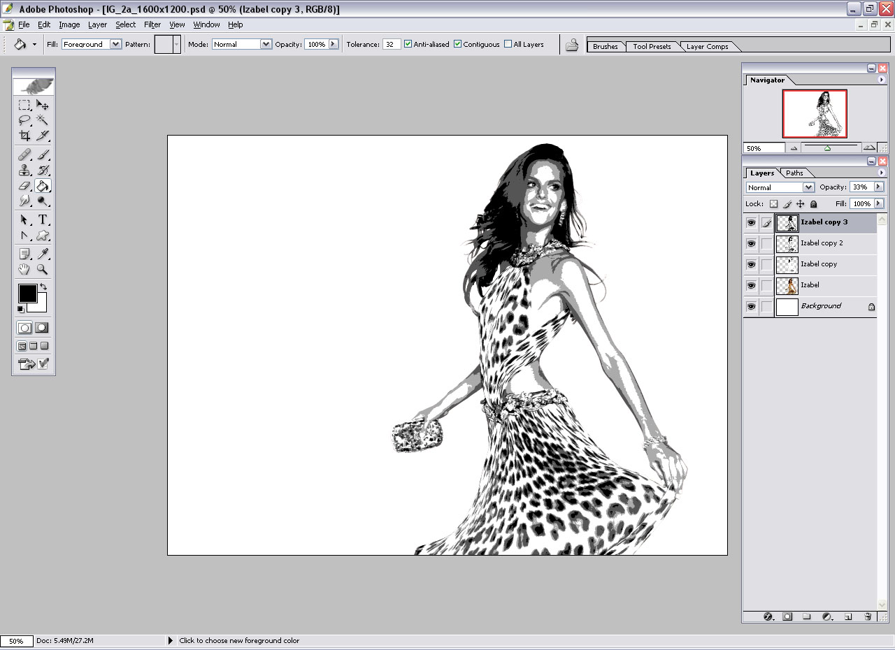
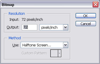
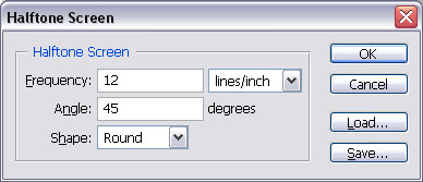
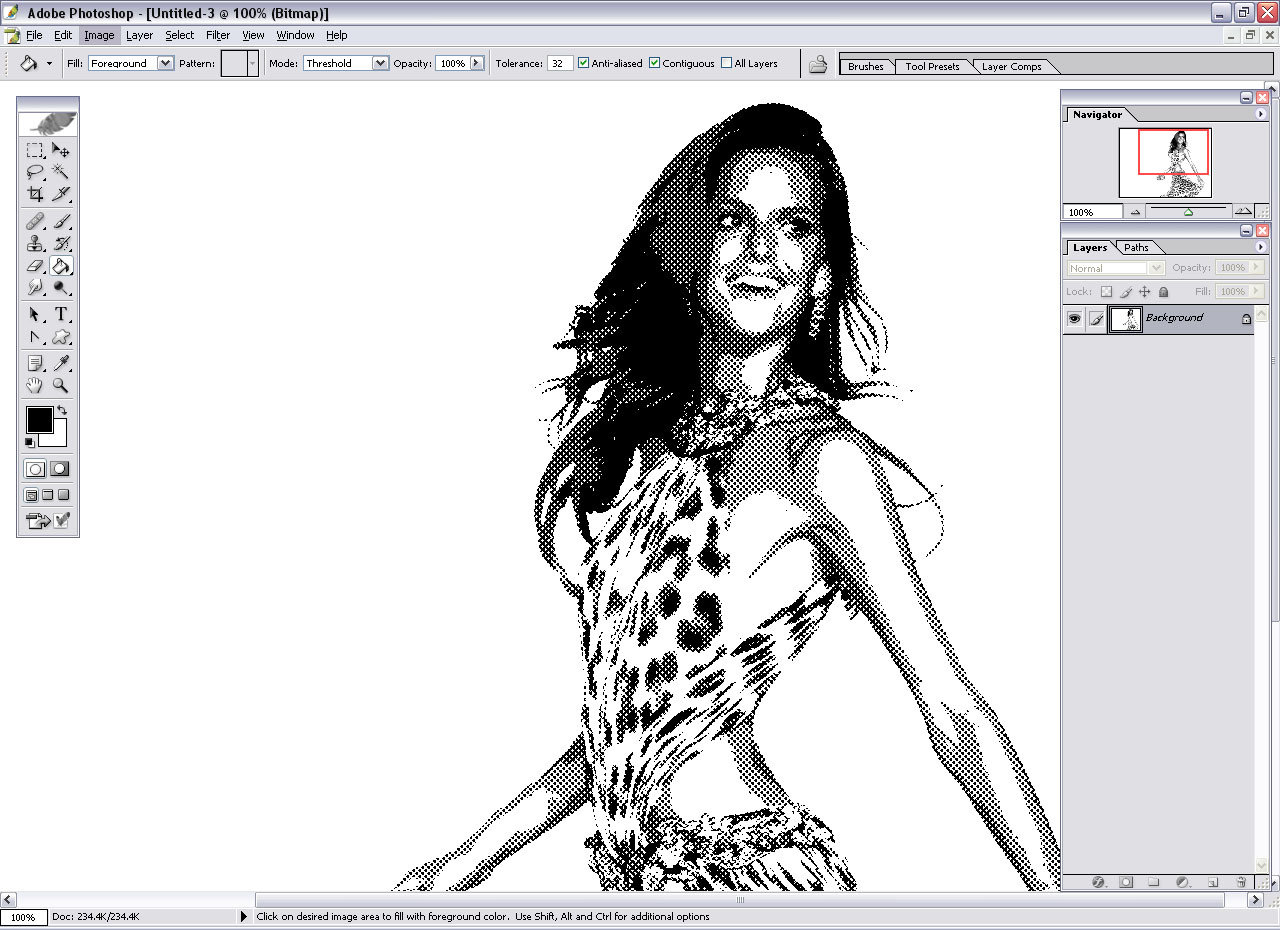
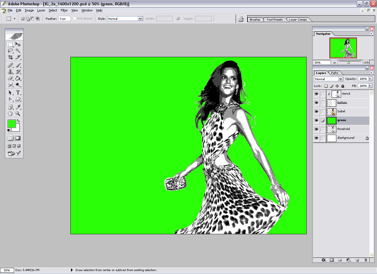
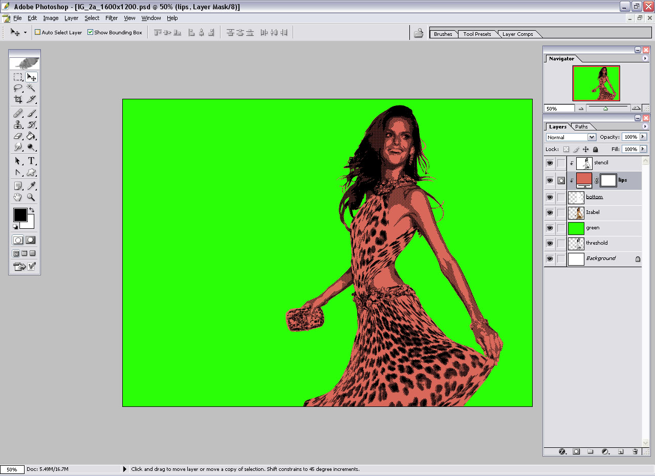
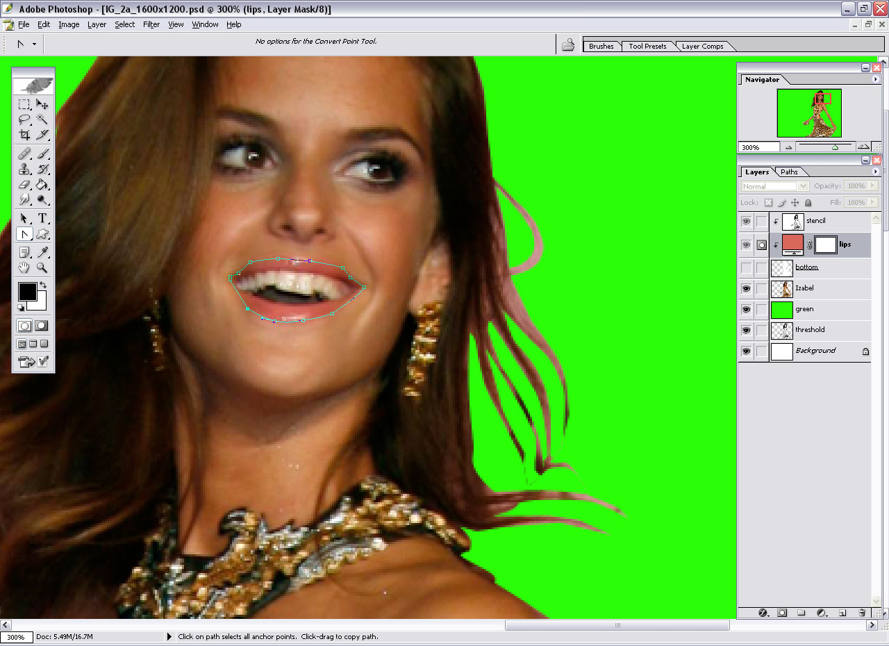
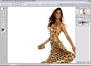
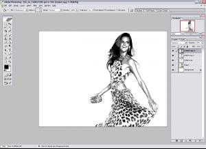
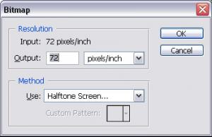
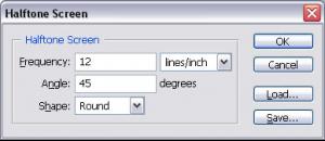
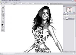
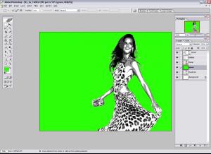
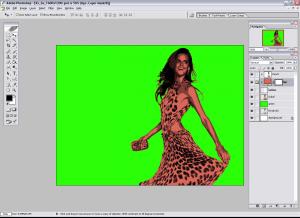
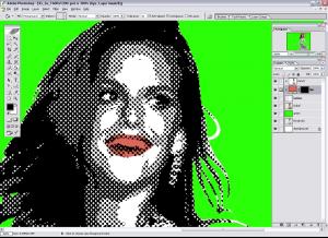
Julia asked me to elaborate on how I made my signature and avatar, so I made this tutorial in case anyone else is interested. ========================================================================= Pop Art tutorial – by Hyperion Prepare your image 1. Select the image that you want to use 2. Use the pen tool to select the portion of the image that you will work with later. a. Be sure to change from “shape layers” to “paths” b. Use the pen tool to make your selection. c. Right-click in the path that you have created and choose “make selection” d. Determine how sharp you want the feather radius around the selection to be. I generally use the default -- zero pixels e. With the area still selected, and the image set as the current layer, click the vector mask button f. Click on the layer mask and choose “apply layer mask” The image is now ready to be manipulated. Define your image This step is as hard as you make it. That is, the more complex you want the image to appear, the more steps are needed. I will use three layers of the same image and apply a threshold adjustment to each layer. It is not necessary to do it three times. One time is enough but three creates more complexity. 1. Duplicate the current layer three times in case you want to start over at some point. Thus, you should have image, image copy 1, image copy 2, and image copy 3 layers. 2. Go to the top-most layer (most likely image copy 3) and apply the threshold adjustment (Image > Adjustments > Threshold). Make sure that the shadows are very dark, but still shows defining features. There isn’t an exact number to choose. Select ‘ok’ and then change the opacity of the layer to 33%. 3. Go to the next layer (most likely image copy 2) and once again apply the threshold adjustment. Make sure that the resulting image is both well defined and lighter than the layer above. That is, the threshold level number should be less than the threshold level number chosen in step 2. Click ‘ok’ and this time change the opacity of the layer to 50%. 4. That leaves a threshold adjustment for image copy 1 (presumably). Apply the threshold adjustment one last time and make sure that this adjustment essentially provides a rough outline. The opacity of the layer should remain at 100%. 5. Merge all three layers by first linking them and then selecting merge linked layers (Layer > Merge Linked or Ctrl-E). This provides the “shading” for the final image. Convert the solid shading to dots 1. Duplicate the merged threshold layer and select “New” as the destination. 2. Now in the new document, the image needs to be converted to grayscale. This is done by navigating to Image > Mode > Grayscale. When prompted to flatten layers select “Flatten” from the dialog box. 3. Then navigate to Image > Mode > Bitmap. We are now ready to add the dots. Leave the resolution as is and instead change the method to “Halftone Screen.” Change the shape to round. The pixels/line number is purely a matter of preference. The lower the frequency, the bigger the dots and vice-versa. So I suggest a number within the 15-25 range. 4. After applying the dots, change the image back to grayscale. Image > Mode > Grayscale. And then back to RGB. Image > Mode > RGB Color. 5. Now duplicate the layer again. This time set the destination to the previous document. You can now discard this document or save it if you like. Adding color to your image To attain the effect that you are looking at a drawing and not a picture, each area of the image needs to be painted over. That is, the skin needs to be painted one color. The hair, eyeballs, lips and clothing all follow the same process. The layer palette should now consist of a dotted image, the original image in black and white and the original image. 1. Rename the dots layer ‘stencil.’ 2. Duplicate the original image. Rename the new layer ‘bottom.’ Adjust the brightness of the layer (Image>Adjustments>Brightness/Contrast) until the layer is completely white. 3. Move the ‘bottom’ layer just below the dotted image. Create a clipping layer between the two of them. Do this by navigating to either layer in the layer window. Move the mouse cursor to the line that separates the two layers. Hold down the “alt” button and an icon of two intersecting circles will appear. With alt still depressed, left click the mouse. The dots layer is now clipped by the image layer. 4. Set the blending option of the ‘stencil’ layer to multiply. 5. The color layer will now be inserted between the ‘stencil’ layer and the ‘bottom’ layer. 6. Insert a solid color layer by navigating to the bottom of the layer window and select the “create new fill or adjustment layer” icon. From there choose solid color and after selecting your color, choose ok. You should now be left with a dotted image of the same color you just picked. All that color can be confusing, so I recommend that you set the foreground brush color to black and then use the paint bucket tool inside the layer mask of the color layer. The color now disappears. 7. The next step can be done in a few ways. You can either use the pen tool to make a new selection or the paint brush to paint the layer mask white where you want your color to go. I recommend the pen tool, but this can take a good deal of time. One small aside, I like to place the original image just under ‘bottom’ in the layer hierarchy. This way, you can change the visibility of the colored layers and then use the pen tool to trace the desired area. After that you can change the visibility of the ‘bottom’ layer back to visible and add color to the layer. 8. Choose the feature that you want to start with. I like to start on the face. So, zoom in on the lips and use the pen tool to trace the outline of the lips. Once you are finished click “Make selection.” Move over to the layer mask and maker sure that it is the active layer. Choose the paint bucket tool and paint white into the selected area. You should now have colored lips. Double-click on the color portion of the layer and adjust the color to red or whatever shade you desire. FYI. You may need to make a white layer over the red layer for teeth. 9. Proceed to add more color fill layers to the image. White for the eyes and teeth. Tan for the skin. A layer for the hair. Etc. I generally leave the skin on the bottom so that all the other fill layers define the boundaries for the arms and legs. Enhancing the image. The image is now essentially done, but sometimes the single toned colors can look dull and boring. So I like to copy the original image and perform a threshold adjustment on it. I then place this layer above the stencil layer. I then change to layer opacity to 33-50% to provide some shading. There are some other effects to add if you desire. You can take the 'stencil' layer and duplicate it and cut out a specific portion -- like a shirt -- that you want the dots to be colored and not black and white. I've used that once or twice. Sometimes it looks nice if you decrease the opacity of the 'bottom' layer and have the original image underneath it.
Thanks for all the vids
I have to say that Breezy is an interesting and totally corny name for a perfume but it works. FYI. Bree's on the cover of Salon City's World Beauty Issue and it's already out. I saw it in the store and contemplated getting it -- but it didn't happen. http://www.marketwatch.com/news/story/glob...=TQP_Mod_pressN
Is anyone going to scan that new Izod ad or am I going to have to go purchase an Instyle magazine?
Spice Girls (but neither are exactly my faves) Nacho Cheese Doritos or Cool Ranch Doritos?
Julia asked me to elaborate on how I made my signature and avatar, so I made this tutorial in case anyone else is interested. ========================================================================= Pop Art tutorial – by Hyperion Prepare your image 1. Select the image that you want to use 2. Use the pen tool to select the portion of the image that you will work with later. a. Be sure to change from “shape layers” to “paths” b. Use the pen tool to make your selection. c. Right-click in the path that you have created and choose “make selection” d. Determine how sharp you want the feather radius around the selection to be. I generally use the default -- zero pixels e. With the area still selected, and the image set as the current layer, click the vector mask button f. Click on the layer mask and choose “apply layer mask” The image is now ready to be manipulated. Define your image This step is as hard as you make it. That is, the more complex you want the image to appear, the more steps are needed. I will use three layers of the same image and apply a threshold adjustment to each layer. It is not necessary to do it three times. One time is enough but three creates more complexity. 1. Duplicate the current layer three times in case you want to start over at some point. Thus, you should have image, image copy 1, image copy 2, and image copy 3 layers. 2. Go to the top-most layer (most likely image copy 3) and apply the threshold adjustment (Image > Adjustments > Threshold). Make sure that the shadows are very dark, but still shows defining features. There isn’t an exact number to choose. Select ‘ok’ and then change the opacity of the layer to 33%. 3. Go to the next layer (most likely image copy 2) and once again apply the threshold adjustment. Make sure that the resulting image is both well defined and lighter than the layer above. That is, the threshold level number should be less than the threshold level number chosen in step 2. Click ‘ok’ and this time change the opacity of the layer to 50%. 4. That leaves a threshold adjustment for image copy 1 (presumably). Apply the threshold adjustment one last time and make sure that this adjustment essentially provides a rough outline. The opacity of the layer should remain at 100%. 5. Merge all three layers by first linking them and then selecting merge linked layers (Layer > Merge Linked or Ctrl-E). This provides the “shading” for the final image. Convert the solid shading to dots 1. Duplicate the merged threshold layer and select “New” as the destination. 2. Now in the new document, the image needs to be converted to grayscale. This is done by navigating to Image > Mode > Grayscale. When prompted to flatten layers select “Flatten” from the dialog box. 3. Then navigate to Image > Mode > Bitmap. We are now ready to add the dots. Leave the resolution as is and instead change the method to “Halftone Screen.” Change the shape to round. The pixels/line number is purely a matter of preference. The lower the frequency, the bigger the dots and vice-versa. So I suggest a number within the 15-25 range. 4. After applying the dots, change the image back to grayscale. Image > Mode > Grayscale. And then back to RGB. Image > Mode > RGB Color. 5. Now duplicate the layer again. This time set the destination to the previous document. You can now discard this document or save it if you like. Adding color to your image To attain the effect that you are looking at a drawing and not a picture, each area of the image needs to be painted over. That is, the skin needs to be painted one color. The hair, eyeballs, lips and clothing all follow the same process. The layer palette should now consist of a dotted image, the original image in black and white and the original image. 1. Rename the dots layer ‘stencil.’ 2. Duplicate the original image. Rename the new layer ‘bottom.’ Adjust the brightness of the layer (Image>Adjustments>Brightness/Contrast) until the layer is completely white. 3. Move the ‘bottom’ layer just below the dotted image. Create a clipping layer between the two of them. Do this by navigating to either layer in the layer window. Move the mouse cursor to the line that separates the two layers. Hold down the “alt” button and an icon of two intersecting circles will appear. With alt still depressed, left click the mouse. The dots layer is now clipped by the image layer. 4. Set the blending option of the ‘stencil’ layer to multiply. 5. The color layer will now be inserted between the ‘stencil’ layer and the ‘bottom’ layer. 6. Insert a solid color layer by navigating to the bottom of the layer window and select the “create new fill or adjustment layer” icon. From there choose solid color and after selecting your color, choose ok. You should now be left with a dotted image of the same color you just picked. All that color can be confusing, so I recommend that you set the foreground brush color to black and then use the paint bucket tool inside the layer mask of the color layer. The color now disappears. 7. The next step can be done in a few ways. You can either use the pen tool to make a new selection or the paint brush to paint the layer mask white where you want your color to go. I recommend the pen tool, but this can take a good deal of time. One small aside, I like to place the original image just under ‘bottom’ in the layer hierarchy. This way, you can change the visibility of the colored layers and then use the pen tool to trace the desired area. After that you can change the visibility of the ‘bottom’ layer back to visible and add color to the layer. 8. Choose the feature that you want to start with. I like to start on the face. So, zoom in on the lips and use the pen tool to trace the outline of the lips. Once you are finished click “Make selection.” Move over to the layer mask and maker sure that it is the active layer. Choose the paint bucket tool and paint white into the selected area. You should now have colored lips. Double-click on the color portion of the layer and adjust the color to red or whatever shade you desire. FYI. You may need to make a white layer over the red layer for teeth. 9. Proceed to add more color fill layers to the image. White for the eyes and teeth. Tan for the skin. A layer for the hair. Etc. I generally leave the skin on the bottom so that all the other fill layers define the boundaries for the arms and legs. Enhancing the image. The image is now essentially done, but sometimes the single toned colors can look dull and boring. So I like to copy the original image and perform a threshold adjustment on it. I then place this layer above the stencil layer. I then change to layer opacity to 33-50% to provide some shading. There are some other effects to add if you desire. You can take the 'stencil' layer and duplicate it and cut out a specific portion -- like a shirt -- that you want the dots to be colored and not black and white. I've used that once or twice. Sometimes it looks nice if you decrease the opacity of the 'bottom' layer and have the original image underneath it.

 It's not hard to do, but you probably need to be experienced with the pen tool. First duplicate the current layer and then desaturate the duplicated image. Cut out the portion of the image where you want the rainbow effect to be and delete or add a layer mask to the image. You should now see black and white where the rainbow will be and the rest of the image should be colored as it normally was. Now, create a new gradient fill layer above the desaturated image. There should be an acceptable gradient that looks like a rainbow to use. Change the blending mode of the gradient layer to multiply (Overlay or screen might look nice as well) and then create a clipping mask between the gradient layer and the desaturated layer. That should do the trick. That's it in a nutshell but if you need me to elaborate I can.
Always glad to help.
KMFDM - Tohuvabohu
^Heh, thanks. Almost at 1000 posts, so I'll need to roll out a new set for myself soon.
It's not hard to do, but you probably need to be experienced with the pen tool. First duplicate the current layer and then desaturate the duplicated image. Cut out the portion of the image where you want the rainbow effect to be and delete or add a layer mask to the image. You should now see black and white where the rainbow will be and the rest of the image should be colored as it normally was. Now, create a new gradient fill layer above the desaturated image. There should be an acceptable gradient that looks like a rainbow to use. Change the blending mode of the gradient layer to multiply (Overlay or screen might look nice as well) and then create a clipping mask between the gradient layer and the desaturated layer. That should do the trick. That's it in a nutshell but if you need me to elaborate I can.
Always glad to help.
KMFDM - Tohuvabohu
^Heh, thanks. Almost at 1000 posts, so I'll need to roll out a new set for myself soon.