

zauberkorn
-
Posts
205 -
Joined
-
Last visited
Content Type
Profiles
Forums
Events
Articles
Posts posted by zauberkorn
-
-
-
On 1/17/2024 at 3:38 PM, versustito13 said:
The Perfect Magazine 2024

-
4 hours ago, radolgc said:
This rare cover was posted on instagram today, Portugese magazine dated 9-10/1994, photo by Karl Laferfeld:

WOW, I never see before.
-
Zeit Magazin February 1st, 2024
For me: the best since very long time. Linda is back.😍
-
2 hours ago, versustito13 said:
Elle Quebec 2007 ( two covers ) ??
Grazy: I have these two differce covers from Canada. Maybe it is for national and international ....


-
2 hours ago, radolgc said:
The more i look at the Perfect cover, the more imperfect and scary it looks to me. She looks dead, there is nothing in her gaze, she looks stoned, scared, mortified...it gives me the feeling of looking of an old drag queen who did not have energy to finish her make-up. And showing that she had removed her breasts is also kinda disturbing. Her proportions are so unnatural. There is something totally wrong with this image. Lets see what the inside photos look like. I am kinda scared to see them. And the prìce of this magazine is ridiculous.
👍👍👍 All your words are absolut exactly !!!
-
22 minutes ago, radolgc said:
Oh well, she is no longer in her 20s i am afraid. Even Icons grow older and their skin is not youthfull already. They use very strong lights on her to "kill" the skin complection and emphasize on strong makeup to highlight her features. But i see no point in going to such extreames in order to get a decent photo. I miss Lindbergh with his realness and natural look. But we will never get anymore. Thank god we have Linda's early work to admire and look at. Everything new looks almost the same...desperate attempts...at least she did not change her lips...no matter how many silly surgical or cosmetic procedures you get, the result is grotesque. Thank God Kristen McMenamy and Helena still look pretty good and glowing for their age. Seems they had a healthier lifestyle. Even such beauty as Christy is looking too old for her age. Only Naomi does not seem to age...lol
Absolutely right. People should own their age. It shows a lot more personality and life experiences. And you can look great even at 57. I especially see Christy here. Yes, she has wrinkles, but her naturalness makes her "shine". THAT is what makes it so charming. I love her laughter, her joy. It infects me. Linda also looks great for her age, but the covers are poorly done. Linda deserves better covers.
")
-
5 hours ago, radolgc said:
I do not even like the Linda cover of Perfect magazine. It is not real at all, they went too far with photoshop, it looks super fake and her face lacks it natural appearence, it looks flat and unrealistic. It is cool they wanna pay respect to such a model Icon, but they should do a better job or simply use old unpublished photos. That will make me much happier. And the V covers and ed are horrific...so bad;((
Rado, I see it exactly the same as you. This PERFECT cover is not good. It could be very much better. It´s very plastic and unnatural.

-
OK! Nov. 2023 Germany

-
2 hours ago, Dayrell said:
2023
Thank you.
-
3 hours ago, radolgc said:
The first one is horrible...the second one is so so...wish this guy does not photograph her...it is sad when bad photographers are allowed to work with big models...:((
Yes!! Why do she have so a very bad ugly wig?? And the position of the golden hands is not good. Bad for a cover.
-
On 10/7/2023 at 12:11 AM, Dayrell said:On 10/7/2023 at 12:11 AM, Dayrell said:
Yes, Gala Greece loves Linda. Another cover

Do you know the year? 2003 or 2023? Thank you
-
These are all very beautyful covers.
-
2 hours ago, versustito13 said:
versustito13: Great job. Thanks.
-
#2 = Lanvin FW 1990
-
4 hours ago, versustito13 said:
Linda Evangelista featured on the New Style cover from March 2016
I don't know what country it is from?
fashionmodeldirectory.com
I think ot was from Russia.
-
7 hours ago, versustito13 said:
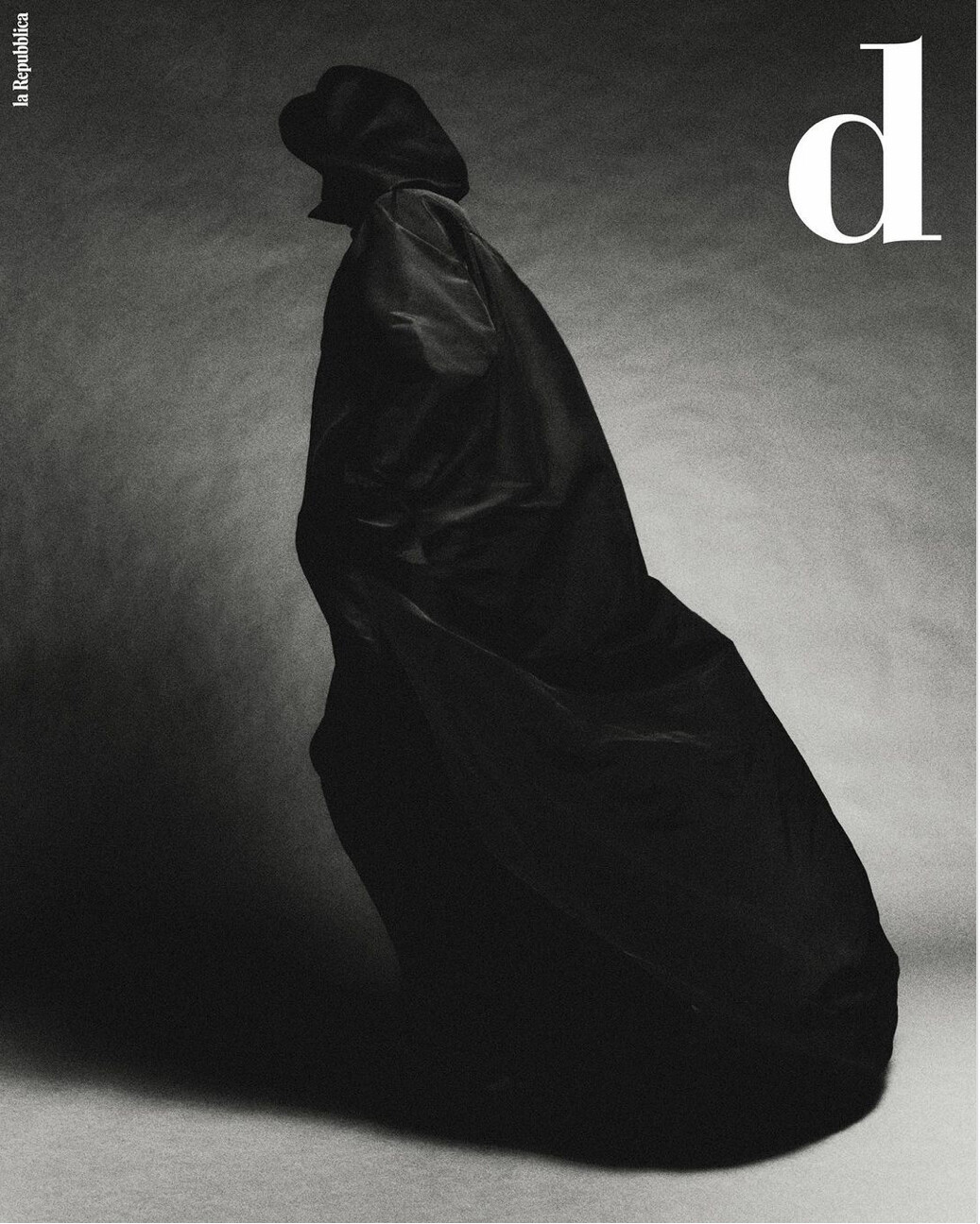
D la Repubblica September 2023 : Linda Evangelista by Robin Galiegue


versustito13, do you know: what is the cover of these ??
-
versustito13: Thanks for all the new covers ect. You are very diligent. TX.
-
14 minutes ago, Doosia said:
Thanks Dossia.
Great, Linda is back!!!
-
15 minutes ago, radolgc said:
It could be her, yes, but it could also not be her...she is the only one who can tell us
I think yes, but it's atypical for Linda from 1985. We really have to ask her :o))
-
Is it Linda? (1985)

-
1 hour ago, LAM said:
WOW !!!!!!!!!!!! This is great😍. I only knew a few pages and had been looking for the catalog for a long time. THANK you for the scans! I love these beautyful photos. What is the year? Is still a other model in the catalog or only Linda?
-
Does anyone know who owns the stefmodels.com site?
-
On 4/16/2023 at 6:20 PM, LAM said:
Found this catalog, can't wait to receive it
 Hi LAM, can we see the photos inside, when you receive the catalog, please? This will be so very great. TX. 🐵


Linda Evangelista
in Female Fashion Models
Posted
Thank you versustito13. But what is the full name for "SSAW" ? I never hear before.